First Union - Identity & Bank Cards
Samuel Grosvenor
Overview
First Union was launching an online banking solution designed for customers who travel. The bank rewards those that spend abroad, gives fair exchange rates and is very customer-first orientated.
The design needed to:
Highlight the key features of the business
Appeal to travellers
Maintain a level of trustworthiness (it’s still a bank)

Design Process
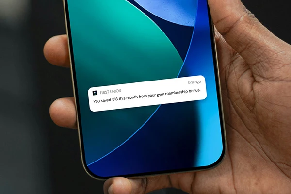
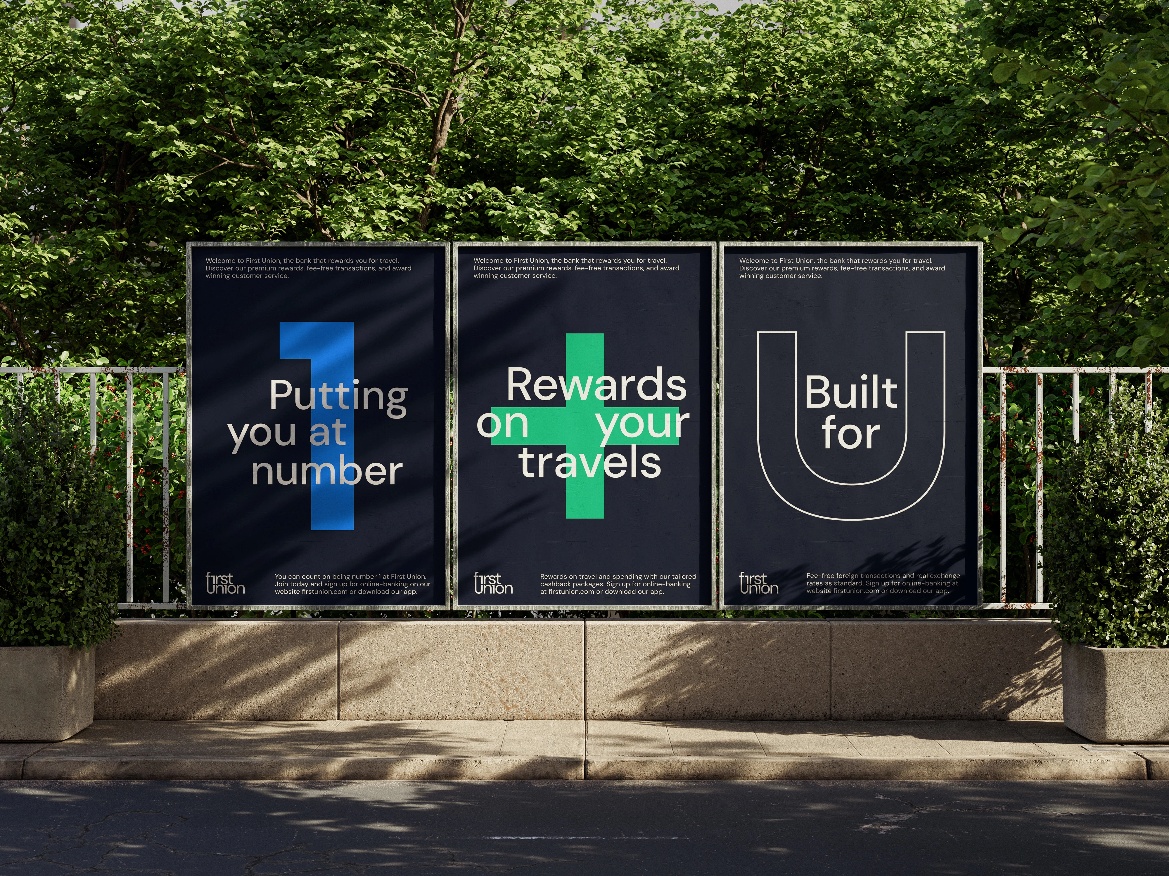
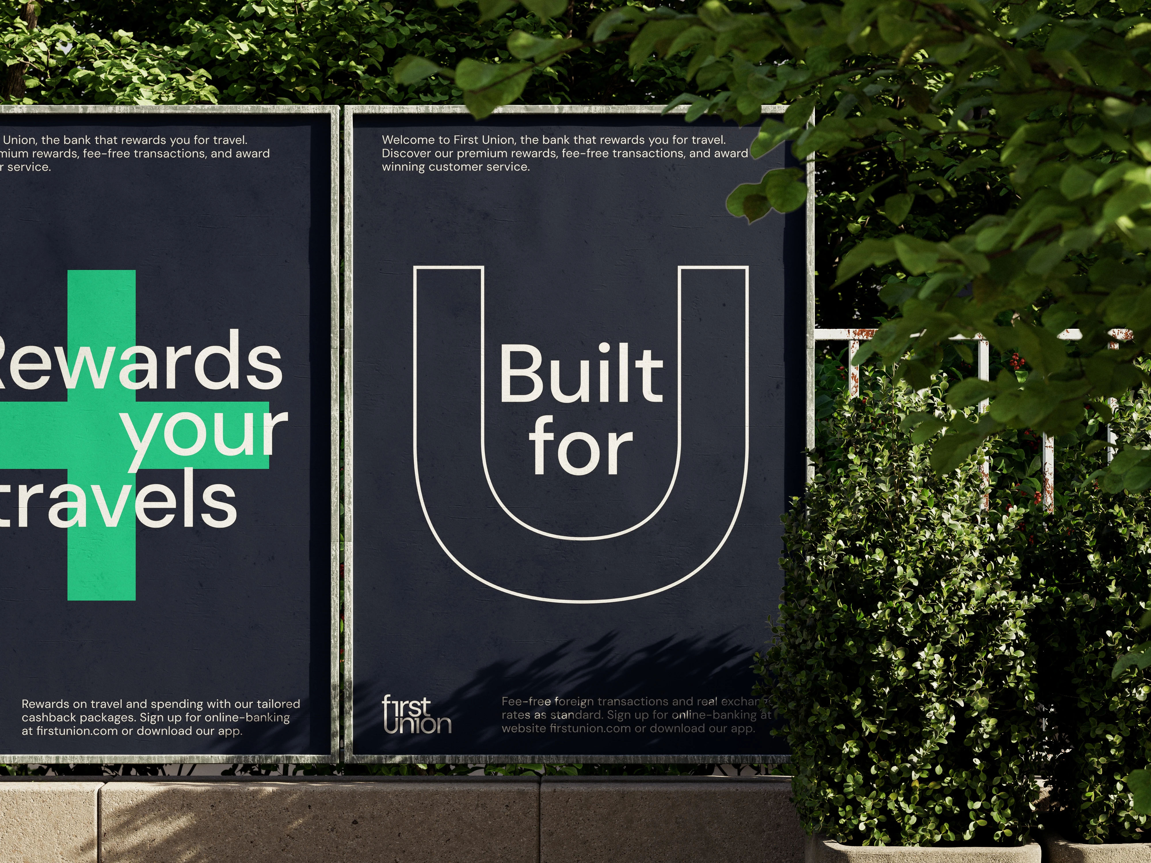
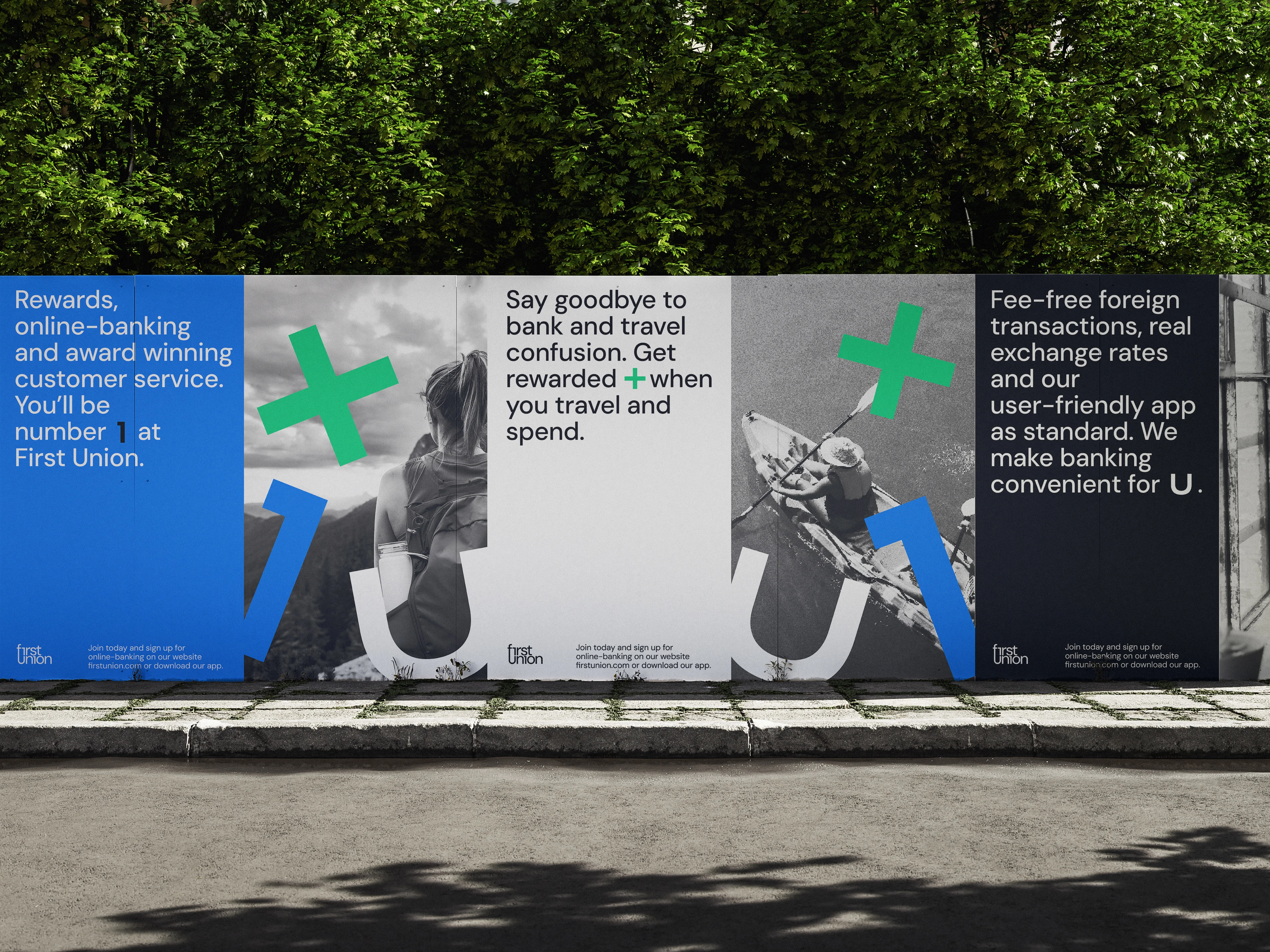
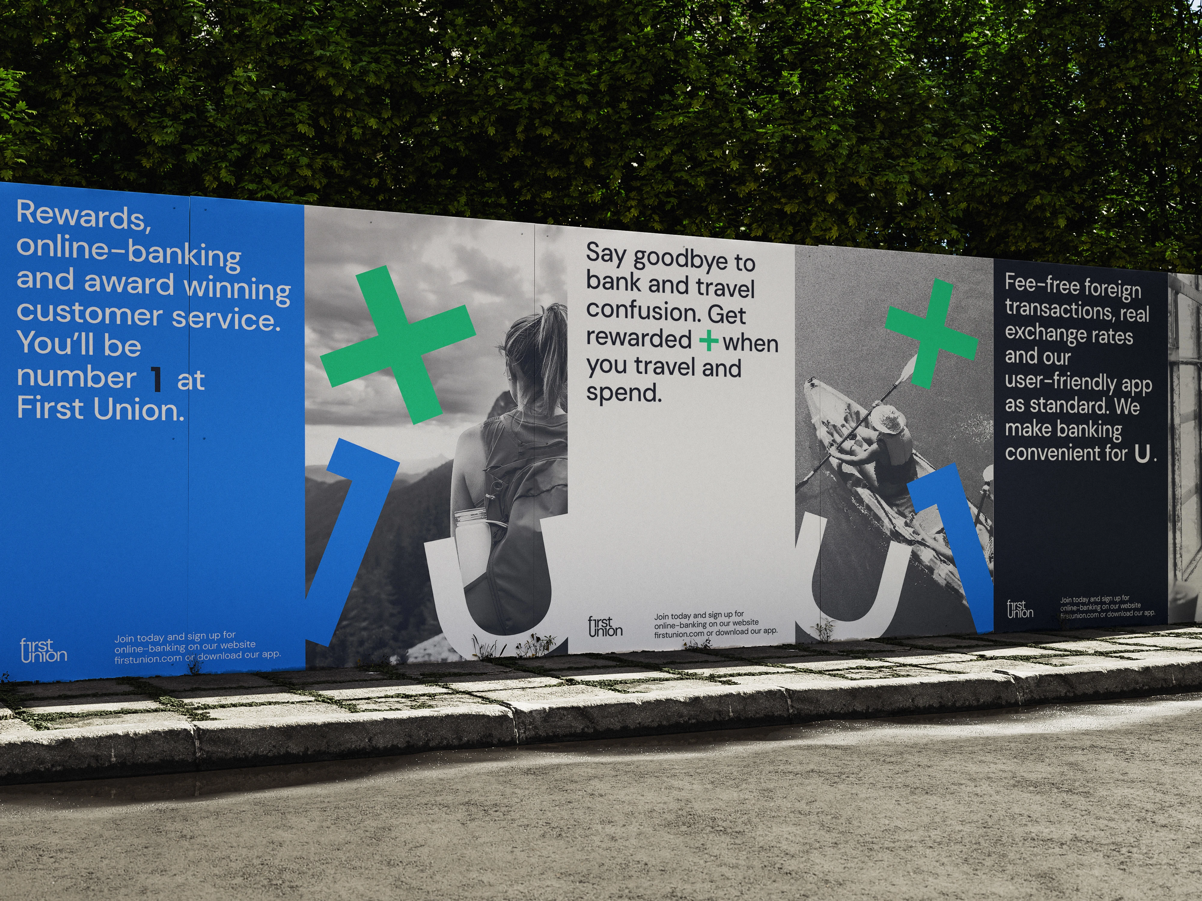
The project began with understanding how to include the key features: rewards, user experience and trustworthiness. This would be the basis for marketing and the brand identity.
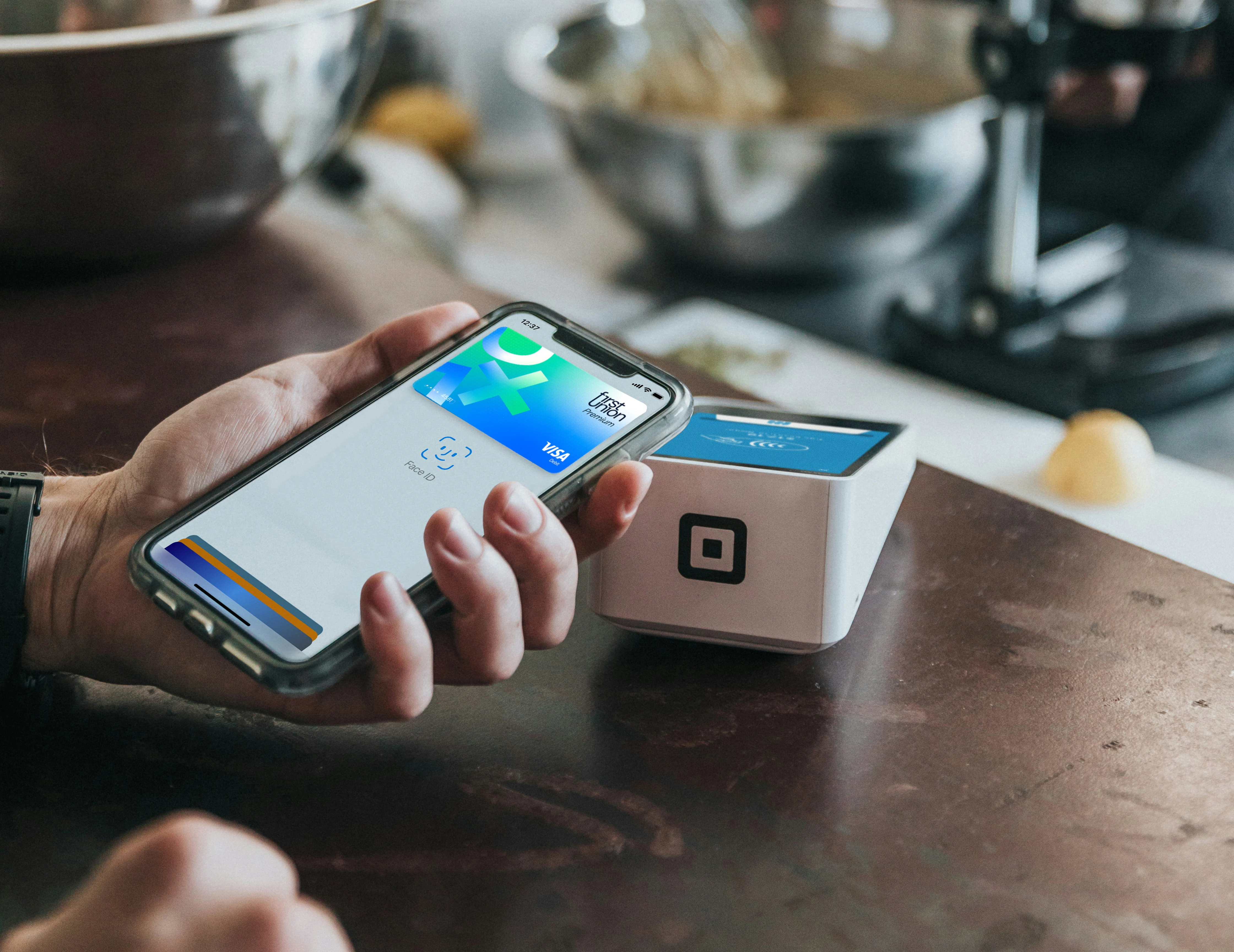
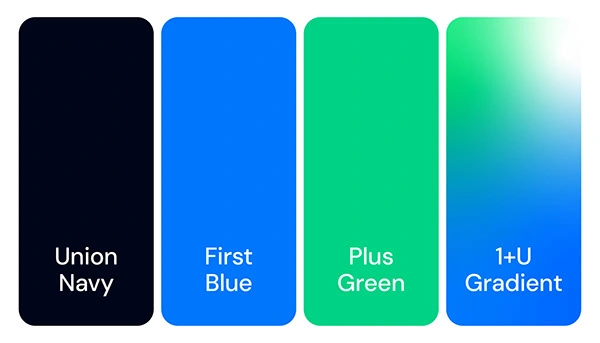
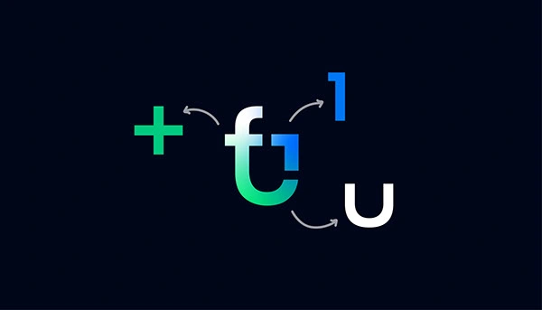
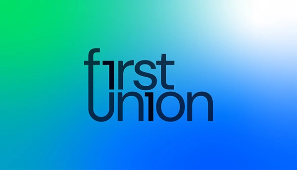
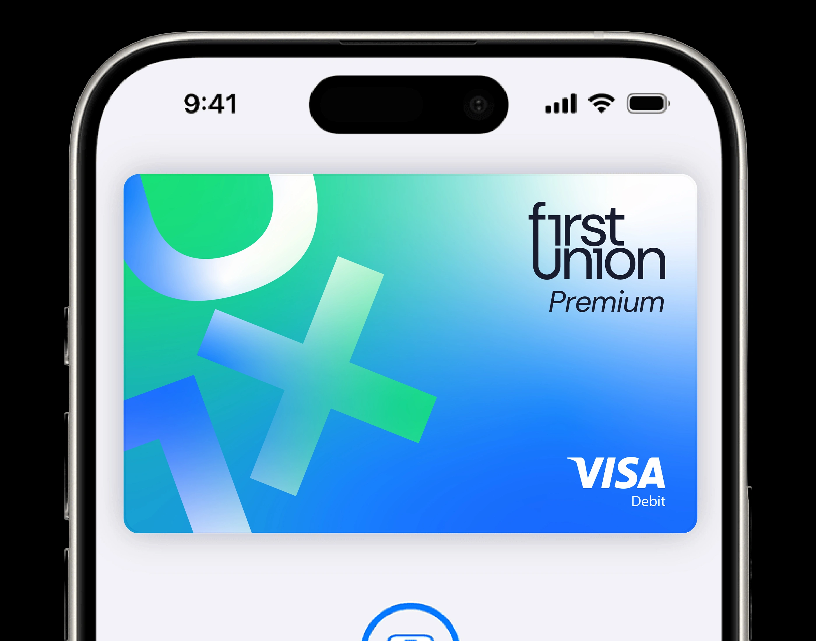
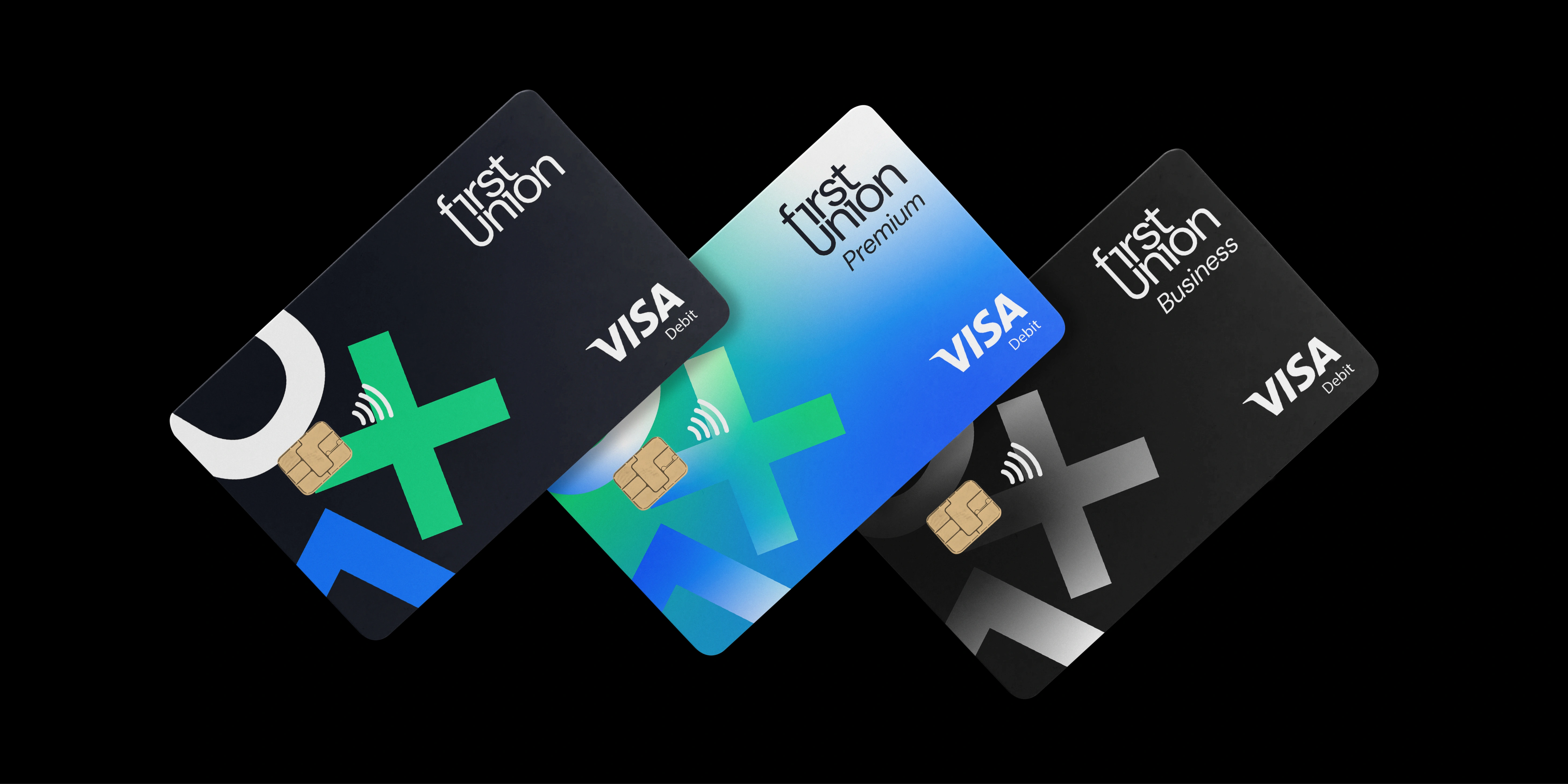
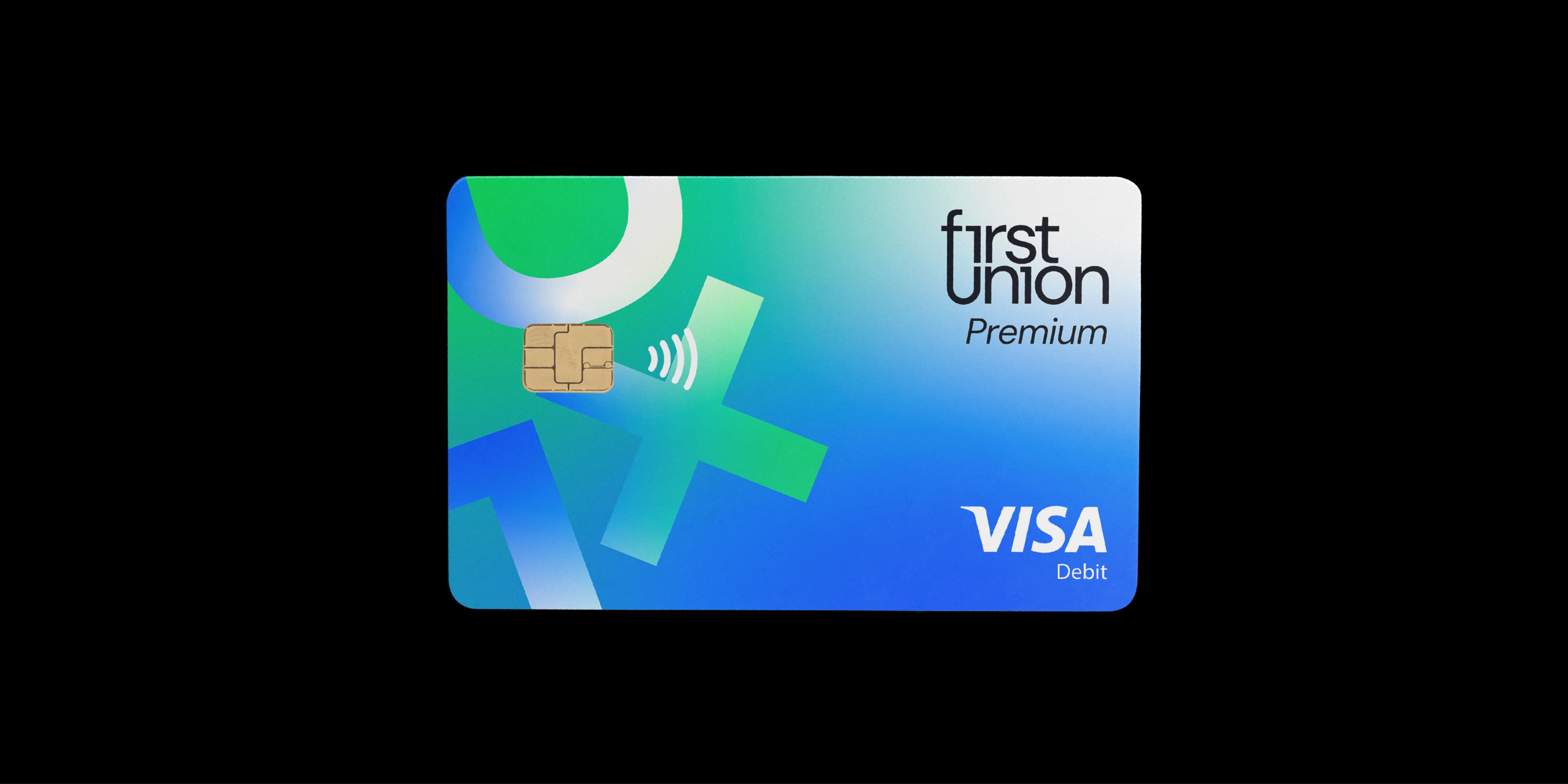
I decided that an assigned colour would make each feature stand out. Simple icons further make the point. A gradient would then be used to bring it all together, showing how these features are all part of First Union package. The 1+U motif and First Union colour palette was born, it’s applied across branding materials to market the USP.
Icon & Wordmark
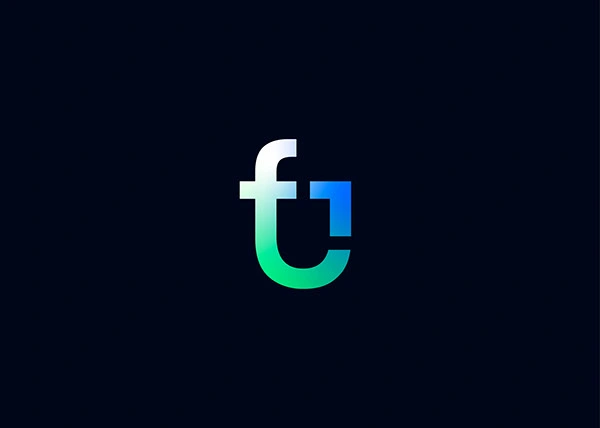
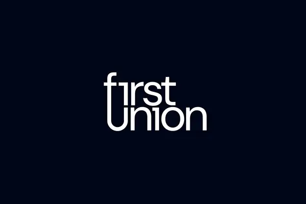
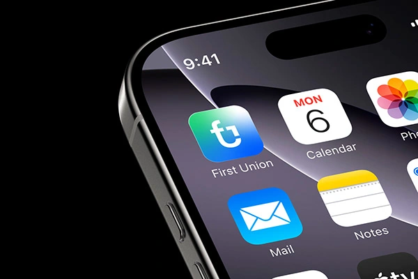
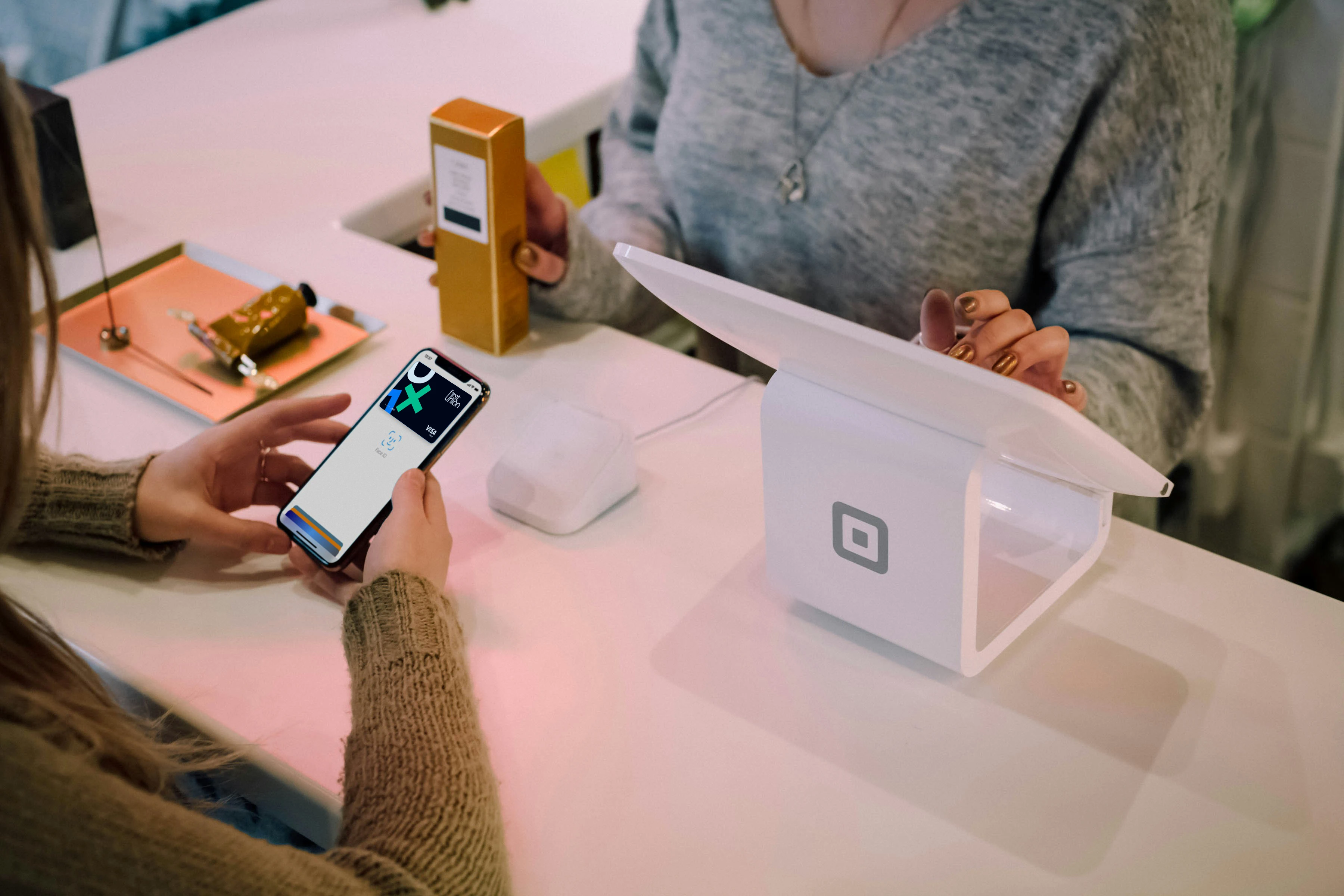
The icon followed suit including the key brand features. “F 1 U” incorporates the brand name, the features motif and forms a shield shape to emphasise trust. This icon style seamlessly works inside the word-mark to form an identity system that easily slots into multiple touch points.
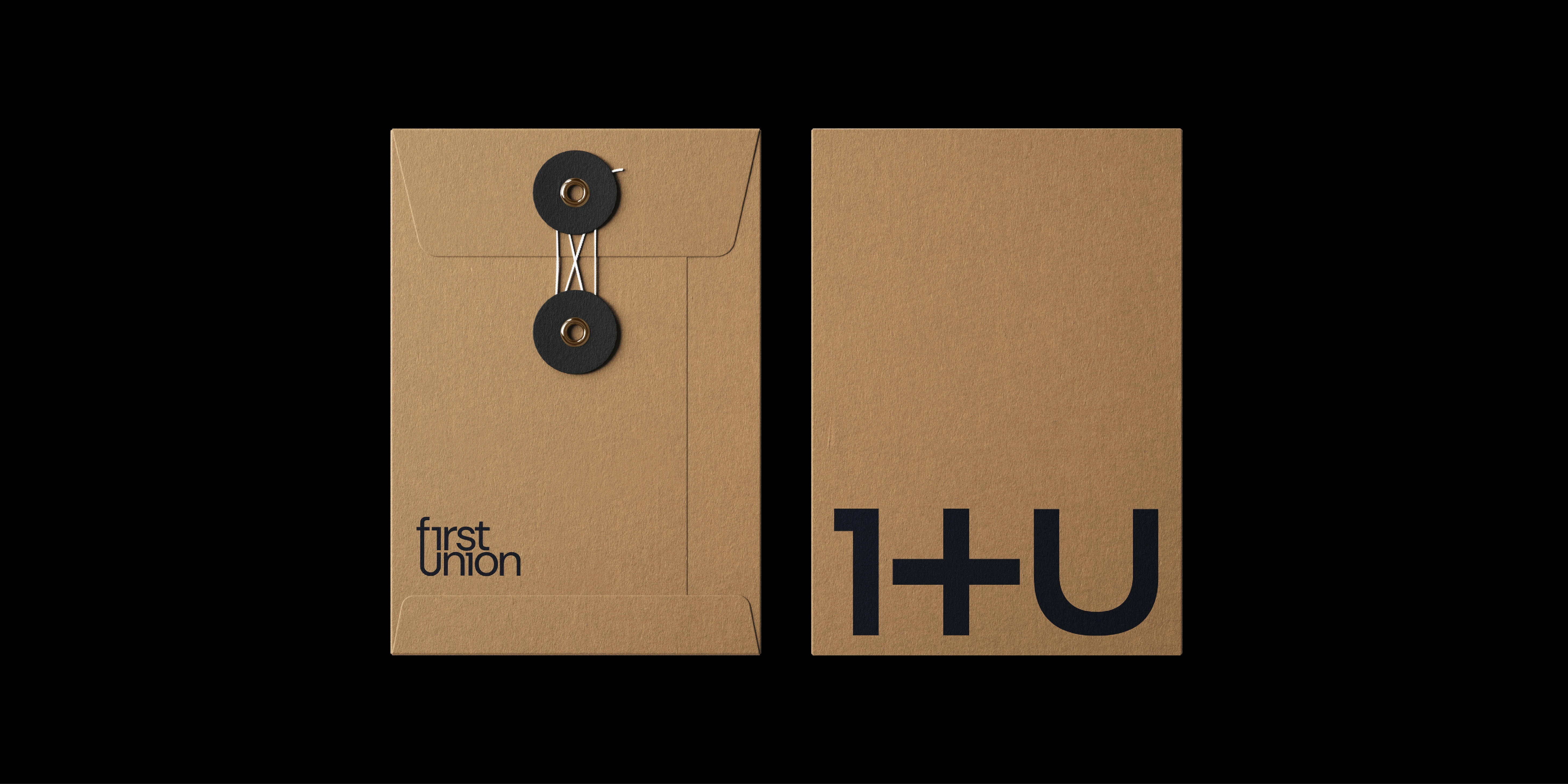
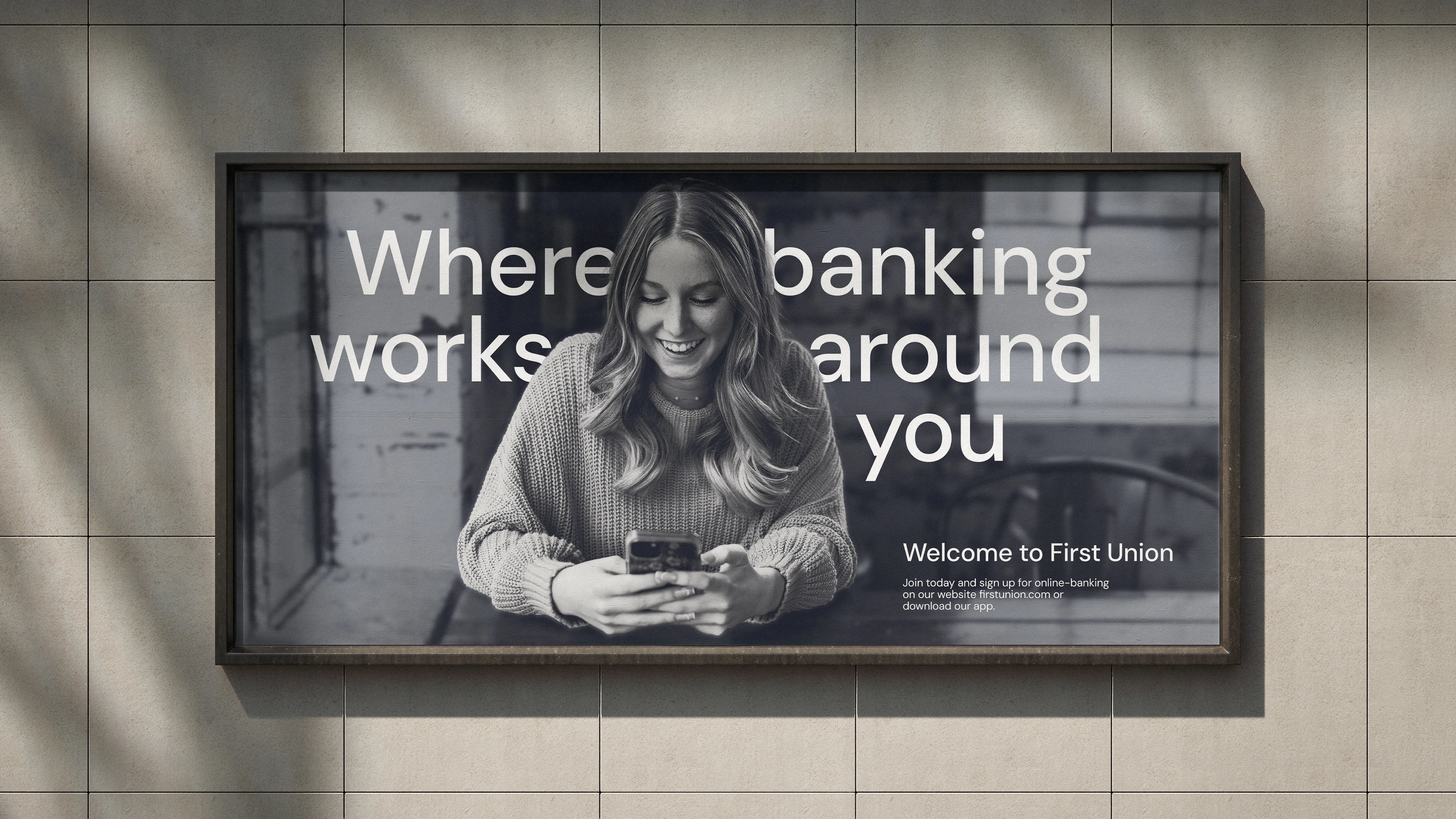
Imagery is de-emphasised using monotone colours but the characters within are brought to the front, highlighting the user first qualities of the First Union brand
Outcome
On launch hundreds of signups were added to the First Union database, and the branding is now being used to launch the First Union app. The results make First Union look unique. It’s easy for someone to identify why they should choose their brand and it appeals to their target market. I enjoyed working with the 1+U motif, it communicates the brand message clearly.
As a traveller myself it was nice to work with a brand that shares my passion and to work on a product that I hope to use in the near future.
Brand: First Union
Role: Brand Identity Designer
Like this project
Posted Mar 11, 2026
Brand identity project for First Union, a FinTech/travel brand that rewards users for spending on their travels.