Streamlining Note-Taking through AI.
Overview
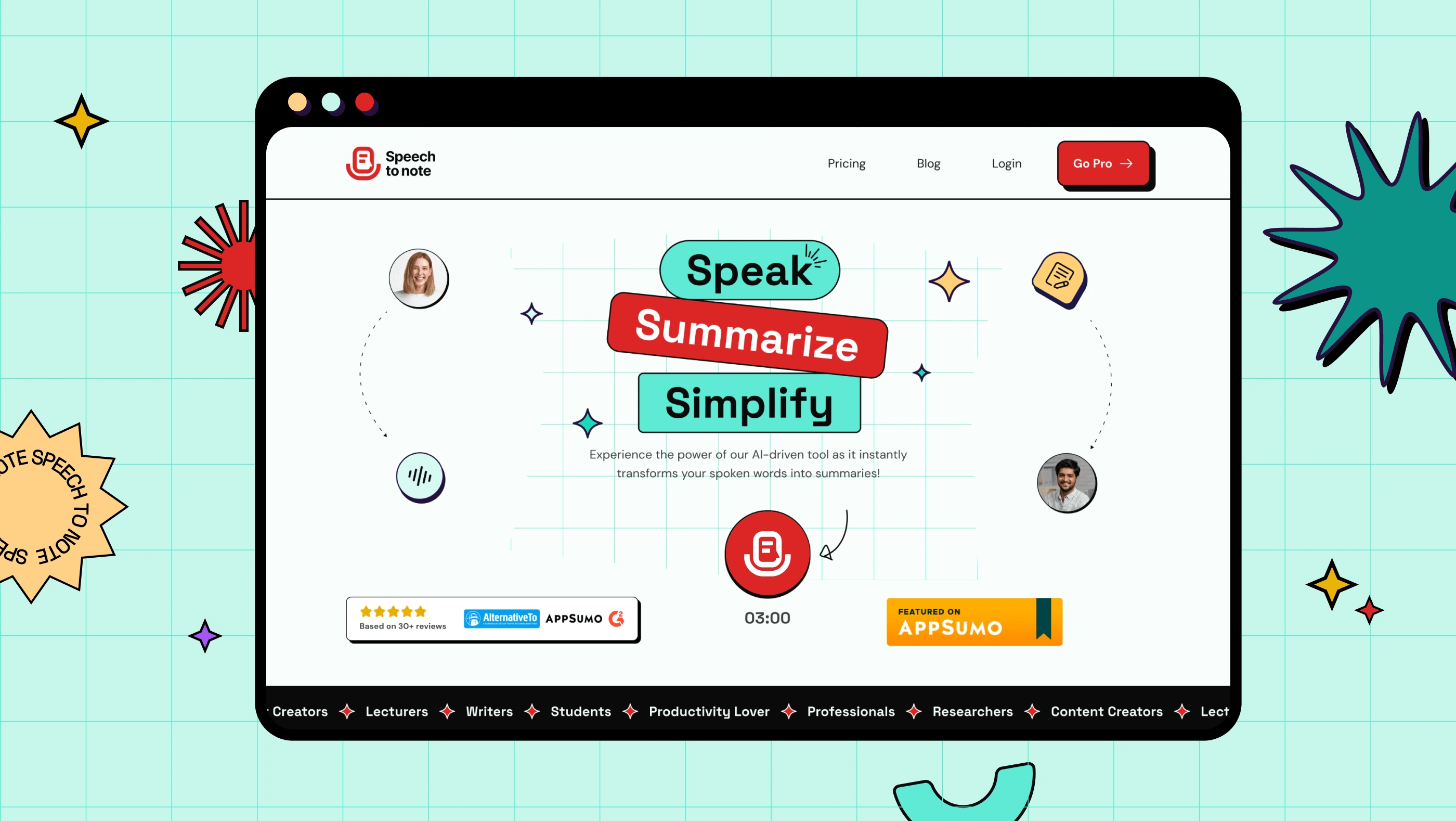
Speech to Note is a powerful AI tool that instantly transforms spoken words into concise and informative summaries saving people’s valuable time and effort. This is aimed at streamlining note-taking through AI.
My Role & Team
As the Visual Designer, I led the creative aspects of the project, from interpreting the product requirements to designing the UI, creating the logo, and establishing a retro-themed design.
I worked closely with Abhishek, the Founder of Speech to Note, and the experienced team of UX Designers, Full-stack Developers, and Digital Marketers at Team Codesign.
Project Goal
Our goal was to focus on the MVP with a user-friendly, retro-themed interface, ship it, spread it, and learn from it. We narrowed our focus on one single feature— Audio to summaries. Only speak your thoughts and get summaries instantly!
Understanding the Users
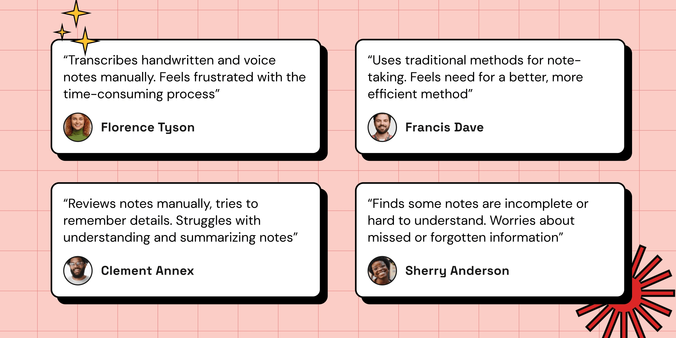
The project kickstarted with research and user interviews led by Abhishek. Key pain points were: tedious manual note-taking, difficulty summarizing information, and time constraints. These were documented and used in mapping out user journeys.
Early Ideation
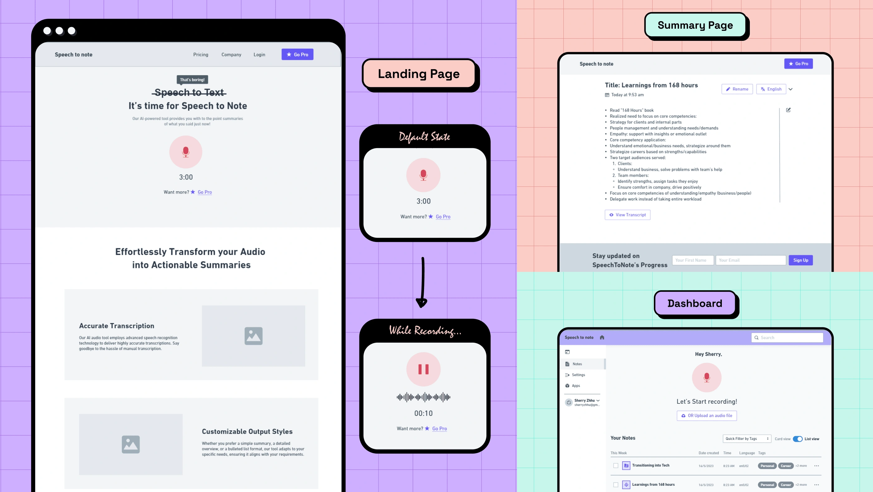
I began by interpreting the product requirement document and creating the user flow. Collaborating with Abhishek, we crafted wireframes while focusing on solving the key problems for our MVP.
On the homepage hero, the user can start recording with a single click on the record button and get their summaries.
Designing for Simplicity
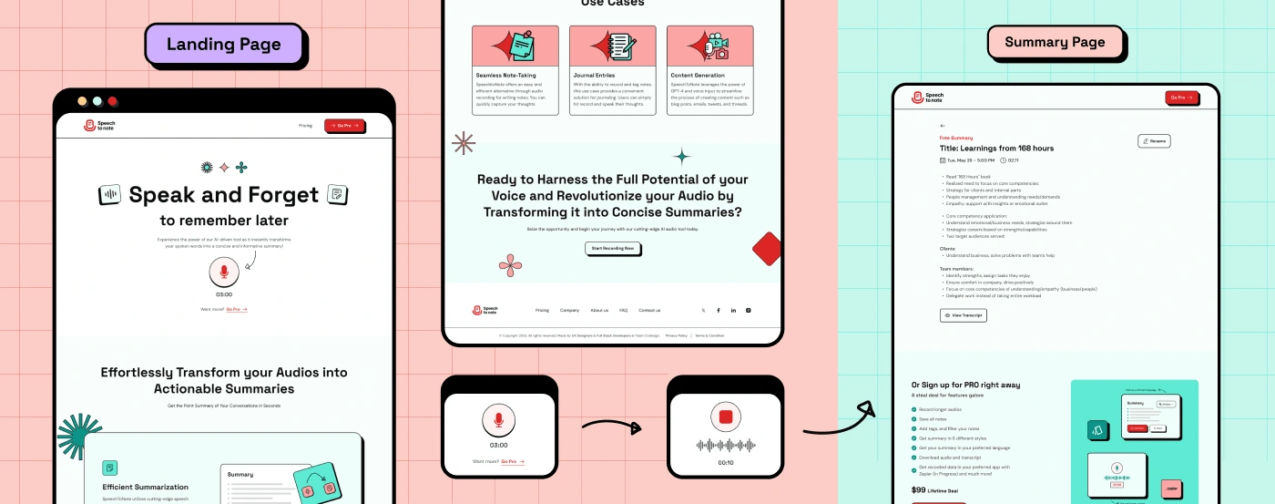
In alignment with Abhishek’s vision, I developed a retro-themed design system starting with the logo creation and UI components that resonated with the target audience.
I incorporated these retro elements into the UI design prioritizing a one-click recording experience. The overall design is aimed at creating a nostalgic and fun experience for users.
MVP Shipping and Spreading
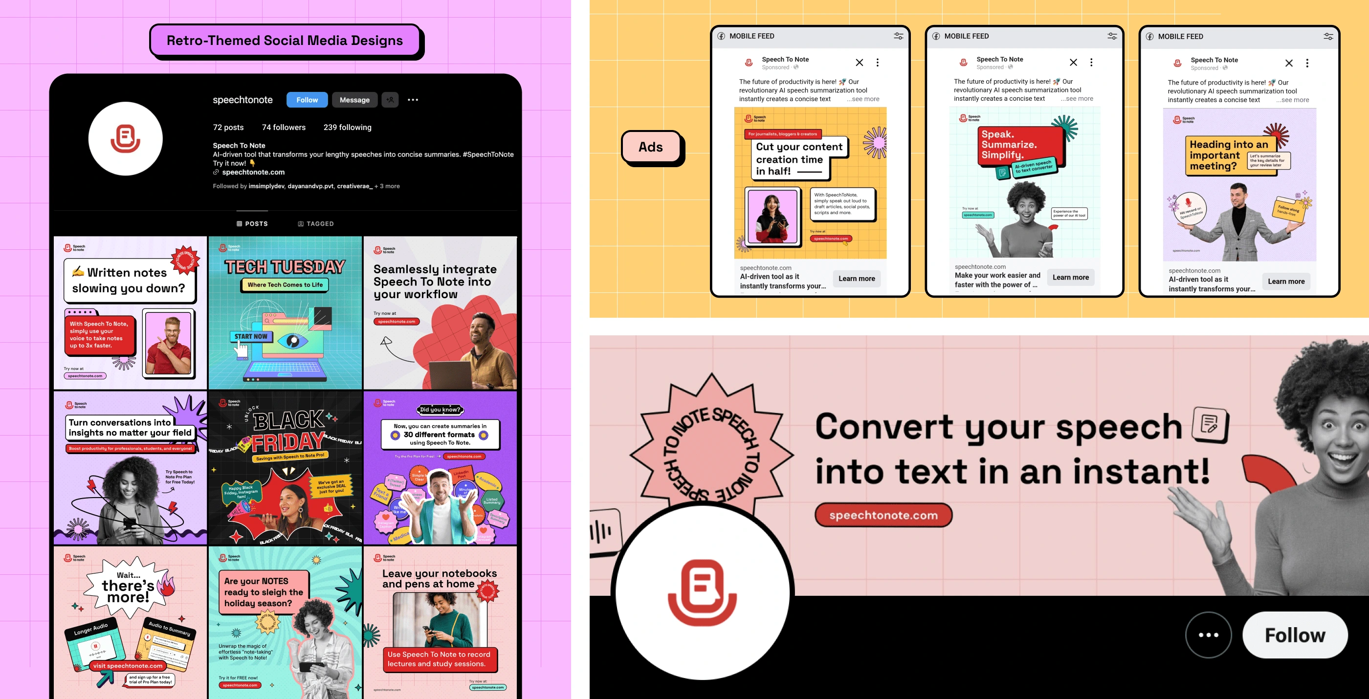
As soon as the designs were approved, we developed and shipped it. To validate the idea, we created retro-themed ad designs and pushed out content on social media pages.
Expanding the Offering
User testing and Ads on social media provided valuable feedback and insights for us. The focus then shifted to the Pro version of Speech to Note.
Homepage Revamp
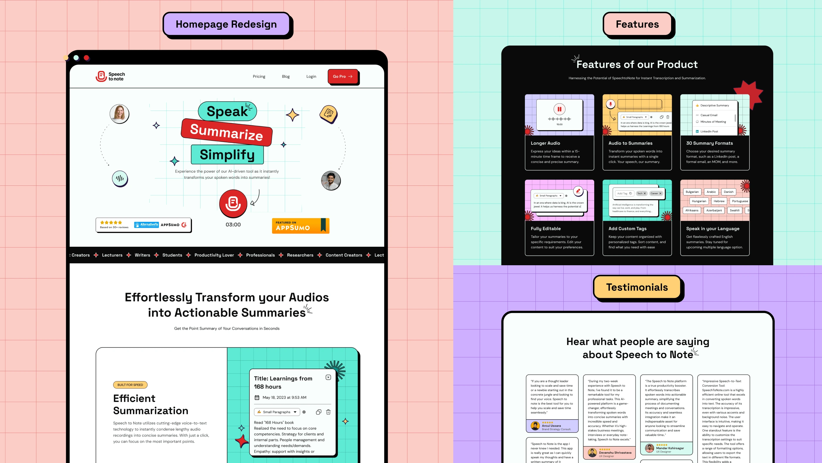
We saw that our initial design was no longer consistent with the vibe we created on social media. So, I re-designed the landing page incorporating the retro aesthetic in social media designs to ensure brand consistency and smooth user experience across platforms.
We also included new sections to showcase the new features, FAQs, and use cases.
Pro Features Dashboard Design
We designed the dashboard for Pro users to allow for efficient recording and management of summaries. And we introduced features like customizable summary styles, longer recording times, and audio file upload.

Refinement and Iteration
Speech to Note Pro launched on November 3rd with the new advanced features. We continued to test and gather user feedback to refine and enhance the user experience. While implementation is still ongoing, we have recently pushed some updates: Retro-themed dashboard, Summary language selection, and multi-note selection.

Impact and Key Achievements
The MVP launched on September 12 and we had a total of 481 active subscribers in the first 7 days.
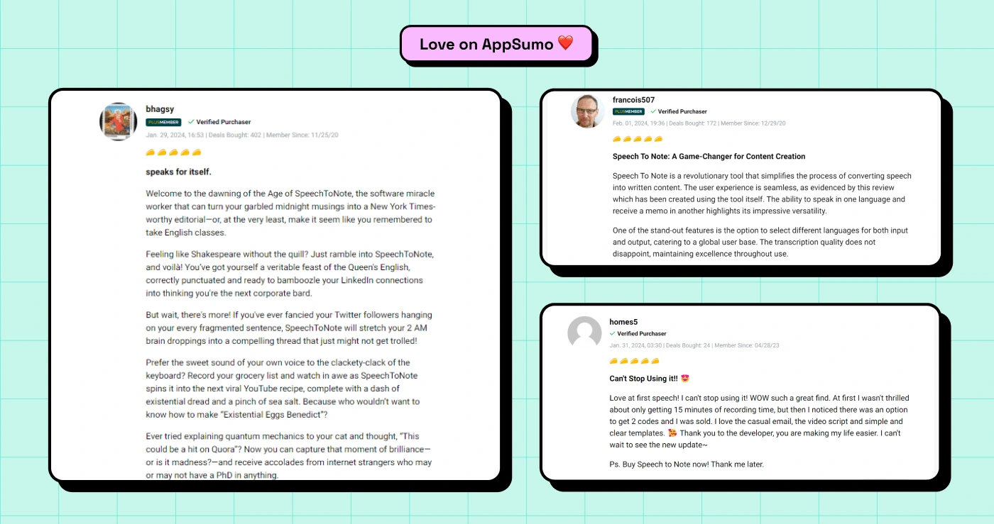
SpeechtoNote launched on AppSumo and resulted in over $10,000 in sales by the end of January, providing valuable revenue and user feedback.
Hey Rachel, STN is live on appsumo and the response is really good. People are appreciating the product... You've done amazing work on it and (once again) we're extremely blessed to be working with you! ❤️
Rumana
Co-Founder
Learnings
Working on Speech to Note made me understand:
The importance of designer-developer collaboration and how it can help in bringing your design vision to development.
The iterative nature of product development. I can't even count the number of times we've had to test and gather feedback from people. Design is indeed an iterative process.
The challenges and complexities that come with building a real-world product. You have to be willing to adapt.
That MVP should be what it stands for—minimal. You have to be willing to cut down that big idea if you want to ship fast.
That feedback is important to the development of a product—good or bad. I've seen Abhishek take both with an open heart and they have helped us improve this product.
Contributing to a successful product launch was fulfilling. A big thanks to Abhishek, the driving force behind this product, and the entire team at TeamCodesign for making it a fun experience.
Thank you for scrolling!
Like this project
Posted Feb 19, 2024
SpeechtoNote is a powerful AI tool that instantly transforms spoken words into concise and informative summaries saving people’s valuable time and effort.
Likes
0
Views
40
Clients
Team CoDesign

