MovieGo | UX/UI Case study
Role
UX/UI design
Graphic design
Year
2023
Responsibilities
Implemented design thinking, user research, conducted interview created paper and digital wireframes, low and high fidelity, prototyping, conducted usability studies, accounting for accessibility and iteration on designs.
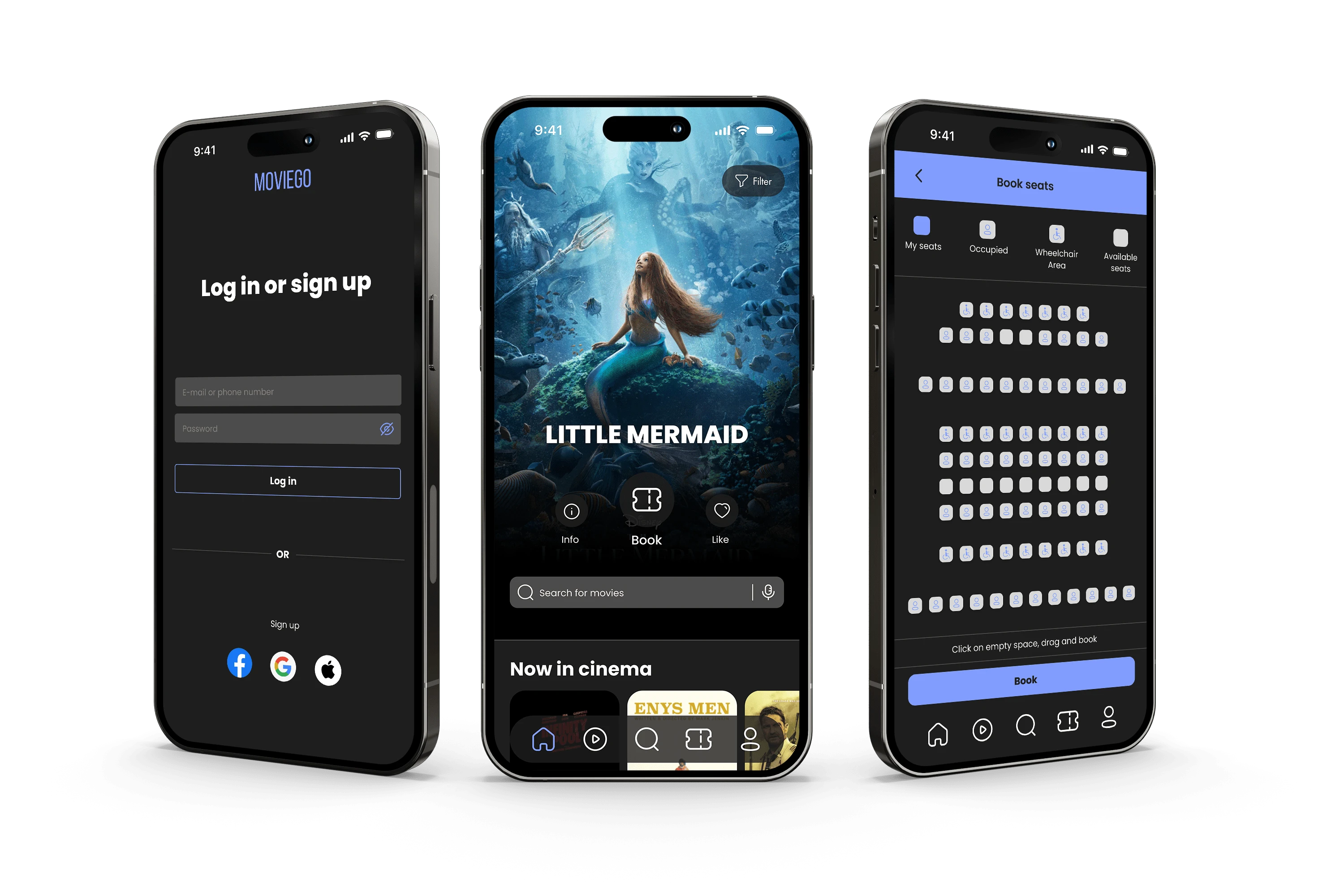
Mobile ticketing app for a movie theater
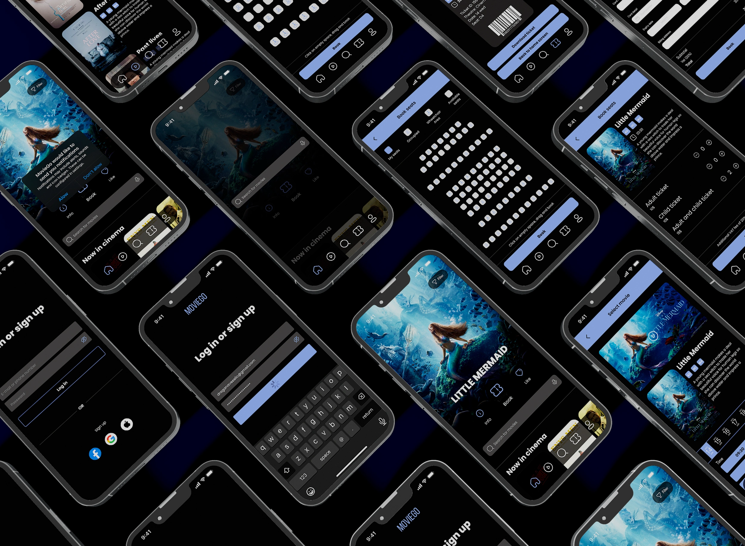
MovieGo is a mobile ticketing app for a movie theater where you can book, and purchase tickets for a movie theater in advance that is accessible and easy to navigate. Following all the steps from Google I have created a mobile application based on Google’s standards that are accepted and applicable in some of the biggest companies worldwide.
Design thinking

Research

In order to learn more about the users, and to empathize with them, I created the questions that will help me to better understand the users and their needs. In that way, I will better understand their perspectives and pain points. By asking the users a lot of questions, observing them, listening to them, and being open-minded I will build deeper connections with users. I asked open-ended questions and follow-up questions that are short in order to receive valuable feedback that will help me build the product.
I have looked for diverse people in order to get the best data in order to create an inclusive design that is accessible and equitable. It is important to create a great experience for all users. Interview questions were written based on the goals identified at the beginning of the process. Those questions were written to be open-ended to encourage detailed conversation.
Empathy maps
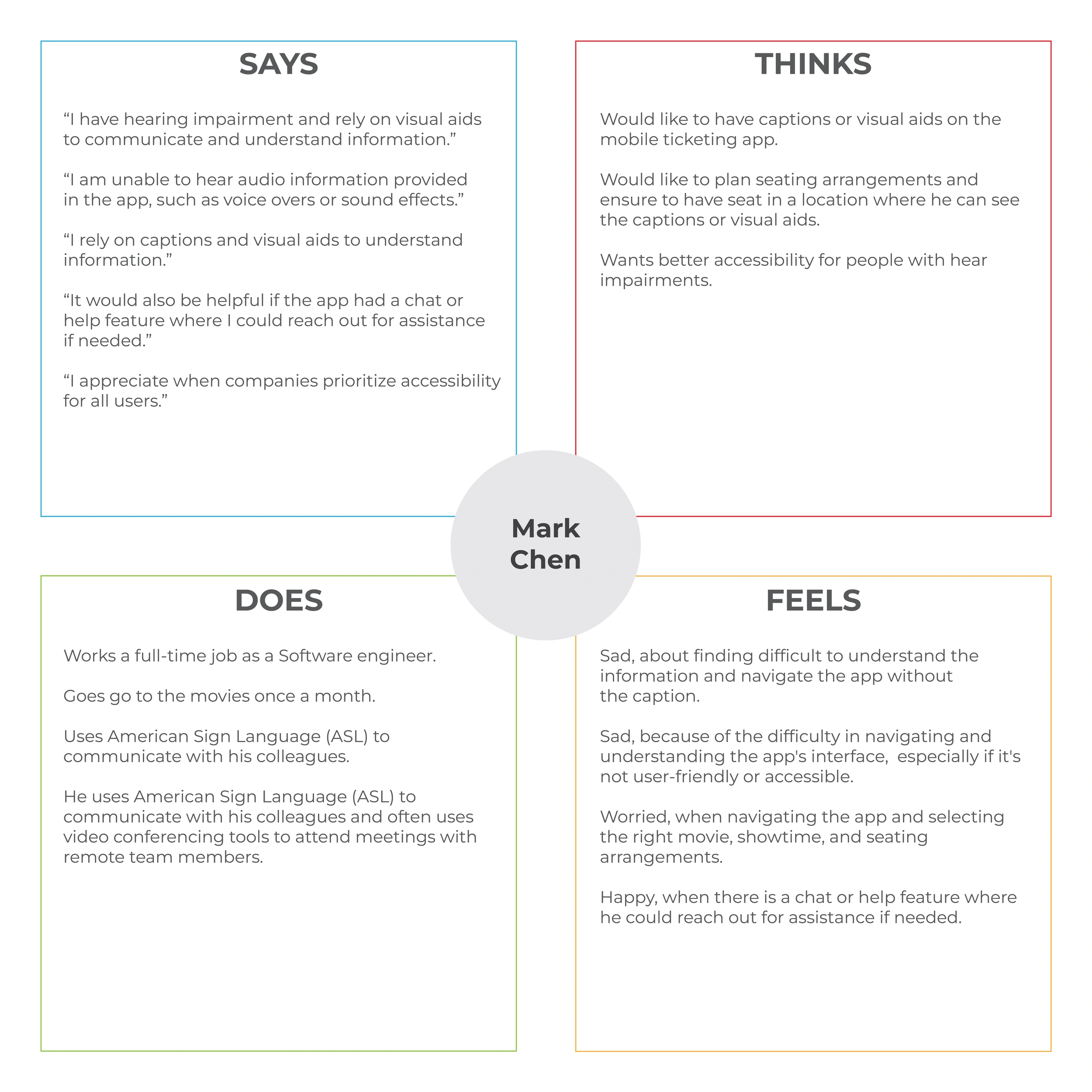
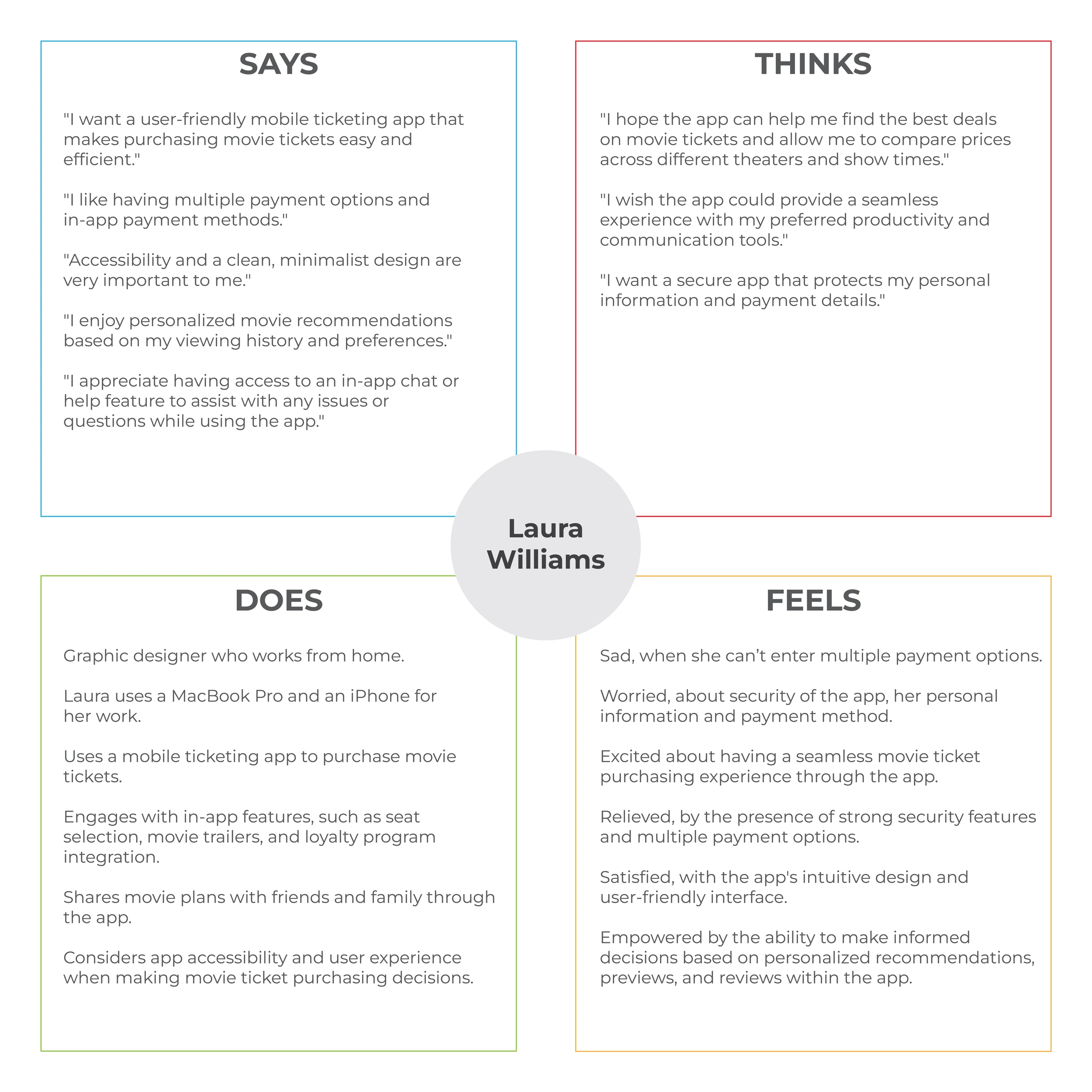
From the interview that I conducted, I have created an empathy map chart that explains everything that I have learned about a user. This will help me better understand user’s perspectives and learn more about their pain points, their thoughts, feeling, and what they think and say.
The empathy map should reflect a different user segment with specific thoughts and needs. In this way, I will have an understanding of their perspective and pain points.
With each user’s empathy map, I need to figure out in which way they overlap in order to create an app that meets users’ needs.
User research pain points
Accessibility
Difficult to understand the movie information and navigate the app without the caption and visual aids.
Security and Payment
Most users are worried about security of the app, personal information and payment method.
Navigation
Difficulty in navigating the app and selecting the right movie, showtime, and seating arrangements.
Personas
By analyzing the results from the user's interview, identifying their pain points, frustrations, and everything that blocks users from performing specific tasks I have created fictional personas which will represent the needs of a larger group of users. It is important that the personas created are understandable in order to empathize and connect with users. In this way, users will have the best experience using the app that I have built.
User story
This is another way to better understand the users and their behavior. This was a great way for me to understand better the type of user, their action, and their benefit. Also very valuable for me, to make sure that I am solving the problems for my users when engaging with my product. It is short, impactful, and to the point.
User story Mark Chen
As a highly skilled engineer who loves to watch movies with his wife.
I want to successfully navigate the app, select the right movie, plan seating in advance, ensure to have a seat in a location where I can see the captions or visual aids, and have captions or visual aids on the mobile ticketing app.
So that I can spend more quality time with my wife.
User story Laura Williams
As a graphic designer who works from home.
I want a clean, minimalist design, a user-friendly mobile ticketing app that makes purchasing movie tickets easy, efficient, and secure that protects my personal information and payment details.
So that I can without any issues and worries enjoy personalized movie recommendations based on my viewing history and preferences.
Problem statements
Based on a simple formula, I have created a clear description of the user's needs that should be addressed. A problem statement. This allows me to focus on a clear goal for problem-solving. A strong problem statement is human-centered. It should be broad enough to allow for some creative freedom, but narrow enough that it can actually be solved by a design solution.
Problem statement Laura Williams
Laura Williams is a/an graphic designer
who needs a user-friendly mobile ticketing app that makes purchasing movie tickets easy, efficient, and secure that protects her personal information and payment details. Because she wants without any issues and worries to enjoy personalized movie recommendations based on her purchased history and preferences.
Problem statement Mark Chen
Mark Chen is a/an highly skilled engineer
who needs an accessible app to successfully navigate, select the right movie, and plan seating in advance
because he wants to have a seat in a location where he can see the captions or visual aids. And to have captions or visual aids on the mobile ticketing app
User journey
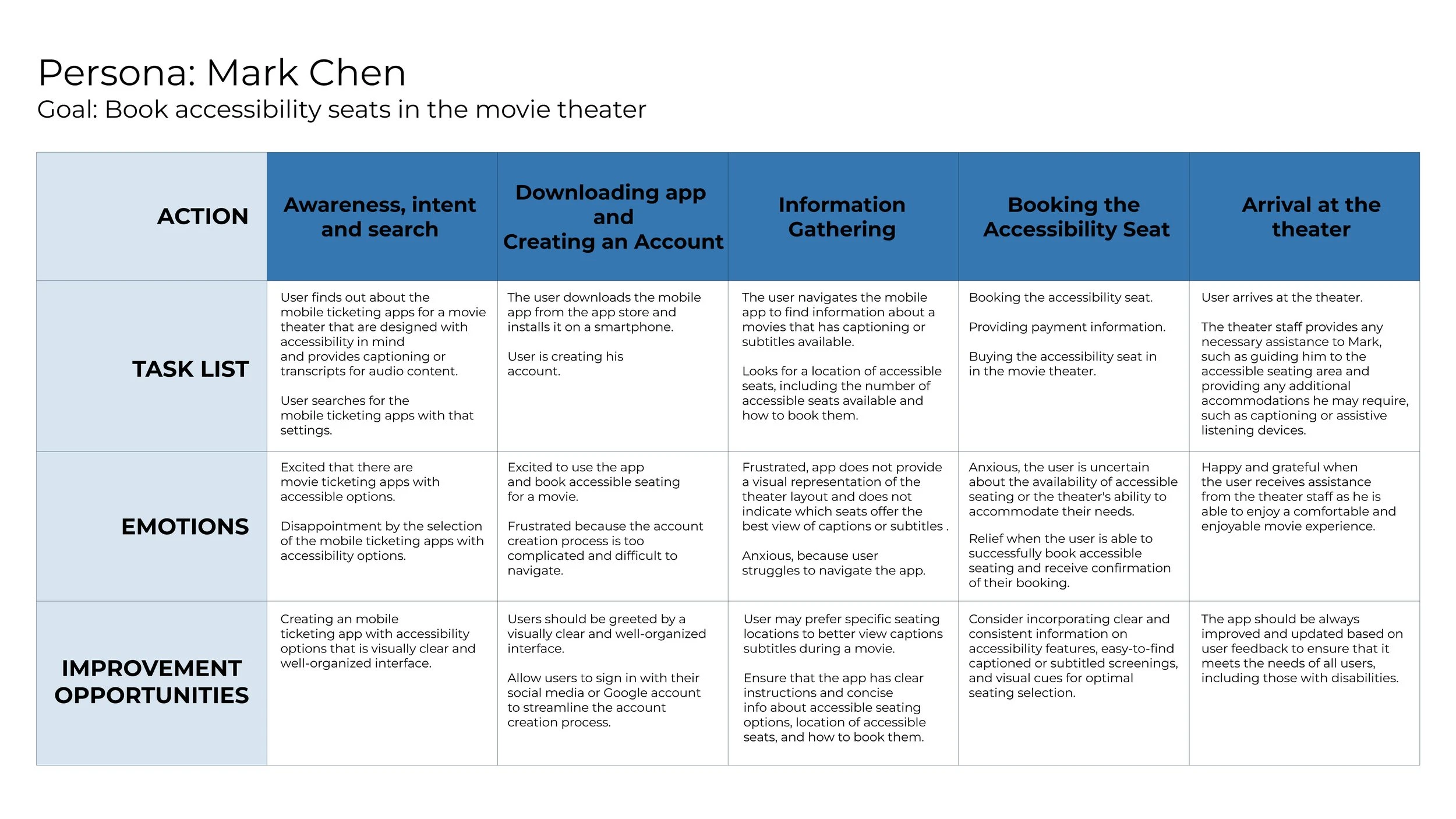
By analyzing the results from the user's interview, identifying their pain points, frustrations, and everything that blocks users from performing specific tasks I have created fictional personas which will represent the needs of a larger group of users.
It is important that the personas created are understandable in order to empathize and connect with users. In this way, users will have the best experience using the app that I have built.
Ideate
The ideation phase involves generating a wide range of ideas and potential solutions to address users' needs, pain points, and expectations.
During the ideation phase, I focused on users' needs and pain points, and develop solutions that truly address users' problems and expectations.
This user-centric approach is essential for creating meaningful and engaging experiences that resonate with the target audience.
Competitive audit
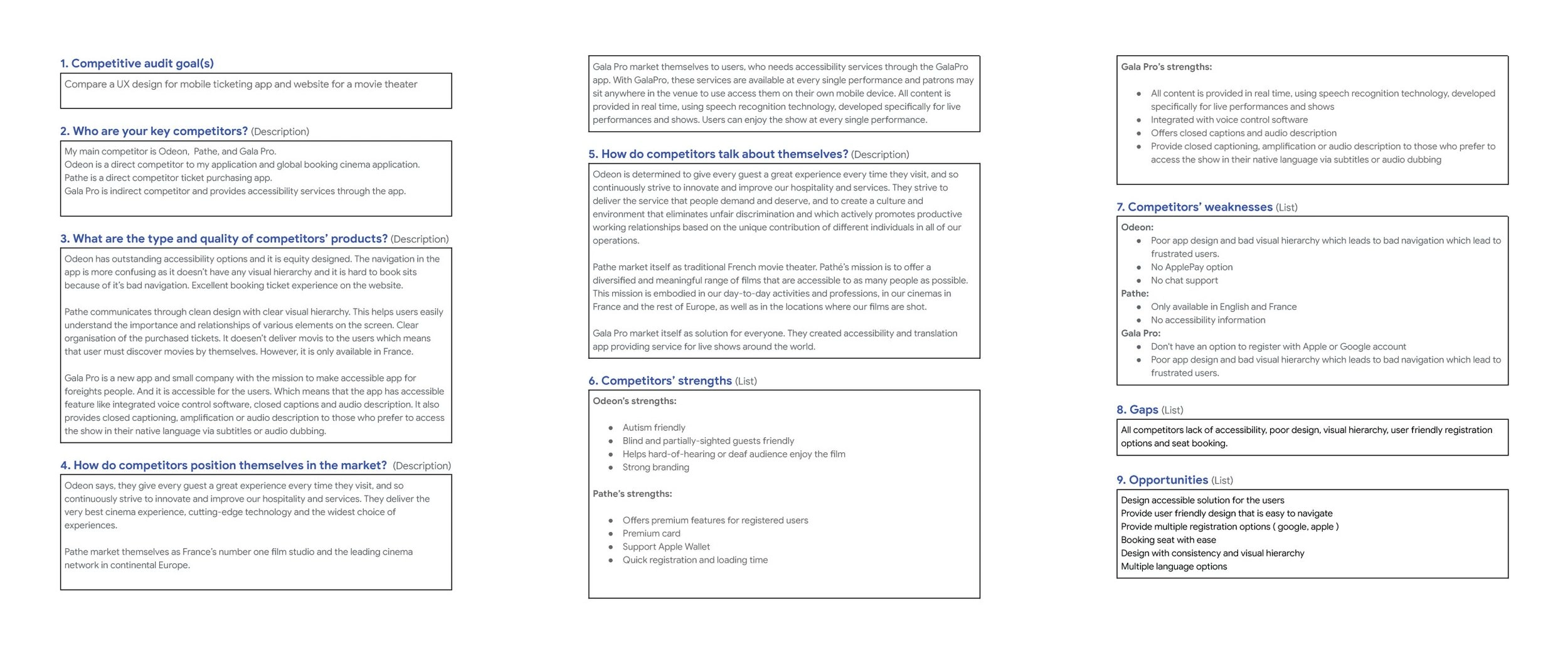
I have outlined direct and indirect competitors for my project. This analysis played a crucial role in shaping my design approach, enabling me to create a user-centric and innovative solution that differentiates itself from competitors.
The primary objective of the competitive audit was to analyze the strengths and weaknesses of existing solutions, uncover gaps in the market, and discover design patterns that could inform and inspire my UX design process. By gaining a thorough understanding of the competition, I aimed to create a product that not only addressed users' needs but also provided unique value and a superior user experience.
I have outlined the competitor’s goals:
Needs work: The app is not usable, and users aren’t getting what they need from this aspect of the app.
Okay: This aspect has some issues, but with some work, it could meet user needs.
Good: This aspect works well but doesn’t always provide users with the necessary information easily.
Outstanding: This aspect feels consistent, and it meets or exceeds the user’s needs.
Conclusion
The competitive audit provided valuable insights that informed my design decisions and helped me create a unique, user-centric solution for my UX portfolio project. By understanding the competitive landscape and leveraging best practices, I was able to develop a product that not only addressed users' needs but also stood out in the market. Showcasing the competitive audit in my portfolio highlights my thorough approach to research and my ability to draw meaningful insights from data.
User flow
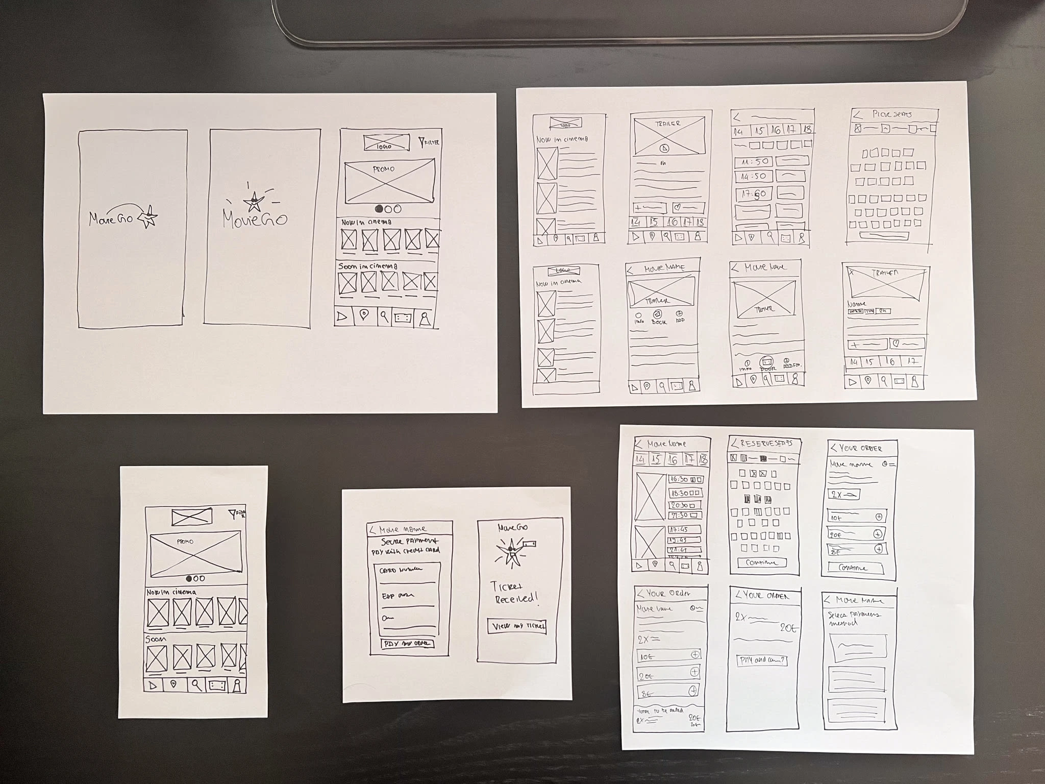
In mobile ticketing app designed for a movie theater, the objective is to create a seamless, intuitive, and enjoyable experience for the user, from discovery, and browsing movies to checkout. This app encapsulates an end-to-end movie ticket booking process, allowing users to explore and select movies, choose convenient showtime, pick their favorite seats, and safely conduct their payment, all in a few simple steps. The user flow below outlines the key steps in this process, demonstrating how our design ensures a user-friendly and engaging experience throughout.
Story board
Storyboards visually describe and explore a user’s experience with a product. Telling a story through visuals is often more effective than using words. Creating a big picture and close-up storyboard, I have explained my ideas visually in that way, I can effectively explain how the product will be used. This should be focused on just the most important parts of a user's experience with the product.
Starting the design
Wireframes
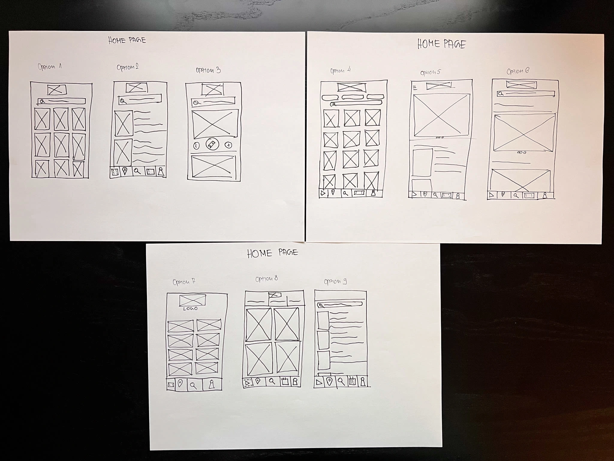
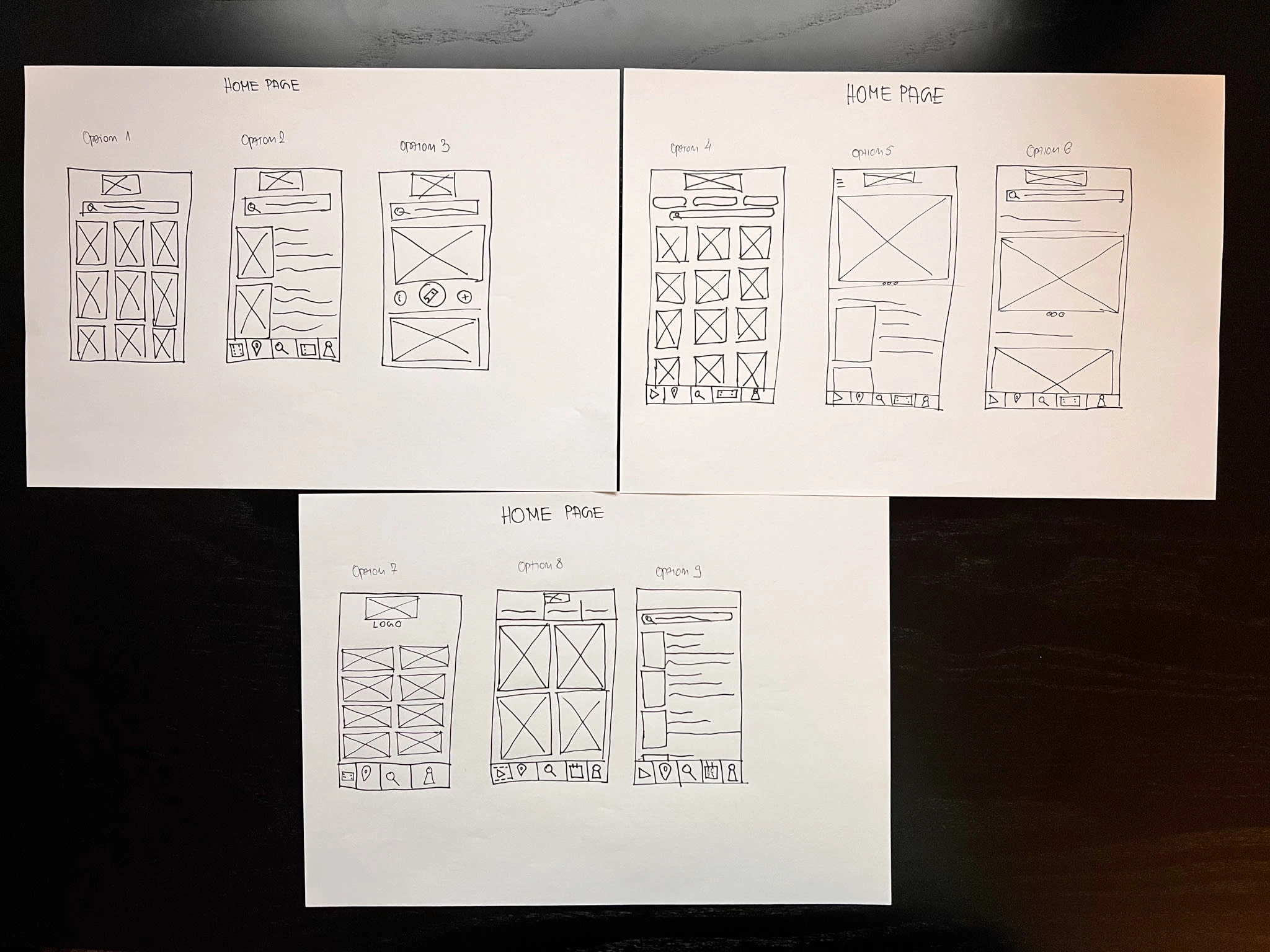
While designing mobile ticketing app for a movie theater MovieGo, I have learned how important it is to conduct usability studies and get the peer's feedback. Which is very important in order to make a better user experience and design for the users.
Like this project
Posted Aug 25, 2023
MovieGo is a mobile ticketing app for a movie theater where you can book, and purchase tickets for a movie theater in advance.

