Happy Nest | UX/UI Case study
Role
UX/UI design
Graphic design
Year
2023
Responsibilities
Conducting research, competitive audit, information architecture, interviews, paper and digital wireframe, low and high fidelity prototyping, conducting usability studies, accounting for accessibility, iterating on designs, and responsive design.
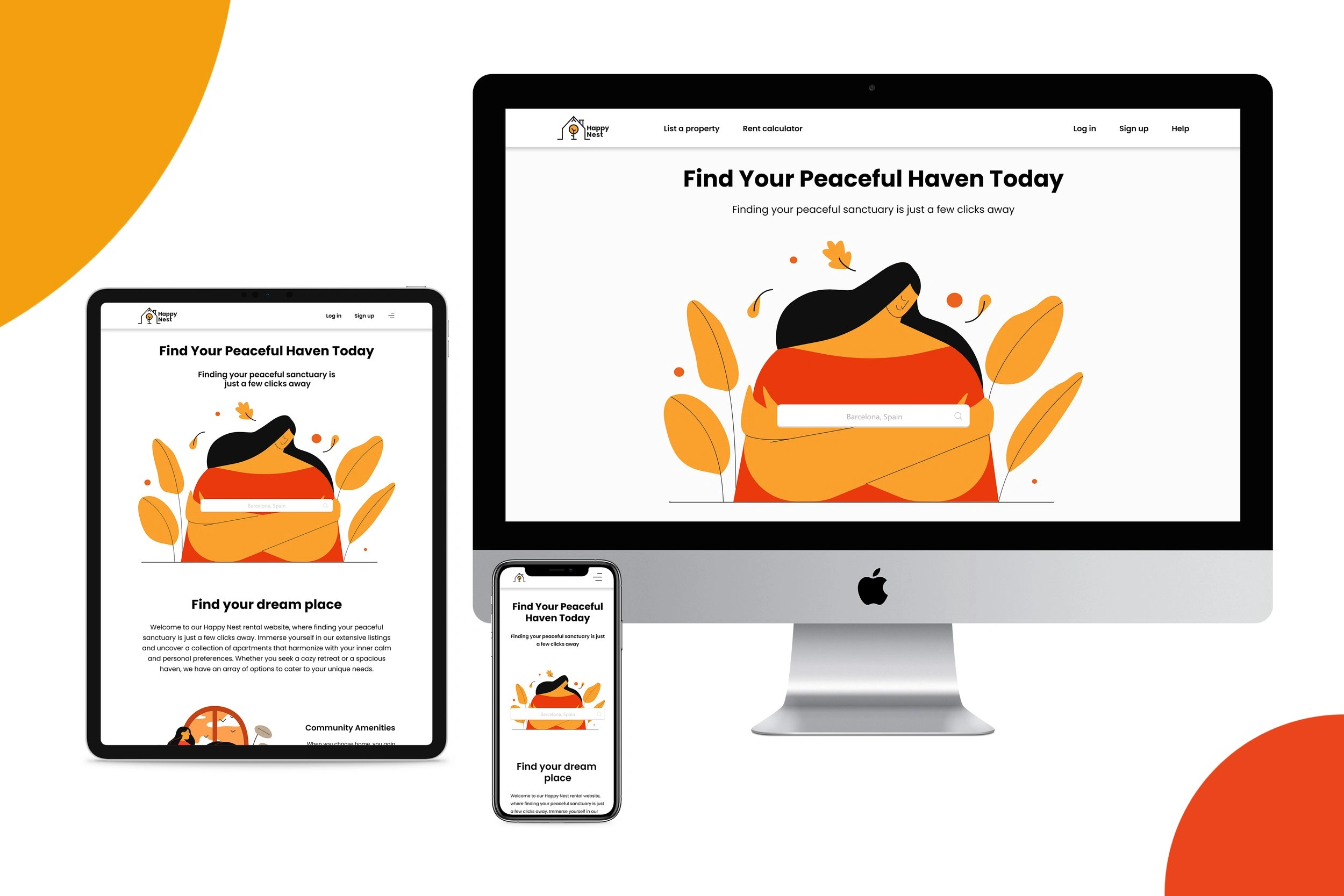
Responsive web design for finding apartments
Happy Nest is a responsive website for finding apartments. The typical users are between 19-50 years old. Most users are college students, career professionals, or digital nomads. I have followed all the steps from Google I have created a mobile application based on Google’s standards that are accepted and applicable in some of the biggest companies worldwide.
Design thinking

Research
I conducted user interviews, and from those, I created empathy maps to gain a deeper understanding of our target users and their needs. During this process, I discovered that many of our target users are quite serious and concerned when searching for an apartment. The increasing rental rates have brought about a rise in scammers, making the search for safe and trustworthy rentals even more challenging. Additionally, there is a lack of transparency in the rental process, and the available filter options don't always yield efficient results. Considering all these findings, it becomes evident why our target users approach apartment hunting with a serious mindset and a sense of caution.
The problem
Current websites lack clear filters, efficiency, transparency regarding the neighborhood, apartment description, internet, and robust protection against scammers.
The goal
Create an responsive website for renting apartments offering affordable apartments prioritizing safety, and providing essential features such as distance from the university, shops, hospitals etc and quality of internet connectivity. The website should also ensure a seamless and efficient online process for users to find and secure their desired apartments.
Empathy maps
From the interview that I conducted, I have created an empathy map chart that explains everything that I have learned about a user. This will help me better understand user’s perspectives and learn more about their pain points, their thoughts, feeling, and what they think and say.
The empathy map should reflect a different user segment with specific thoughts and needs. In this way, I will have an understanding of their perspective and pain points.
With each user’s empathy map, I need to figure out in which way they overlap in order to create an app that meets users’ needs.
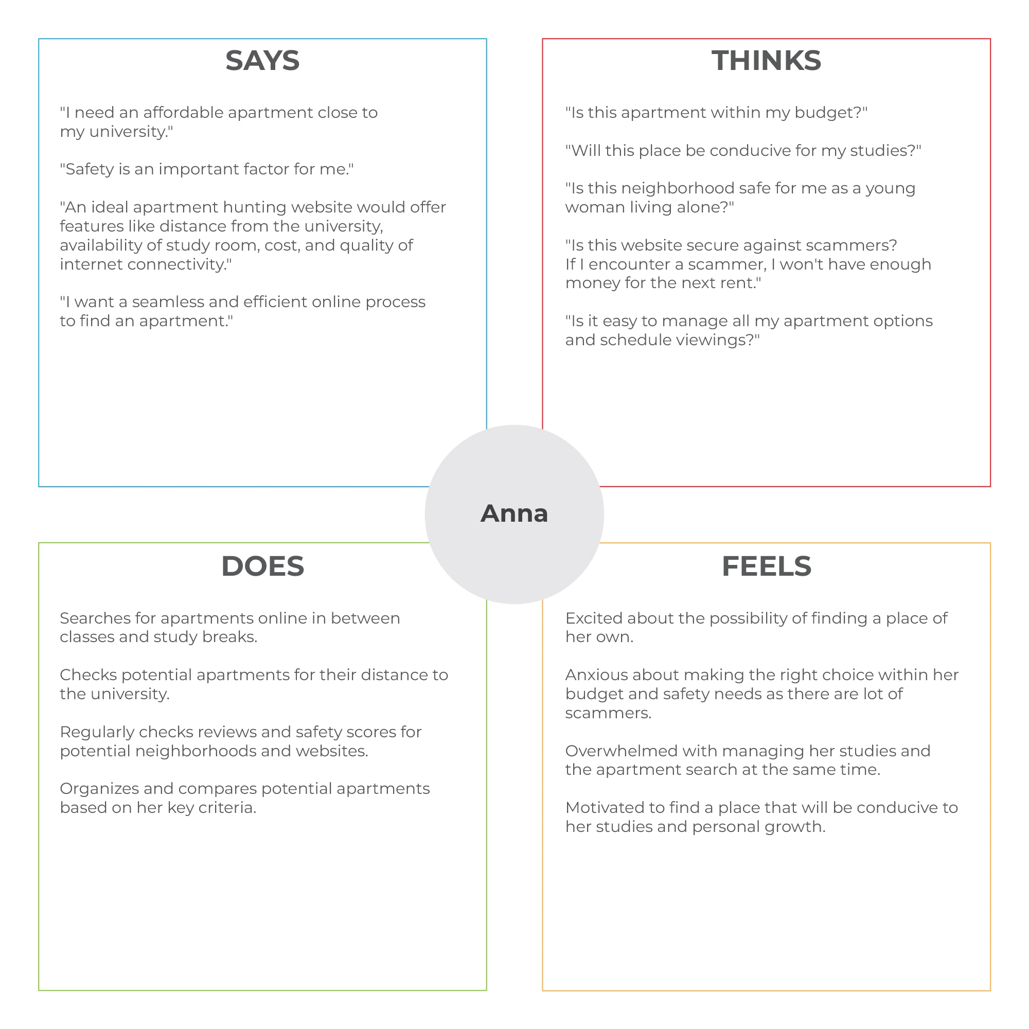
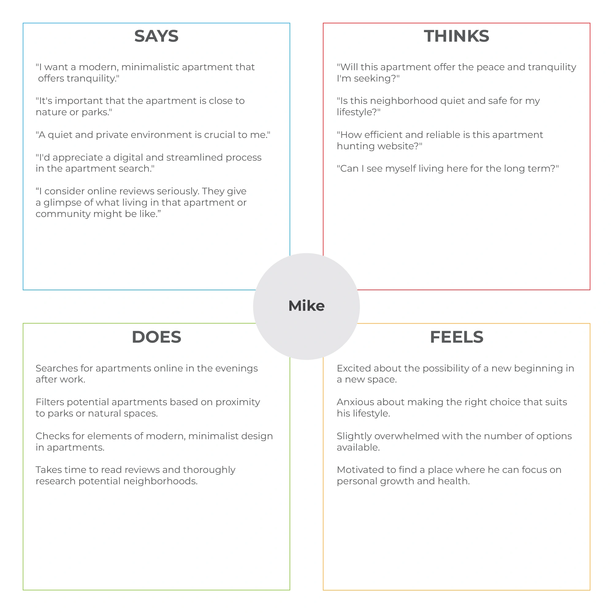
User research pain points
Safety
Many websites don't have a high level of security and verification steps before registering on the website. Which is ideal place for scammers.
Navigation
The search functionality might be too basic, not allowing users to refine their search based on specific criteria (like location, price, apartment size, and amenities), or it might return irrelevant results.
Experience
Many websites do not provide enough information about the apartments, such as details about the neighborhood, proximity to public transport, utilities included, etc. This can lead to users having to spend additional time researching these details elsewhere.
Problem statement
Based on a simple formula, I have created a clear description of the user's needs that should be addressed. A problem statement. This allows me to focus on a clear goal for problem-solving. A strong problem statement is human-centered. It should be broad enough to allow for some creative freedom, but narrow enough that it can actually be solved by a design solution.
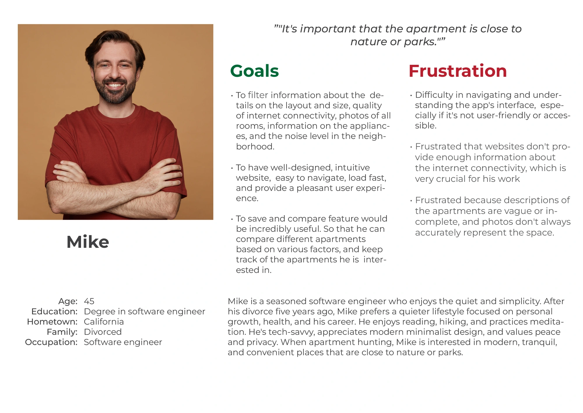
User story Mike
As a highly skilled engineer who loves to watch movies with his wife.
I want to Have a transparent apartment search websiteSo that I can find an apartment that meets my specific criteria
Problem statement Mike
Mike is a/an software engineer
who needs transparency in apartment search websites because he wants to find an apartment that meets his specific criteria such as proximity to parks.
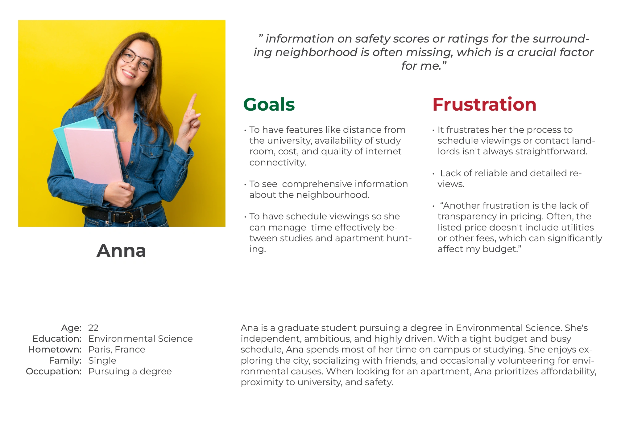
User story Anna
As a graphic designer who works from home.
I want safe access to the website registration and verification
So that I can find a safe, affordable apartment near my university
Problem statement Anna
Anna is a/an graduate student
who needs an apartment search website that provides effective filters because she is on a tight budget and wants an affordable, safe apartment near her university.
User journey
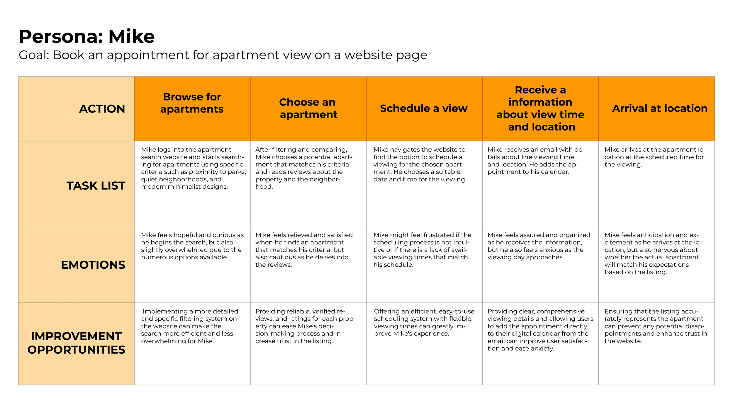
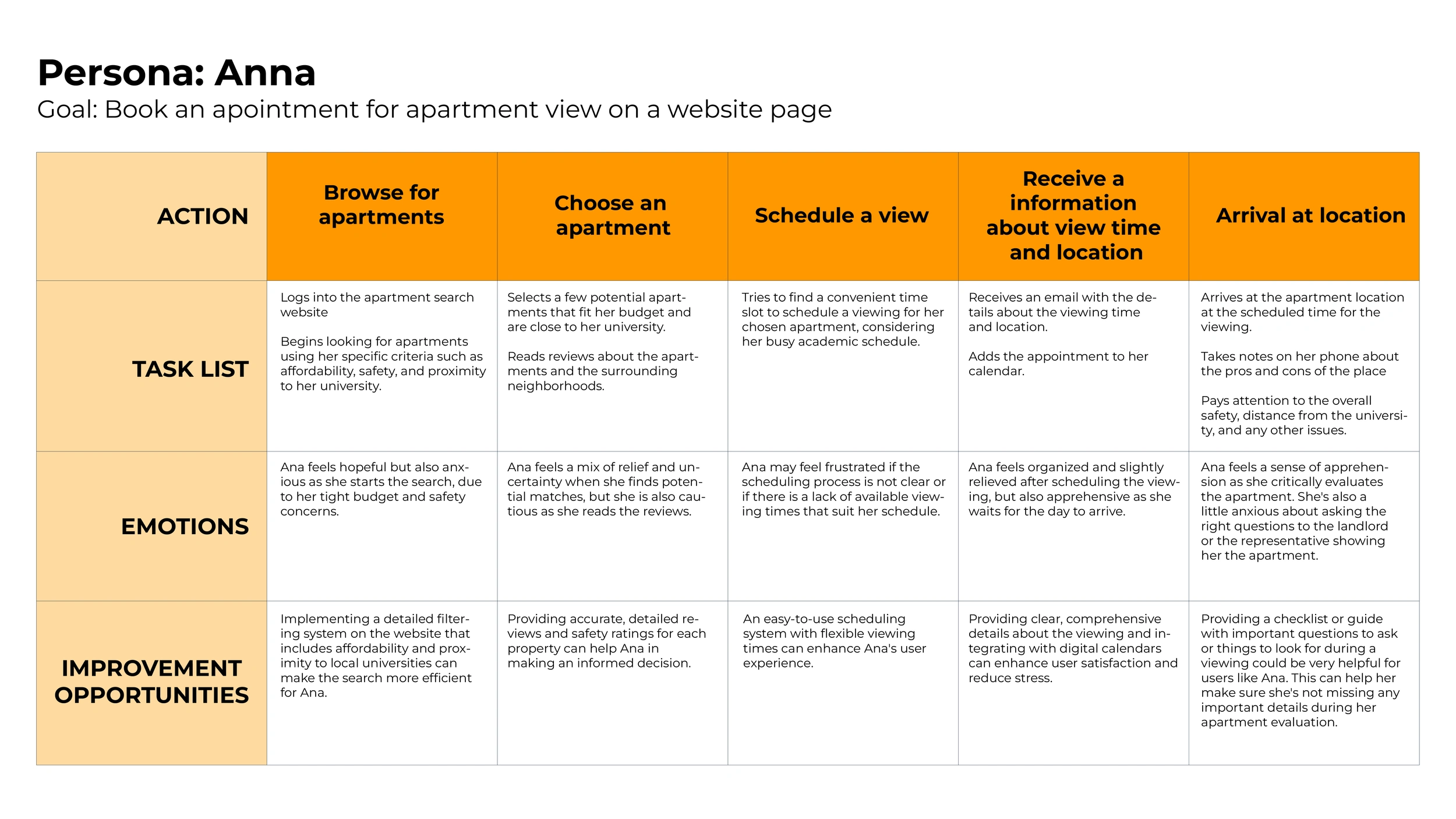
By analyzing the results from the user's interview, identifying their pain points, frustrations, and everything that blocks users from performing specific tasks I have created fictional personas which will represent the needs of a larger group of users.
It is important that the personas created are understandable in order to empathize and connect with users. In this way, users will have the best experience using the app that I have built.
Ideate
The ideation phase involves generating a wide range of ideas and potential solutions to address users' needs, pain points, and expectations.
During the ideation phase, I focused on users' needs and pain points, and develop solutions that truly address users' problems and expectations. This user-centric approach is essential for creating meaningful and engaging experiences that resonate with the target audience.
Competitive audit
I have outlined direct and indirect competitors for my project. This analysis played a crucial role in shaping my design approach, enabling me to create a user-centric and innovative solution that differentiates itself from competitors.
The primary objective of the competitive audit was to analyze the strengths and weaknesses of existing solutions, uncover gaps in the market, and discover design patterns that could inform and inspire my UX design process. By gaining a thorough understanding of the competition, I aimed to create a product that not only addressed users' needs but also provided unique value and a superior user experience.
I have outlined the competitor’s goals:
Needs work: The app is not usable, and users aren’t getting what they need from this aspect of the app.
Okay: This aspect has some issues, but with some work, it could meet user needs.
Good: This aspect works well but doesn’t always provide users with the necessary information easily.
Outstanding: This aspect feels consistent, and it meets or exceeds the user’s needs.
Information architecture
Starting the design
Wireframes
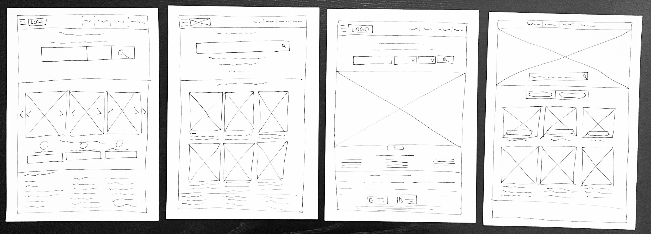
I started with drawing wireframes of a Happy Nest. Based on 4 homepages, I needed to figure out in which way can I simplify the home page and make it more user-friendly and meet users’ needs. See below.
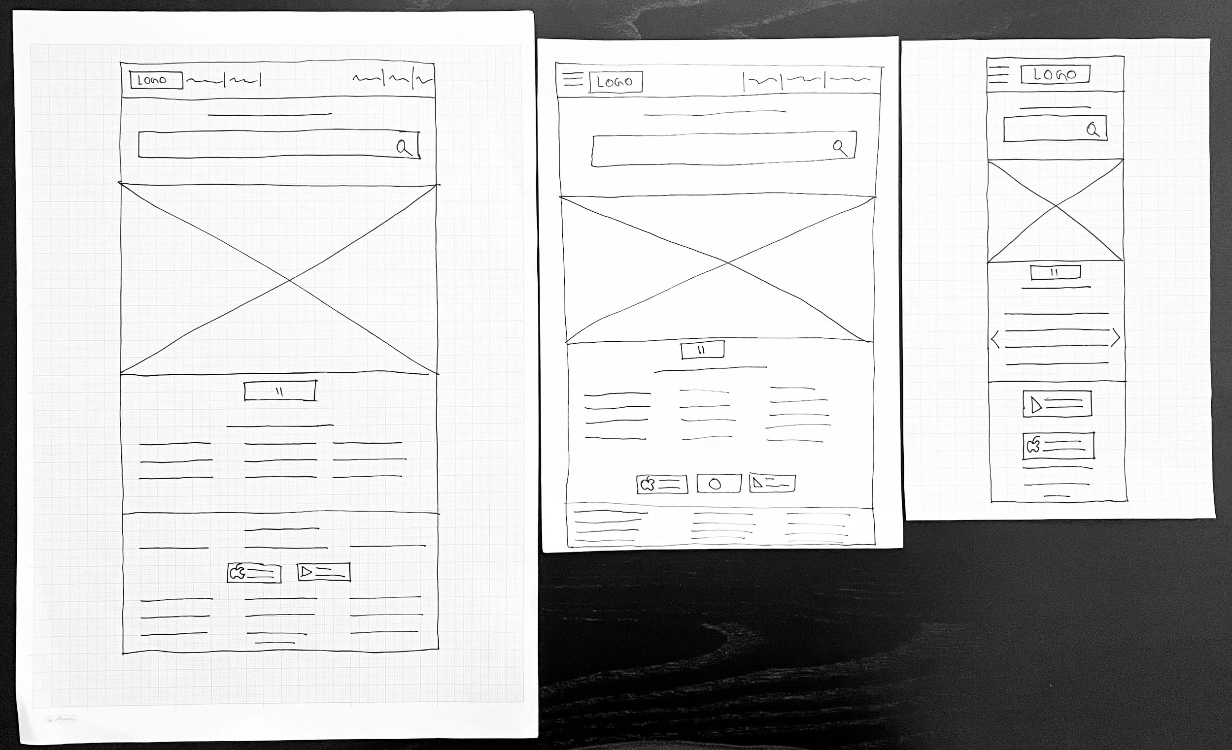
Users are browsing apartment search websites on various devices. From the refined design, I have started to design for additional screen sizes, to make sure the site will be fully responsive.
Digital wireframes
Moving from paper wireframes to digital wireframes, made it easy to understand how the design will address user pain points and improve user experience.
I have prioritized the user flow for booking apartments.
Users can log in and sign up right away
Digital wireframes screen variations
On the first landing users can right away search for apartment
Low-fidelity prototype
I have created a low fi-prototype in order to conduct usability testing and get feedback from the users, where later I can make modifications based on feedback from the peers.
View prototype here
Mockups
Based on the peer’s feedback from the usability study, I have made changes to the design. I have created steps that will guide users to ID verification process in order to book apartment.
Before usability study
After usability study
Based on the peer feedback from the usability study, I have made the second change to the design. I have added language options at the footer so that users can freely change the desired language of the website.
Before usability study
After usability study
Mockups: Original screen size
Design guidelines
High-fidelity prototype
Based on the user’s feedback I have created high-fidelity prototypes. I have created and updated the rest of the screens, and this high-fidelity prototype is ready for the next testing. Link
Accessibility considerations
I have used headings in different sizes, the visual hierarchy is present.
I have used landmarks to help users navigate the site.
I have added language options in the footer, the users can choose in which language the website can be translated.
Impact
My users have shared with me that they feel safe while using the website, as I have added ID verification with detailed guidelines. They can be safe from scammers and they will have more chances in apartment search and booking.
Like this project
Posted Aug 25, 2023
Happy Nest is a responsive website for finding apartments. Most users are college students, career professionals, or digital nomads.

