Sartor app- Re-designing the Sartor buyer experience
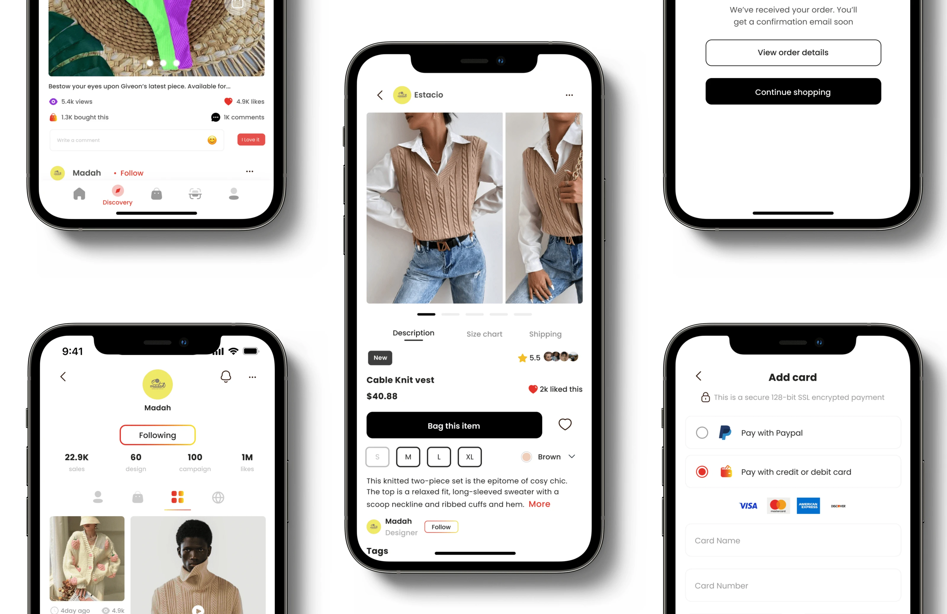
Overview🔎
This end-to-end UX refresh of Sartor for buyers aimed to create a vision for a desired and effective buying experience. As a design-driven initiative, it was used to plan measurable experience gains in product roadmaps.
My role🧑💻
conduct user research to find pain points of the application
Brainstorm & Iterate multiple solutions
Test solutions through Usability Testing
Finalize designs and release
Timeline⏳
Mar 2020 - Jun 2021 [Full time]
Problem & Solution 🤝
Short-sighted iterations had led to an overcomplicated IA that failed to consider UX opportunities (or failures).
Key findings
Poor and low reviews from customers on the google play & App Store
Decrease in customer stickiness & retention.
The product lacks good Information architecture thus not providing relevant information to users to enjoy their journey purchasing from the app.
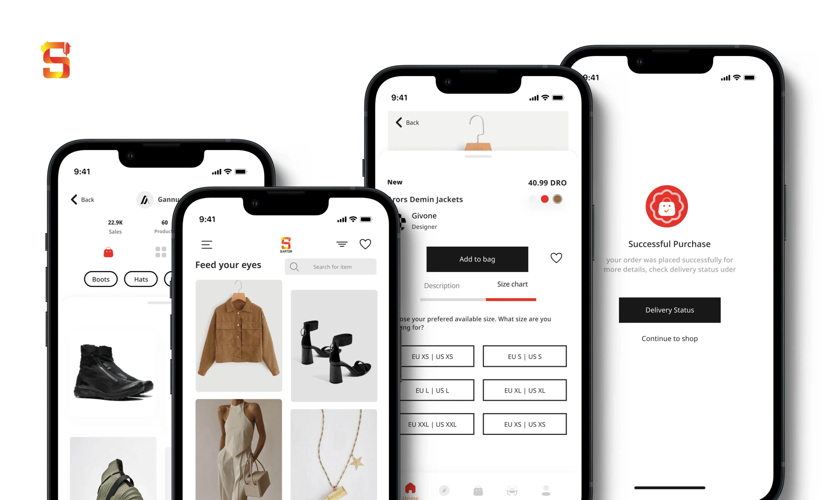
The old version of Sator
Understanding the product 📱
The Sartor app is designed to empower shoppers by providing them with a seamless online experience. The app is dedicated to helping shoppers discover and explore unique and authentic fashion brands that are not widely available. Sartor are committed to showcasing small, new, and exciting fashion brands for all genders and ages, making it easier for users to find the perfect style that matches their aesthetics and preference.
The main flow of the product is:
Home page: Users can view Items that are available from different brands
Search: Users can choose to search for specific items of their choice
Discovery: Users can follow independent brands and designers they love. That way they can stay up to date with their latest release and campaigns
Bag: From here users can easily see what's in their bags and quickly checkout
Scan: When a user sees an item they can use the scan feature to capture the image and the app automatically searches for variations and varies of the item of the user's choice
Profile: Users get to manage their accounts and personalize their profiles how they please.
Design Process
UX Audit
To prioritize our efforts, I analyzed app analytics and product performance, gauging user interactions and their impact on our business. Additionally, a UX Benchmarking exercise provided a heuristic review of Sartor UX, comparing it with our main competitors—Grailed, Depop, and Poshmark.
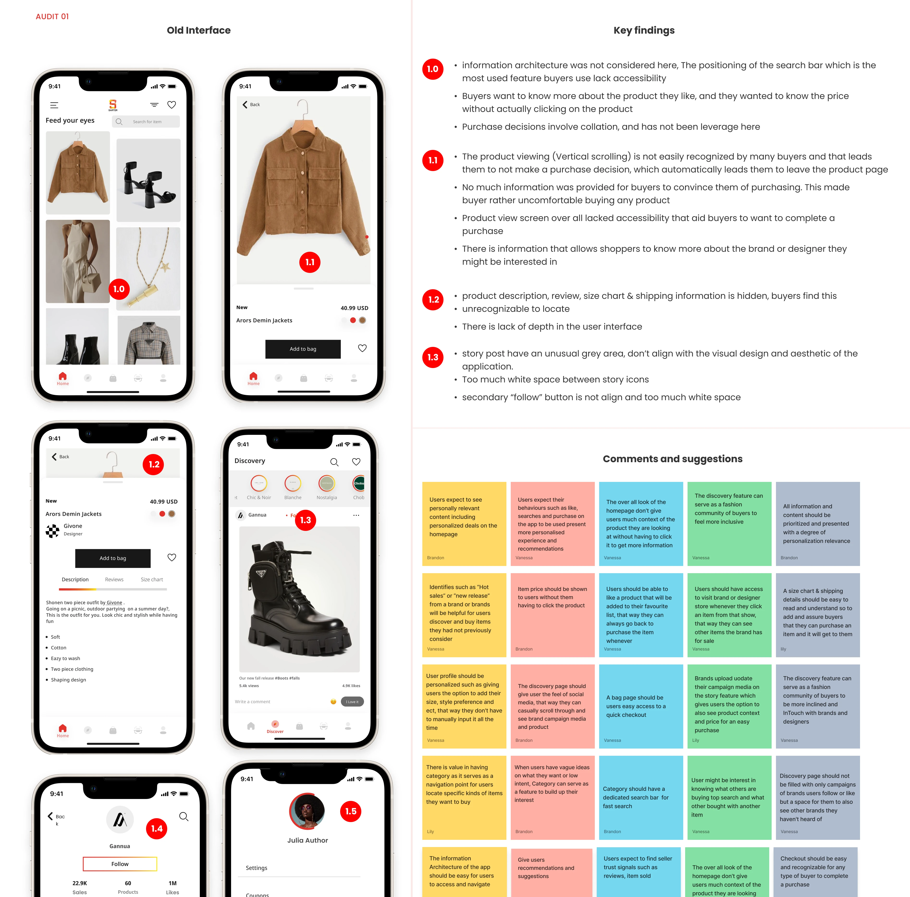
A UX Audit on the old version
Understanding users needs
To expand on our qualitative knowledge of who and what our main users need, I conducted interviews with 10 buyers, mapping out their purchasing journey from start to finish, My goal was to develop a deeper level of sympathy with them on their user journey, collect diverse feedback, understand how these users were interacting with the app and how that impacts the business.
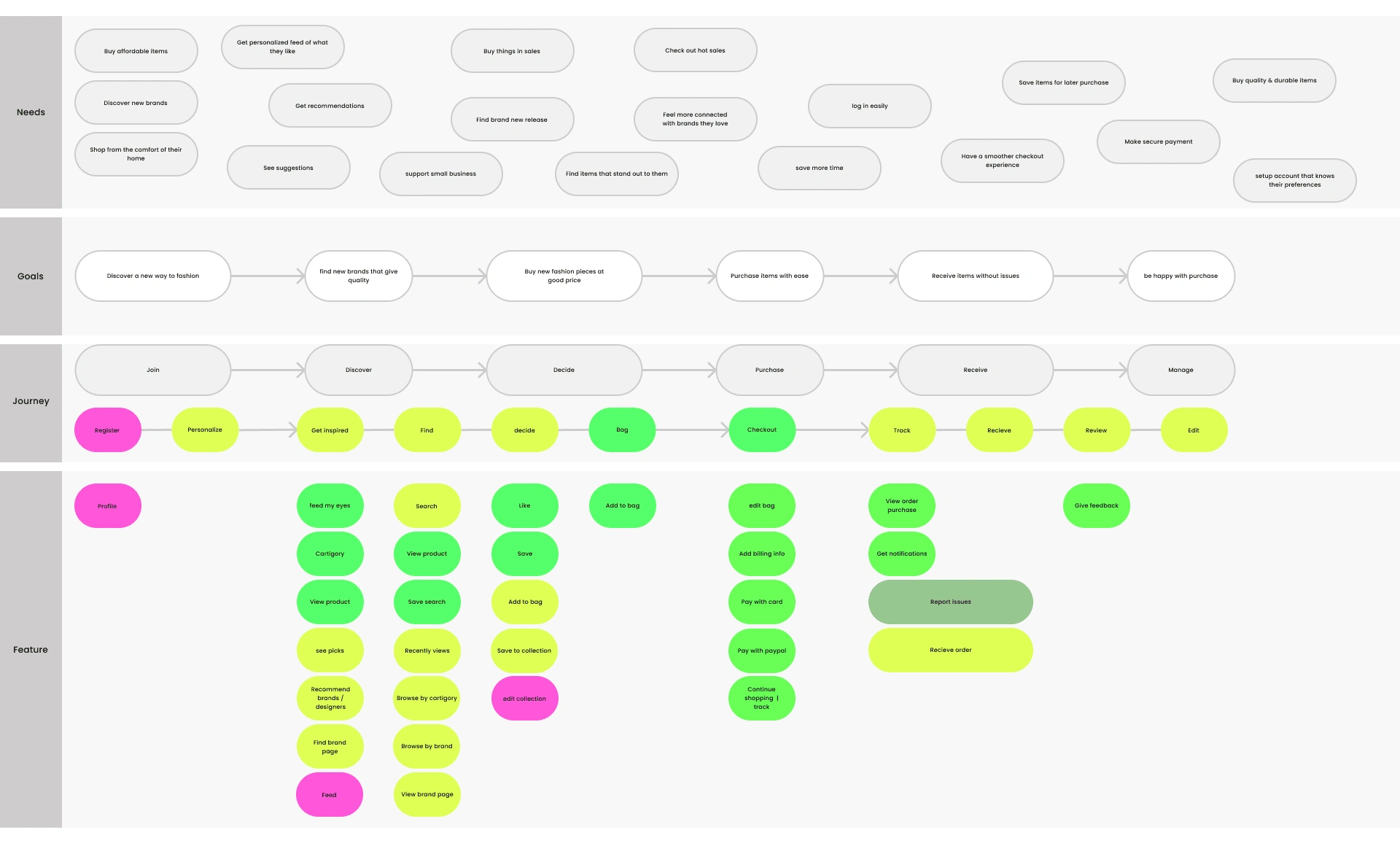
A user Journey map
Establishing key insights to improve UX
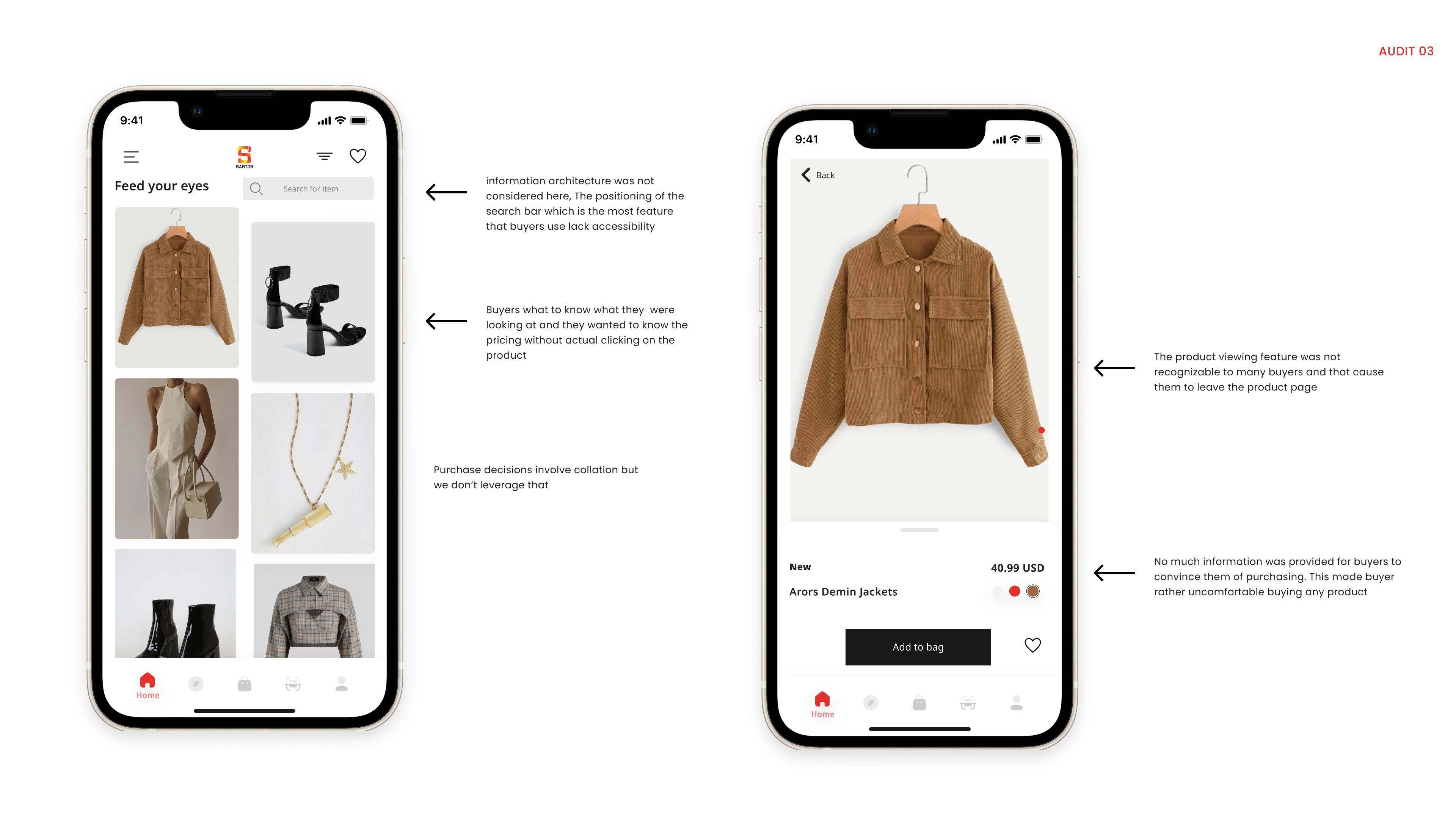
Seeing what wasn't working on the older version gave me insight into how to improve it
Solution
Wireframes
The next step was to dive in deep and work on some wireframes. Starting with low fidelity and then moving to high fidelity.
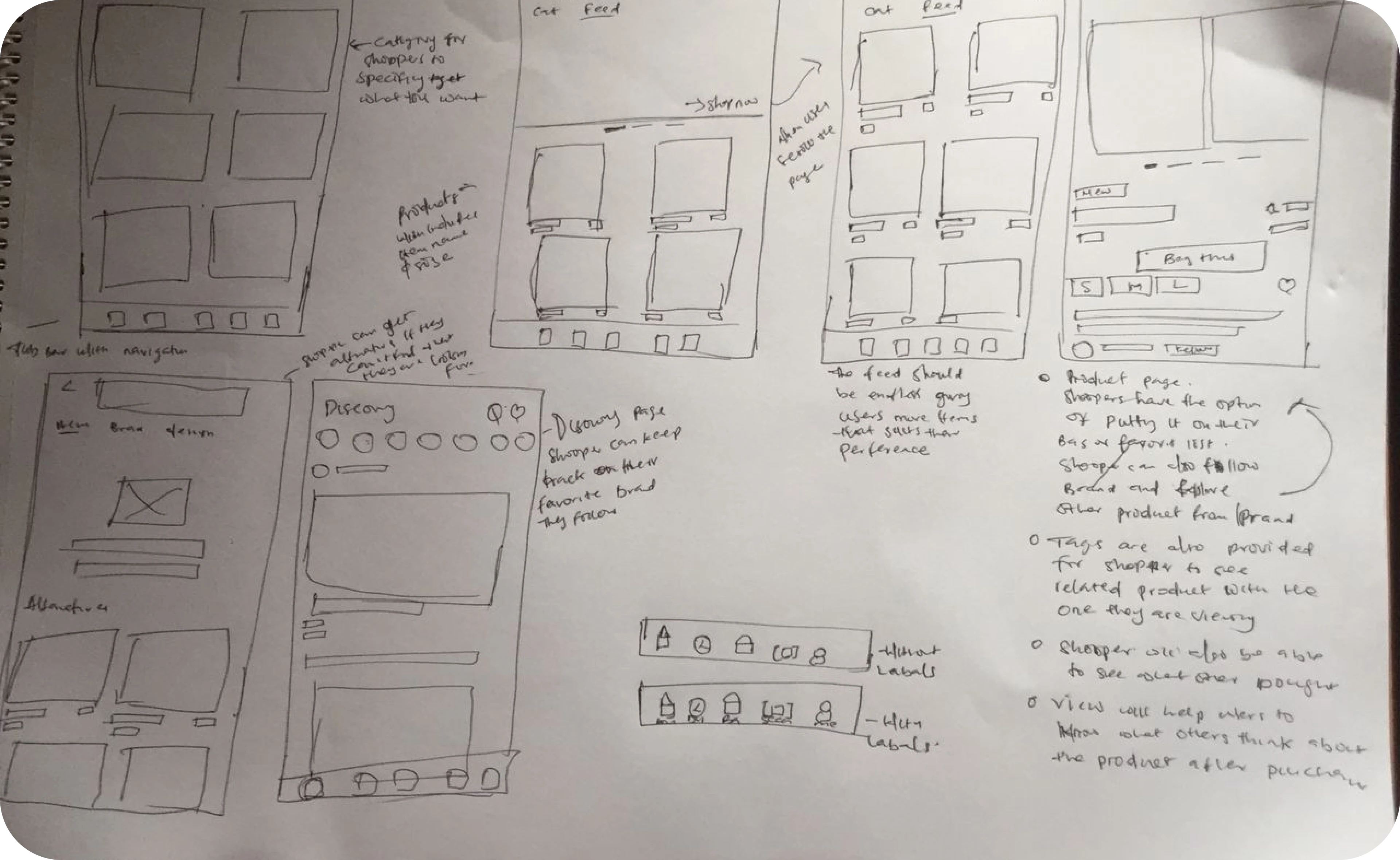
A representation of some of the wireframes
Design

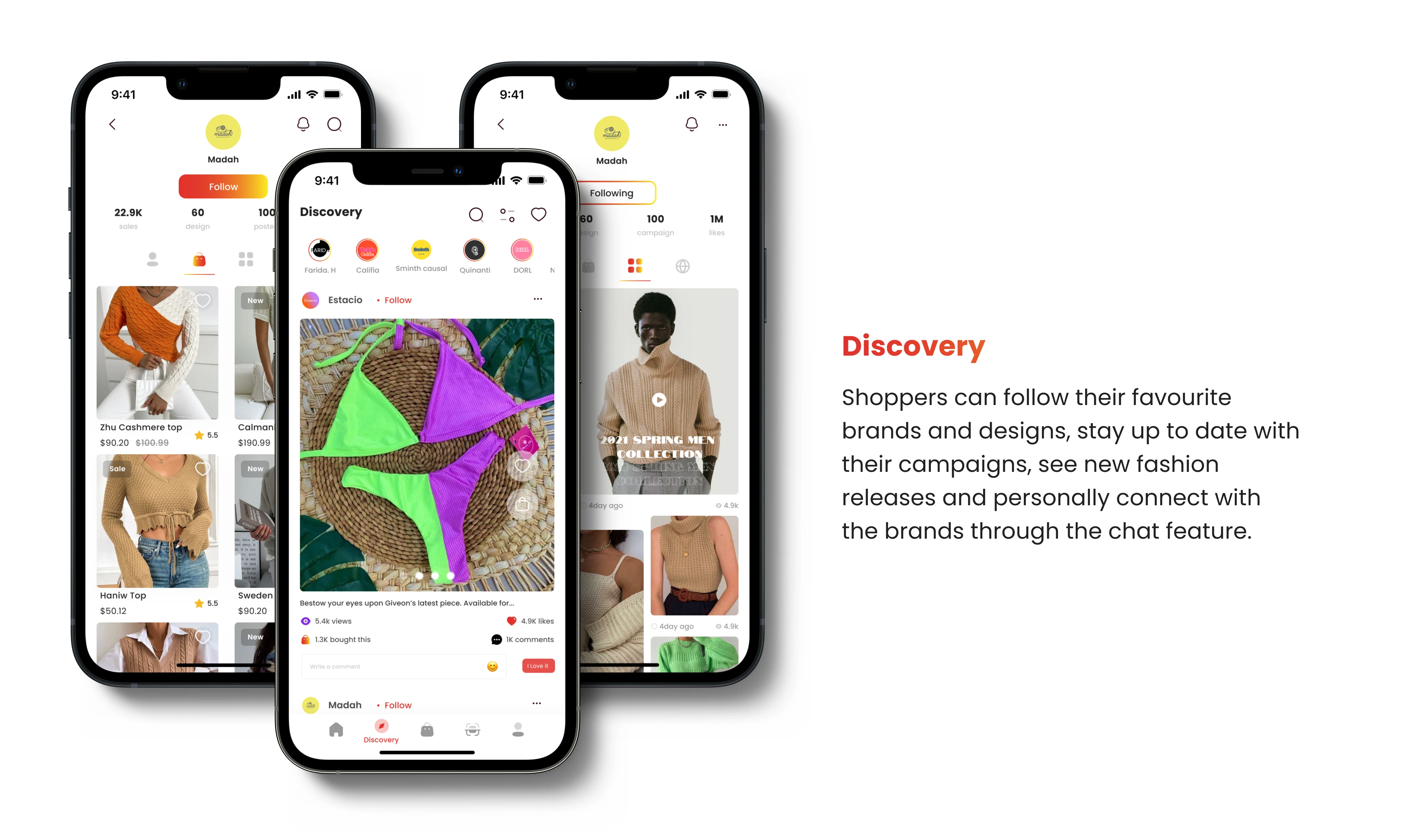
Take-Away
Personalization: Personalisation is the key to relevance, which is the key to engagement. All information and content should be prioritized and presented along the degree of personalized relevance
Guidance not prescription: Proactively guide users through the journey toward a purchase. help navigate the path from discovery through a decision to checkout, and acknowledge key information at the various stage of the journey to proceed to the next stage. User existing mental model when possible. Do not over-describe concepts
Open-ended discovery: Enable the users to effortlessly persist in discovery as long as it’s relevant. AVOID dead ends to minimize navigation decisions. ALWAYS provide an entry point to the follow-up or fallback discovery path at a point when it is least disruptive to the current one. The best next discovery path is the SHORTEST route to a product view
Categorization: Users are better able to process the architecture and structure of the app when information and function are sorted as a system of classes. Using this allows us to organize information in a coherent manner so it is easier for users to learn how the experience works and navigate it.
Transparency: Users should be able to clearly identify why they are seeing something without over-explanation. The sources and meaning of every piece of information presented to a user should be clear and transparent.
Like this project
Posted Jul 13, 2023
An end-to-end Re-design and revamp of Sartor buyer app - E-commerce
Likes
0
Views
16


