Nektar Brand Identity and Packaging Design
Merengeese Ambapardiwala
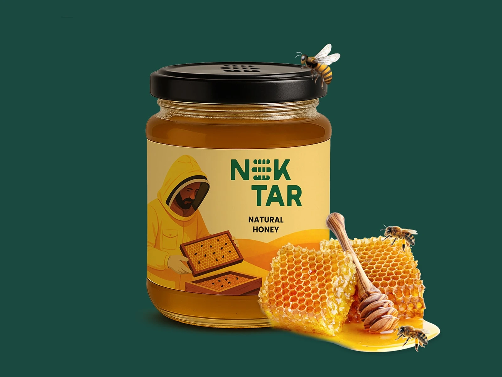
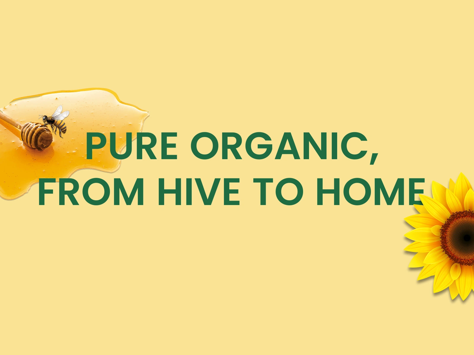
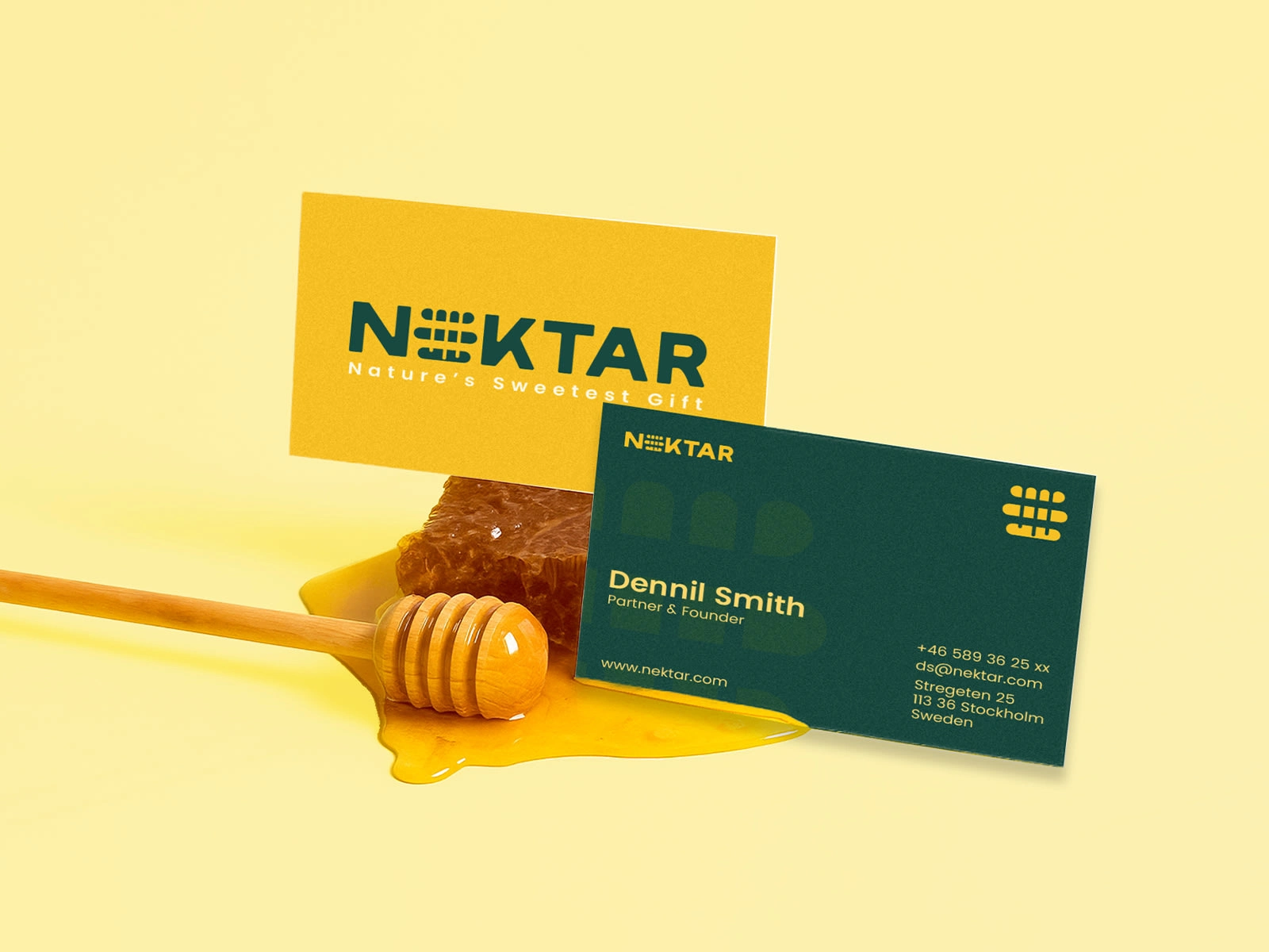
Nektar Nature's Sweetest Gift
Project Overview:-
Nektar is a premium honey brand born to celebrate nature’s purest essence the golden rhythm of wellness, taste and authenticity. The project centered on crafting a refined brand identity, cohesive visual language and versatile packaging system that reflects the purity, elegance and modern sophistication of honey.
Our vision was to position Nektar as a trusted, contemporary honey brand, bridging the honesty of nature with modern design sensibility. The identity extends across packaging, retail and digital platforms, creating a seamless, elevated honey brand experience that feels tactile, authentic and luxurious.
The Challenge:-
Launching a new honey brand in the crowded wellness and FMCG segment meant standing apart from conventional, overly commercial honey brands.
Key challenges included:
a. Designing a premium, authentic and emotionally resonant honey brand identity.
b. Developing a scalable packaging system for multiple jar sizes, flavors and seasonal editions.
c. Ensuring a consistent brand language across digital and physical touchpoints.
Objectives:
a. Craft a memorable honey brand identity conveying purity, elegance and wellness.
b. Develop a flexible visual and packaging system adaptable across products and platforms.
c. Establish Nektar as a symbol of trust, natural indulgence and modern sophistication.
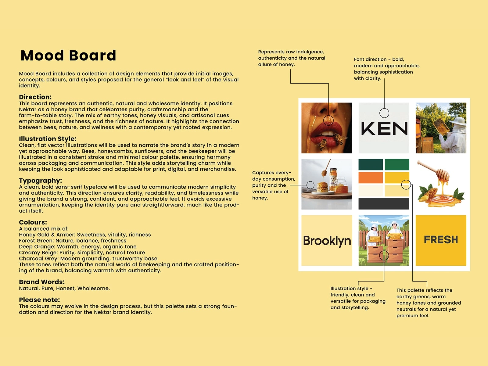
Moodboard & Inspiration:-
The moodboard set the soul of Nektar:
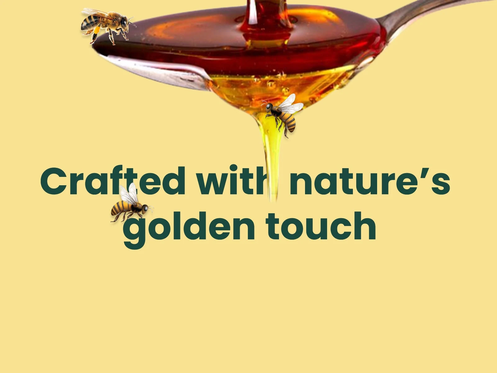
Color palette: Warm ambers, golden hues and natural neutrals inspired by raw honey, sunlight and flowing nectar.
Textures & materials: Matte and tactile finishes echoing the authenticity of natural honey jars.
Design tone: Minimalist, serene and boutique wellness-inspired.
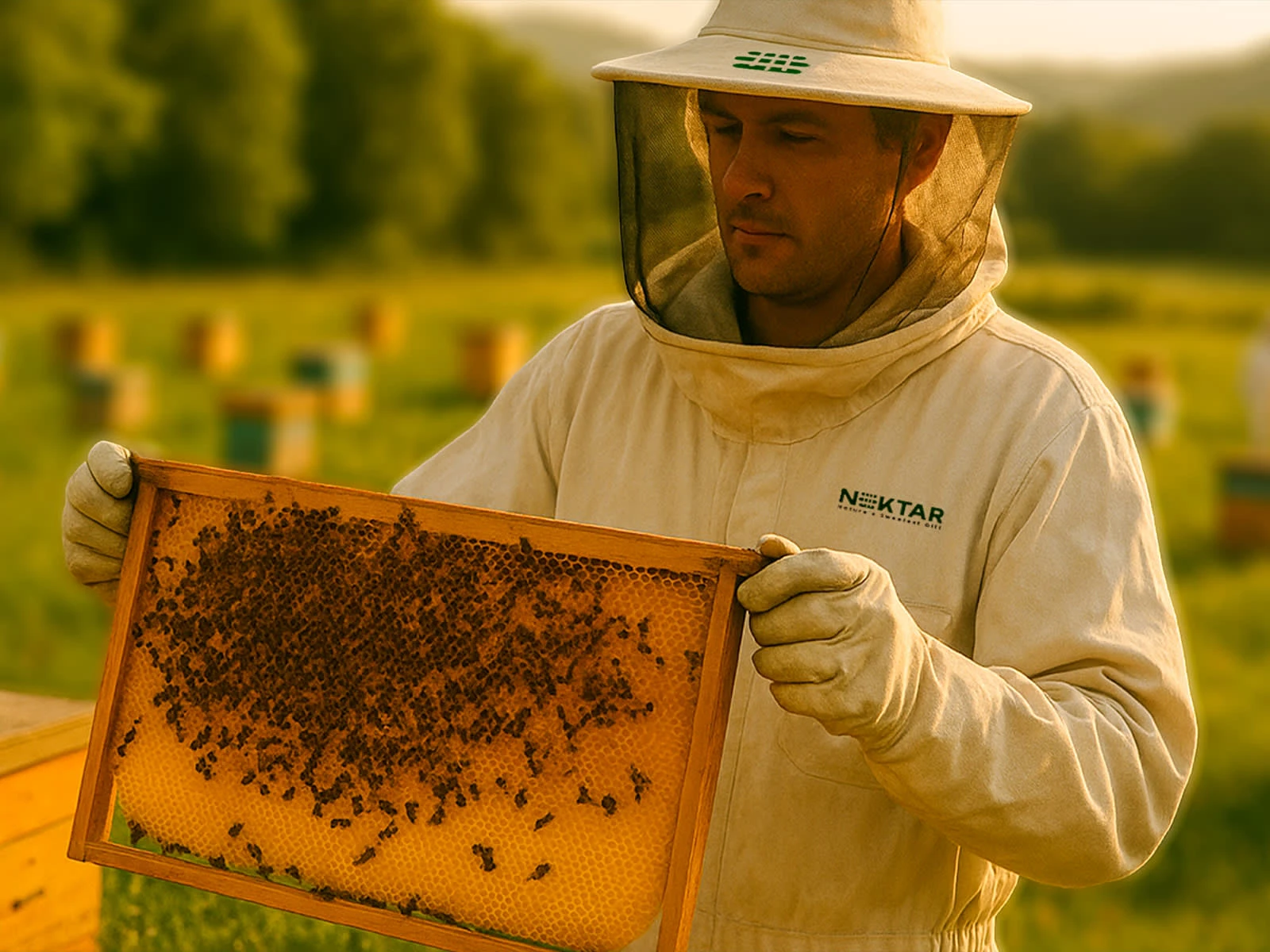
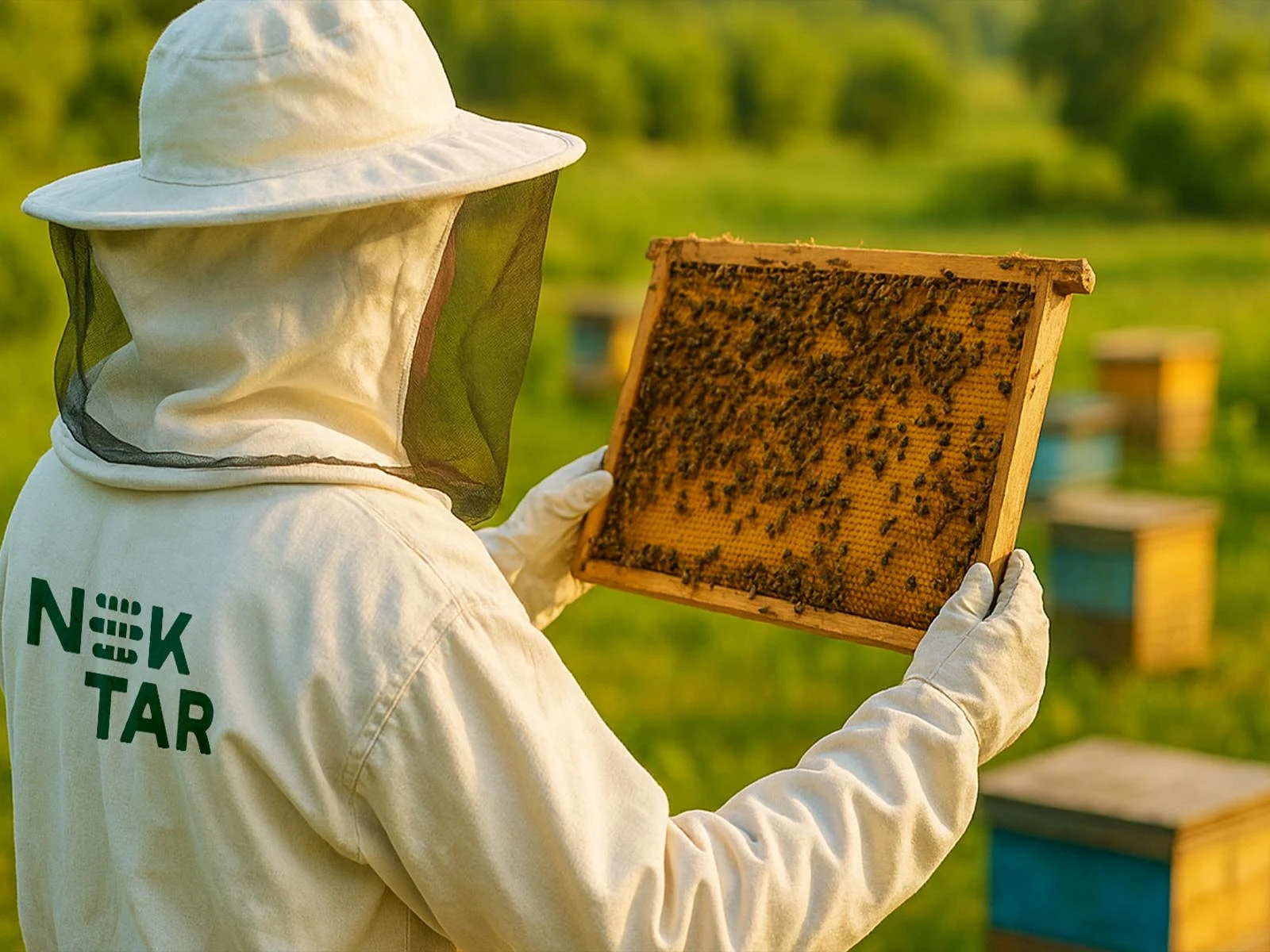
Visual cues: Honeycombs, flowing nectar, sunlight reflections and organic geometry.
Every design choice was guided by the vision of translating the essence of honey into modern, luxurious design, creating a world that feels calm, refined and connected to nature.
Approach & Process:-
We collaborated closely with the client, aligning creative strategy with brand vision, audience expectations and retail goals. The process combined research, concept development, iterative design and refinement.
Research & Strategy
a. Studied honey, wellness and FMCG categories to identify market gaps.
b. Analyzed competitors to find opportunities for differentiation.
c. Focused on simplicity, storytelling and purity as core principles.
Concept Development
a. A signature wave motif beneath the emblem symbolizes the flow of honey, energy and balance.
b. Organic shapes and gentle movement informed the visual language.
c. Messaging highlights wellness, refinement and authenticity, reflecting honey’s natural qualities.
Design Execution
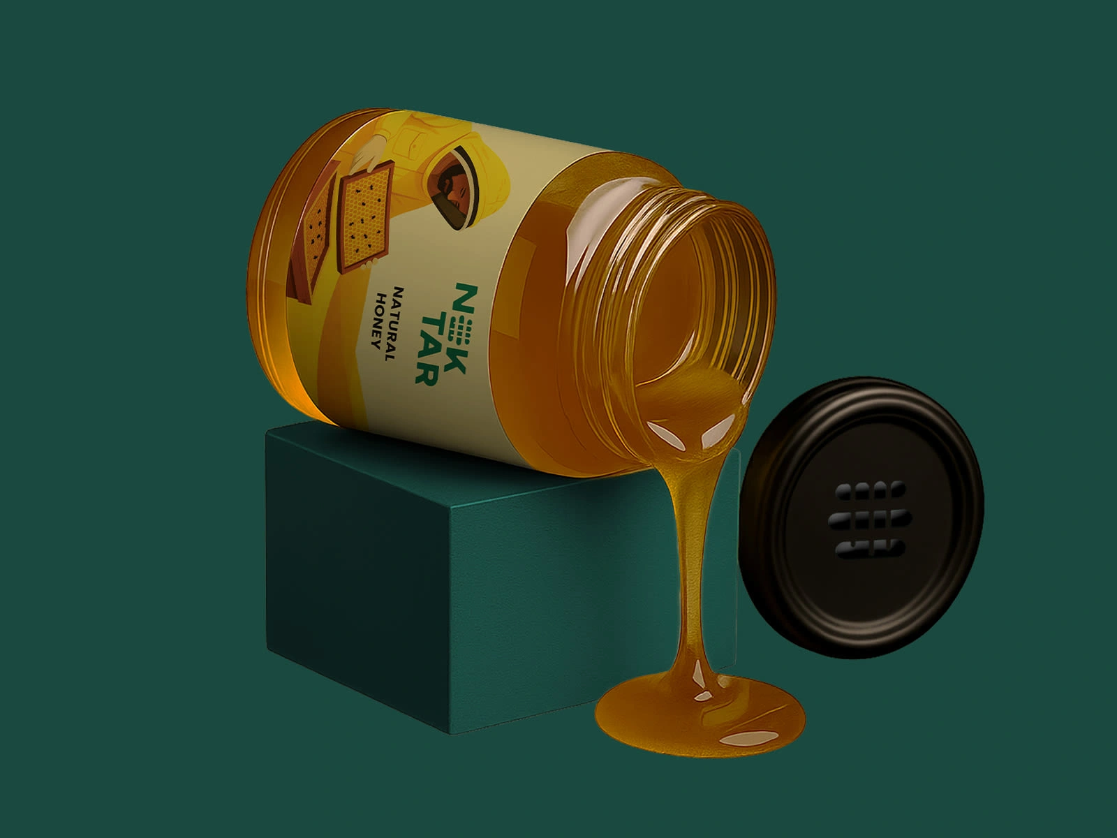
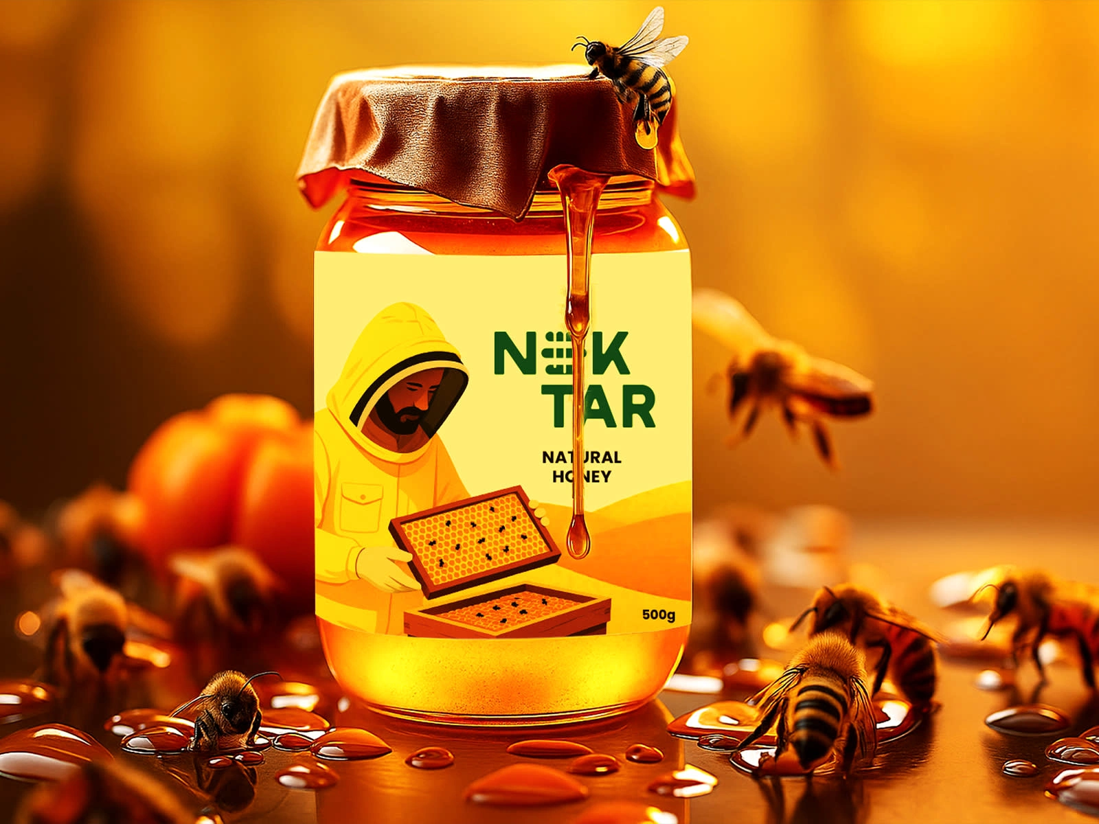
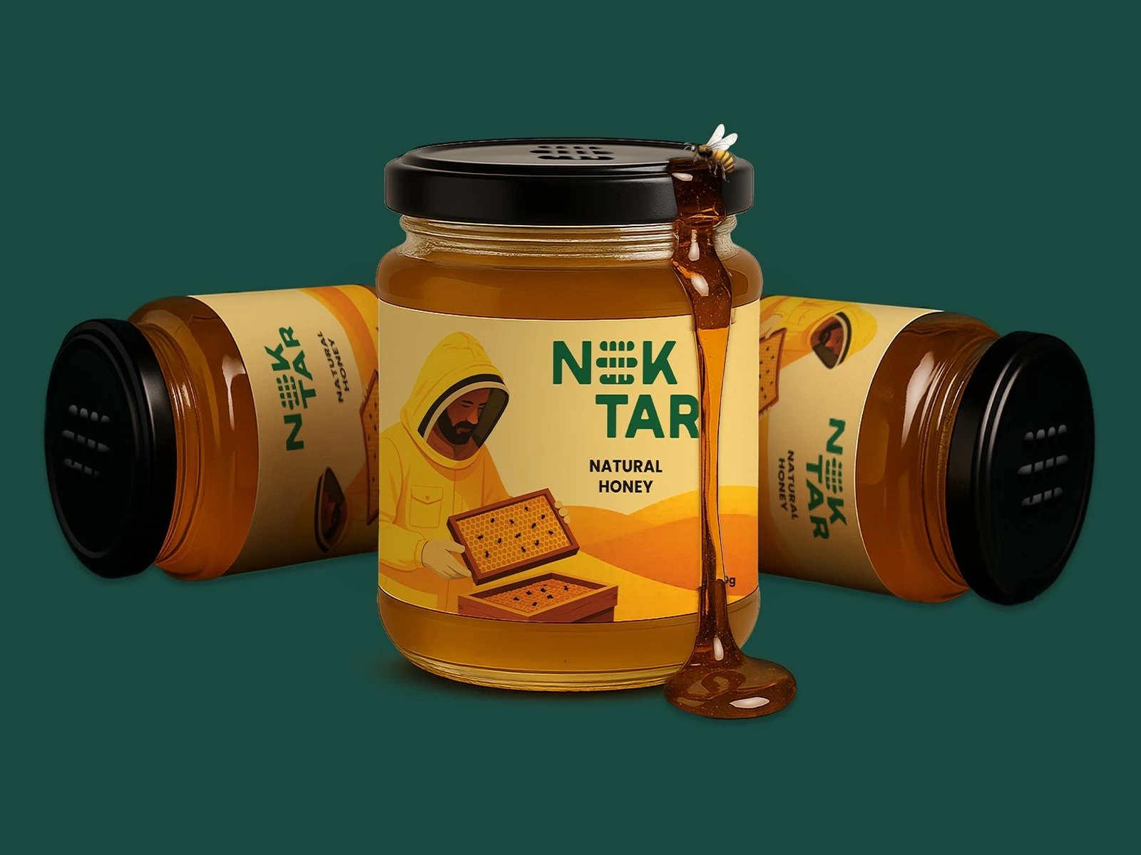
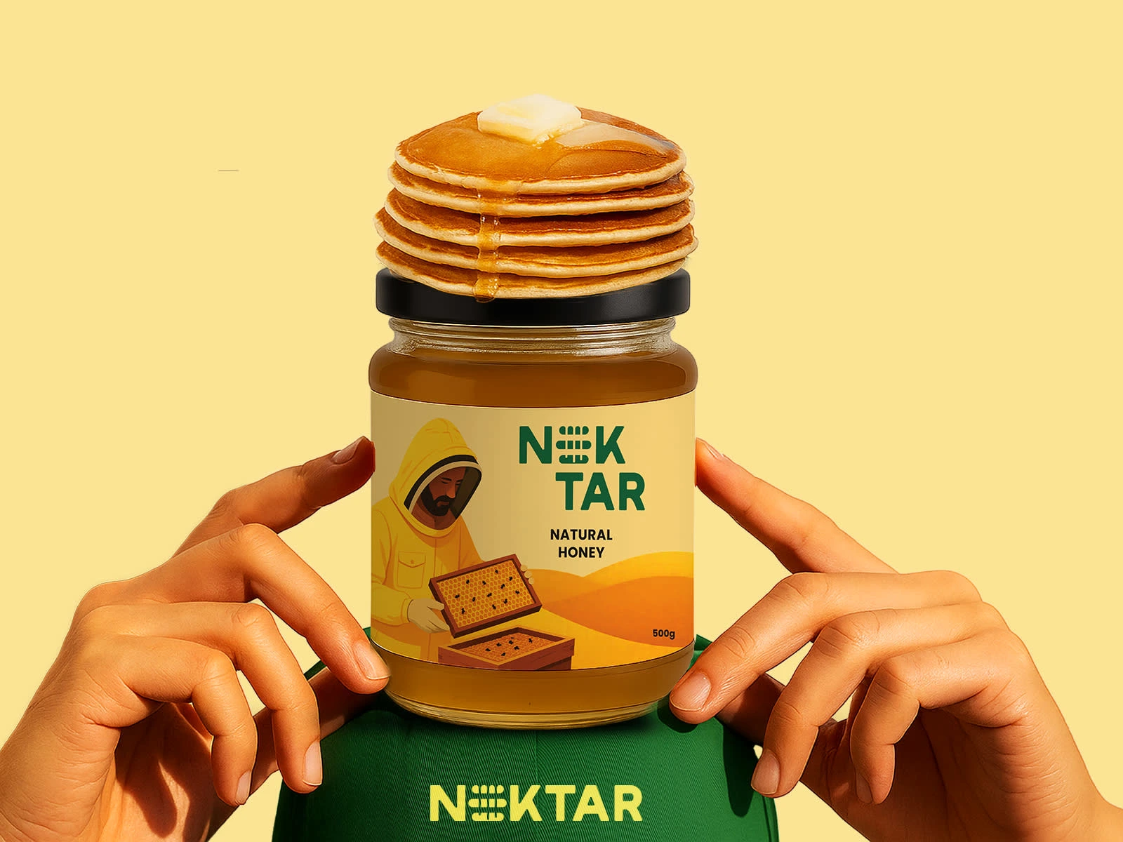
Logo & Symbolism: Inspired by organic geometry, representing purity, expansion and sacred balance.
Color Palette: Warm ambers, golden hues and soft neutrals for a premium honey feel.
Typography: Timeless serif for elegance paired with a clean sans-serif for readability.
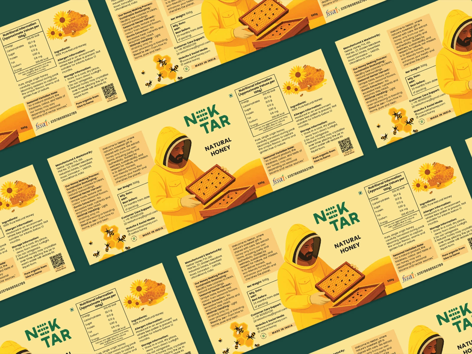
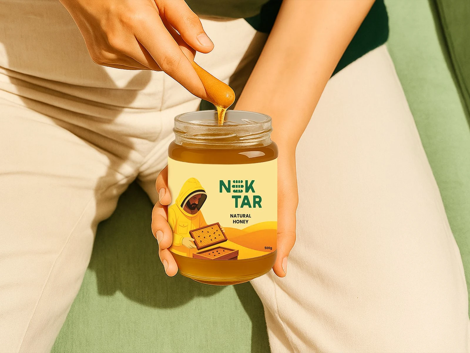
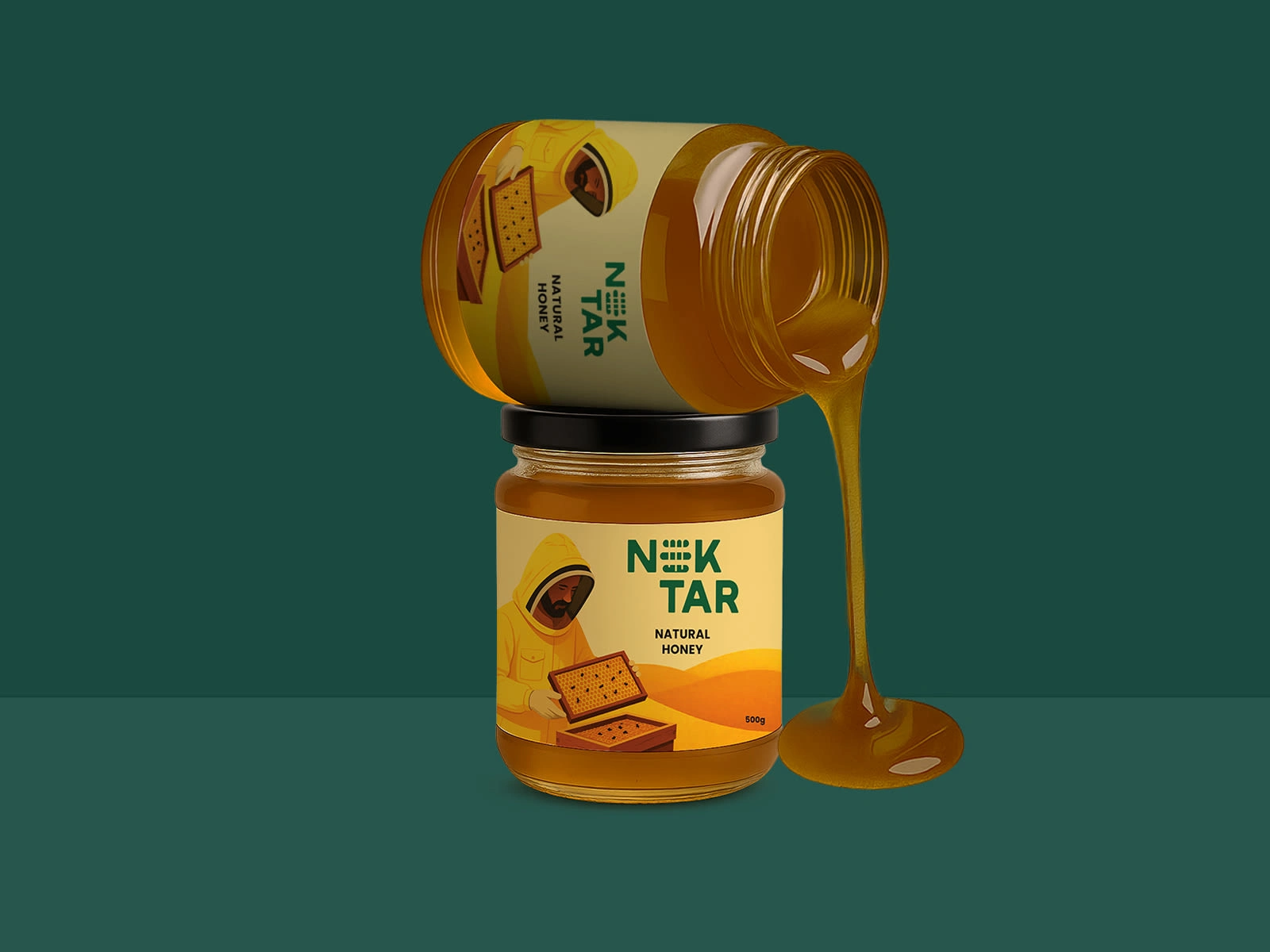
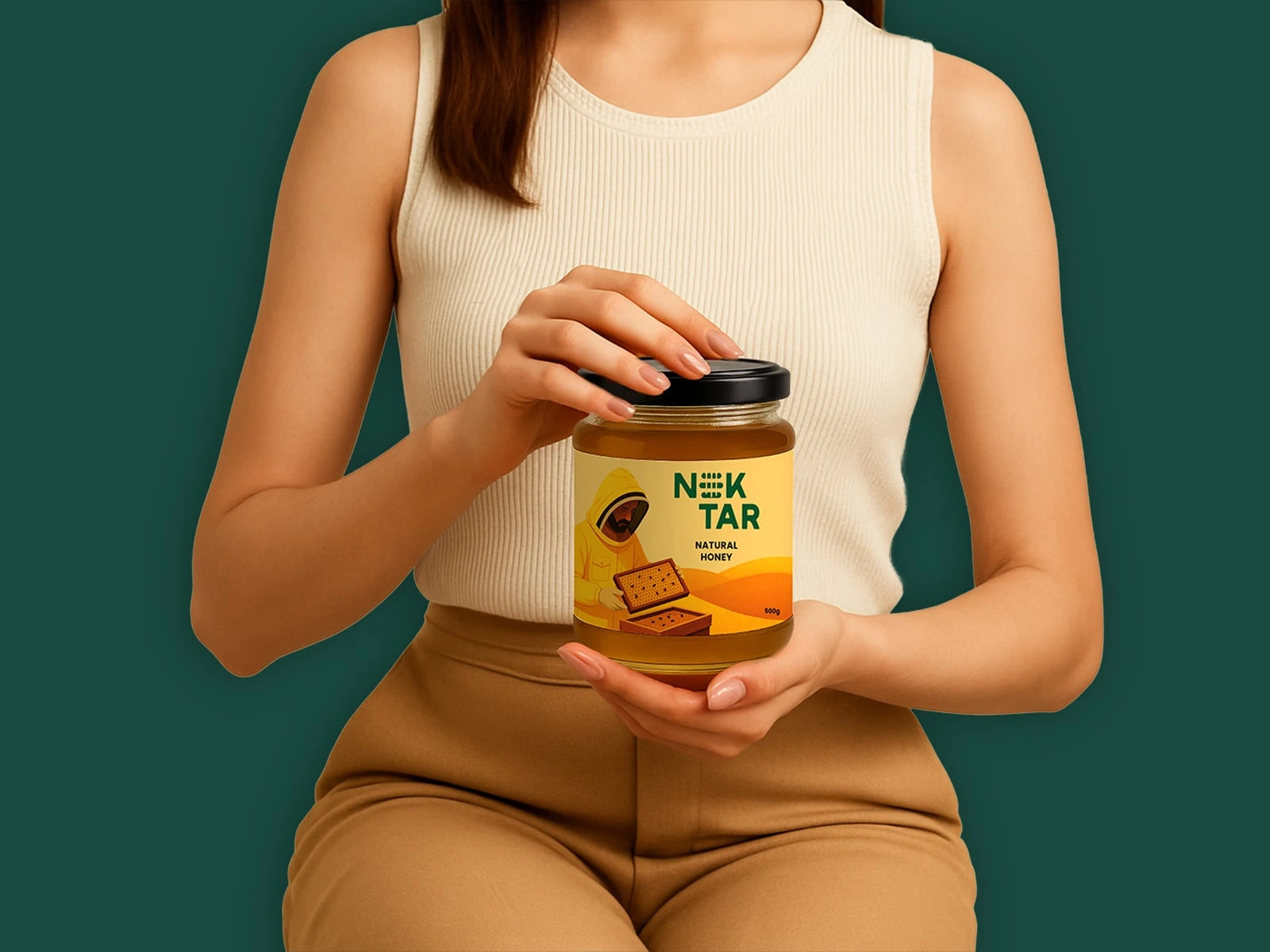
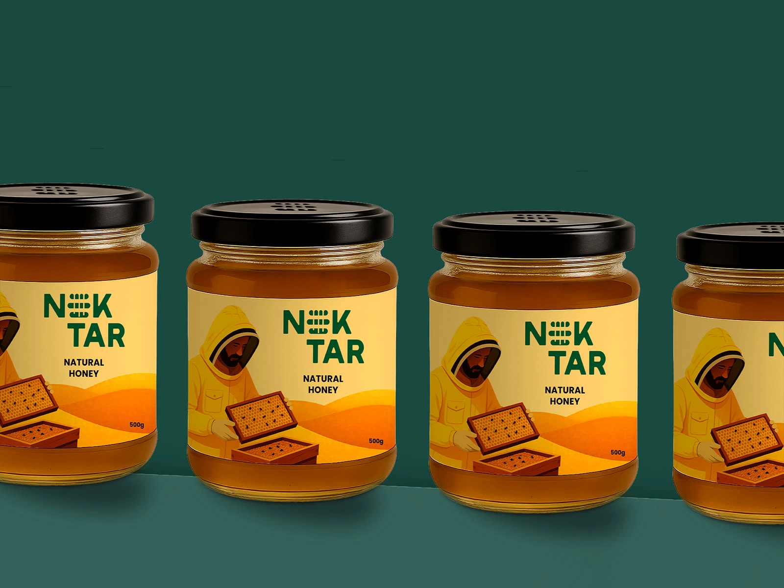
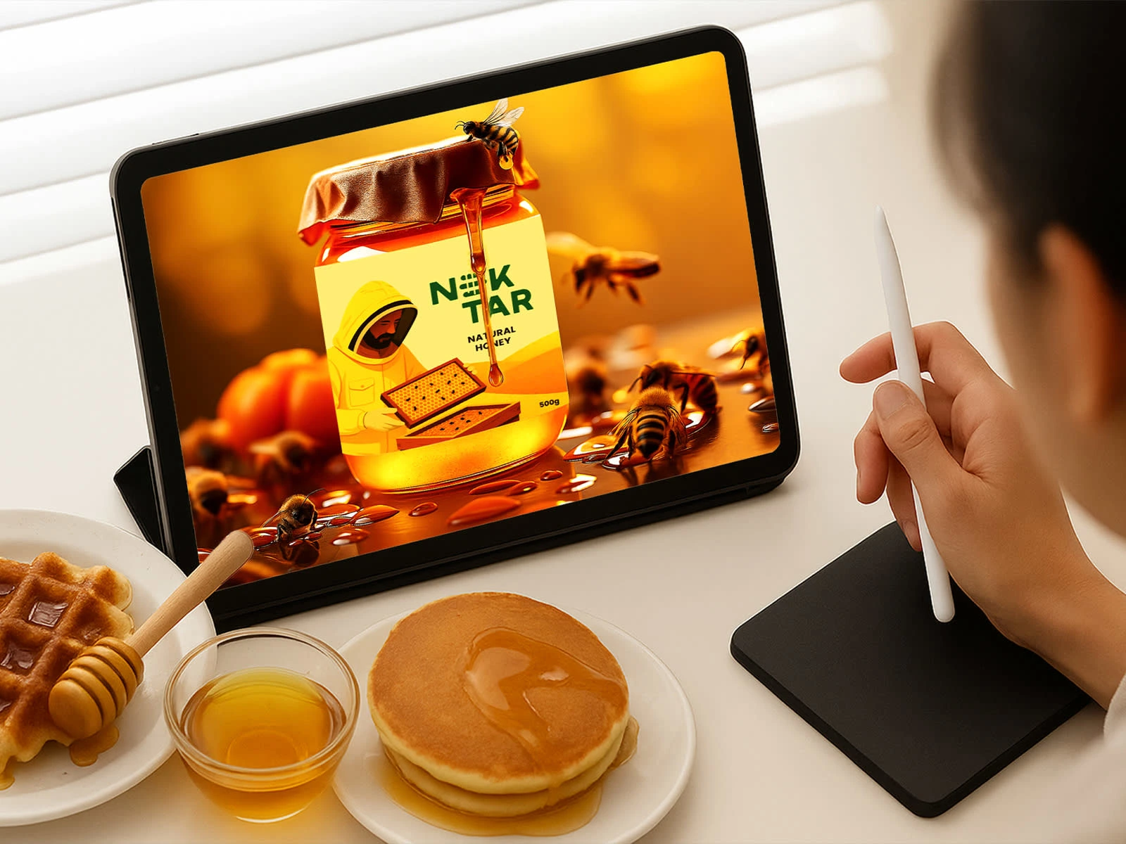
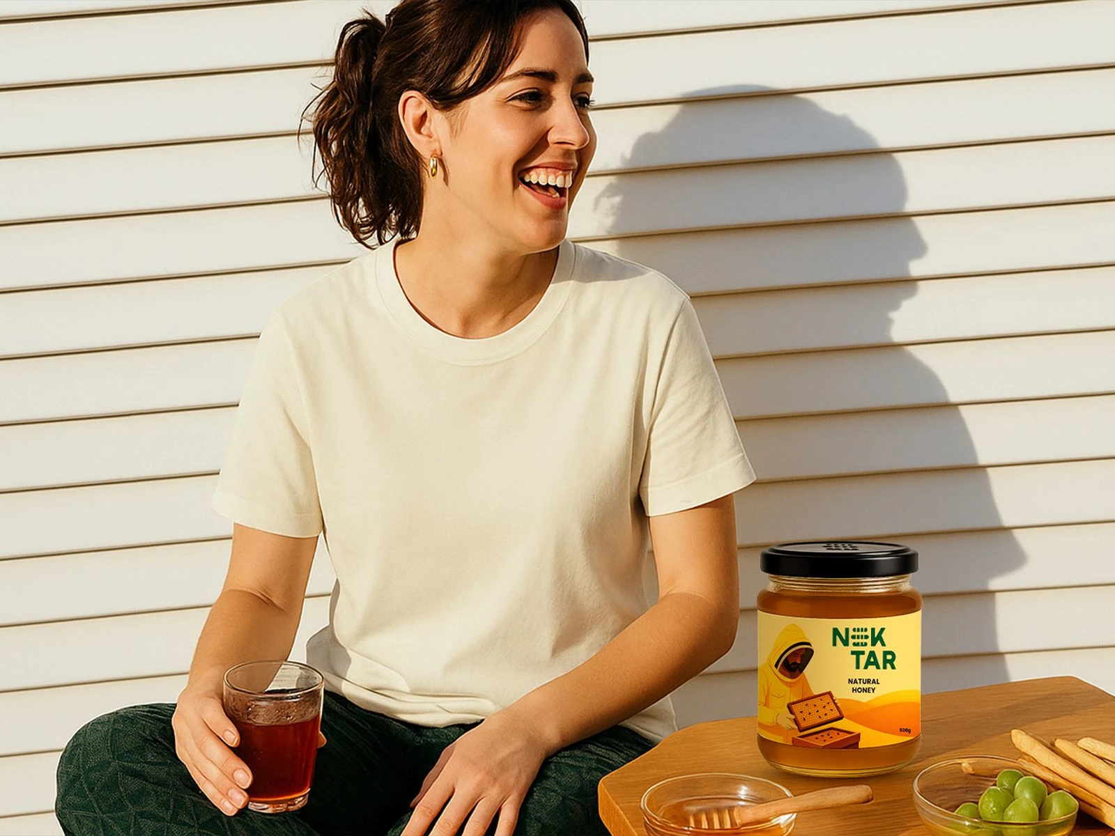
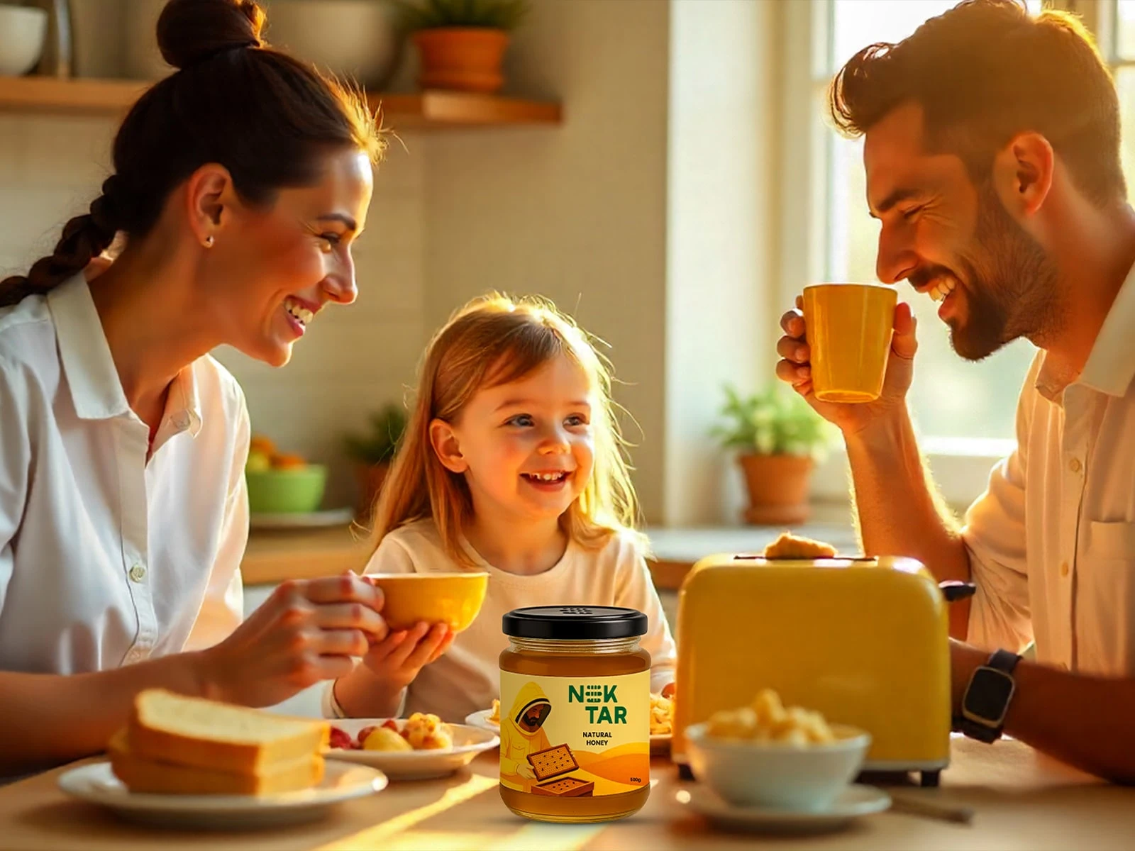
Packaging: Minimal, tactile and clean layouts for premium honey jars.
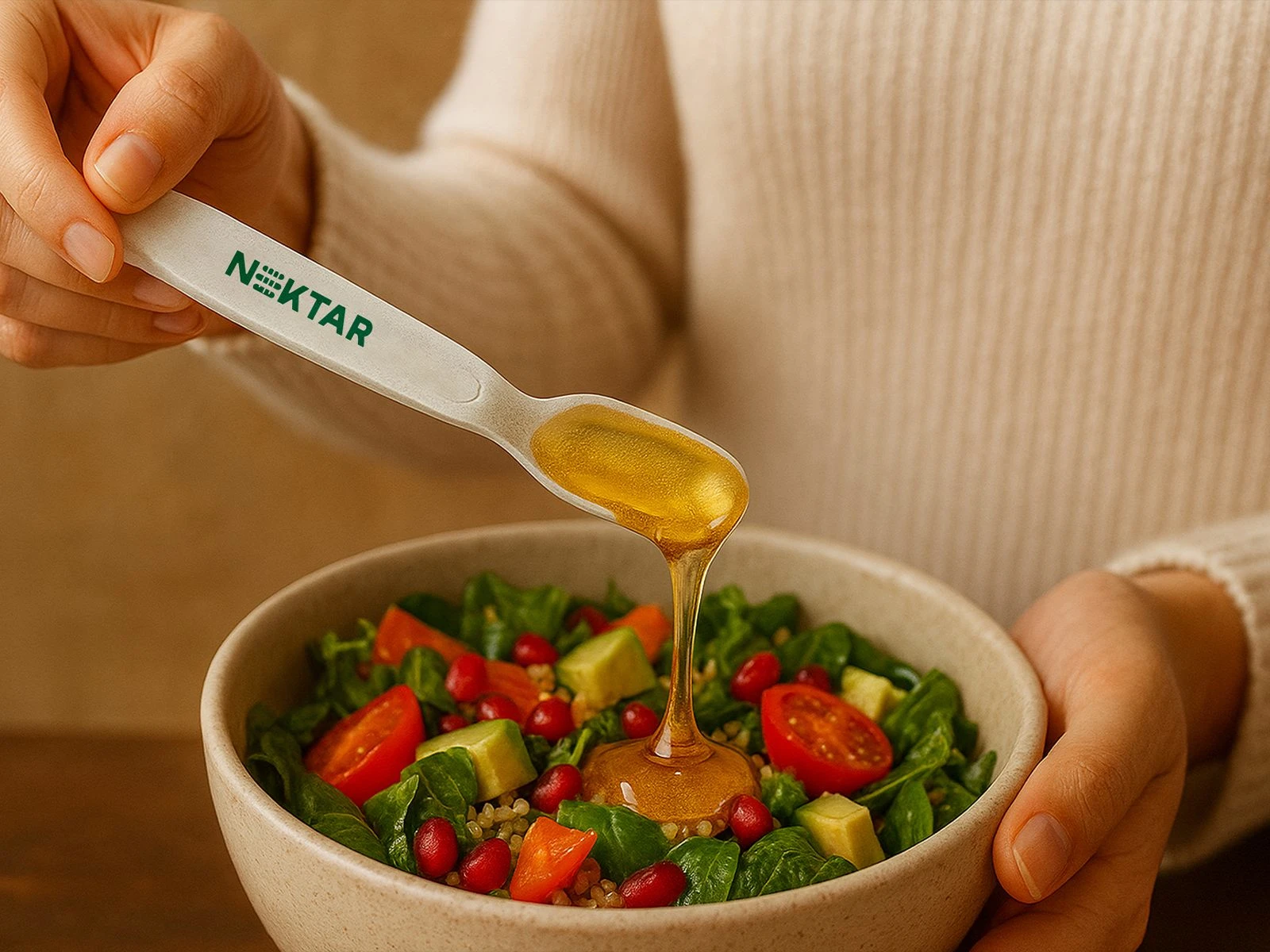
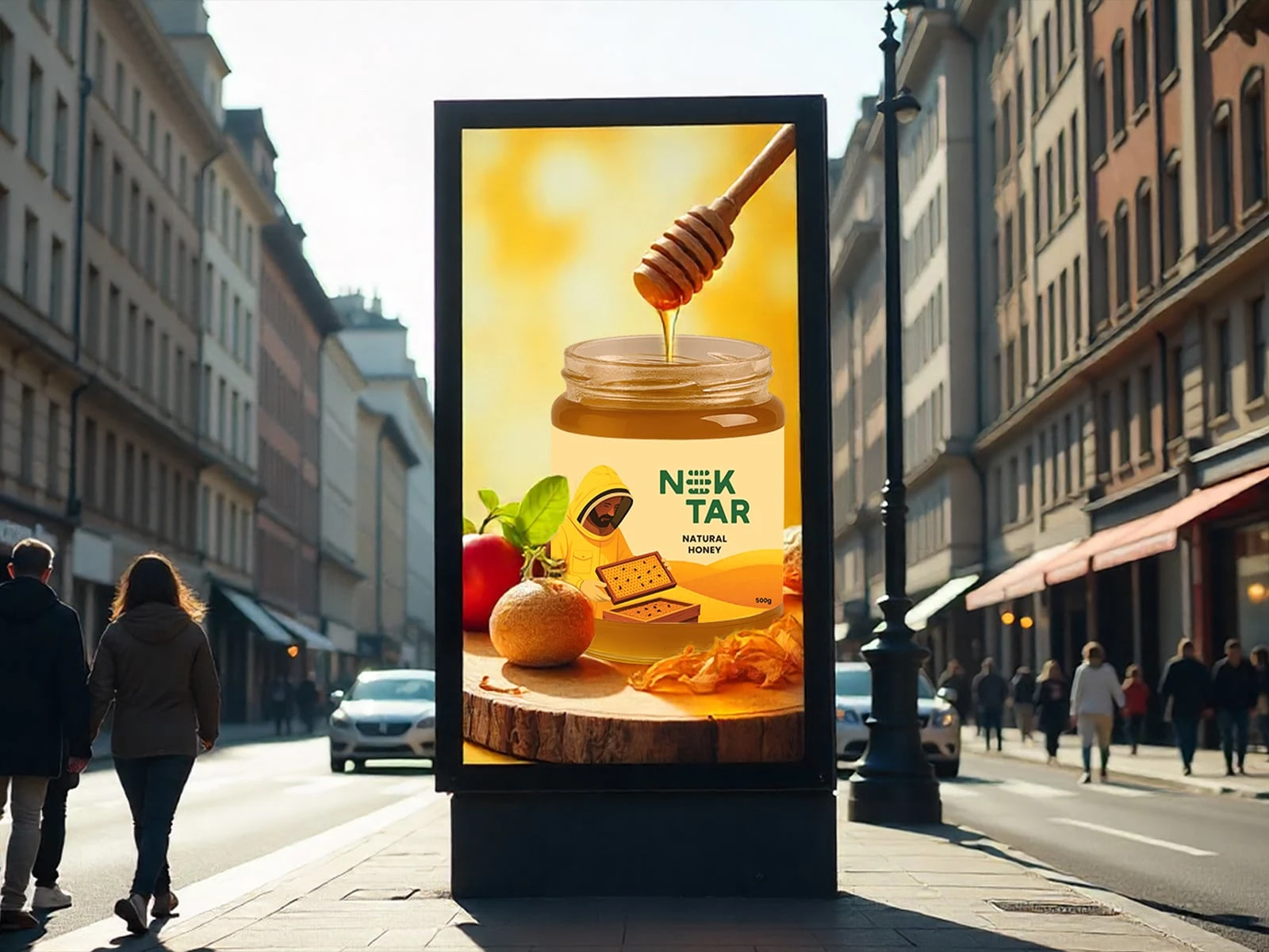
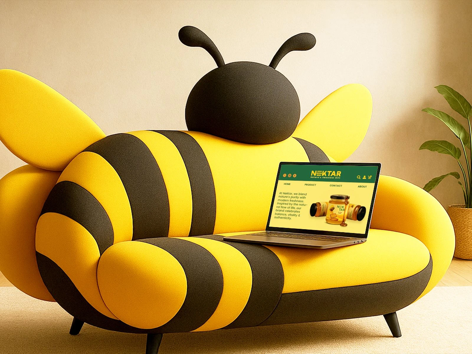
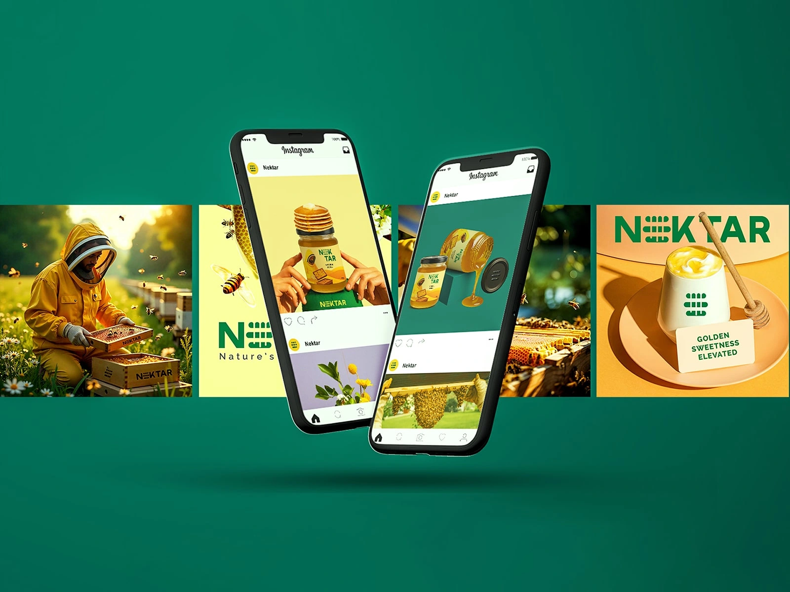
Digital & Retail Applications: Social media templates, e-commerce visuals, stationery and retail collaterals that extend the honey brand story.
Solution & Deliverables:-
Brand Identity:
a. A premium honey brand system combining logo, typography, color palette and visual language.
b. Emphasis on authenticity, luxury and modern refinement.
Packaging Design:
a. Primary and secondary packaging for jars of varying sizes and honey flavors.
b. Minimal layouts with tactile finishes and gold foil accents.
c. Designed for shelf impact, brand recall and scalability across honey products.
Digital & Social Media:
a. Templates for Instagram, website and e-commerce platforms.
b. Visual storytelling highlighting purity, wellness and lifestyle appeal.
Retail & Collateral Applications:
a. Stationery, product tags and thank-you cards that extend the premium honey brand experience offline.
b. Maintains a refined, nature-inspired brand language throughout all touchpoints.
Result:-
Nektar successfully establishes a premium, contemporary presence in the honey and wellness segment.
a. Cohesive brand identity ensures strong honey brand recall, shelf visibility and scalability.
b. Elevates honey from a commodity into a modern lifestyle product rooted in purity and craftsmanship.


Thank you!
If you’re ready to craft a brand identity that feels uniquely you and elevates your business, I’d love to hear from you. Reach out below.
Like this project
Posted Nov 28, 2025
Crafted a refined brand identity and packaging for Nektar, a premium honey brand.