Pace+ Skincare Brand Identity Design
Merengeese Ambapardiwala
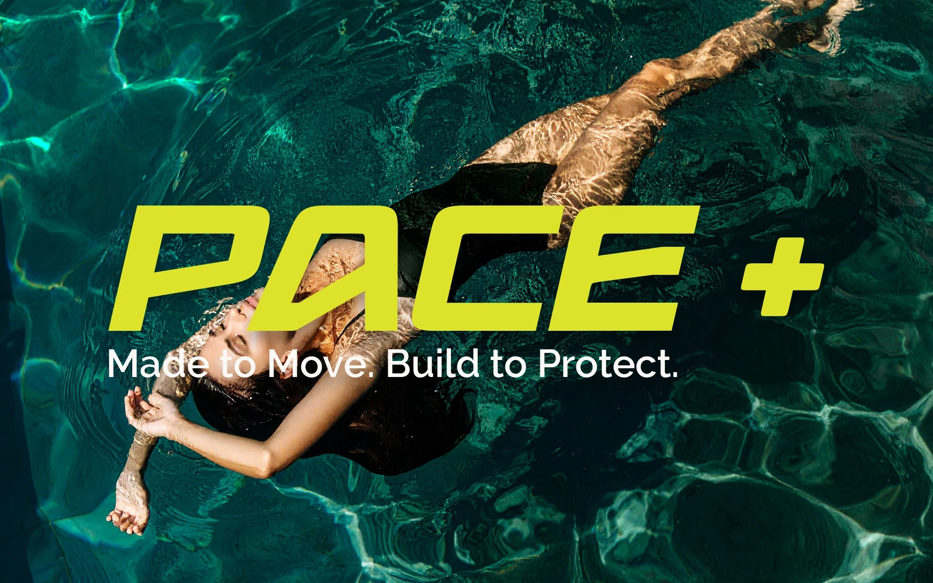
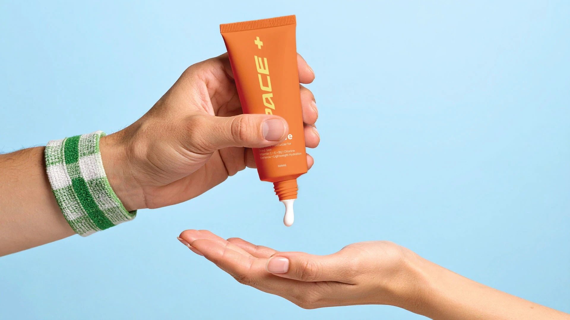
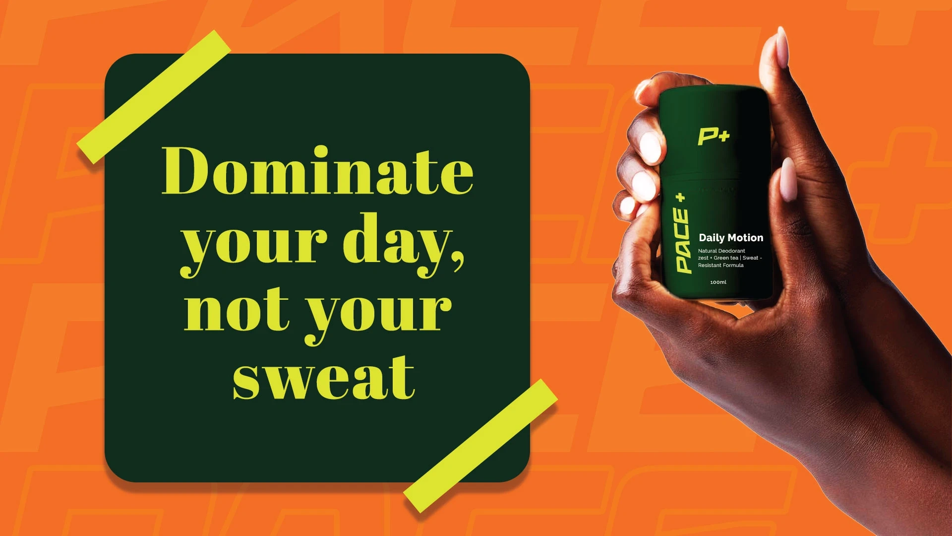
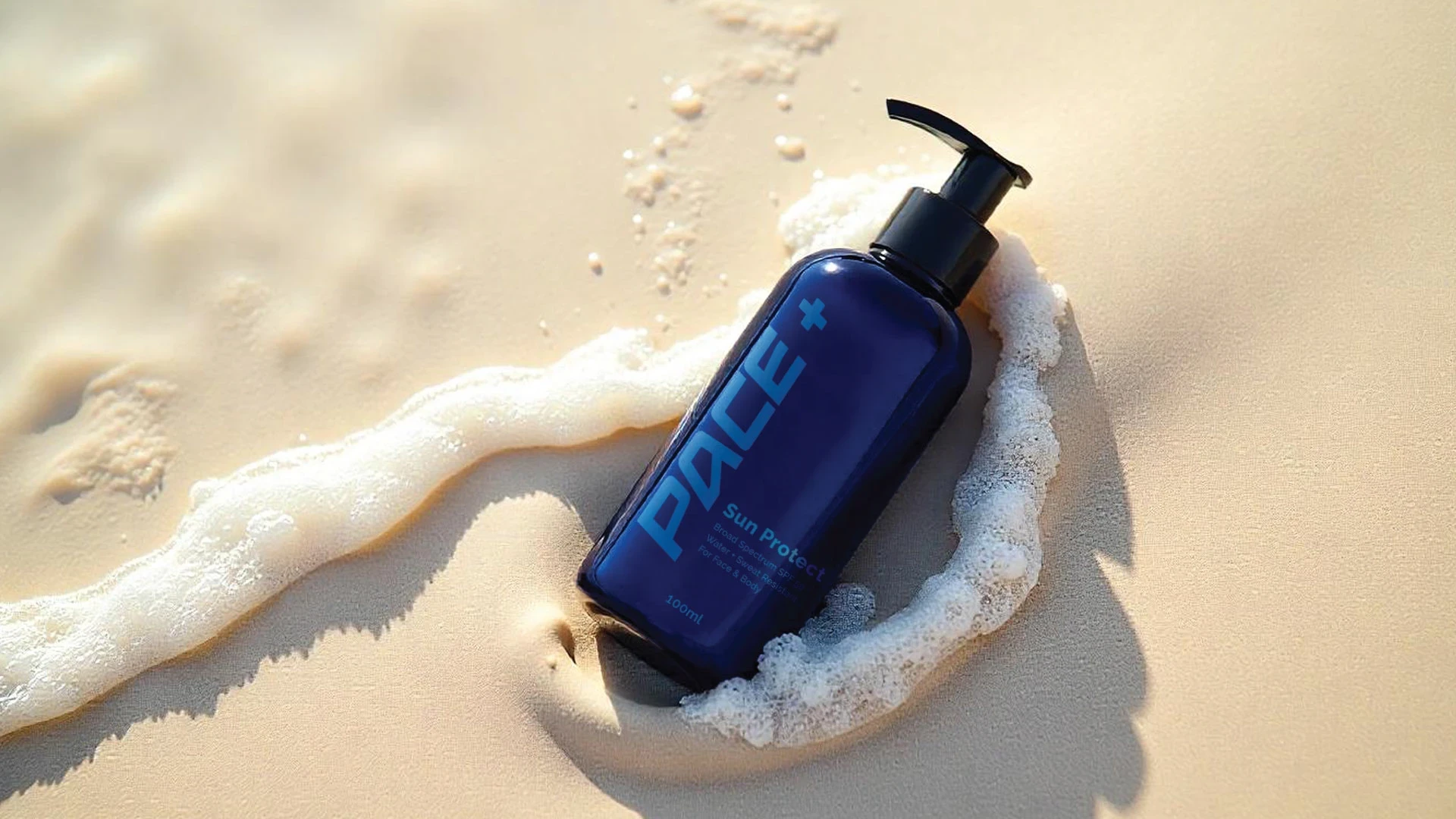
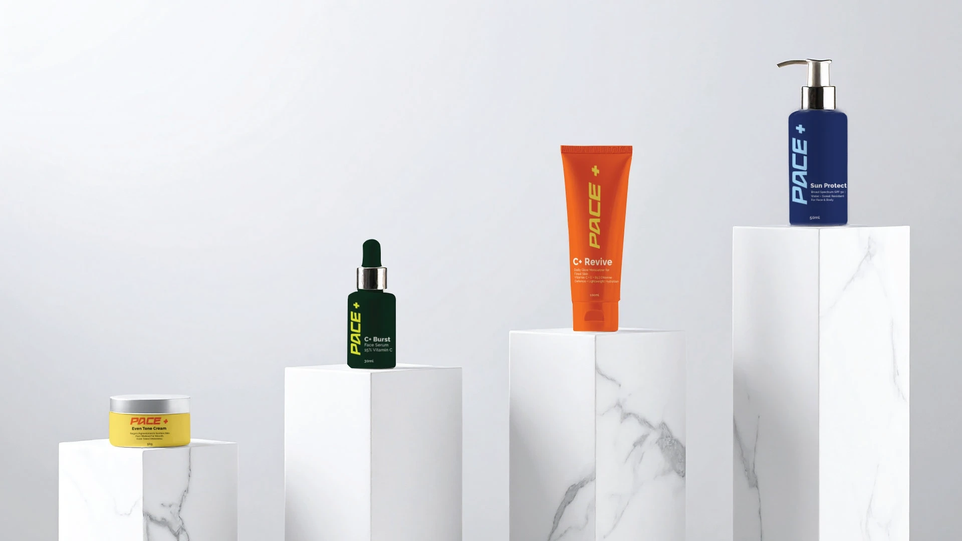
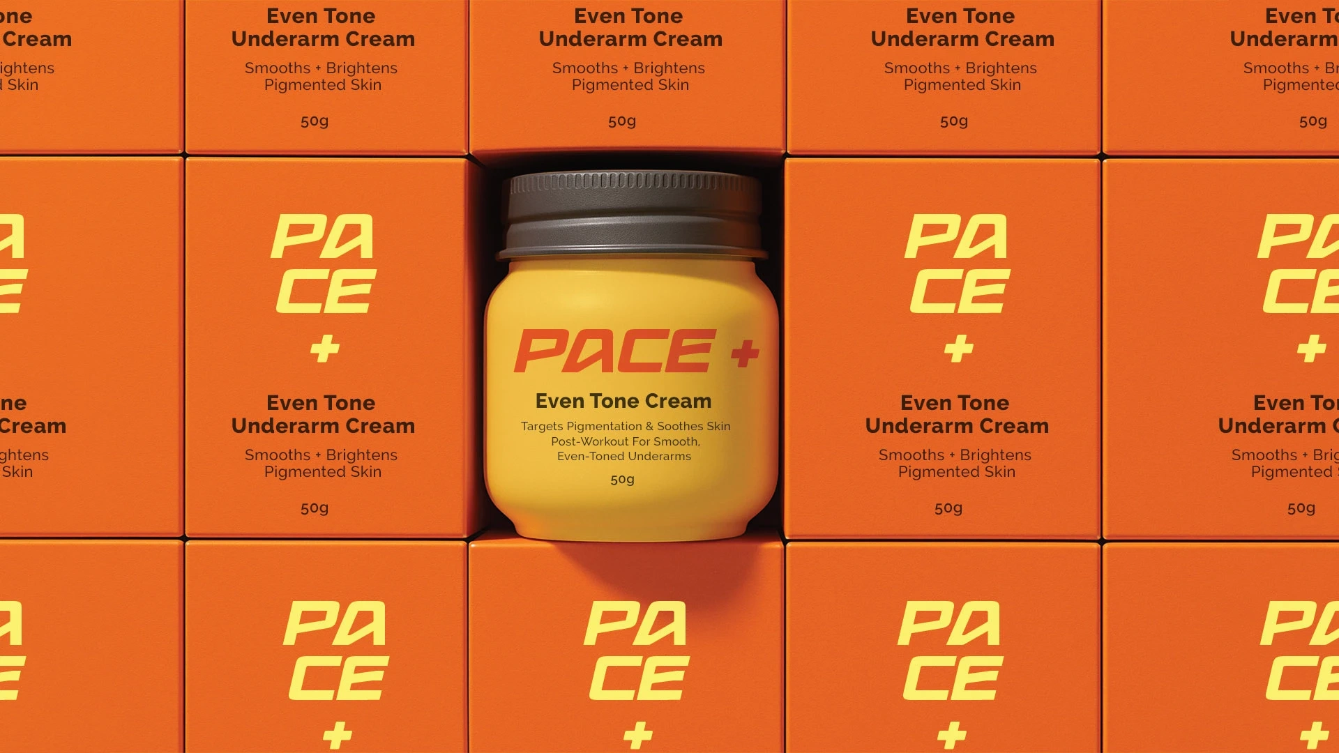
Pace+ is a high-performance skincare brand designed specifically for swimmers and athletes. Built to protect skin from chlorine, sun exposure and sweat, Pace+ delivers powerful skincare for people who move fast in water and in life. The brand combines sports-driven design with modern skincare packaging to create a bold and functional identity.
Challenge
To create a clean, minimal, and athletic brand identity that resonates with both professional and amateur swimmers. The skincare branding needed to reflect speed, endurance and confidence and work seamlessly across water-resistant packaging, social content, and digital touchpoints.
Solution
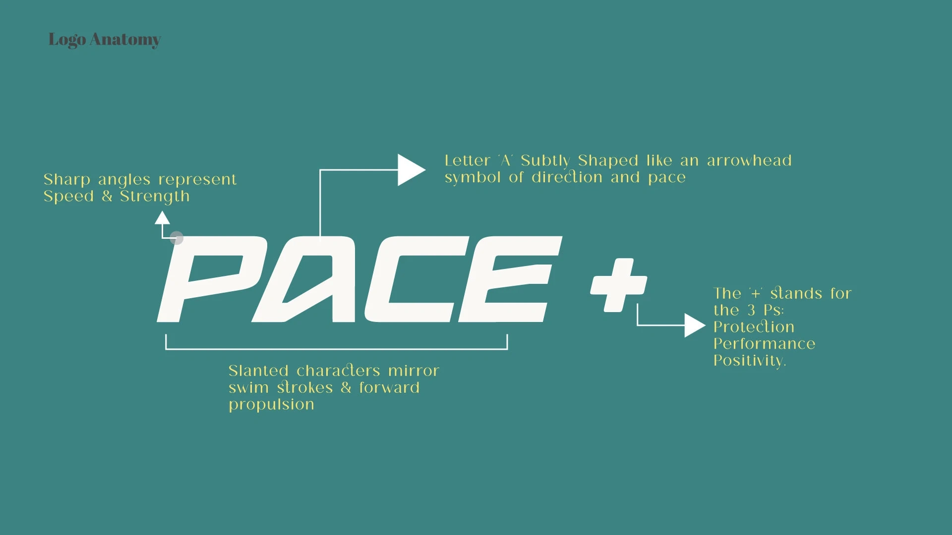
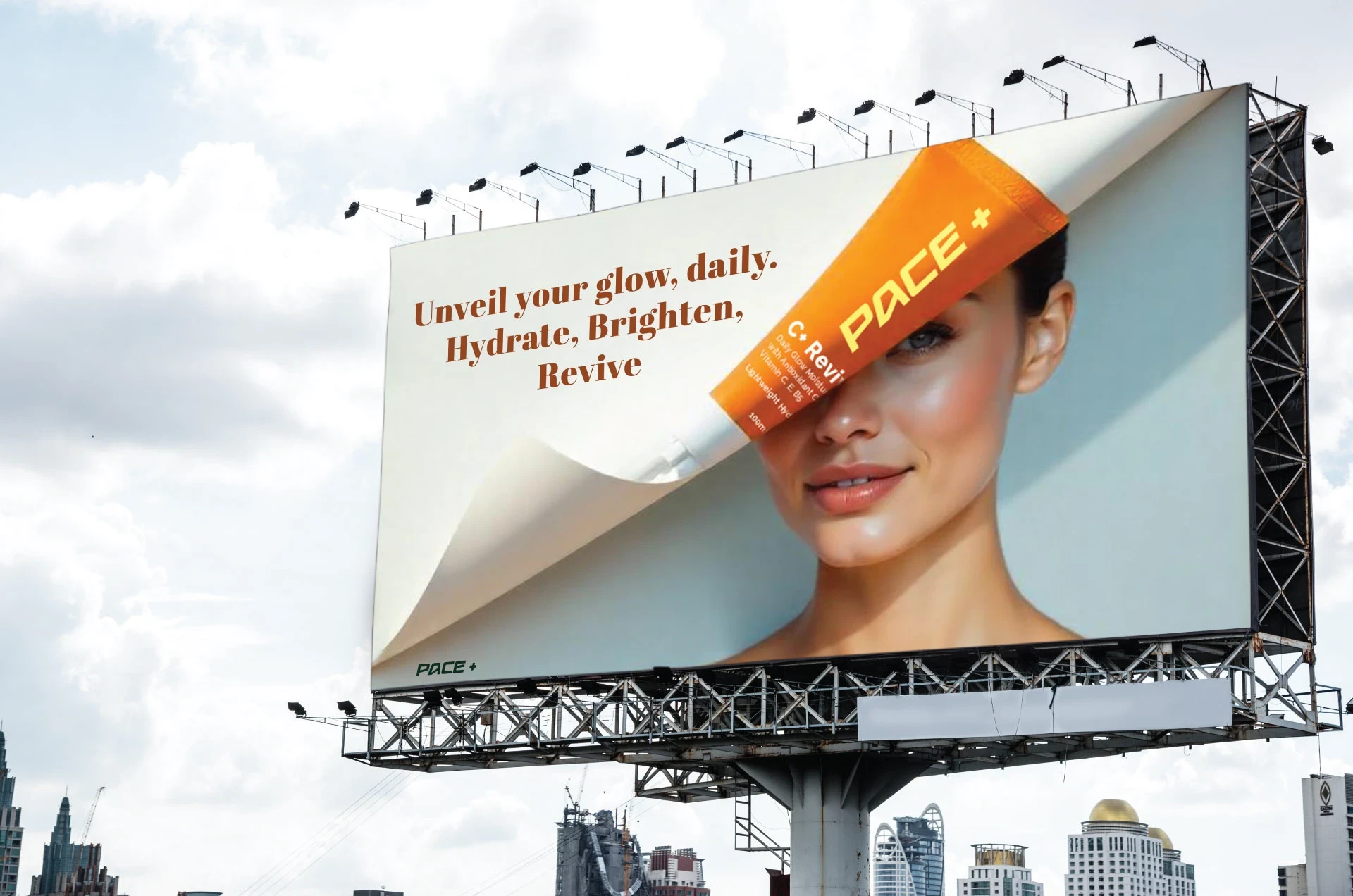
We developed a performance-inspired visual system that captures the rhythm of swimming fast, smooth and fluid. The dynamic wordmark uses motion-inspired typography. The color palette contrasts deep aquatic tones with bold accents to reflect energy and performance.
Color Palette
Ocean Teal • Chlorine Green • Energy Orange
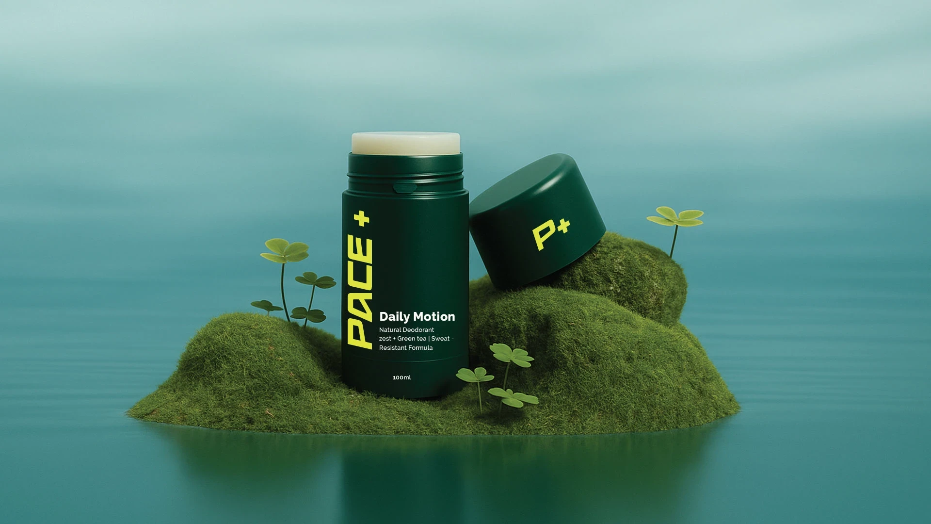
These brand colors reflect water, power and stamina ideal for wellness and active lifestyle brands.
Typography
Modern, high-clarity sans-serif typefaces that communicate speed, efficiency, and modernity.
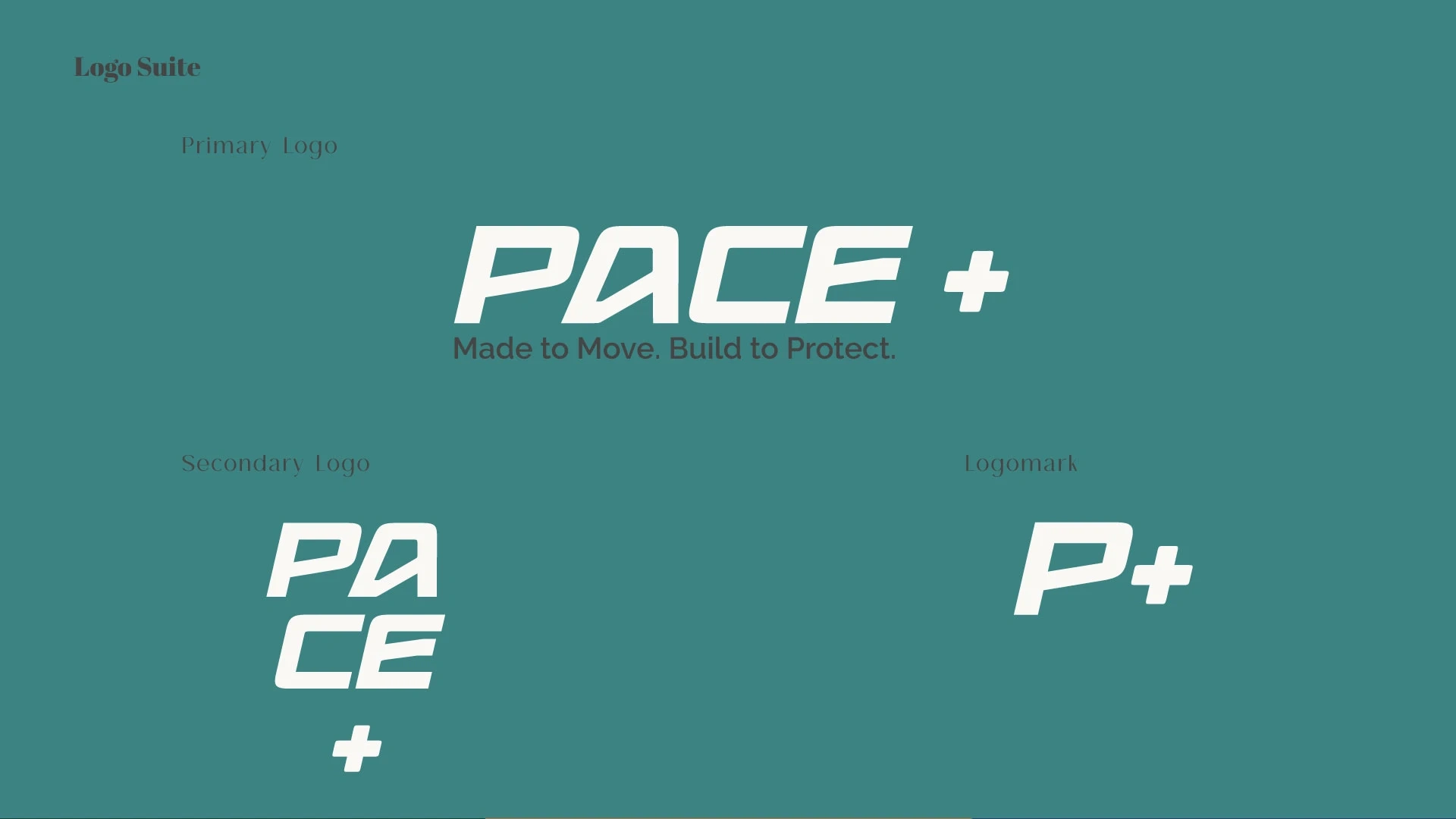
Logo System
A modular identity with adaptable logomark and wordmark variations, working across print, digital, and packaging.
Applications
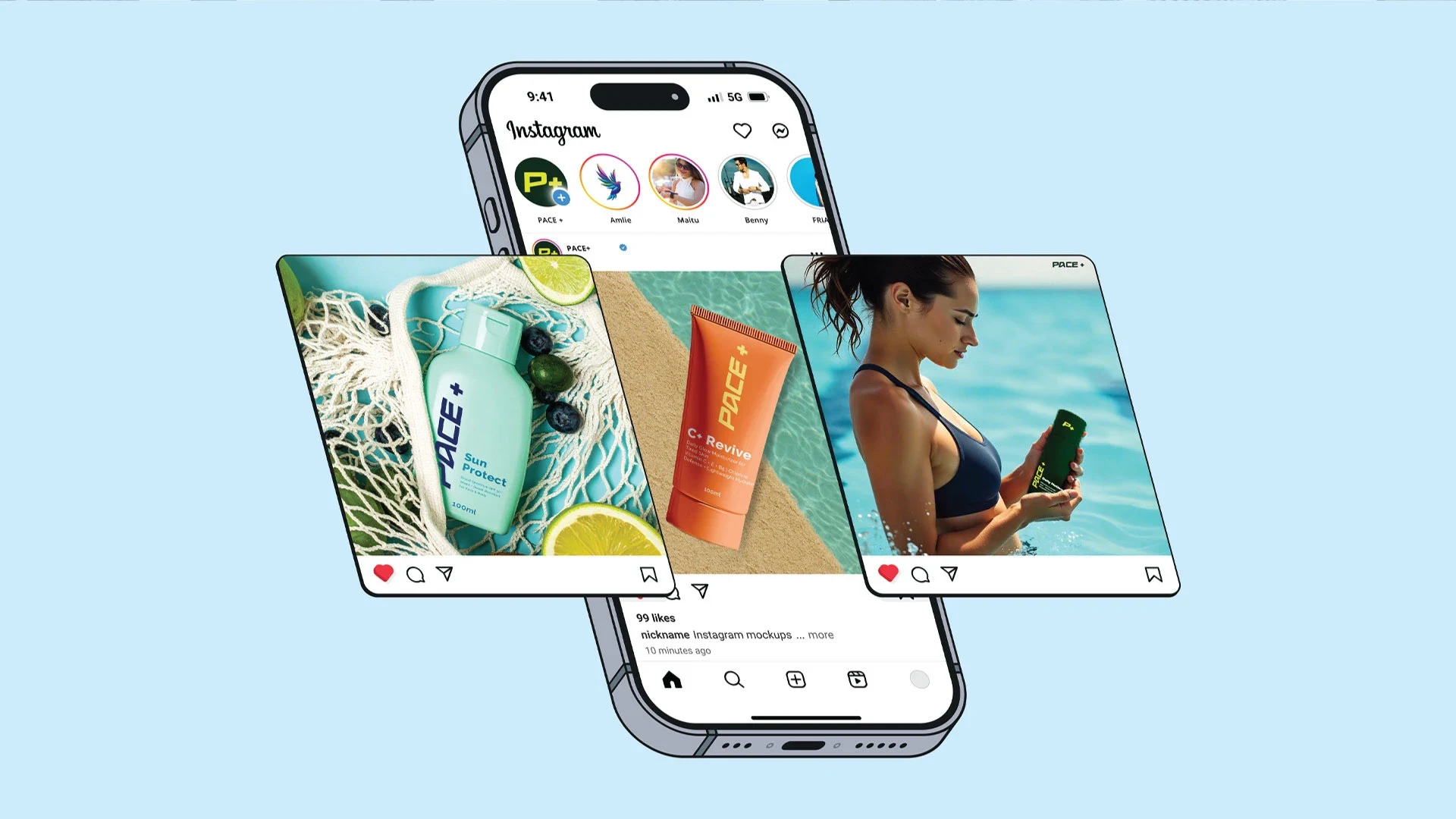
From waterproof skincare packaging (tubes, bottles, and kits) to social campaigns and eCommerce, Pace+ is a bold wellness brand that proves skincare can keep up with performance.
Thank you!
If you’re ready to craft a brand identity that feels uniquely you and elevates your business, I’d love to hear from you. Reach out below.
Like this project
Posted Dec 1, 2025
Created a dynamic brand identity for Pace+ skincare for athletes.