Hirzo: Online Job Board & Hiring Platform Branding
Imagine Geometric

Hirzo Project Overview
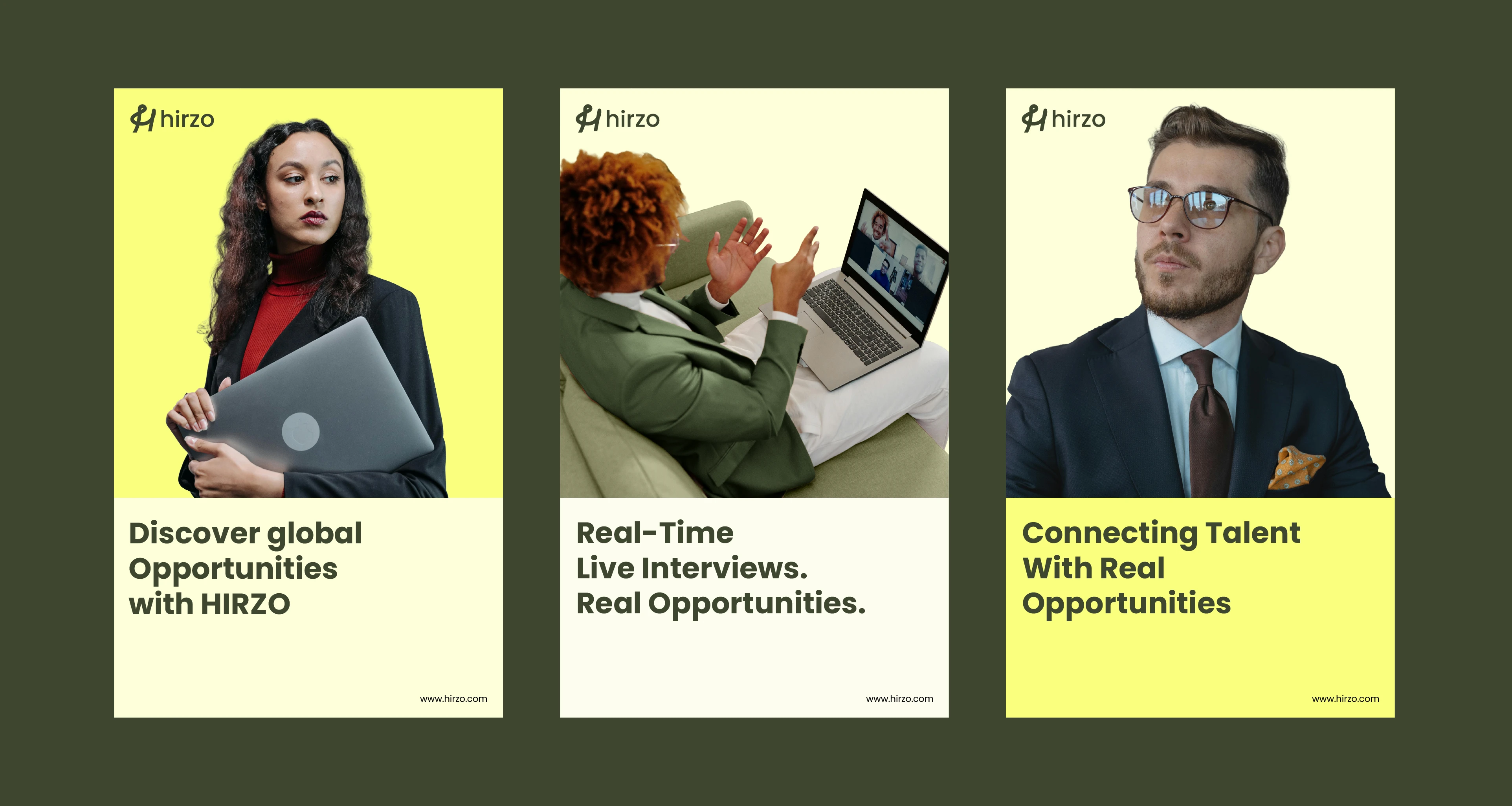
Hirzo is an online job board and hiring platform built to connect job seekers with the right opportunities while helping companies hire smarter. When the team came to us, they had a working product but no brand identity to back it up no visual language, no tone, nothing that could scale with them.
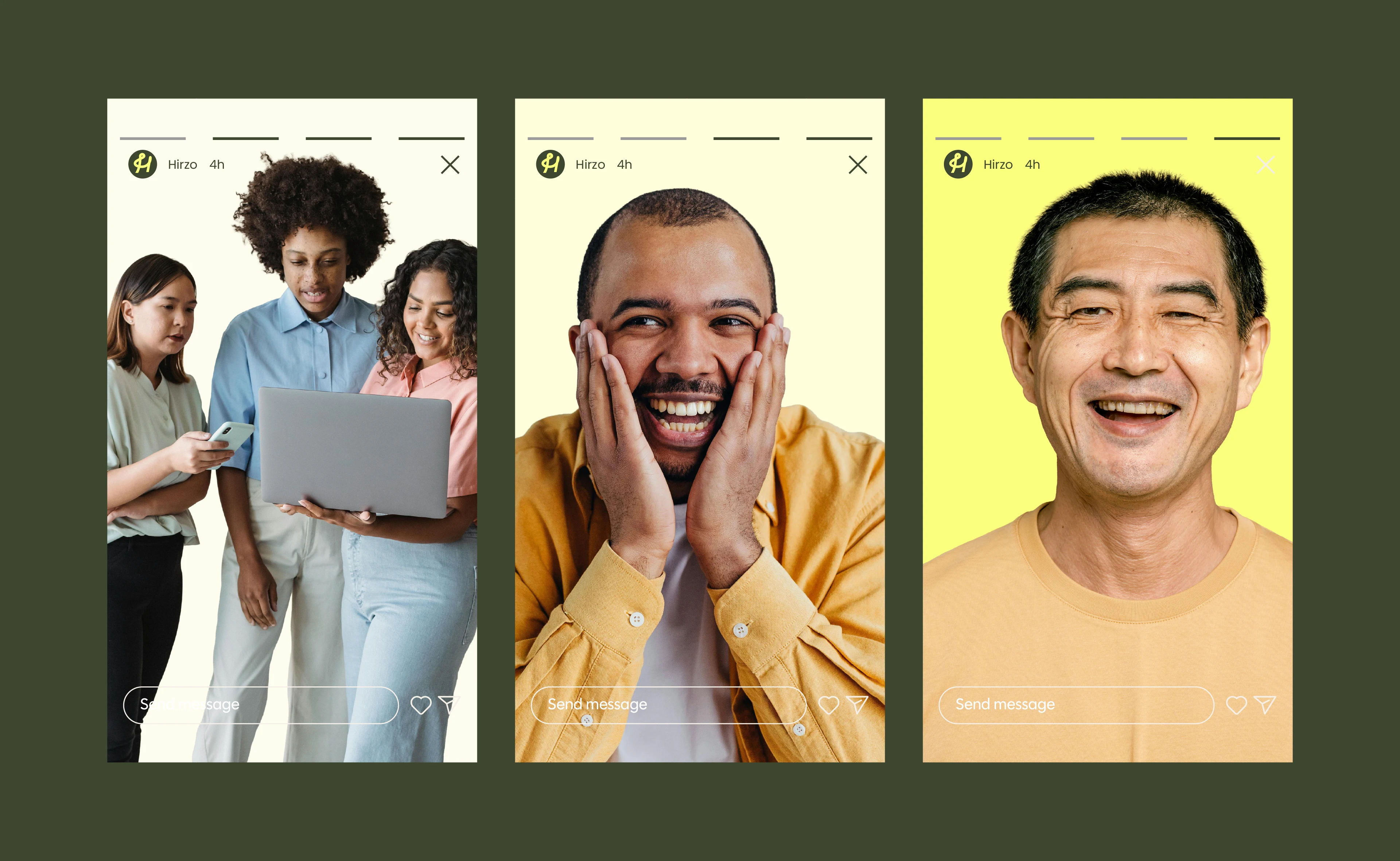
We started with discovery to understand what Hirzo needed to feel like before deciding what it should look like. The brand had to serve two very different audiences: job seekers who need clarity and confidence, and hiring teams who need efficiency and trust. From that, we built a clean, minimal identity rooted in modern SaaS principles a restrained color system, purposeful typography, and a visual language that feels both approachable and professional.
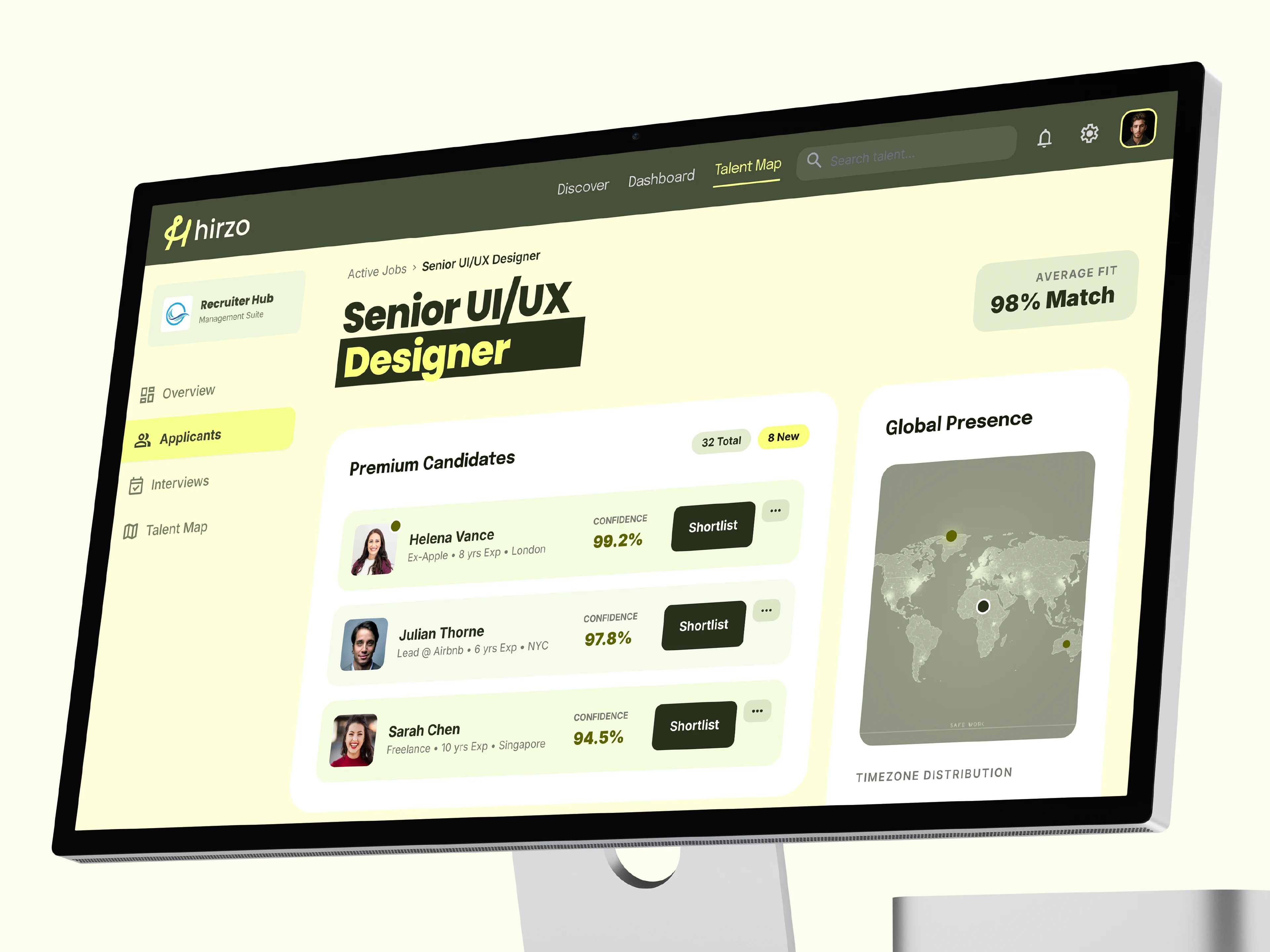
We carried that identity straight into the UI/UX, designing around the two core user journeys without letting either feel like an afterthought. The result is a cohesive platform experience that builds trust at first glance and holds up across every touchpoint.


Like this project
Posted Apr 6, 2026
Hirzo is an online job board and hiring platform that came to us without a defined brand identity.