Vaporwave Brand Design
Graphic Design - Case Study
Making A Statement
With the launch of a new local hotspot reminiscent of an 80s arcade, the team and I at Sons of Kent Brewing Company met with the Arcade owners to create something to make their first summer as a business meaningful. This resulted in the creation of a drink that truly felt like the 80s.
Responsibilities
- Business Research
- Product Naming
- Visual Development
Project Duration
4 Weeks
Tools Used
Adobe Illustrator
Adobe Photoshop
Developing the Feeling
Research Methods Used
Popular Media Search
Interest Group Discussions
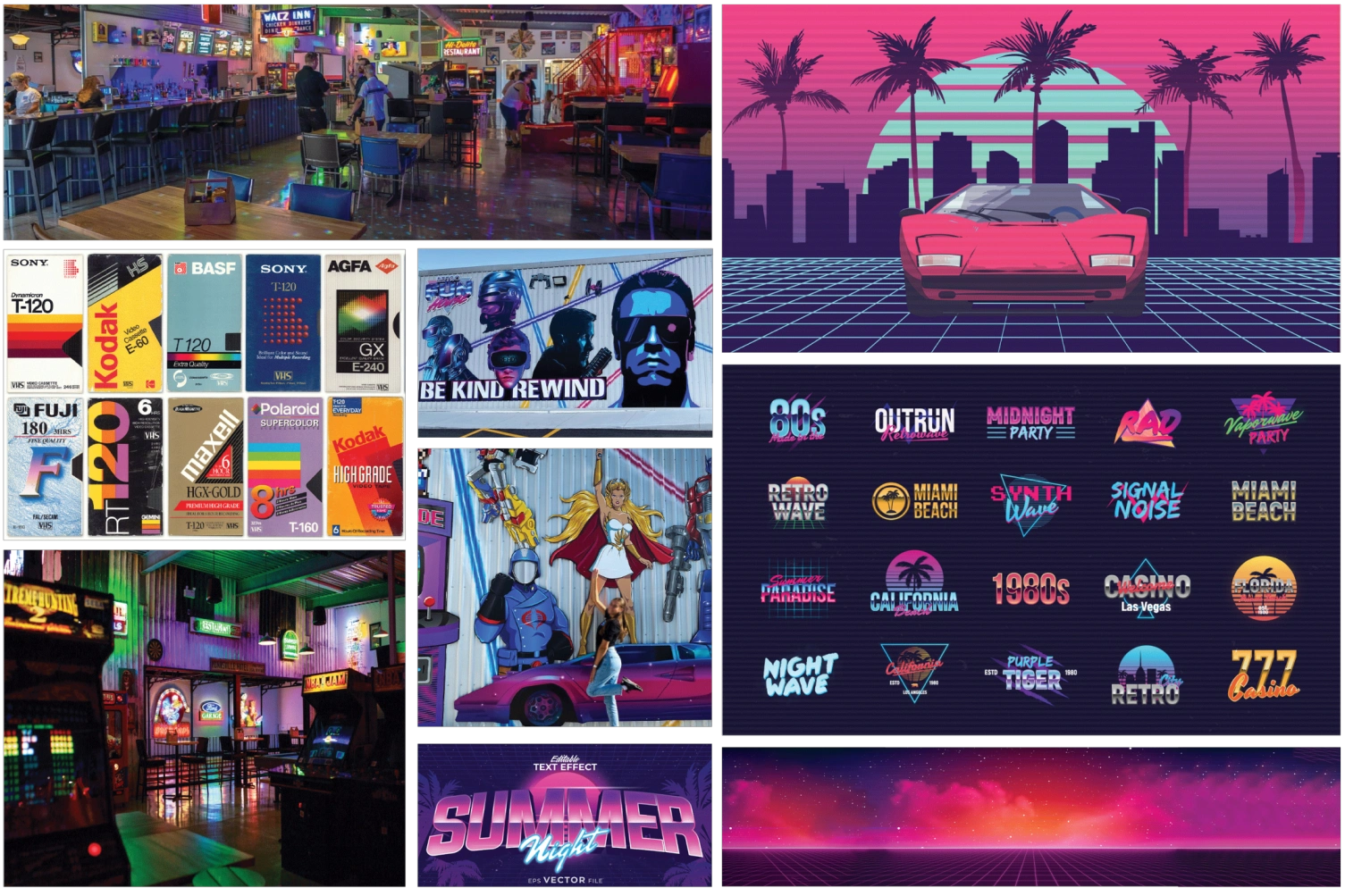
In the journey of crafting the perfect product, the first crucial step was all about diving headfirst into the world of research. While I might be a bit too young to have personally experienced the feeling of spending a Friday night at an arcade, I was determined to ensure our product would capture the very essence of those nostalgic times. This meant not only delving into the atmosphere of Retro Fun House, the arcade we were working with but also seeking out the opinions and memories of those who had the privilege of living through that iconic period.
Key Takeaways
- Make a product with a feeling not just an appearance. This product was nothing like brand products I had completed previously, I wasn't just making that looked visually appealing but something that brought back an old feeling.
- Capturing the era was key. While I had not experienced it myself, the conversations I had with those who had made it very clear that being an 80/90s kid was not just about playing games and being a kid but a piece of time that should be cherished and represented.
Phase 1
From Ideas to Identity
With the research came with the most important aspect of product creation in craft beer, the product name. The drink itself was a cherry cola-based ale which already encapsulates nostalgia, so the name had to be just as fitting.
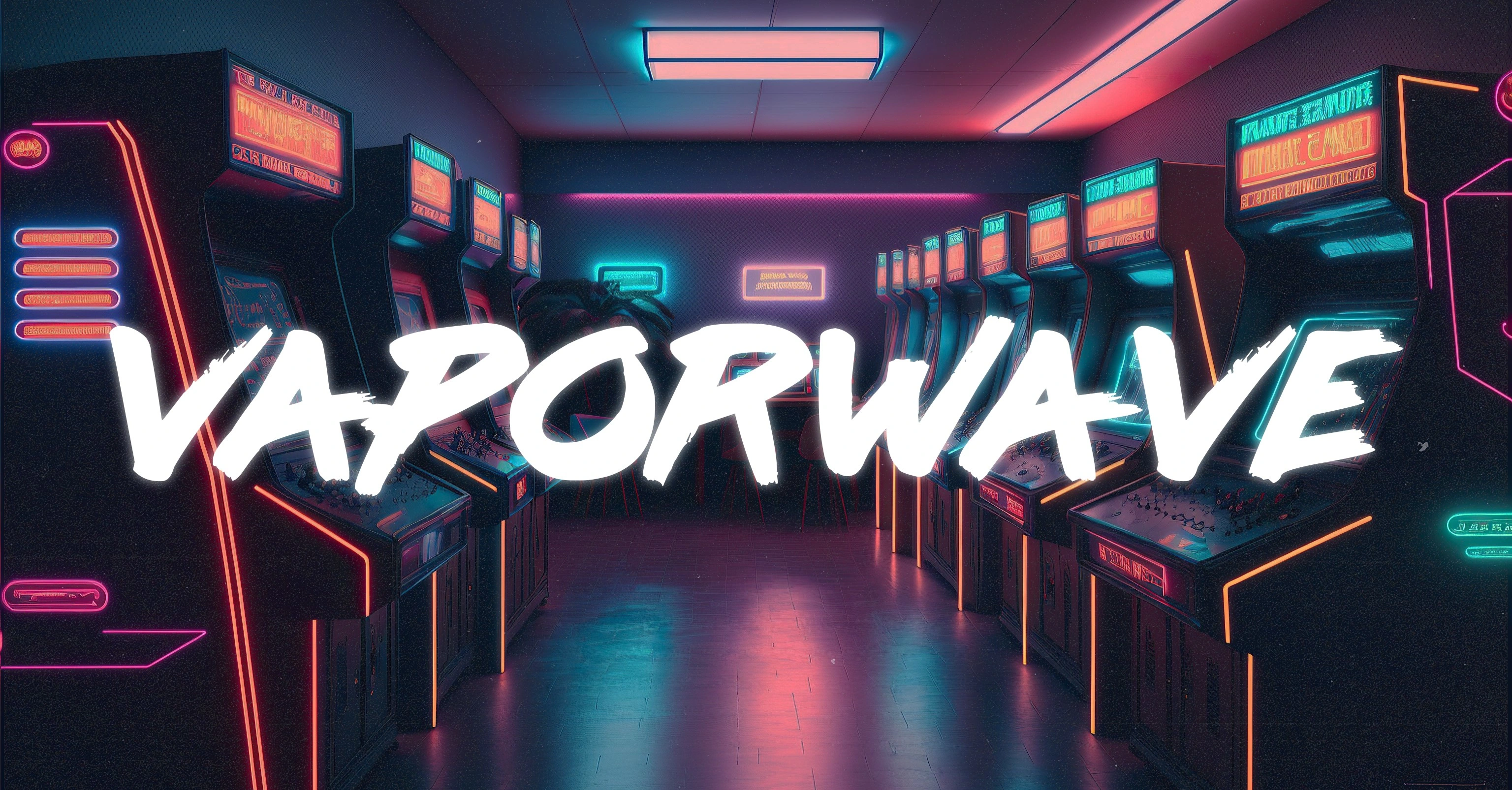
While completing the media search aspect of research I was exposed to countless examples of retrofuturism and the name Vaporwave was finalized. The feeling of the fleeting nostalgia revived by modern ideas is exactly what we wanted to capture in our product and that's what Vaporwave does.
Phase 2
Visualizing the Concept
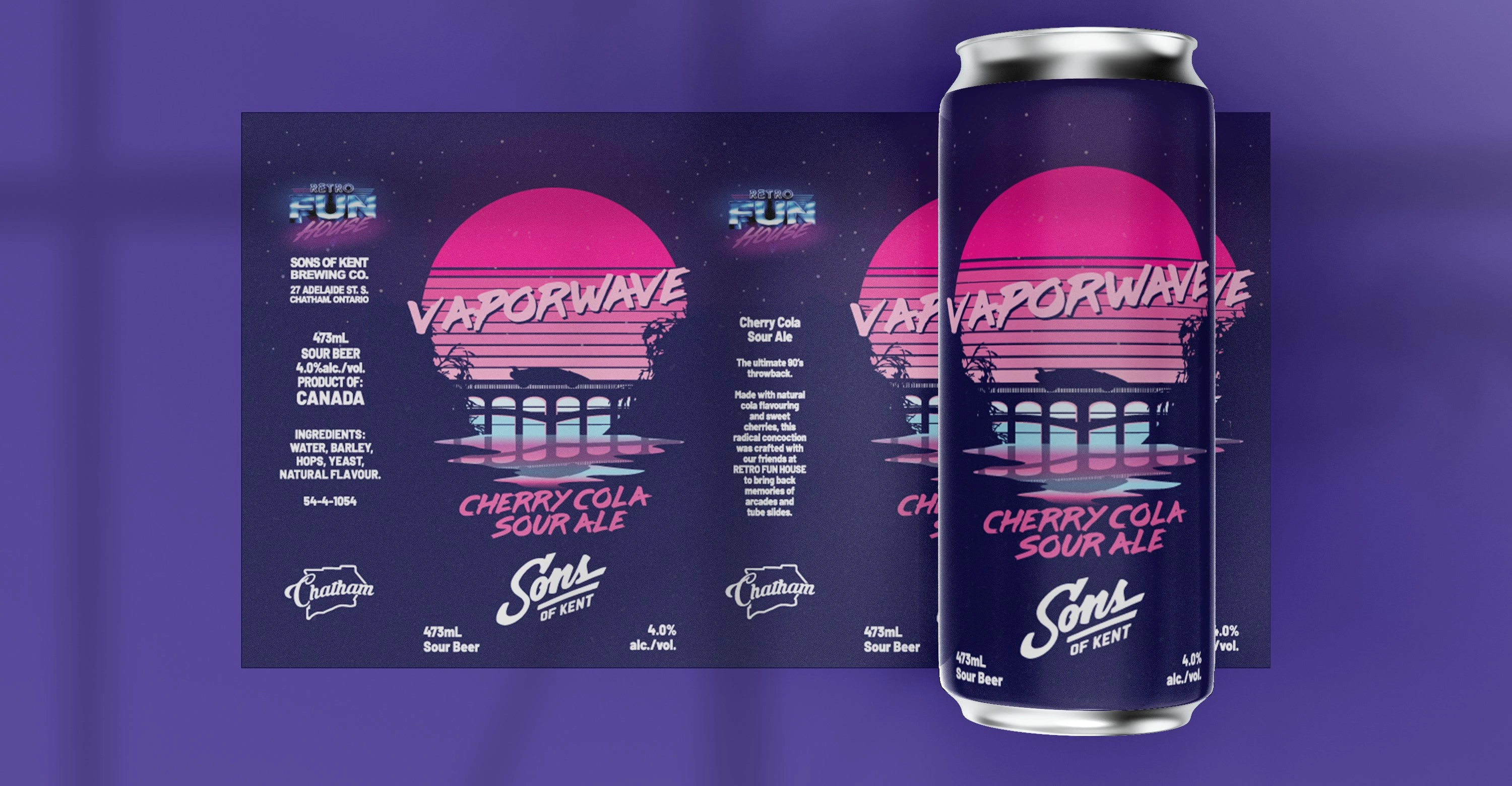
I began the visual aspect piecing together different concepts and images I found recurring in 80s nostalgic designs. Sunsets, fast cars, and arcade machines are where we originally started.
With the aid of a second designer and the marketing team within the brewery, we drew the connection between the sports car on the front of the arcade and an illustration I had developed. This is where everything began coming together. Using the colour palette provided to us by Retro Fun House we developed the first sketch.
Phase 3
Development and Finalizing
With the base idea in hand we knew the final version would require minimal adjustments, mainly just finer details that completed the scene we had depicted.
Typography became the next step. We dug into 80s-style fonts, the bold, bright styles that oozed unstoppable confidence. Choosing the right typeface wasn't just about looks; it was about stirring up all that nostalgia we were aiming for.
My design partner discovered the Lazar84 font and was set. We toyed with the fonts placement, colours, and strokes until we had it exactly how we wanted.
Phase 4
Final Changes
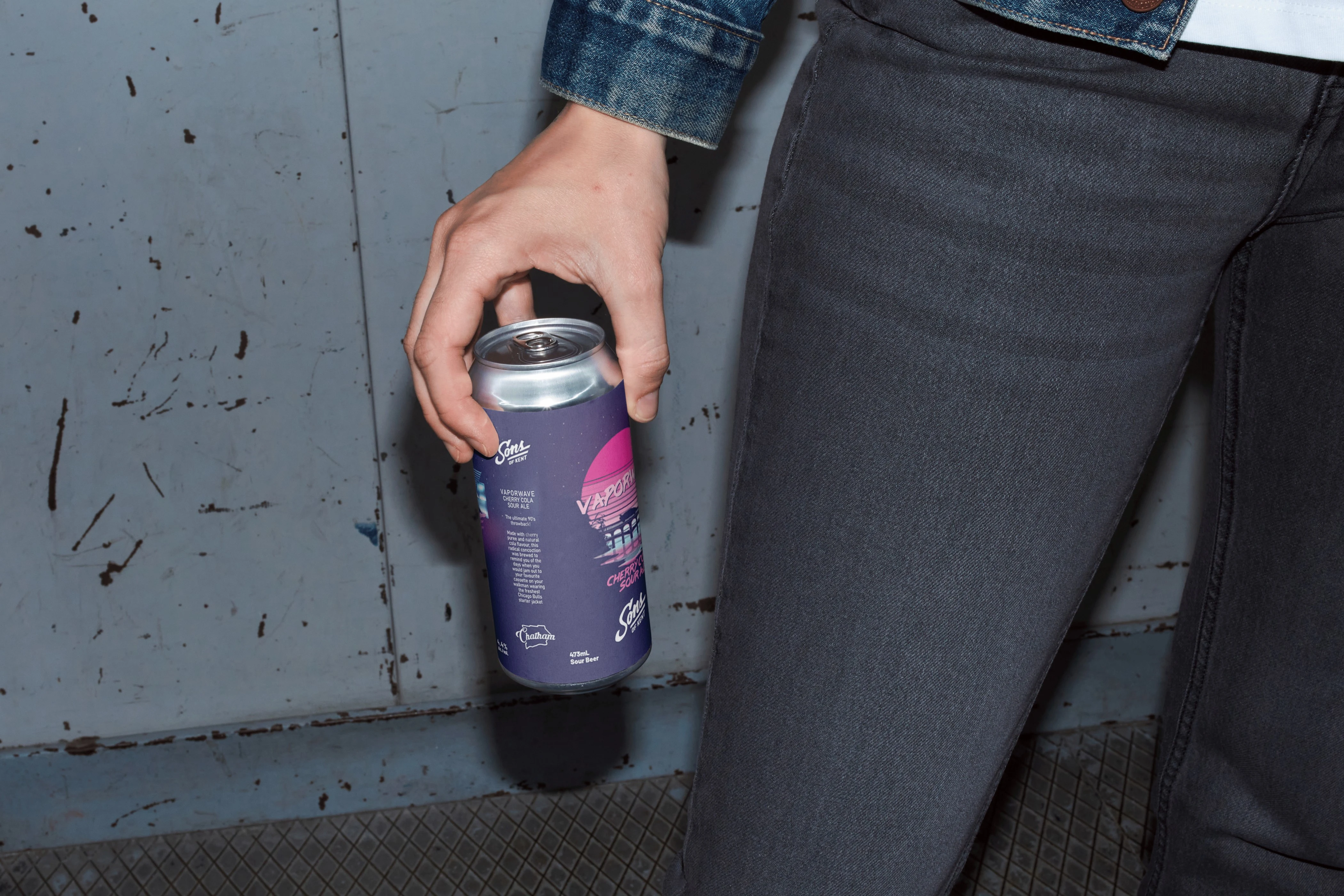
The design was complete and it was taken from my hands to the print, at the request of the client a second version was created by a second designer that only included the company logo and the contents of the drink, having already established the overall theme of the product, the illustration was replaced with the Retro Fun House logo to be sold alongside one another within the arcade and brewery.
Phase 5
Release and Reflect
Everything was done, all goals were completed and both clients were happy. The product flew off the shelves and was sold out within the first few weeks of sales.
It was a blast being the lead designer in this project and by far my absolute favourite piece.
Like this project
Posted Sep 29, 2023
With the launch of a new local hotspot reminiscent of an 80s arcade, the team and I at Sons of Kent Brewing Company needed to make a statement product!
Likes
0
Views
23
Clients
Sons of Kent Brewing Company
Retro Fun House

