Built with Webflow
Webflow website design and development. Paving supply company
Karina Slizova
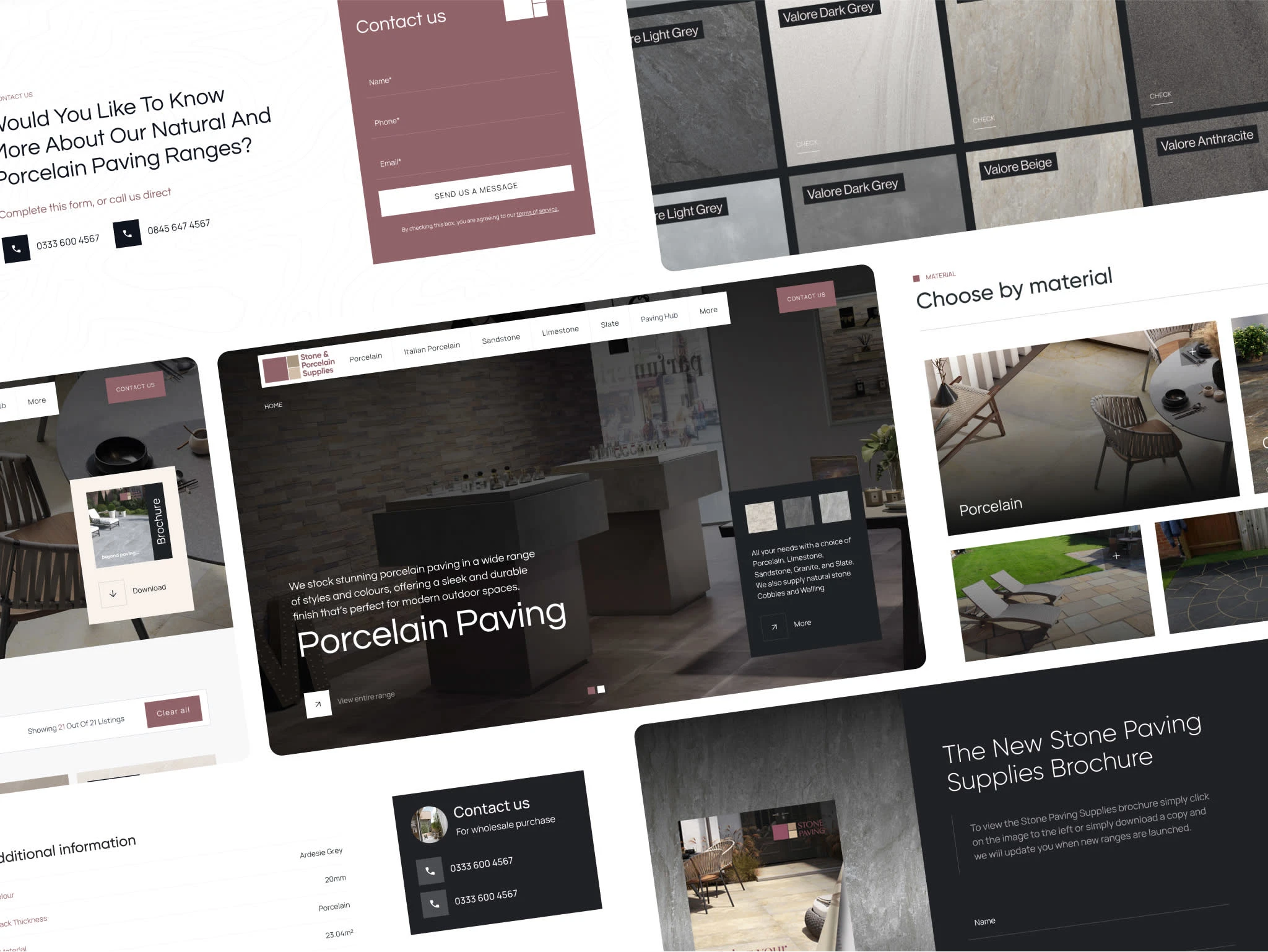
When approaching the design and development of the Stone & Porcelain Supplies website, my priority was to build a scalable, CMS-powered solution that feels calm, minimalistic, and intuitive for users. As a Webflow designer and developer, I always start by understanding the product ecosystem before touching visual layouts – and this project perfectly demonstrates why that strategy matters.
1. Starting with Wireframes: Understanding Product Hierarchy
Before jumping into colors, typography, or layout styling, I spent time mapping out the wireframe structure of the site. The key questions were:
What types of products does the company offer?
How are these products categorised – by material, by range, by application?
What specific information does a customer need to see to make a confident enquiry or purchase decision?
The Wireframe Process
I built low-fidelity wireframes to define:
Homepage Layout – Hero section, featured categories, USPs (e.g. UK-wide delivery), and CTAs like “Find Stockist” or “Request Sample”.
Category Listing Pages – A structure to dynamically list products within each category, allowing future expansion without re-design.
Product Detail Pages – Placement for hero image galleries, product summaries, variant selectors, technical downloads, and “Similar Products”.
Stockist Finder – A dedicated page to locate regional suppliers efficiently.
About, Contact, and Supporting Pages – Consistent layout blocks ensuring brand trust.
This wireframing phase clarified the CMS architecture requirements before design or development began.
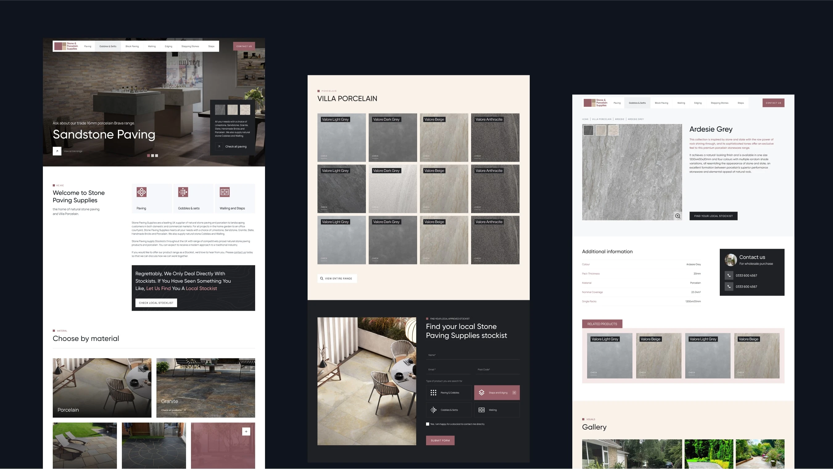
2. Defining the CMS Architecture
After finalising wireframes, I moved into creating a scalable Webflow CMS setup:
Product Categories
I built a Categories Collection with fields for name, slug, featured image, and description. Example categories included:
Villa Porcelain
Traditional Stone
Premier Natural Stone
Weathered Limestone
Steps & Treads
Wall Cladding
Each category template dynamically lists linked products, keeping maintenance efficient for the client team.
Products & Variants
Next, I created a Products Collection with fields such as:
Product Name & Slug
Associated Category (Reference field)
Base Description & Hero Image
Multi-image Gallery
Technical PDF Upload
Application Notes
Multi-reference field to Variants
Variants Collection
Variations are critical for a stone & porcelain supplier. Each variant required:
Name (e.g. Valore Light Grey 600×600)
Color, Size, Thickness, Finish
SKU or internal ID
Variant Image
Stock status or availability notes
Price range indicator if needed
This structure allowed each product to showcase its available sizes, colors, and finishes without duplicating entire product entries. On product detail pages, I embedded a dynamic collection list pulling variant data and swapping images/specs accordingly – creating a seamless UX.
3. Filtering & Ranges
One of the client’s goals was to ensure products within ranges (e.g. Villa Porcelain Brava Range) could be grouped logically for browsing. In Webflow CMS:
Each product was tagged with its range as a category reference or as a dedicated multi-reference field if cross-category.
On the Category or Range listing pages, users can filter by attributes like color, size, or material.
For advanced dynamic filtering beyond Webflow’s native capabilities, I integrated Jetboost to enable live filters without reloading pages. This enhances UX and keeps the site light, fast, and intuitive.
4. Minimalistic, Calm, Brand-Focused Design
After building the structure, I transitioned to visual design in Webflow:
Color & Typography
Palette: Earthy neutrals, stone greys, and soft whites, reflecting natural product textures.
Typography: Clean sans-serif typefaces with subtle weight variation to maintain readability and elegance.
Layout & Spacing
The design focused on breathability with generous white space, allowing high-resolution product imagery to stand out without clutter. Consistent padding, margin, and a baseline grid ensured visual harmony.
Product Pages
Each product page included:
Hero image gallery with variant-linked images
Right-side panel for quick specs and variant selectors
Tabbed content for detailed descriptions, technical specs, installation advice
Prominent CTAs: “Find Stockist”, “Request Sample”, and downloadable PDF links
These layouts were designed first in wireframe and seamlessly translated into Webflow for responsive build.
5. Mobile Responsiveness
Given the audience of installers, designers, and customers browsing on-site, mobile responsiveness was non-negotiable. I built breakpoints for:
1920px+ large screens
Standard desktops (1440px, 1280px)
Tablets (991px, 768px)
Mobile landscape and portrait (479px and below)
All interactive elements, from variant selectors to filters, were touch-friendly with appropriate hit areas and font sizes for accessibility compliance.
6. Stockist Finder CMS
To streamline enquiries, I built a Stockist Collection with fields for region, location, and contact details. The frontend features:
A dropdown filter for region selection
Dynamically displayed stockist cards based on the selected region
Optionally, I planned for future integration of a CMS-driven map if expanded into a nationwide or EU-wide distribution map.
7. Performance, SEO & Accessibility
The final phase involved:
Setting meta titles/descriptions dynamically via Webflow CMS fields
Adding alt-text to all images from CMS fields
Optimising all images to WebP or compressed JPEG, ensuring fast load times
Conducting Lighthouse audits for performance and accessibility adjustments (color contrasts, keyboard navigation testing)
8. Final Testing & Client Handover
Before launch:
I tested each breakpoint and browser for layout issues.
Created CMS training videos for the client, showing how to add new products, variants, and categories without risk to site structure.
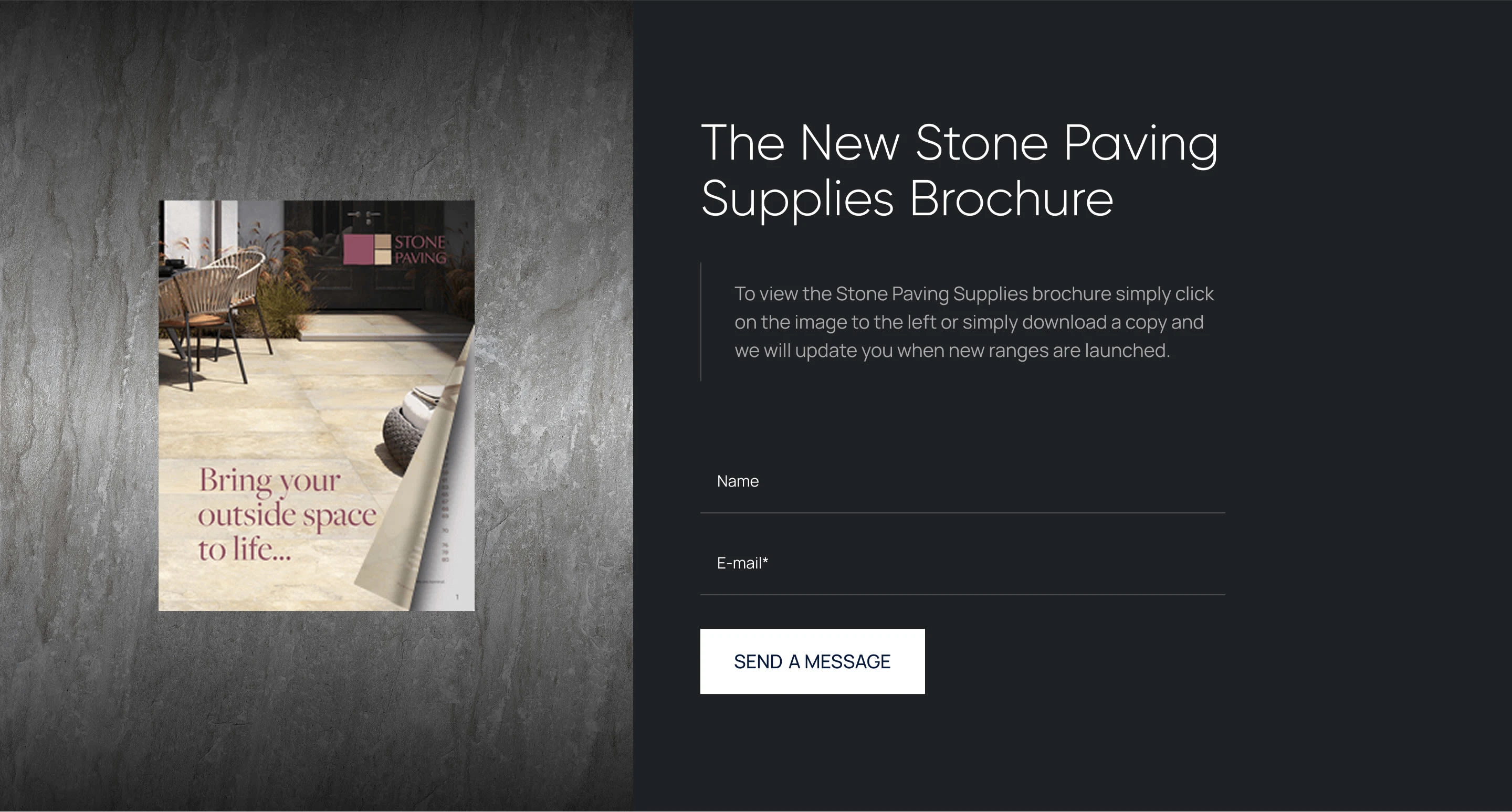
Ensured form submissions (sample requests, contact forms) triggered client notifications with clean, branded auto-responses.
9. Results & Reflection
The final website is a minimalistic, brand-consistent digital catalog, enabling Stone & Porcelain Supplies to:
✅ Present their extensive product ranges with clarity
✅ Offer dynamic product variation displays
✅ Empower their internal team with an intuitive Webflow CMS
✅ Ensure a mobile-first experience for all site visitors
✅ Drive enquiries efficiently via well-placed CTAs and stockist integration
Like this project
Posted Sep 24, 2025
Stone and Porcelain Supplies. Witeframes and Design were created in Figma. After all, design was transferred to Webflow. CMS for Products.
Likes
1
Views
19
Timeline
Apr 1, 2025 - Jul 9, 2025