Respawn Products - Website Design
The Overview
One of my main lead sources came to me with this project and ask me if I could create a fully bespoke custom Shopify website for them. As I specialise in Shopify and ecommerce design solutions this was a matched made in heaven.
Respawn was seeking a full redesign and rebuild of their website, updated with their fresh new brand identity. An additional reason for the redesign and build was that Respawn wanted to move from Woocomerce over to Shopify after hearing all the positives of Shopify.
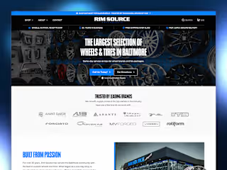
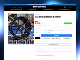
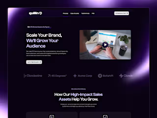
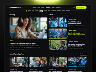
A quick fire, short gif of a few of the pages designed for Respawn Products.
The Problems & Our Solution
At the highest level, what problem did you solve, and who did you solve it for?
Respawn had many issues with their site build at the time, it wasn't following industry best practices for design and development, there was many inconsistencies with branding and UI elements, wasn't meeting accessibility standards as well as wanting to increase their conversion rates.
Here is a list of just some goals we was able to achieve during this project
• Streamline the overall user journey to checkout.
• Utilise the stunning product assets and renders.
• Allow for a more seamless user experience.
• Create a user interface that accommodated the user experience.
The Process
We began with a mini audit of the current site to help identify user pain points and dead ends that could leave to drop offs or even worse, abandoned carts! During this process we was able to empathise with users, define their pain points, and ideate solutions to solve these issues. This helped create base level empathy maps, users personas and journey maps.
Building Wireframes and Low-Fidelity Prototypes
We used our research findings to construct low fidelity wireframes that help plan out the journey we wanted the users to take and avoid using any deceptive patterns. After consulting with the client and everyone was happy with the user experience we moved on to the UI stage.
Applying the UI Elements and Branding
As mentioned a few times, Respawn recently had a brand identity overhaul and had a fresh lick of pain through the company, and we needed to reflect that on the site which the client loved! They was really pleased with how we applied the branding and used their stunning assets and image renders to create really immersive sections on multiple pages through the site.
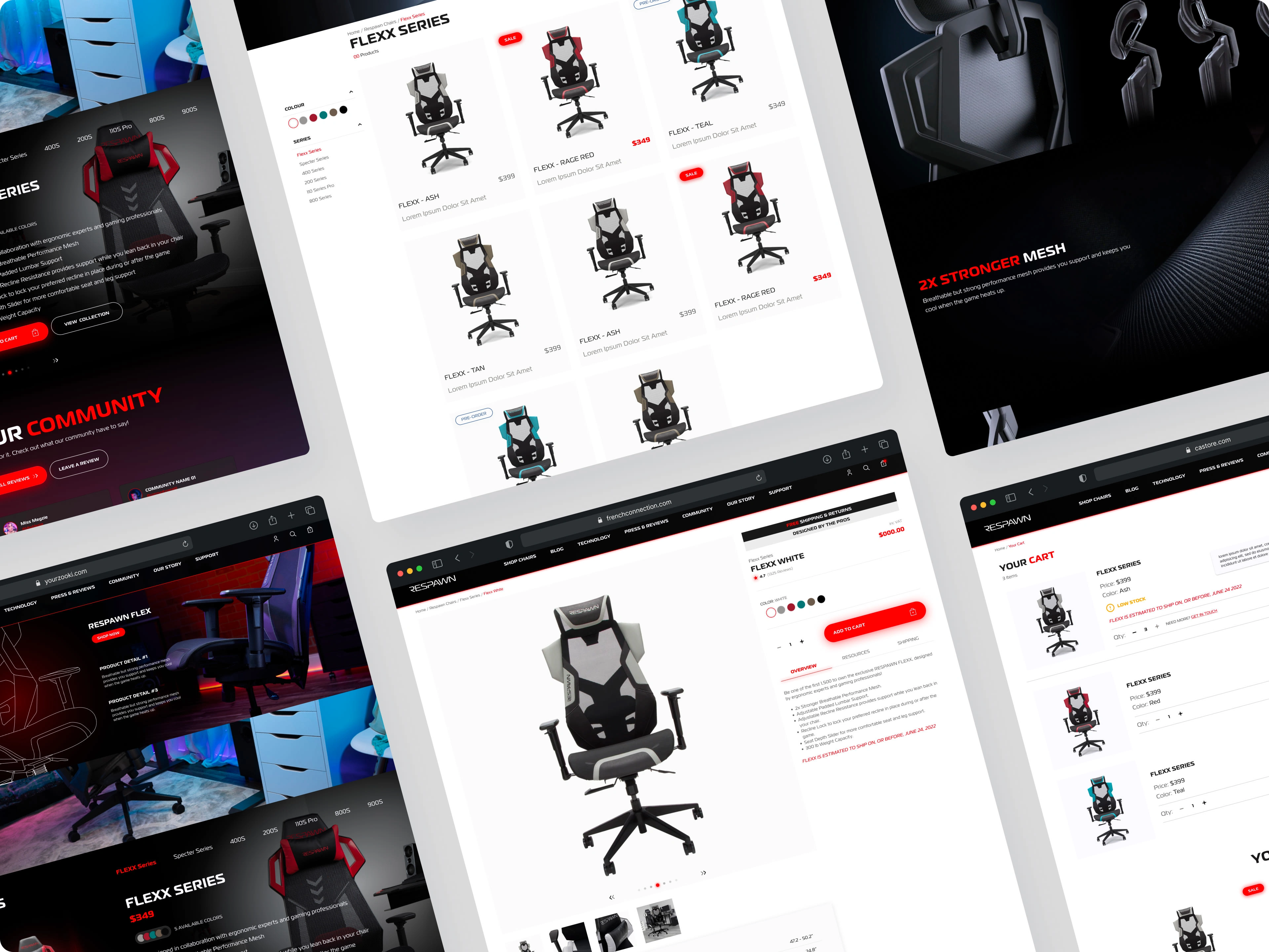
A handful of mockups from this projects.
The Final Results
I truly believe we achieved our goal with this project, our client was very happy with how the site looked and how the site was functioning. The client had very little design rounds and the rounds they did have their was only minor changes, I put this down to really nailing the wireframes which helped create a solid foundation for the UI elements.
As for the development of the website, I feel that the development team really smashed the transition from Figma to a fully functioning website beautifully! Asking for feedback consistently on new page and sections that where being create in order to limit the amount of QA/QC time spent at the end of the project.
Like this project
1
Posted Aug 16, 2023
I took the lead on the design, I had to create a unique user experiences, user flows and user interface that was inline with Respawns fresh new brand identity.
Likes
1
Views
5
Clients

Respawn


