Qoray Mobility Web & Mobile Payment and Admin System

Josiah Bello


Project Description
Qoray (by Sterling) is a comprehensive e-mobility ecosystem revolutionising Nigeria's transportation through sustainable electric vehicles. Focusing on light electric vehicles (LEVs) - from two-wheelers to mini-busses - Qoray tackles EV adoption barriers through integrated charging infrastructure, financing solutions, and technical support. Named after the Hausa word 'Kore' meaning 'Green', our platform delivers cost-effective, clean energy mobility solutions that empower communities through strategic partnerships and innovative infrastructure.
Overview
"Qoray (by Sterling) is an innovative e-mobility initiative inspired by the Hausa word 'Kore', meaning 'Green'. As a pioneering clean energy-powered mobility solution, Qoray combines cutting-edge technology with sustainability to deliver high-quality, cost-effective, and reliable products. Our mission goes beyond transportation - we're building a greener future by empowering communities and fostering strategic partnerships that drive sustainable mobility innovation.”
Goal
The client tasked us with creating a comprehensive payment ecosystem for Qoray that would seamlessly handle battery swapping and charging payments. Their primary requirement was to develop two interconnected systems: a user-friendly, mobile-responsive payment platform that would allow customers to easily manage their transactions through multiple payment channels and a powerful administrative dashboard for tracking payments and managing different customer segments.
The fundamental idea was for customers to have a smooth payment experience with built-in wallet functionality, while giving Qoray administrators complete control over transaction monitoring, customer type management (individuals, communities, and corporates), and vehicle owner payments. The client emphasized scalability, with plans to evolve from a mobile-responsive web application to a full-fledged mobile app in future iterations.
Creating a Product Experience: From Vision to Visual Design
At its core, the Qoray Payment System needed to blend functionality with simplicity while maintaining high-security standards. Our design approach focused on creating an intuitive payment flow that would instil confidence in users while making battery swapping and charging payments effortlessly.
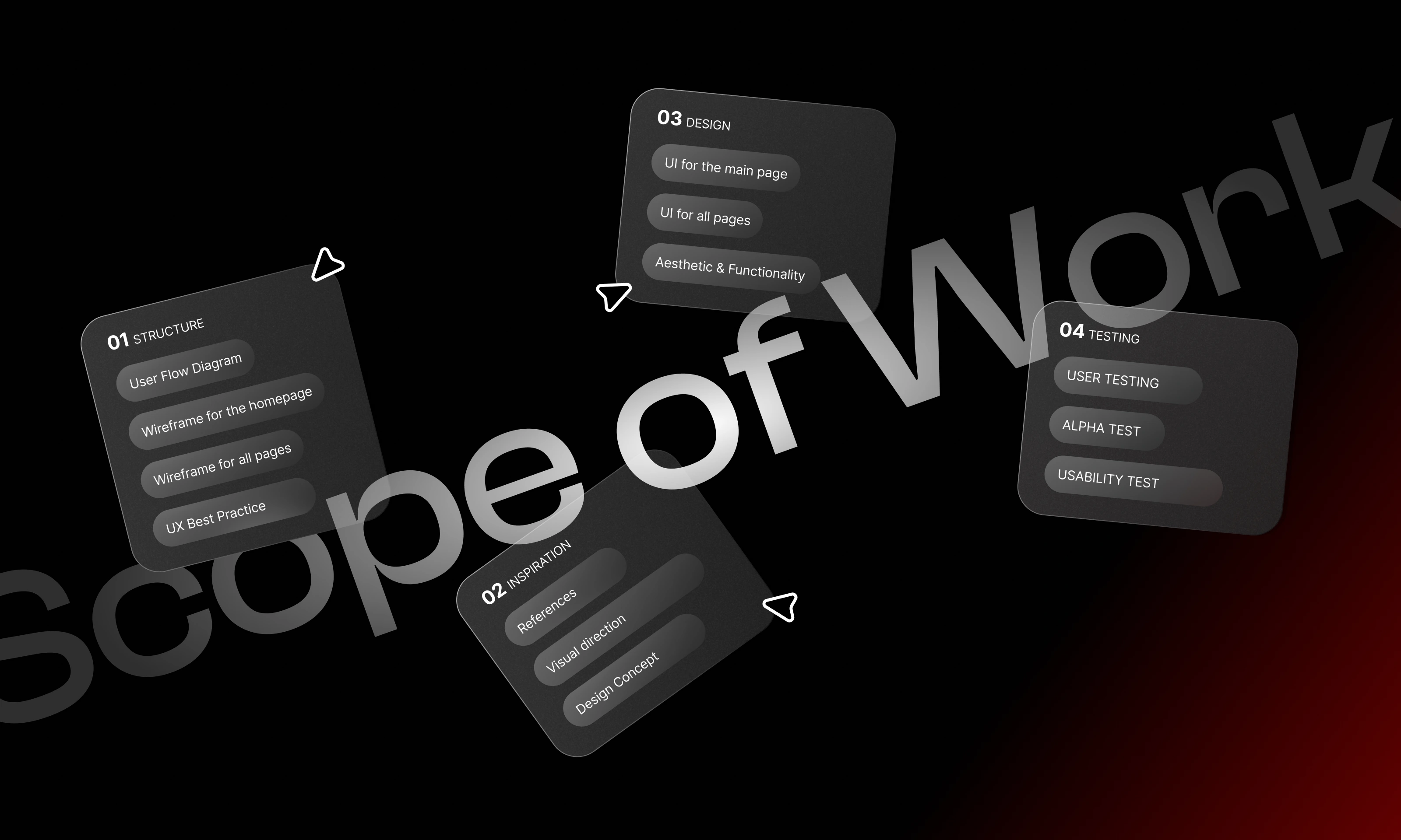
The UI Design Process
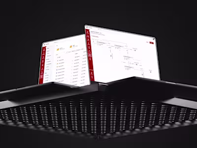
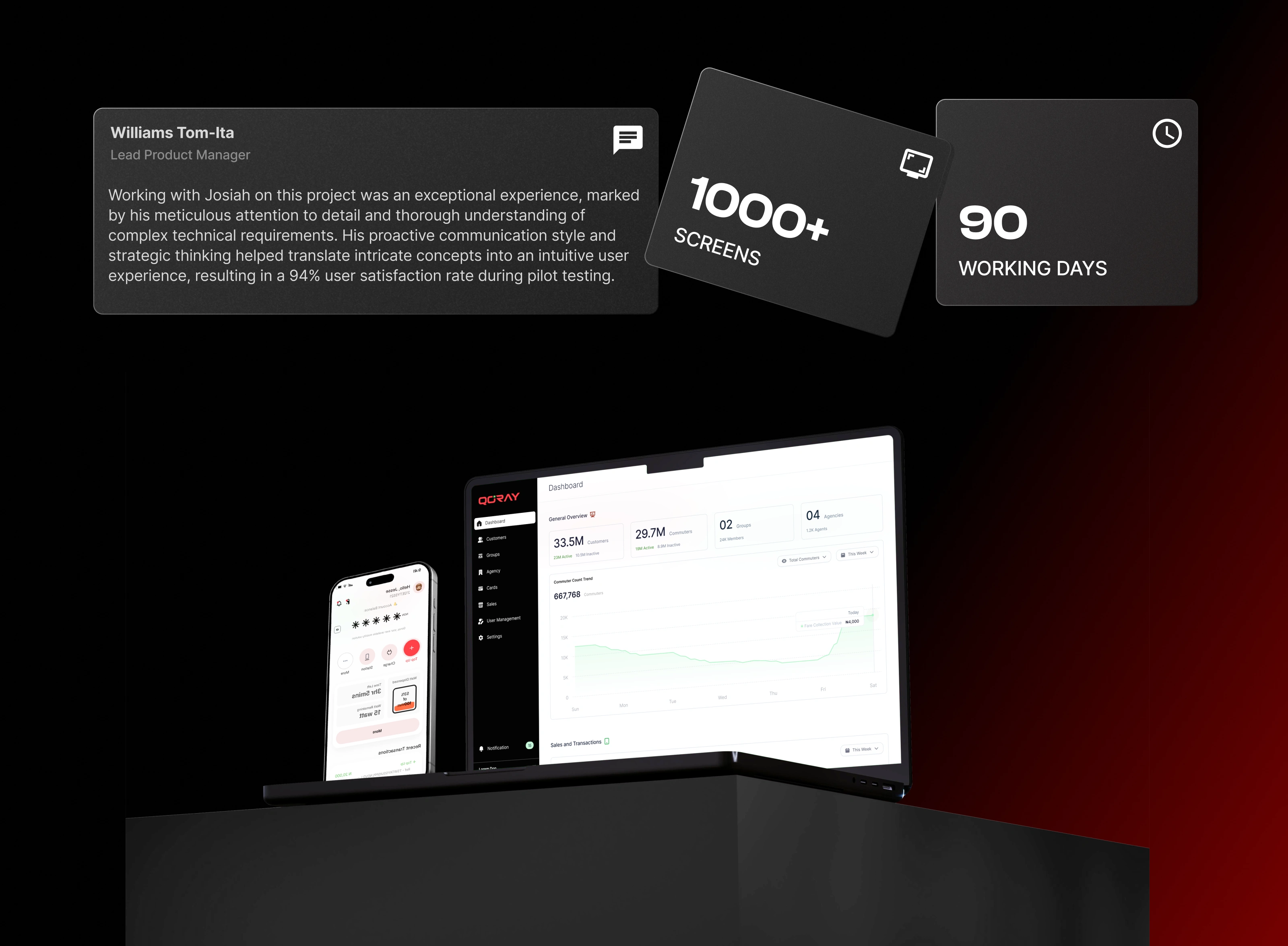
We started by designing the payment platform's core interface - the dashboard. This central hub displays essential information like wallet balance, transaction history, and quick-access payment options. Users can easily navigate between different payment methods, manage their wallets, and track their battery swapping/charging activities all from one cohesive screen.
The administrative interface was crafted to provide comprehensive oversight while remaining intuitive. Clear data visualization, customer segment management tools, and transaction monitoring features were carefully arranged to support efficient workflow management.
Crafting a Cohesive Visual Identity for Qoray
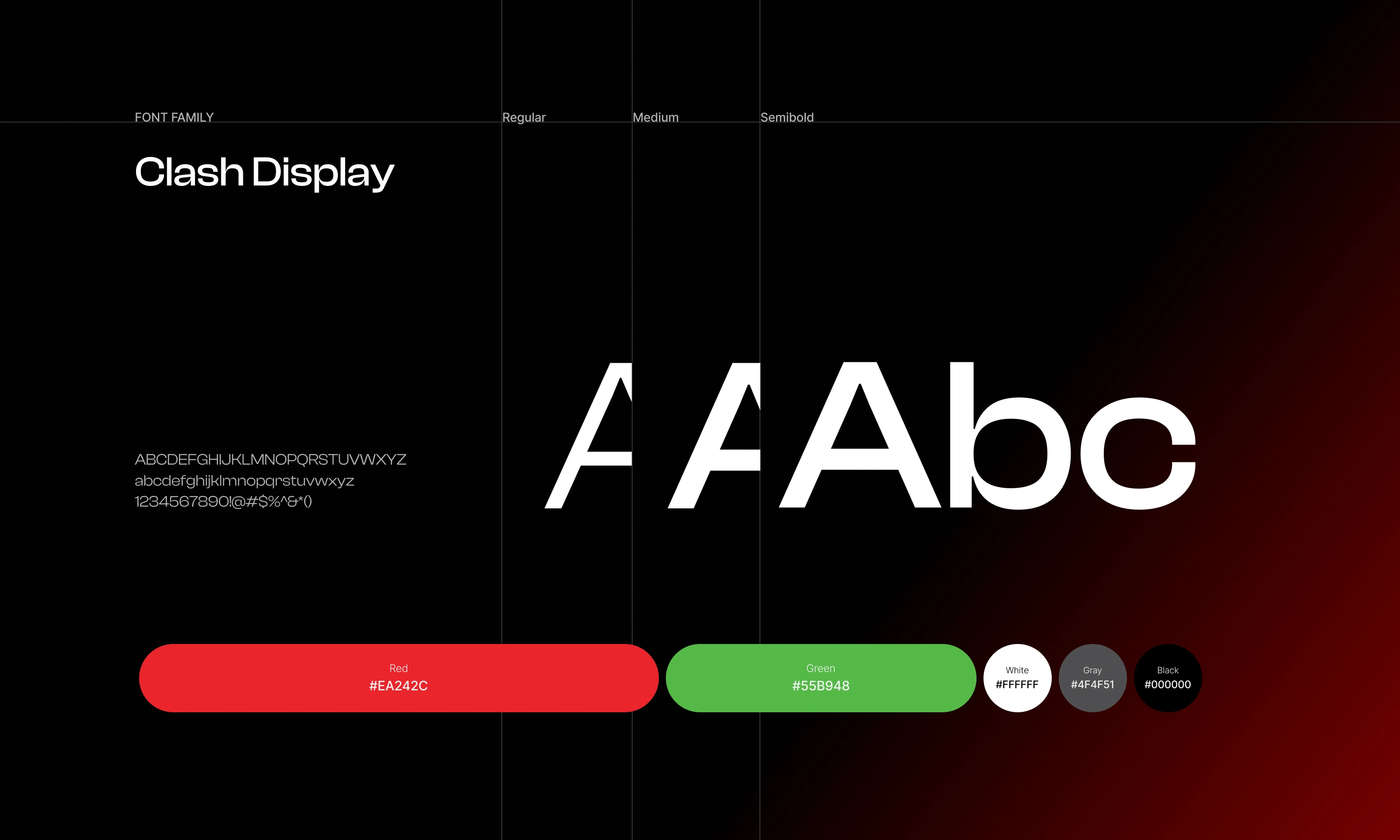
Our design approach to the Qoray Payment System focused on developing a cohesive visual language that would resonate with the platform's diverse customer base. From the vibrant color palette to the distinctive iconography and impactful typography, every element was carefully crafted to cultivate an engaging, trustworthy, and user-centric experience.
The Qoray Color Scheme: We established a vibrant, future-forward color scheme that forms the foundation of the visual identity. Anchored by a bold primary palette of greens and blues, the color system is accented by warm neutrals and pops of complementary hues. This dynamic range allows for eye-catching highlights and clear information hierarchy across the interface, reinforcing Qoray's progressive and sustainable positioning.
Intuitive Iconography: Custom iconography plays a crucial role in enhancing the user experience. Drawing inspiration from the platform's clean energy focus, we crafted a library of distinctive icons that visually represent key features and functionalities. These icons seamlessly integrate with the overall visual language, serving as intuitive wayfinding elements that help users navigate the interface with ease.
Impactful Typography: Carefully selected typography lends an air of professionalism and accessibility to the Qoray brand. The primary typeface, a modern sans-serif, strikes a balance between clear legibility and a contemporary aesthetic. Thoughtful typographic hierarchy, sizing, and spacing create a cohesive and visually striking interface, ensuring optimal readability and information hierarchy. By meticulously crafting these core visual elements, we were able to bring Qoray's progressive vision to life through a cohesive, user-centered design approach that resonates with the platform's diverse customer base.
Delivering Measurable Impact with Qoray.
The Qoray Payment System has delivered exceptional results, elevating the user experience and driving meaningful engagement.
Intuitive Workflows and Visually Appealing Interface Seamless navigation, clear information architecture, and distinctive UI elements have created a frictionless experience that empowers users to manage their payments with confidence.
Increased User Engagement The integration of gamification elements has significantly boosted user interest and motivation. Customers actively track their transaction history, manage digital wallets, and explore Qoray's payment options.
Like this project
Posted Oct 27, 2025
Developed a comprehensive payment ecosystem for Qoray's e-mobility platform.
Likes
0
Views
0
Timeline
Apr 8, 2024 - Aug 19, 2024