Landing Page CRO Audit System Development
Laura Castano
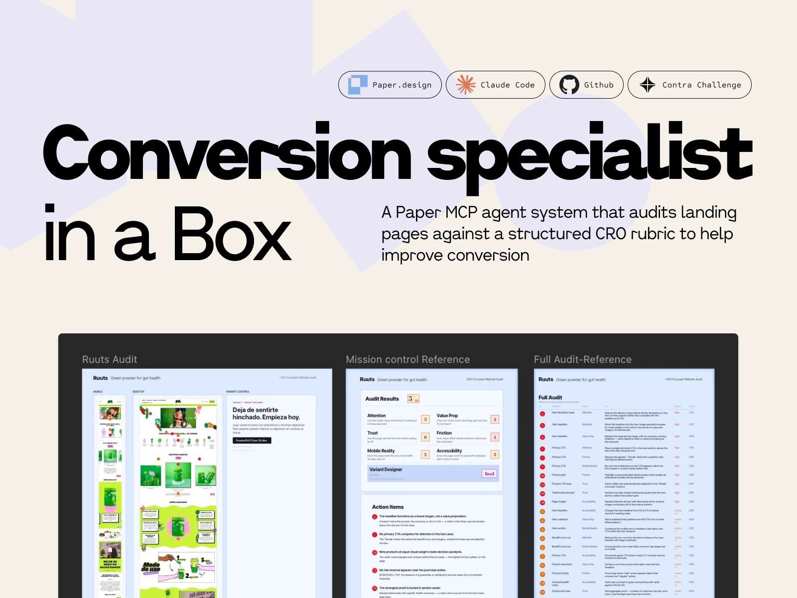
Conversion Specialist in a Box
A Paper MCP agent system that audits landing pages against a structured CRO rubric.
What the system is for
Designers and product owners lose objectivity on their own pages. You look at the same hero fifty times and you stop seeing what a first-time visitor sees. Twenty of those times you've already half-flagged a thing that isn't quite right — the headline, the third CTA, the mobile hero — but it's easier to keep moving than to open it up.
This is the second set of eyes.
It runs the audit I'd run on a client's page, scores the six areas where pages actually leak, and hands you back a prioritized action plan with pins on the screenshot that line up to a table of fixes. Some of what it flags you'll already suspect; that's the point. Reinforcement on the things you've been meaning to look at, plus the ones you've stopped seeing.
The rubric
Six categories, all standard CRO territory: Attention, Value Prop, Trust, Friction, Mobile Reality, Accessibility. None of these are controversial — any CRO practitioner would recognize them.
The design work wasn't in inventing the categories. It was in turning them into something an agent could execute consistently across different pages. That came down to two specific decisions:
Scoring anchors at three bands. Each category scored 0–10, with anchors at 9–10 (good), 5–6 (functional but leaking), and 0–2 (broken). A 7 is a 5–6 that's trying; an 8 is a 9–10 missing one thing. A rater — human or agent — picks the nearest anchor and nudges. The value of three anchors instead of ten is that the rater always makes the same class of decision. You're not arguing between a 6 and a 7 from scratch; you're deciding whether a leaking page is trying or not.
Splitting category score from fix-level impact. A category can score 3/10 and still contain a low-impact fix if that fix isn't the binding constraint on the page. A category can score 7/10 and contain a high-impact fix if one element is leaking hard. Score grades the page; impact grades the fix. Two different questions, and the rubric answers them separately. Without that split, a reader sees six scores and can't tell which broken thing to do first.
The split also sets up the handoff. Once the rubric returns scored fixes with impact tiers, the next step for a designer or PM is an effort/impact matrix against their own stack and capacity — is this a Webflow text change I can do in ten minutes, or does it need engineering? The rubric gives you the impact axis pre-filled. You supply the effort axis based on what you actually ship on. That's the part only a person in the company can answer.
The rubric itself ships as a forkable markdown file, stack-agnostic and résumé-free. It travels as a standalone artifact — the receipts belong in this post; the rubric just has to be usable by whoever picks it up.
The architecture, built for Paper
Paper works in artboards on a shared canvas. The agent talks to the canvas through a single MCP client, and anything that writes to an artboard has to do it through that client. That's the constraint the architecture is shaped around.
I looked at three ways to wire the agents.
One agent, one long prompt. Simple to build, but the output reads like one voice giving six opinions.
Six agents writing in parallel. Fast, but the single MCP client means two agents trying to place annotations simultaneously produce a mess of overlapping writes.
One orchestrator, six specialists dispatched in sequence.
The orchestrator holds the canvas state and is the only process that writes to Paper. It loads the live page content and the screenshot artboard, then dispatches each specialist in turn — Attention, then Value Prop, then Trust, then Friction, then Mobile Reality, then Accessibility. Each specialist evaluates only its category and returns structured JSON. The orchestrator collects all six returns, reconciles them into one annotation layer, assigns pin numbers in reading order, and renders three views on the canvas.
The orchestrator doesn't score. Its job is to dispatch, collect, reconcile, and render. The scoring judgment lives inside each specialist, inside its category. This separation is what keeps the output structured — each specialist stays on its own question, the orchestrator does the integration, and the canvas gets written once, cleanly, by one process.
There's also a mission control row across the top of the audit area — seven circles, one per specialist plus the conditional variant. The orchestrator emits a state update every time a specialist transitions from pending → active → complete (or skipped, for the variant). The currently-running specialist animates; completed ones show their score; the whole row tells the audit's story as it populates. Sequential dispatch would otherwise look like the canvas was frozen; mission control turns that into the visual signature of the system.
The layer behind the audit
Running a landing page audit in Figma from a screenshot is a known pattern. Designers have been doing it for years — paste the screenshot, drop pins, write fixes in the margin.
The extra layer this system adds, and the one I think is the actual quiet differentiator: it reads the live site, not just the screenshot. The specialists pull the published page content and evaluate it against that authoritative source. Then the findings get mapped back onto the screenshot as numbered pins, with each pin tying to a row in the audit table.
Screenshot audits can miss what isn't visually obvious. Live-site reads catch those. And keeping the screenshot as the annotation target means you still get a visual artifact anyone can read: the designer, the PM, the founder who owns the page, the stakeholder who asked what's wrong with conversion.
The seventh specialist — why the hero matters
There's a conditional seventh specialist: the Variant Designer. It generates a rewritten hero block beside the original, but only fires if the Value Prop or Friction score is 5 or below.
The hero is the highest-leverage part of any landing page. It's the first — and often only — thing a visitor sees. It has to answer four questions inside the first few seconds: What is this? Who is it for? How does it work? Why should I care now?
Most visitors never get further. Industry data puts average landing page bounce rates at 40–60% on well-built pages and 70–90% on unoptimized ones. Which means if the hero is failing on any of those four questions, it's not one of the problems — it's the problem. The headline, the subhead, the CTA label, the first visible proof: that's the conversion surface.
That's why the Variant Designer is a separate specialist with a threshold. Rewriting a hero on a page that's already answering the four questions well adds noise. Rewriting it on a page that isn't is the single most impactful thing the system can do. The OR condition — Value Prop or Friction ≤ 5 — means either weakness in the hero area is enough to justify the rewrite. Both categories are where the hero carries the weight.
When the rewrite fires, it renders in the Variant Control frame beside the original, in the page's native language. When it doesn't fire, the Variant Designer badge shows skipped and the agent moves on. That skip state is information, too — it tells the reader their hero is doing its job.
Two pages to test the rubric
The demo runs on two pages in the same category, one obviously optimized and one with room to improve. Same product (greens powder), same language (Spanish), same buyer intent.
Ruuts (ruuts.com.co) — Colombian DTC greens powder. Polished but leaky. Typography, photography, and brand voice are competent. The weakness is in conversion craft. The "looks great but leaks" pattern — which is where a rubric has to actually do work, because visual polish would otherwise hide the problems.
AG1 (drinkag1.com/es-eu) — European Spanish localization of the global greens leader. Not the US version, which would score 9s across the board and tell me nothing. The EU Spanish variant has the same conversion craft but pays a localization tax, so it's a strong page with specific, honest gaps.
Two reasons for running it on both.
One. I needed to see if the rubric discriminates. A rubric that scores every page as leaky is useless — it flags everything and helps nothing. Running it on an obviously strong page and an obviously weak page in the same category lets me see whether the scoring bands actually separate conversion craft, or whether the rubric is just pessimistic. If AG1 came back scoring 4s and 5s, that was a problem I needed to find before submission.
Two. The two pages together make the output more useful to a reader. Seeing what a 7 or 8 looks like next to what a 4 or 5 looks like gives a designer or owner a reference point — this is what a well-scored Mobile Reality looks like, and this is what a leaking one looks like. Abstract scoring bands are less useful than two real pages with their fixes visible.
What the scores showed
Ruuts averaged 4.83 — overall 5. Attention 5, Value Prop 4, Trust 6, Friction 4, Mobile Reality 5, Accessibility 5. The rubric returned 26 fixes across 19 pin locations: 10 high-impact, 11 medium, 5 low. Variant Designer fired — Value Prop 4 and Friction 4 both tripped the ≤ 5 condition.
AG1 averaged 7.83 — overall 8. Attention 8, Value Prop 7, Trust 9, Friction 8, Mobile Reality 8, Accessibility 7. 13 fixes, most medium-impact, sharply asymmetric distribution across categories. Variant Designer skipped.
Every AG1 category scored higher than the corresponding Ruuts category. No overlap on any axis. A 3-point average spread with non-overlapping fix profiles — Ruuts got structural fixes, AG1 got polish-level ones.
The detail that made me trust the specialists: the Friction agent caught an untranslated "View Supplement Facts" button on an otherwise fully-Spanish AG1 page and correctly framed it as Friction — language-switch hesitation at a decision point — not a copy error. An agent that notices one English button in a sea of Spanish and routes it to the right lane is behaving like a real designer.
What gets shown
The canvas is one audit document across three artboards.
Mission Control is the scorecard: six category badges in a 2×3 grid, each with its score in Fraunces 83px at the band color. Variant Designer in its own row underneath in a separate panel. Legend strip below. Action Items at the bottom: five high-impact fixes written as narrative sentences. The executive summary.
Screenshots + pins is the evidence artboard: mobile on the left (the Mobile Reality fixes), desktop in the center (the rest), Variant Control frame on the right with the rewritten Ruuts hero. Pins numbered top-to-bottom, left-to-right, so pin-to-row matching is mechanical.
Full Audit is the complete table: 26 rows for Ruuts, sorted impact descending, then pin ascending within each tier. Columns: pin, element, persona, fix, impact, score.
Three artboards, layered by information density. Mission Control = how bad is it. Evidence = where are the leaks. Full Audit = complete sortable record. Each one does a different job, and together they're not feedback — they're a roadmap. Scored diagnosis, impact-ranked fixes, clear next action.
The demo video is a replay of the run. The orchestrator dispatches the six specialists in sequence, each badge populates on camera with its score in the correct band color, Action Items fills in, the full audit table writes itself row by row, and the Variant Designer fires last — badge updates, rewritten hero generates in the Variant Control frame, Audit Results header locks in at the top with the page's overall verdict. The canvas does the work.
What I wanted out of this
A tool that a designer or product owner could actually use.
When you've been looking at your own landing page for weeks, you stop seeing it. A fresh set of eyes — calibrated to the patterns that matter for conversion — is genuinely useful, especially when it gives you something structured to act on instead of vague feedback. Score, pin, priority, fix. Not "this feels off."
The receipts at the top of this post are what make that calibration worth trusting. Cartopia, NASM, Zoomforth, and NextFi are where this rubric came from — the places where this way of looking at pages turned into real numbers. The agent doesn't know anything I don't. It just applies the same pass consistently to any page you point it at.
If you're a senior PM or design hiring manager at a DTC brand and this is the kind of thinking you want running on your landing pages — I'm open to work.
Like this project
Posted Apr 22, 2026
Developed a system to audit landing pages and provide actionable feedback for CRO improvements.
Likes
0
Views
8
Timeline
Apr 17, 2026 - Apr 20, 2026