Product Launch Website Design
Nicole
Designing a Product Launch Website in 30 Days
Helping a community tech startup communicate value and drive early product exposure
Overview
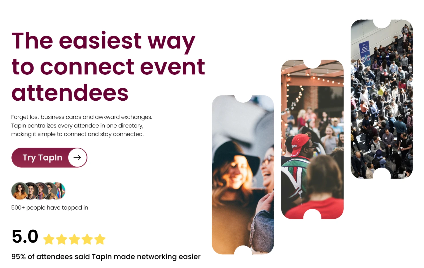
TapIn is a community networking product designed to help event attendees build meaningful connections and retain them after the event. I partnered closely with the founder to design and build a marketing website that introduces the beta product and encourages early adoption.
The project had a tight timeline of thirty days. The main challenge was not only visual execution but also shaping how the product should be understood by users who had never experienced it before.
My focus was to use behavioural science principles and research insights to craft a simple narrative that lowers cognitive effort, builds trust, and motivates action.
Understanding goals and behaviour
The founder’s goal was clear. Increase product exposure before launch and help potential users quickly grasp the core value.
Through conversations with the founder, product builders, and early users, several behavioural patterns emerged:
Event networking often feels overwhelming and unstructured
Users struggle to remember who they met after events
Organizers lack actionable data to measure community impact
People are motivated by relevance and social proof
These insights shaped the website strategy. Instead of presenting features first, the design focused on helping users recognize their own pain points before introducing the solution.
Designing with behavioural science
I structured the website to guide attention and reduce decision friction.
Progressive disclosure
Information is layered from simple to detailed. Users first understand the problem, then the product flow, then deeper feature explanations.
Cognitive load reduction
Content blocks were kept visually digestible with clear hierarchy and predictable scanning patterns. This helps users build confidence as they scroll.
Motivation and trigger alignment
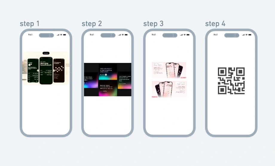
Call to action placement followed moments of perceived value. For example after showing how easy it is to scan a QR code and connect with attendees.
Social proof and trust signals
Testimonials and event visuals were introduced early to help users imagine real world usage and reduce uncertainty.
Mental model reinforcement
The product journey was visualized step by step to match how people experience events in reality. Discover people. Connect. Retain relationships.
Aligning various features together would increase cognitive load for user.
Agile design approach
To move fast while staying aligned, I adopted weekly design sprints.
Each sprint included:
Rapid wireframe exploration
Feedback sessions with the founder
Validation with users or team members
Iteration based on new insights
I used Whimsical as a low to mid fidelity playground. This helped us test structure and messaging without committing to visuals too early. Once direction became clear, I translated concepts into high fidelity prototypes in Figma and later built the site in Framer.
We also referenced the 30 Days of Product roadmap to align design decisions with product maturity and target market readiness.
This process allowed the team to maintain clarity despite evolving product details.
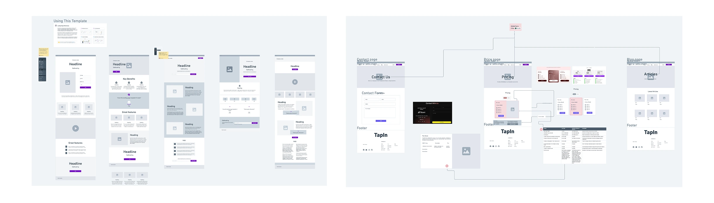
Ideation with wireframes in Whimsical in the early-stage.
Key design decisions
One important shift was moving from feature explanation to behaviour driven storytelling. Instead of listing capabilities, the site demonstrates how the product fits into real event scenarios.
Another decision was to emphasize simplicity in navigation and layout. Early tests showed that users lost focus when too many concepts were introduced at once.
By simplifying the content flow, we improved perceived usability and comprehension.
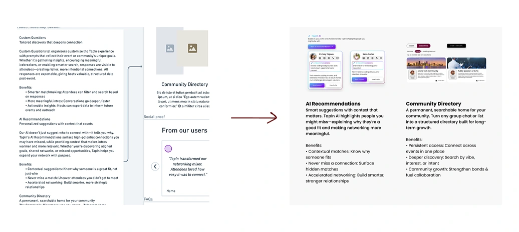
Simplify the amount of content volume
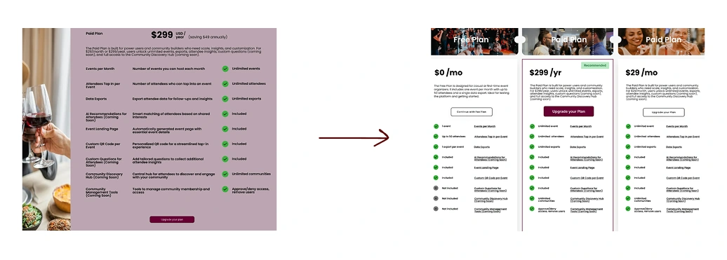
Presenting in differentiation and nudging a decision in the price table
Outcome and impact
The final website provided the startup with a clear and credible platform to introduce their beta product. It became a communication tool for demos, community outreach, and investor conversations.
More importantly, the process helped clarify the product narrative itself. Aligning user psychology with business goals created a stronger foundation for future product iterations.

Reflection and learning
This project strengthened my ability to move from ambiguity to execution within a short timeframe.
It also changed how I think about modern design workflows. Today, I would start with low fidelity validation and then leverage AI assisted coding tools to accelerate implementation while using design tools as strategic references rather than the final step.
Design is no longer only about crafting screens. It is about shaping understanding, behaviour, and momentum.
If you like my work, you can follow more on https://nyfish.vercel.app/
Like this project
Posted Mar 25, 2026
Designed a product launch website for TapIn using behavioral science principles in 30 days.