Hey Happy Petal
Overview 🔎
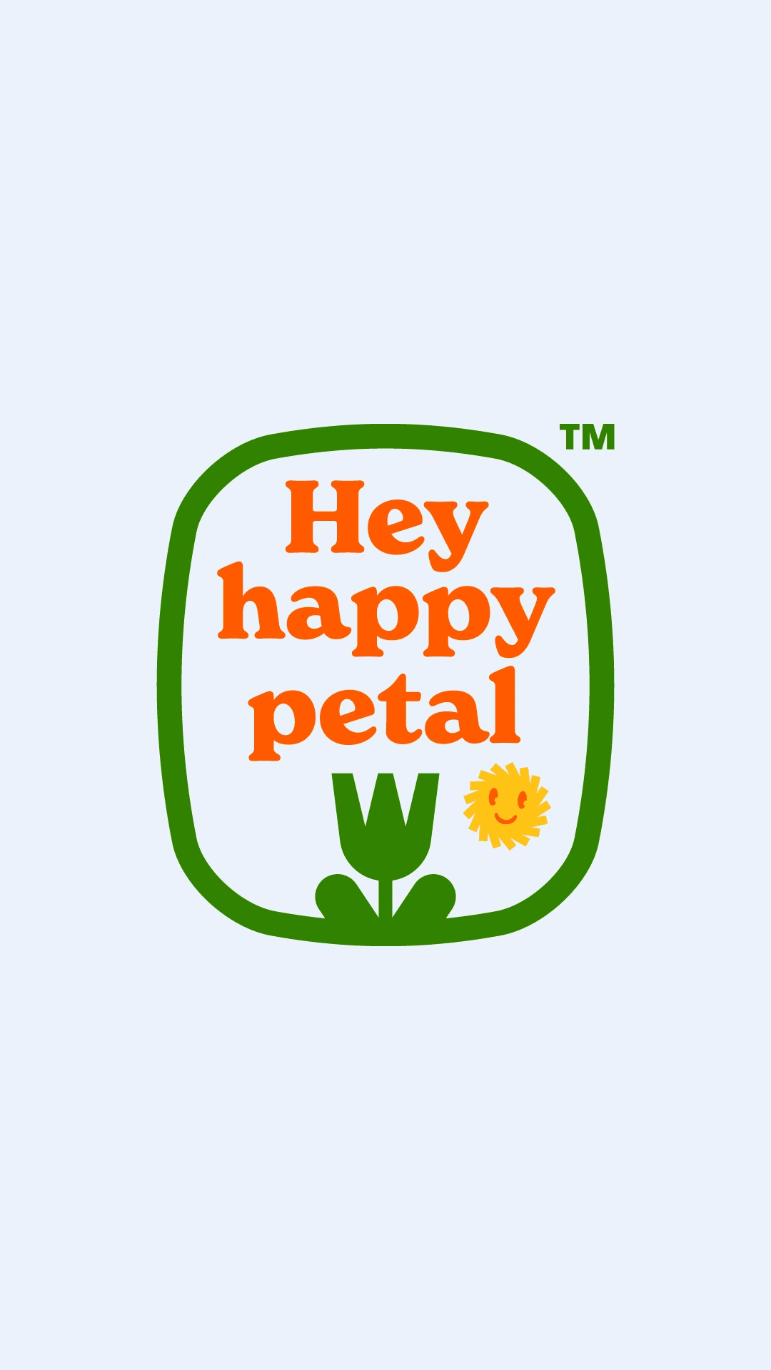
Hey Happy Petal was seeking a simple and unique visual brand for their home-grown flowers. Achieving this was nothing short of a miracle. Actually, it came pretty easy. Sometimes simple is the best solution. Especially in this case when the business itself is a simple thing. Growing flowers. What's more pure than that. We didn't want to get in the way. We just built a great looking visual brand that customers would fall in love with and recognize easily.

Problem & Solution 🤝
The only problem was Hey Happy Petal didn't have a visual presence. No one had anything to love or recognize other than the beautiful flowers. We put a face to it. The flowers speak for themselves but now Hey Happy Petal has a face of their own to help their fans recognize them. They can also sell some merch to generate more income.
Goals/Requirements:
• Goal - Build a beautiful, recognizable, and simple visual brand.
• Goal - Make sure fans know this is for flowers.
• Goal - Make it fun and lovable!
Process 🛣
The process requires listening to our client. Who are they. I dig into what my clients want and who they want to appeal to. I research what else is out there. Then I let my imagination run wild. I ask myself the simple question: What would be so cool that I would want to put it on a shirt or a hat and wear it?
Boiled Down: Listen - React - Research - Deliver - Iterate - Finalize.

Results 🎁
The results in any visual identity project are difficult to measure in the short term. Its crucial to start off your brand with a solid recognizable face. I believe that branding isn't a luxury or an option, but the foundation of a solid successful brand.
We couldn't have asked for a better visual identity! We're happier than we could have imagined. 🗣
Irene M.
Owner / Founder / Gardener
Takeaways 📣
Heading into this project I didn't know much, or anything, about flowers of that business. Part of what I love about what I do is getting to know the businesses and owners that I wouldn't normally dive into.
Like this project
Posted Jul 21, 2023
A locally sourced flower shop growing happy flowers for happy folks. This is a simple business with a simple and stunning visual brand.


