The project started with raw
Soul Luciani
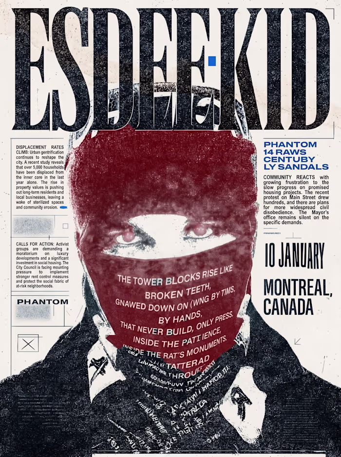
The project started with raw artist photography and legacy album art that felt like a collection of static files rather than a campaign. I restructured the layout into a "tactical zine" aesthetic, layering distorted typography, grainy textures, and surrealist motifs to turn a standard portrait into a high-density visual interface. I used aggressive color friction and "cut-and-paste" sequencing so that every element, from the brain-cap to the target-motif, functioned as a piece of brand infrastructure. The final graphic gave the brand a high-output visual engine to drive awareness and authority across social channels.
Like this project
Posted May 8, 2026
The project started with raw artist photography and legacy album art that felt like a collection of static files rather than a campaign. I restructured the l...