Soul Luciani
Specialized Design Unit for Brand Infrastructure.
New to Contra
Soul is ready for their next project!

Holistic Portuguese Residency Platform Development
0
1
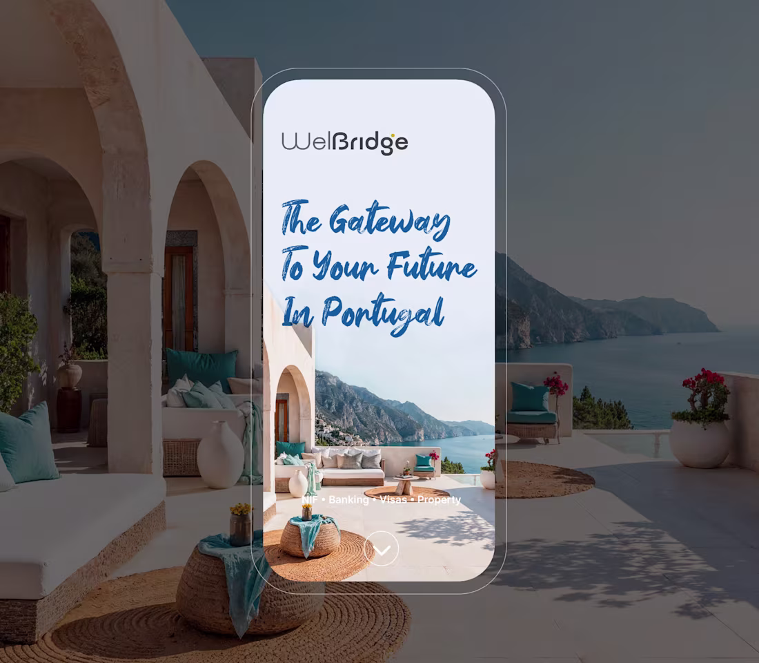
Portuguese residency was a fragmented experience. Applicants juggled disconnected fiscal representatives, real estate advisors, and visa consultants, creating friction at every step of a high-stakes transition. I built Welbridge around one idea: relocation as a single seamless journey. One brand, one process, one point of certainty, unifying NIF acquisition, remote banking, visa assistance, and real estate advisory into a single trusted platform. From concept to over 1,000 clients served. Welbridge defined the market it entered.
1
50
ElevenLabs SFX Model Motion Video & Social Campaign
0
0
Brand Identity & Web Design
0
104
Most AI product launches read like release notes. For ElevenLabs' SFX model upgrade, we treated the product interface as the primary cinematic subject. Buttons, sliders, and prompt fields are the visual language. That discipline scaled into a full social campaign where each asset highlighted a different capability while holding one authoritative aesthetic. Delivered across motion video, eight social assets, conference environment, and branded merch. One system. Every surface.
0
46
h. Discovery Digital Ecosystem Development
0
1

Brand Identity & Web Design
0
95
Oakley — Campaign Design & Brand Strategy
1
1
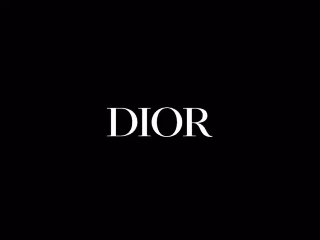
Sauvage sold one bottle every three seconds in 2021 by making men feel something before they ever read the name. I developed the concept and cut a film that worked the same way, opening on a single eye, pulling back through wilderness, fire, and horses in motion, building tension with no product visible until the final frames. The voiceover and the cut points were timed so the bottle and the Dior wordmark landed like a conclusion the viewer had already reached on their own.
1
49
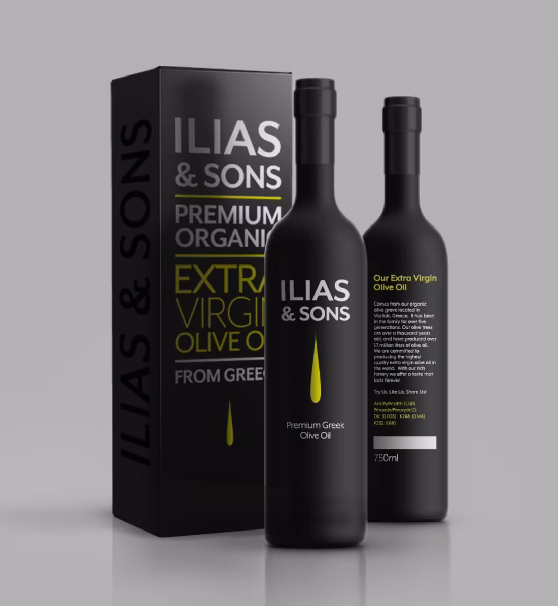
The product was premium. The packaging said otherwise. I led the full rebrand for Ilias & Sons, including a new visual identity, reimagined packaging, and updated business collateral, building an aesthetic that finally matched the tier the oil deserved to occupy. The rebrand moved the product out of the commodity shelf and into placements where premium buyers actually shop. Sales and market position followed.
1
61
Heritage performance brands lose the next generation the moment the technology stops feeling like a frontier. Oakley needed more than a campaign. I built a unified visual engine that treats the iconic O geometry as a technical interface, synchronizing high-velocity motion with surgical product studies and HUD overlays across every touchpoint. The result repositioned the product from equipment to sensory infrastructure, making the brand feel like a tactical advantage before a single spec was read.
1
63
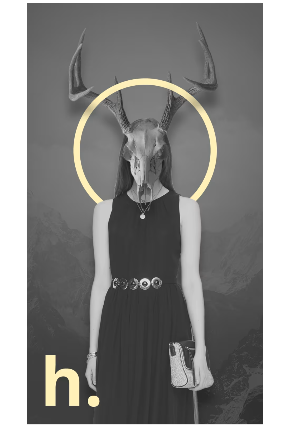
Fashion e-commerce fails when the shopping experience feels generic, regardless of how distinctive the product is. h. Discovery is an online boutique curating unique fashion for a discerning audience and needed a brand and product experience that matched the quality of what it sells. I designed the full brand identity and carried it through a complete app UI/UX, making every screen and visual decision reflect the brand's point of view. The result holds up against the best in fashion e-commerce.
0
61
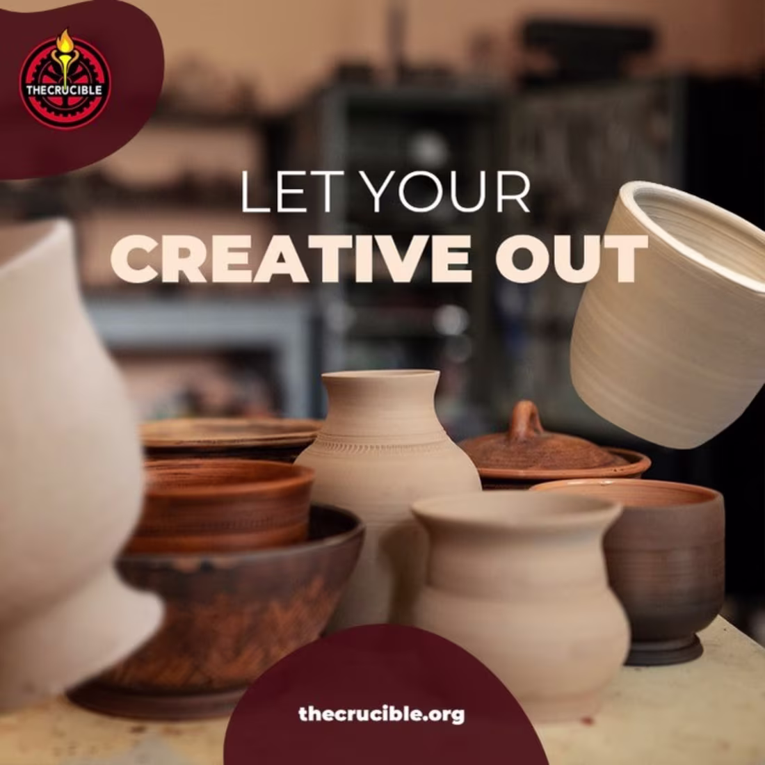
The Crucible runs over 900 classes a year across 18 industrial art disciplines, but their social content wasn't turning that breadth into enrollment. I designed a full Instagram suite spanning their catalog, covering flamework, glassblowing, ceramics, woodworking, and foundry work, pairing real student photography with bold type and their signature dark red palette. Each post gave a different discipline its own moment while keeping the brand consistent enough to build recognition and drive traffic toward enrollment.
1
1
51
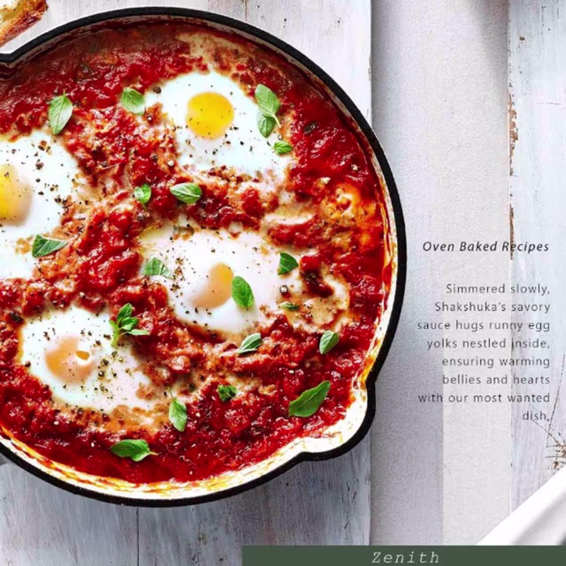
Being named one of the top 14 most instagrammable restaurants in the world is a title you have to defend on every post. Zenith's menu carries a depth that generic food photography was never going to communicate. I designed a social series that read as editorial magazine spreads, building each post around the story behind the dish rather than the dish alone, so every piece of content made the food feel worth seeking out rather than simply worth photographing.
3
67
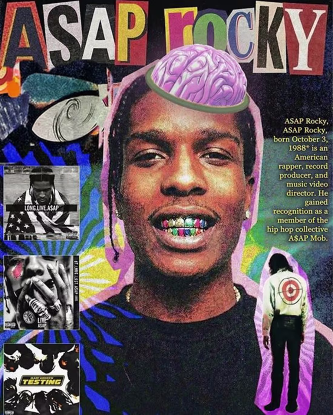
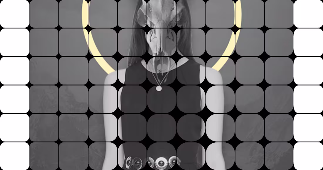
The project started with raw artist photography and legacy album art that felt like a collection of static files rather than a campaign. I restructured the layout into a "tactical zine" aesthetic, layering distorted typography, grainy textures, and surrealist motifs to turn a standard portrait into a high-density visual interface. I used aggressive color friction and "cut-and-paste" sequencing so that every element, from the brain-cap to the target-motif, functioned as a piece of brand infrastructure. The final graphic gave the brand a high-output visual engine to drive awareness and authority across social channels.
4
66
A streetwear brand shooting inside a grand theater had strong raw footage, but needed editing to turn it into a drop campaign rather than a behind-the-scenes clip. I structured the cut around tension and release, sequencing performance scenes, piano moments, and garment closeups so each piece got a moment without slowing the pace. Glitch and distortion effects added texture where the rhythm called for it. The video gave the brand a campaign asset to drive awareness for the drop across social channels.
1
51
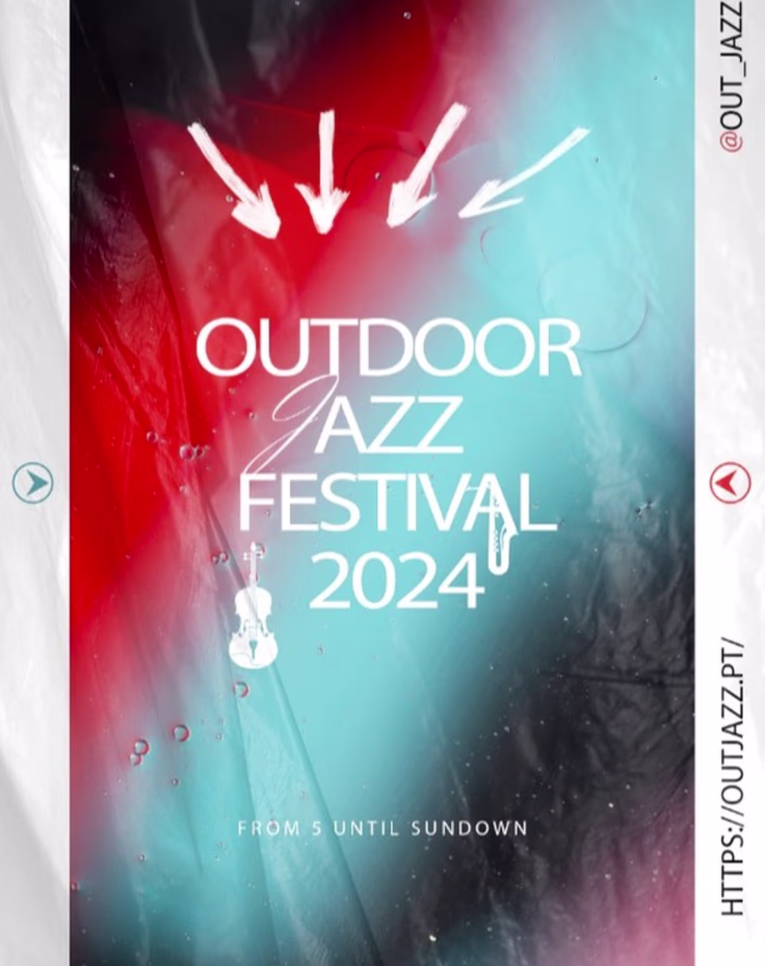
Out Jazz has spent nearly two decades bringing free outdoor concerts to Lisbon's historic gardens every Sunday, but free entry makes an event harder to position as a cultural moment worth planning your weekend around. I designed the 2024 poster around fluid abstract color, blending warm reds against cool turquoise to capture the feeling of an open-air evening already in motion, with mixed typography and a hand-drawn arrow motif that pulled the eye toward the stage. The poster gave the event the visual weight its reputation deserved.
1
77
Most cafe videos show the space. This one needed to make the coffee itself the reason to visit. I built the edit entirely around macro footage of the espresso pull, roasted beans, and latte surface, using panel and strip transitions to create a sensory rhythm between shots. The pace moved from process detail to atmosphere before landing on branded signage to close. The result was a content asset that communicated craft and worked natively across every social platform the brand pushed it to.
1
54
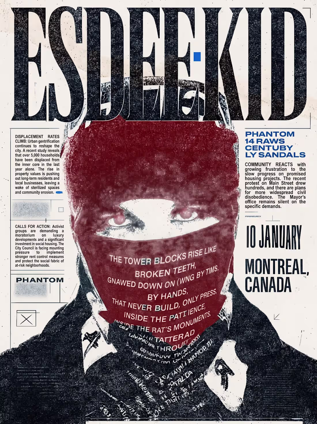
Montreal. January 10. The poster needed to travel further than the show. I built the design around a masked figure at full bleed, layering distressed display type, newspaper column text, and spoken word verse directly into the composition. The red, black, and cream palette drew from protest print history to give the piece weight and credibility. It functioned as an event announcement, and as a standalone graphic, the audience would share and keep it long after the night was over.
0
57
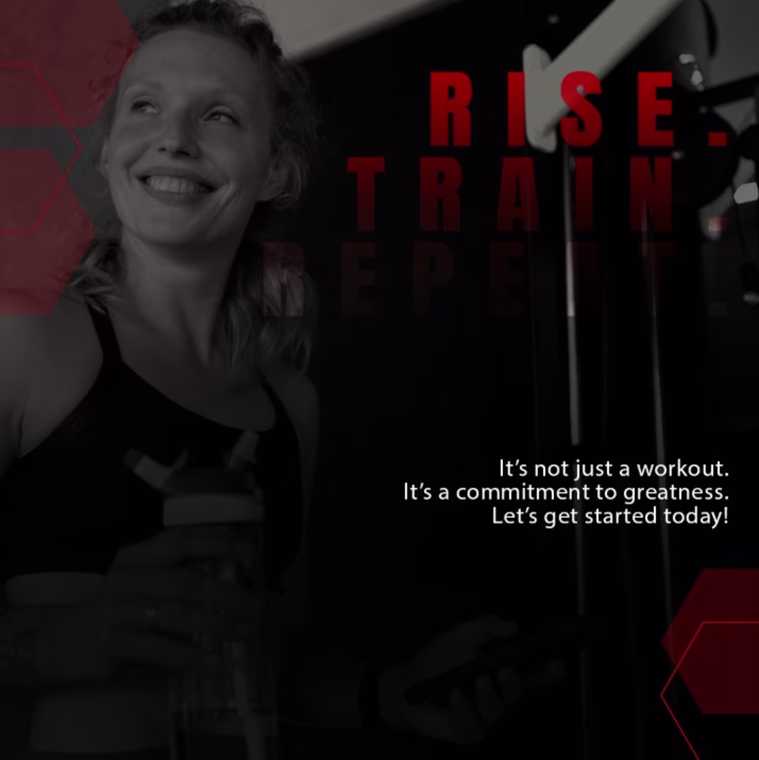
Most gym content motivates people who are already members. Element needed posts that converted the ones still making excuses. I designed their Instagram content around monochrome photography and red typographic commands, creating a visual tone that felt more like a direct challenge than an ad. Personal training, massage, and group classes each got their own post, but the throughline was the same: make the person scrolling feel called out and ready to book.
0
51
Lenus has spent 10 years positioning itself as the growth partner for the world's best health coaches, but a static logo sitting on a pitch deck or app screen does nothing to communicate that momentum. I animated the logo reveal to mirror what the brand actually does, building the two fluid wave forms in motion before settling into the wordmark, so the first thing anyone sees communicates energy and forward movement before a single word of copy appears.
0
59
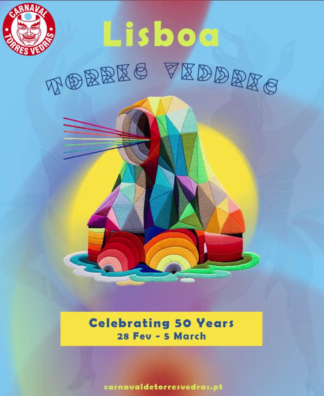
Fifty years is a milestone that demands more than a standard event announcement. I designed a flyer anchored by a large sculptural carnival figure, surrounding it with layered color gradients and expressive typography that captured the energy of the occasion. Key event details were given visual weight without competing with the central image. The piece communicated scale and celebration in a single frame and worked across both print and digital placements.
2
56
$1.4 billion from selling water. The story demanded visuals that matched the audacity of the brand. I designed and edited a full motion video breaking down how Liquid Death built a rebellion around a commodity product, building the layout system from scratch with animated product shots, bold mixed typography, and dotted circle motion graphics. Every design choice reinforced the editorial argument rather than decorating it. The result is a content piece that educates and entertains while demonstrating exactly what brand strategy executed at the highest level looks like.
1
59
Static logo files tell you what a brand looks like. A reveal tells you how it thinks. I designed the sequence around Splash Studios' four tile mark, timing each panel to enter with deliberate pacing rather than a single simultaneous pop. Depth and shadow reinforced the 3D quality already embedded in the design rather than layering motion on top of it. Every video and presentation the studio puts out now opens with an asset that commands attention before a word is spoken.
0
49

Datta Solutions — Brand Identity & Web Design
0
0
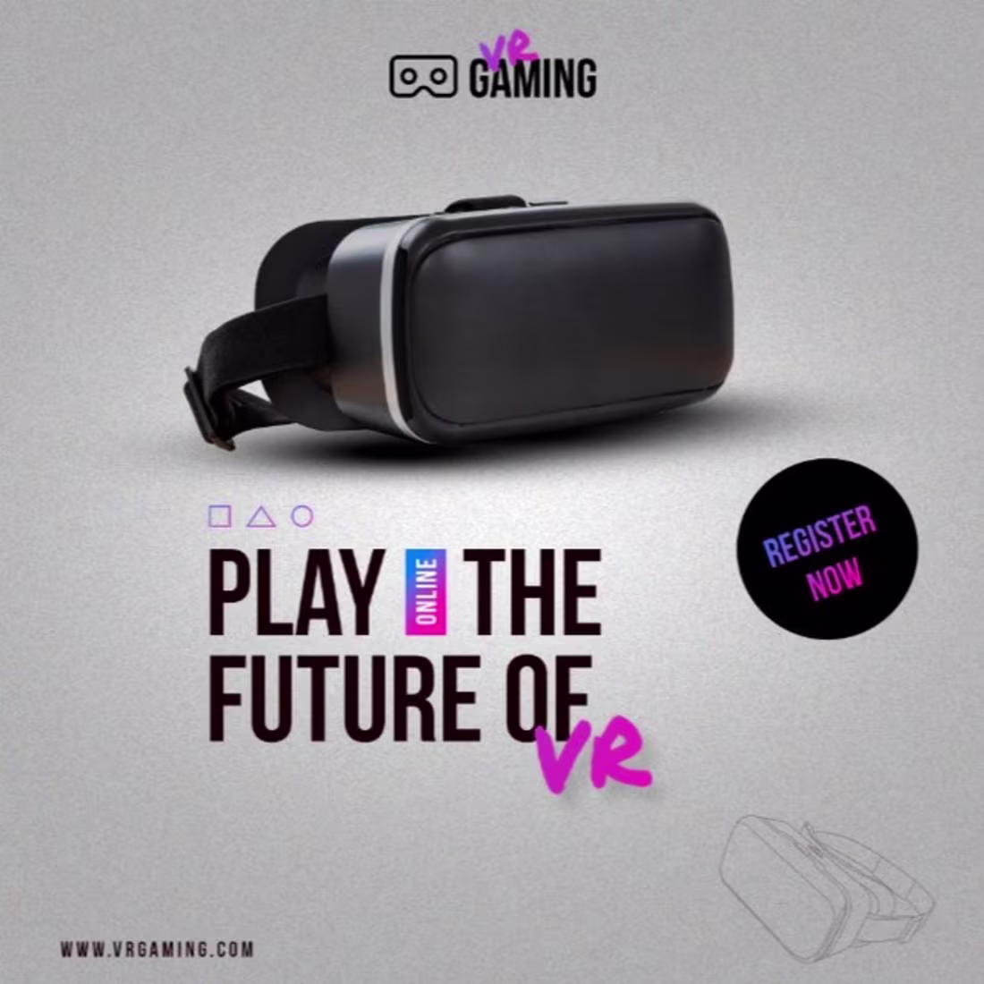
Only 5 to 10% of gamers have ever tried VR because the hardware barrier makes the experience feel out of reach. I designed a social suite that closed that gap visually, using full-body player reactions in grayscale to sell the feeling rather than the equipment, bold type that read like a dare, and neon purple accents that made the brand feel like it belonged in the world it was selling. Every post drove toward registration by making signing up feel like the only logical next move.
0
46
Independent producers on Epidemic Sound compete on sound alone because most never build a visual identity to match. Jobii needed a visualizer that made the beat feel like a world. I animated the lyrics using everyday phone UI as the visual language, treating alarms, calendars, and Do Not Disturb toggles as a canvas, so each frame felt pulled from the listener's own life. By the time "a beat by Jobii feel like Obi Wan Kenobi" hit, the name had already earned it.
1
61
High fashion social content has one rule: the design should never be louder than the clothes. I built a content series for Hope Ave around white space, editorial photography, and clean typography, creating a system that stays scroll-stopping and completely consistent without ever tipping into overdesigned. Every post earns attention without breaking the minimal tone that the brand lives in. The grid reads like a magazine, not a feed.
3
76
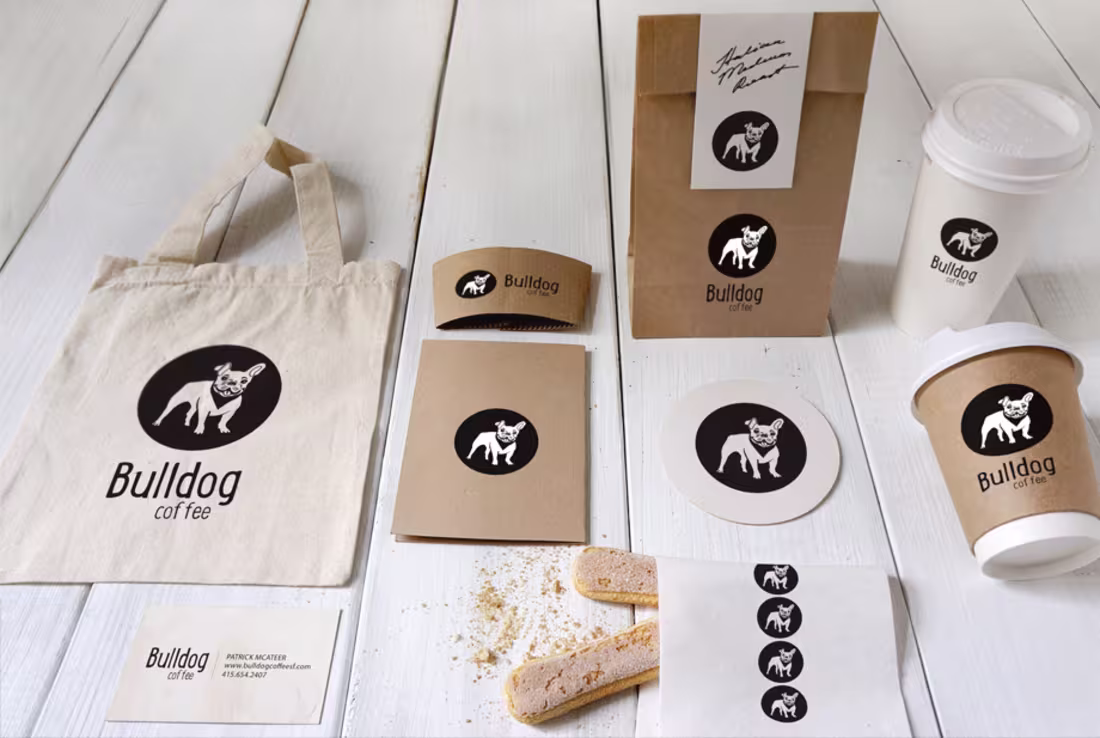
The name alone demanded a visual identity with character. Starting from zero, I built the complete system for Bulldog Coffee, including logo, typography, color palette, and brand guidelines, then extended it across every physical touchpoint: cups, sleeves, bags, business cards, and packaging. The identity had to hold at every scale from a sticker to a storefront without losing its edge. It does. Rugged, confident, and recognizable enough to build real loyalty in a crowded market.
0
48
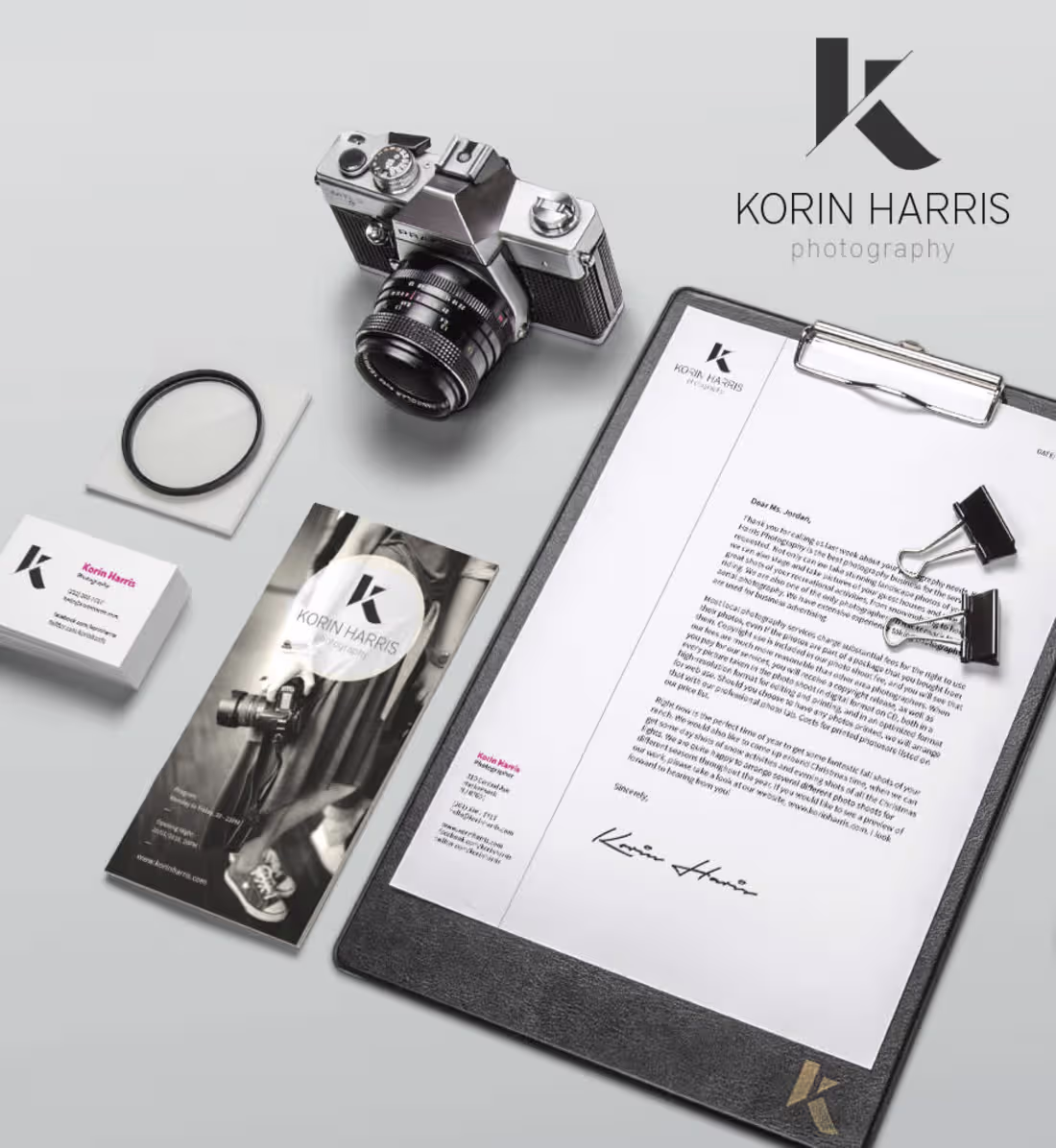
The work behind the lens was already exceptional. The brand just needed to get out of its own way. I built the complete visual system for Korin Harris from scratch, including logo, typography, color palette, and stationery, then extended it into a full lookbook. Every decision was made in service of restraint, so the photography leads and the brand carries the authority behind it without competing with it.
2
61
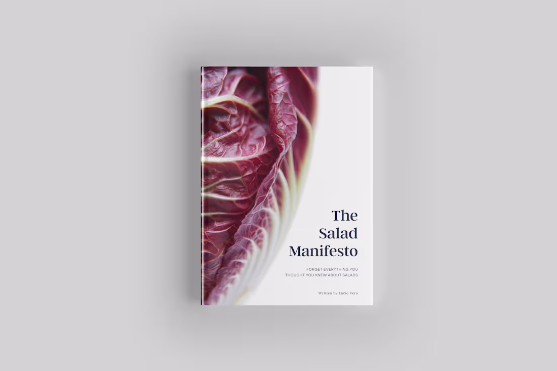
Culinary branding defaults to rustic clichés that trap a chef's philosophy behind generic food photography. This project demanded something built to a different standard. I developed a complete editorial system pairing a rigid typographic hierarchy with expansive macro photography, where every layout decision was made as part of a single visual logic. The result is a high-fidelity print piece that reads as a serious creative work rather than a cookbook with good design.
2
71
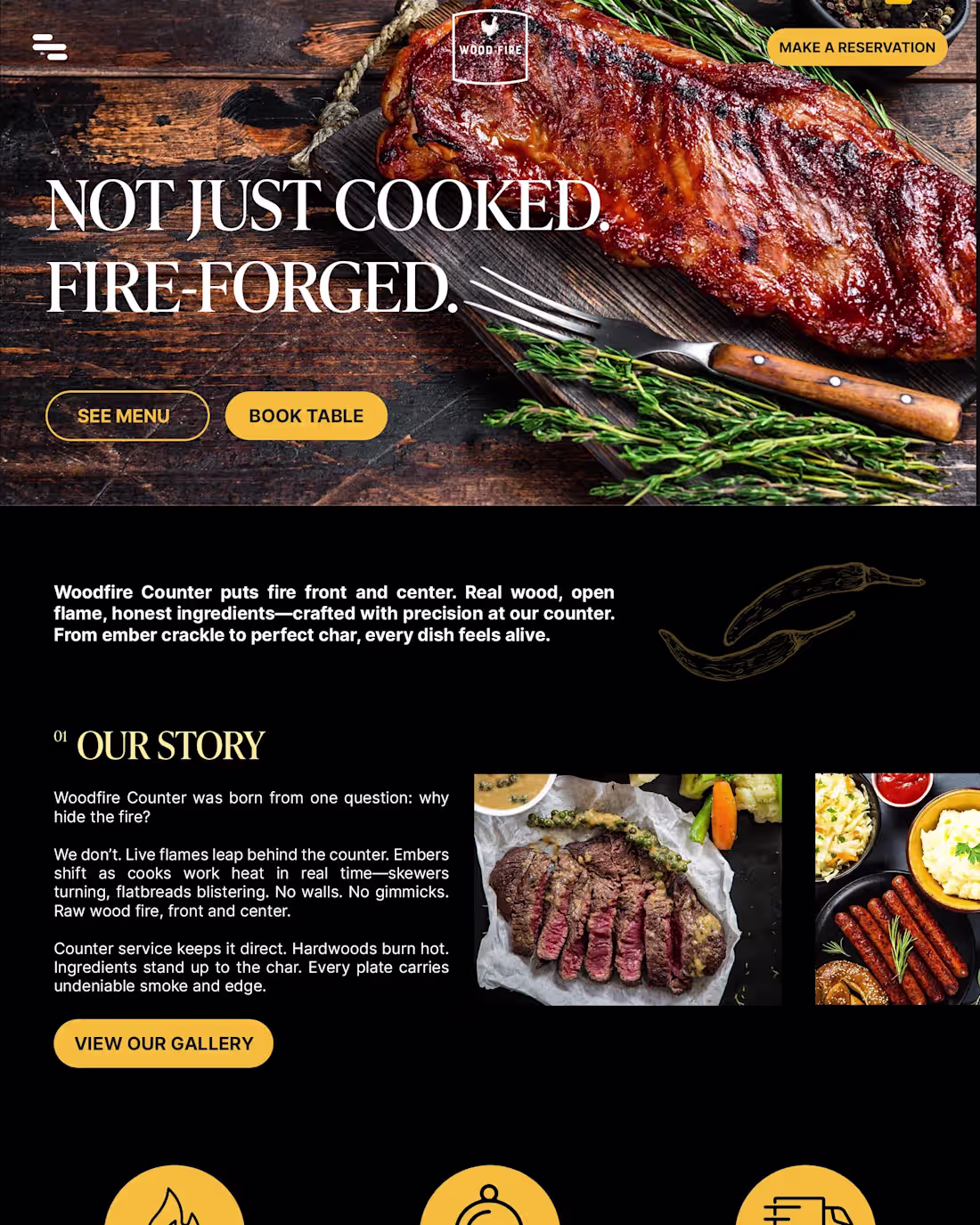
Woodfire Counter is a contemporary dining concept where the warmth of the kitchen needed to carry through every single touchpoint. I built a unified design system where spatial rhythm, environmental graphics, and digital interface operate from the same logic rather than being solved separately. The brand scales from menu to signage to screen without fracturing. For a hospitality brand, that coherence is the product — it is what guests feel before they taste anything.
0
51
Portuguese residency was a fragmented experience. Applicants juggled disconnected fiscal representatives, real estate advisors, and visa consultants, creating friction at every step of a high-stakes transition. I built Welbridge around one idea: relocation as a single seamless journey. One brand, one process, one point of certainty, unifying NIF acquisition, remote banking, visa assistance, and real estate advisory into a single trusted platform. From concept to over 1,000 clients served. Welbridge defined the market it entered.
0
47
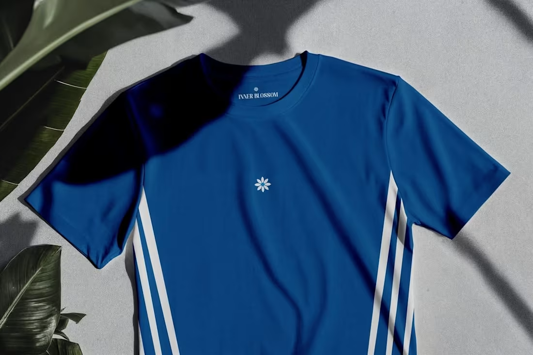
Launching a first merch drop without an established product line means the clothing has to do the branding work. I designed two pieces around the brand's daisy mark, using a minimal chest placement and dual side stripes to give the collection a clean athletic silhouette. The back graphic combined distressed type, an editorial figure, and brand verse to add depth and intent beyond a logo tee. The collection gave the brand a physical product that new customers could connect with and existing followers would actually want to wear.
0
56
Heritage performance brands lose the next generation the moment the technology stops feeling like a frontier. Oakley needed more than a campaign. I built a unified visual engine treating the iconic O geometry as a technical interface, synchronizing high velocity motion with surgical product studies and HUD overlays across every touchpoint. The result repositioned the product from equipment to sensory infrastructure, making the brand feel like a tactical advantage before a single spec was read.
1
129