Big Redwood Park
Rafael Renzon Payumo
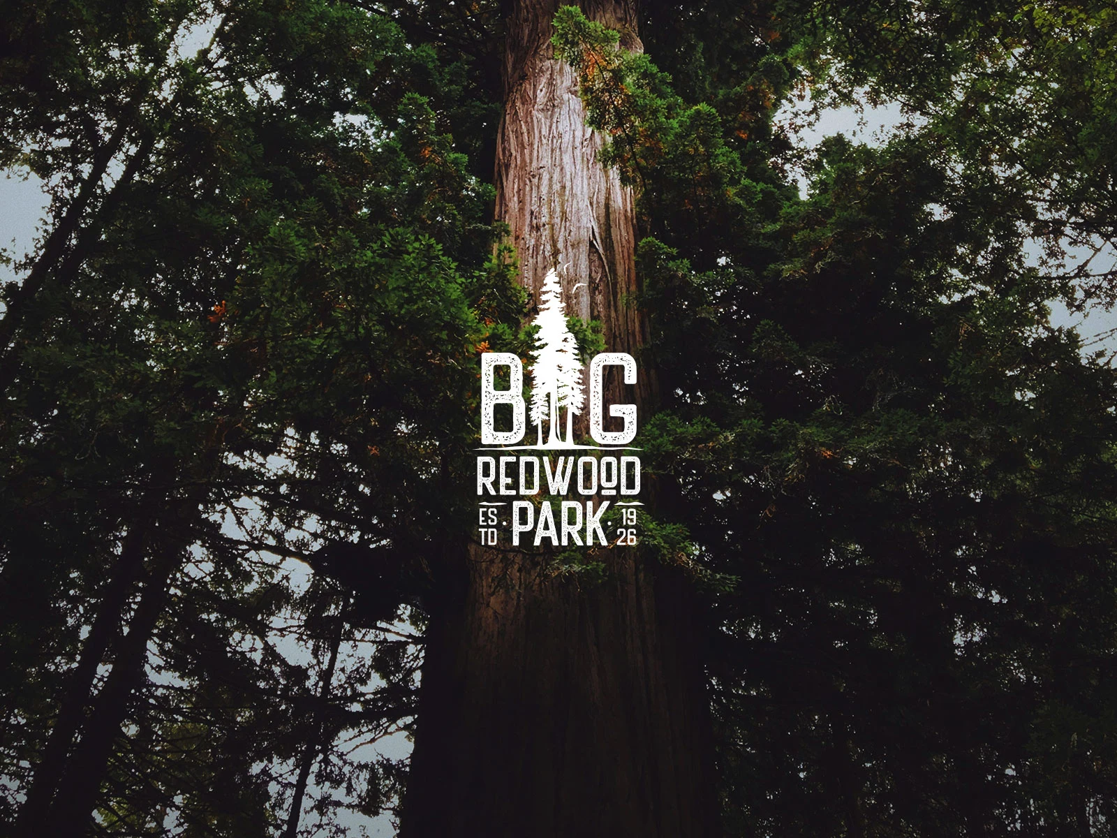
Big Redwood Park
I was asked to create a brand identity framework for a small residential community that is close to nature and its community.
Deliverables
Logo design
Brand Manual
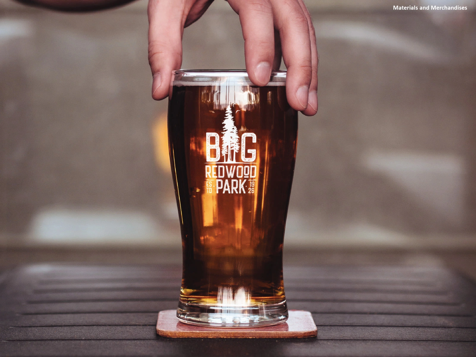
Mockups
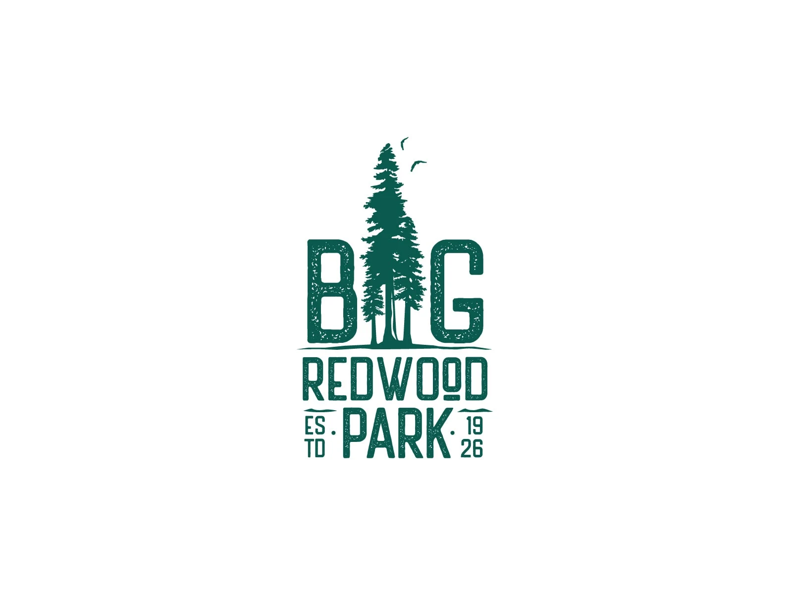
Big Redwood Parks is a residential community located in Los Gatos, California, which was established in 1926. Filled with the wide area of forest and bliss, Big Redwood Parks is a perfect spot for people who want to be close to home with loved ones.
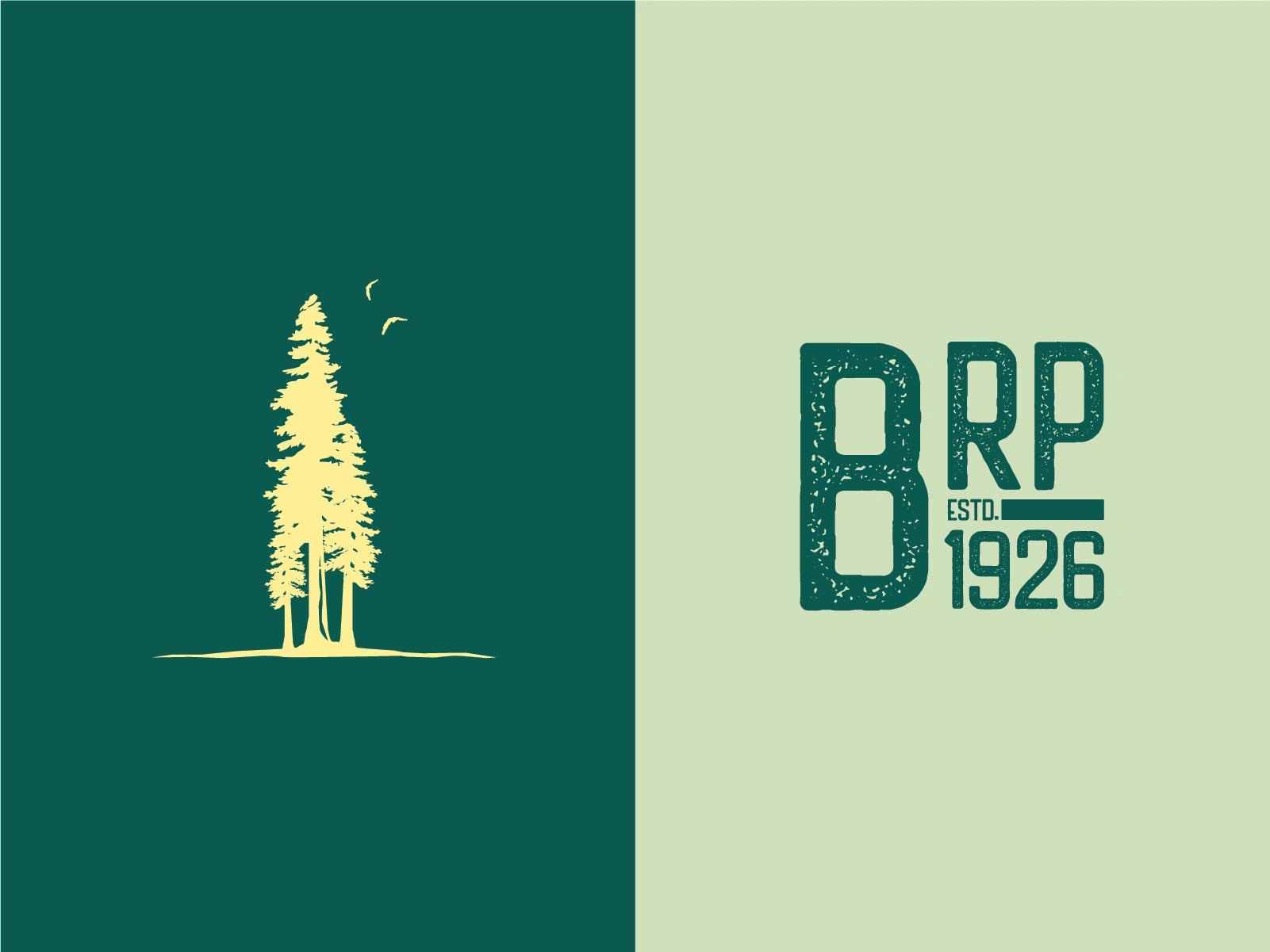
Iconography and typeset logo.
Inspired by the tallest trees in the world, Coast Redwood trees, it's perfect to be the symbol of their identity in a small community where everyone can live in harmony. The Redwood tree identity positioned itself as the center of growth and progression as time goes by.
Color palette and moodboard.
For the color palette, my inspiration comes, of course, from the Redwood trees, but I intended to go in a different direction instead of starting with brown and yellow for the purpose of highlighting the tree trunks. I use the shades of green as my focal point to show the natural tone and the feeling of moistness in the surroundings during rainy seasons. Then I use the yellow color, which represents the earthly palette, where one feels the warmth of nature during the summer and fall seasons.
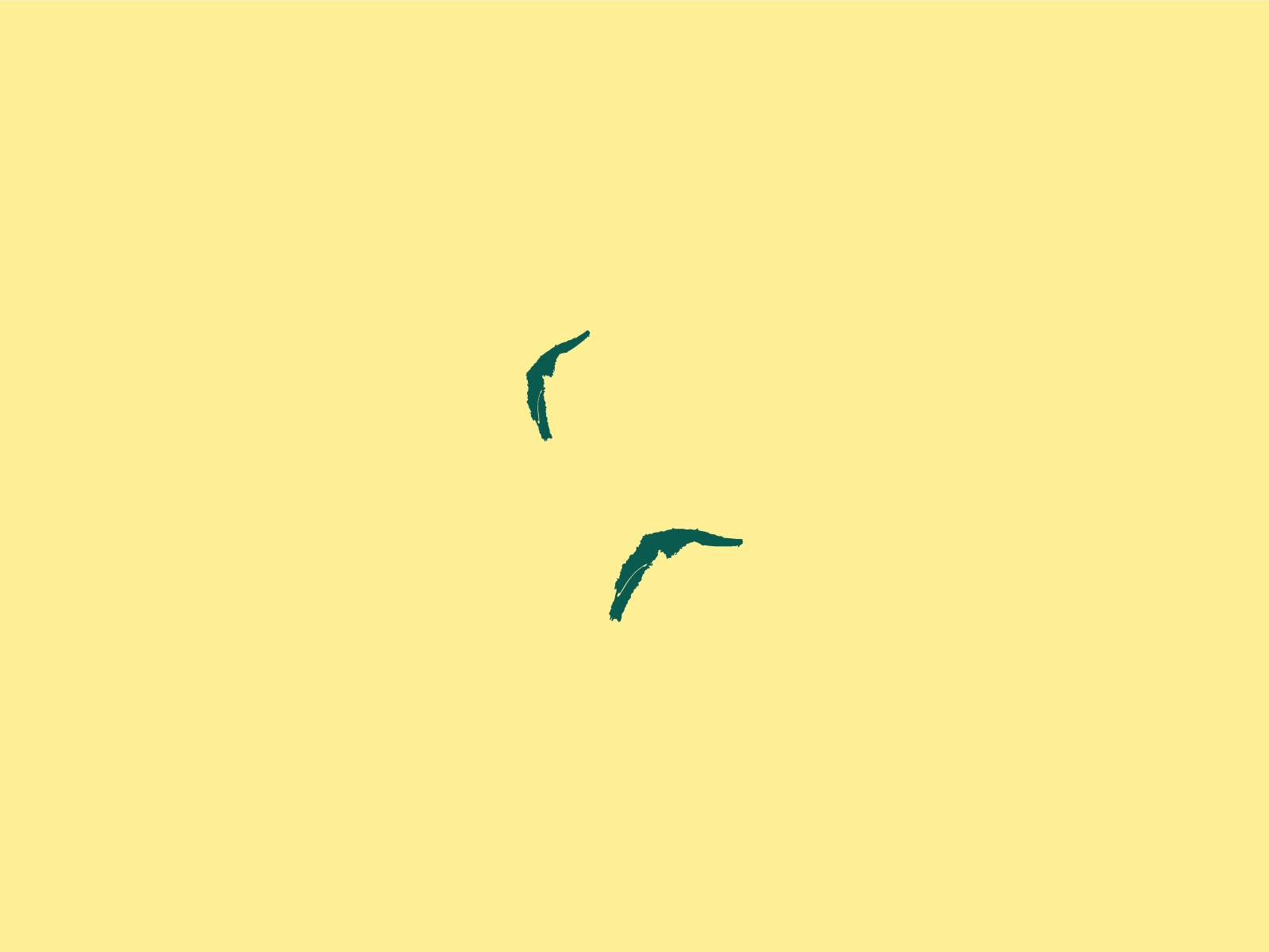
For the elements, I mostly love the trees because they stand out everywhere and they give comfort and relaxation, pleasing to our eyes. The birds are my subtle element of iconography, where they express freedom and serenity, where they have a home under the big Redwood tree. They represented the small community, even though private, they are built with a strong foundation of values, belongingness, and charity towards their fellow neighbors.
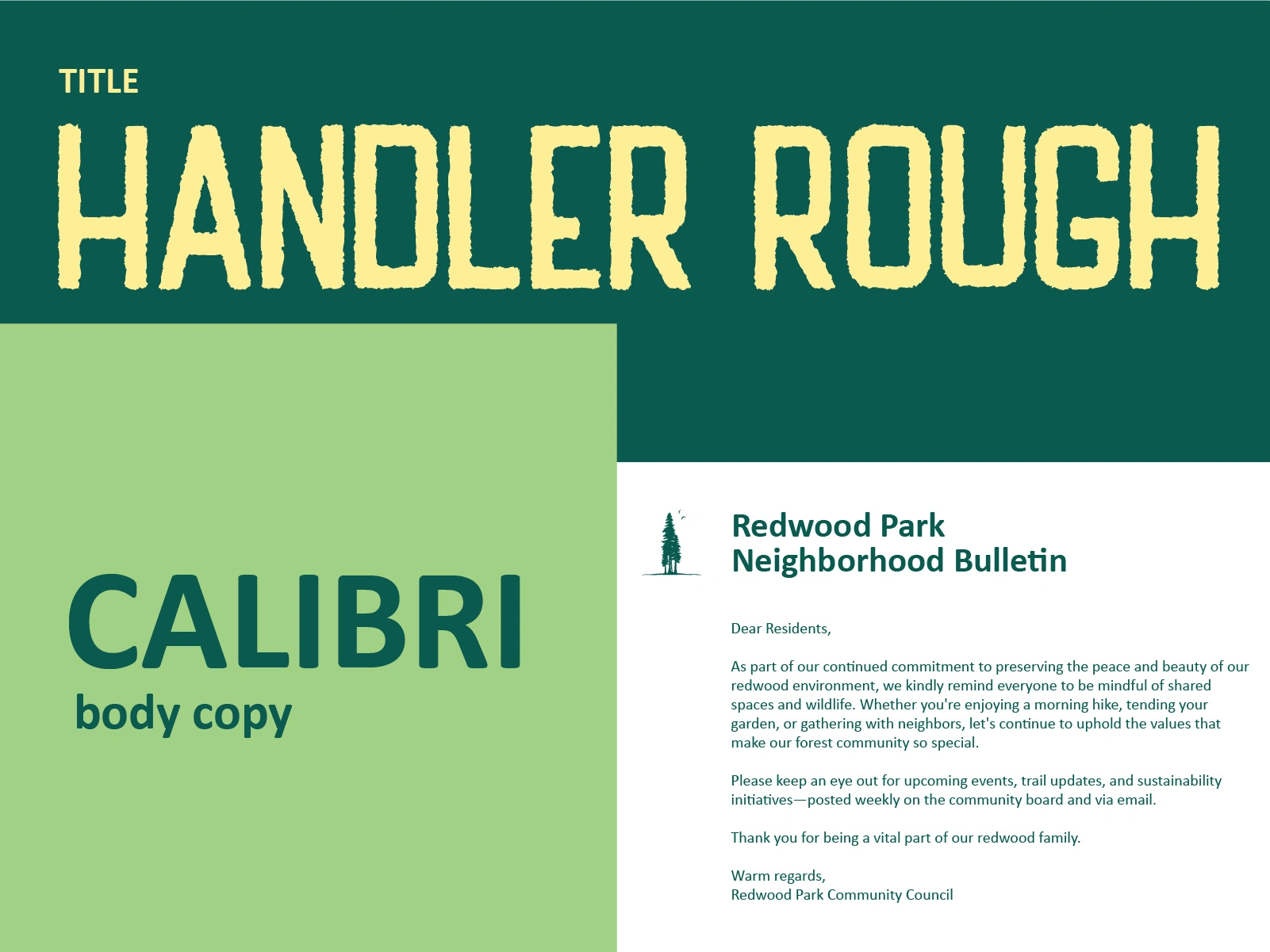
After building, we finalized the creation of the logomark. I designed the brand identity manual to ensure they follow the brand's guidelines, avoiding the use of elements, colors, and fonts that don't reflect the brand.
This brand identity system was thoughtfully designed to reflect not just how the brand looks, but how it thinks and communicates. Every element, starting from the logo, colors, and typography to the imagery style, serves a strategic purpose: to create a cohesive and recognizable presence across all platforms. The visual language is built to align with the brand’s values, ensuring consistency while leaving space for creative flexibility. This manual acts as a guide to keep the brand’s voice clear, intentional, and emotionally resonant in every touchpoint.
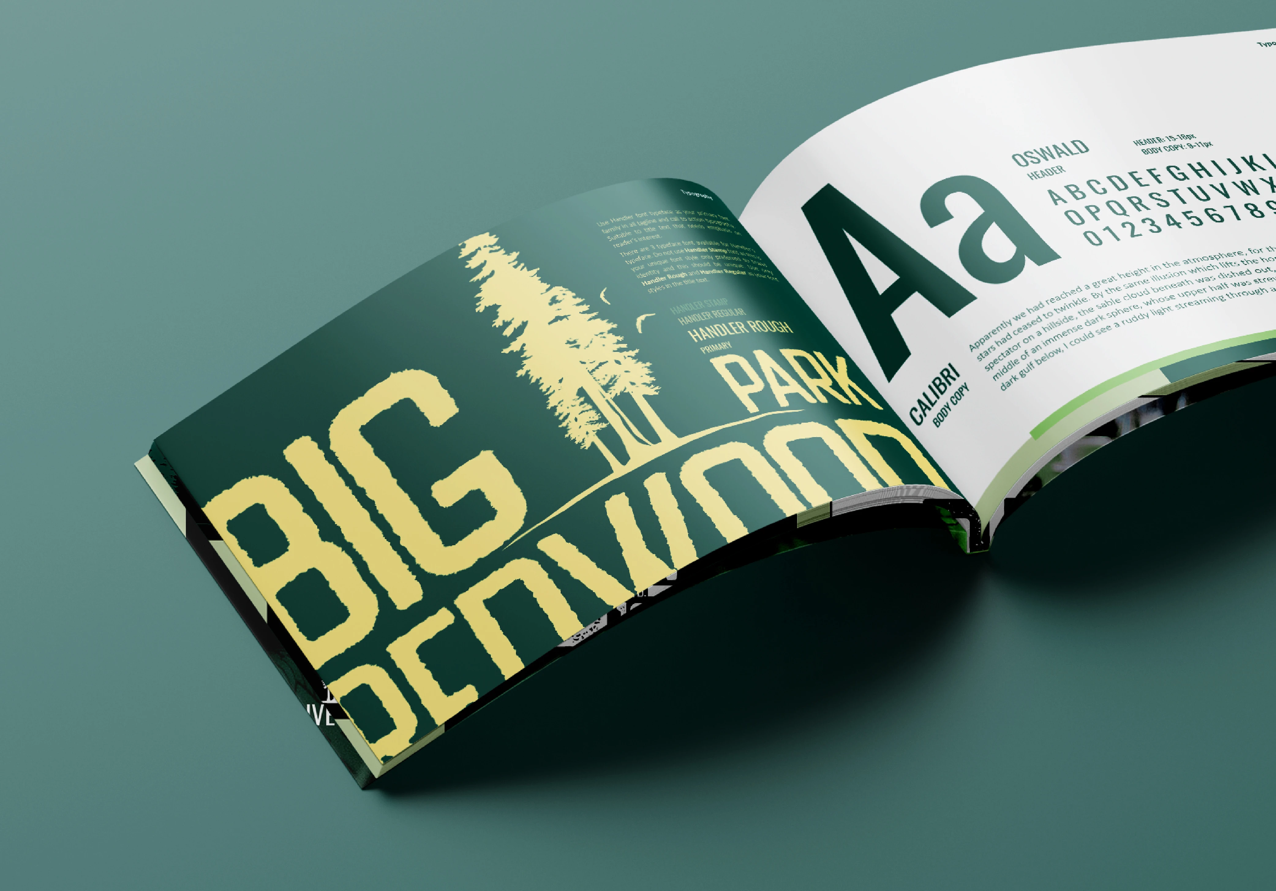
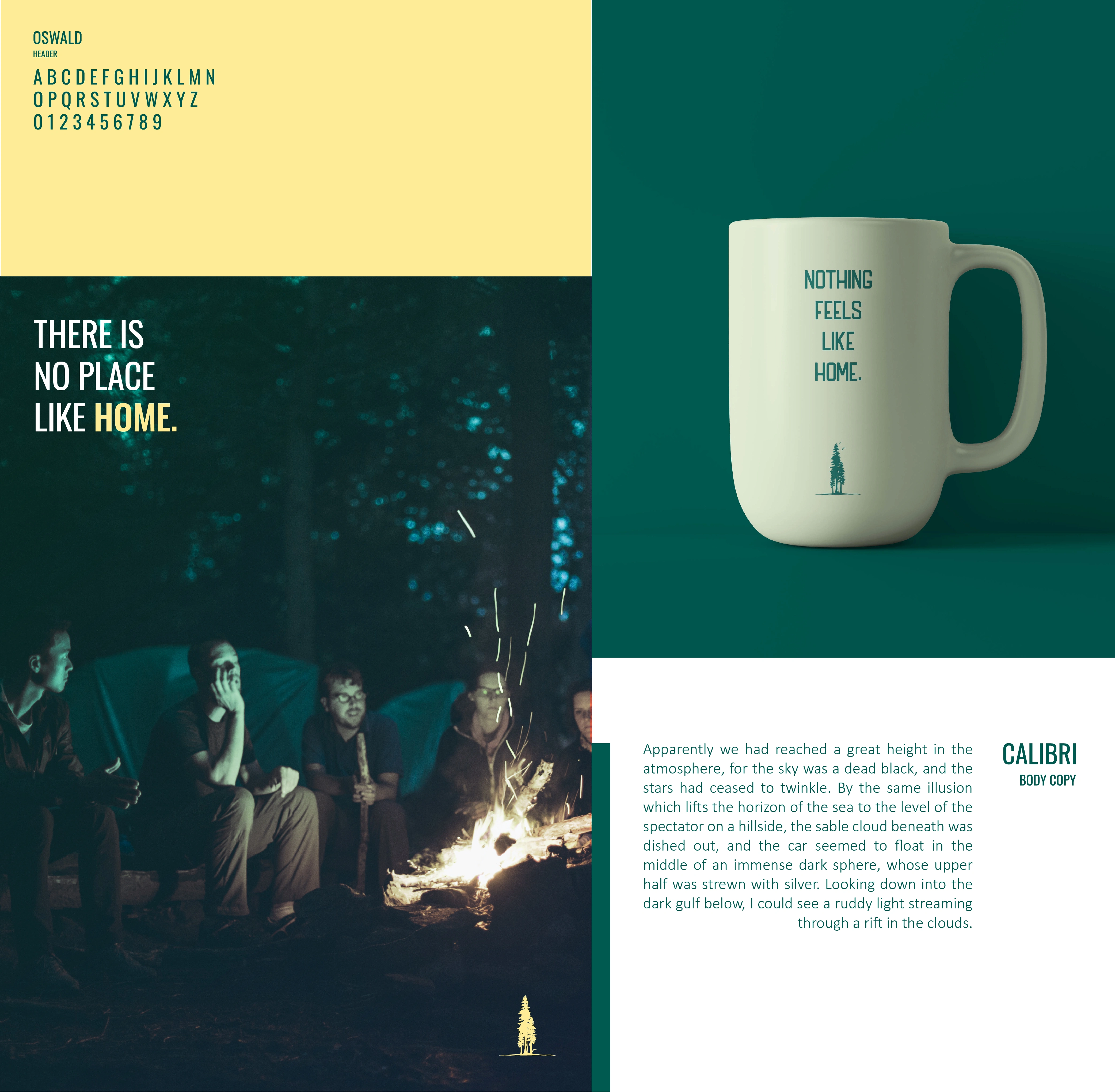
Brand manual showing the typography guidelines.
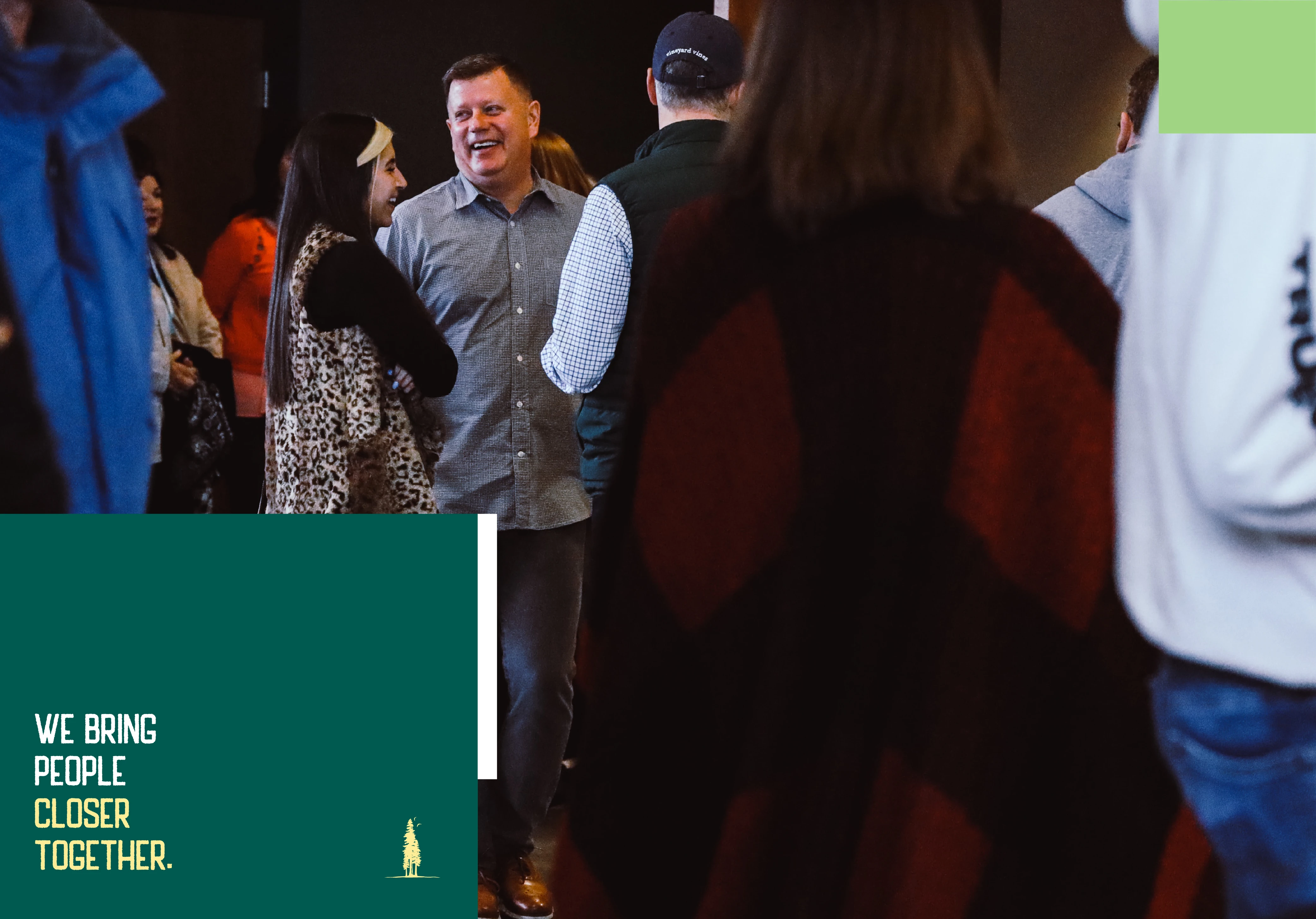
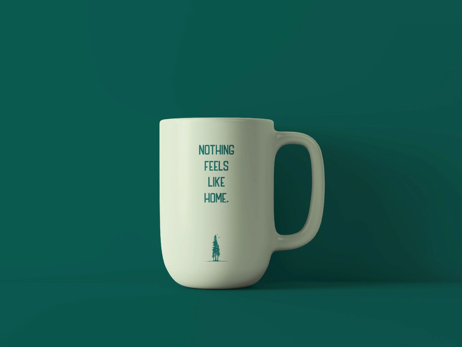
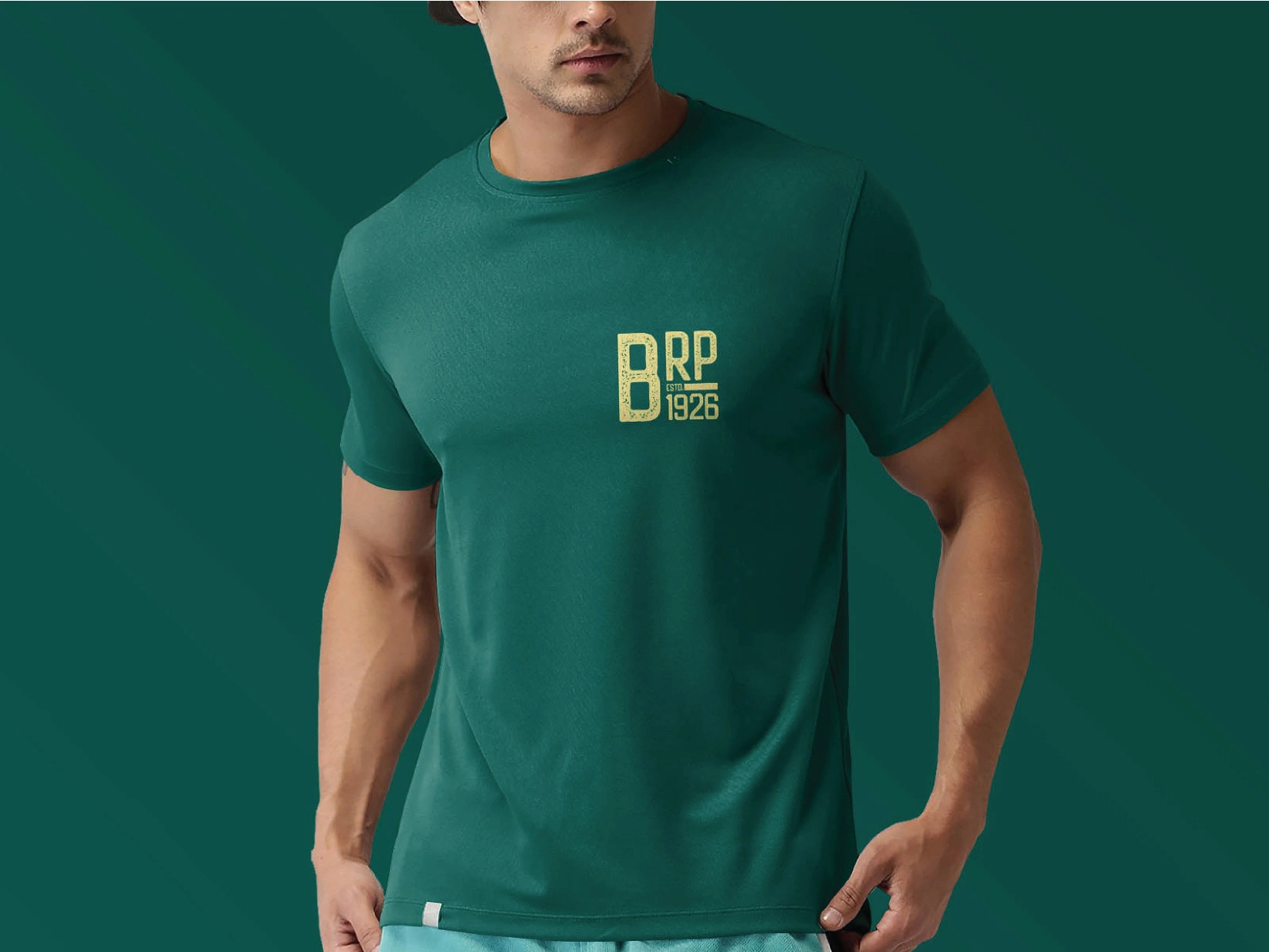
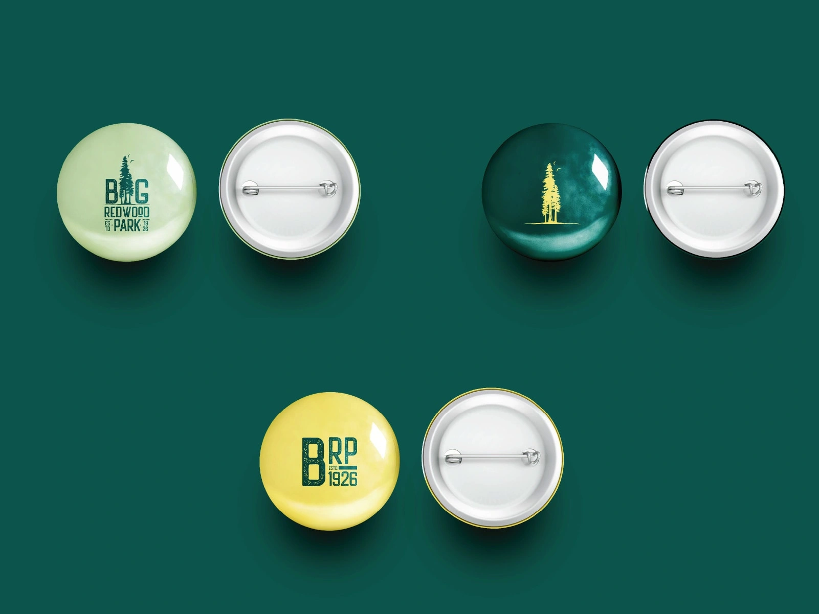
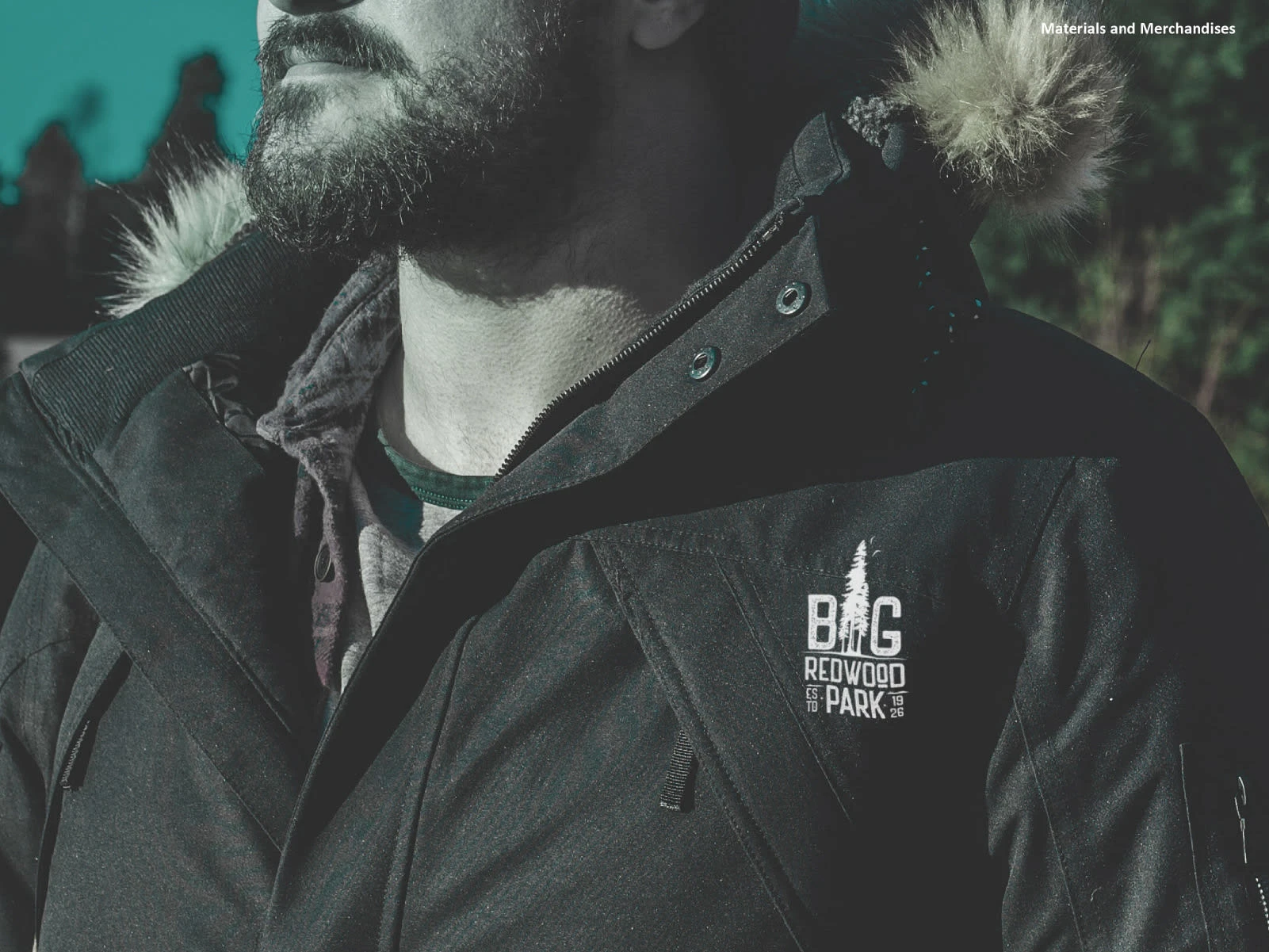
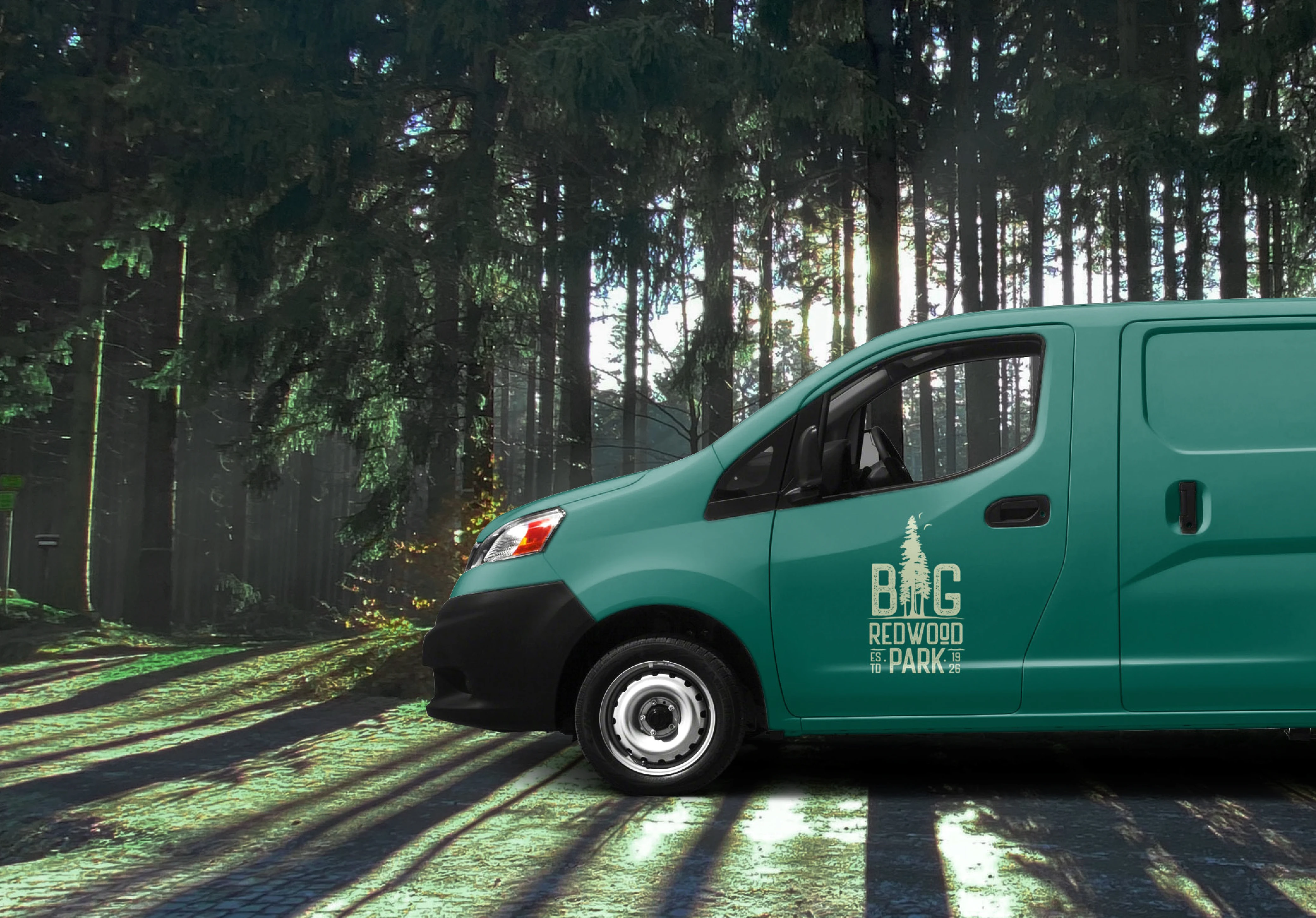
Afterwards, I created a series of mockups to bring the brand to life while showcasing its cases during events, printouts, and how it looks when you display it in public.
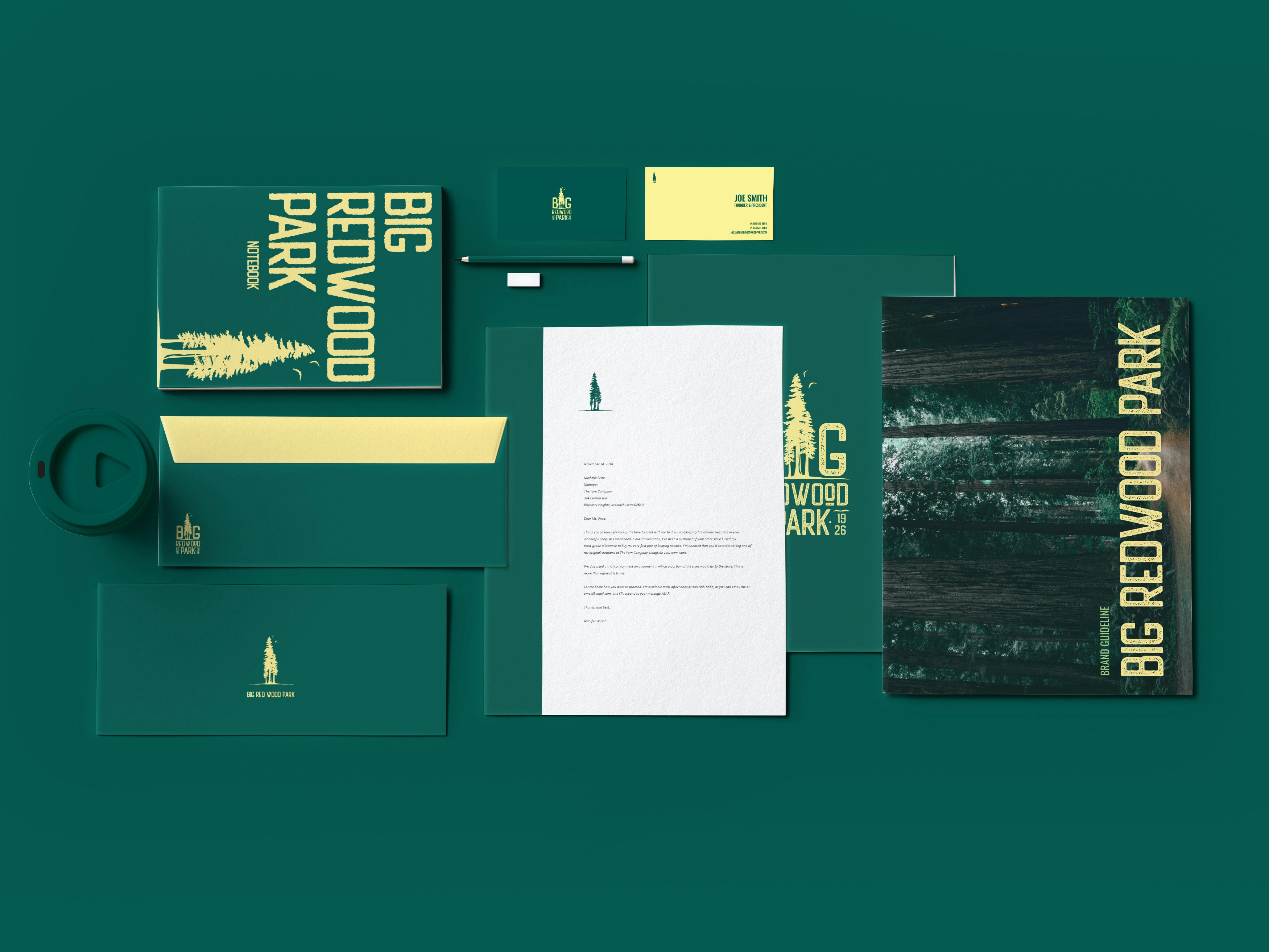
Brand Identity Kit.

Not sure where to start? That’s cool. Hit me up at humind.hello@ralphpayumo.com. Let’s chat, no pressure.
Like this project
Posted Jun 4, 2025
Created a brand identity for a small community that is near to Redwood Trees National Park. Logo Design | Brand Identity | Brand Manual
Likes
0
Views
8
Timeline
Apr 11, 2021 - Apr 16, 2021