Built with Framer
VeyRide - Landing Page Design
Anky C.
VeyRide - Landing Page Design
Overview
After designing the VeyRide mobile experience, Here we are covering product ecosystem with a landing page focused on trust, clarity, and conversion.
Status: Confidential (NDA)
Disclosure: Reinterpreted for portfolio use
Note: UX decisions and product structure remain aligned with the original work.
Goal:
Create a modern mobility landing page that speaks to both passengers and drivers without making the experience feel split or overwhelming.
The challenge was balancing two user groups on a single page while keeping the interface visually lightweight and conversion-focused.
Design Approach
The overall design direction focused on minimal layouts, spacious composition, soft gradients, and strong typography hierarchy.
Instead of filling the interface with unnecessary UI elements, the experience was designed around clarity and flow. Every section was structured to guide users naturally through the platform story.
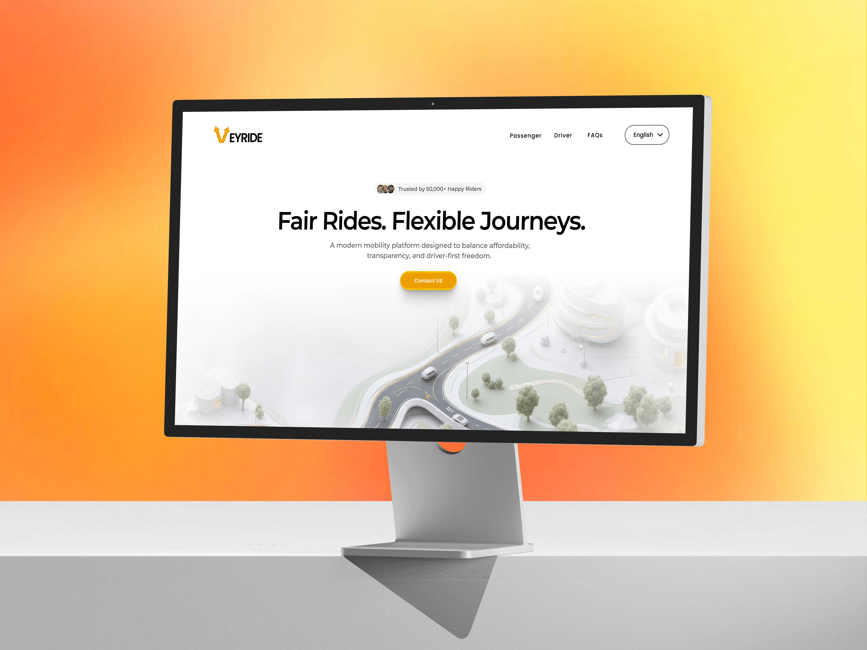
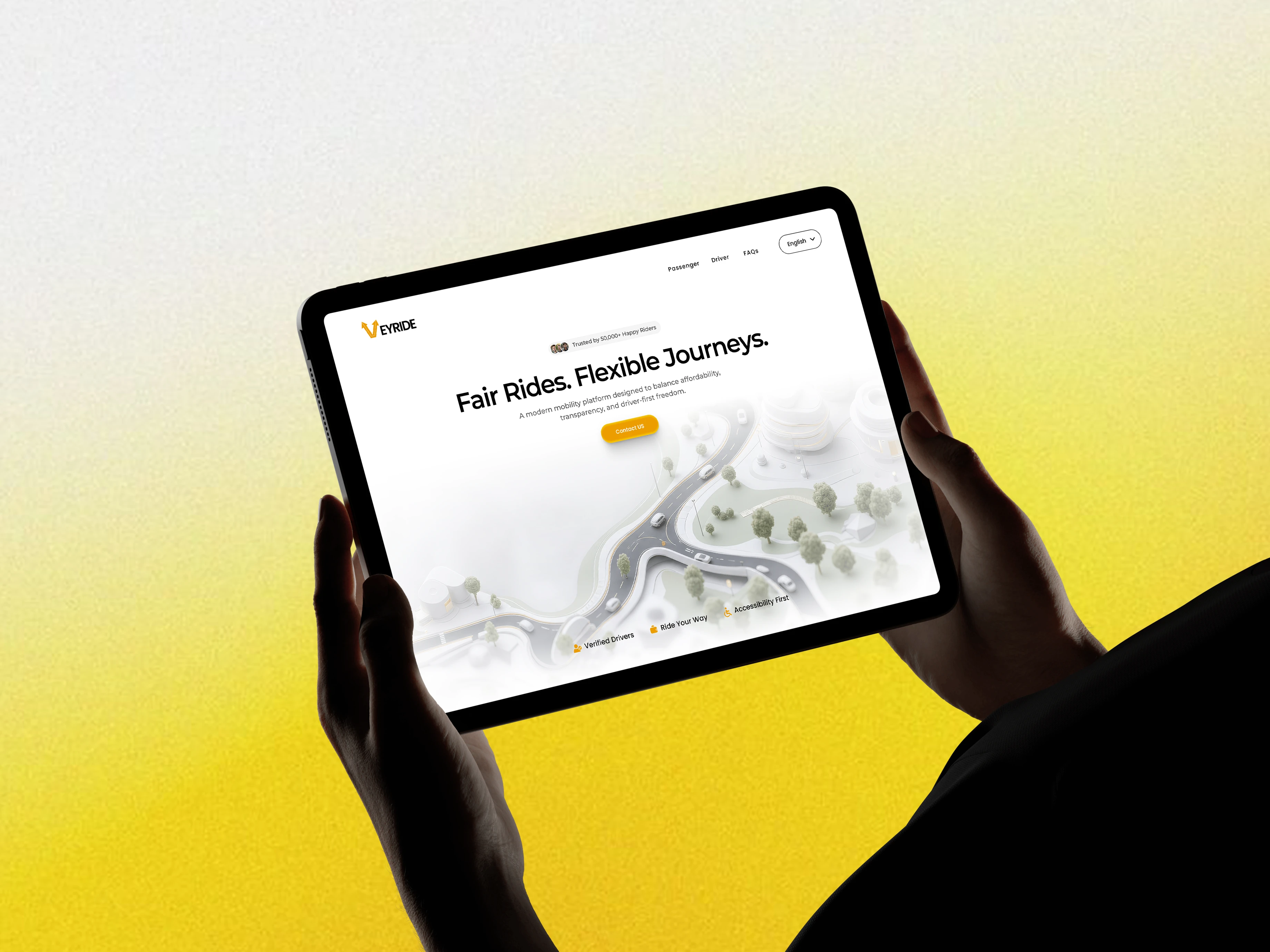
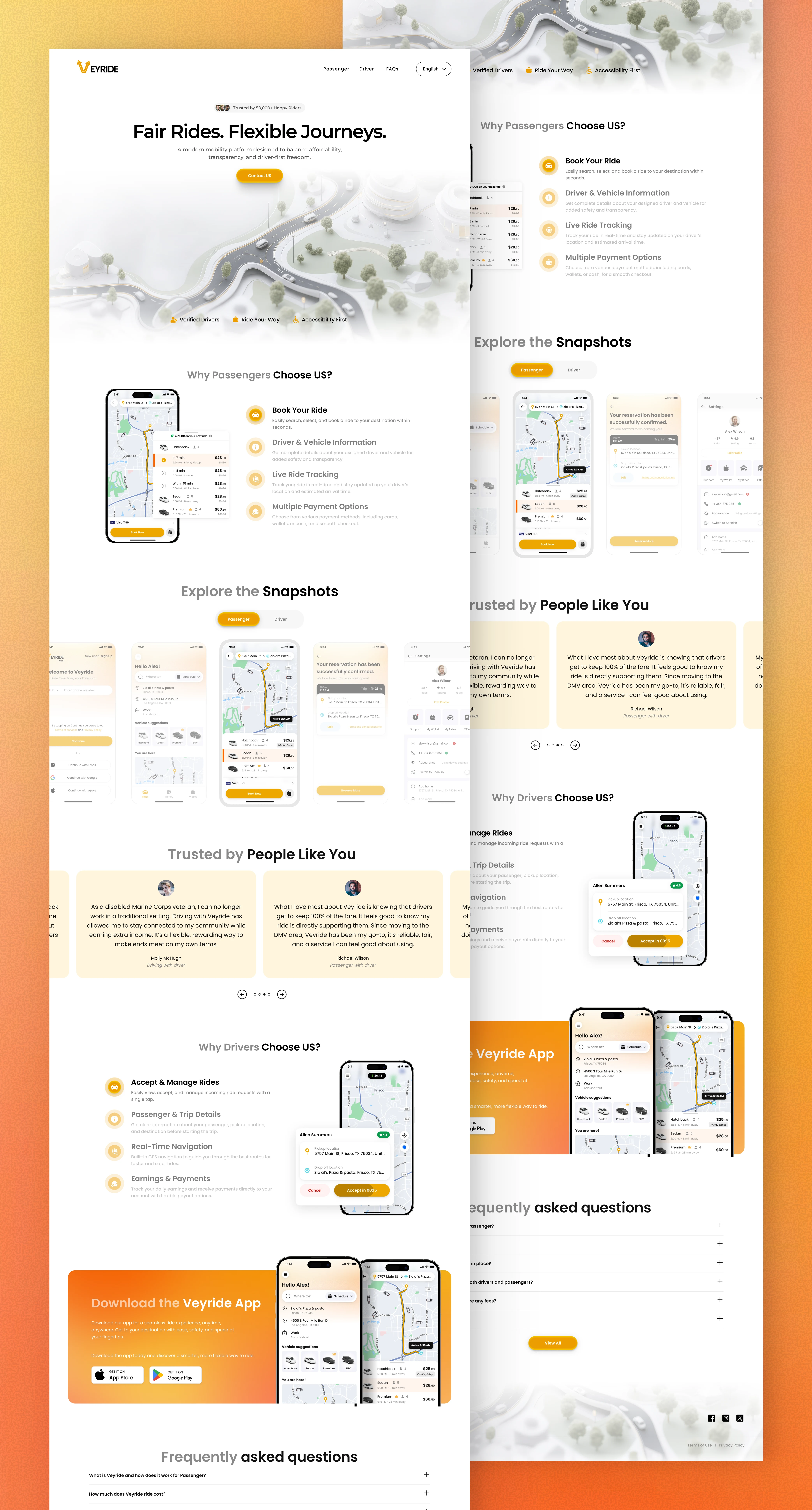
Hero Section
The hero section was designed to instantly communicate the core value proposition:
Fair rides. Flexible journeys.
I focused on:
Strong typography hierarchy
Minimal navigation
Trust indicators
Clean spacing
A modern mobility focused visual system
The target was to make the product feel reliable, transparent, and driver-friendly within the first few seconds.
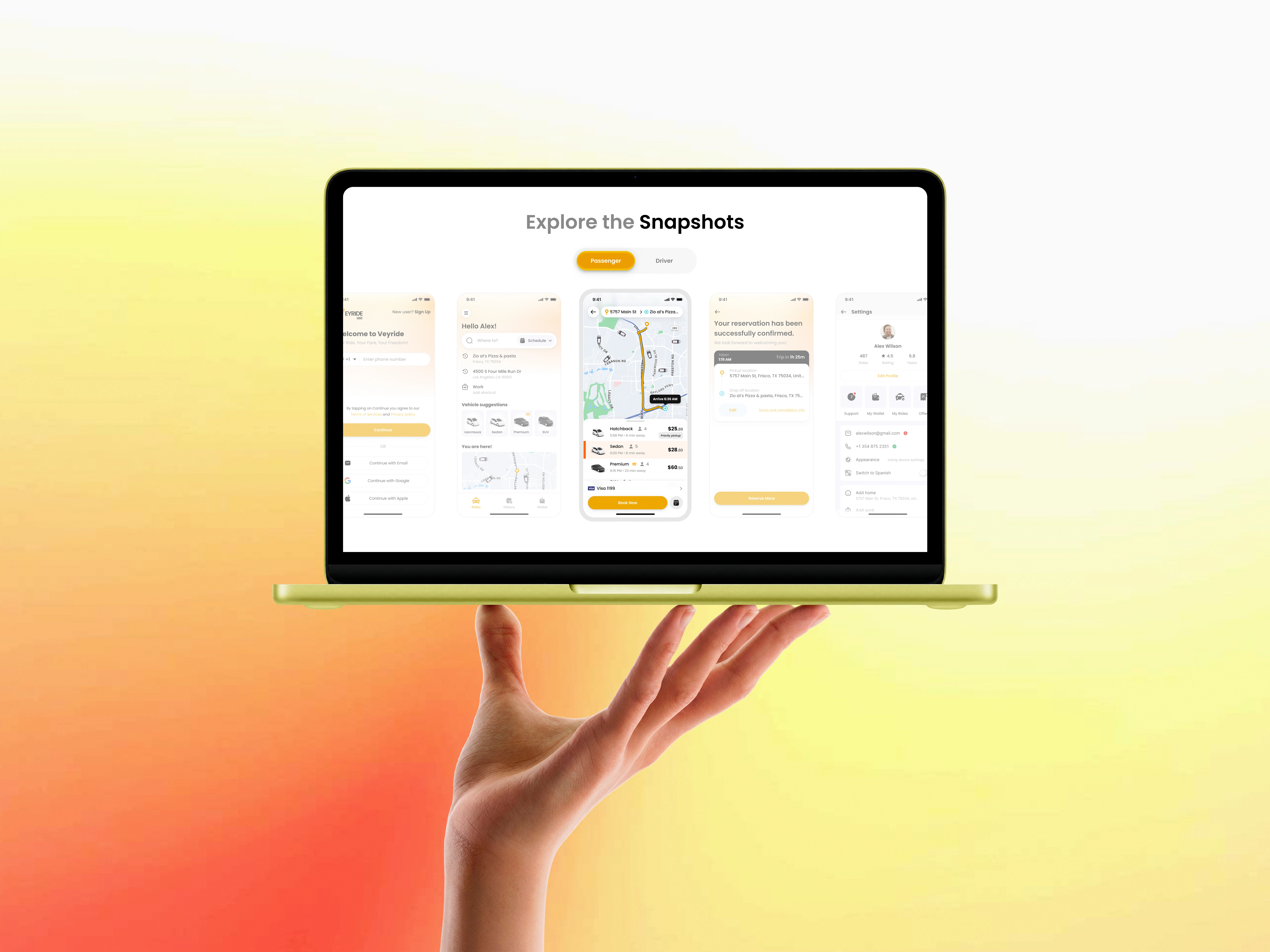
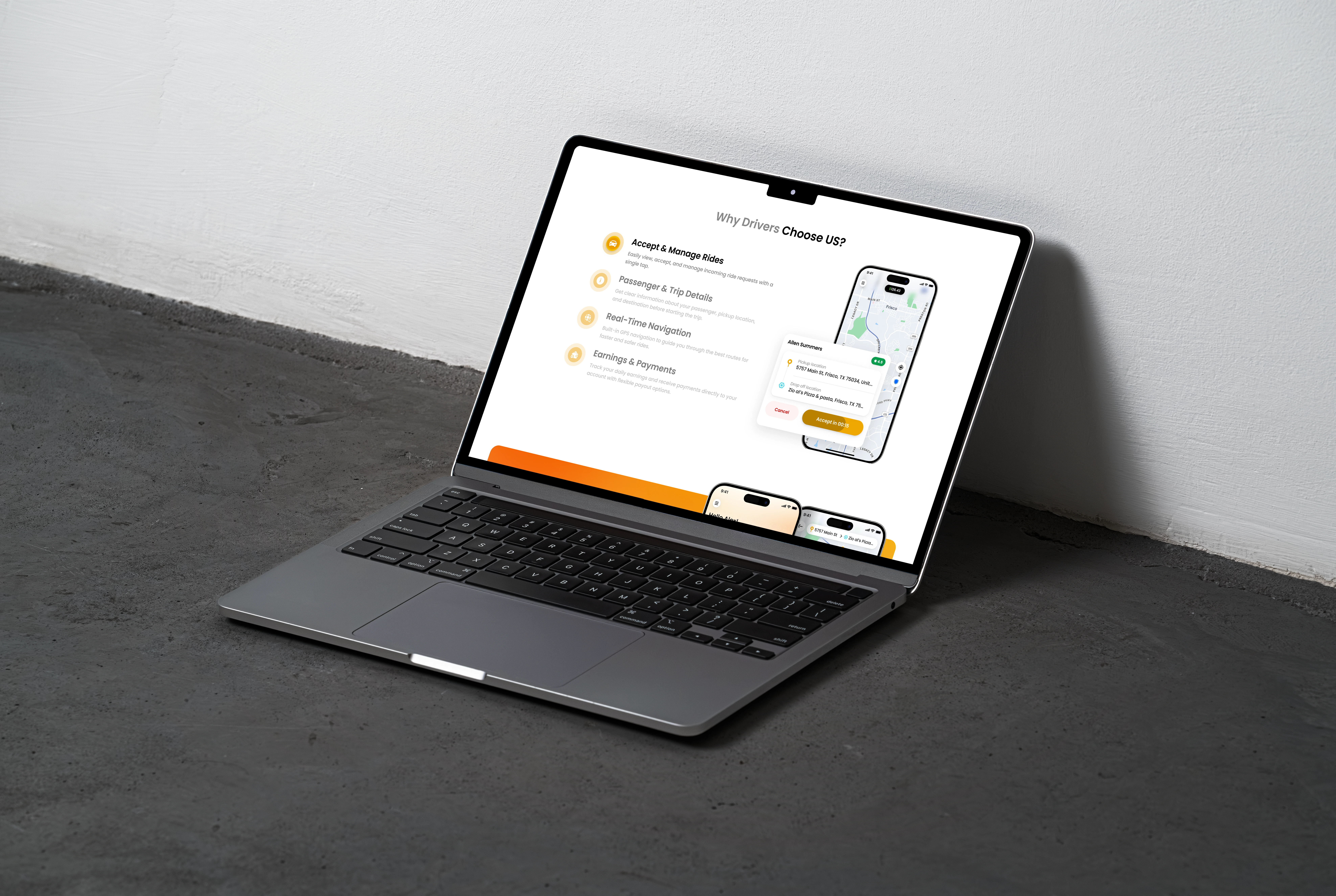
Passenger & Driver Experience
One of the key challenges was showcasing two different user journeys without making the page feel disconnected.
To solve this, I designed a toggle-based interaction where users can switch between passenger and driver snapshots. This helped keep the experience compact while adding an interactive layer to the landing page.
It also reinforced the idea that VeyRide is built equally for both audiences.
Social Proof & Trust
The testimonial section combines feedback from both passengers and drivers to create a stronger sense of platform authenticity.
Instead of treating reviews as decorative elements, they were integrated into the page flow to strengthen trust throughout the experience.
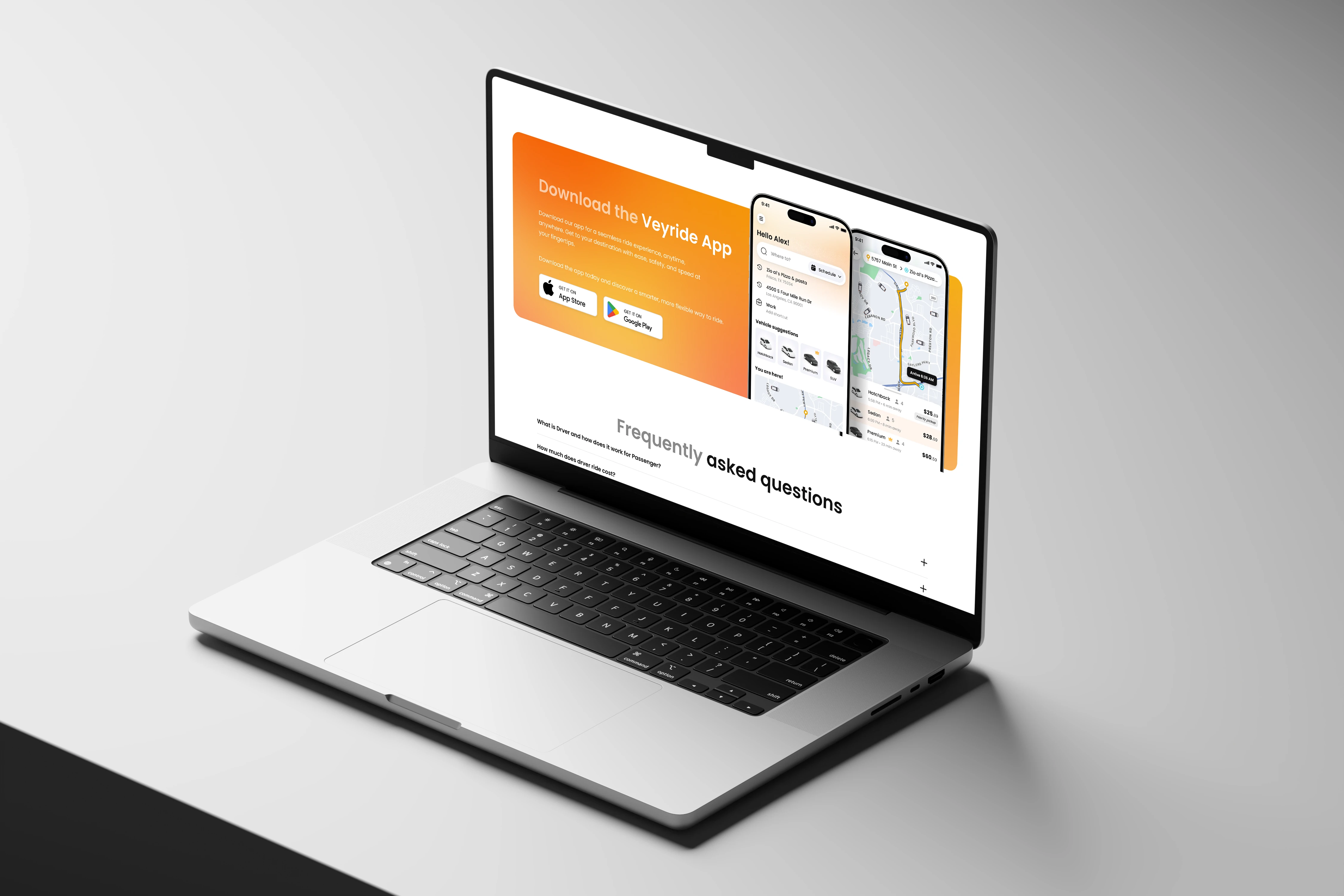
Conversion Strategy
The CTA section near the end of the page was intentionally designed with stronger contrast and simplified visuals to create a clear conversion moment.
The integration of App Store and Play Store download buttons keeps the action simple and immediate.
Final Outcome
The final landing page delivers a modern and conversion-focused experience while maintaining balance between passenger and driver communication.
The project explored how thoughtful hierarchy, minimal UI, and interactive storytelling can help mobility platforms feel more approachable, trustworthy, and user-focused.
Book a call ❇️
If you’re building products where clarity, conversion, and flow matter, I’d be glad to help shape that experience.
Like this project
Posted May 21, 2026
Designed a conversion-focused landing page for VeyRide with balanced passenger and driver communication.