B2B Website Conversion Optimization for Impirica

Kaleab Eshetu


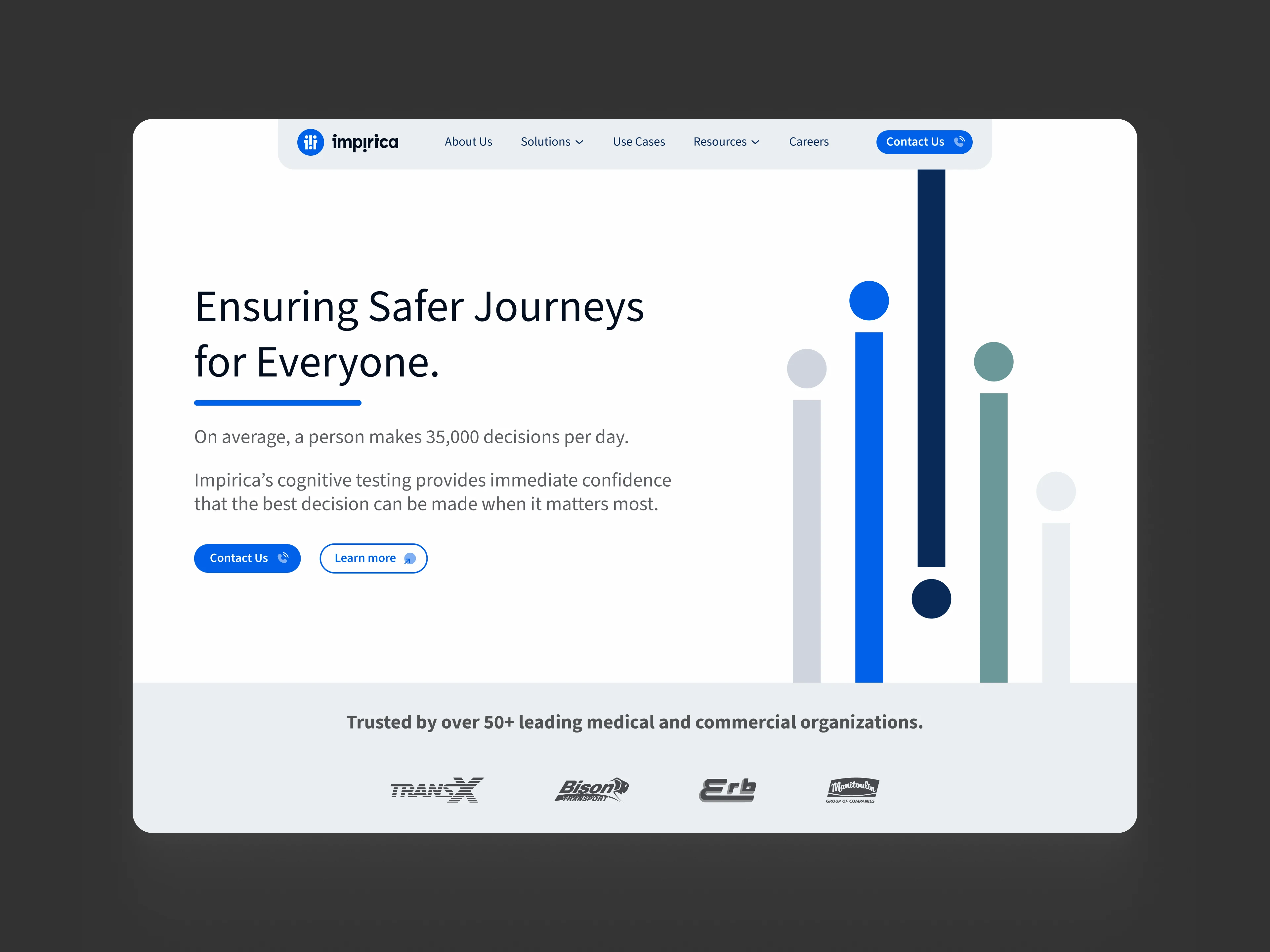
Helping a B2B startup triple booked calls through clearer messaging and better UX.
The Challenge
Impirica's website wasn't converting visitors effectively. With a 69% bounce rate and 65% of traffic coming from mobile, the experience needed to communicate the company's complex products more clearly and turn visitors into leads.
The Approach
01 — Clearer positioning
Simplified the messaging and reorganized content to help potential customers quickly understand Impirica's value.
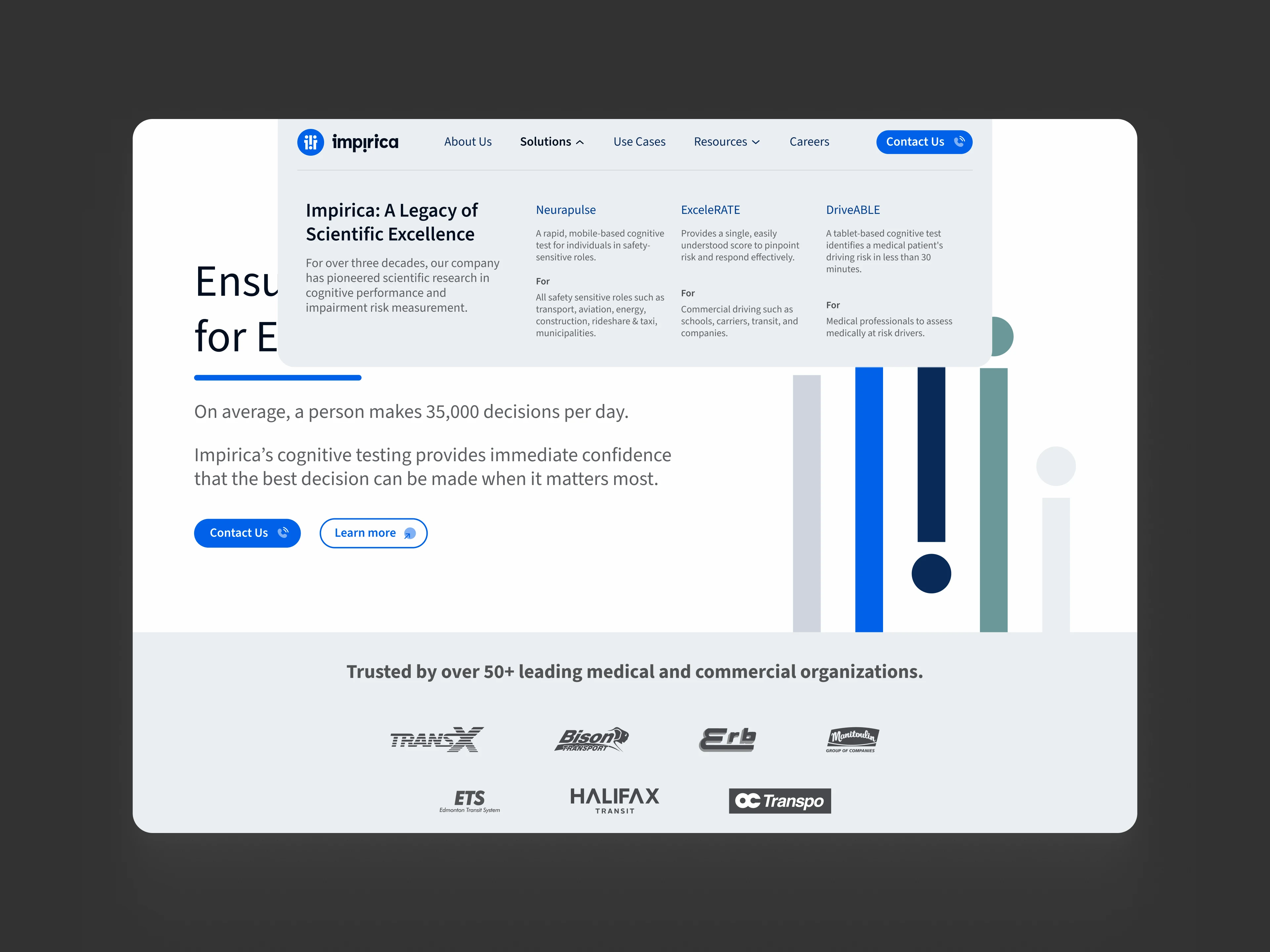
Mega menu design for Impirca
02 — Mobile-first redesign
Prioritized the mobile experience, improving navigation, readability, and visual hierarchy across screen sizes.
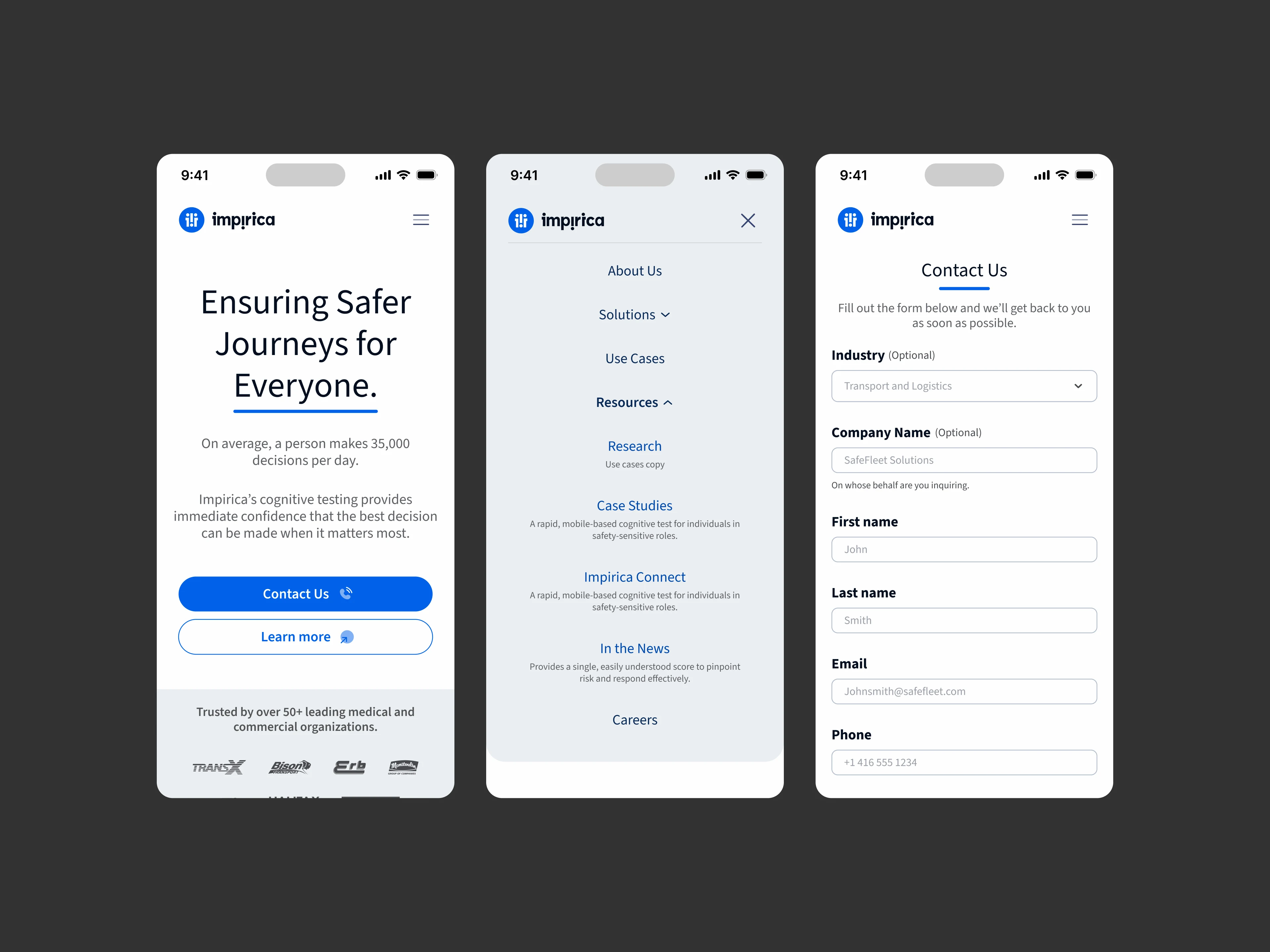
Mobile version of the landing page
03 — Dedicated product pages
Designed individual landing pages for each product, highlighting its unique value, benefits, and use cases while maintaining a consistent design system.
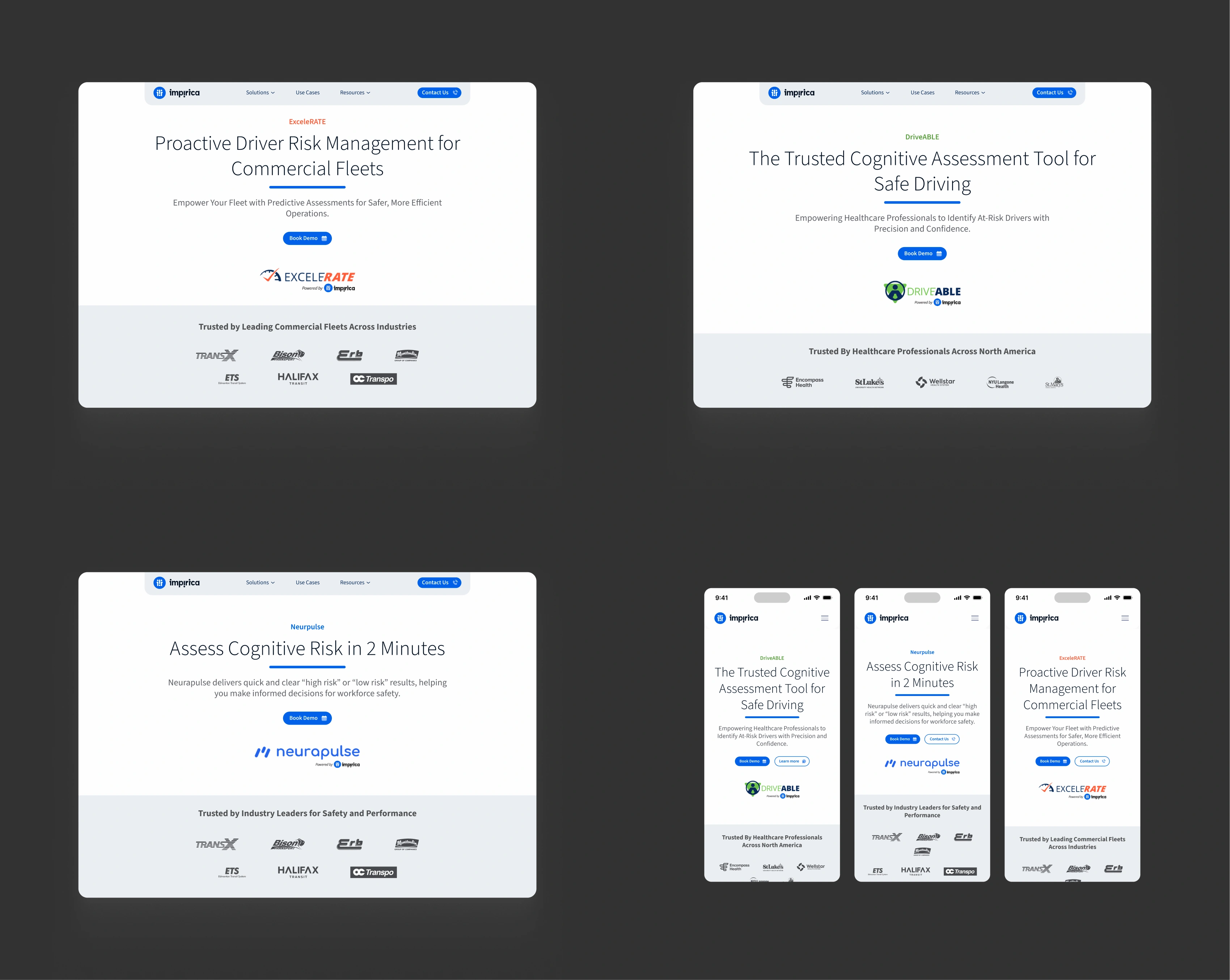
Product pages
04 — Conversion-focused UX
Created clearer paths from product discovery to booking a call, with more prominent CTAs and a streamlined user journey.
Use case, case study and book demo page to do just that.
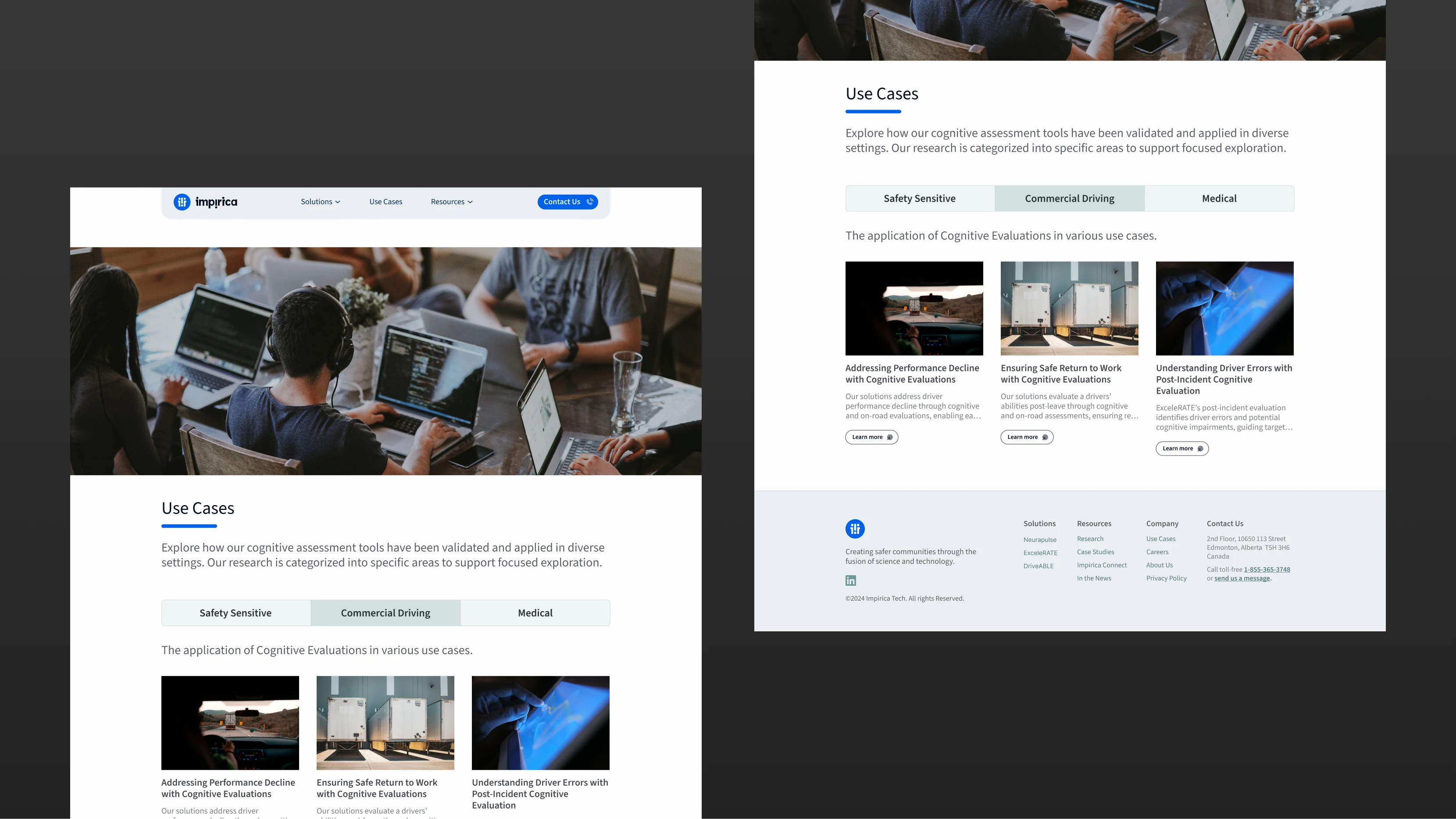
Use cases page
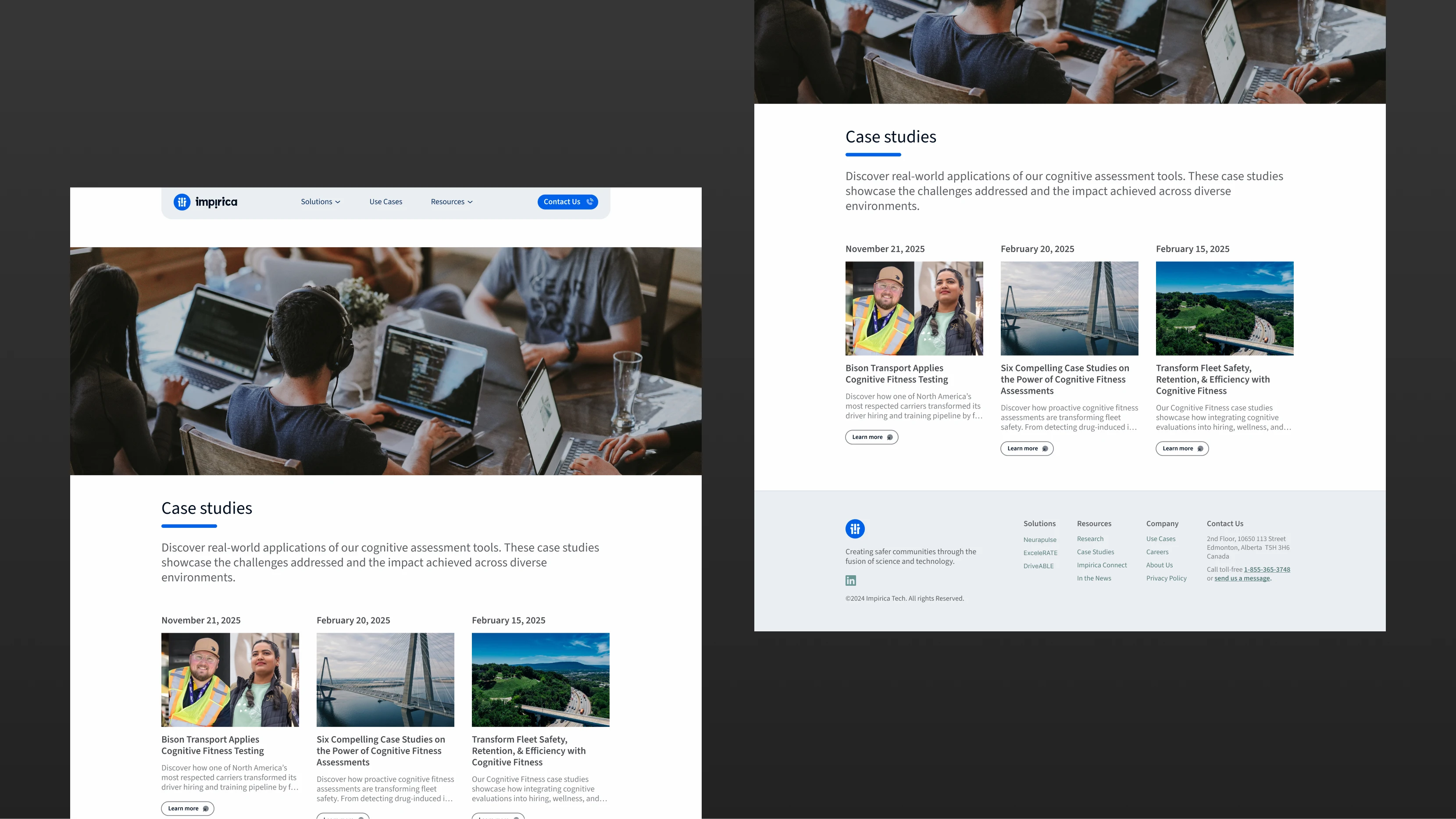
Case studies page
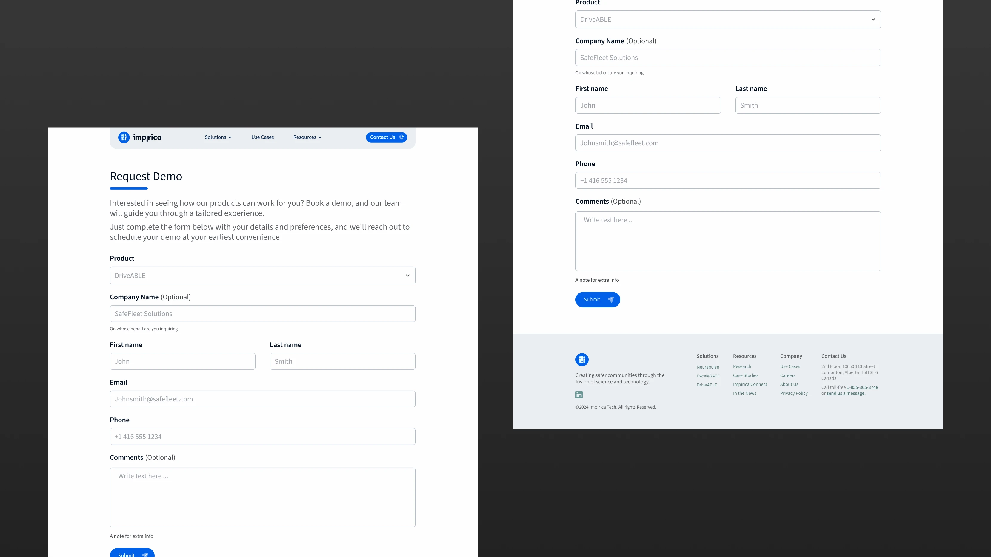
Book demo page
The Results
3× more booked calls within the first month.
69% → 38% bounce rate within three months.
Nearly 2× website visits within three months.
Live link: impirica.tech
Animated some of their assets in Rive (never got to prod tho)
Like this project
Posted Oct 18, 2026
Redesigned Impirica's website to boost conversion and lower bounce rate.
Likes
0
Views
1
Timeline
Oct 1, 2024 - Dec 1, 2024
Clients
Impirica