Designing for Real Results: The Postis Transformation

Stefan S


Postis is a Romanian platform that runs last-mile delivery for big retailers like IKEA, Carrefour and Decathlon. The engine underneath was already strong. It pulls dozens of couriers into one place, uses data science to predict and route deliveries, and tracks all of it in real time. The interface on top hadn't kept up, though. It worked, but it felt like something built by engineers for engineers. Over about five months in 2024, I rebuilt the core of it, the dashboard an operations team lives in all day, and handed the designs to their devs to ship.
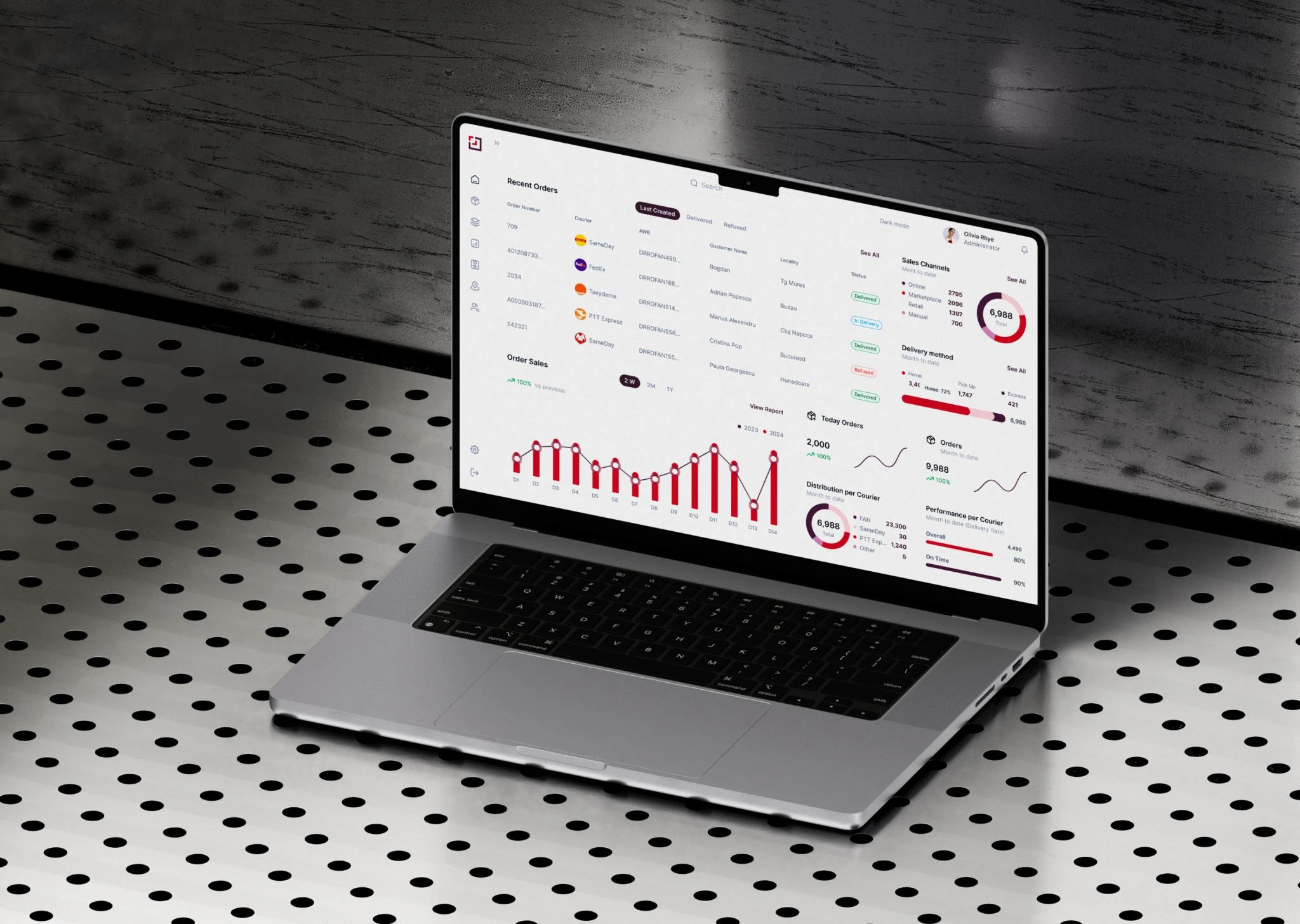
Postis platform interface
What Postis actually does
Postis sits between the moment someone clicks "buy" and the moment a parcel lands on their doorstep. It brings dozens of couriers together behind a single integration, predicts and automates deliveries, and gives retailers a live view of cost, SLAs, returns and customer satisfaction. Clients include IKEA, Carrefour, Decathlon, Auchan and Intersport.
I mention all that because it's the whole design problem in one sentence: everything the platform can do has to become something a person can read at a glance and act on.
The challenge
The old product worked, it just wasn't nice to use. The core was a single dashboard trying to carry four analytics views at once (created orders, customer experience, delivery stages, cost analysis), each one packed with charts, maps and filters. Nothing really needed inventing. It needed making legible, so an ops manager buried in delivery data could find the signal fast.
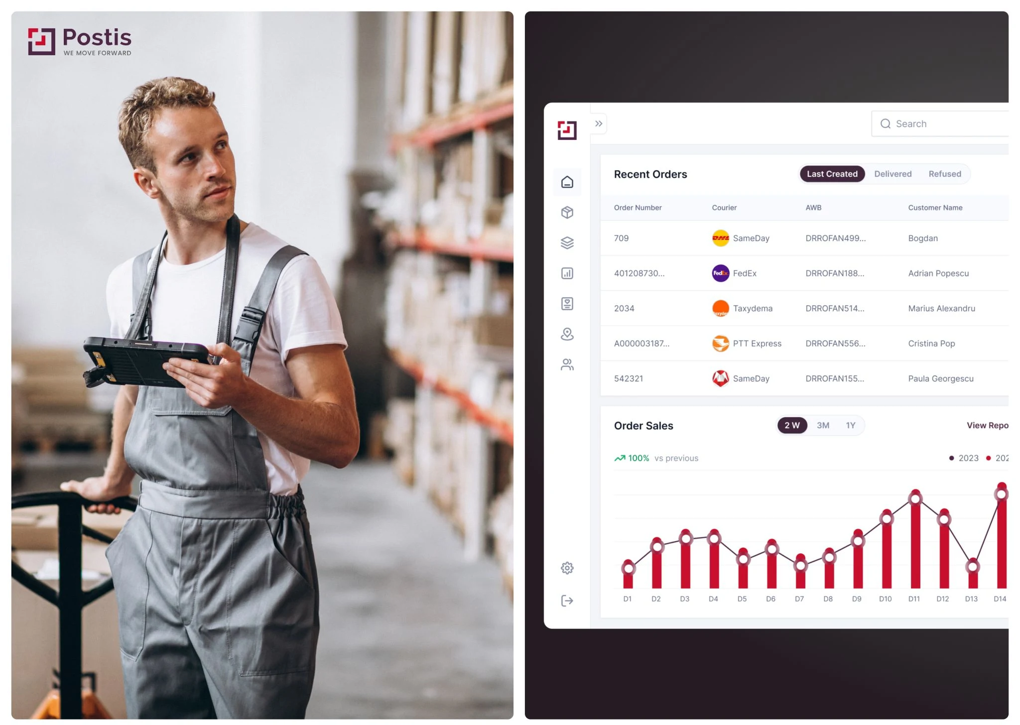
Postis dashboard overview
My role
It was a milestone-based project, scoped over roughly four to six weeks of focused work and run in stages so the client could see how it was going before committing to the next bit. I handled the UX and UI for the core dashboard and the design system under it, working straight with their product owner and passing finished screens to the dev team to build.
The dashboard was the real puzzle
Most of the work, and most of the fun, was the dashboard. Four different views had to live in one page without turning into a maze, so I started with the structure: each view self-contained but consistent, so you always knew where you were.
A few of the calls I'm happiest with.
There was a map that doubled as a filter. Click a region and the whole dashboard narrowed to it, which was handy, except there was no way back out without reloading the page. I gave it a proper reset, so it became something you could explore with instead of get stuck in.
Filters were confusing because no one could tell what they'd actually change. So I split them in two: some affect the entire dashboard, others only touch the view you're on, and the design makes which is which obvious.
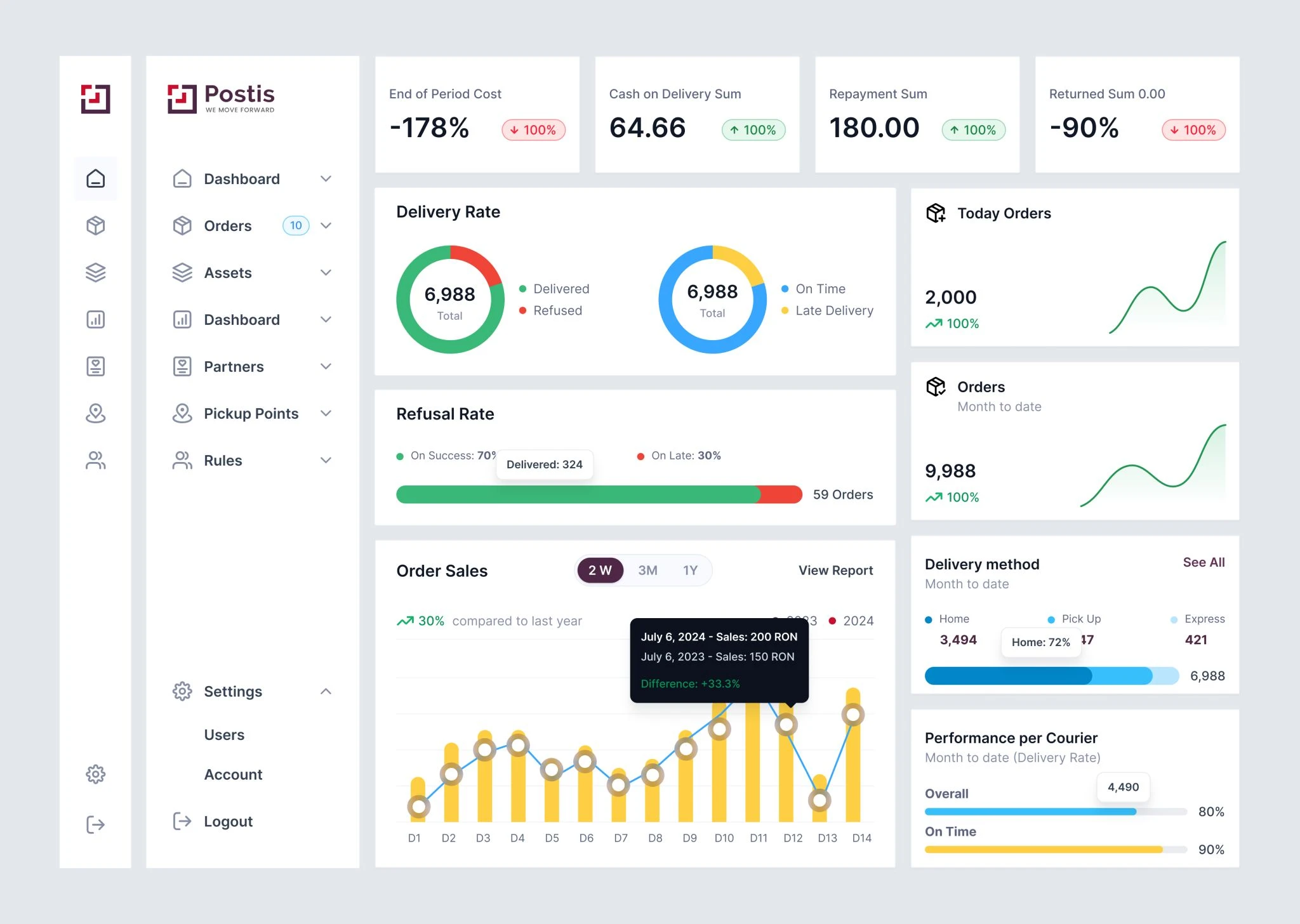
Postis dashboard, analytics and map view
People needed to compare periods, 2023 against 2024 on orders and customer experience, so I designed those comparison views. Part of that was knowing when to stop forcing everything onto one screen and let it scroll, once two years of charts needed the room to breathe.
For the numbers themselves I dug into how each metric worked before choosing a chart, cost analysis especially, so the visuals fit the data instead of just dressing it up. Same for the NPS cards and the delivery-stage statuses.
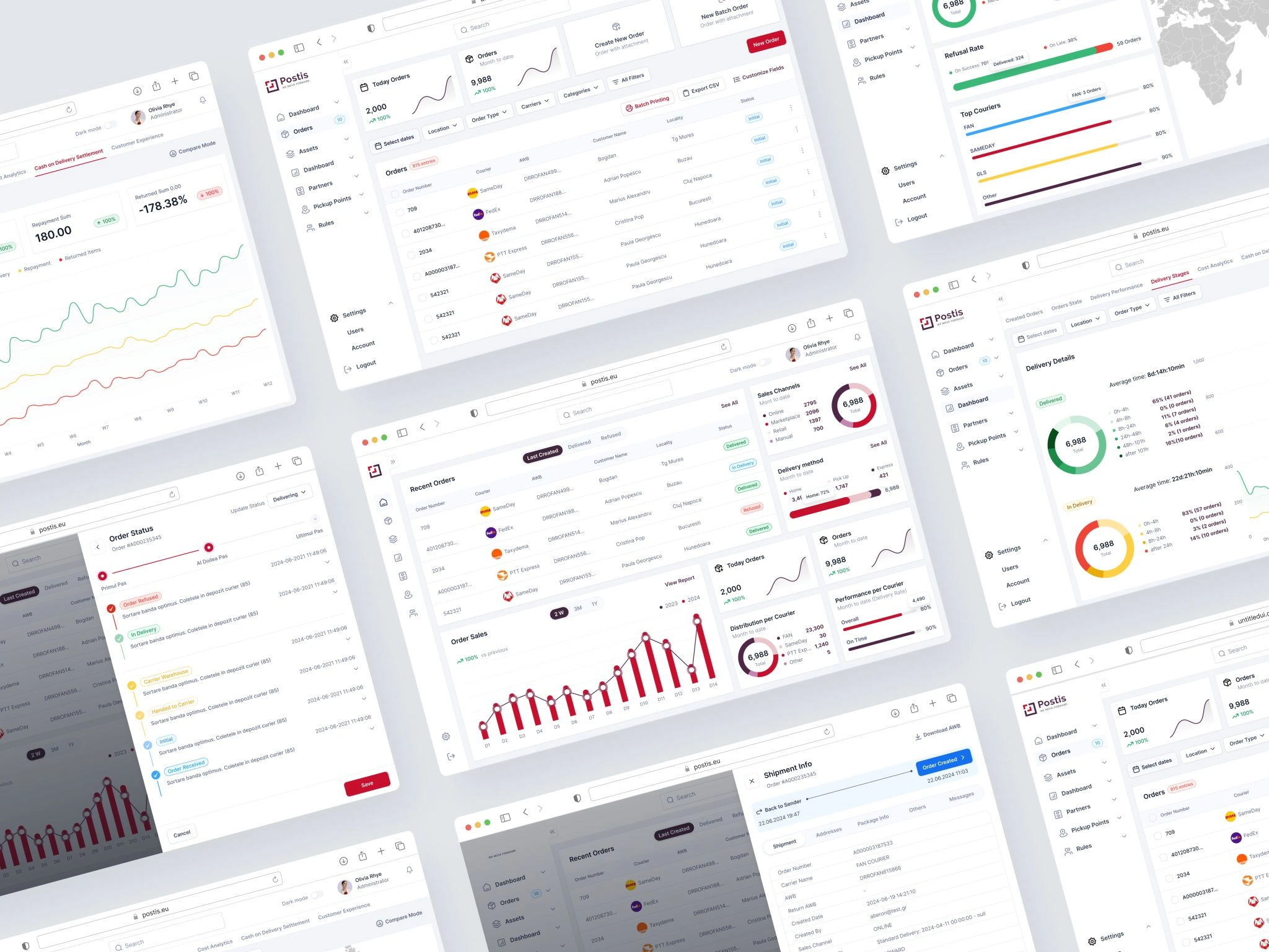
Postis dashboard, comparative analytics
The system underneath
Under the screens I built the design system that keeps everything coherent: components, states, and a color setup that survives both dark and light mode. Small stuff that adds up. Chart colors built from tints and shades, so the semantic ones (warning, error) still mean something. States for notification counts, disabled icons, hover. Row patterns for adding one item or a whole batch. Mostly I wanted something the devs could build against fast, without the UI slowly drifting out of shape.
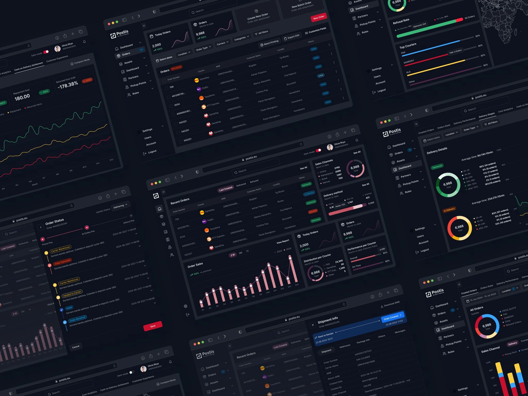
Postis design system and components
How it landed
I took a clunky internal tool and turned its core into something that feels like an actual product, shipped in stages and handed to the Postis engineers to build. We got through every milestone and they wanted to keep going, which for freelance work is about the best sign you can get.
The interface I designed is the front end of a platform Postis says delivers:
€2.3M saved, a 10–25% cut in delivery budgets in the first month
A doubled average NPS, and 25% fewer call-center calls about deliveries
2.4M km saved and 25% fewer late deliveries, from a first-time-right approach
185,000 fewer refused parcels, around 20% fewer returns
1M+ manhours saved, 5 to 15% more operational efficiency
Those are Postis's own published platform numbers, which is what the product I worked on is built to do.
Thanks for reading
Want something like this? Get in touch.
Like this project
Posted Jan 7, 2026
I rebuilt the core interface of Postis, a last-mile delivery platform used by retailers like IKEA and Carrefour, turning a clunky internal tool into a product an operations team can actually run their day on.
Likes
0
Views
36