UX Design for a High Converting Ecommerce Website
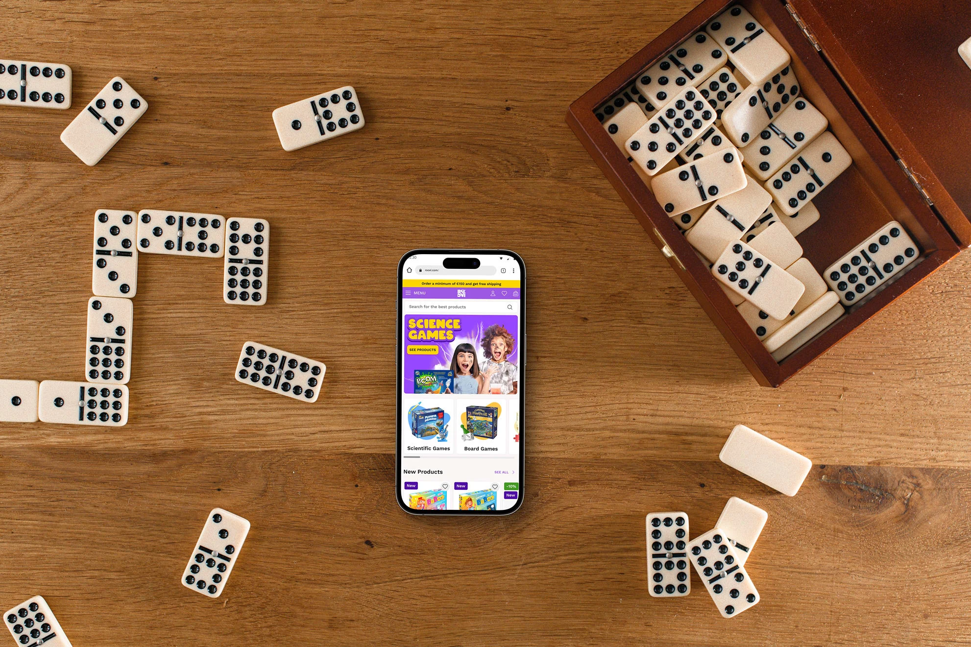
Dive into the UX case study revealing the digital transformation of D-Toys, a Romanian hub for board games and puzzles. As the lead UI/UX Designer and Researcher, I spearheaded a complete design revamp, enabling the brand to flourish online.
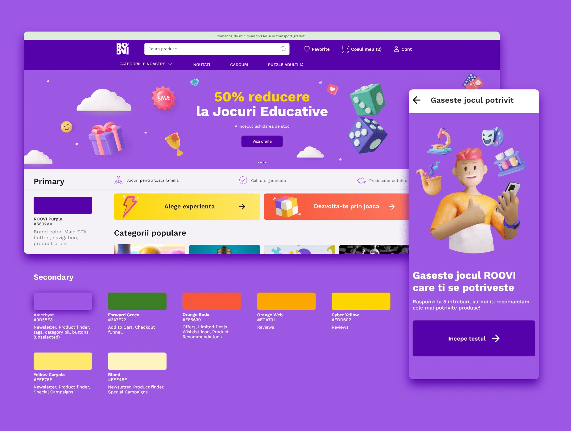
Table of contents
🧶 Problem
Steering the transition of a heritage brand, D-Toys, from its traditional brick-and-mortar presence to a captivating digital landscape was a pivotal challenge. With users accustomed to familiar marketplaces, our task was to entice them to embrace our webshop under the newly rebranded name and create a design solution that would set us apart from the competition.
💡Solution
Adopting a user-centric design approach, we focused on crafting a compelling and intuitive online experience tailored to the specific needs and preferences of our target audience. By leveraging insights from in-depth research and user interviews, we aimed to streamline the user journey and create a seamless pathway to product discovery and purchase.
🔬Research Strategy
Our research strategy was multifaceted, combining both qualitative and quantitative approaches to gain a comprehensive understanding of user preferences and market dynamics.
Research objectives:
Understand the preferences and behaviors of contemporary Romanian parents aged 25 to 45.
Identify the challenges and pain points in the current shopping experience for board games and puzzles.
Determine the factors influencing consumer decisions in transitioning from traditional retail to online shopping.
Explore the expectations and needs of the target audience regarding interactive learning experiences for their families.
Gather insights to reshape consumer perceptions and encourage engagement with the rebranded webshop.
User Interviews
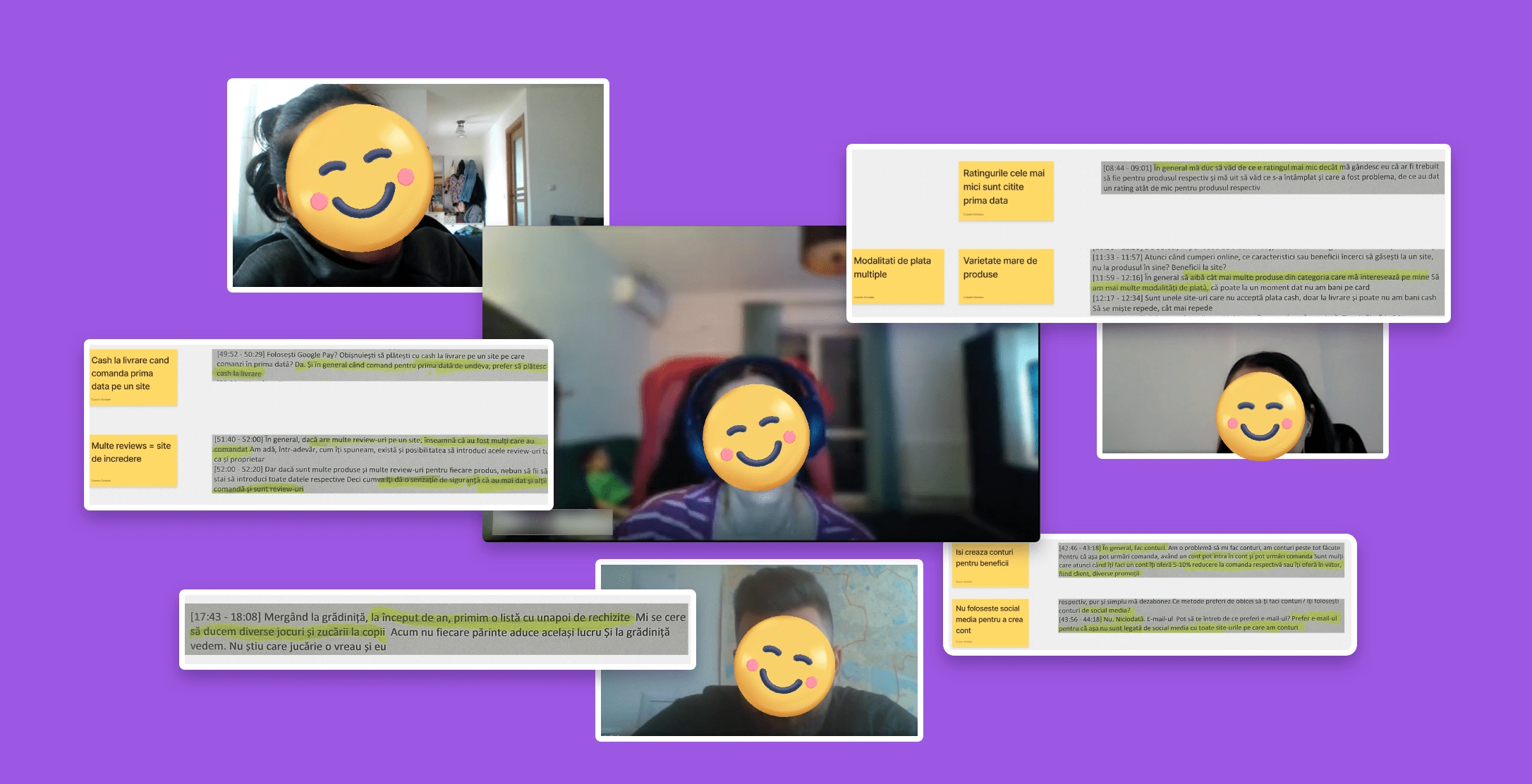
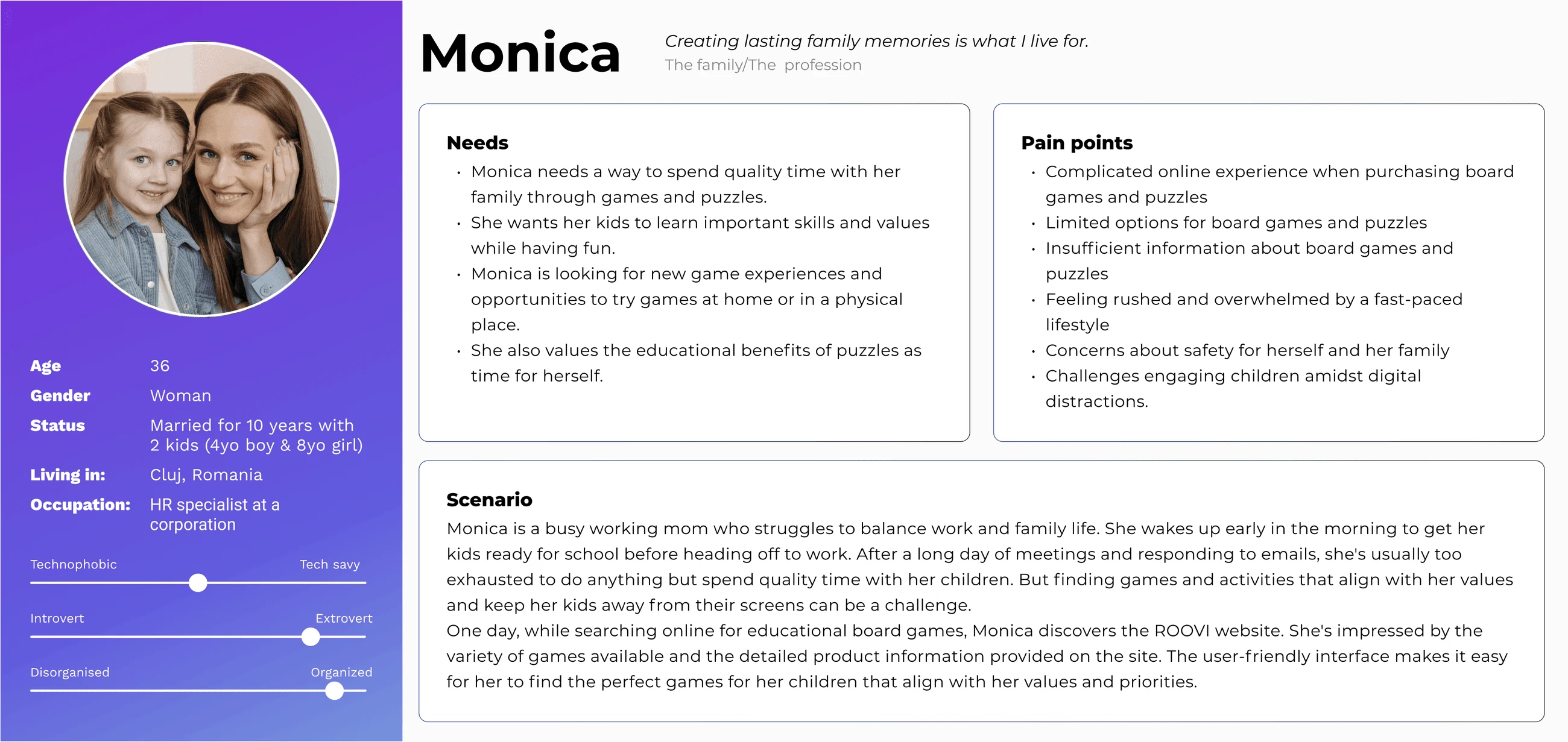
In the initial phase, I interviewed a group of individuals to understand their preferences and habits, which shaped our design strategies. We asked about their daily routines and preferences. I spoke with 5 participants over a week, gathering insights for our website enhancements. Their feedback emphasized the importance of detailed product images and user reviews. Creating lists was common, serving as memory aids and for sharing. They sought educational games with filtering options based on age, themes, players, and skill development. We used this to create user personas, keeping their needs in focus during the website refinement.
User Persona
Customer Journey
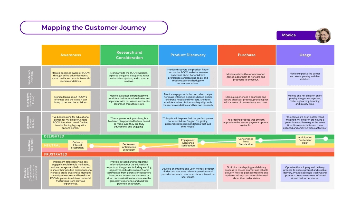
By addressing Monica's actions, thoughts, emotions, and key points at each stage of the customer journey, we can design solutions that cater to her needs, build trust, and ensure a positive overall experience with ROOVI's products and services.
Secondary Research
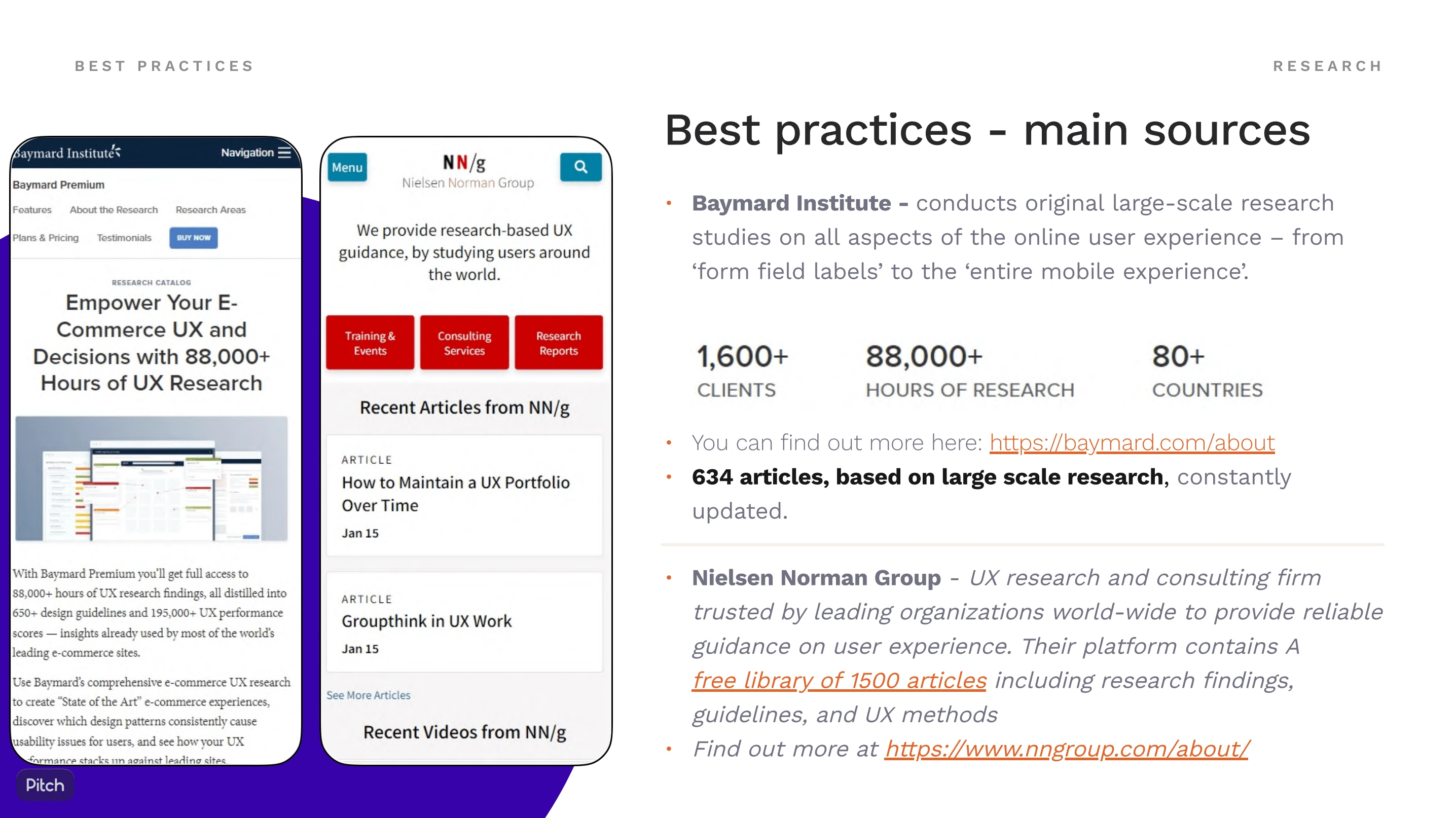
During the secondary research phase, I followed a comprehensive approach to gather valuable insights for the ROOVI project. By studying and applying specific guidelines, I gained a solid understanding of the industry standards and best practices that can enhance ROOVI's website.
Kano model
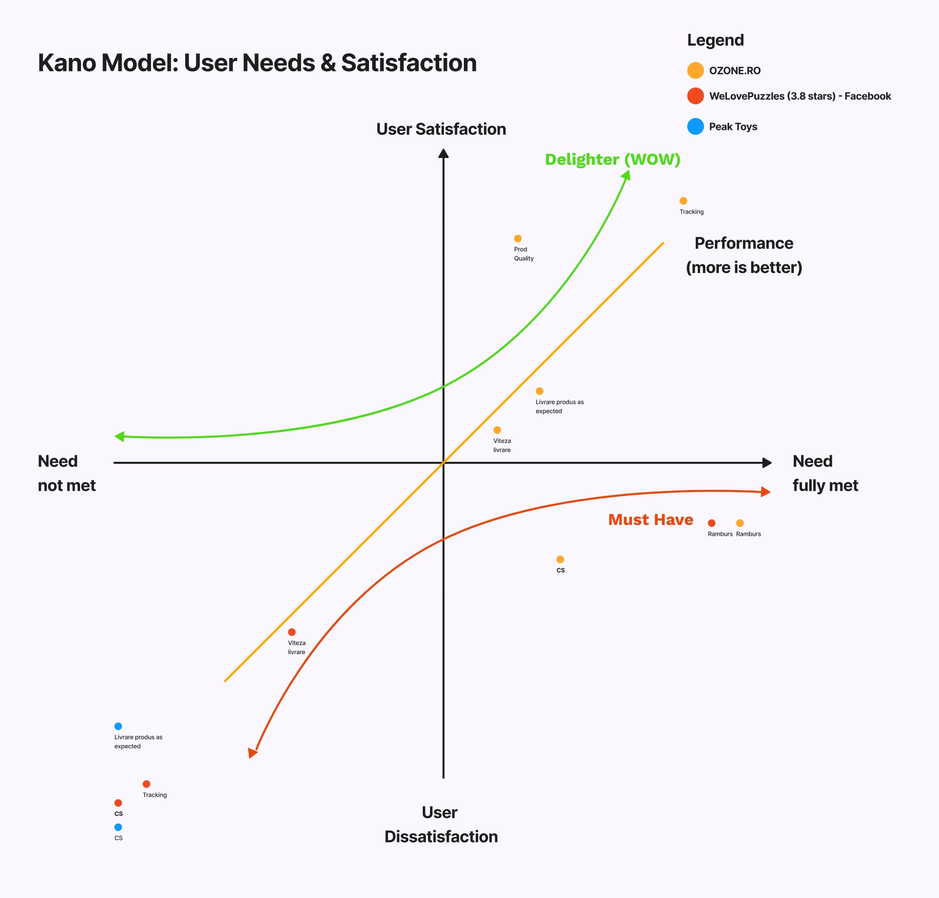
Next, I conducted a thorough competitor analysis focusing on ROOVI's top three direct competitors. This analysis involved diving deep into their product offerings, pricing strategies, website design, functionality, and customer reviews. By carefully examining their strengths and weaknesses, I gained valuable insights into the competitive landscape and identified areas where ROOVI could stand out.
By understanding customer needs and aligning them with product development, organizations can create products that not only meet basic requirements but also deliver superior customer satisfaction and delight.
🧭 Information Architecture
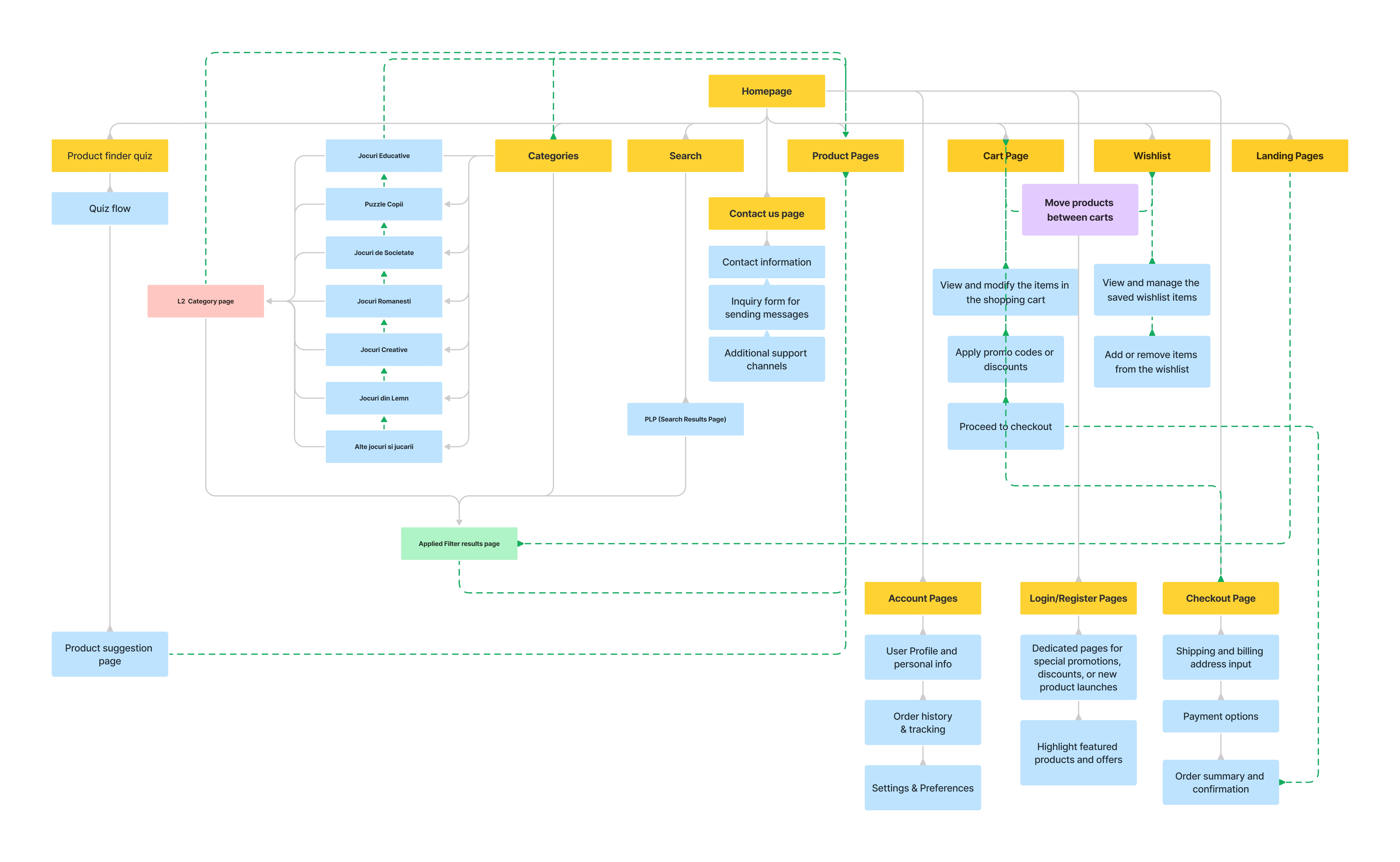
The D-Toys website offers a wide range of educational games and toys for children. The goal is to provide an intuitive and user-friendly experience for parents like Monica, who are looking for educational and engaging products for their kids.
📐 Wireframes
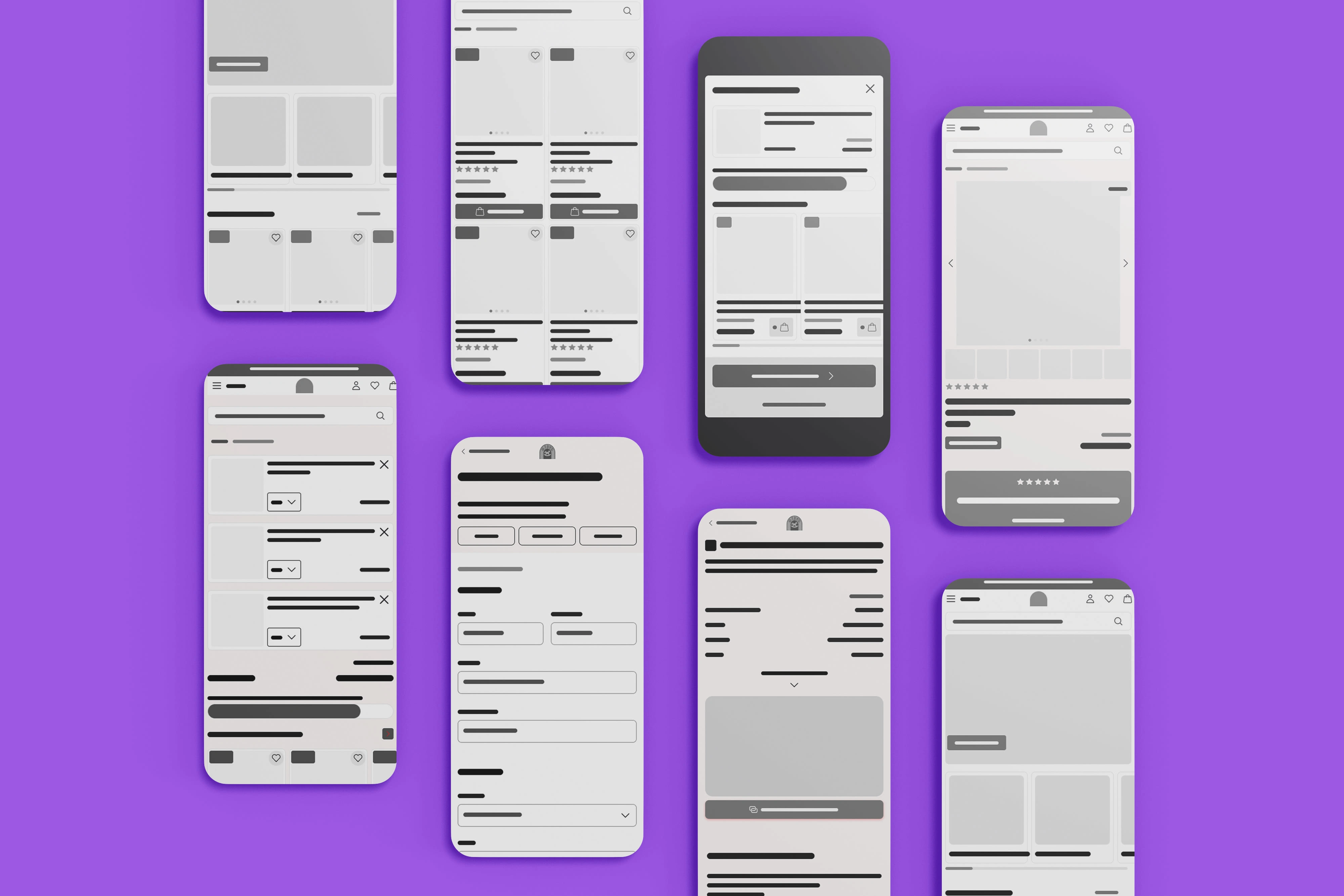
Wireframes allowed us to define the information hierarchy and organization of different page components. We could determine the placement of key elements, such as navigation menus, content sections, and calls to action. This helped us establish a logical flow of information and guide users through the website intuitively
👩💻 Usability Testing & Iteration
Real life example of our design iteration process:
Issue:
Users are done searching and exploring after they add a product to cart
3 out of our 5 users mentioned that they need a way to go back to their search, after they added a product to cart,.
Solution:
Allow users to get back to their search or filtered list anytime it's possible
Our solution was to replace the go to cart button (which became irrelevant) with a back to list button, in the product added to cart confirmation modal. We also added a back to list button to all product pages (or a go to homepage button for users that reached a PDP directly, without extra navigation).
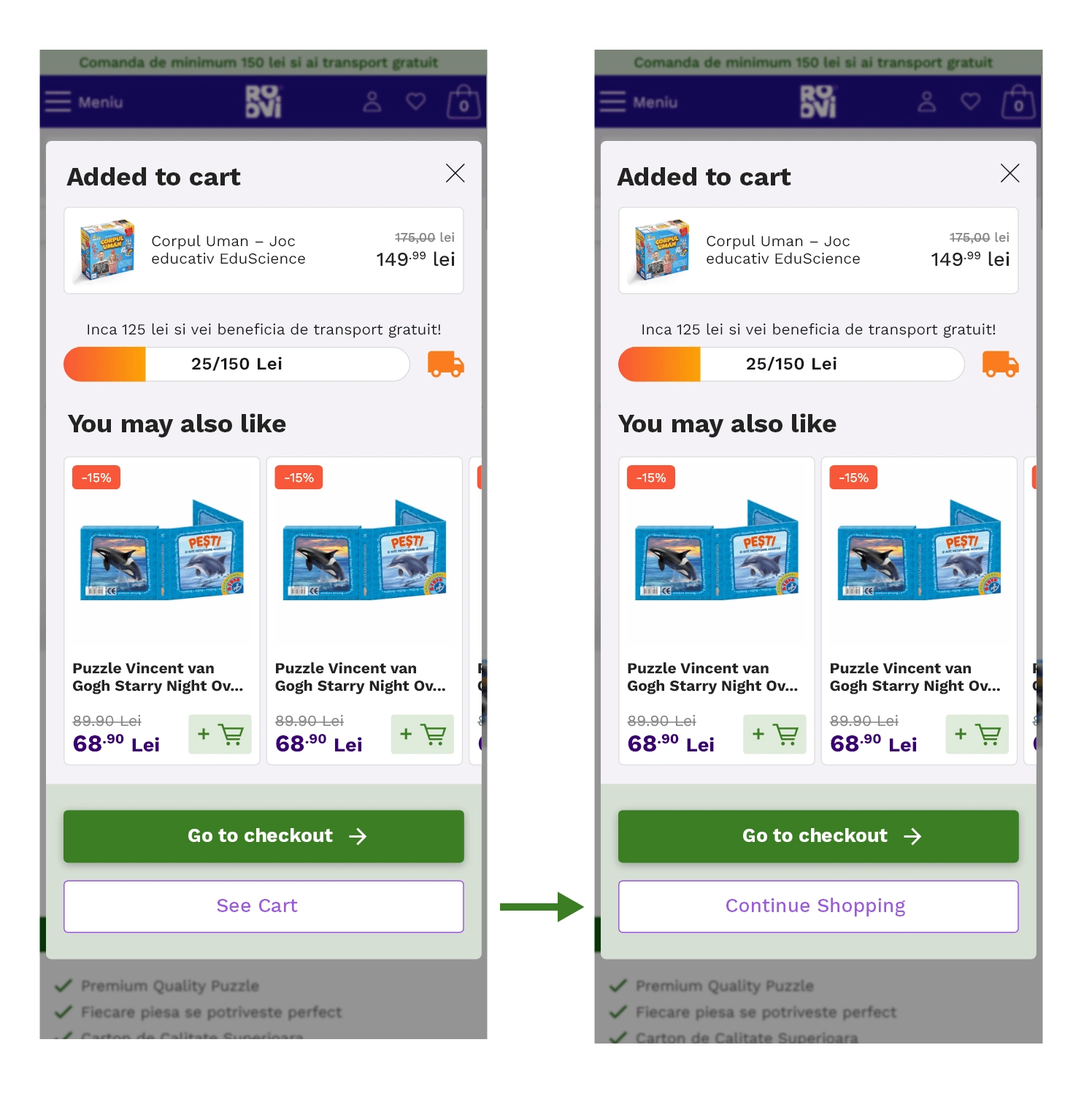
Left: The Product added modal has the option to Go directly to cart or checkout.
Right:We gave the users the freedom to continue exploring, before entering the checkout funnel through the shopping cart.
⭐ The Fun Part: UI Design
Once I tested out the usability mistakes, I started designing the final screens in Figma.
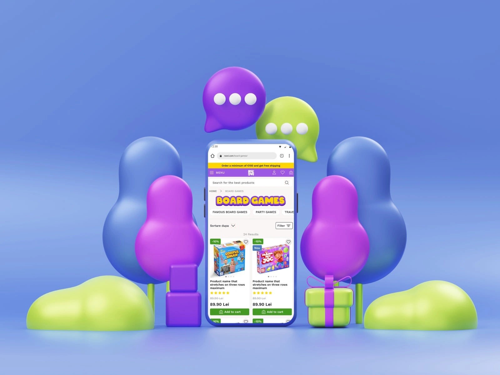
I applied a fresh and modern visual style to the UI design of ROOVI, inspired by the brand's desire to project a contemporary and inviting image. Following the principles and guidelines of Material Design, the design incorporates clean aesthetics and intuitive interactions, ensuring a consistent and familiar user experience.

🧱 Design System
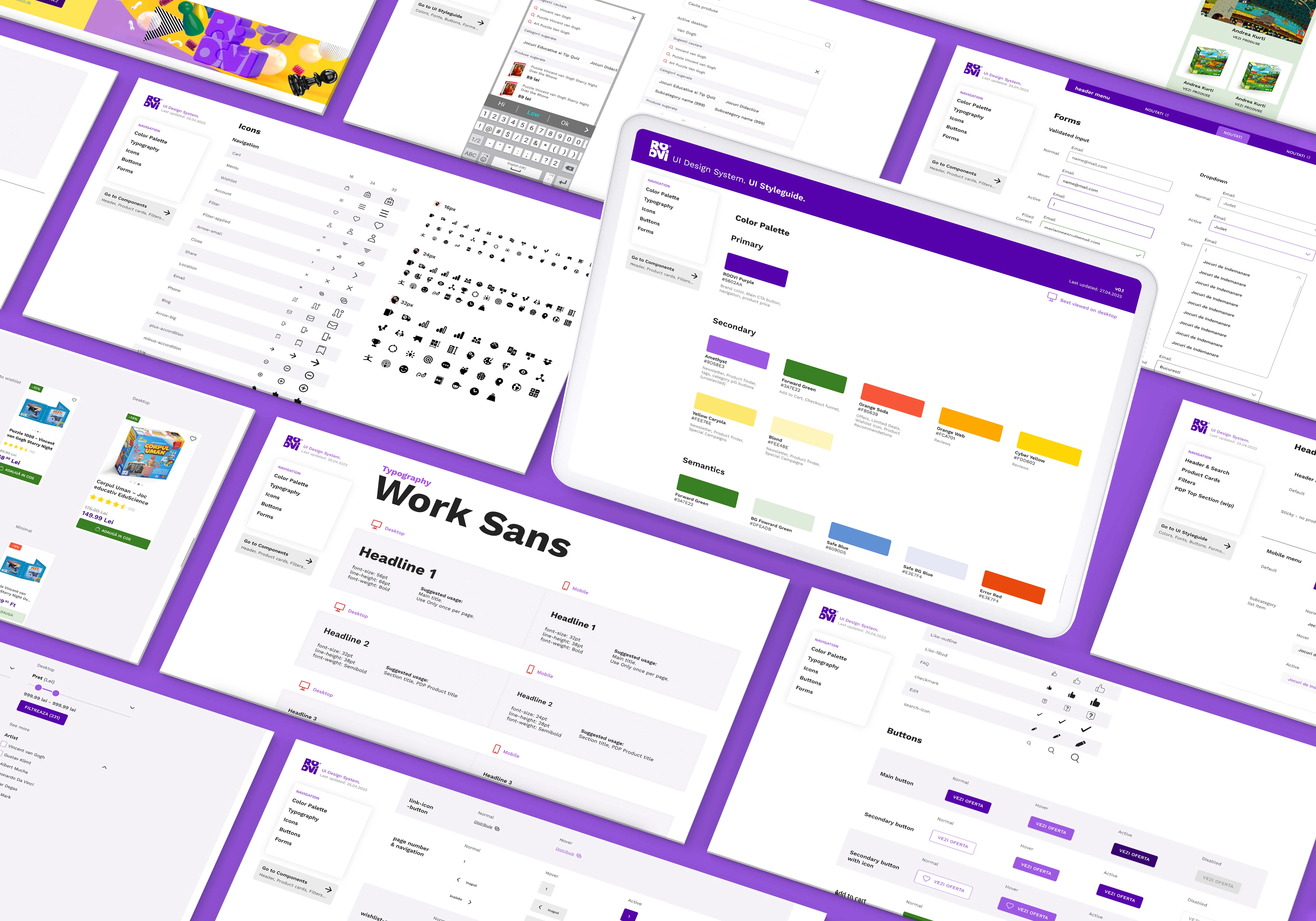
I created a design system from scratch for ROOVI, drawing inspiration primarily from Material Design and IBM's Carbon Design. This system serves as a foundation for maintaining consistency and coherence across the entire platform. It includes a set of reusable components, standardised typography, color palettes, and layout guidelines.
✨Conclusion
This case study has been a transformative and fulfilling experience for me. Throughout the project, I've immersed myself in understanding the users' needs, frustrations, and aspirations.
Measurable results:
⬆️ 269% Increase in Overall Conversions
in Q3/Q4, compared to the first 2 quarters.
🤩 Huge Bounce Rate Improvement
After redesigning the shopping cart, the bounce rate dramatically decreased from 58.7% to 7.2%.
What I've Learned
This project has further ignited my passion for user-centered design and reinforced the importance of simplicity, content focus, and intuitive interactions. I am excited to continue my journey, applying these learnings and contributing to future projects that make a positive difference in people's lives.
Thank you!
Feel free to contact me for the design project of your dreams!
Like this project
Posted Mar 22, 2024
Dive into the UX case study revealing the digital transformation of D-Toys, a Romanian hub for board games and puzzles. As the lead UI/UX Designer and Researche
Likes
0
Views
37

