
Visual Brand Identity & Packaging
© September 2025
SMASH — Fast Food Branding & Packaging Design
THE DESIGN CHALLENGE
A fast-food identity needs to communicate personality quickly across a short name and compact takeaway packaging. The challenge is to create a strong signature without relying on food photography to do all the work.
THE DESIGN SOLUTION
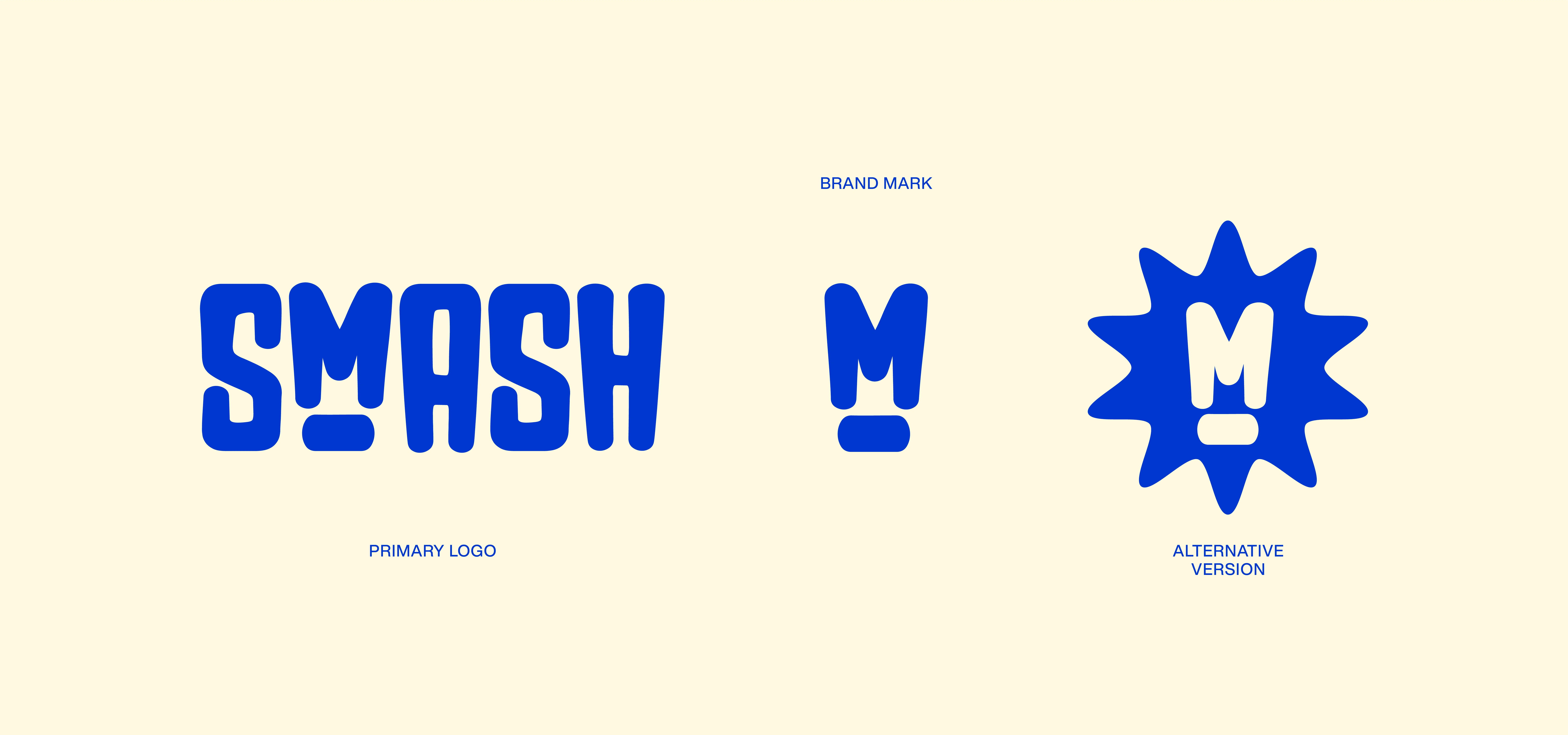
The identity makes heavy condensed lettering the main graphic asset. Soft corners and the unusual M construction add a playful interruption. Blue-violet and pale cream repeat across the wordmark and packaging to create one connected family.
WHY THESE DECISIONS MATTER
A strong typographic silhouette gives the name visual presence. Restrained colour and repeated lettering carry the personality into everyday packaging while keeping the system consistent.
Need restaurant branding or food packaging design? Message me with your brand, packaging formats and visual direction.
Designed by @FIEONART
1 like · 9 views · Oct 16, 2026
Fast-food branding and packaging driven by expressive condensed lettering, a distinctive wordmark and blue-violet/cream colour contrast.


