Pure Gluten Free. Logo and Packaging Design


Pure is a family owned food company based in South Africa that focuses on producing safe gluten free products.
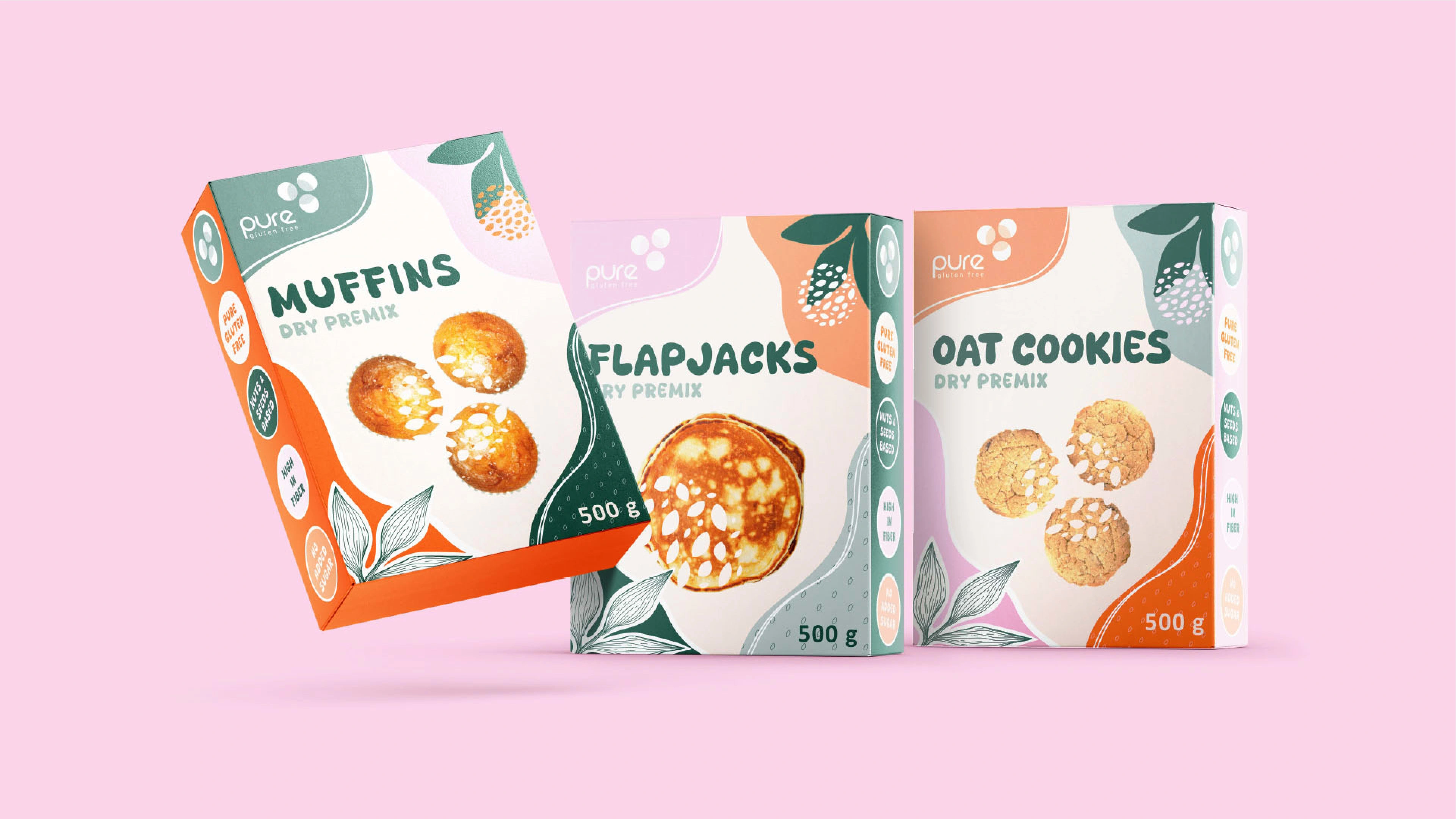
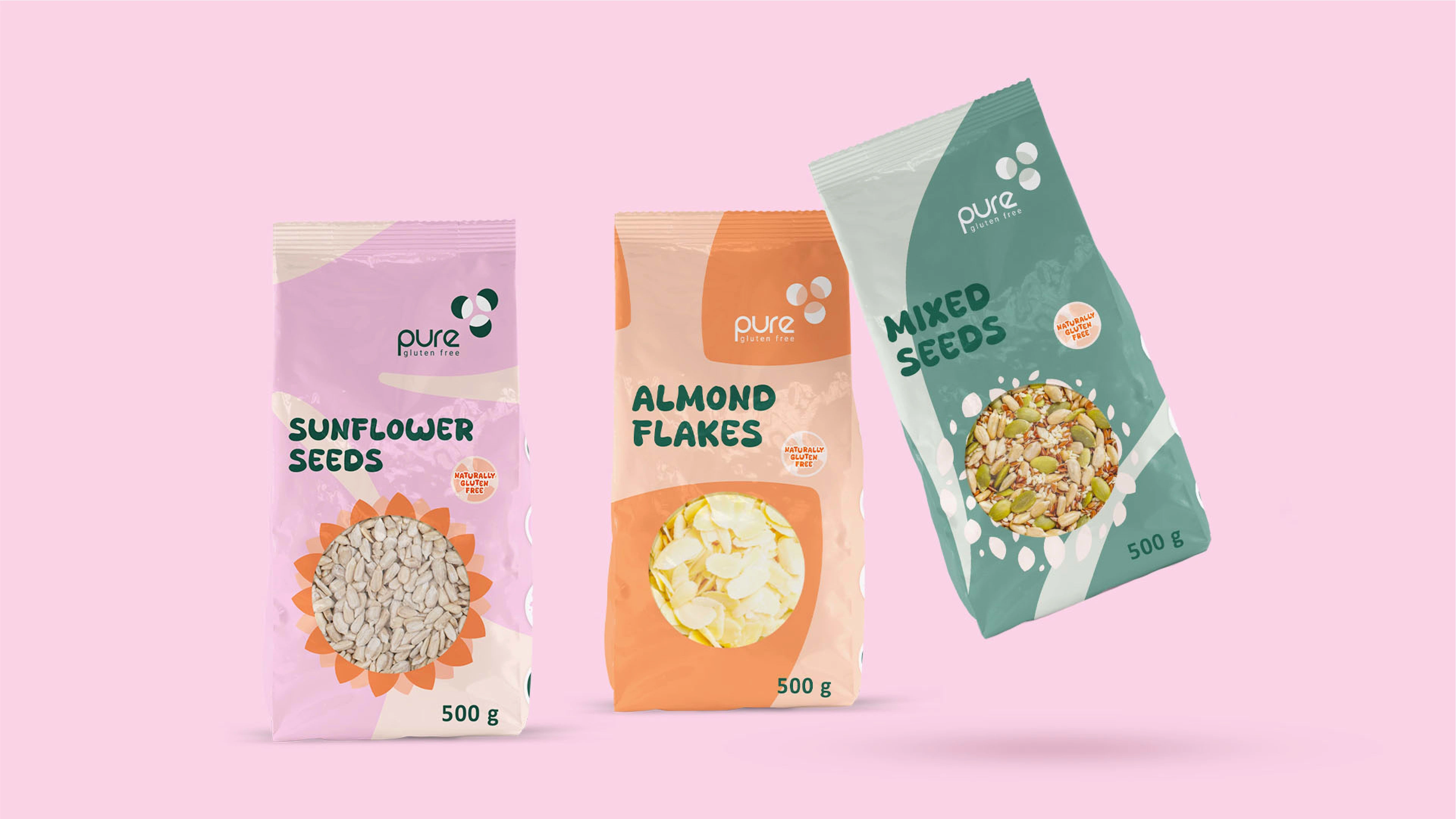
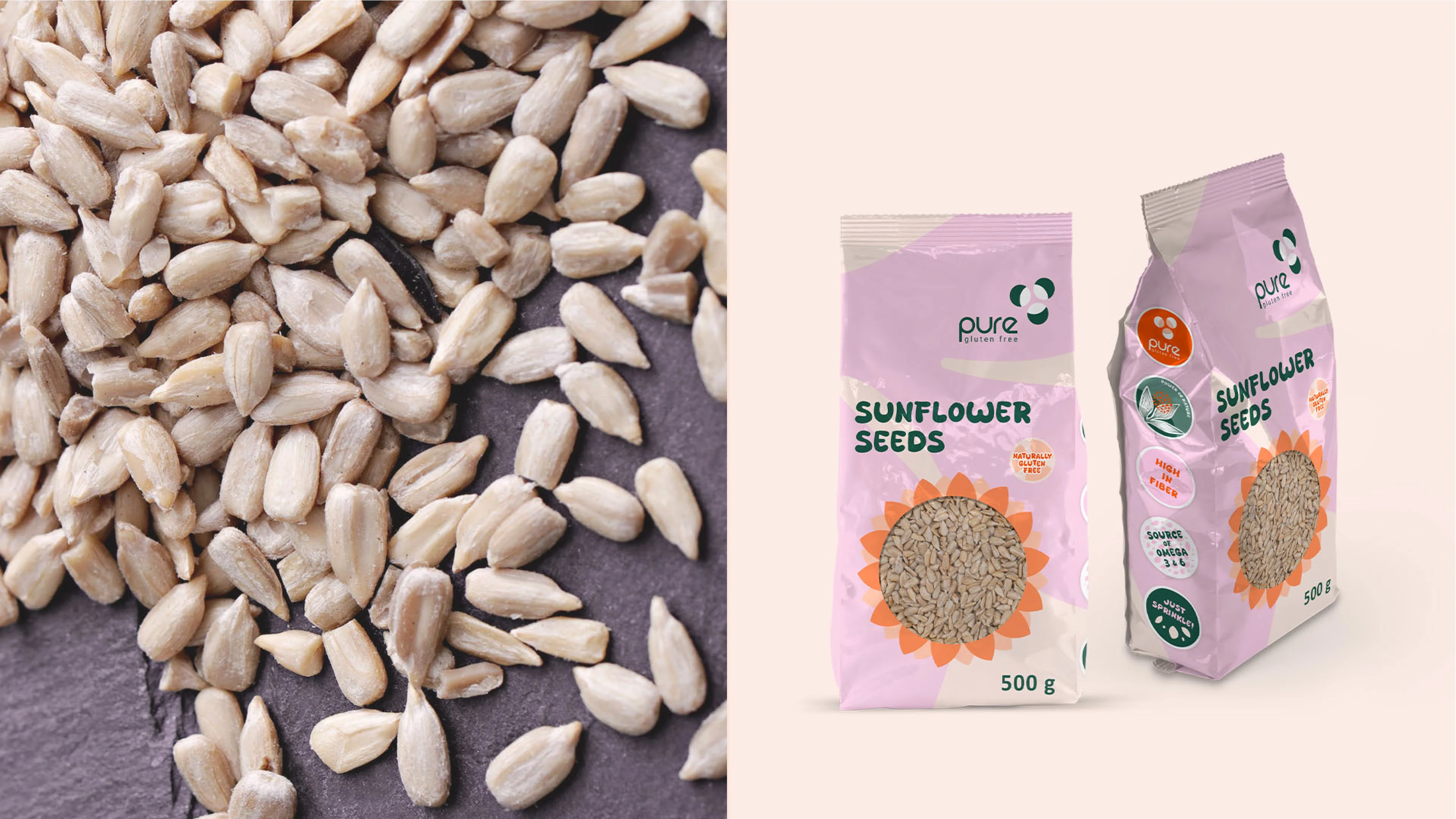
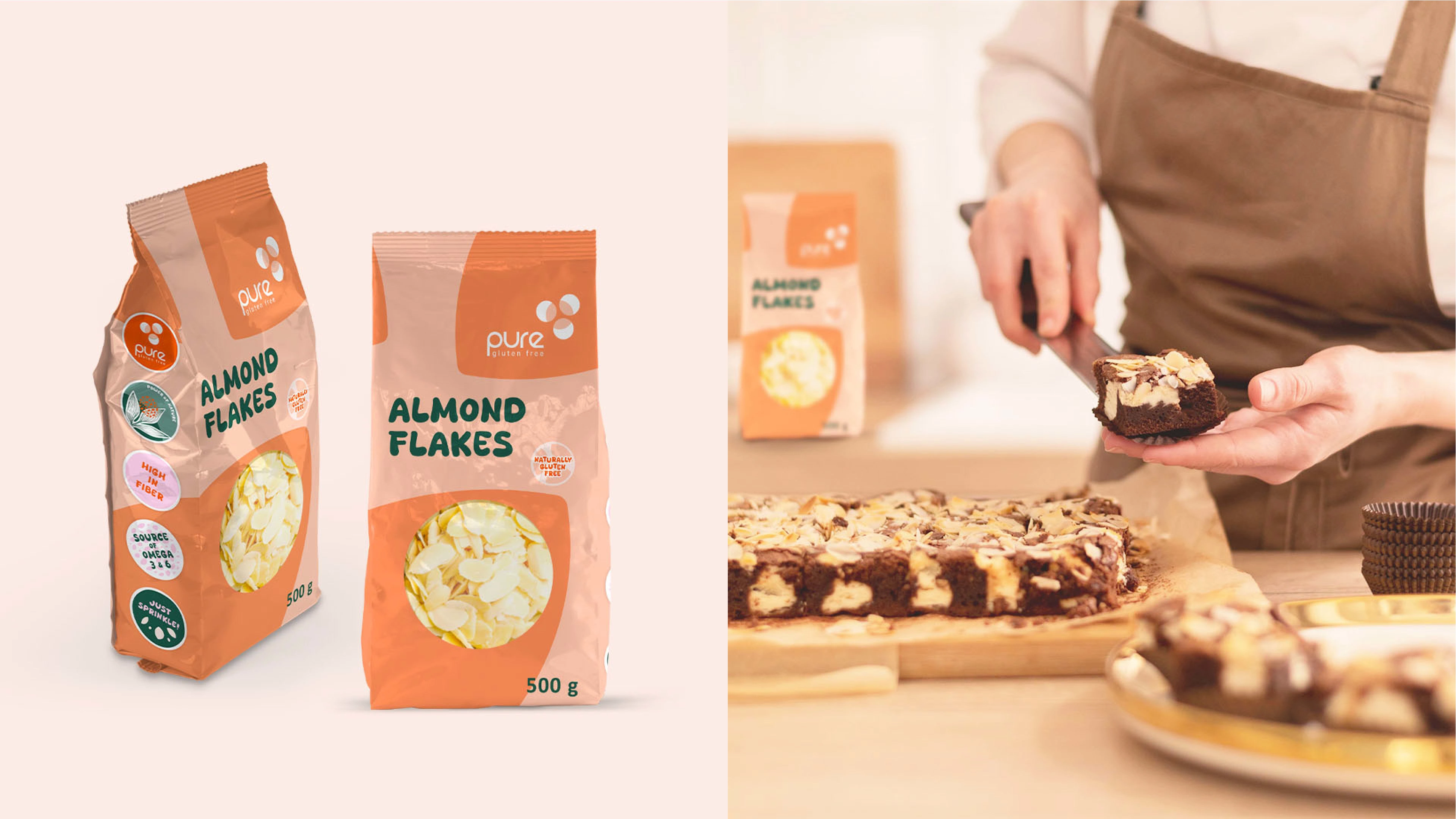
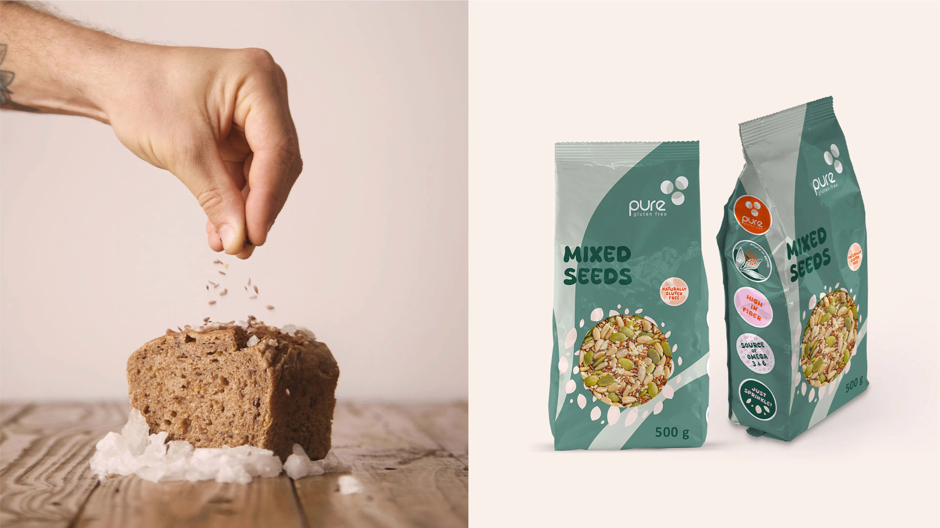
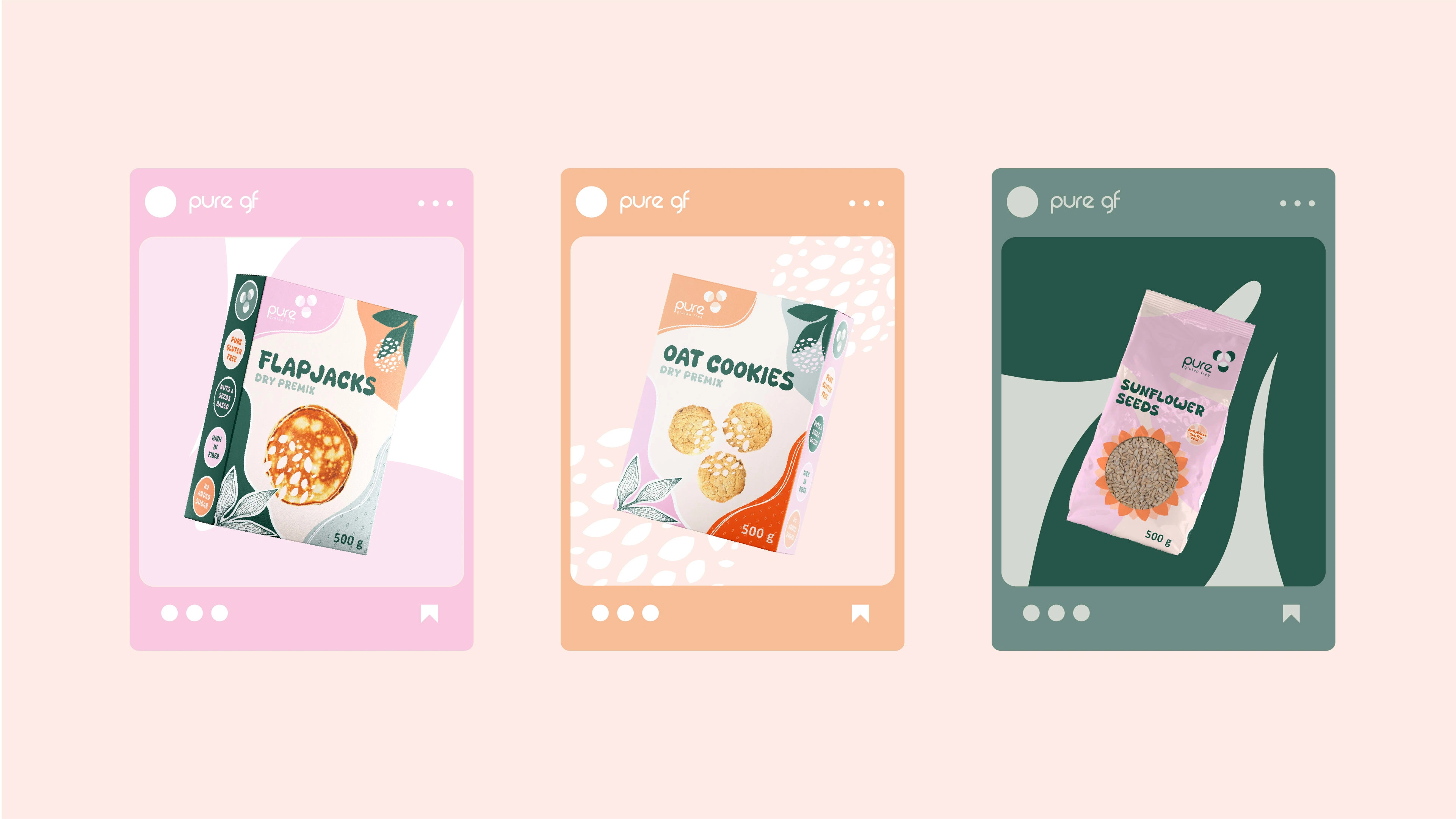
They are starting off offering gluten free baking mixes and a range of seeds and nuts as an addition to home prepared baking goods and meals.
The company is a new player in the industry and would like their new logo and packaging design to communicate their values, stand out among busy competitors and have their own unique flair.
Tone of voice: TRUSTWORTHY, CLEAN, HOMEGROWN, COZY, HOMELY.
Metaphor - HOMEMADE AESTHETICS.
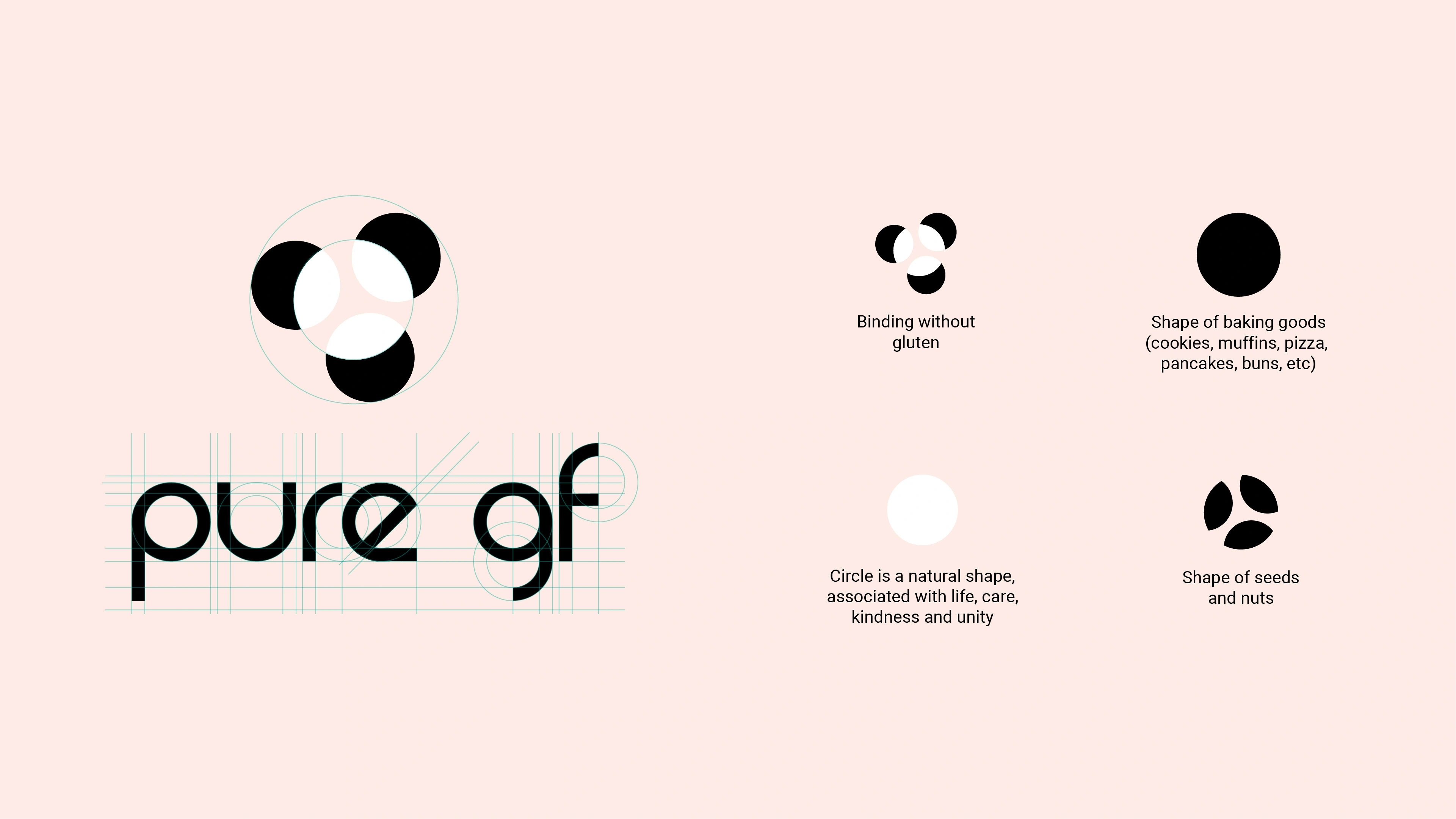
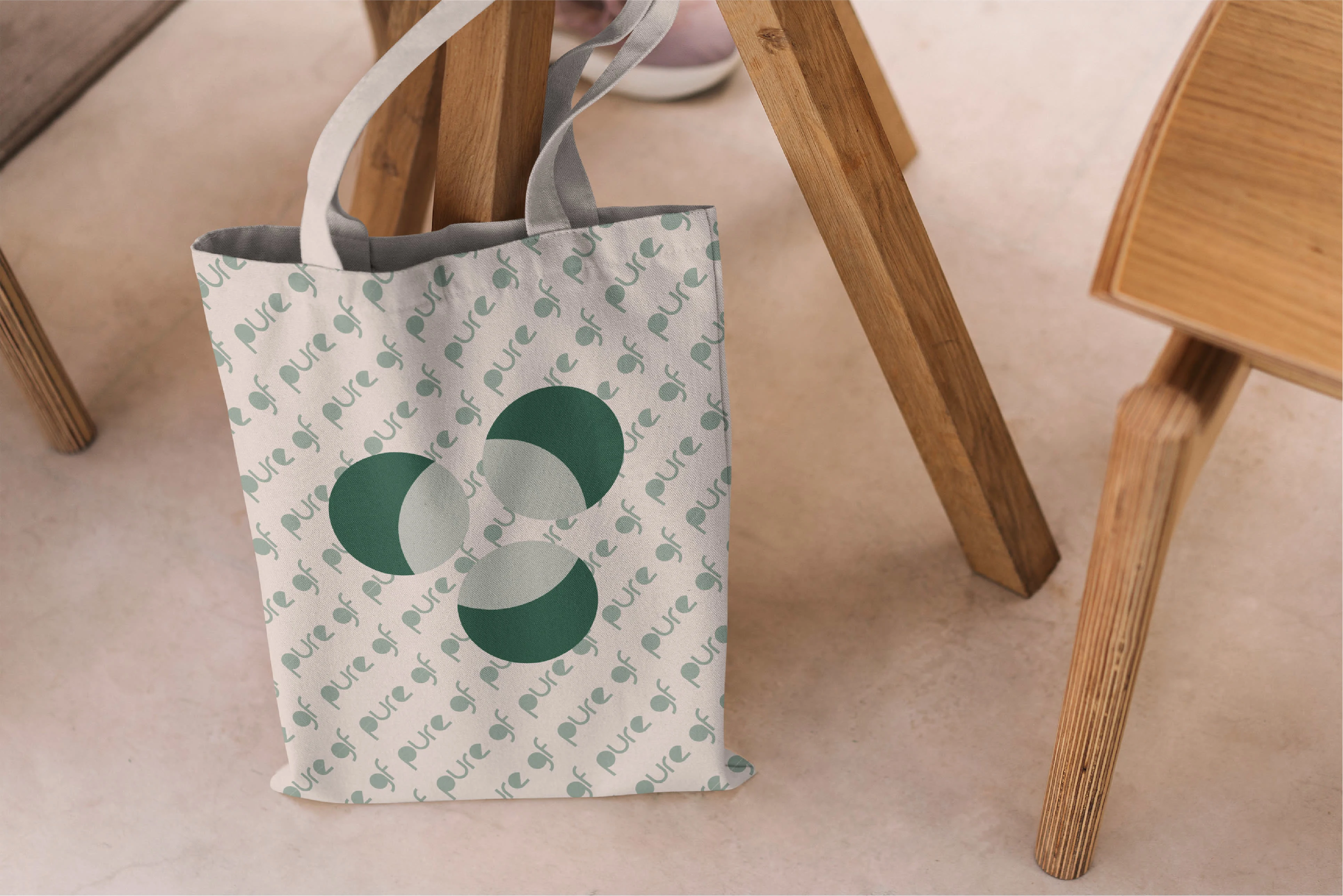
The Logo. The nature of the brand was to be styled minimally, which led to a process of producing a bold yet simple geometric logo. Three circles united by a partially invisible central circle, "binding without gluten".
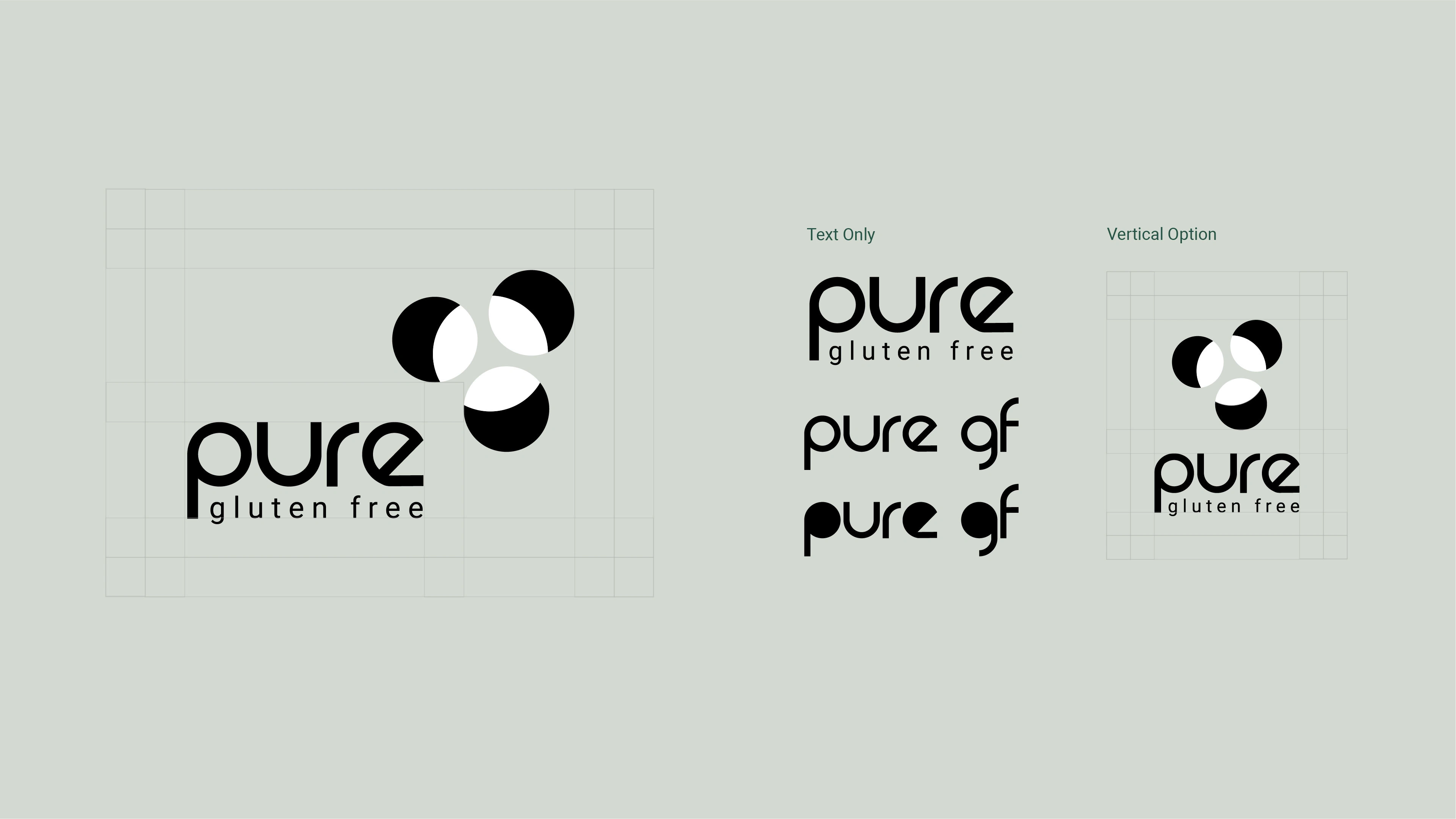
Logo Variations.
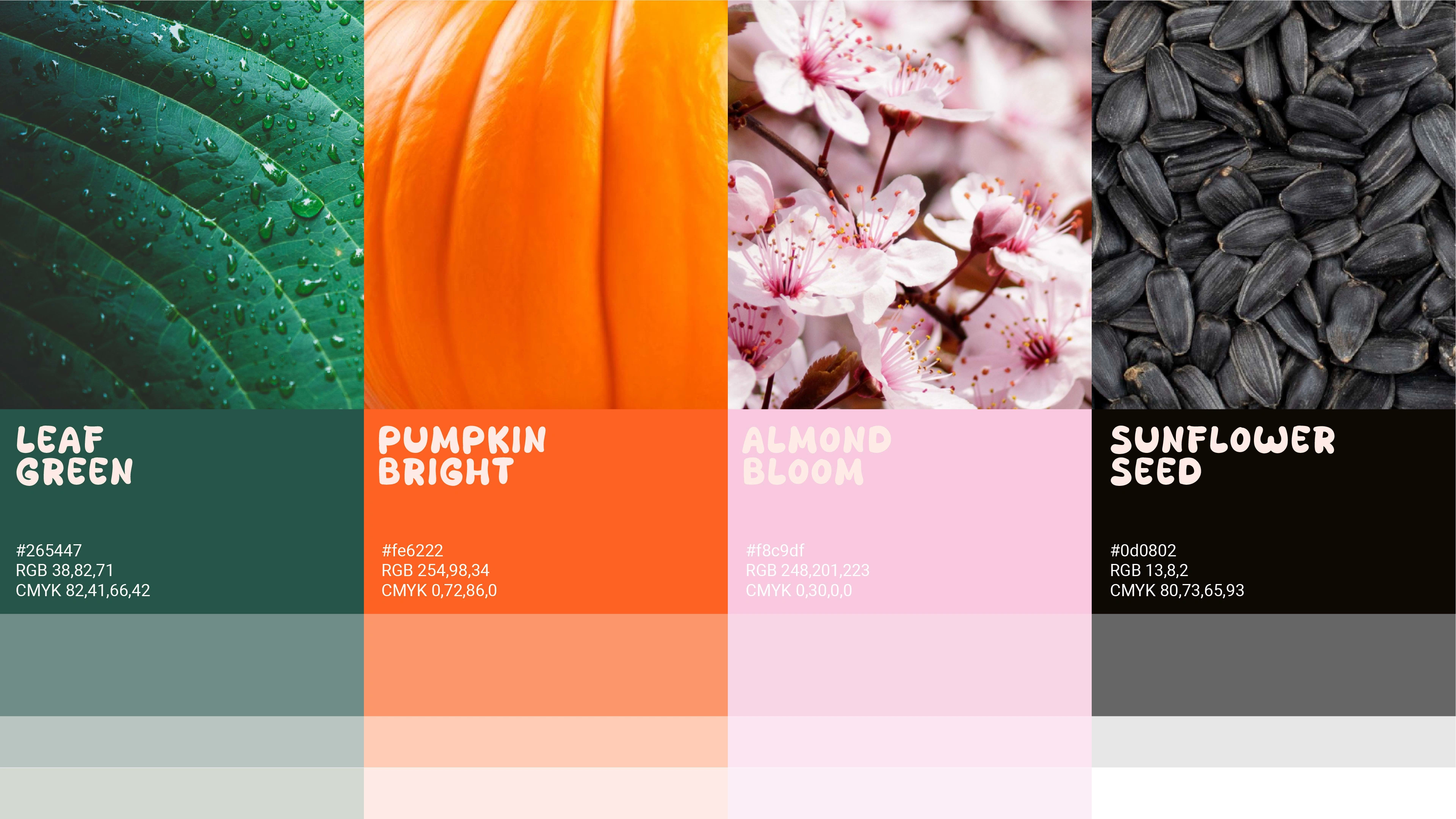
Colors are the key ingredient of the project. Bright and vibrant colors, inspired by the products origins, binding by their subtle tints.
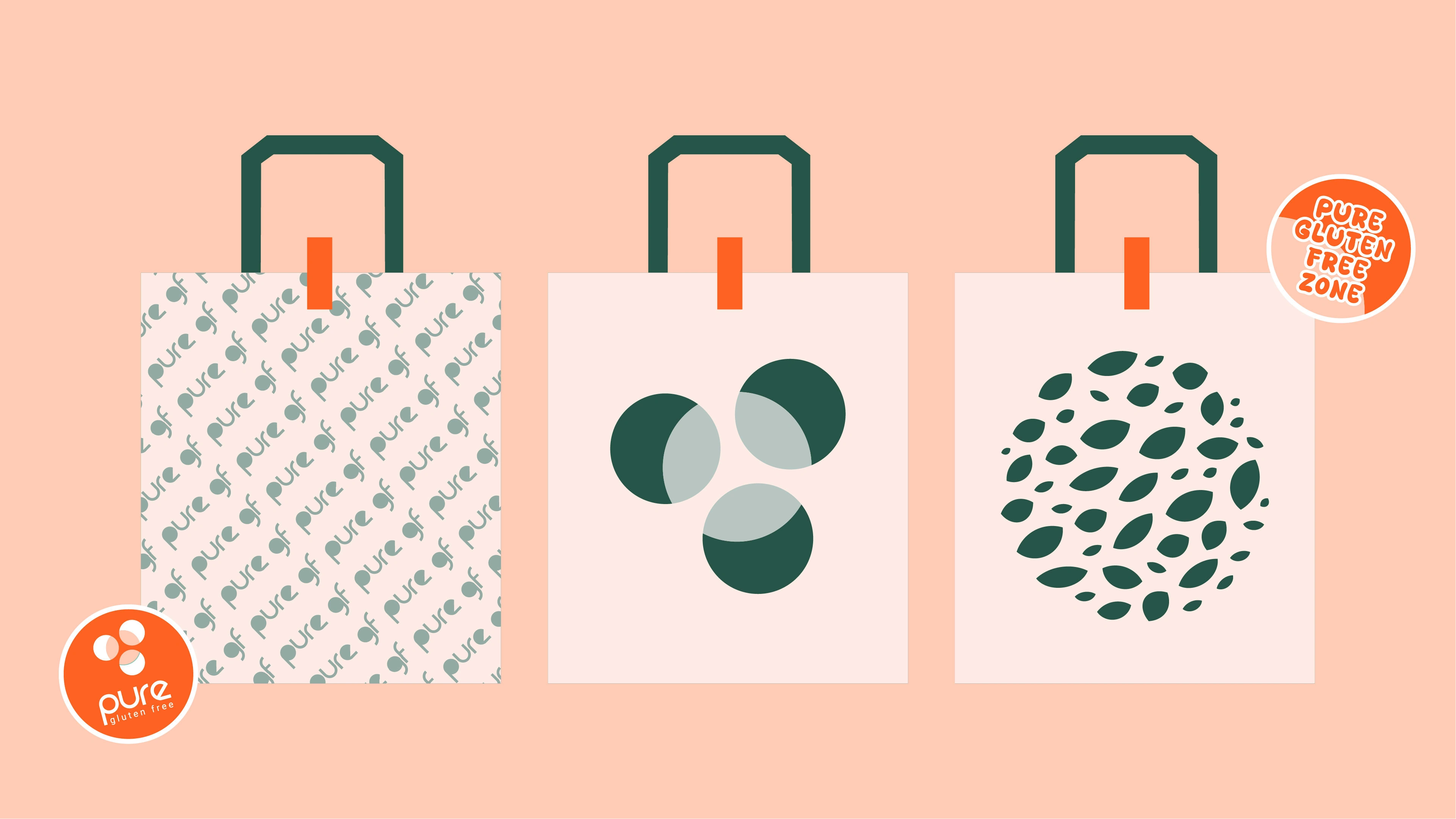
The logo interacts well with the pattern.
Trigger claims - bright, bold stickers attract attention and focus on providing logical and factual information to support the buying decision.
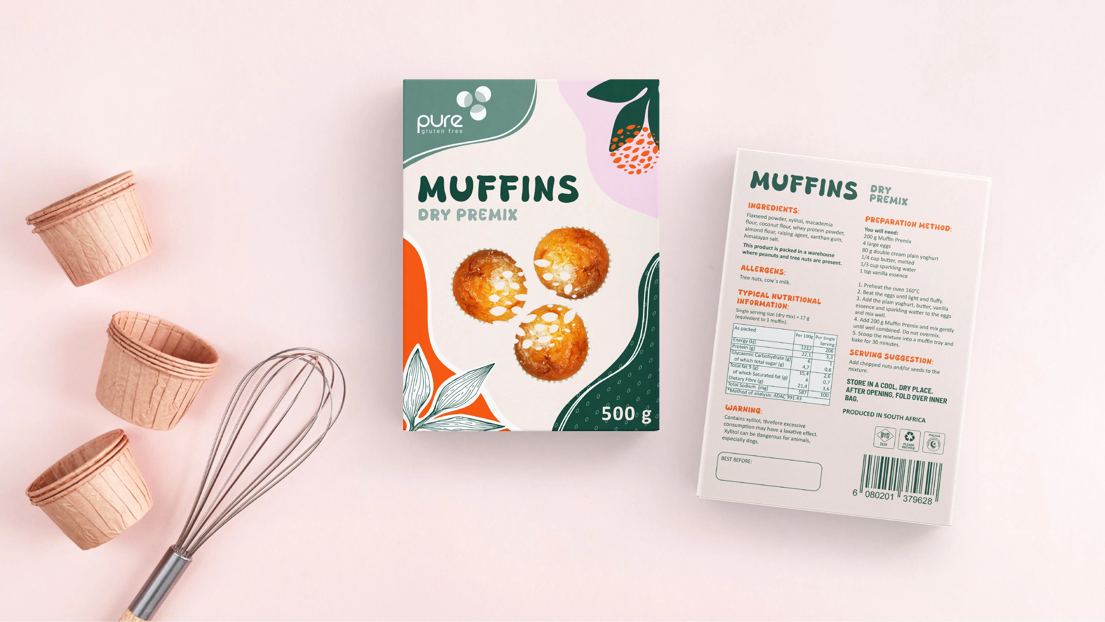
The integration of nature inspired abstract lines, shapes and branded pattern does not only enhance its visual allure but also communicates the brand values, authenticity, and connection to the nature of the product.
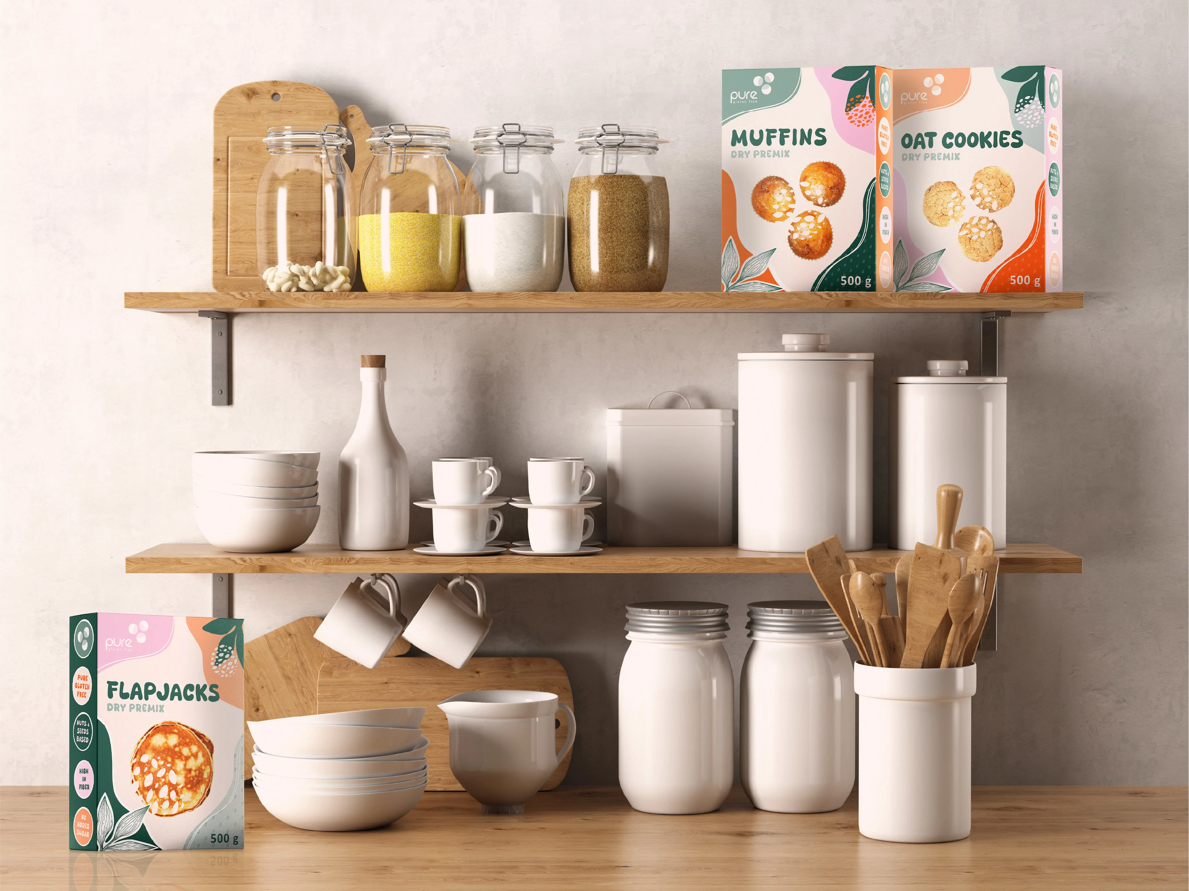
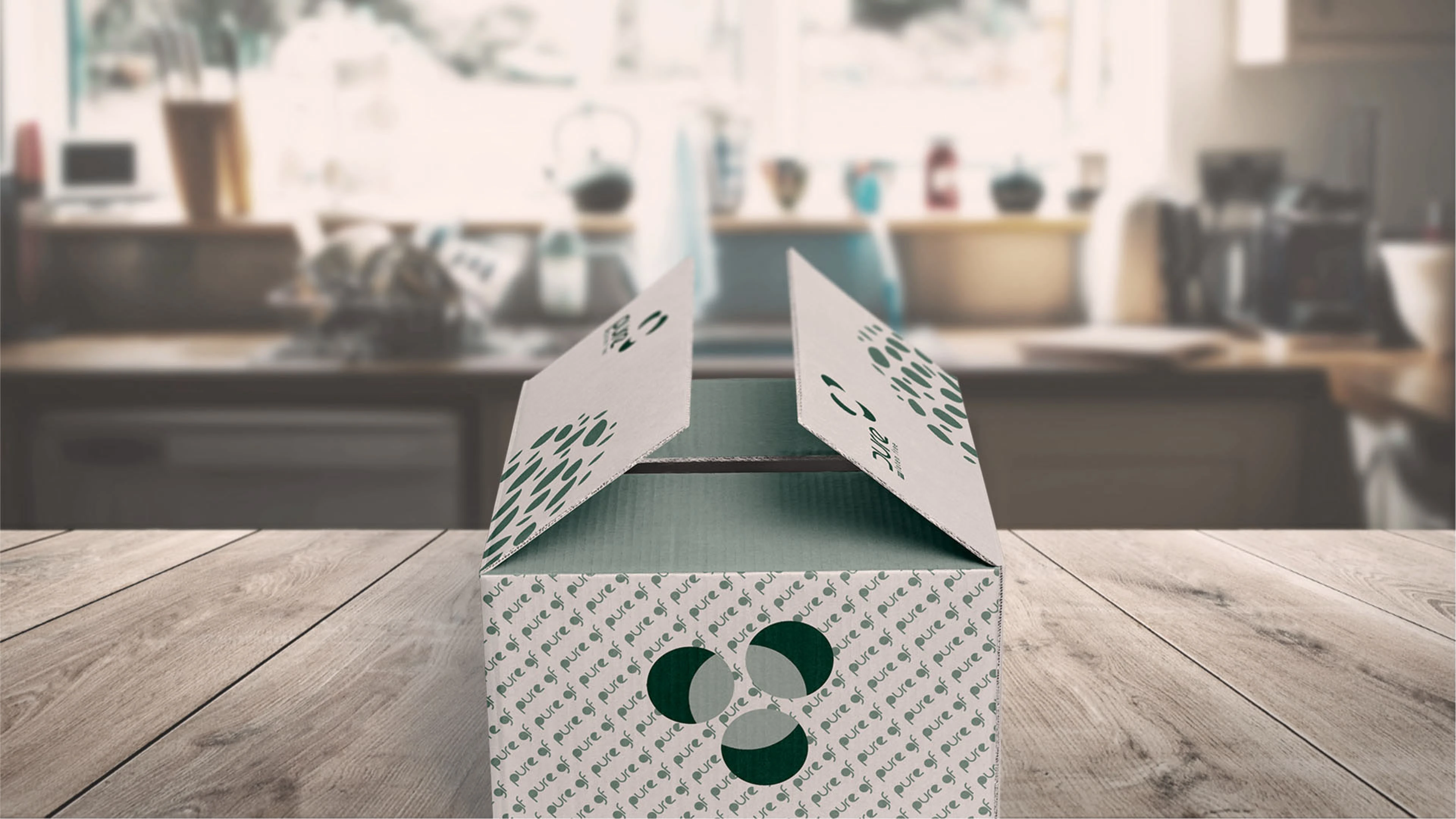
Box Packaging Design Mockup
Gusset Pouch Packaging Design Mockup
Like this project
0
Posted Jan 30, 2024
The goal of the project was to create the logo and packaging design to showcase the company`s values, stand out on the shelf among busy competitors.


Premium Pest Control. Logo Design

Logo Design

Morningvale Dairy. Logo and Packaging Design