Formalab | Branding & Website
Andrea Rondon
Inside Formalab
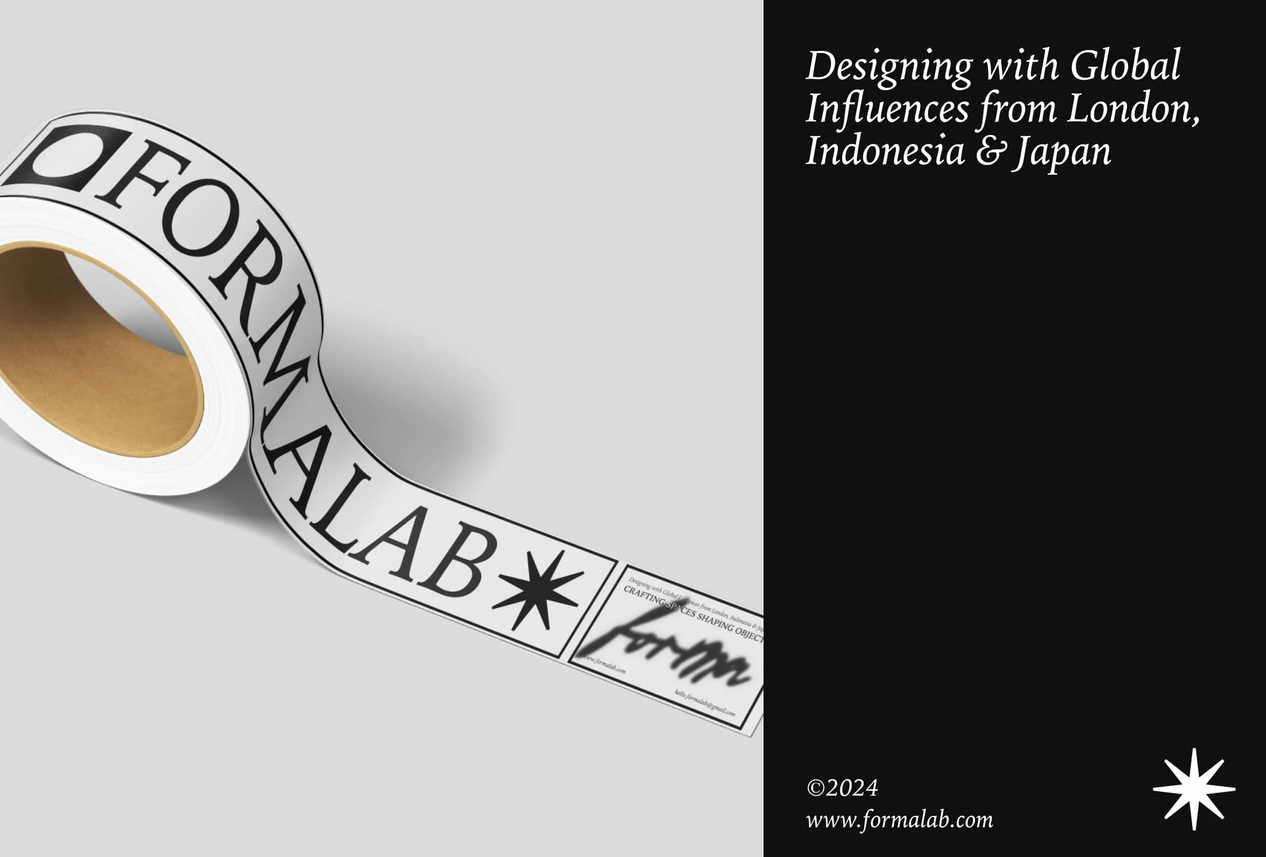
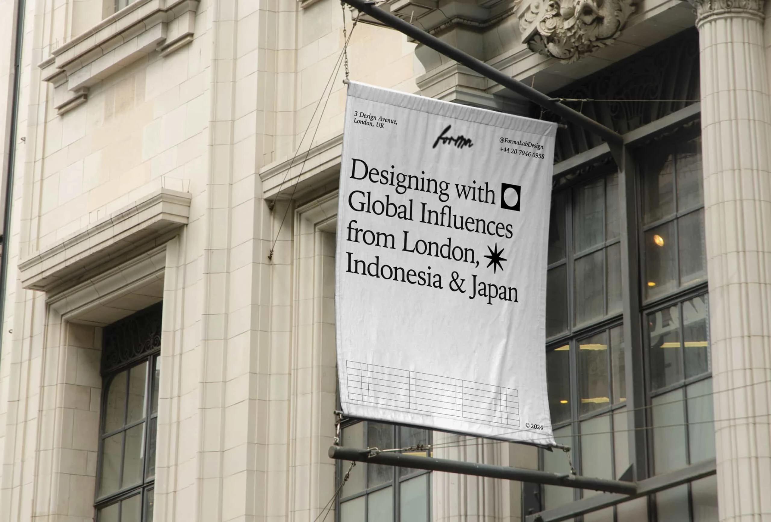
FormaLab is a London-based design studio working at the intersection of interior and industrial design. Its visual and conceptual identity draws from three distinct influences: the quiet precision of Japan, the material warmth of Indonesia, and the structured clarity of London design.
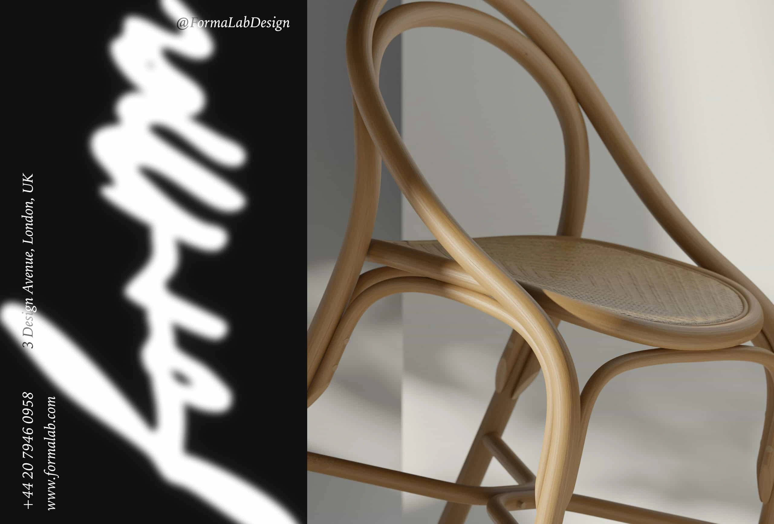
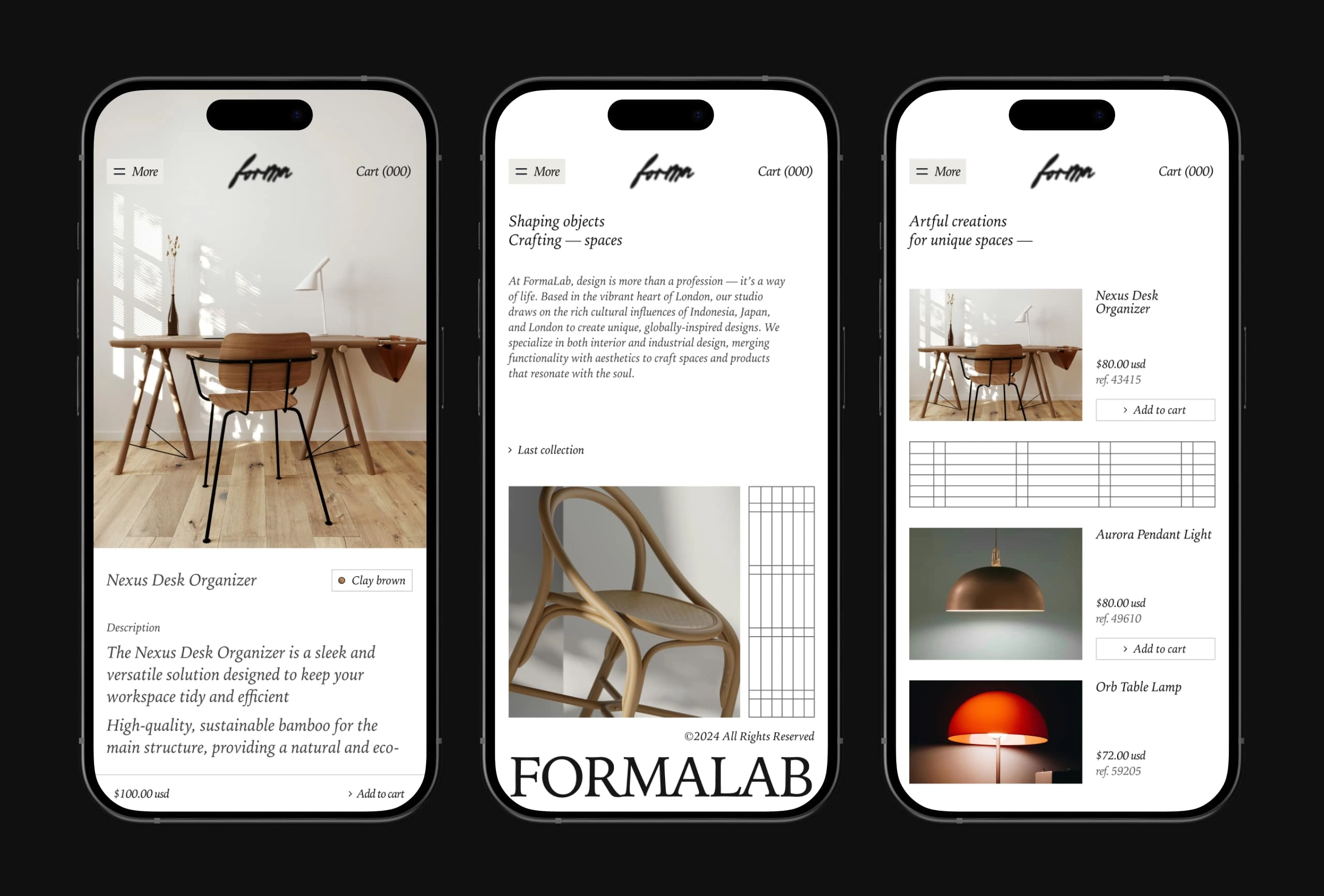
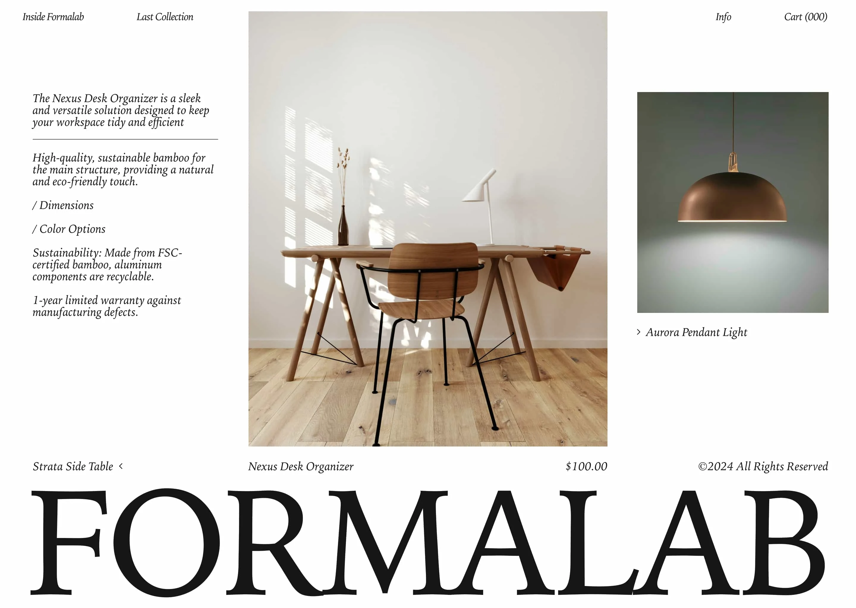
The branding for FormaLab is built on a core idea: beauty emerges when form meets intention. With that in mind, we developed a visual identity that is clean yet characterful—anchored in a strong typographic system, a neutral color palette with warm accents, and a graphic layout that gives space for objects to breathe and take center stage. The logotype acts as a subtle signature, while the overall visual language balances technical clarity with emotional resonance.
Every design decision—from editorial tone to the choice of materials in mockups and renders—was made to convey a sense of quiet refinement without falling into generic minimalism. The aesthetic aims to blend structure and softness, logic, and feeling.
Art direction played a key role in expressing this balance: sharp lines and intentional space meet tactile surfaces, gentle shadows, and compositions that evoke calm and sophistication.
FormaLab doesn’t just design objects or interiors—it designs atmospheres. Environments and pieces that feel personal, livable, and thoughtfully considered.
Like this project
Posted Feb 28, 2025
Visual identity, branding system, and art direction for a design studio blending interior and product design with cross-cultural influence.
Likes
1
Views
18