Garden Dried Fruits — Branding & Packaging Design
Andrea Rondon
Inside Garden
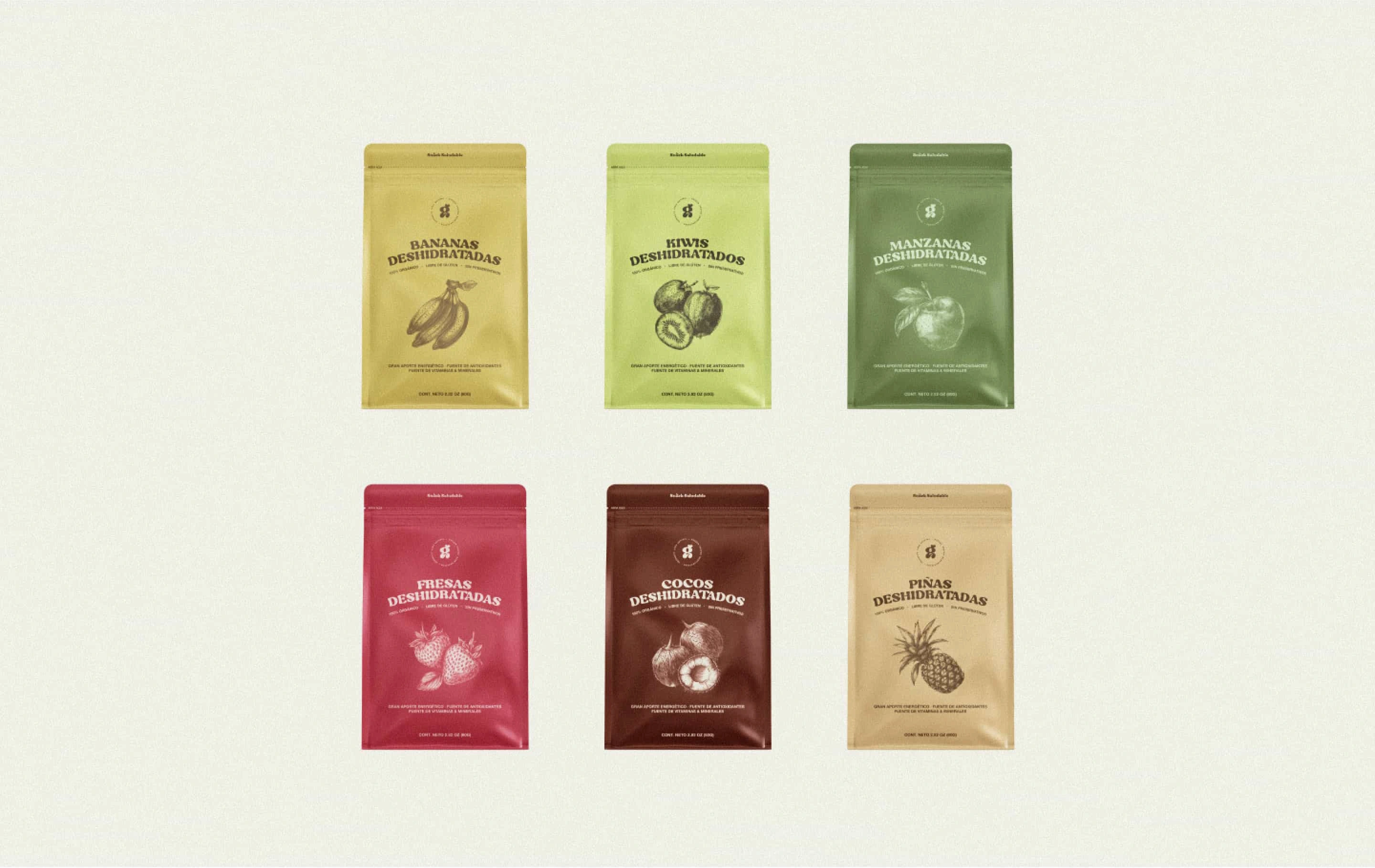
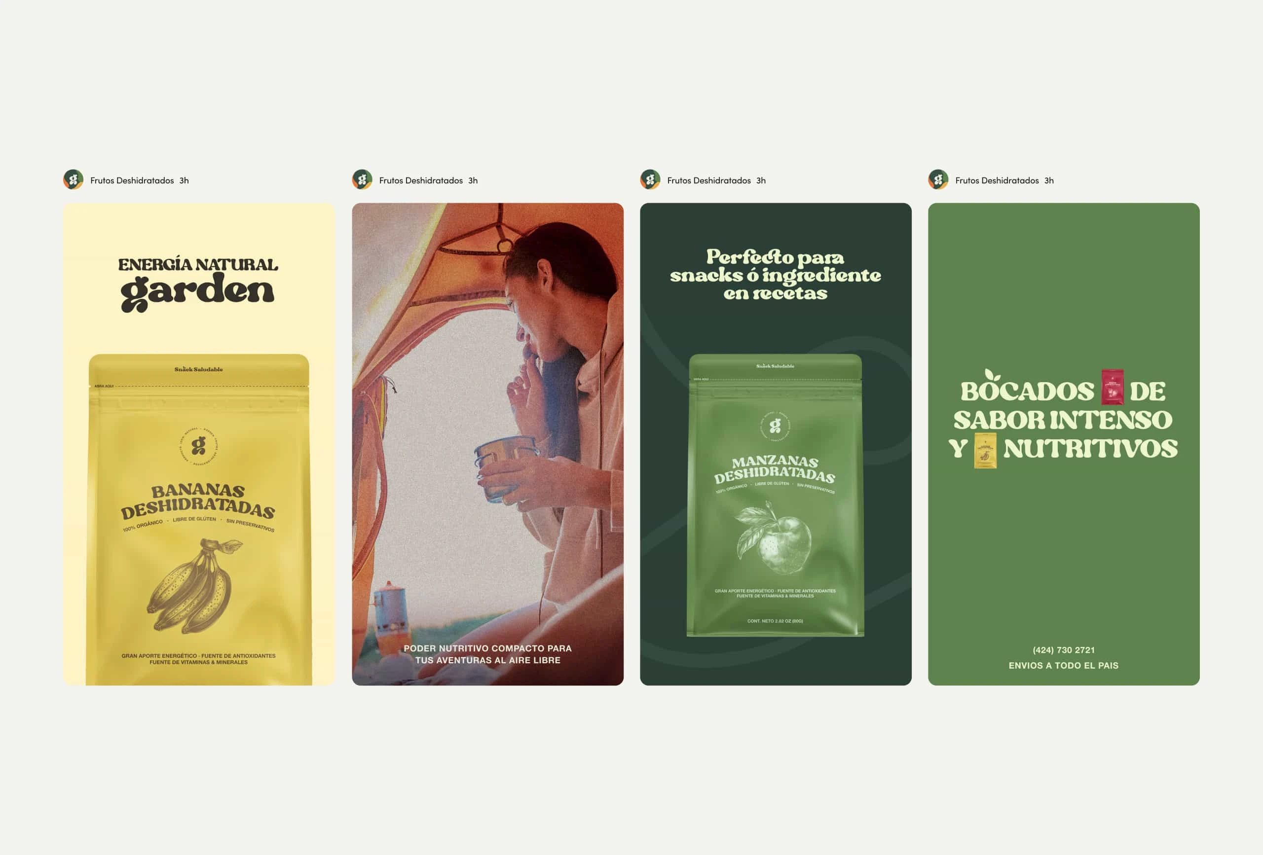
Garden is a brand dedicated to capturing the essence of fresh fruit through a carefully curated selection of naturally dried blends. With a soft, minimal visual identity and a calm, grounded tone, the project sought to reflect the brand’s commitment to simplicity, quality, and nature—without relying on vibrant visuals or artificial cues.
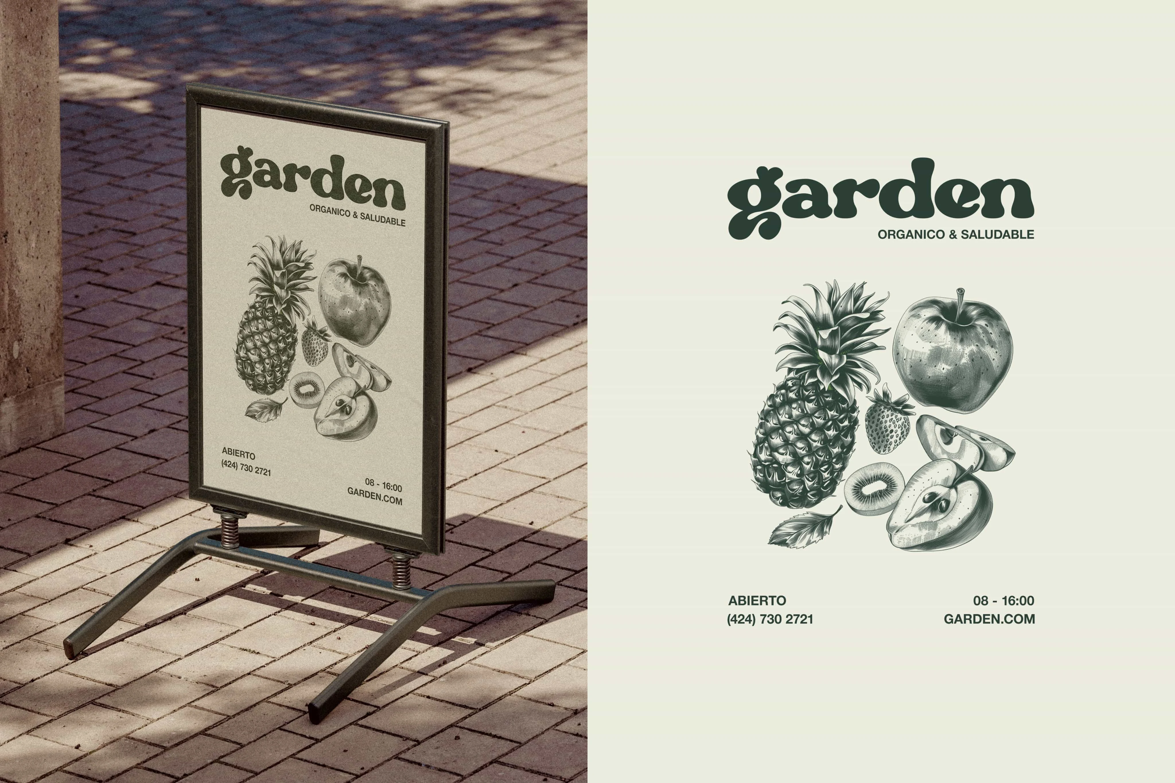
The branding is rooted in a restrained color palette that leans into earthy neutrals and soft hues, intentionally avoiding saturation to allow the product’s natural texture and form to take center stage. The typography is clean, warm, and slightly rounded—communicating a sense of approachability without losing clarity. The logo works as a quiet mark, adaptable and balanced, designed to live across print and packaging with ease.
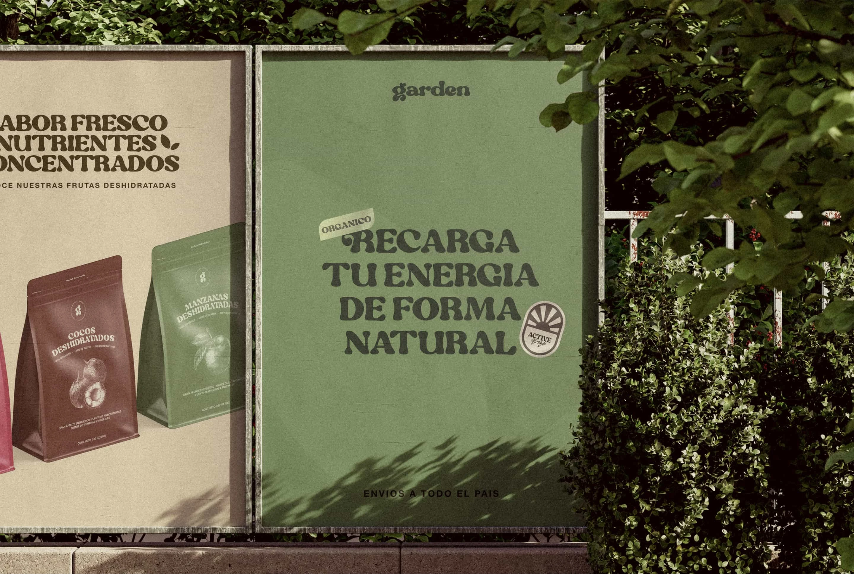
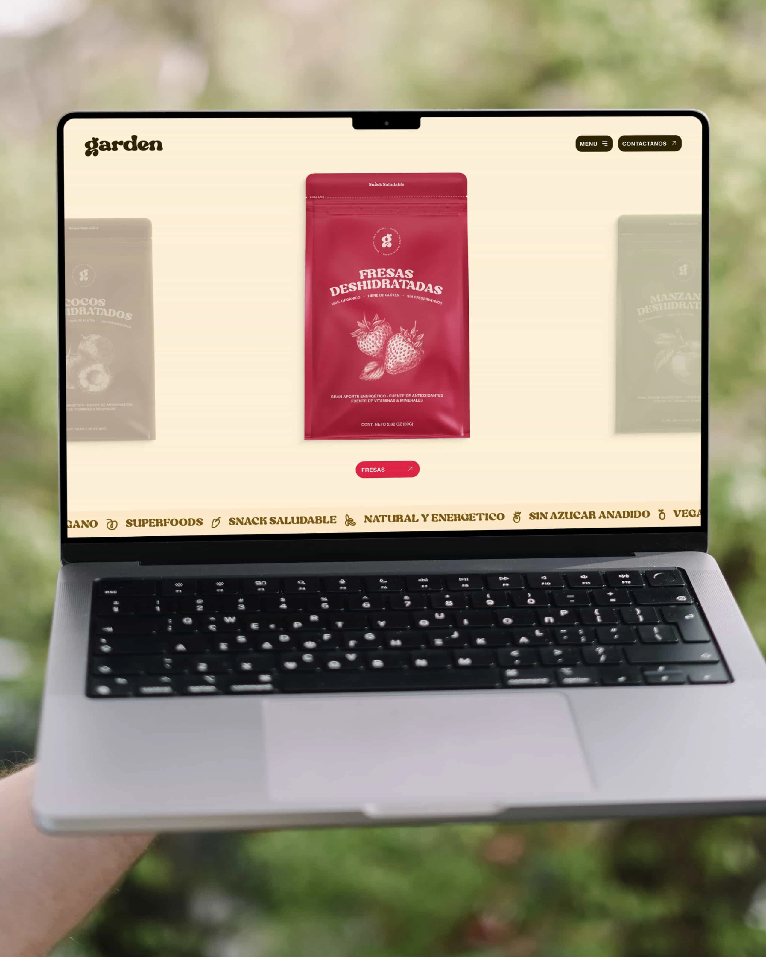
The packaging system was built to feel honest and light, both visually and physically. It avoids loud design in favor of soft compositions, where photography plays a quiet role—showcasing the dried fruit in a raw, almost meditative state. Layouts use negative space as a design tool, creating a visual rhythm that aligns with the brand’s sense of calm and natural flow.
Every decision in this project—from the tactility of the labels to the uncoated textures and visual language—was made to support the idea of a product that doesn’t need to shout to feel special. Garden is a brand that speaks through presence, not noise. A subtle celebration of nature’s original design, preserved and presented with care.
Like this project
Posted Mar 11, 2025
The new brand identity and web design for Garden highlights a distinctive range of natural dried fruits, maintaining the character of fresh produce 🍎 🍍 🍌 🍓