🖤 3 landing pages. 3
Mladen Stankovć
🖤 3 landing pages. 3 different industries. One design system that converts.
I just wrapped up three high-converting landing pages - and I want to break down exactly how I approached each one.
The secret? Every decision was intentional.
Here's what went into each build:
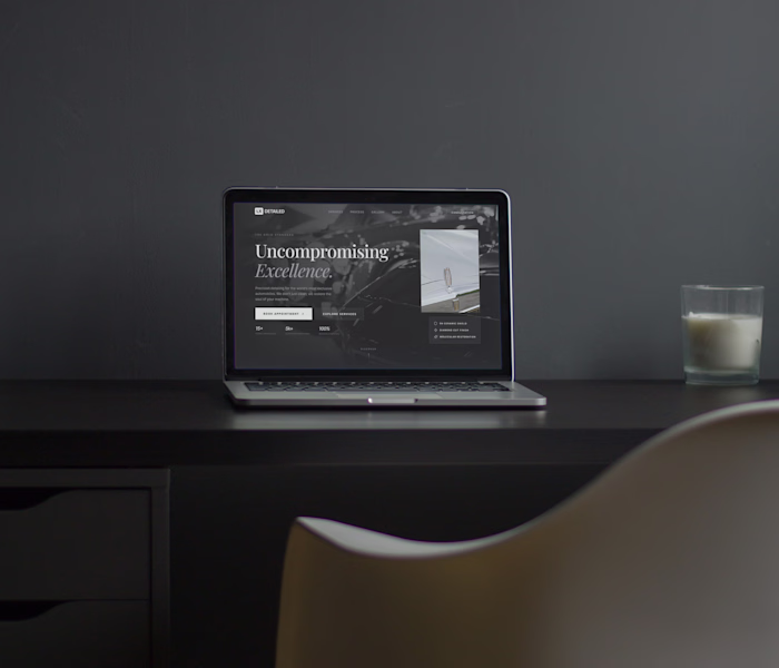
LX Detailed (Luxury Auto Detailing)
Dark, cinematic, editorial. I used a near-black base with white serif typography to signal premium positioning. The CTA hierarchy was clear - one primary action, one secondary. No noise.
L'Aura (Luxury Wellness & Spa)
Warmth over sharpness. I leaned into soft contrast, earthy tones, and generous whitespace to make the visitor feel relaxed before they even read a word. Trust is built before the scroll.
Iron & Steel (Men's Grooming)
Bold, unapologetic, high-energy. Heavy black backgrounds, oversized type, and a punchy amber accent color. This one had to feel like the barbershop itself - confident and no-frills.
What these three have in common:
→ A single, dominant headline that speaks to identity - not just features
→ One clear CTA above the fold
→ Color psychology matched to the target audience
→ Imagery that sells the feeling, not the product
Most landing pages fail because they try to say everything. These work because they each say one thing louder than anything else.
Like this project
Posted May 10, 2026
🖤 3 landing pages. 3 different industries. One design system that converts. I just wrapped up three high-converting landing pages - and I want to break down...
Likes
0
Views
0