Lotly: Brand Identity & Icon System for AI PropTech

Amirul Hakim


Lotly Brand Cover
Lotly 3
Lotly 4
The Problem
Lotly was a brand-new product entering the AI-powered property management space. No track record, no brand recognition, no visual identity. For a platform asking tenants to submit sensitive personal documents and landlords to trust AI-driven screening, that's a problem.
Generic stock icons and placeholder visuals signal "we threw this together." For users in the affordable housing segment, who are already cautious about sharing personal data with unfamiliar platforms, every visual shortcut erodes trust. A custom brand identity and icon system wasn't a nice-to-have. It was the difference between "this looks legit" and "I'm not uploading my ID here."
Lotly 5
Lotly 6
The Users
Tenants searching for affordable housing. They interact with the brand through the application flow, document uploads, and status screens. Every icon and illustration they see either reinforces trust or raises doubt.
Landlords and resident managers reviewing applications. They see the brand through dashboards, verification summaries, and management tools. The visual system needs to communicate professionalism and reliability at a glance.
Both groups need to feel that the platform was built with care, not cobbled together from free icon packs.
Lotly 7
Lotly 8
Lotly 9
The Process
Step 1: Analyze the users and the service. I studied how Lotly serves both tenants and landlords, what screens they interact with most, and where icons and illustrations would carry the most weight. Document upload screens, verification status, level indicators, and empty states were the highest-impact surfaces.
Step 2: Research and reference. I gathered references from a wide range of icon and illustration styles, looking for visual languages that balance approachability with professionalism. The goal was to find a direction that felt warm enough for tenants in the affordable housing segment, but polished enough for property managers.
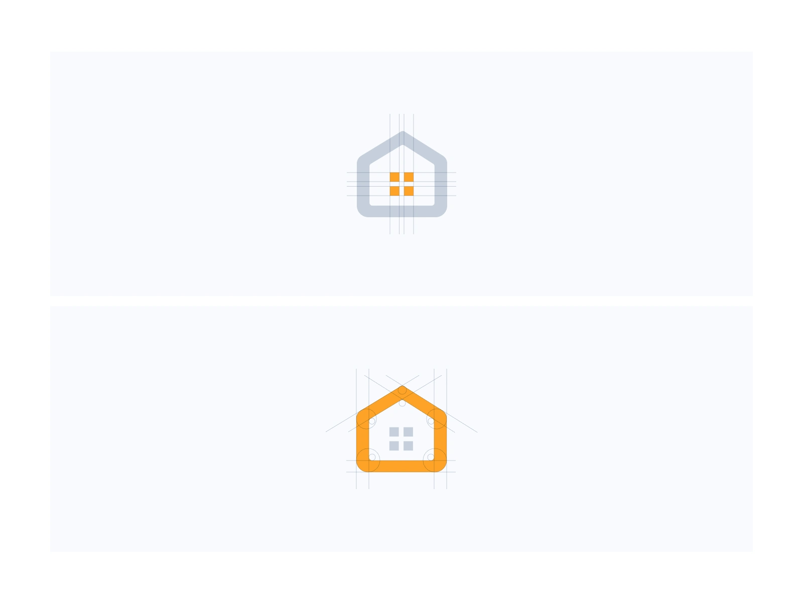
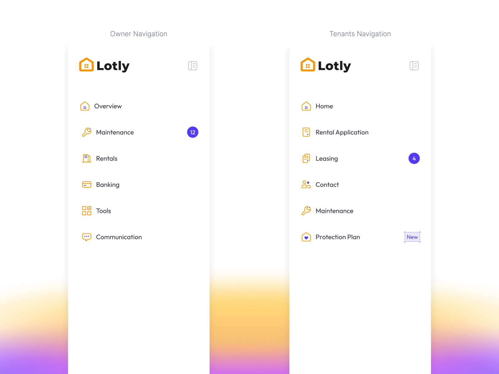
Step 3: Simplify, modify, brand. From the references, I distilled the shapes down, modified proportions and details, and aligned everything to Lotly's brand character. Every icon was custom-built from scratch, not adapted from a library.

Lotly 10
Lotly 11

Lotly 12
Lotly 13
Lotly 14
The Key Design Decision: Humanist Meets Pixel
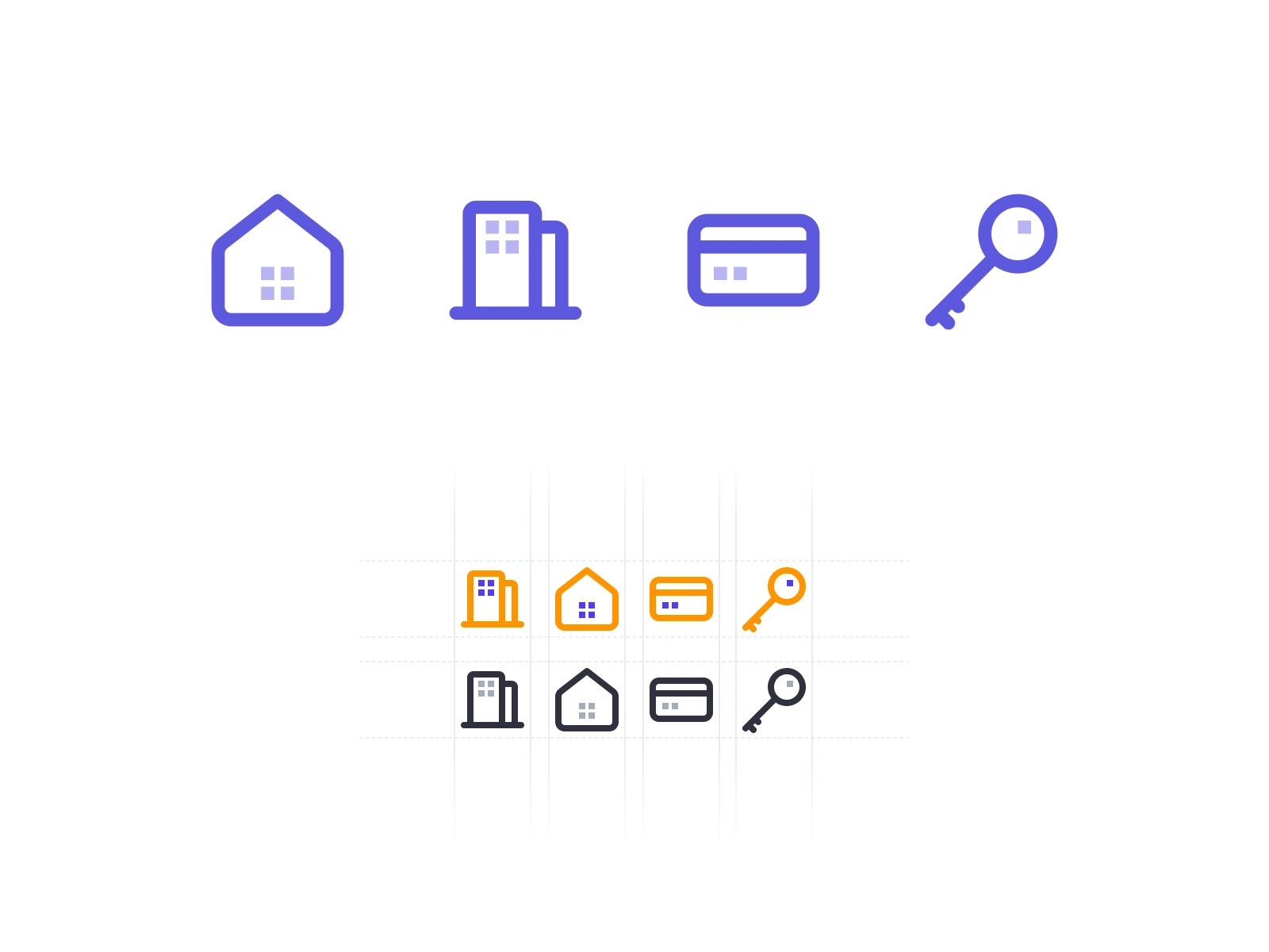
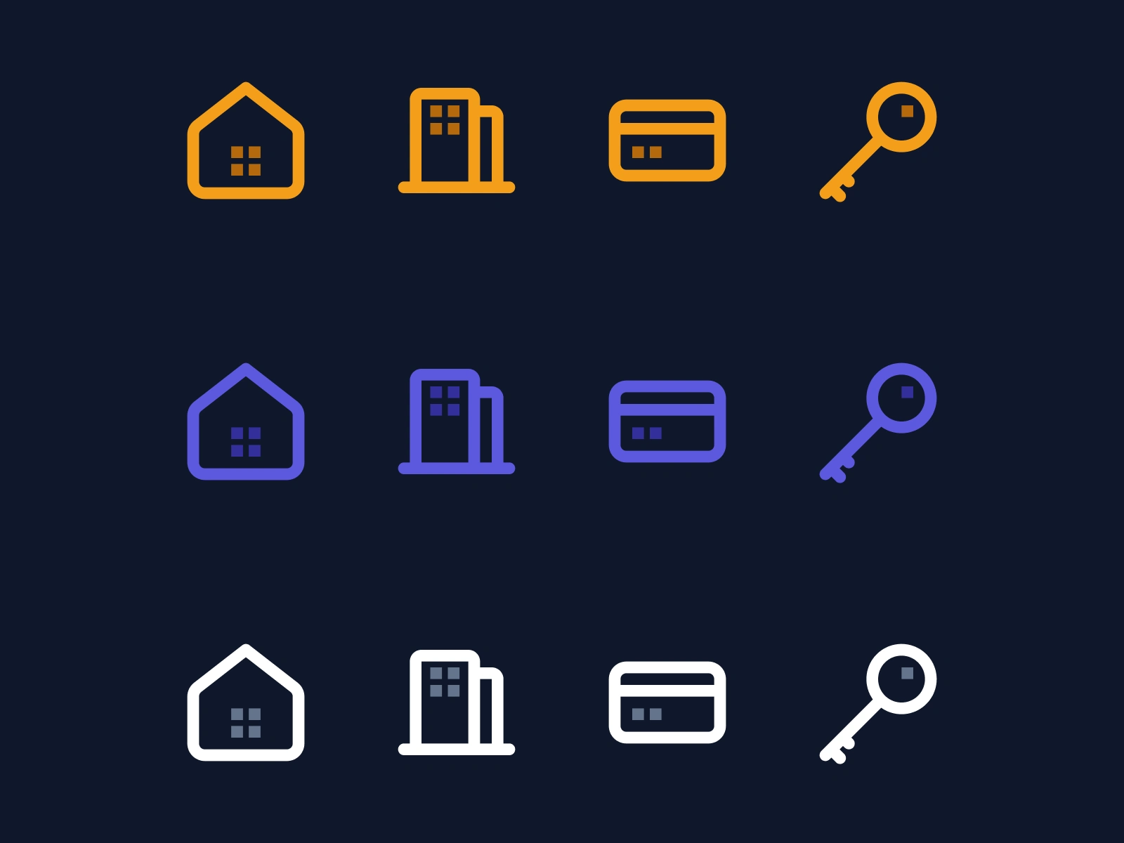
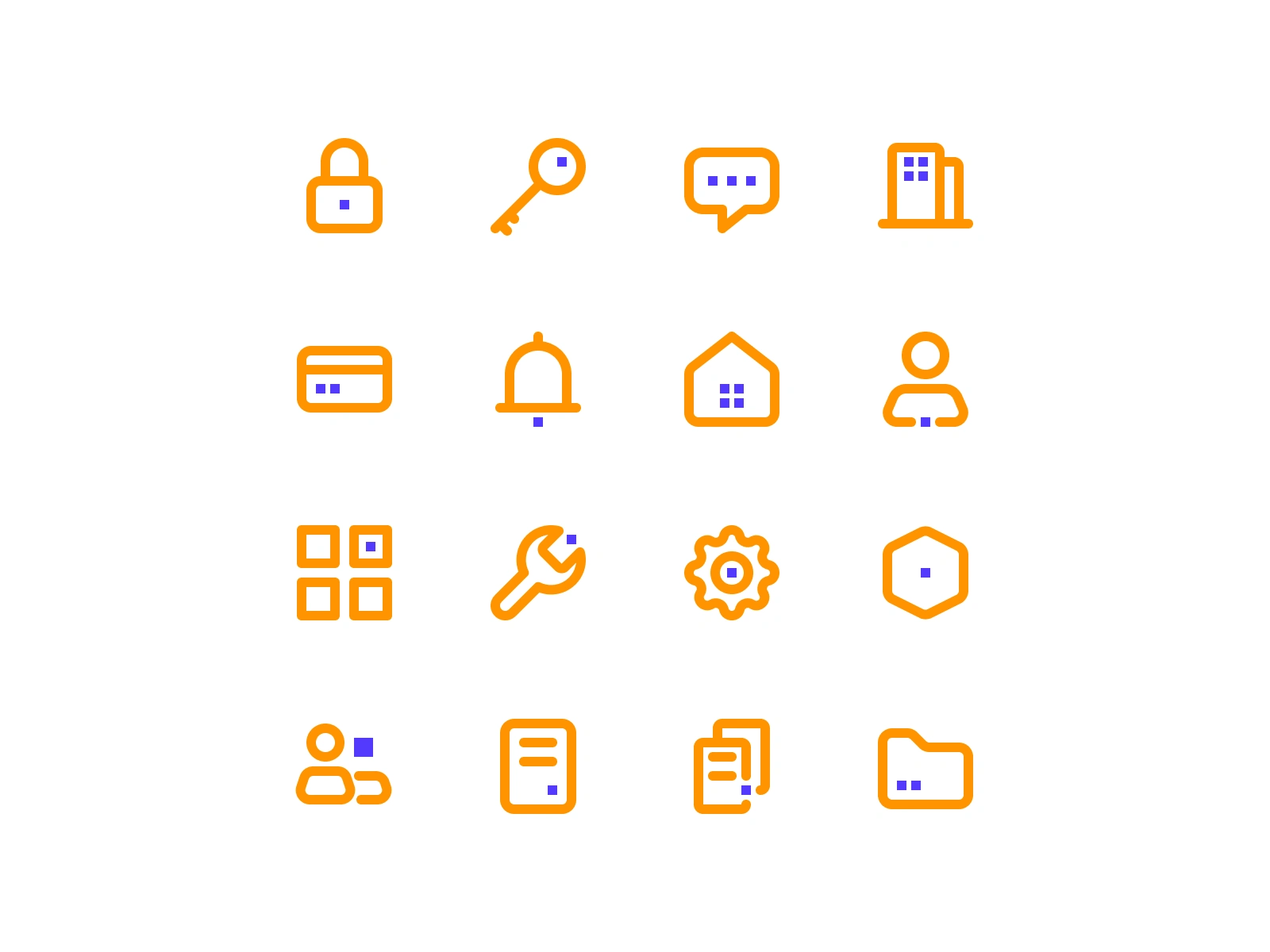
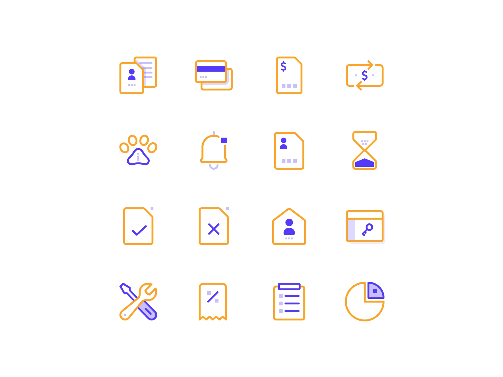
The most important decision was the visual language itself: combining humanist (organic) forms with pixel-based technology motifs.
Pixels are the universal symbol of digital technology. They signal "this is AI-powered, this is modern." But pixels alone feel cold, mechanical, clinical. For a platform handling sensitive personal documents in the affordable housing space, cold is the wrong signal.
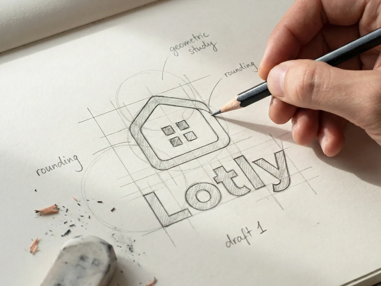
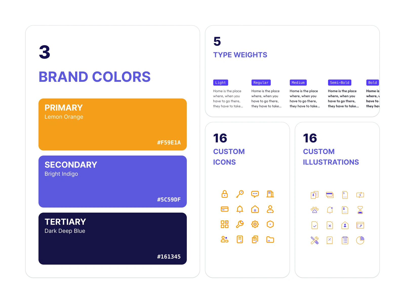
So every icon and illustration is built on curves and rounded corners, the hallmarks of humanist design. Soft edges, organic proportions, approachable shapes. These communicate warmth, care, and accessibility.
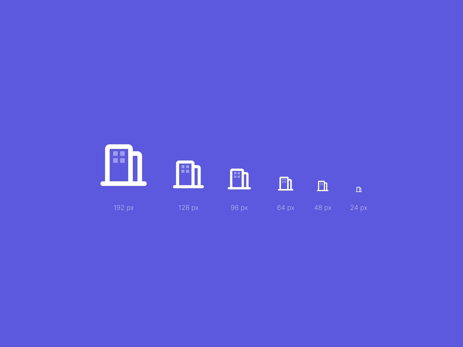
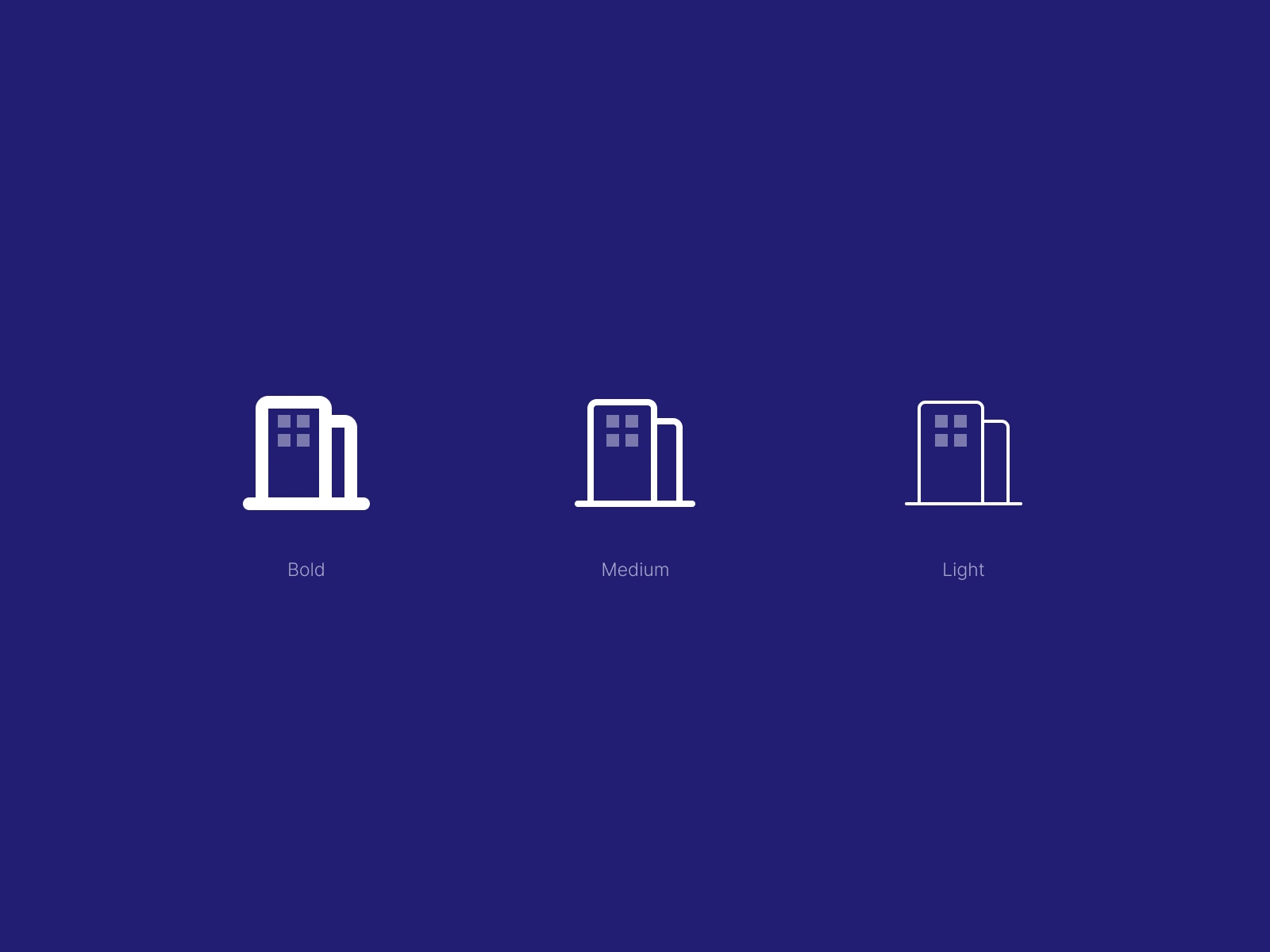
The pixel motif is then woven into these organic forms. It appears as texture, as structural detail, as a subtle pattern within the curves. The result: icons that feel human-first but unmistakably tech-powered. Warm but smart. Approachable but credible.
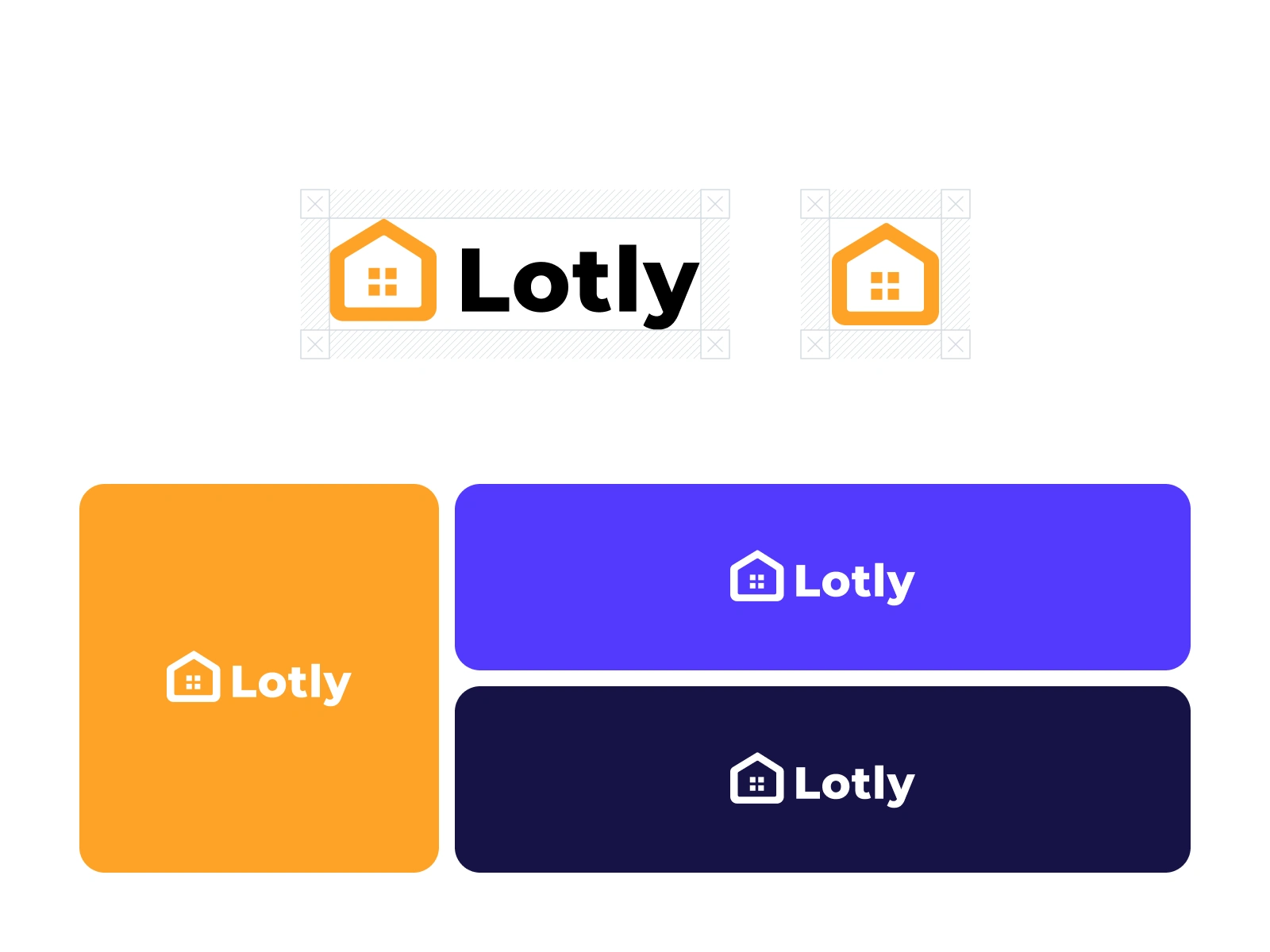
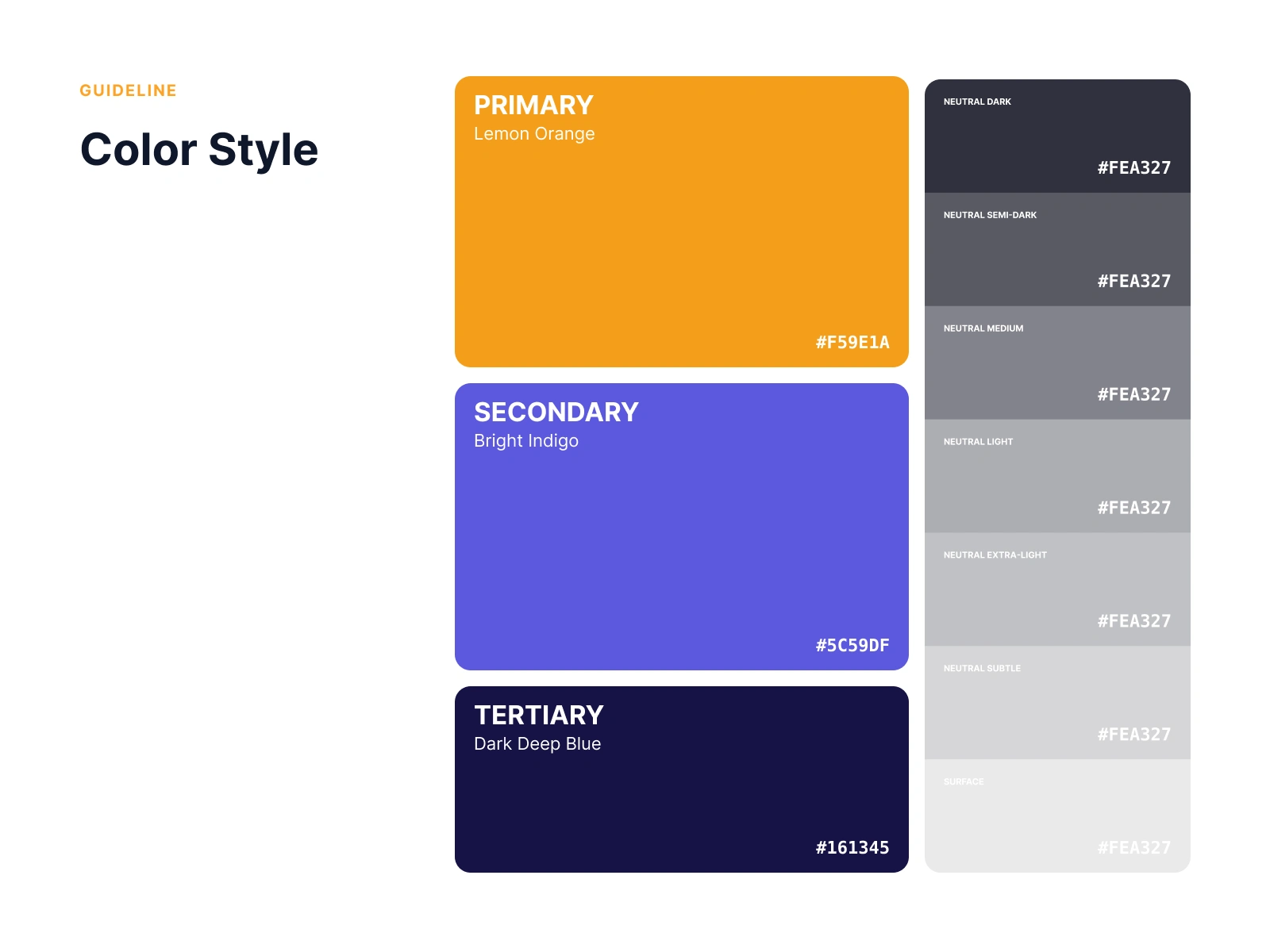
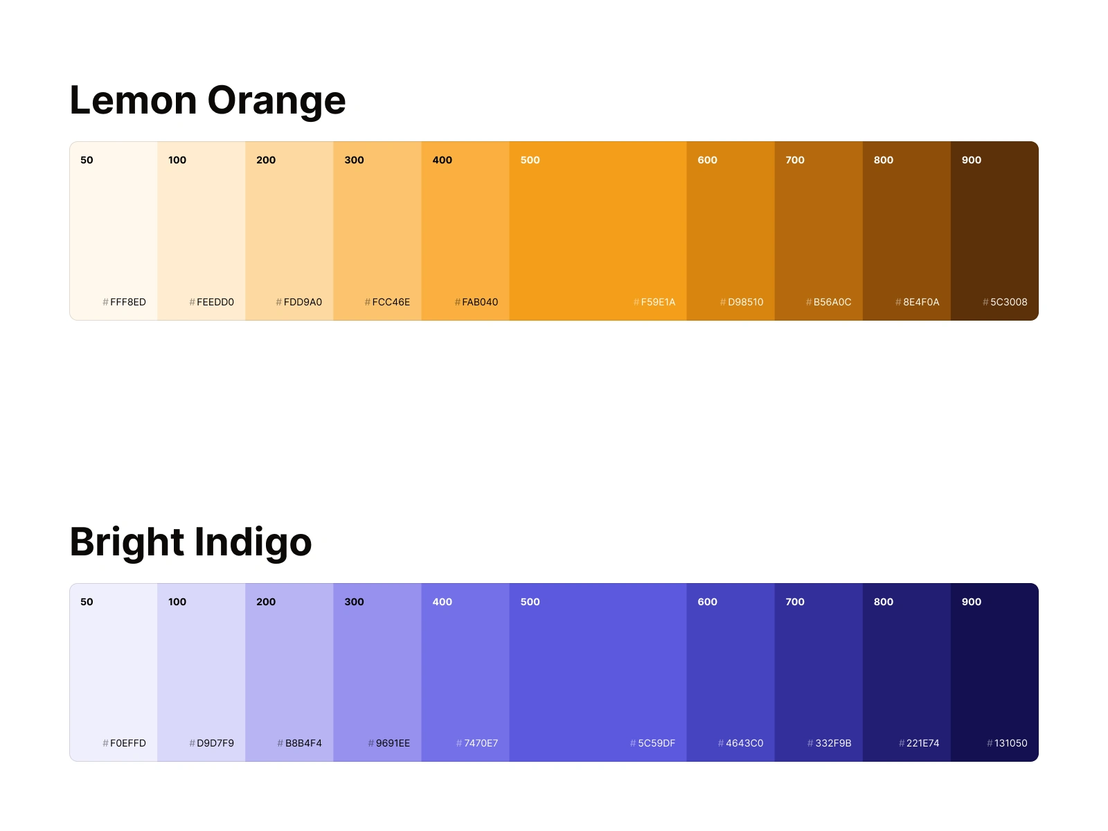
This duality runs through the entire system: the logo, the icon family, the illustrations, and the brand palette. It's not decoration. It's the visual translation of Lotly's core promise: AI that serves people, not the other way around.
Lotly 15
Lotly 16
Lotly 17

Lotly 18
Lotly 19
Lotly 20
Lotly 21
Lotly 22
Lotly 23
Lotly 24
Lotly 26
The Outcome
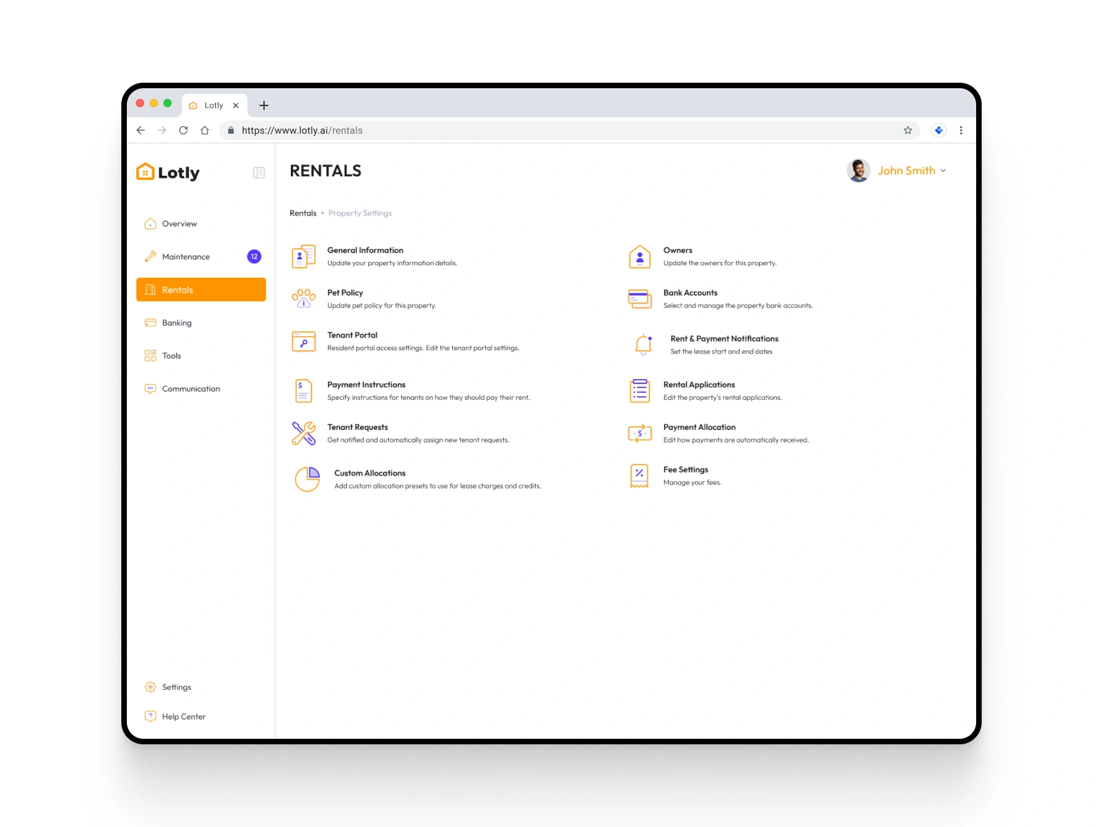
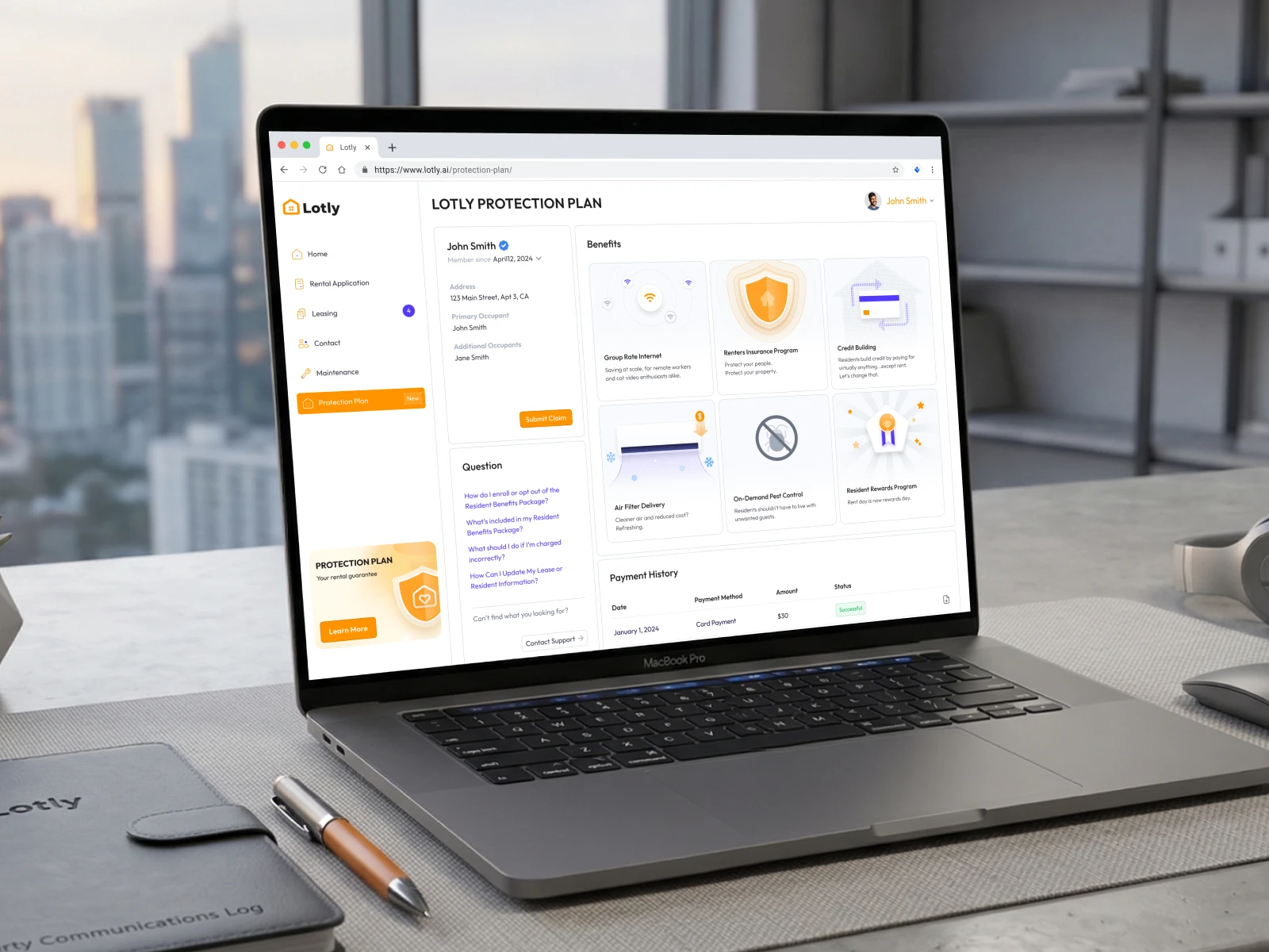
Lotly launched with a cohesive visual identity from day one. The custom icon system and brand illustrations shipped across every screen of the platform, from onboarding to document verification to landlord dashboards.
Since launching in 2025, Lotly has grown to 100,000 users, a significant milestone for an AI-powered real estate startup targeting the affordable housing segment. The brand identity played a direct role in that early traction: in a category where trust is the primary barrier to adoption, looking like a product built with intention (not assembled from stock assets) made the difference between users uploading their documents or bouncing.
Like this project
Posted Jun 17, 2026
Lotly an AI-powered tenant screening platform. Combined humanist curves with pixel motifs to build trust for a new product targeting affordable housing.
Likes
2
Views
27
Clients
Lotly