
The challenge
Explaining something invisible: the same website showing different content to different people. It had to land with marketing leaders at B2B companies, without leaning on code or dense UI.
Exploration
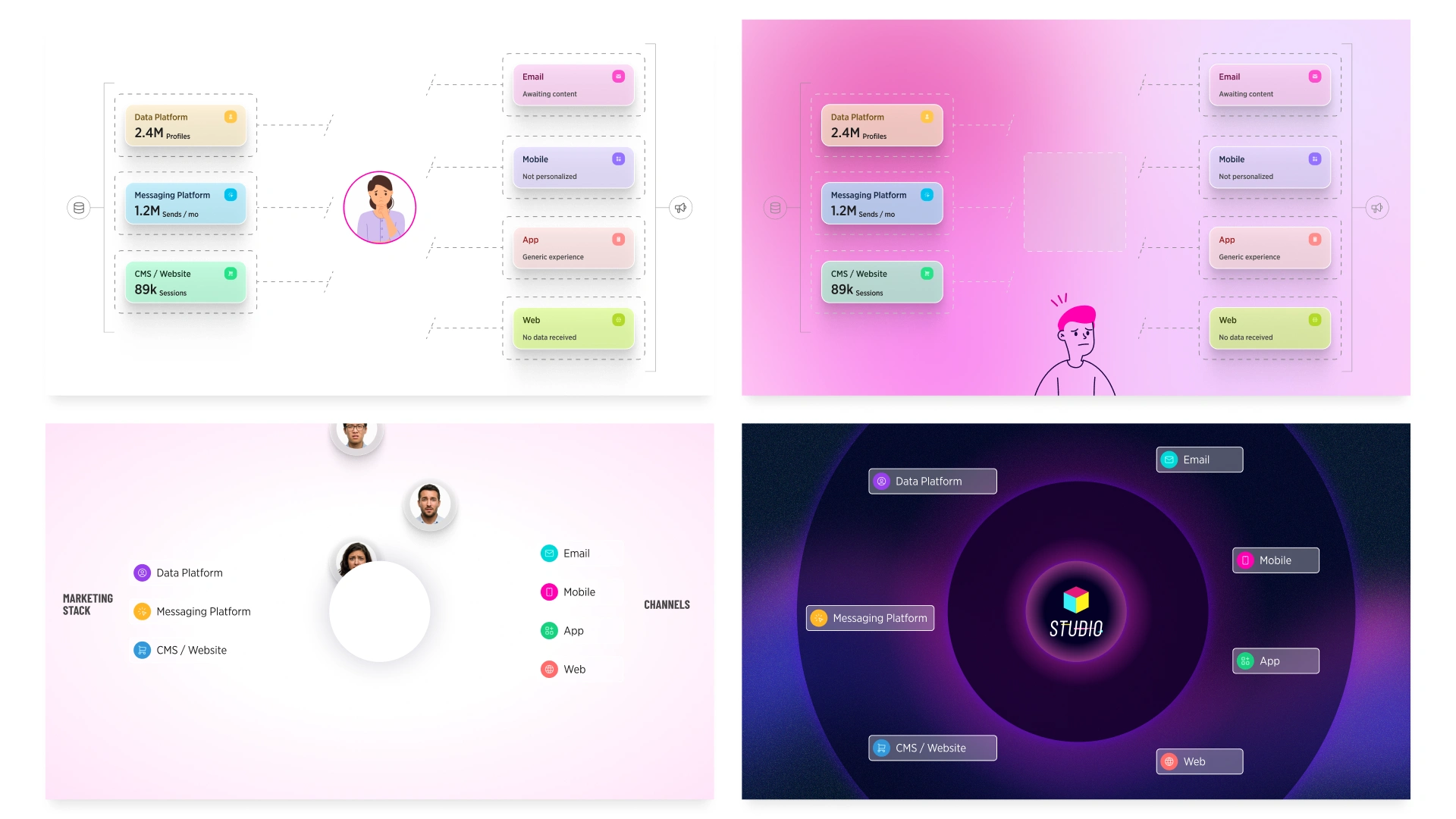
Four directions, each built on the same scene from the script so the choice was about style, not content. Characters ranged from detailed illustration to simple line art to real photography, to keep representation broad and relatable.
Final direction
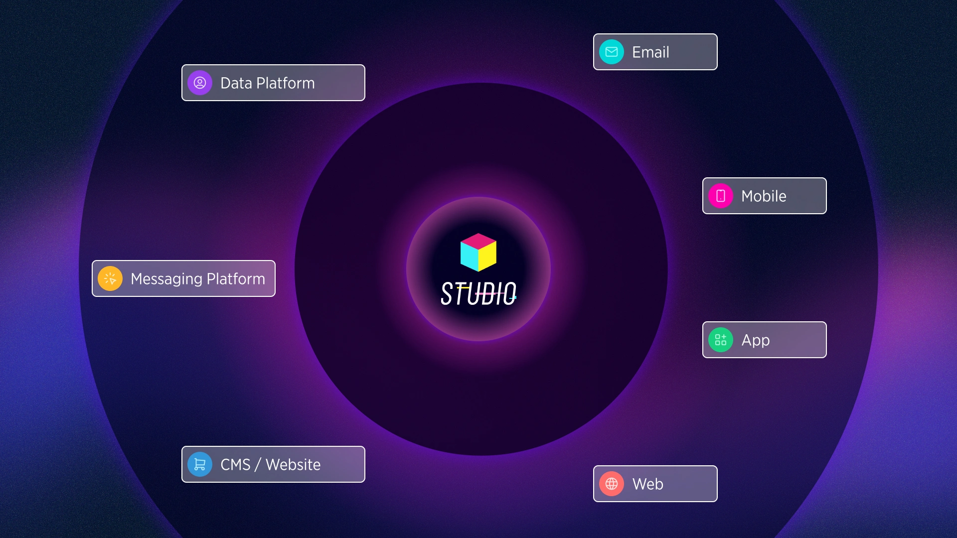
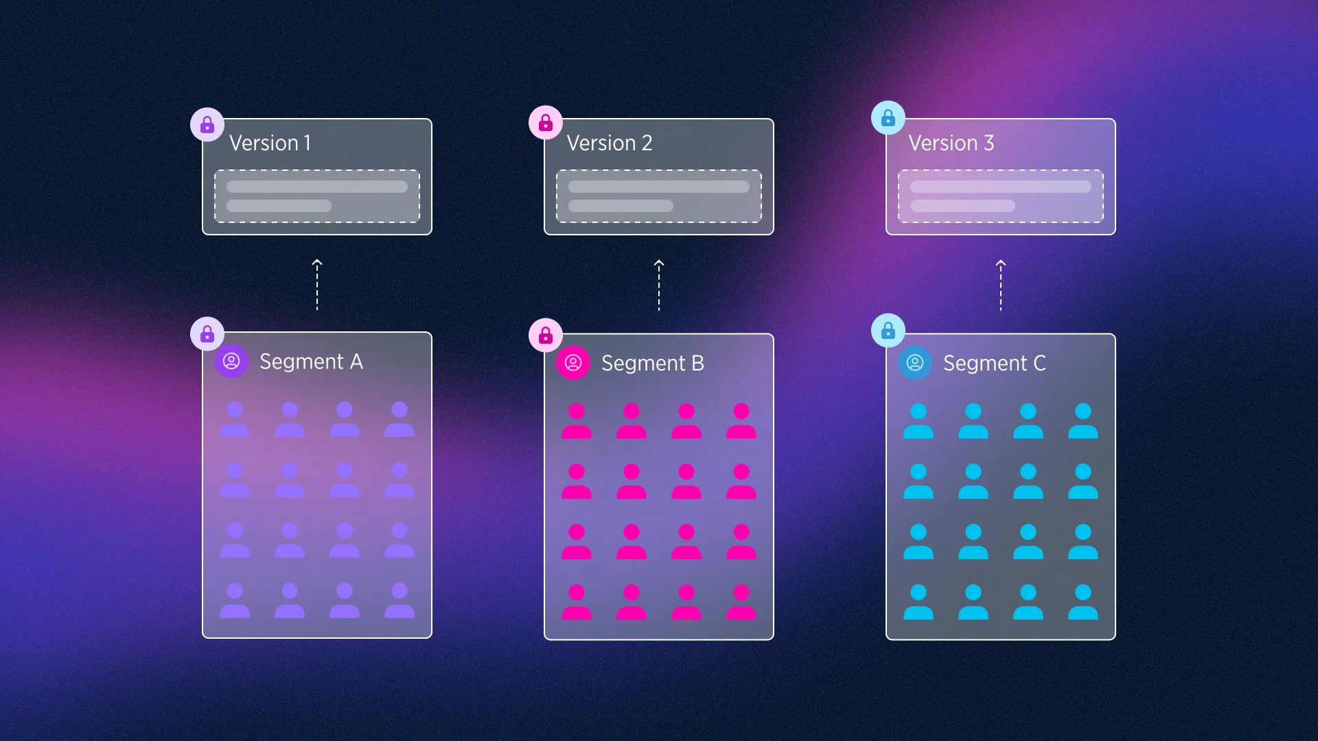
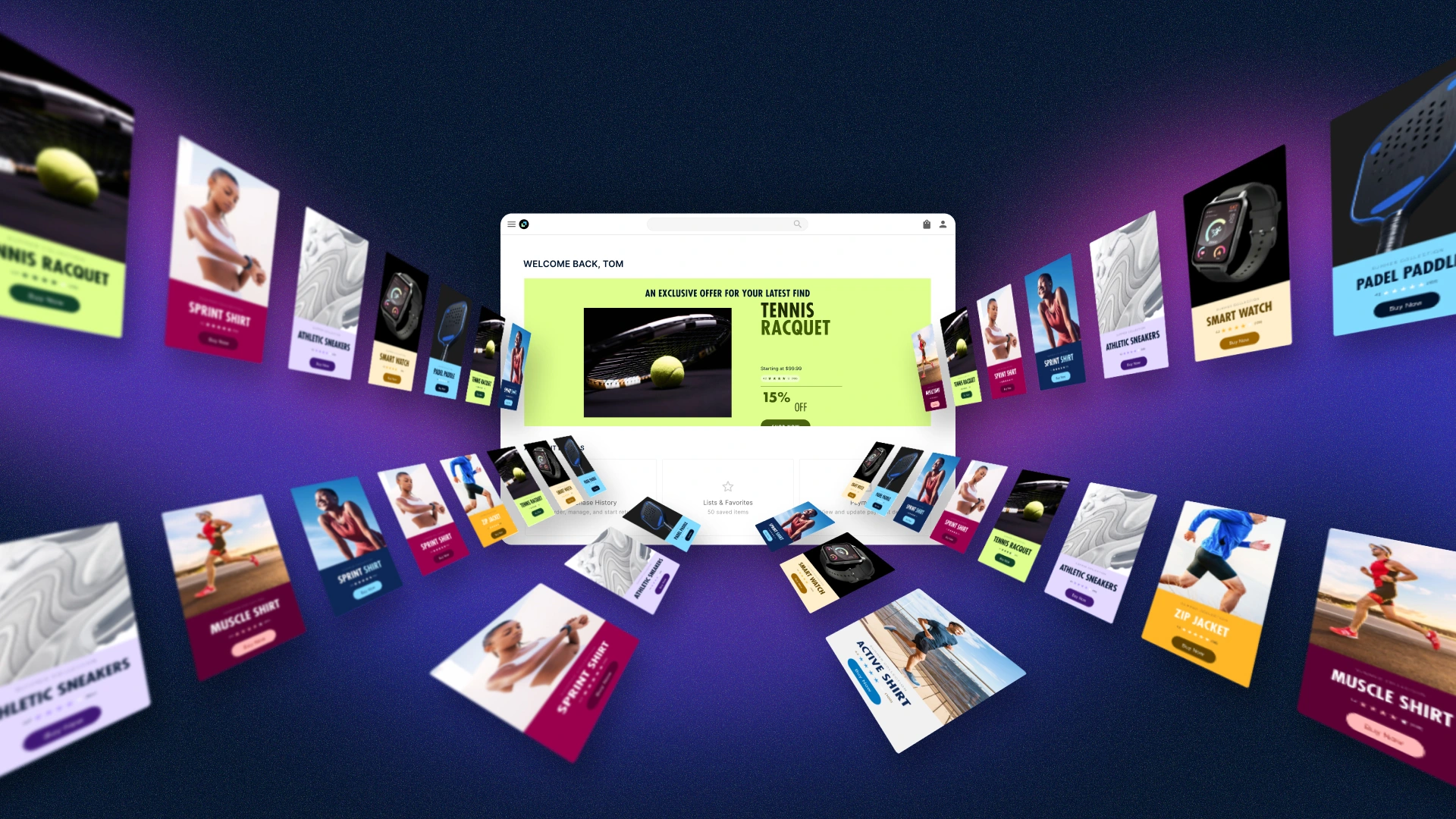
A dark, cosmic look with glass cards and Studio at the center of the stack. I turned audiences into simple figures colored by segment, so color carries the story: each segment gets its own version of the page. The closing frame expands that into a tunnel of personalized content around a single site.
Handoff
The frames became the visual guide the animation team used to build the final video.
1 like · 0 views · Nov 13, 2026
Four style directions and final frames for a 2D explainer of Movable Ink’s Studio for Web, a tool that personalizes websites for every visitor.
Timeline
Jun 29, 2026 - Jul 22, 2026
Tags

What the client had to say
Jere was easy and fantastic to work with. Came with great ideas and communicated and worked together well. Really happy with what we produced.


Joel Mann, MannMade.tv
Jul 22, 2026, Client