Salesforce Architect Diagram Design Kit
OVERVIEW: Salesforce Architect Diagram Design Kit is a collection of design resources and templates for creating consistent and high-quality architecture diagrams. The kit includes a set of icons, symbols, and templates that are specifically designed to represent Salesforce components and architectures. This case study will outline the benefits of using the Salesforce Architect Diagram Design Kit and its impact on design processes.
Challenge:
Before the Salesforce Architect Diagram Design Kit was created, architects using Salesforce components had to rely on inconsistent resources to create their architecture diagrams. This lack of consistency led to difficulties in communicating designs, misinterpretations, and overall confusion. Salesforce saw the need for a unified set of design resources to help their architects better communicate their designs.
Solution:
The Salesforce Architect Diagram Design Kit provides a unified set of design resources and templates for creating high-quality architecture diagrams. This kit includes a set of icons, symbols, and templates that are specifically designed to represent Salesforce components and architectures. By providing this design kit, Salesforce is ensuring that architects have a consistent and easy-to-use set of resources to create architecture diagrams that communicate effectively.
Impact:
The Salesforce Architect Diagram Design Kit has had a significant impact on the design process for Salesforce architects. The kit has provided a unified set of resources that have helped architects communicate their designs more effectively. It has also led to an increase in productivity by reducing the time spent on creating designs from scratch. With the Salesforce Architect Diagram Design Kit, architects can focus on the content of their designs rather than worrying about the consistency and quality of the diagrams.
Conclusion:
The Salesforce Architect Diagram Design Kit is a valuable resource for architects working with Salesforce components. By providing a unified set of resources and templates, Salesforce has ensured that architects have the tools they need to create high-quality and consistent architecture diagrams. The design kit has had a significant impact on the design process, leading to an increase in productivity and more effective communication of design ideas.
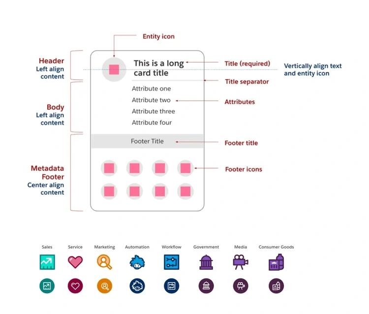
Here is a description of the anatomy of the card included in the Salesforce Architect Diagram Design Kit:
The card is divided into three sections, the header, body, and metadata footer. The header is located at the top of the card and is designed to give a quick understanding of the unit, area, or concept being represented on the map. The body of the card is optional and contains additional text-based details about the entity depicted. Finally, the metadata footer is located at the bottom of the card and is unique to Salesforce charts, providing additional characteristics about an entity. The kit comes with a variety of icons, including basic icons to represent Salesforce entities and all icons from the Lightning Design System.

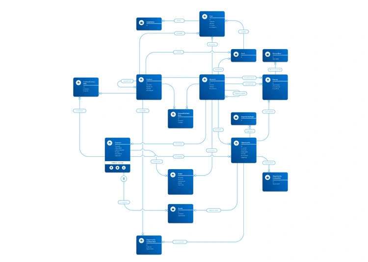
Accessibility
Around the world, approximately 1.3 billion people live with some form of disability, accounting for 15% of the world’s population. Accessibility is about making your diagram understandable for all your viewers. There are two particular focus areas that can help your diagrams be more accessible: optimizing for screen readers and using color contrast appropriately.
You can more resources on designing for accessibility on the Salesforce Design blog.
Screen ReadersA screen reader is a software application that reads aloud the words in a file, app, or website. A screen reader can read diagrams to individuals who are unable to see it clearly. The best format for screen reader compatibility is PDF (Portable Document Format). Unlike images and non-accessible applications, PDFs can be accessed by screen readers for reading words, shapes, and colors. Exporting your diagrams to PDF format when sharing with others can boost accessibility.
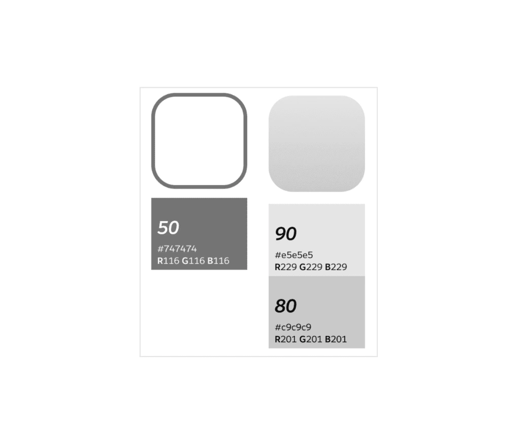
Color ContrastIncreasing the color contrast is another way to help your diagram be more accessible. People will be better able to recognize and read your diagrams when they meet the Web Content Accessibility Guidelines (WCAG) minimum color contrast of having a 4.5:1 ratio between the background color behind the text and the color of the text itself.
Each color in the Salesforce color system has a number, between 0 and 100, associated with it. When choosing colors for your diagrams, make sure the background color behind the text is at least 50 points greater than or less than the color of the text. For example, if your background color is 80, then your text color should be no higher than 30. Consider using the 50-point rule as needed for borders and outlines as well.
Like this project
Posted Feb 23, 2023
Designed and launched company-wide design kit, standardizing architecture diagram design and improving cross-functional collaboration.
Likes
0
Views
51
Clients

Salesforce


