Reviving a broken feature to recover lost revenue
Maryna Lytvyn
Client: Service marketplace platform
Role: Product Designer, UX Researcher
The Result
Increased engagement, retention, and revenue from a previously underperforming feature.
The Problem
The platform's messenger was underused. Messages did not load in real time, requiring users to refresh frequently or rely on email notifications. This intended quick communication channel turned out to be unreliable and ineffective.
Low messenger engagement negatively impacted retention and monthly recurring revenue. I was assigned to identify root causes and redesign the experience.
What I Did
Research
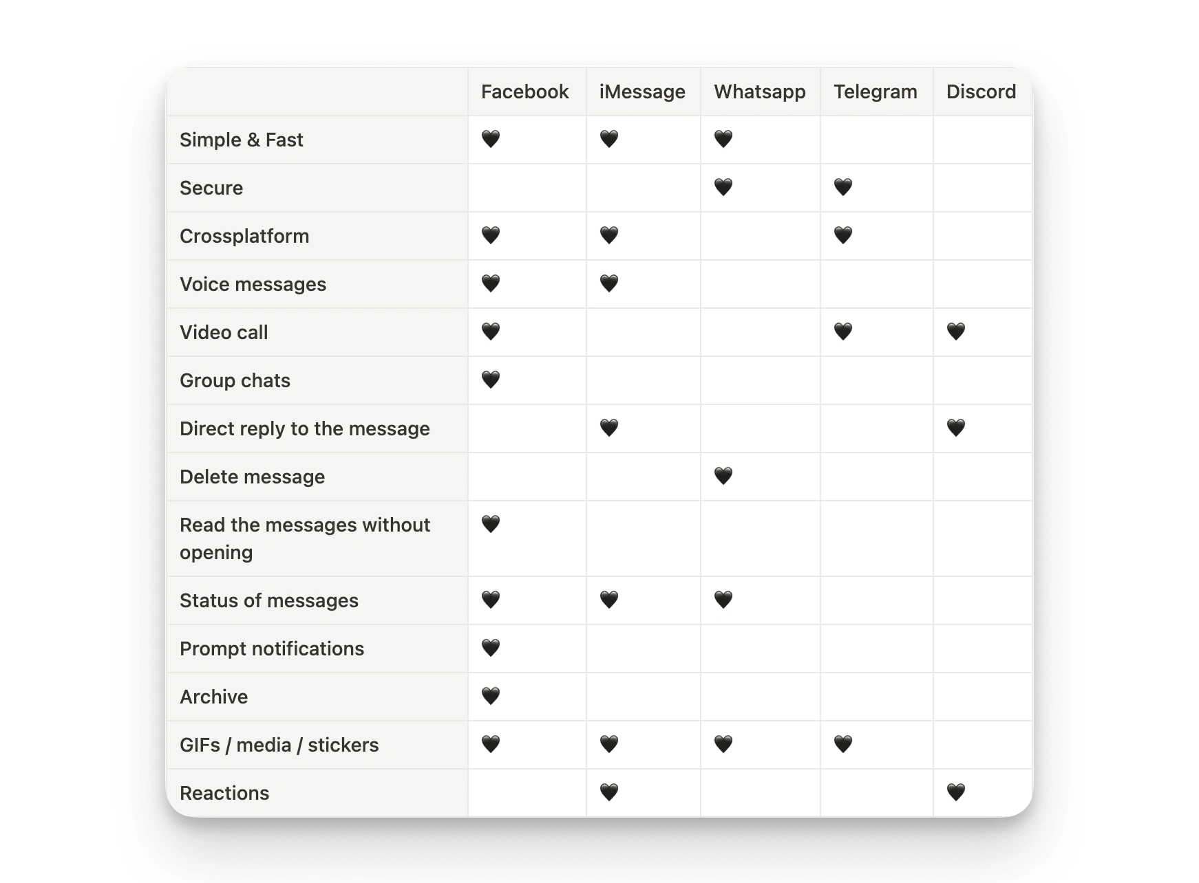
I conducted a survey and moderated usability testing sessions using UserTesting to understand user expectations for messaging. I focused on which platforms users trusted and what encouraged continued use. The results were clear: users expected the messenger to meet the standards of WhatsApp or iMessage. Anything less was perceived as broken.
Ideation
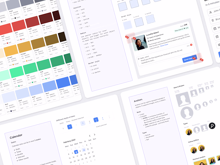
Based on the research, I designed a modern real-time messenger interface. The goal was to ensure it was intuitive and familiar, requiring no learning curve. I developed high-fidelity components and created a clickable prototype for usability testing.
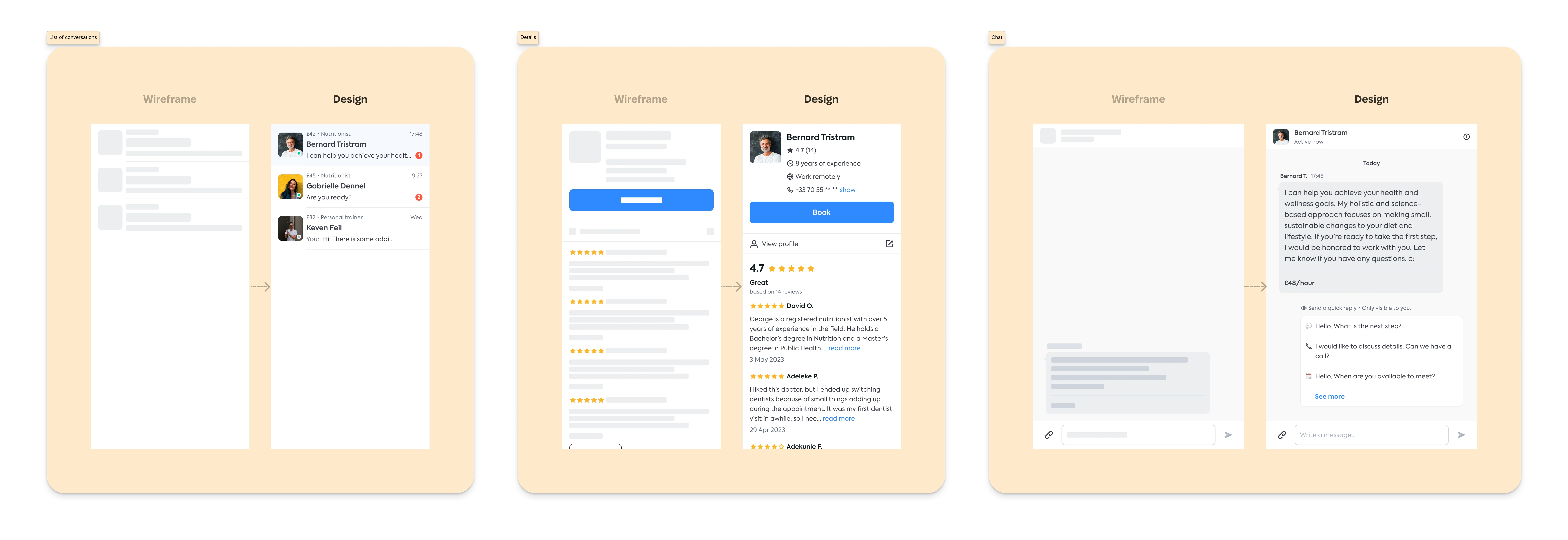
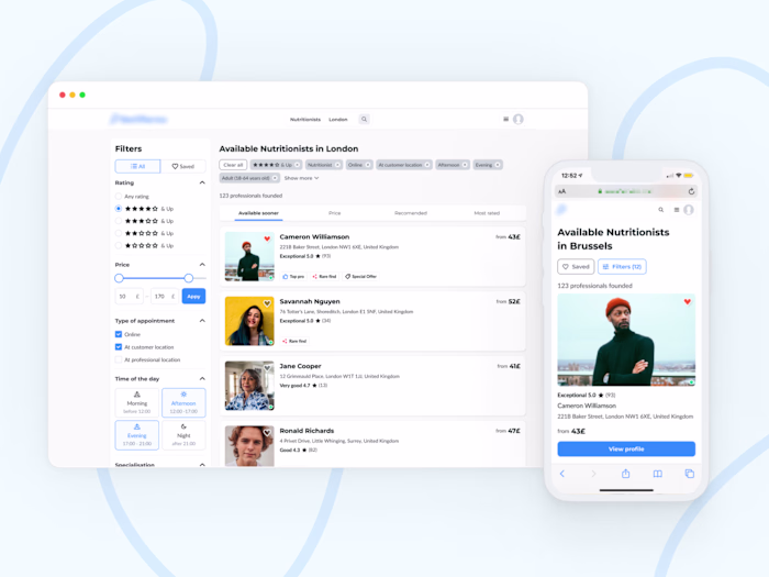
Messenger layout – conversation list, details of the Service providers, and chat
The key decision: pop-up vs full-screen
I tested two design options with users: a small in-app pop-up and a full-screen dedicated messenger. During usability sessions, I observed how users searched for and contacted service providers, assessed navigation, located key information, and initiated conversations.
User feedback was clear - they preferred the full-screen version. Users wanted to focus on one task at a time, view provider details within the chat, and access all conversations in a single location.
Based on this feedback, I decided to proceed exclusively with the full-screen version. This eliminated redundant development and allowed us to focus resources where they would have the most impact.
Final design
The redesigned messenger featured real-time messaging, a clean, distraction-free layout, and a unified view of chat, provider details, and conversation history. The design is simple, focused, and matches actual user communication habits.
Key Takeaways
Real-time messaging is a baseline expectation; anything less corrupts end-user trust.
Testing two design directions early saved major development time and budget.
Design decisions based on actual user behaviour led to better engagement, retention, and revenue.
Like this project
Posted Aug 6, 2025
Through UX research and data-driven insights, identify and address key pain points that have hindered messenger usage.