Introducing: Pain Point
Kendall Shafe
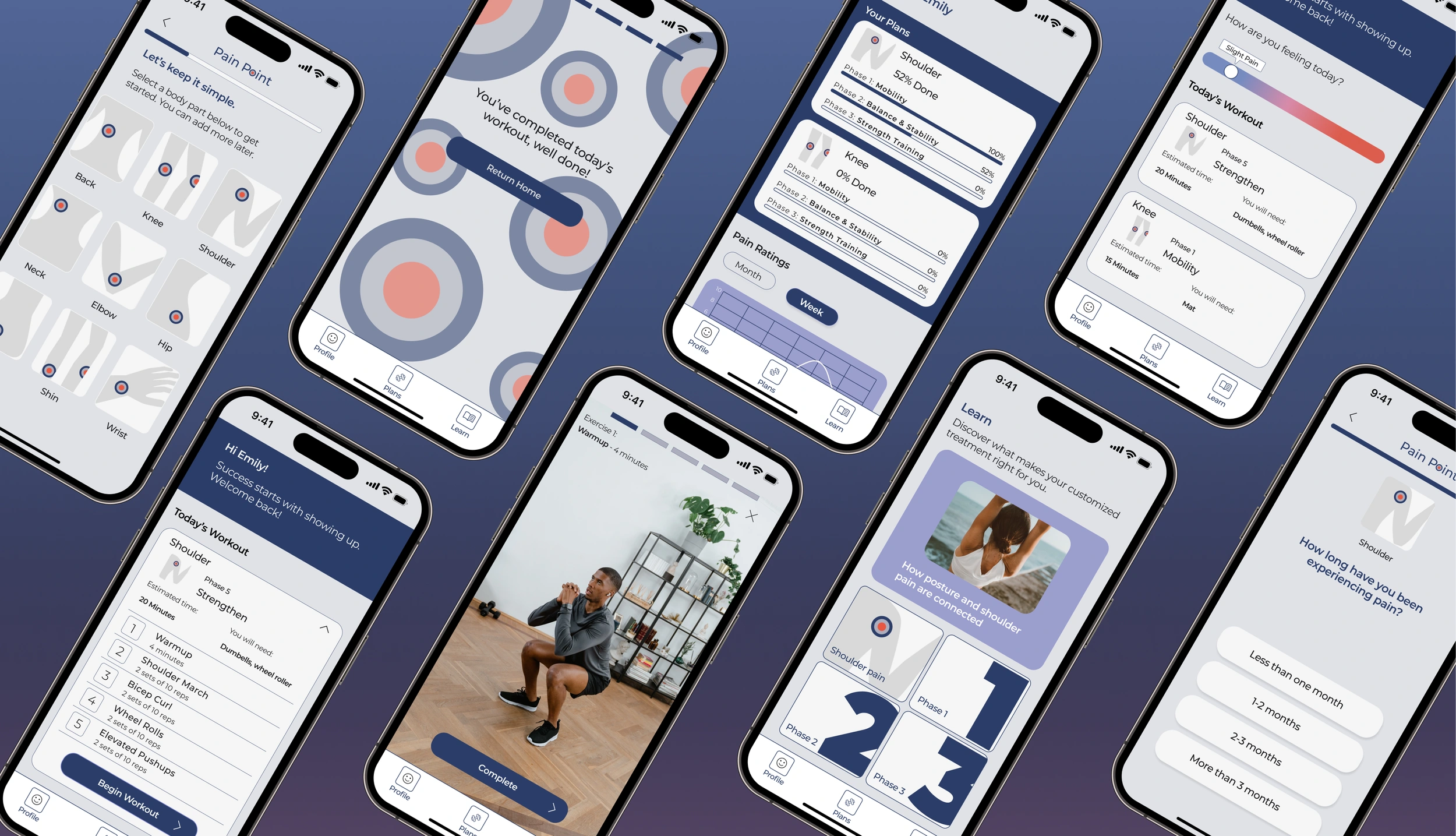
Pain Point App
A physical therapy planning tool for those in chronic pain.
My Role
Product Designer
Duration
Four weeks, September 2023
Project Type
End to End
Tools
Figma, Google Docs
Overview
Pain Point is a treatment plan app that allows the user to easily select specific areas of the body to learn more about the leading cause of pain, the stretches and exercises appropriate for said pain, and treatment plans to help expedite the healing process. This free app encourages education, self-discovery, and empowerment for the user and is accessible to all!
The target audience is those in varying levels of pain who are seeking relief through physical therapy online.
Problem Statement
It’s easy to search for stretches and exercises for “low back pain”, but it can be difficult to pinpoint what is causing the pain. Getting access to a physical therapist can be difficult and expensive and some people want to learn about their body even if they don’t have access to health providers. There is only one comparable app that exists currently and is completely subscription-based in the mobile app.
Hypothesis
We can help people find relief by creating a resource of educational information, discovering users’ current behaviors around online physical therapy and their needs in a treatment plan, and providing an interactive experience that maintains user retention and enjoyment.
The Solution
A physical therapy planning tool for those in chronic pain.
Easy-to-follow workouts
With visual and written instructions users can follow the workouts with ease. Users can preview their workouts including a time estimate, materials required, and pace themselves in their own time while completing the workout.
Intuitive sign-up and quiz feature to get you feeling better faster
The onboarding pain quiz allows users to log their symptoms and find solutions immediately with the ability to save their results through a variety of sign up options.
The Journey
The Design Process
Research
Age Range
Characteristics
22-54
Experiences chronic pain
Salary
$35k-$250k
Interviews
I conducted five moderated interviews with people ranging from 22-54 who experience acute to chronic pain over Facetime and in person. Most users told me their physical pain limits them from participating in daily activities and are looking for some form of free online physical therapy.
Most users use a Google search or online exercise videos to help their pain and are open to using apps for their physical therapy needs.
Most users experience some level of pain and have some methods they find effective, but all are open to learning more. People are curious about their bodies, especially when they are in pain, and are willing do to a lot to help relieve the pain. Most people will find a free resource helpful and believe it will help them stay on track.
User Interview Findings
— Bri Comstock
— Thor Von Bargen
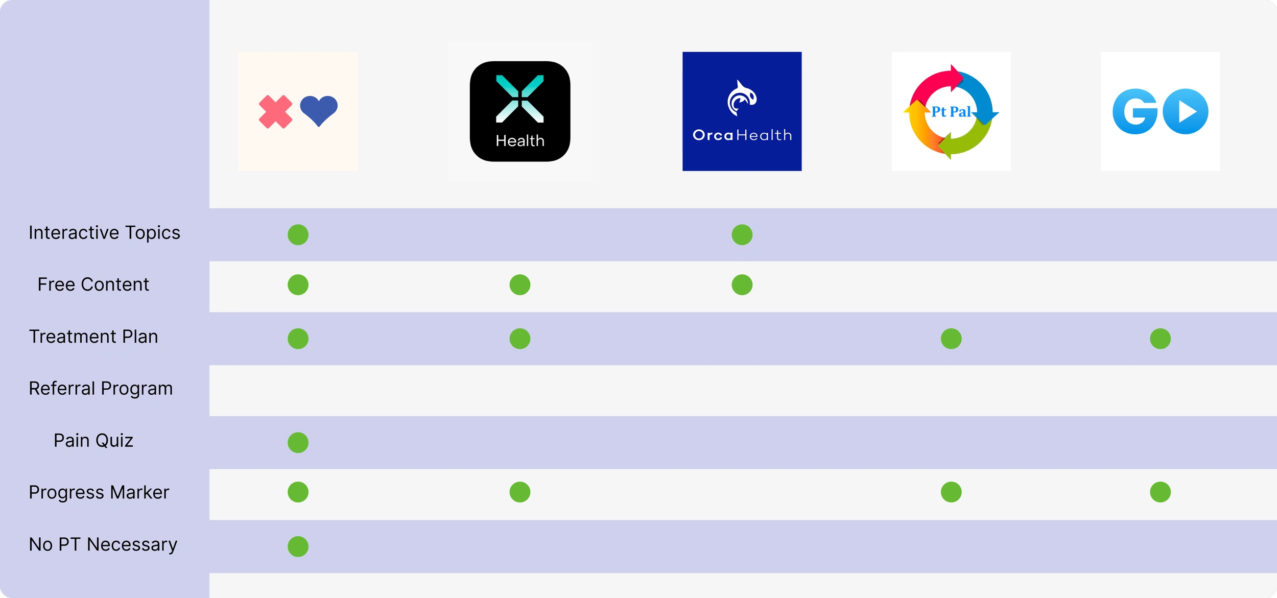
Competitive Analysis
I looked at in-category and out-of-category apps with a similar audience. It seems the industry standard is a physical therapy app requiring a doctor to set up the app for the user to access its content. Creating a free resource that is easy to use will fill a large gap in the health & wellness field.
I learned that injury map is competitive, however, it is not free, and while it doesn’t require a physical therapist, it is more effective with users who already see a physical therapist.
Key Takeaways
Most interviewees experience some level of pain ranging from mild to chronic
Most interviewees have some routine for relief that is only slightly effective
Most find PT and other resources difficult to access and expensive
100% of interviewees said they would find it helpful to have a progress bar or checklist for a pain regimen
40% of interviewees said they prefer learning exercises in person
100% of interviewees said they would like to use an online resource
Define
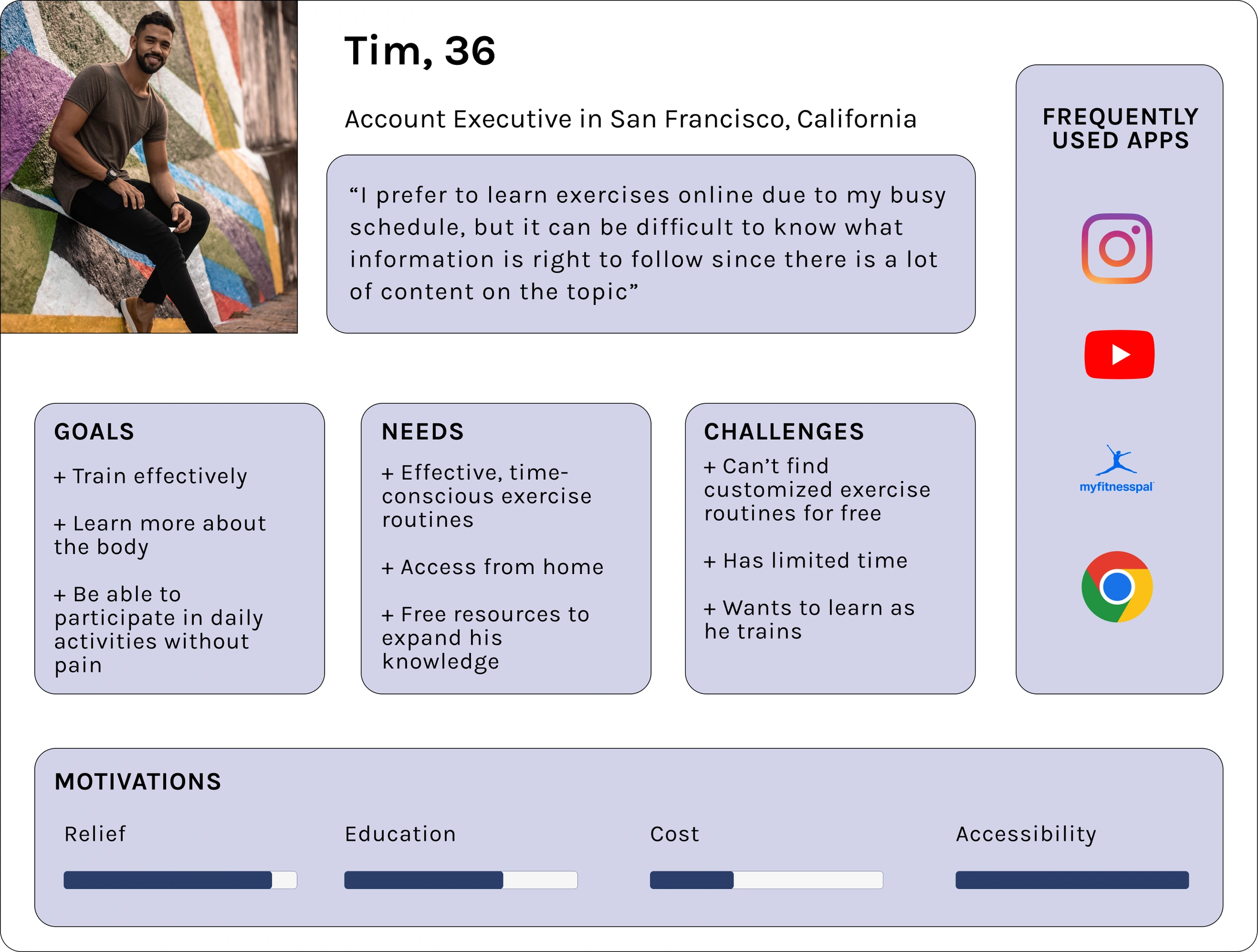
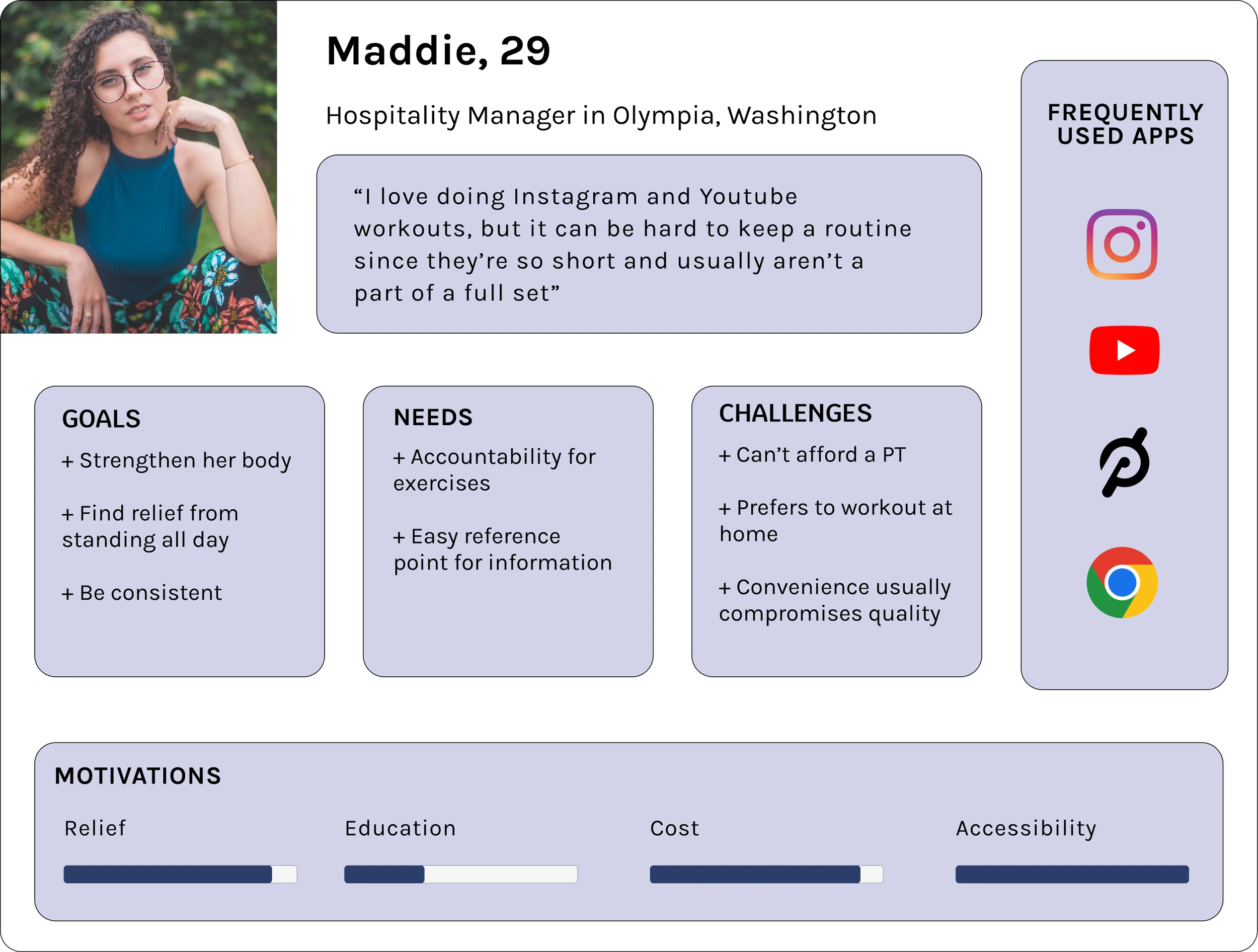
Personas
Target Audience
I created user personas that I can center my design around. The user persona I created is someone who would benefit tremendously from this app. It’s important to focus on the user’s goals and needs to properly execute a design solution.
Research Synthesis
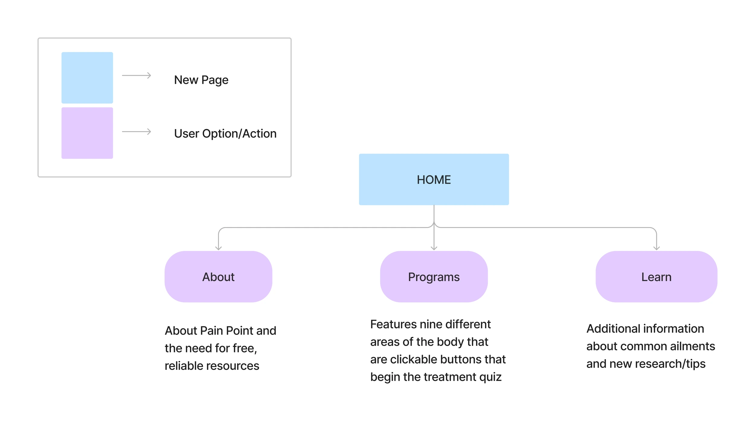
The research completed shows that users are looking for easy-to-access information about their pain to help them find relief. Keeping the sitemap simple and straightforward allows users to understand the nature of the app and get right to the thing they came for— pain relief. The three navigation categories moving forward will be: an about page, where users can learn more about the app and its purpose, a programs page where users can find their current workout programs, and a learnpage to discover more about their programs and their bodies.
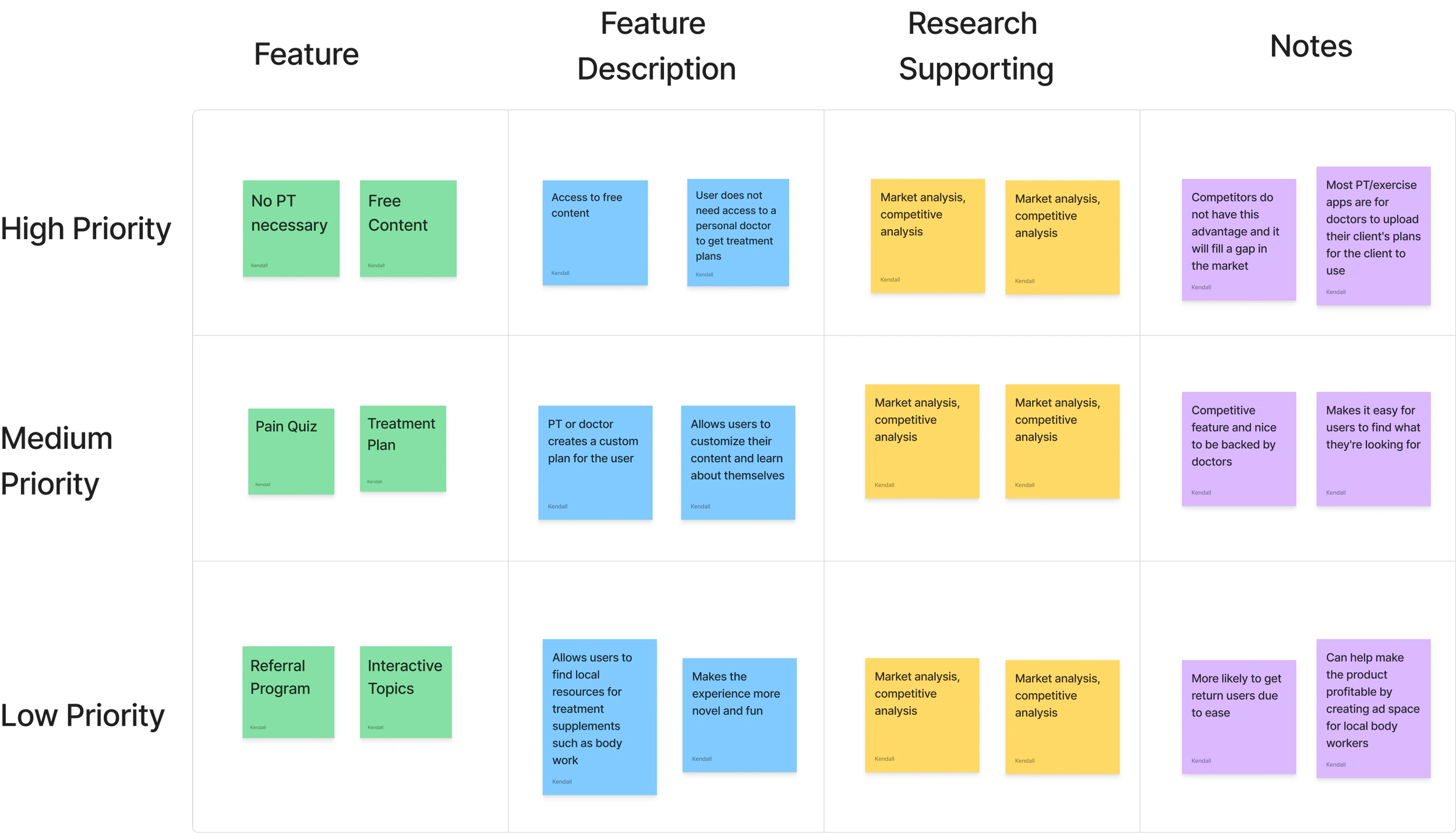
MVP Features
Based on the research, I decided on MVP features that would get the app up and running:
Physical therapy for those without access
A treatment plan quiz
All content is free
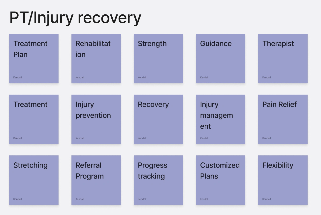
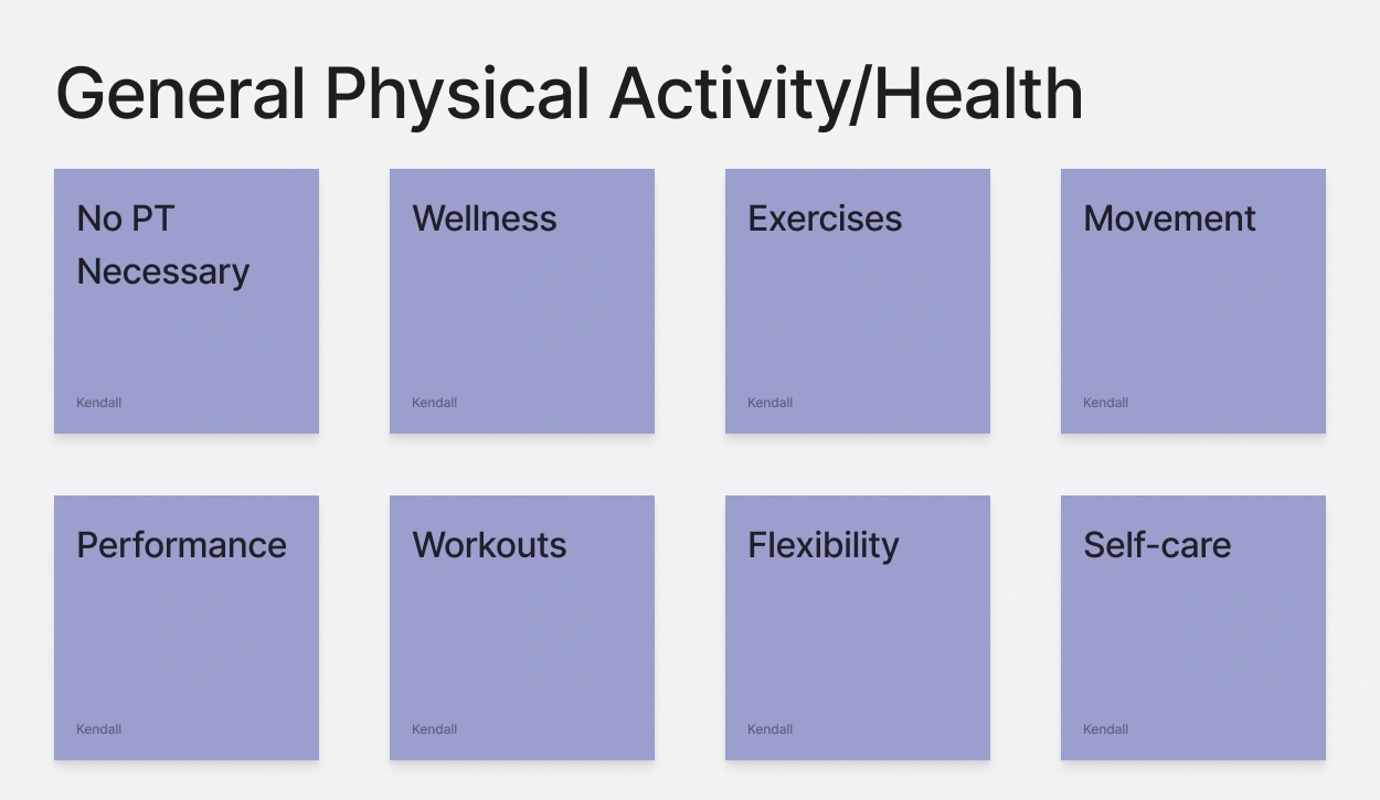
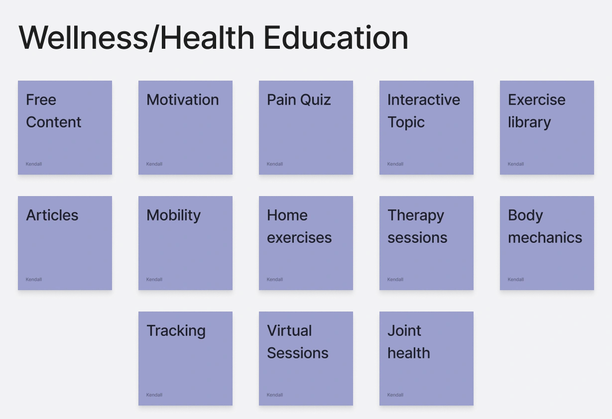
The affinity mapping showed themes relating to these topics and dictated the MVP features that would comprise the first iteration of the Pain Point App. Users range in age so finding an intuitive organization is necessary.
Must-Have Features
Free content
No physical therapy necessary
Nice To Have Features
Treatment plan
Pain discovery quiz
Features For Later
Referral program
Interactive topics
Information Architecture
Site Map
Considering the scope of the project, it’s better to lay the foundation now and continue to iterate moving forward. This is the groundwork to move forward toward referral programs and more that will help make the app profitable without imposing the user with membership fees.
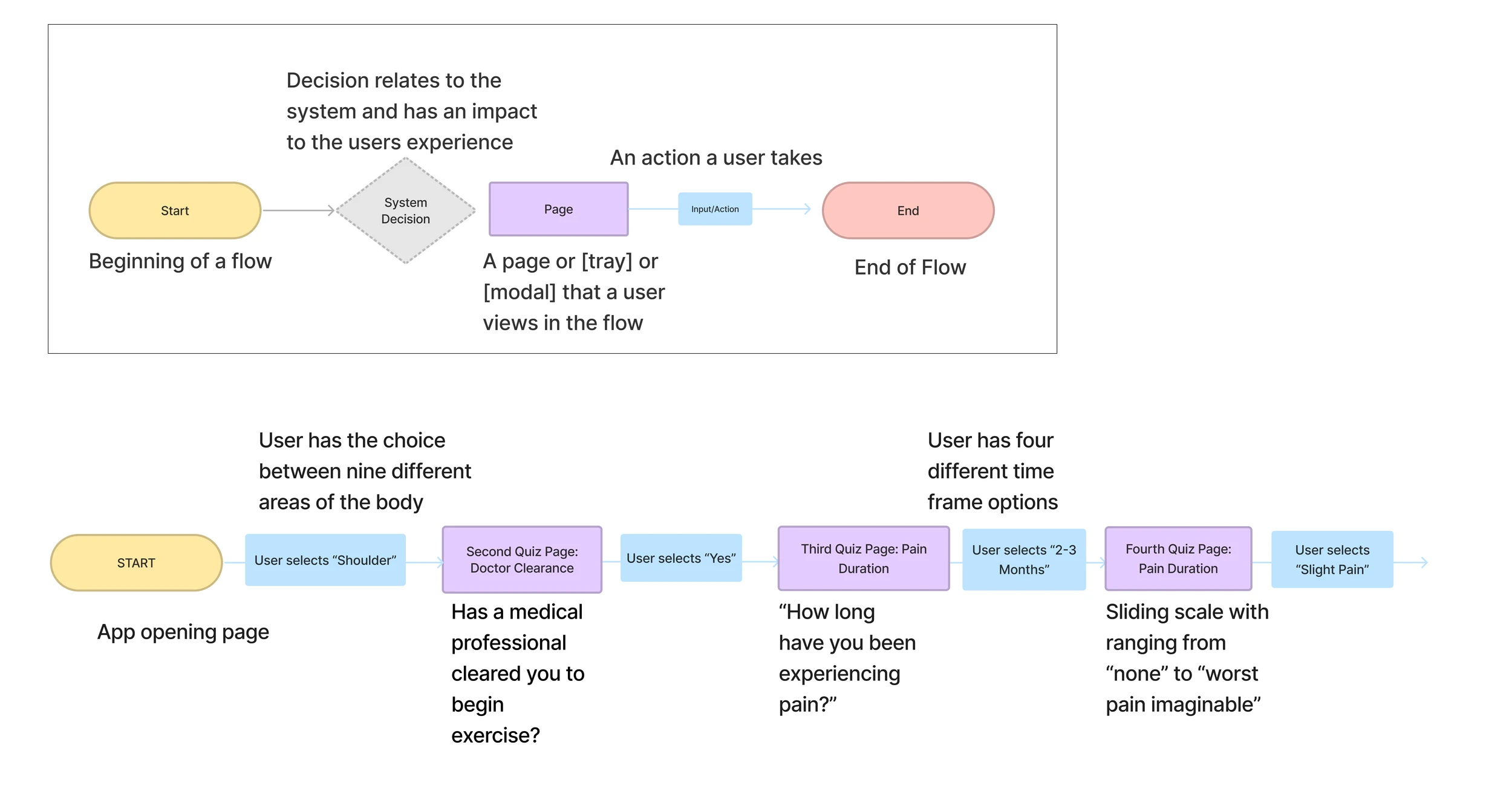
User Flow
The main feature of the app is the treatment plan creation. Without it, users would have to search for their own answers with only their understanding of their pain. The quiz helps guide users to have effective treatment plans and achieve the results they’re looking for and is the basis of the product.
The slideshow below features two slides showing the treatment plan creation user flow.
Ideate
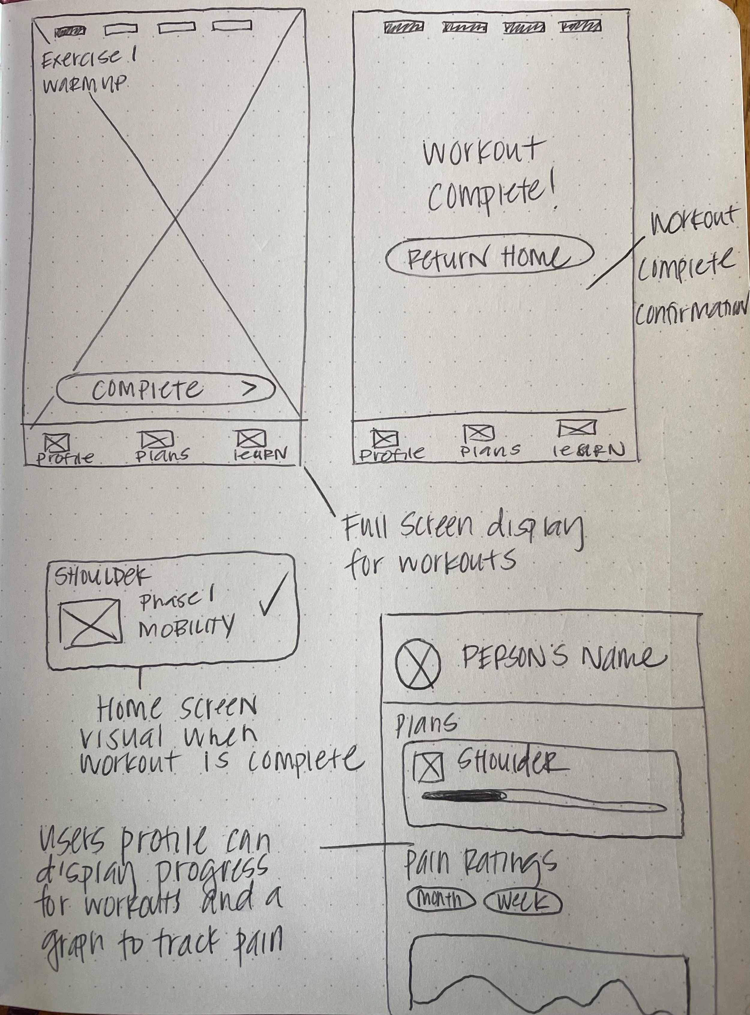
Low-Fidelity
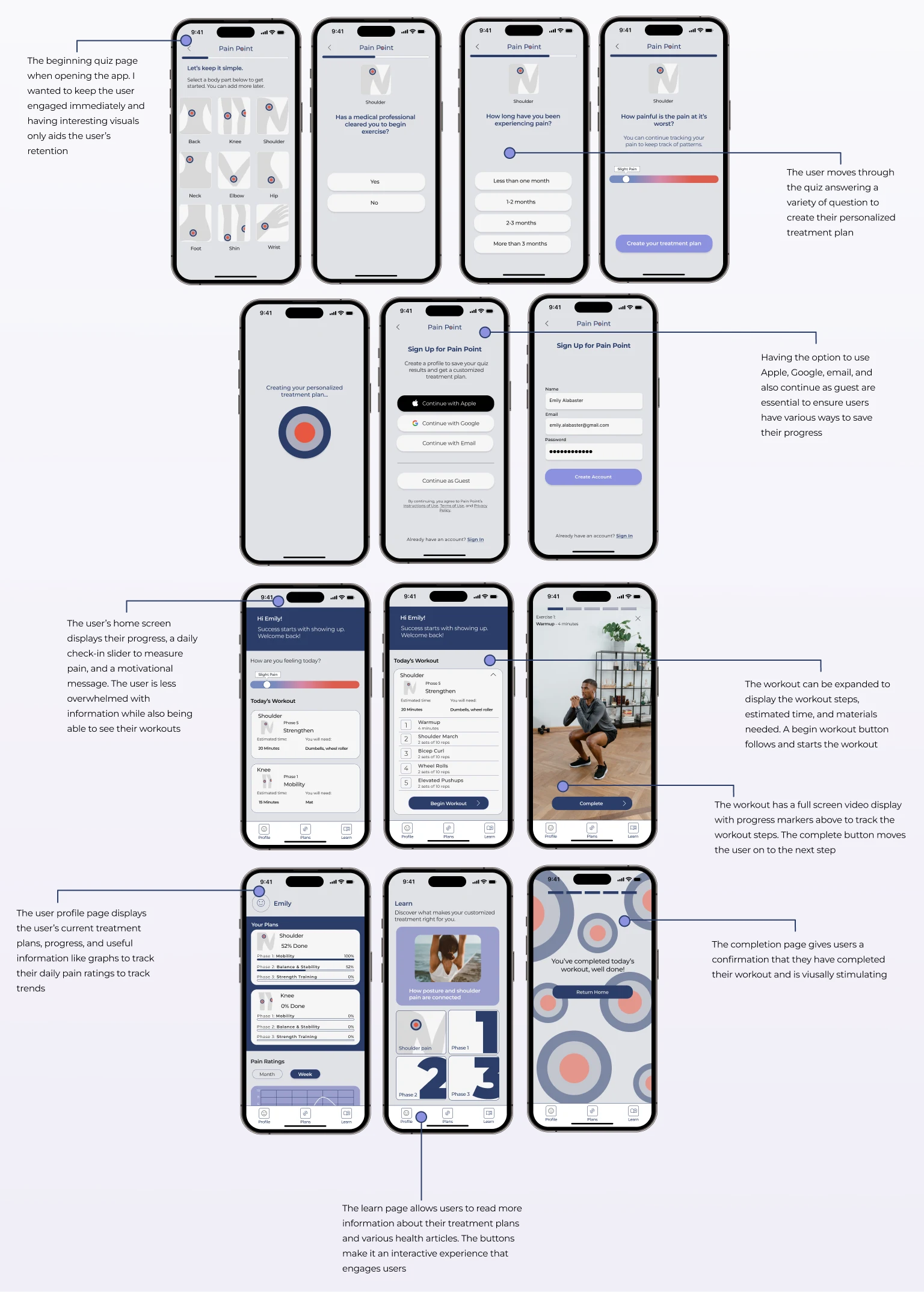
With the given research I began sketching basic ideas, then created wireframes for my concepts to understand the structure of the app’s UI. The wireframes show the pain quiz, sign up workflow, personal profile, exercise workflow, and the learn page where users can learn more about their pain and personalized treatment plan.
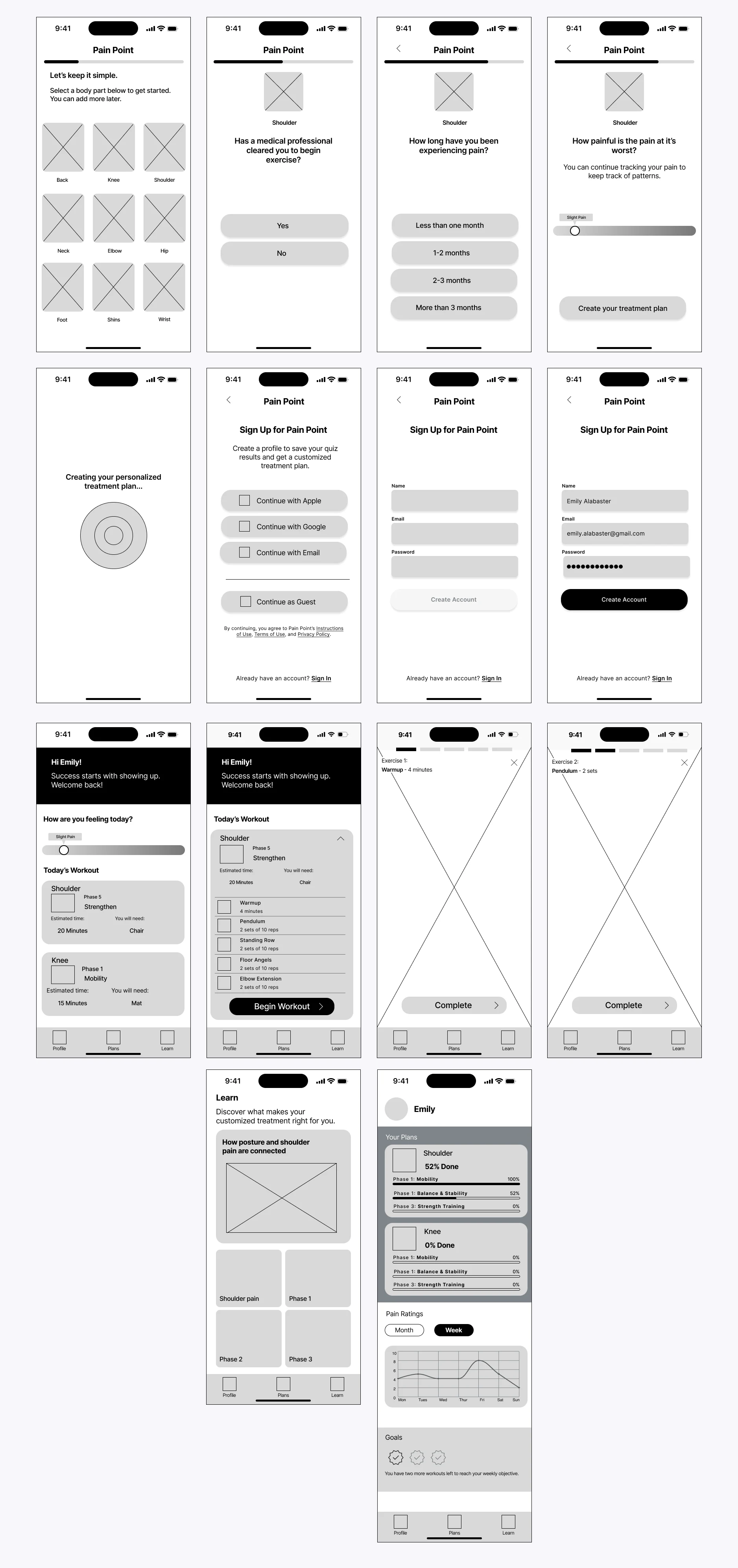
Mid-Fidelity
Using the ideas from the low fidelity sketches I created some basic wireframes to get a sense of the flow of the UI. The flow of the onboarding quiz is important to ensure the user stays engaged. The structure of the homepage has simplicity while still providing ample information for the user.
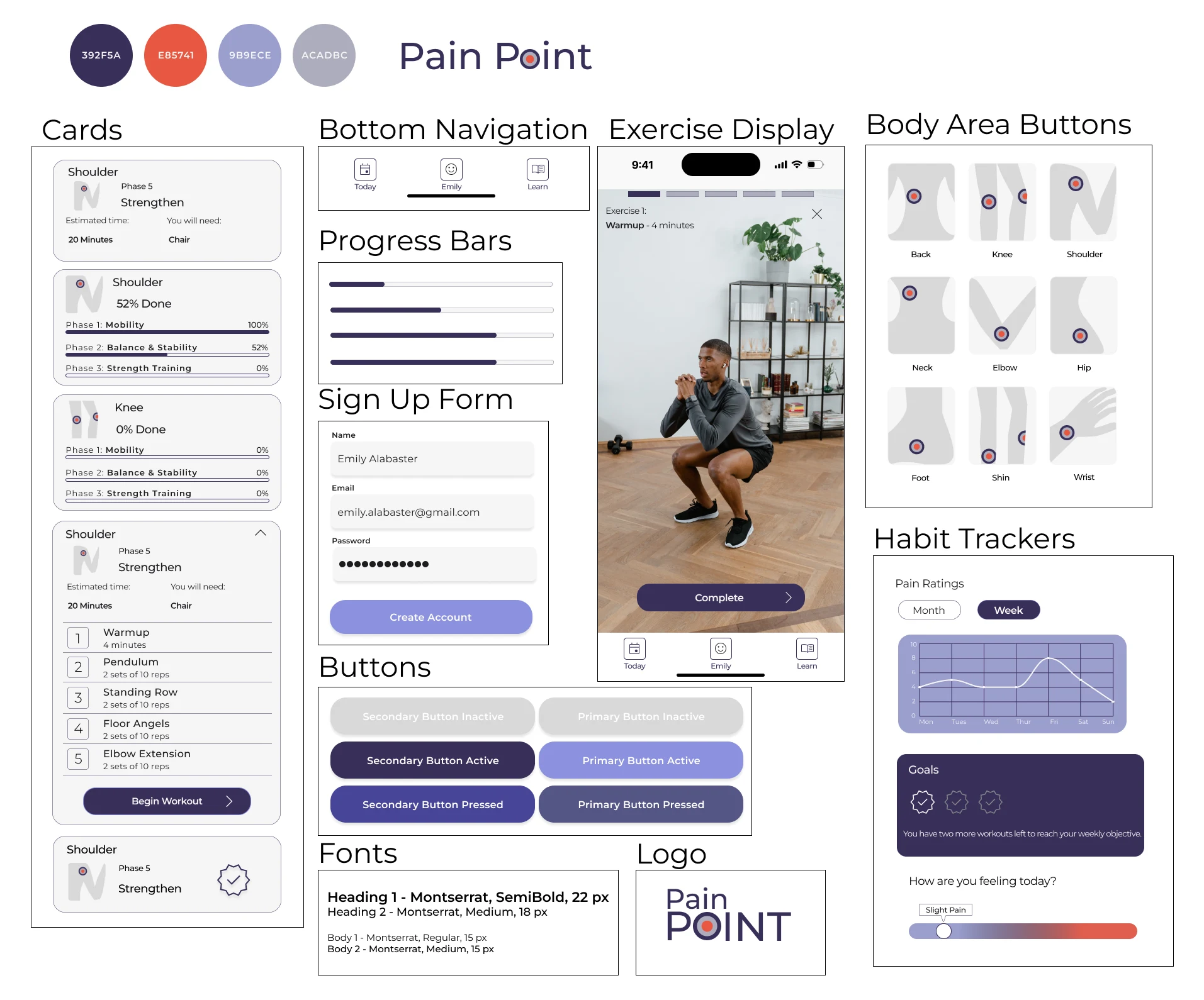
UI Components
Component Board
I wanted to keep the colors simple and sophisticated while adding in some fun graphics to keep users engaged and excited about the product. The body part graphics were designed to be playful and identifiable, the cards maintain consistency for clear progress marking, and the habit trackers allow for a unique user experience.
Testing
Usability Tests
Pain Quiz and Onboarding
With the knowledge that users are looking for solutions to their pain as quickly as possible, I decided that using the pain quiz as the opening feature for the app was essential. The quiz followed by onboarding allows users to save their results and jump right into their treatment plan if desired.
The first impression of the app is crucial, so testing the opening wireframes allows us to see user engagement and test how intuitive the product is on the first try.
Users found the buttons and simple questions useful in creating a personalized treatment plan. Overall they felt the usability test was approachable and interactive without requiring too much commitment on the user-end.
Iterations
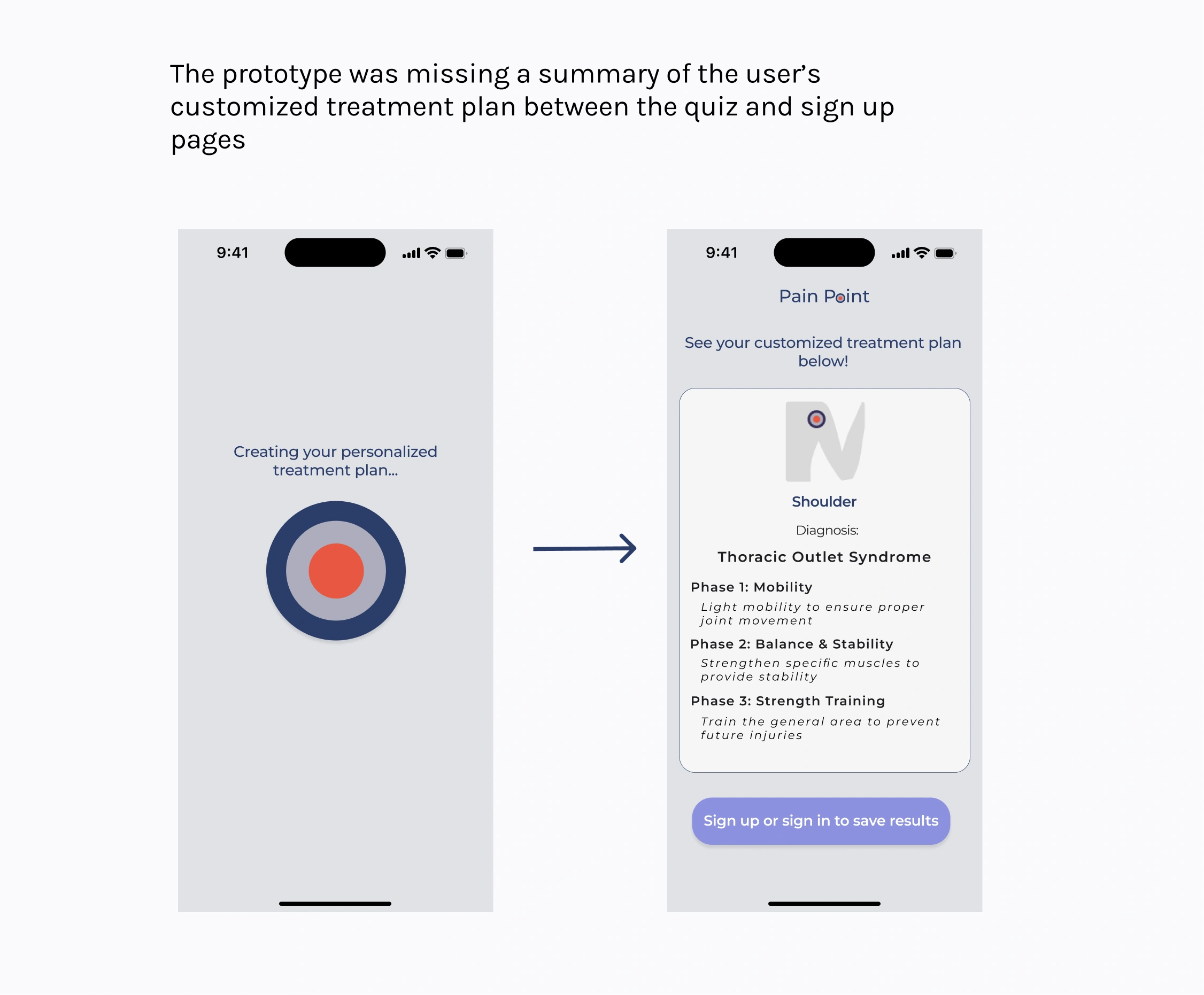
Post-Testing Revisions
After testing the prototype, I found I was missing one key page to highlight the user’s treatment plan post-quiz and pre-sign-up. Below is my iteration to include the treatment plan.
Final Product:
High Fidelity
FINAL THOUGHTS
Creating a free resource for those in pain is helpful to a large community and promotes healthier lifestyles. Creating the MVP features in this project allows for more opportunities in the future.
Moving Forward:
Create a referral program for local practitioners that can advertise their services by integrating external resources into treatment plans
Learn user’s habits and find ways to encourage retention by creating inviting notifications as reminders for workouts
Continue expanding the library of information about various pains
Like this project
Posted May 8, 2024
Pain Point is a treatment plan app that allows the user to easily select specific areas of the body to learn more about the leading cause of pain, the stretche
Likes
0
Views
21