10 Usability Heuristics Every UX/UI Designer Should Know in
Jakob Nielsen’s 10 Usability Heuristics for User Interface Design have served as a foundation for creating intuitive, user-friendly designs since 1994. As UX/UI design continues to evolve, these heuristics remain highly relevant and essential for ensuring an optimal user experience.
In 2024, with advanced technologies, users’ expectations have increased. Here’s an in-depth look at how these heuristics guide designers in crafting modern, user-centric products:

Photo by Desola Lanre-Ologun on Unsplash
1. Visibility of System Status
What it Means:
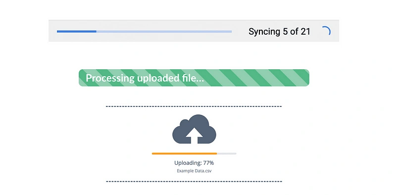
Users should always be informed about what is happening within the system through appropriate feedback within a reasonable amount of time. Whether it’s loading states, system processing, or form submission, users need visual confirmation that the system is functioning as intended.
Best Practices:
Progress indicators: Show loading bars, spinning icons, or timers to indicate system activity.
Notifications: Use in-app or push notifications to keep users aware of ongoing processes, especially for background tasks.
Status updates: If an action takes longer than expected, keep the user informed with periodic updates or estimations of completion time.
Why it Matters:
Uncertainty about what is happening can cause user anxiety and frustration. Visible system status reassures users and builds trust, making them more likely to stay engaged with the product.
2. Match Between System and the Real World
What it Means:
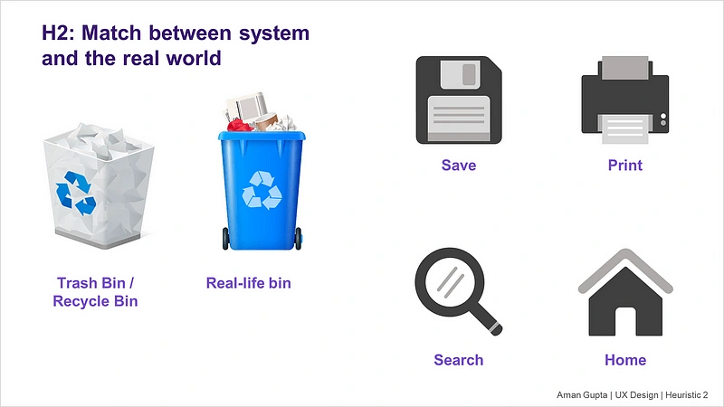
Design interfaces using language, icons, and visual elements that users can easily relate to from their everyday experiences. Avoid technical jargon and use real-world metaphors to create familiarity and reduce cognitive load.
Best Practices:
Language: Write copy in the language your users speak. Avoid complex terminology unless it’s essential to the audience.
Real-world metaphors: Use icons like envelopes for email or trash bins for delete to draw from users’ physical world understanding.
Natural sequencing: Ensure that workflows follow a logical, real-world sequence that users can predict.
Why it Matters:
When the system mirrors the real world, users intuitively understand how it works. This reduces the learning curve and enhances user satisfaction.
3. User Control and Freedom
What it Means:
Users should feel in control of their experience, with the ability to undo or redo actions and exit tasks at any point. Having escape routes prevents users from feeling trapped by the system.
Best Practices:
Undo/redo options: Allow users to backtrack or recover from mistakes without restarting the entire process.
Clear exit points: Provide visible and accessible “Cancel” or “Back” buttons in forms, modals, or processes.
Confirmation dialogues: Before critical actions, like deleting files or submitting irreversible information, ask for confirmation to prevent accidental errors.

Why it Matters:
Giving users the ability to correct mistakes or exit unwanted processes fosters confidence and reduces frustration, enhancing the overall experience.
4. Consistency and Standards
What it Means:
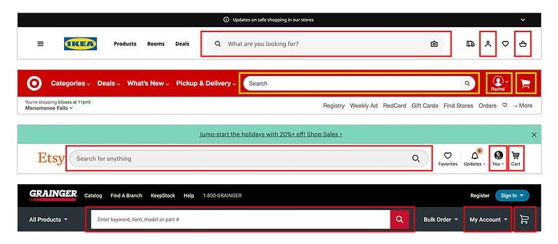
Maintain consistency in your design by using familiar icons, terminology, and behavior across the product. When different parts of the system follow similar rules, users can apply their existing knowledge to new contexts.
Best Practices:
Visual consistency: Use a uniform color scheme, typography, and iconography across the interface.
Interaction patterns: Ensure that buttons, menus, and controls function similarly throughout the platform.
Adhere to platform conventions: Follow design guidelines specific to iOS, Android, or web standards to meet user expectations for each platform.
Why it Matters:
Consistency builds a sense of reliability, reducing the amount of mental effort users need to navigate and use the system. It also makes learning the interface faster and more intuitive.
5. Error Prevention
What it Means:
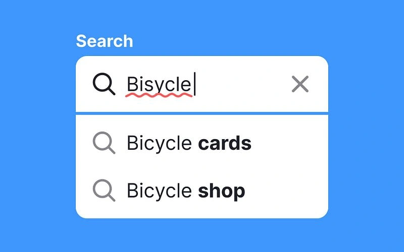
Preventing errors is more efficient than allowing users to make mistakes and then correcting them. Design systems that guide users through tasks in a way that minimizes the possibility of errors.
Best Practices:
Preventative constraints: Disable or hide buttons and options that don’t apply or that might lead to errors.
Inline validation: Use real-time form validation to alert users of potential issues before they submit.
Confirmation steps: For sensitive actions, like submitting forms or deleting items, require users to confirm their choices.
Why it Matters:
By proactively preventing mistakes, you reduce frustration and build user trust in the system, as it helps users avoid common pitfalls.
6. Recognition Rather Than Recall
What it Means:
Minimize the user’s memory load by making options, actions, and information visible. Instead of relying on users to remember details from one screen to another, provide cues and prompts.
Best Practices:
Tooltips and hints: Offer helpful tips or descriptions when users hover over or select unfamiliar features.
Pre-filled forms: Where possible, pre-fill fields with known information to save users time.
Recent actions: Display recent searches, visited pages, or previously entered information to avoid making users re-enter data.

Why it Matters:
When users don’t have to remember details, they can focus more on the task at hand, making the experience more intuitive and reducing the likelihood of errors.
7. Flexibility and Efficiency of Use
What it Means:
Design should cater to both novice and experienced users. While beginners may prefer guided workflows, advanced users often seek shortcuts and ways to perform tasks more quickly.
Best Practices:
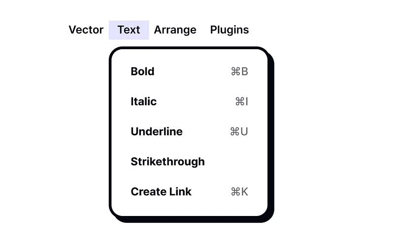
Keyboard shortcuts: Provide power users with shortcuts to speed up interactions.
Customization: Allow users to customize their interface, such as adjusting layouts or creating shortcuts to frequently used features.
Streamlined workflows: Offer quick paths for advanced users while keeping more detailed instructions available for beginners.
Why it Matters:
By accommodating different user types, you ensure your product is inclusive and can grow with the user, enhancing long-term satisfaction.
8. Aesthetic and Minimalist Design
What it Means:
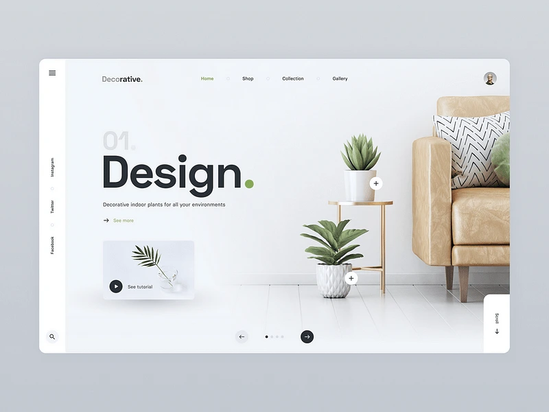
Less is more. Interfaces should present only the information that’s necessary, with minimal distractions. Visual clutter can overwhelm users, making it harder for them to focus on their primary tasks.
Best Practices:
Whitespace: Use ample whitespace to improve readability and create a clean, modern look.
Prioritization: Highlight the most important information and hide or deprioritize less relevant details.
Simplified layouts: Avoid overloading users with too many buttons, links, or sections on any single page.
Why it Matters:
A minimalist design reduces cognitive load, allowing users to focus on what’s essential without feeling overwhelmed by unnecessary elements.
9. Help Users Recognize, Diagnose, and Recover from Errors
What it Means:
When users encounter errors, they should be able to understand what went wrong and how to fix it. Clear, actionable error messages are crucial to helping users recover quickly.
Best Practices:
Human-readable error messages: Avoid technical jargon. Instead, explain the error in plain language.
Offer solutions: Provide clear instructions or options to fix the problem.
Visual cues: Use color coding (e.g., red for errors, green for success) and icons to draw attention to errors and guide users.

Why it Matters:
Well-designed error messages prevent frustration and keep users engaged with the system, even when things go wrong. Clear guidance reduces drop-off and increases user satisfaction.
10. Help and Documentation
What it Means:
While a good interface should be intuitive, some users will still need help. Offer clear and easily accessible documentation and support features to guide users through unfamiliar or complex processes.
Best Practices:
Contextual help: Provide help directly within the interface, such as tooltips or “Learn More” links near complex features.
Searchable knowledge base: Create a comprehensive, searchable library of articles, FAQs, and tutorials.
Customer support: Ensure users can quickly access support options like live chat or contact forms when needed.

Why it Matters:
Easily accessible help ensures that users can resolve issues on their own, reducing frustration and support inquiries. Proper documentation also empowers users to explore more advanced features.
Conclusion
In 2024, Jakob Nielsen’s 10 usability heuristics remain critical tools for UX/UI designers to create seamless and user-friendly interfaces. These principles help ensure that the product meets user expectations, reduces friction, and provides a satisfying experience. By embedding these heuristics into your design process, you can craft products that are intuitive, accessible, and truly centered on the user experience.
Like this project
Posted Oct 6, 2024
This an article written for UX Designs on Medium on a publication Bootcamp.
Likes
0
Views
5


