Renewd - Subscription Tracker

Devansh Thapa


Renewd — Subscription Renewal Tracker
A subscription tracker that catches autopay charges before they happen, helping students and budget-conscious users avoid losing money to forgotten renewals.
Overview
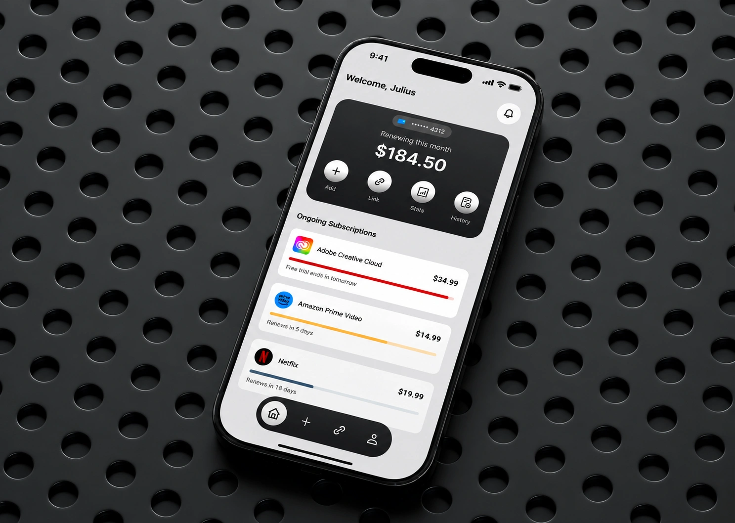
The average person underestimates their subscription spending by more than double, and forgotten free trials often convert into charges people can't afford. Renewd was designed to solve the moment that actually matters: the window before a renewal happens, when there's still time to act.
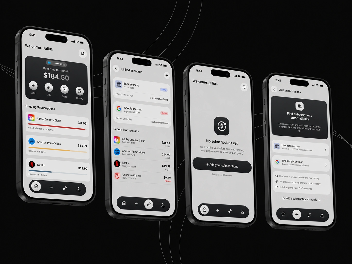
From welcome to empty state: dashboard, linked accounts, first-time state, and account linking, all built around one rule, sort by urgency, not alphabet.
The Challenge
Existing subscription trackers focus on detecting charges after the fact. Through user interviews, I found the real problem wasn't awareness, it was timing. People don't forget subscriptions out of carelessness, the information is scattered across email, bank statements, and receipts, and the moment of realization almost always comes too late.
The Solution
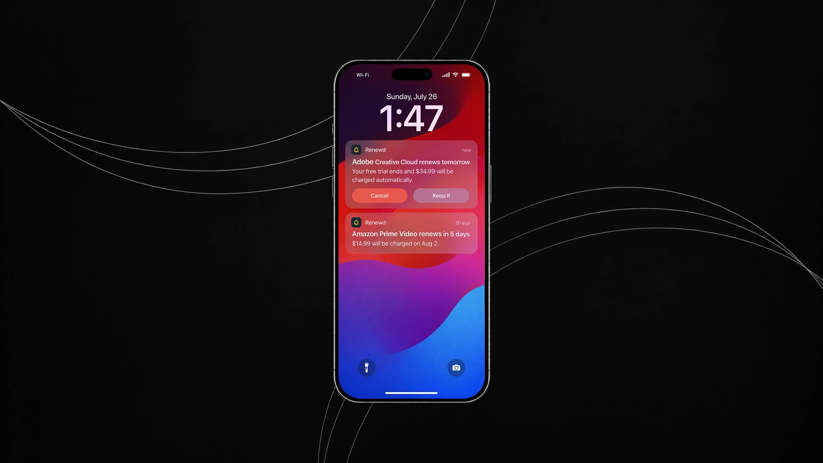
I designed a focused four-screen core flow built around one job: catching a renewal before it charges. A disciplined three-color urgency system (coral for today, amber for this week, denim for everything else) makes the dashboard scannable at a glance. A countdown timer appears only within a genuine 48-hour urgency window, keeping the experience calm rather than anxiety-inducing outside of it. Account linking was designed around trust, with manual entry offered as an equal option and every detected subscription requiring manual confirmation before being added.
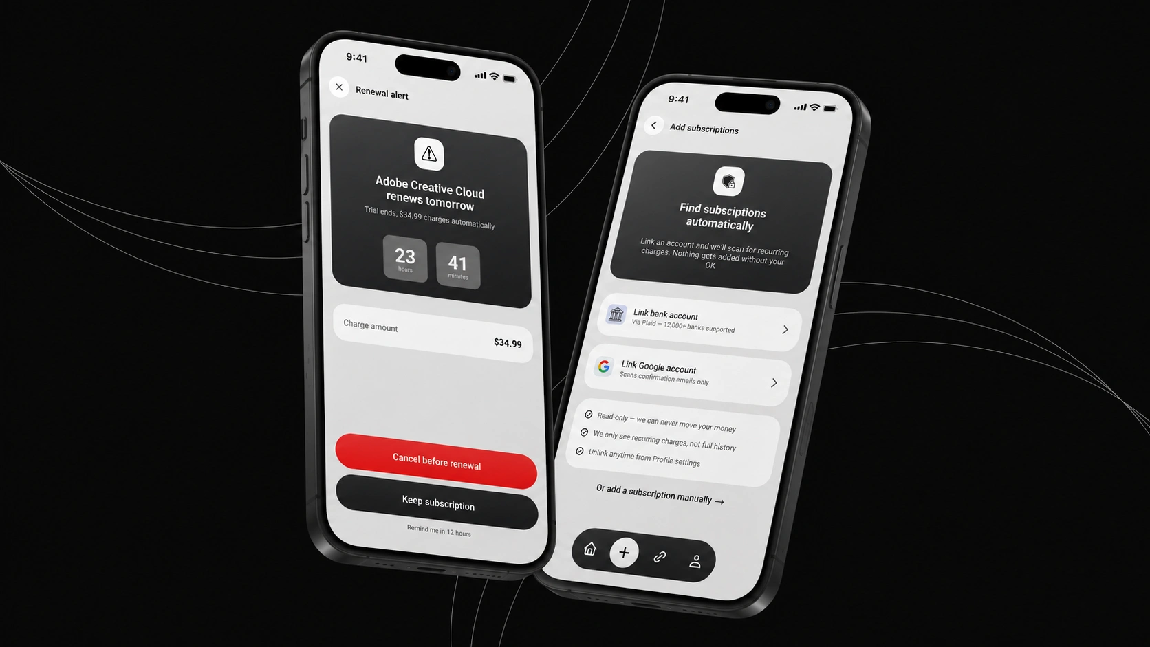
The renewal alert and account-linking screens side by side: one built for urgency, the other built for trust.
My Process
Conducted user interviews and competitive analysis (Rocket Money, ReSubs, Bobby) to identify a genuine gap in the market
Defined a focused problem statement and scoped the product to a single core flow rather than a full budgeting suite
Designed a color system with functional meaning, not just branding, tied directly to urgency levels
Built and iterated on key screens: dashboard, renewal alert, push notification, account linking, and detected subscriptions
Outcome
A cohesive, focused case study demonstrating end-to-end UX process, from research and problem definition through visual design and interaction design, scoped deliberately to show depth on one problem rather than breadth across a full app.
Thank You for your time
Like this project
Posted Sep 29, 2026
A subscription tracker that catches autopay charges before they happen, helping students and budget-conscious users avoid losing money to forgotten renewals.
Likes
2
Views
2
Clients
Renewd