Virtual Assistant Platform — Full Landing Page UX/UI Redesign
Sagar Donda
🔹 The Problem
The original Virtual Assistant landing page struggled with:
• Overwhelming content hierarchy
• Low visual trust and credibility
• Poor scannability for services and industries
• No clear user journey from discovery to conversion
Users found it difficult to quickly understand the platform’s value, compare providers, or take action.
🔹 The Goal
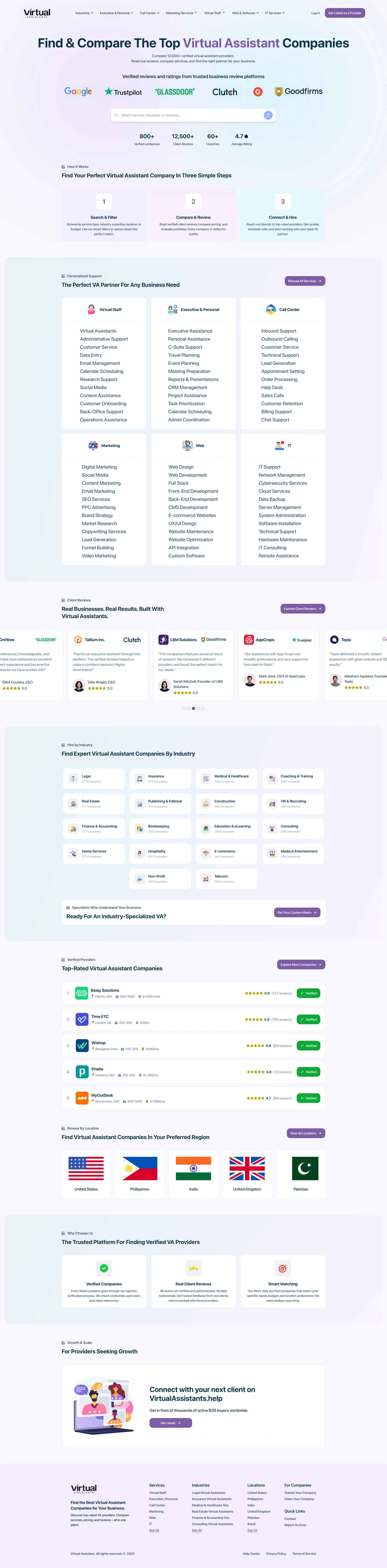
Create a high-converting, user-friendly landing page that:
✅ Clearly communicates the platform’s value
✅ Builds trust through reviews and verification
✅ Makes service discovery effortless
✅ Scales with future features and categories
🔹 My Role
UX/UI Designer (End-to-End)
• UX research & inspiration
• Design system creation
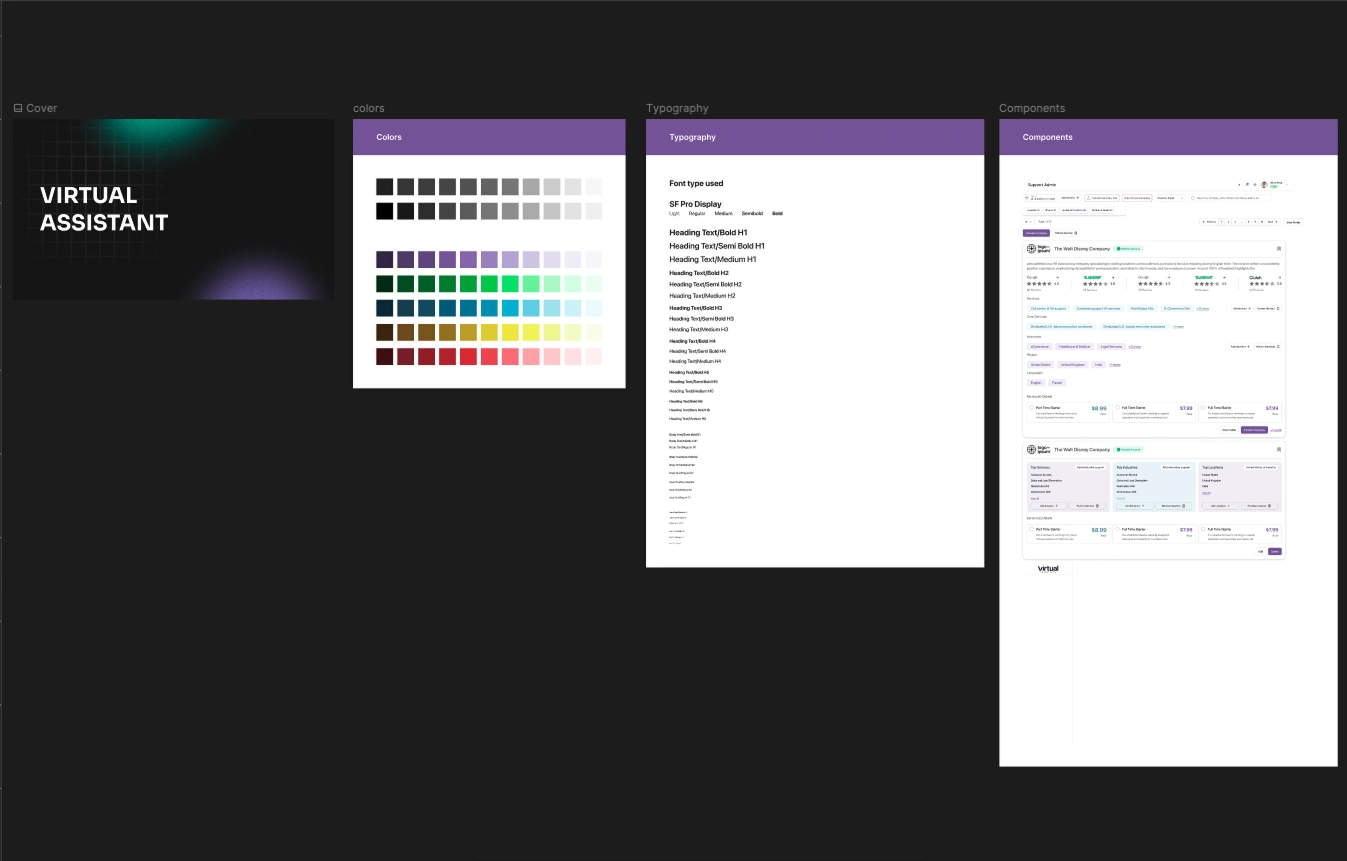
design system
• Moodboards & visual direction
• Wireframing & layout structure
• Full UI design
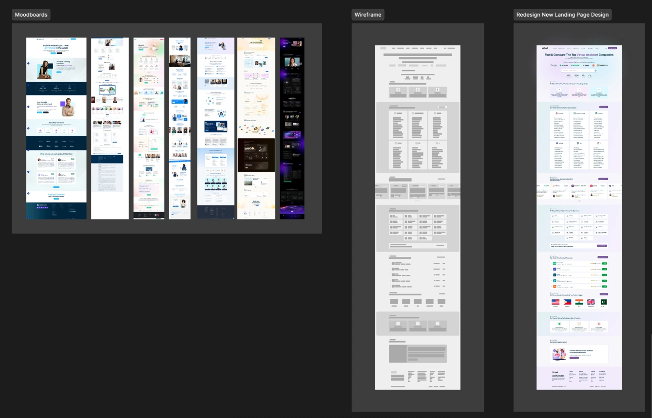
Moodboards, Wireframing & layout structure
🔹 Key Features Designed
• Smart service categorization
• Industry-specific VA discovery
• Verified company listings
• Social proof integration
• Step-by-step onboarding flow
• Regional provider search
• Conversion-optimized CTAs
The Result?
The redesign created a cleaner, more intuitive user experience that significantly improved content clarity, service discoverability, and overall visual trust — positioning the platform for higher engagement and conversion.
Like this project
Posted Feb 9, 2026
Redesigned a Virtual Assistant SaaS landing page to improve UX, trust, and conversions with a modern UI system and scalable design structure.
Likes
0
Views
7