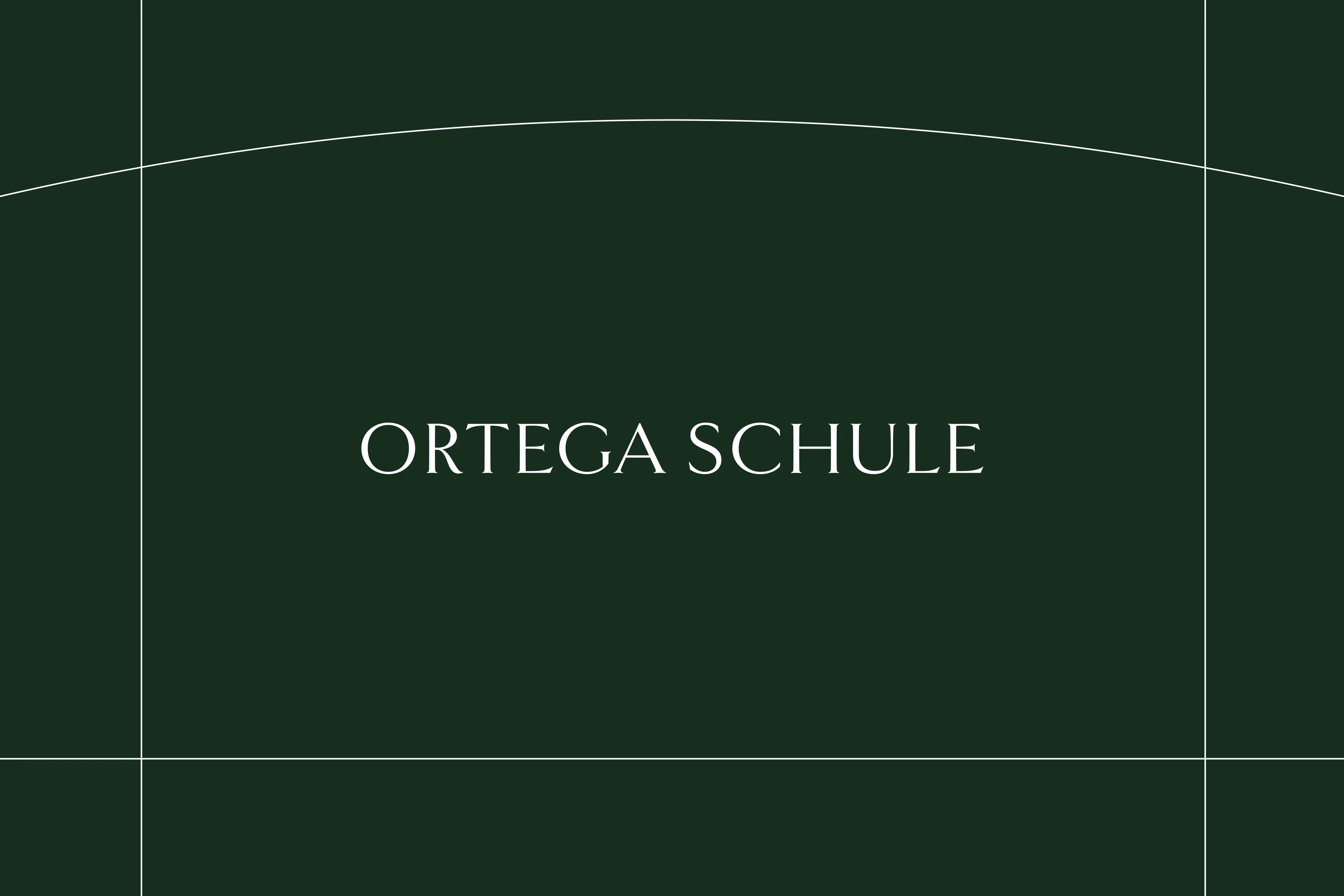
Ortega Schule Branding
Cansu Dağbağlı Ferreira
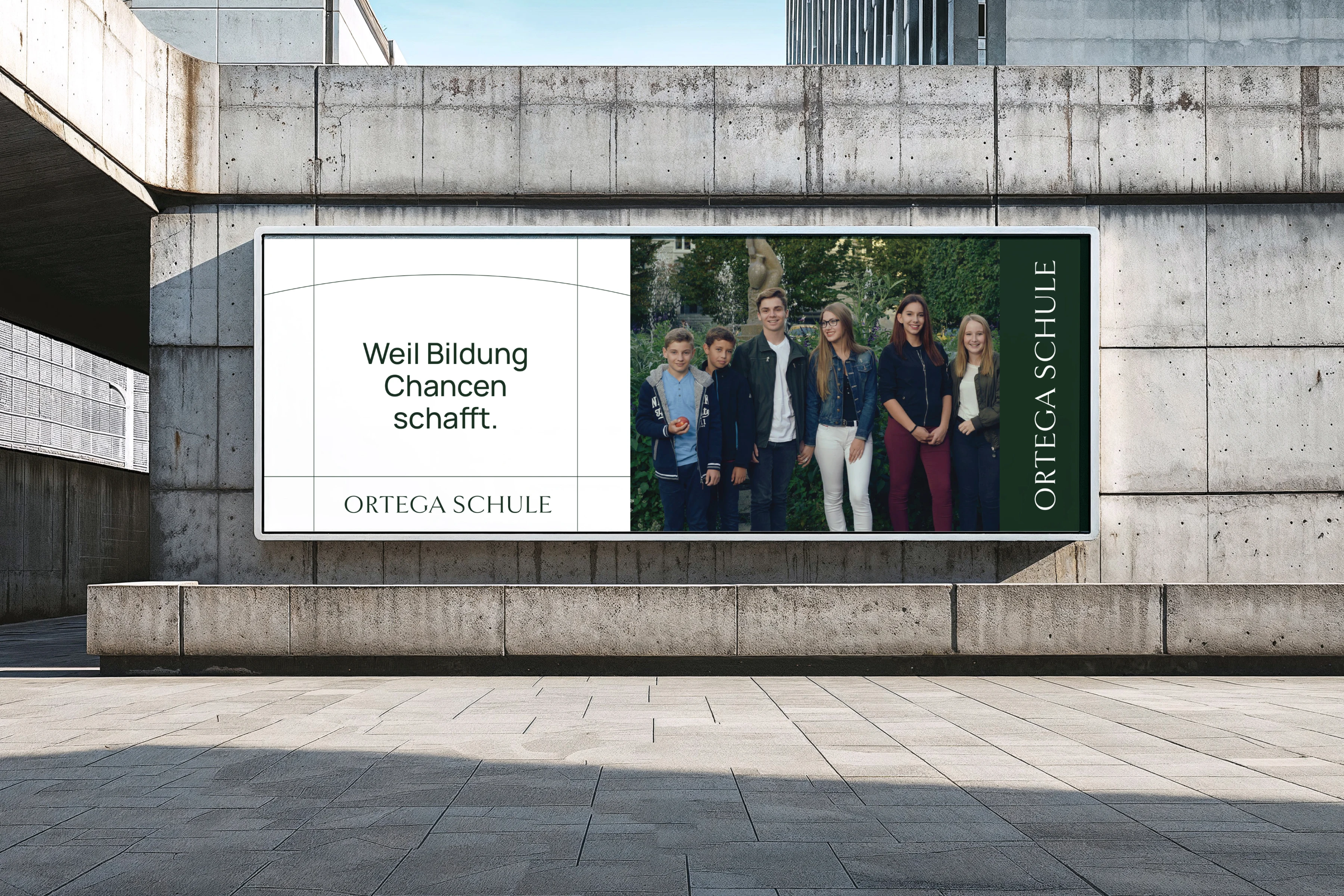
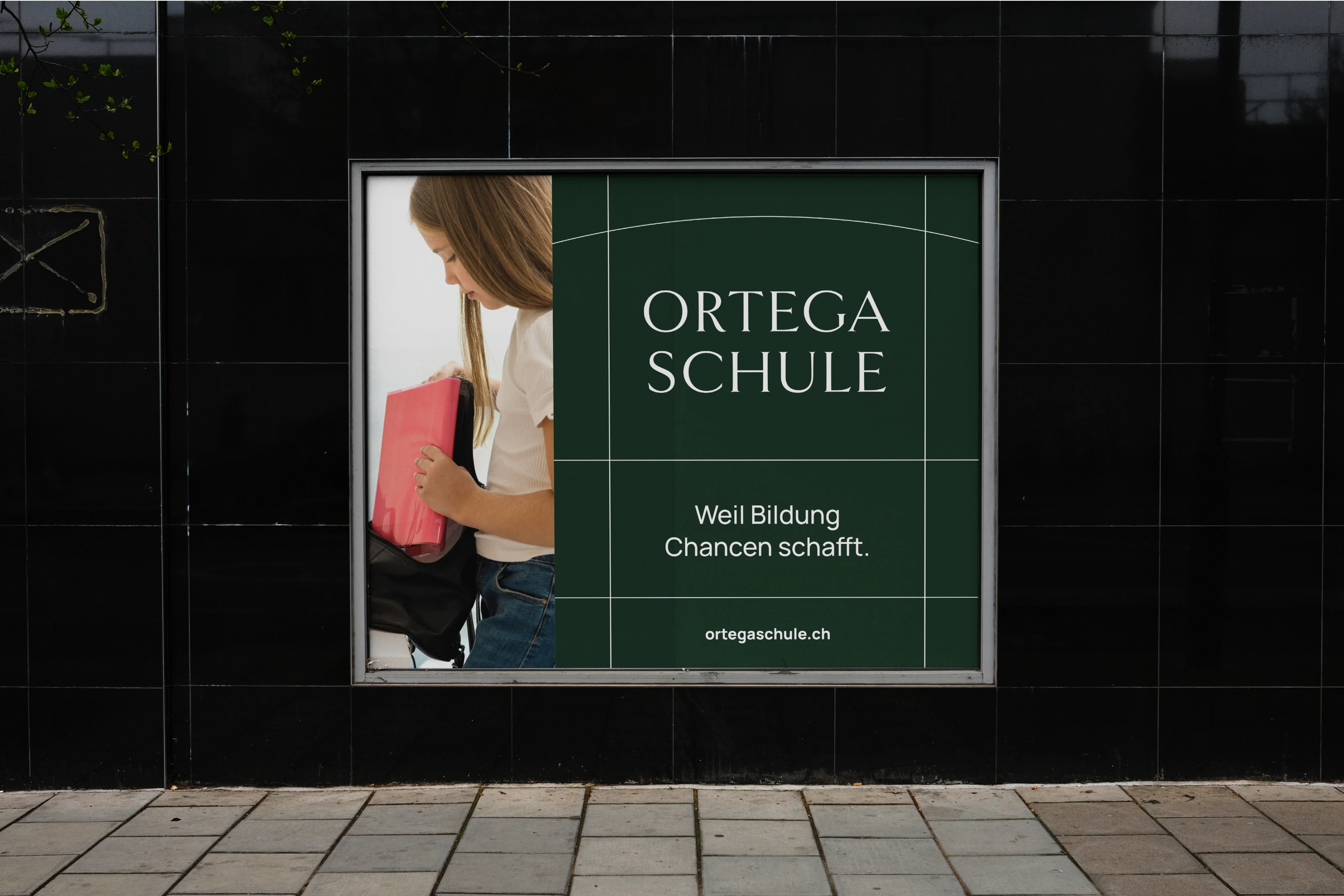
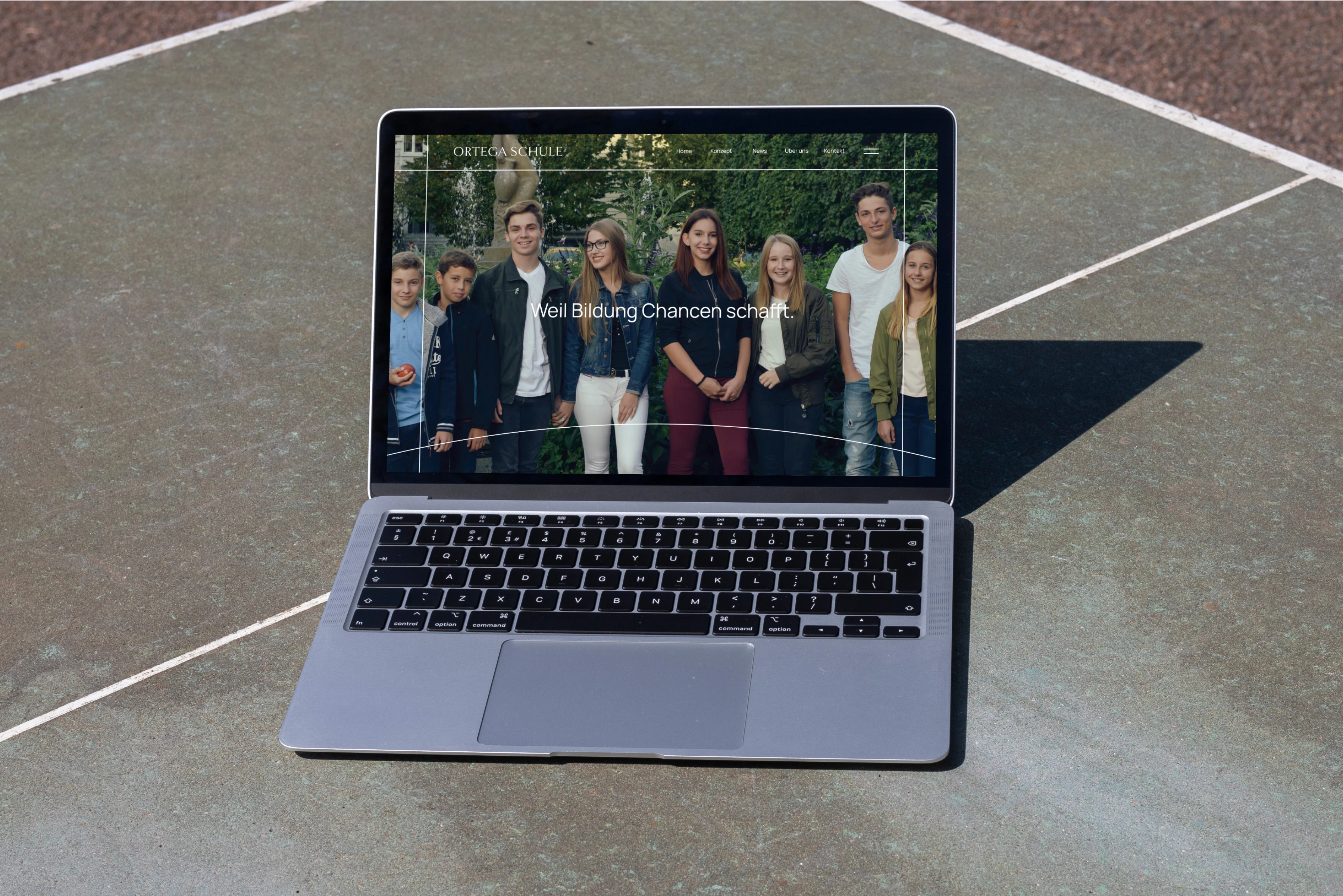
Because education creates opportunities.
Ortega Schule looks back on a years of success story, having established itself as a leading educational institution with a unique pedagogical concept. We set to refresh the brand identity for the celebration of their 60th year.
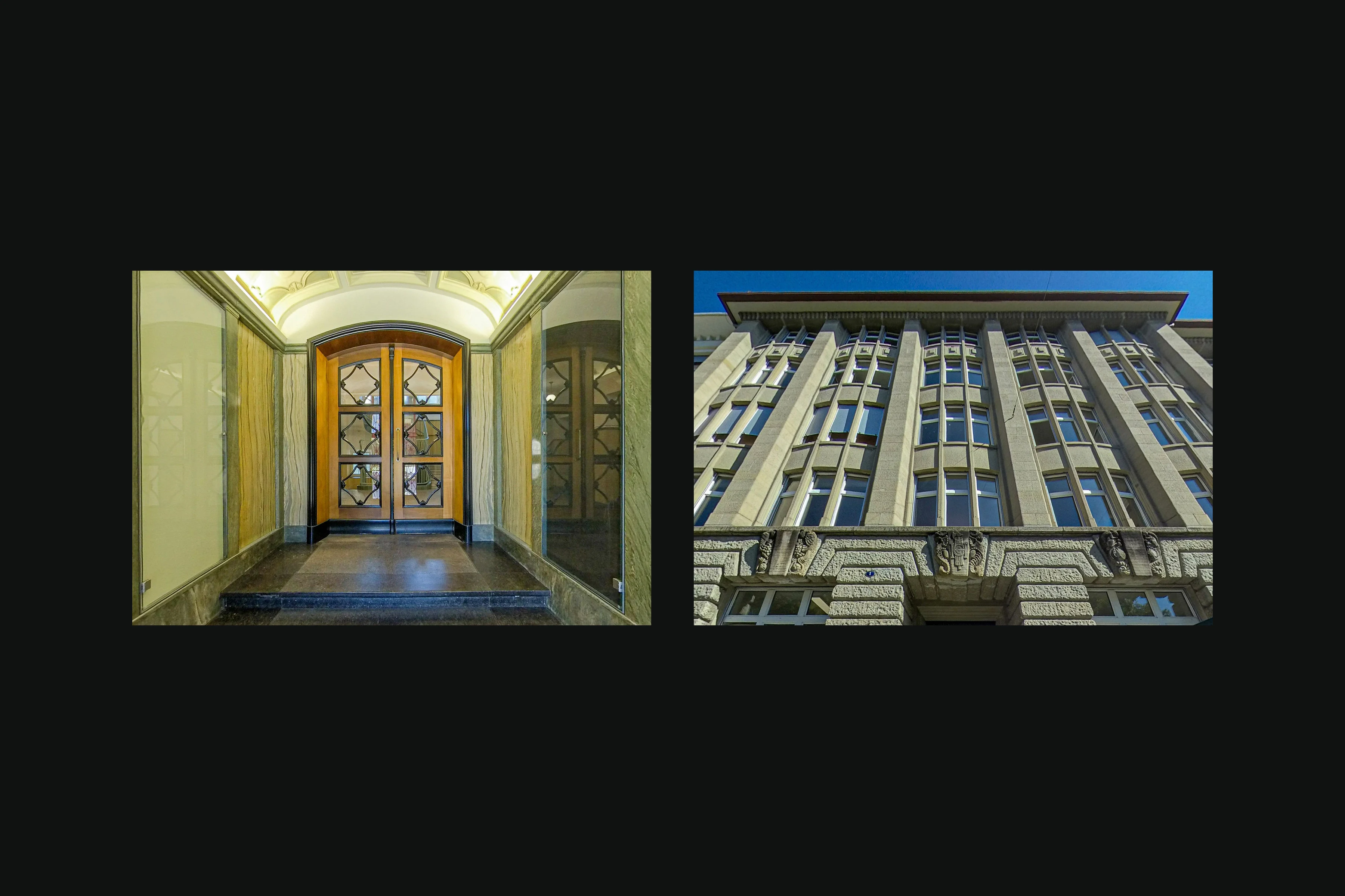
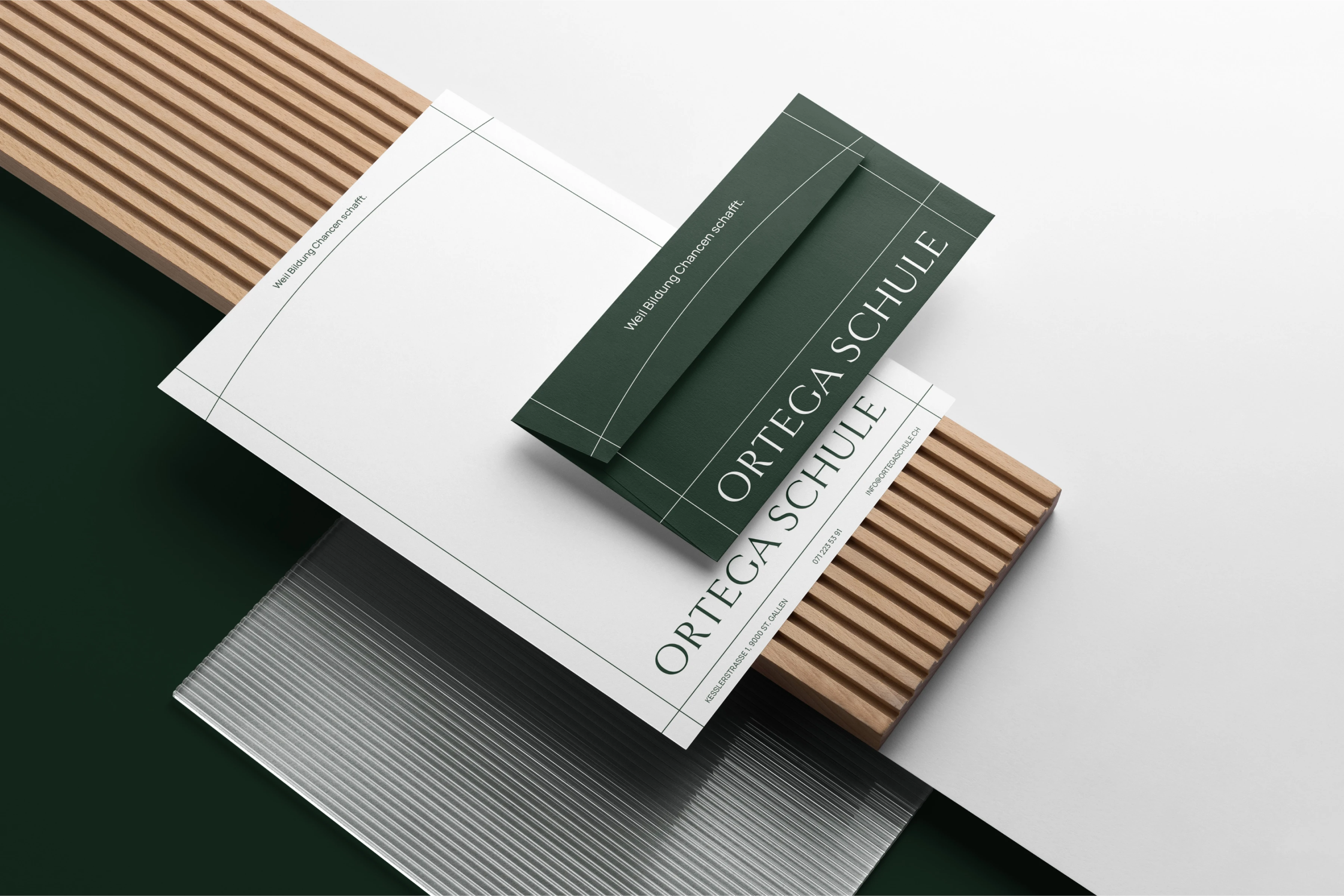
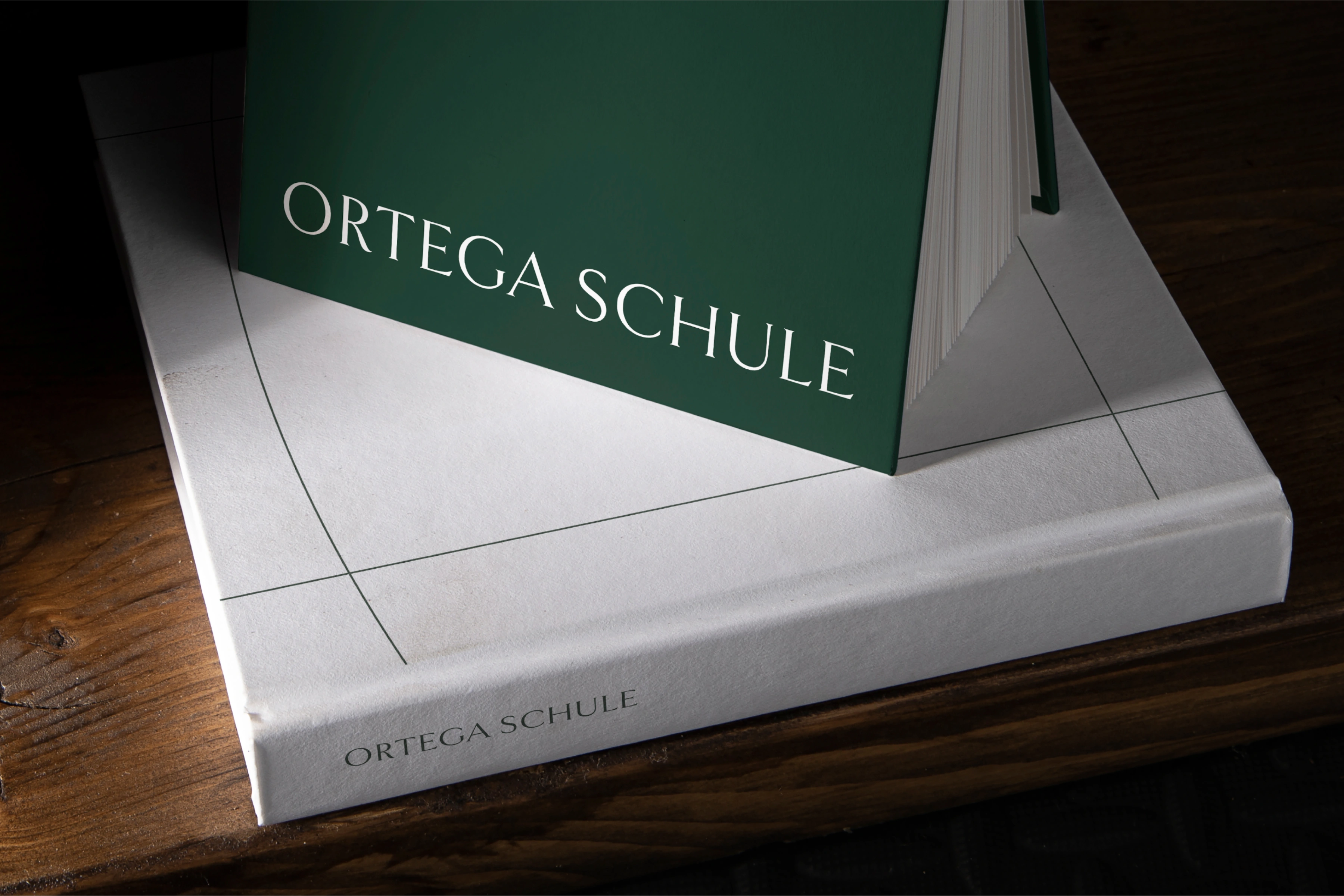
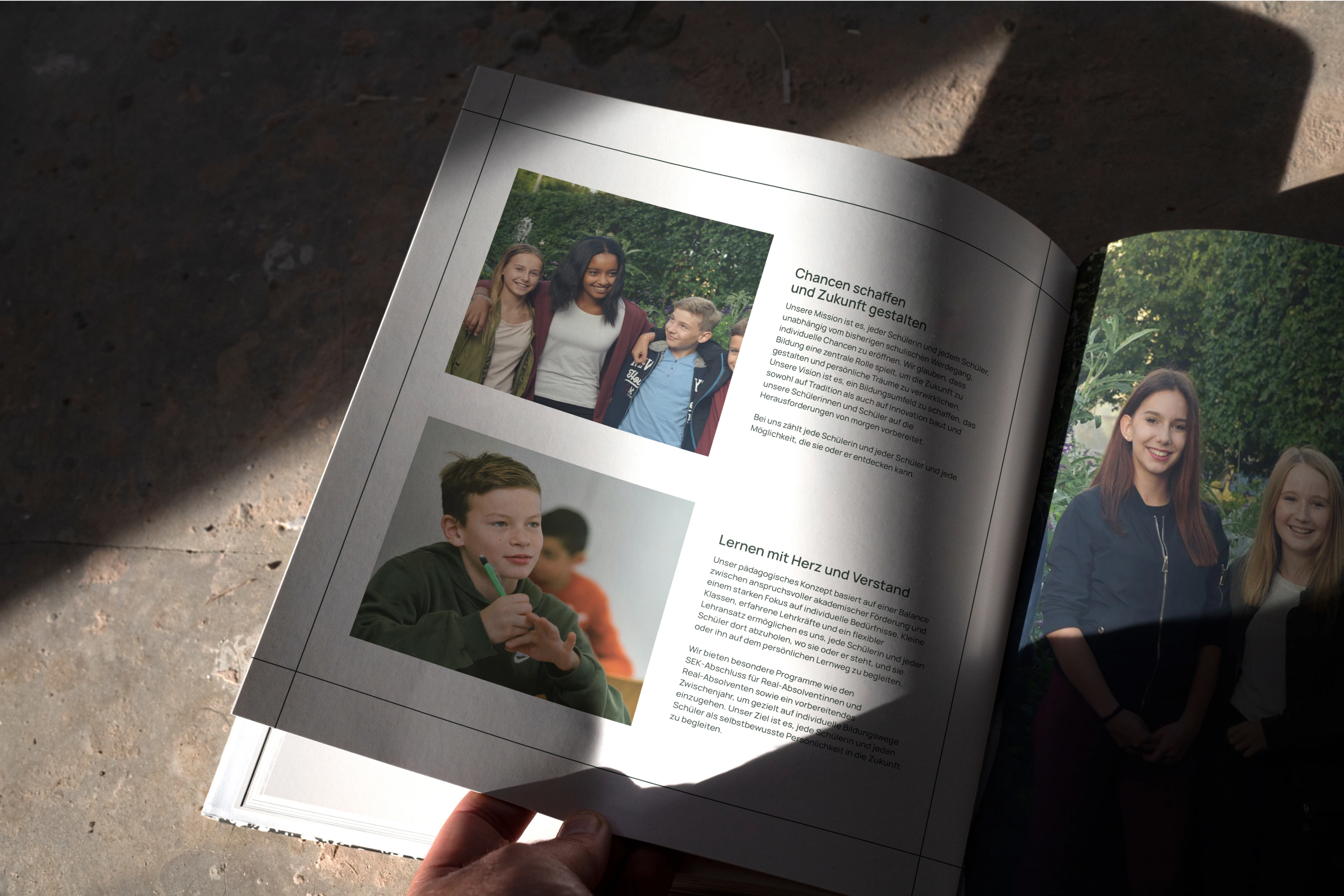
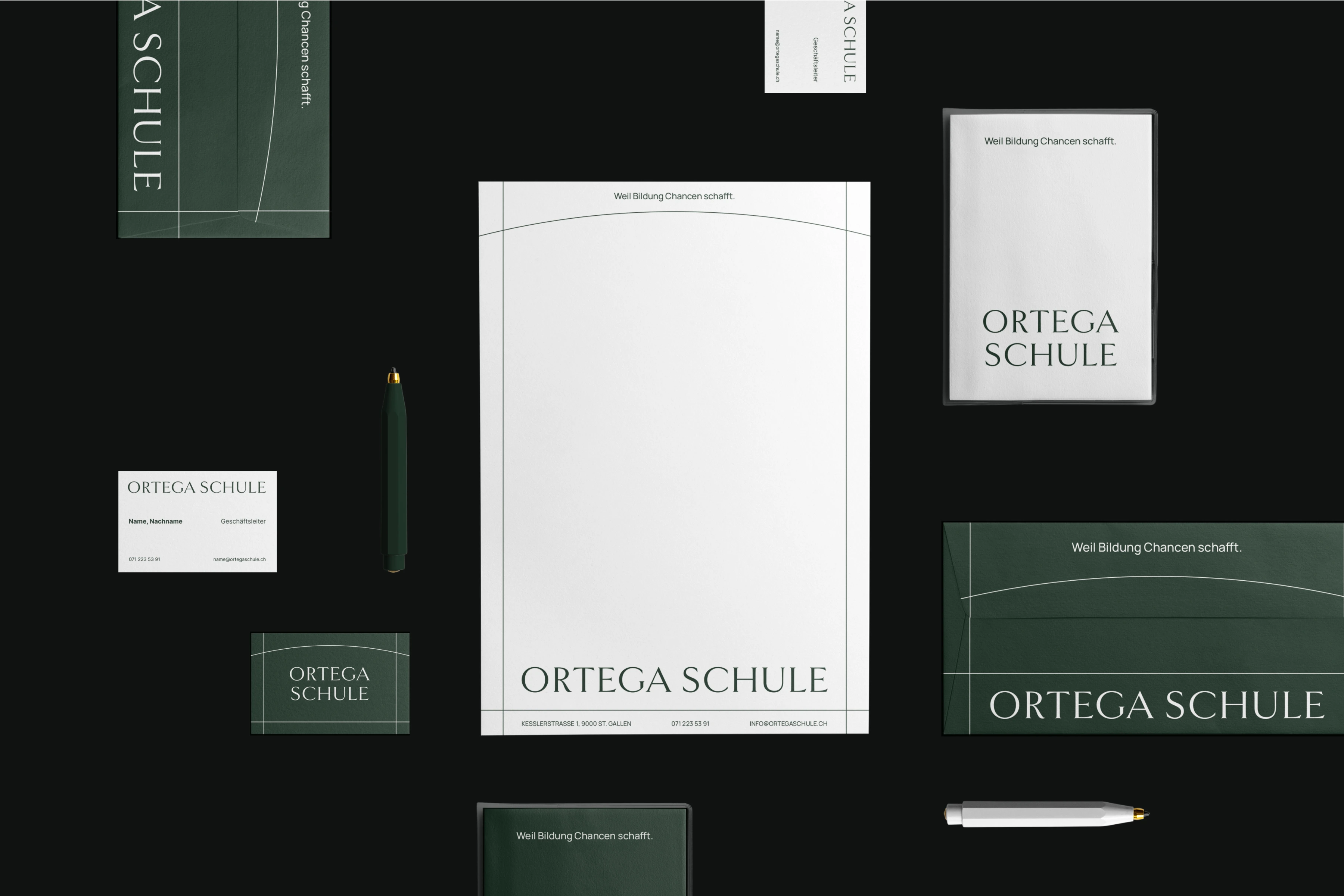
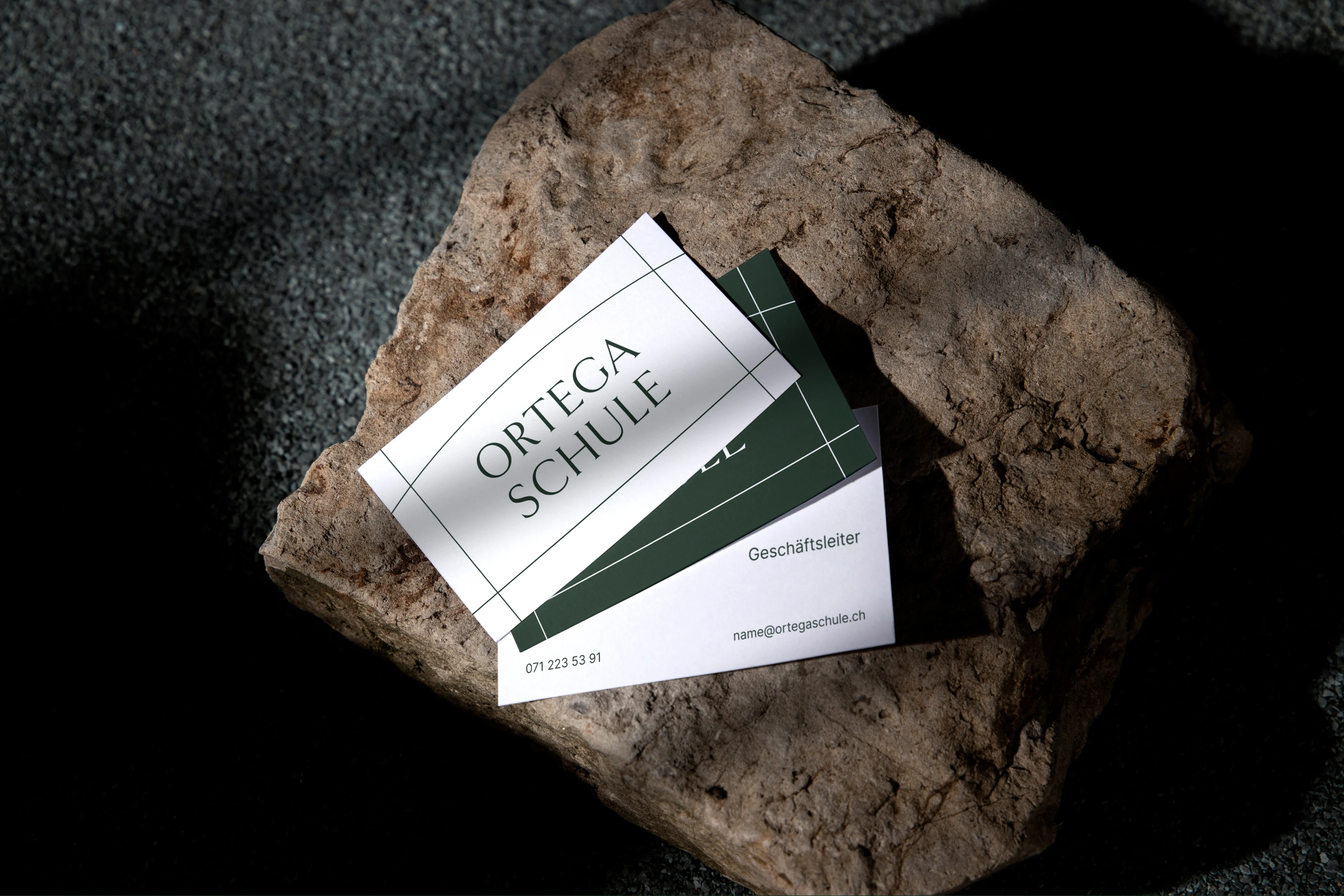
Inspired by the architectural harmony of the school, this brand identity reflects both its heritage and forward-thinking approach to education. The school's building masterfully blends curved and straight lines—an interplay that became the foundation of the brand’s visual language.
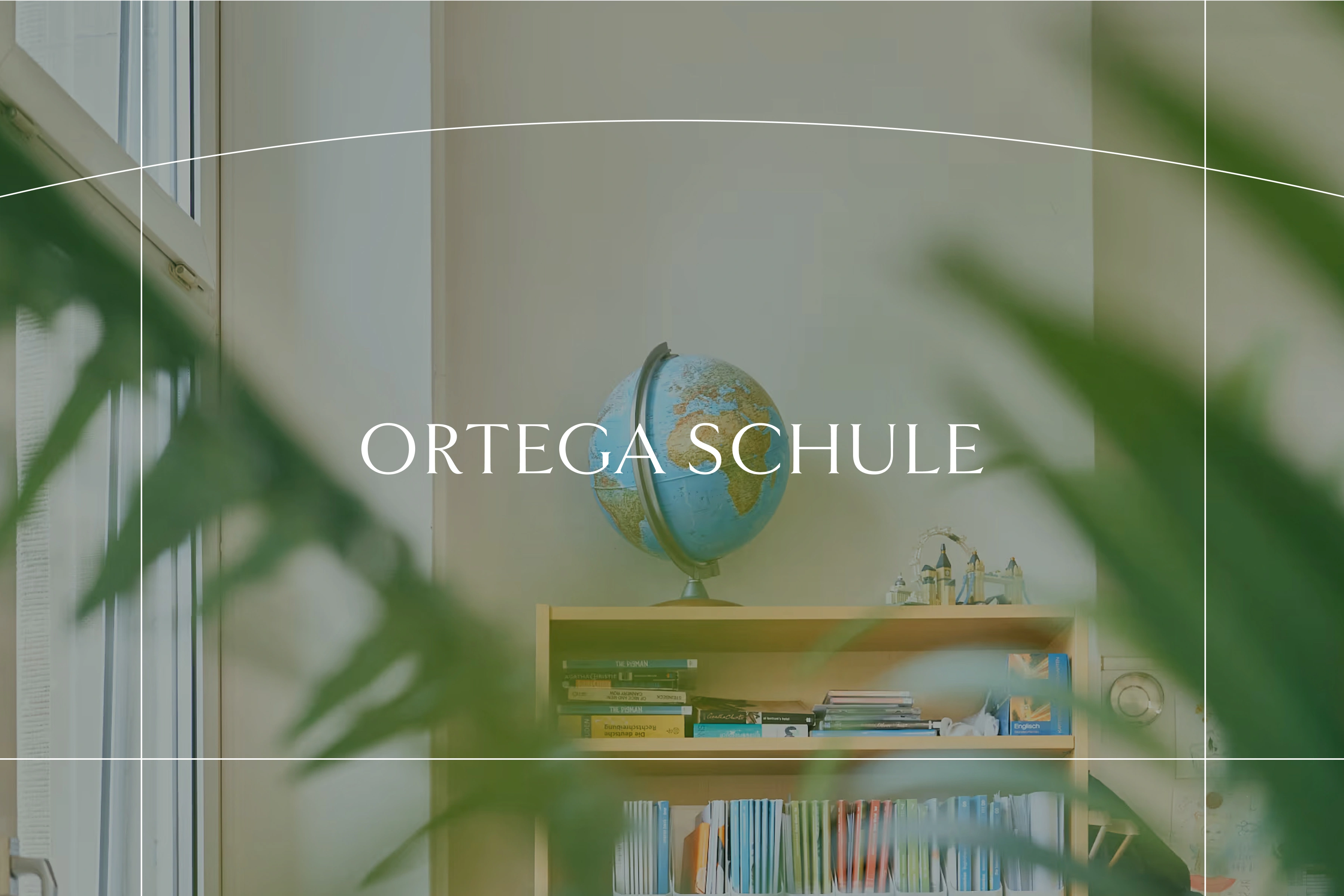
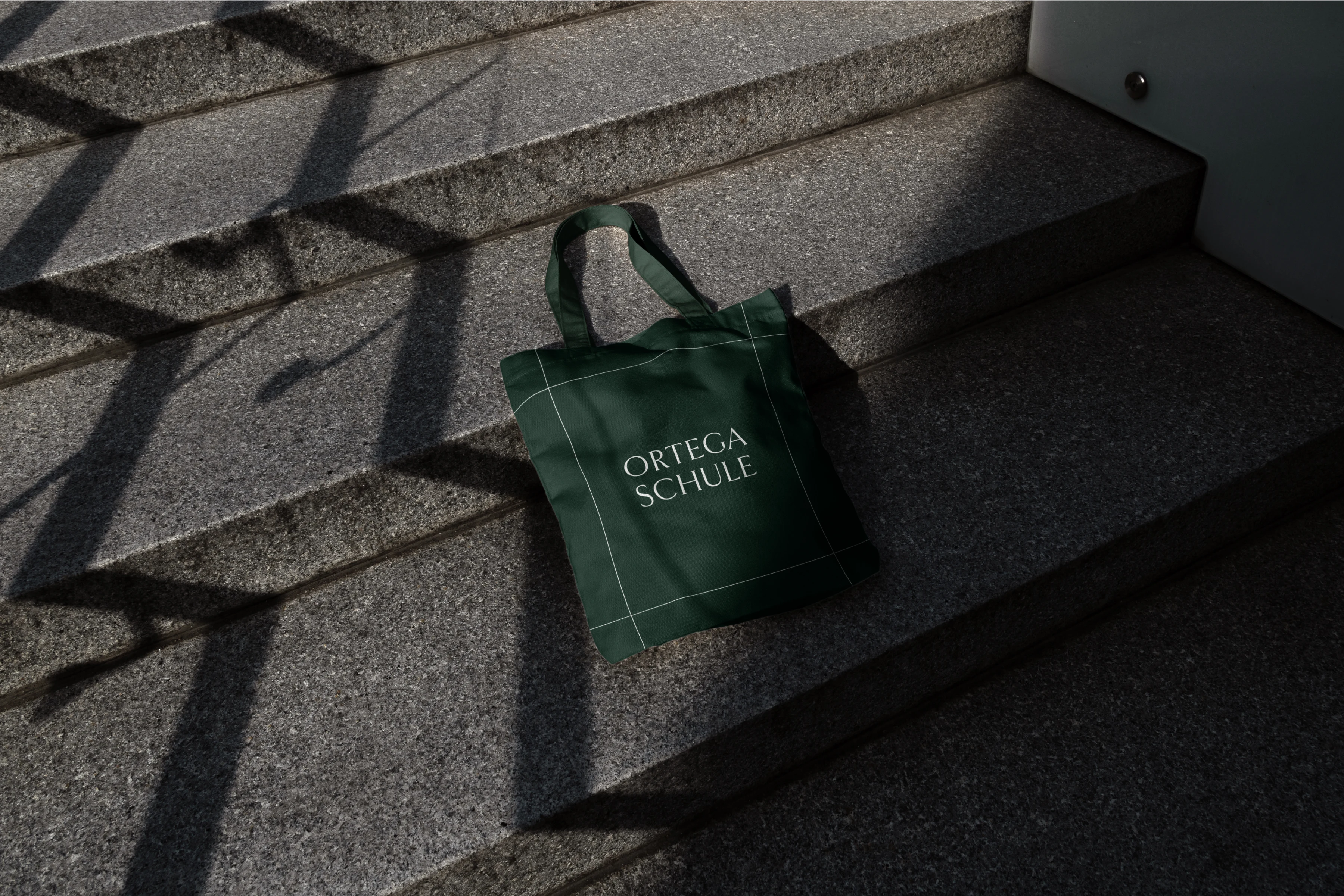
The signature lines in the branding dynamically frame images and the logo, symbolizing the school's commitment to tailored learning experiences. Just as every student learns differently, these organic and structured forms merge to represent personalized education methods that adapt to each individual.
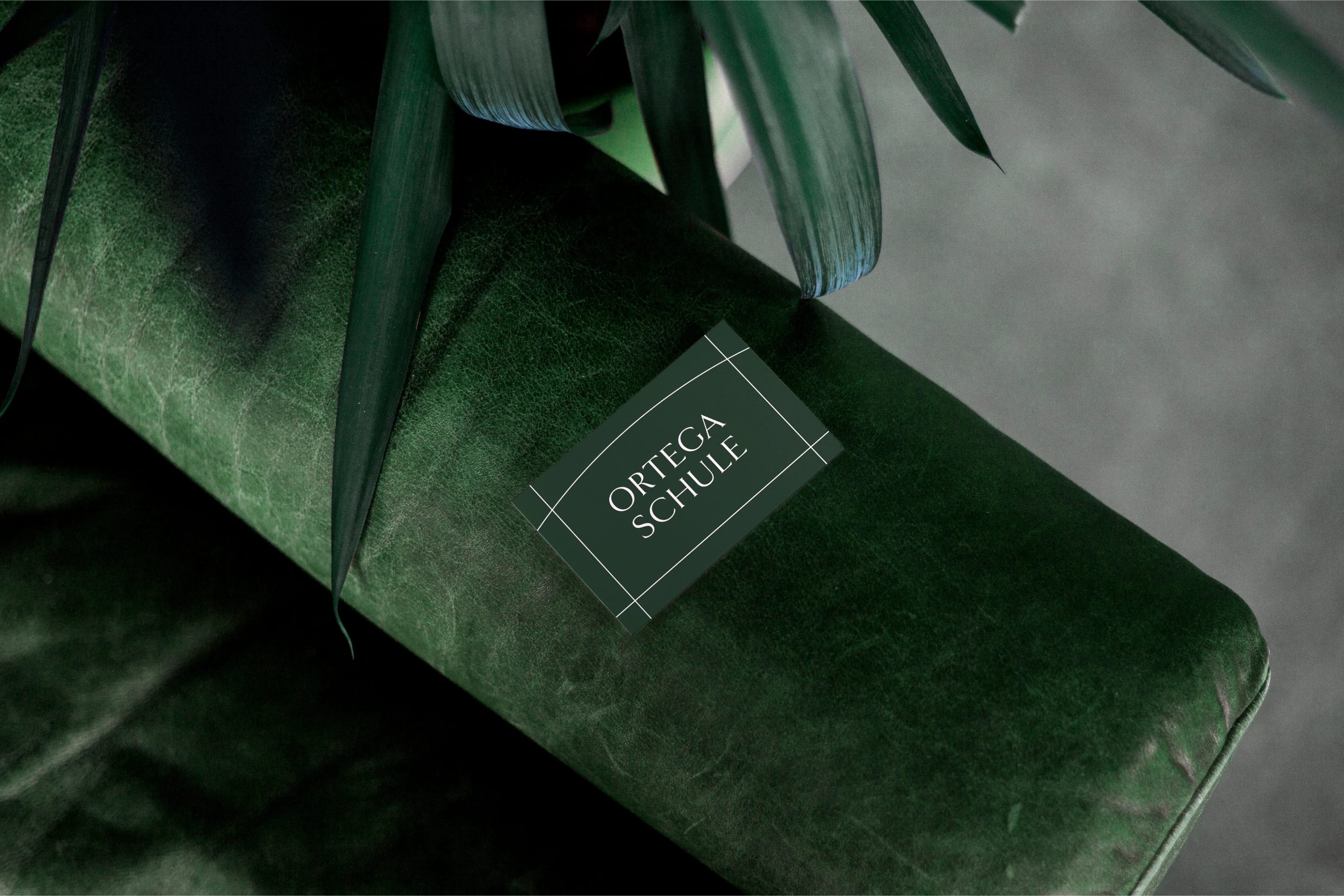
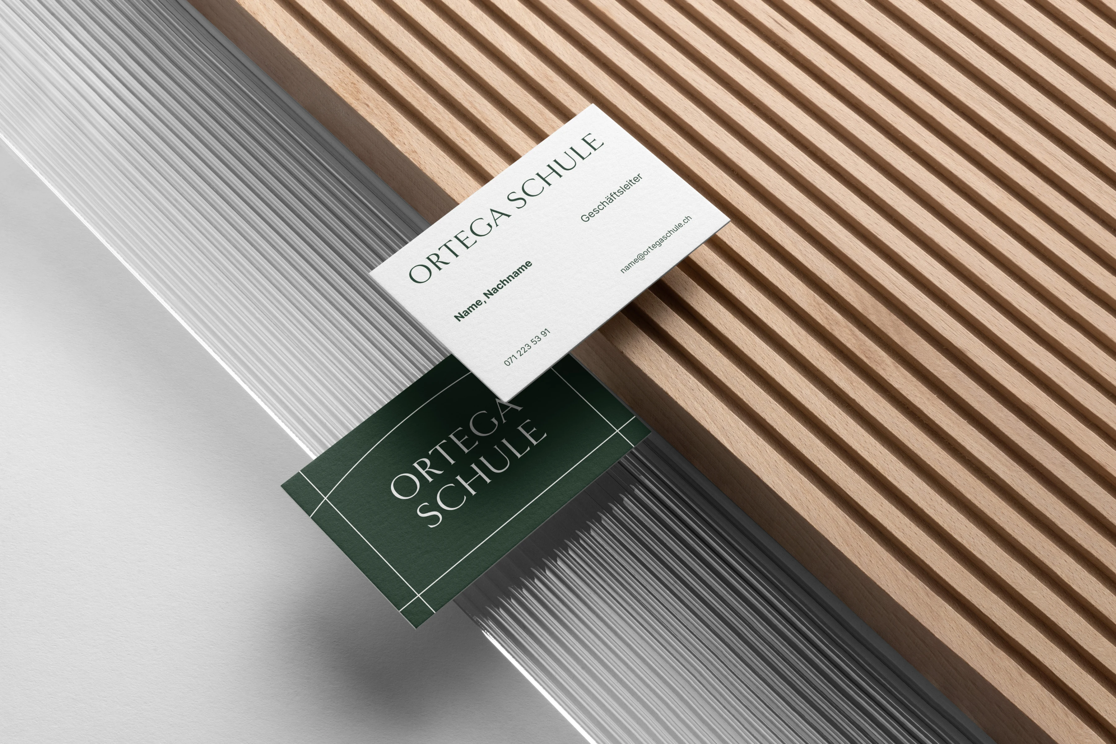
A deep green, paired with white, conveys a sense of prestige, trust, and modernity, reinforcing the institution’s reputation while maintaining an inviting feel. The typography choice, Manrope, is both clean and accessible, balancing elegance with clarity—perfectly mirroring the school’s philosophy of combining tradition with innovation.
Services: Creative Direction, Branding, Poster & Stationery Design
Motion Design: Murat Kaan Öztürk


Like this project
Posted May 21, 2025
Timeless and Modern Brand identity for Ortega Schule, inspired by its architecture and personalized teaching methods.