Pay4me | Web ui design
Henok Ed
The Pay4Me Landing Page is a sleek, intuitive, and conversion-focused design created to introduce users to the innovative Pay4Me platform. Designed with a clear structure and a modern aesthetic, the page effectively communicates the platform's core value—making cross-border payments faster, more affordable, and accessible to everyone. By combining strategic layouts, user-centric design, and engaging visuals, the Pay4Me landing page aims to attract users and convert visitors into loyal customers.
Key Features
Engaging Hero Section
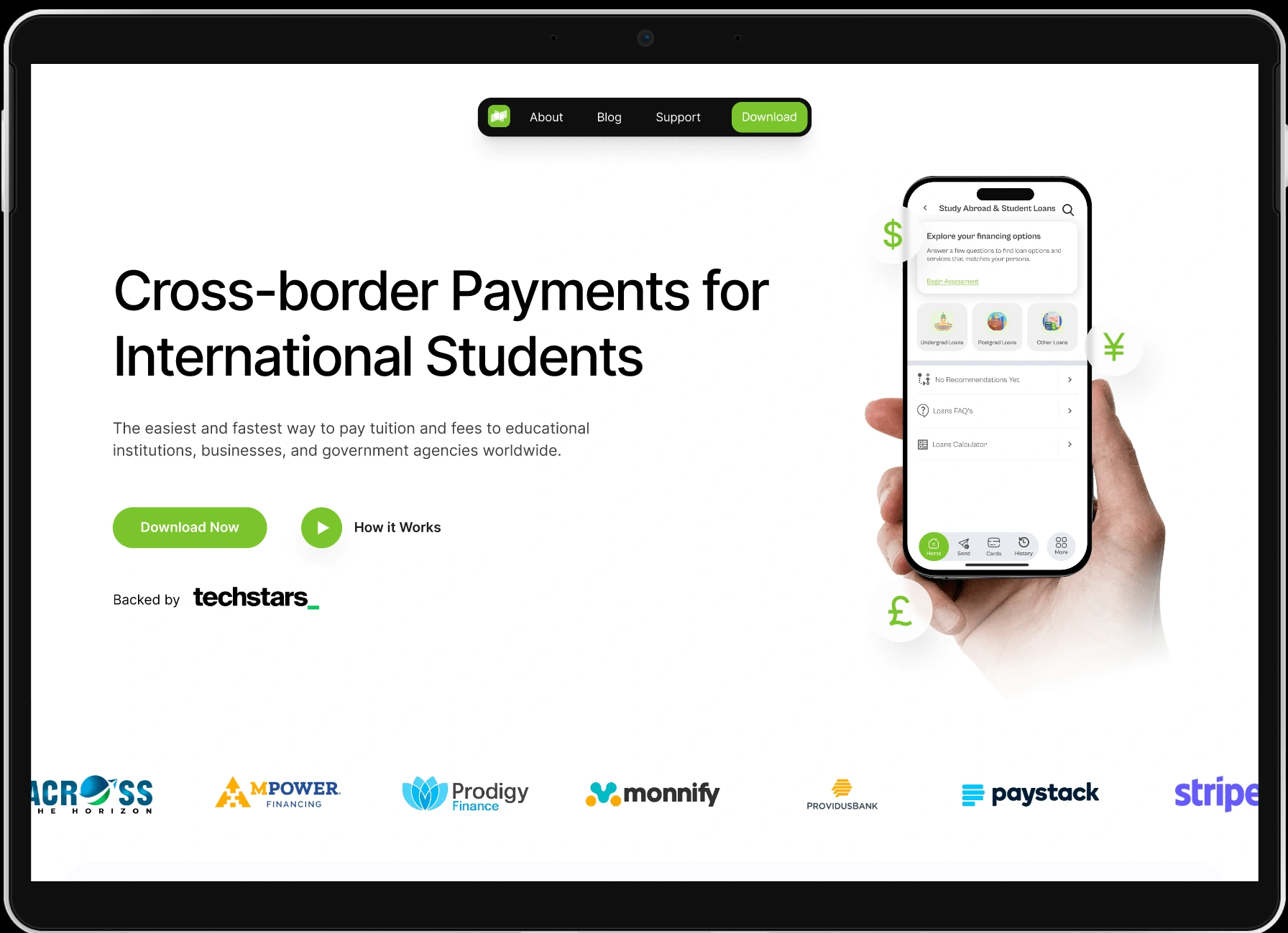
The hero section greets visitors with a bold headline, subheading, and a prominent call-to-action (CTA). This area highlights the platform's core promise: seamless international payments. Accompanied by an eye-catching visual, it sets the tone for trust and reliability.
Overview of Features and Benefits
The landing page outlines Pay4Me’s key features, including fast transactions, low fees, and secure payment processing. Each benefit is displayed with concise text and custom icons, making it easy for users to understand the platform's value at a glance.
How It Works Section
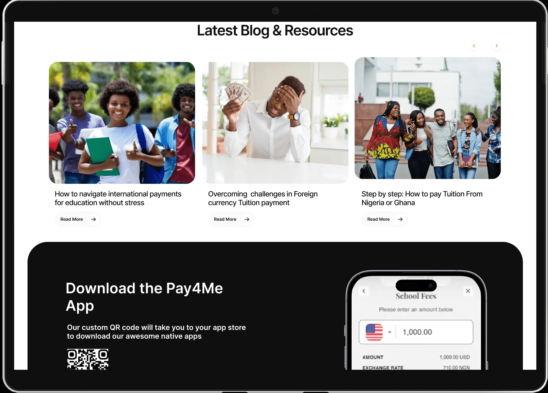
A step-by-step guide explains how Pay4Me operates, breaking down the process into three simple steps. This section is complemented by clean illustrations, ensuring clarity and encouraging user action.
Use Cases for Target Audiences
The landing page addresses diverse user groups—students paying tuition fees abroad, freelancers receiving payments globally, and businesses managing international transactions. Each use case is accompanied by relatable imagery and scenarios, connecting directly with user needs.
Social Proof and Testimonials
A testimonial section features feedback from satisfied users, reinforcing credibility and trustworthiness. Quotes are accompanied by user names and photos, providing authentic social proof.
Pricing Information
A transparent pricing section outlines the cost structure, ensuring users understand Pay4Me’s affordability. This section simplifies decision-making by clearly demonstrating the platform's cost-effectiveness compared to competitors.
Interactive Call-to-Actions
Strategically placed CTAs throughout the page encourage users to explore further, sign up, or contact support. The CTAs are designed to stand out visually, prompting immediate action.
FAQ Section
To address common questions and concerns, the page includes an FAQ section with concise, informative answers, helping reduce barriers to entry for new users.
Contact and Footer Section
The footer wraps up the page with a contact form, social media links, and additional navigation options, ensuring users can easily connect with the Pay4Me team or explore more.
Design Approach
The Pay4Me landing page leverages a modern and minimalistic design approach, prioritizing usability and visual appeal. The color palette reflects trust, reliability, and innovation, with strategic use of white space ensuring a clean and professional look. Typography choices emphasize readability, while smooth transitions and subtle animations create a dynamic browsing experience.
Target Audience
The landing page is tailored for a diverse audience, including:
Students paying for tuition or living expenses abroad.
Freelancers receiving payments from international clients.
Small businesses managing cross-border transactions.
Anyone seeking a simple and cost-effective solution for international payments.
Like this project
Posted Jan 14, 2025
Introducing the Pay4Me Landing Page a meticulously crafted user interface and experience design project aimed at revolutionizing online payment solutions.
Likes
0
Views
26