Gold Mine Corporate Website
Iaroslav Vinokurov
Gold Mine Corporate Website Redesign — Concept & Direction
Overview
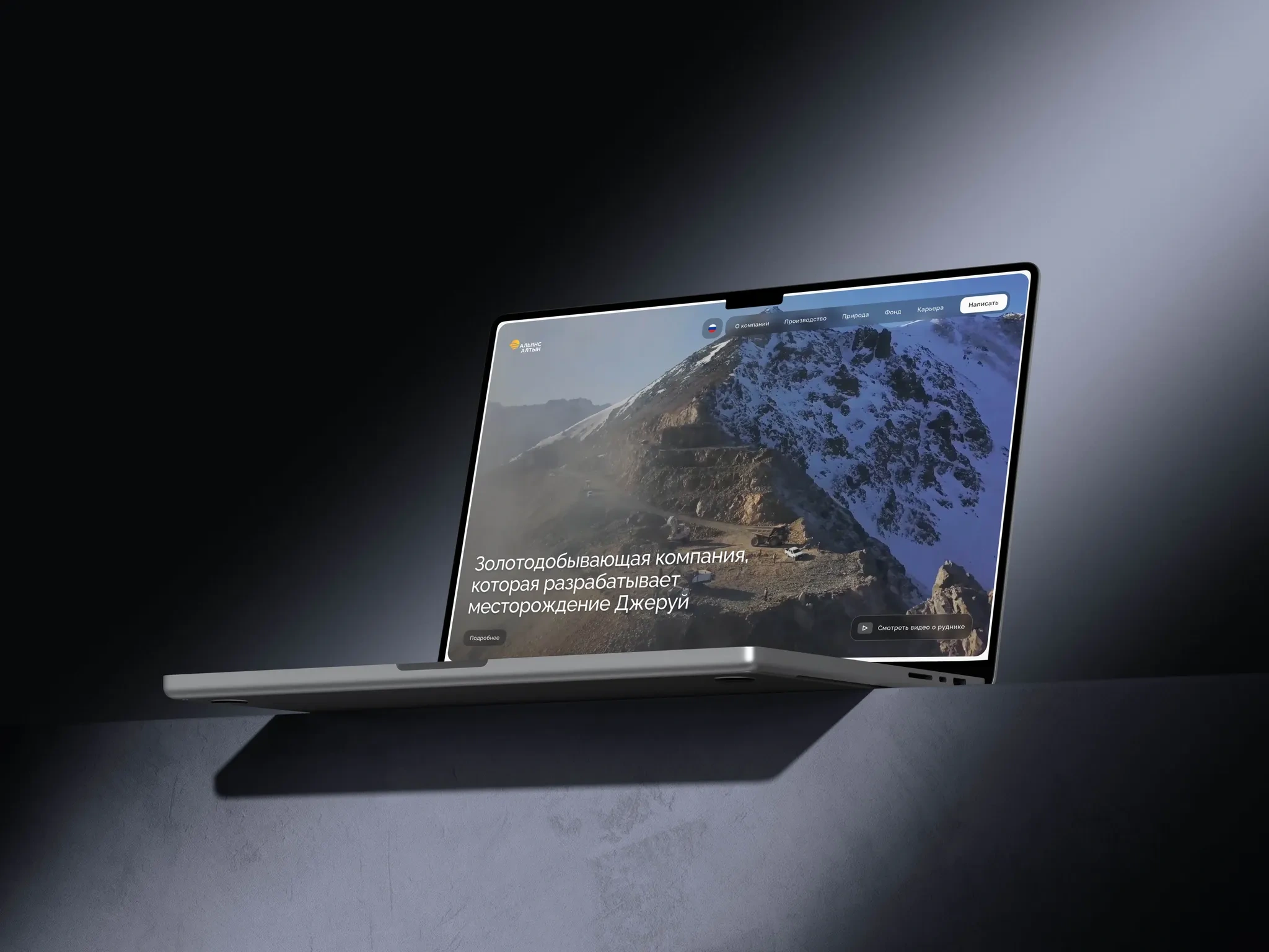
I led the first phase of a corporate website redesign for a gold-mining company, clarifying the brand story, improving navigation, and making the inner workings of the mine and production more tangible through authentic media.
Goals
Establish a clear, compelling homepage that orients users and expresses the brand.
Streamline navigation to key destinations (careers, locations, mine operations).
Build trust through real people, real processes, and transparent storytelling.
Audience
Prospective candidates
Business partners
Professional community & media
My Role
Lead Product Designer — research synthesis, information architecture, content strategy, UX/UI concepts.
What I Did
Audited the current site structure, content, and tone.
Reviewed the client brief to align on goals and priorities.
Mapped audiences and their jobs-to-be-done.
Studied available materials: internal write-ups, photo/video tours of gold extraction and the mine—capturing how the company actually works.
Proposed a new homepage as the primary entry point and brand narrative.
Concept
The homepage follows a sequential storytelling arc:
Clear introduction to who the company is
What the company does (gold mining) and how work is organized
Real employee voices and day-in-the-life moments
Guided paths into Careers (HR blog, locations, roles, opportunities)
Design Approach
Modern, clean, understated visual language aligned with client preferences.
Shift away from decorative “festival” visuals toward honest photography and short videos featuring mine employees and on-site processes.
Minimal ornament; emphasis on credibility and clarity.
Next Iterations
Refine imagery (retouching, updates, and potential new shoots from the mine).
Evolve copy with the client’s content team.
Increase layout density where needed based on feedback.
Strengthen brand expression via patterns and other signature elements.
Like this project
Posted Sep 30, 2025
Led the redesign of a gold-mining company's website, enhancing brand clarity and navigation.
Likes
0
Views
4
Timeline
Jul 1, 2025 - Ongoing