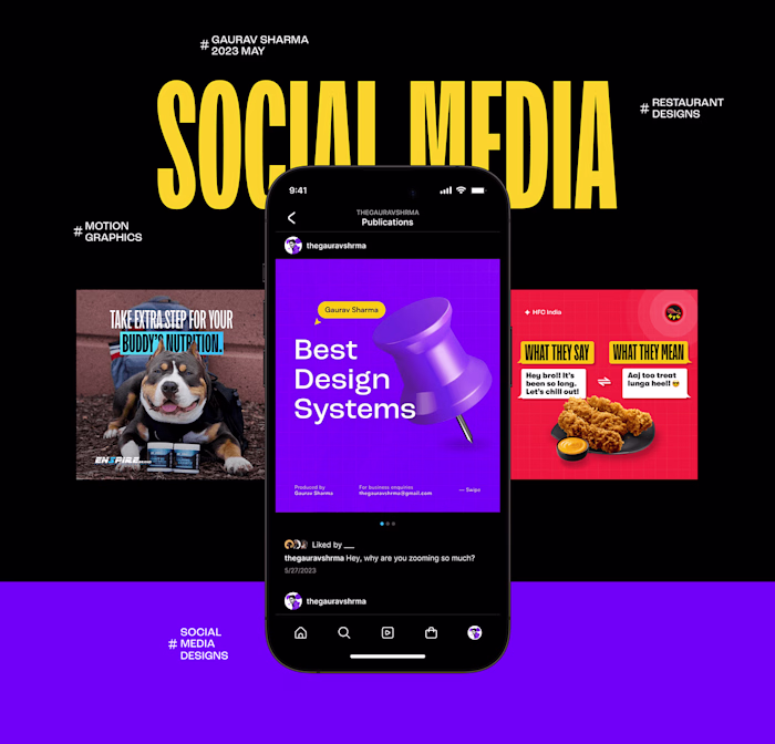
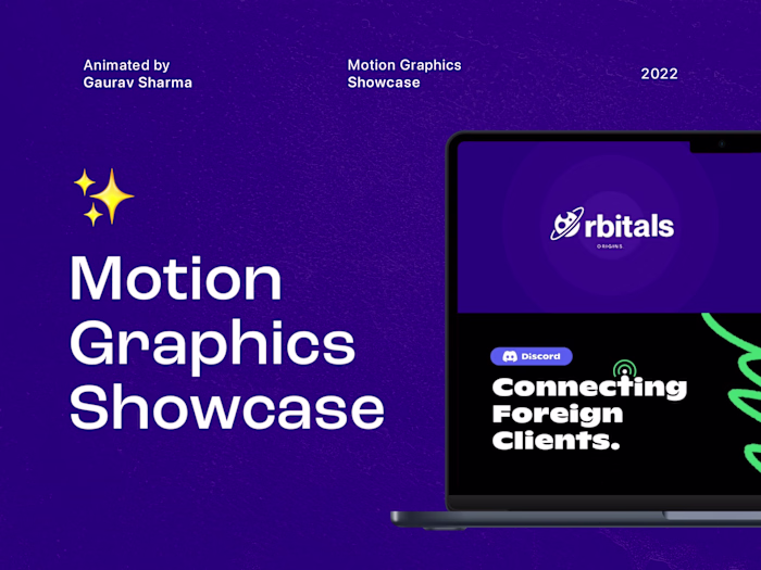
Orbitals Origins Brand Identity Design
Gaurav Sharma
1.1 Cover design
Behind the Design
Orbitals Origins, a research and content-creating studio simplifies difficult words for you to understand concepts of astronomy, science, and human behavior.
This creative production house has a great vision to have everybody a great knowledge about how they work, how the world works, and how everything works around you. They also have a mission to spread scientific knowledge around the world in simple words.
Creative Support
Visual Identity Design
Creative Direction
Strategic Branding

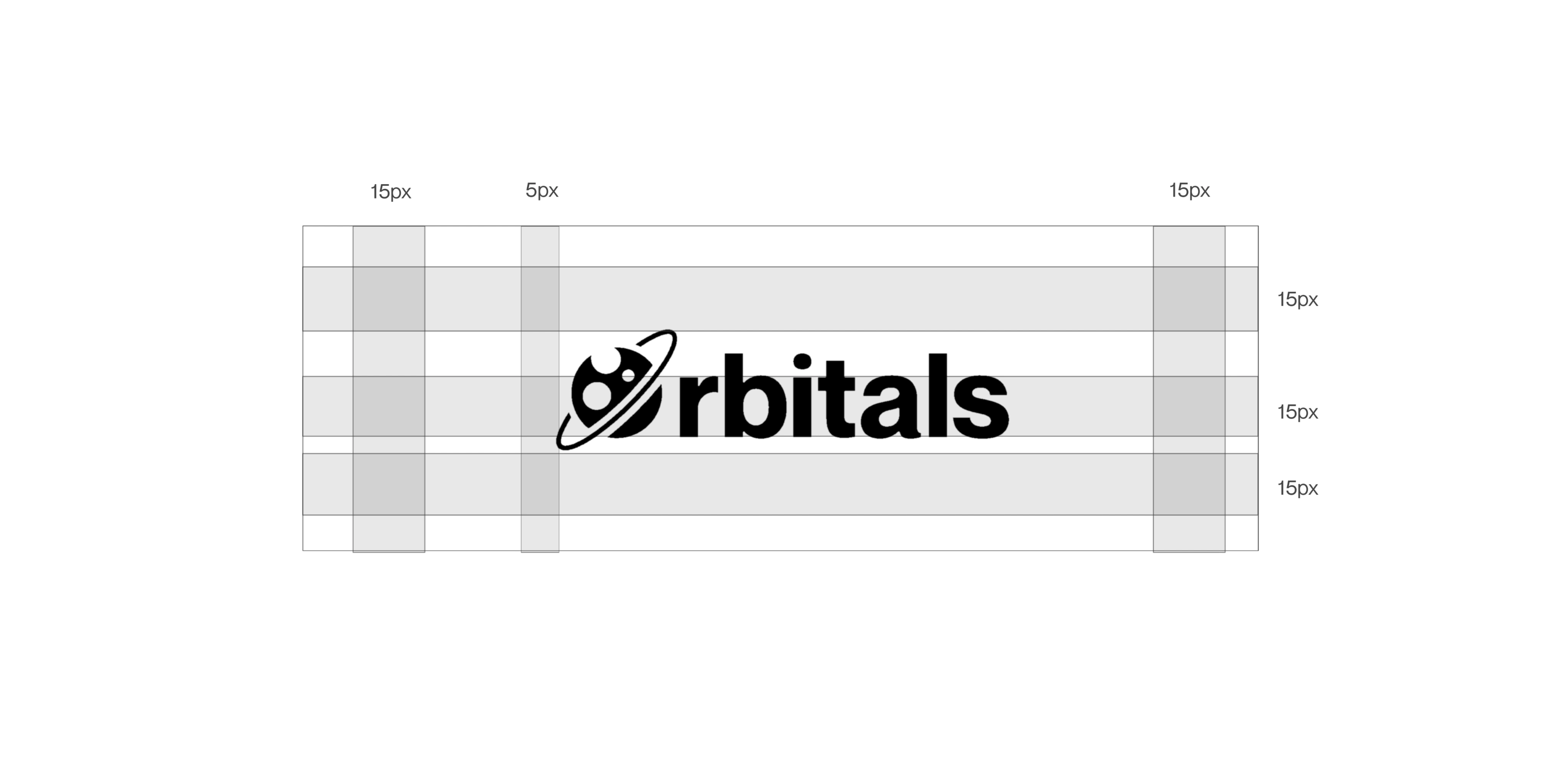
2.1 Logo
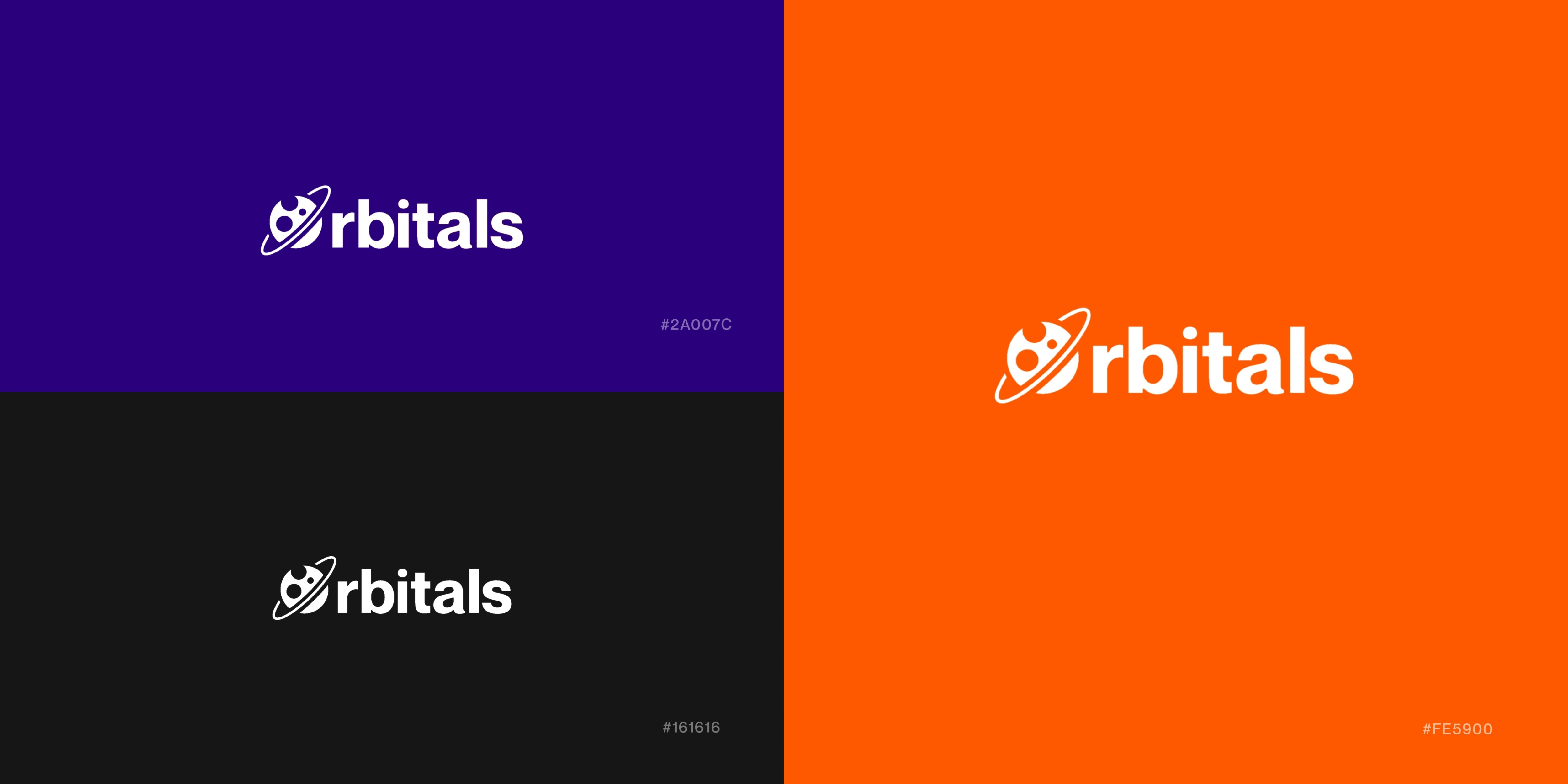
2.2 Logo variations
Design Process and Explanations
We created custom variations of logos and depending upon the brand’s goal, we have decided to create an astronomical kind of logo that would better represent their business.
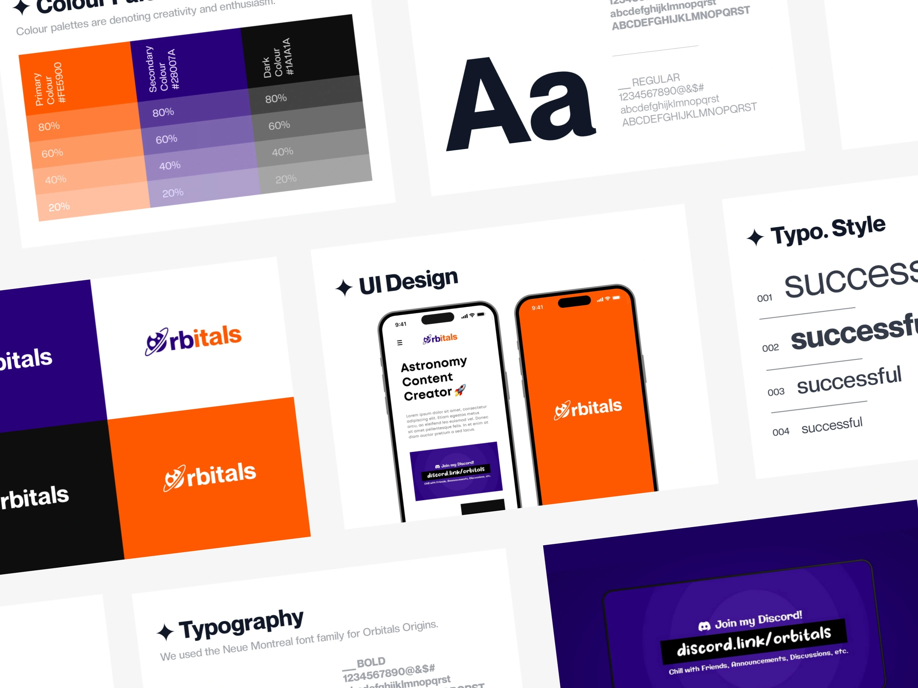
The color palette is inspired by FedEx Inc. But from logo to logo, color and their meanings get changed. In this color palette, Orange color represents Creativity and Enthusiasmspa for space lovers, whereas Purple color represents Royalty, Luxuriousness of the product.
3.1 Proto
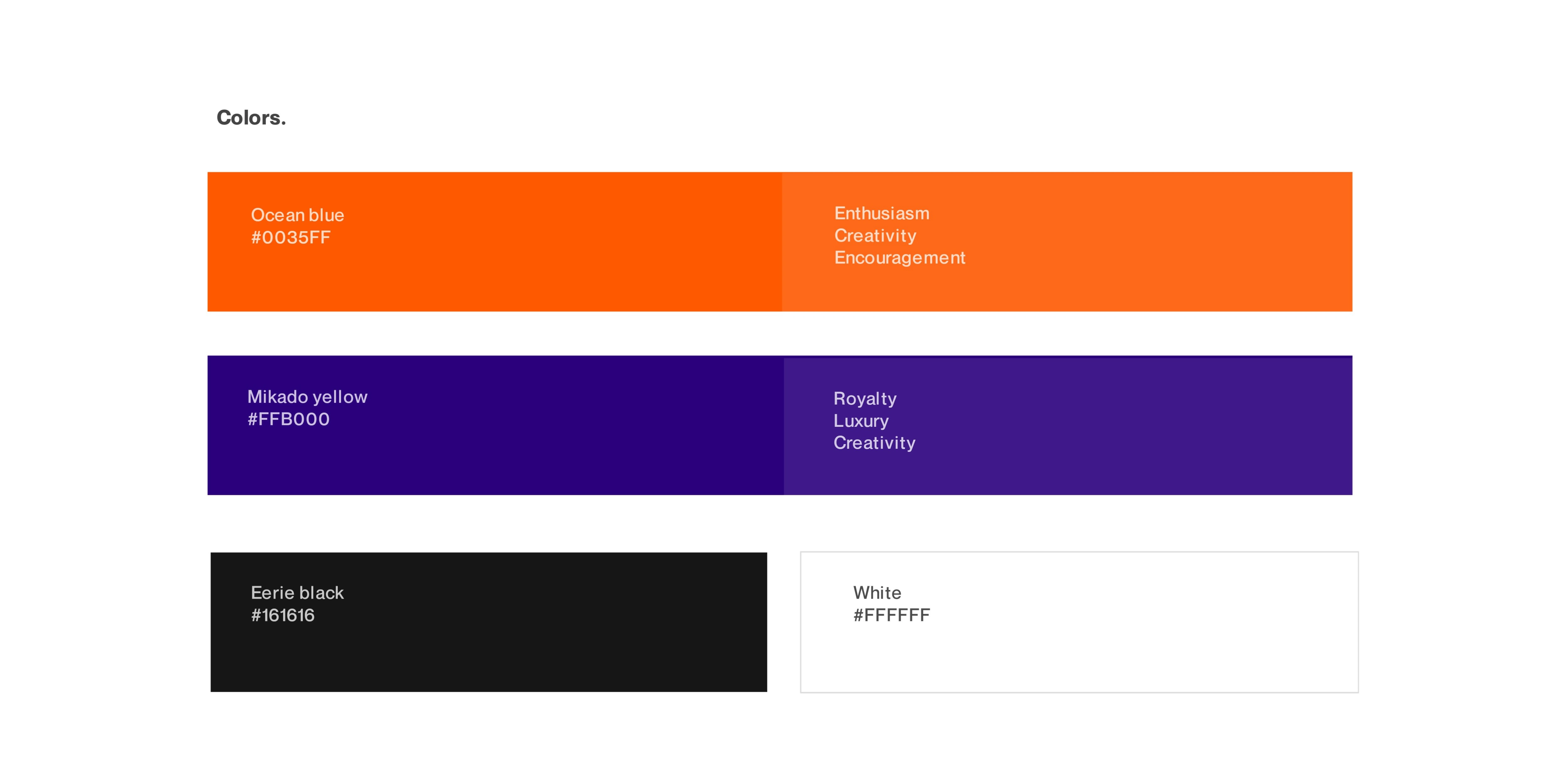
3.2 Color palette
4.1 Logo animation

4.2 UI Design

4.3 Banner
Like this project
Posted Jul 25, 2023
Orbitals Origins, an research and content creating studio simplifing difficult words for you to understand concepts of astronomy, science and human behaviour.