Built with Kajabi
Optimizing Kajabi Momentum Template for Embedded Tools
Kraig Mathias
Project Overview
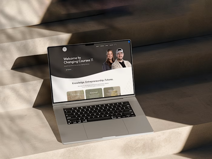
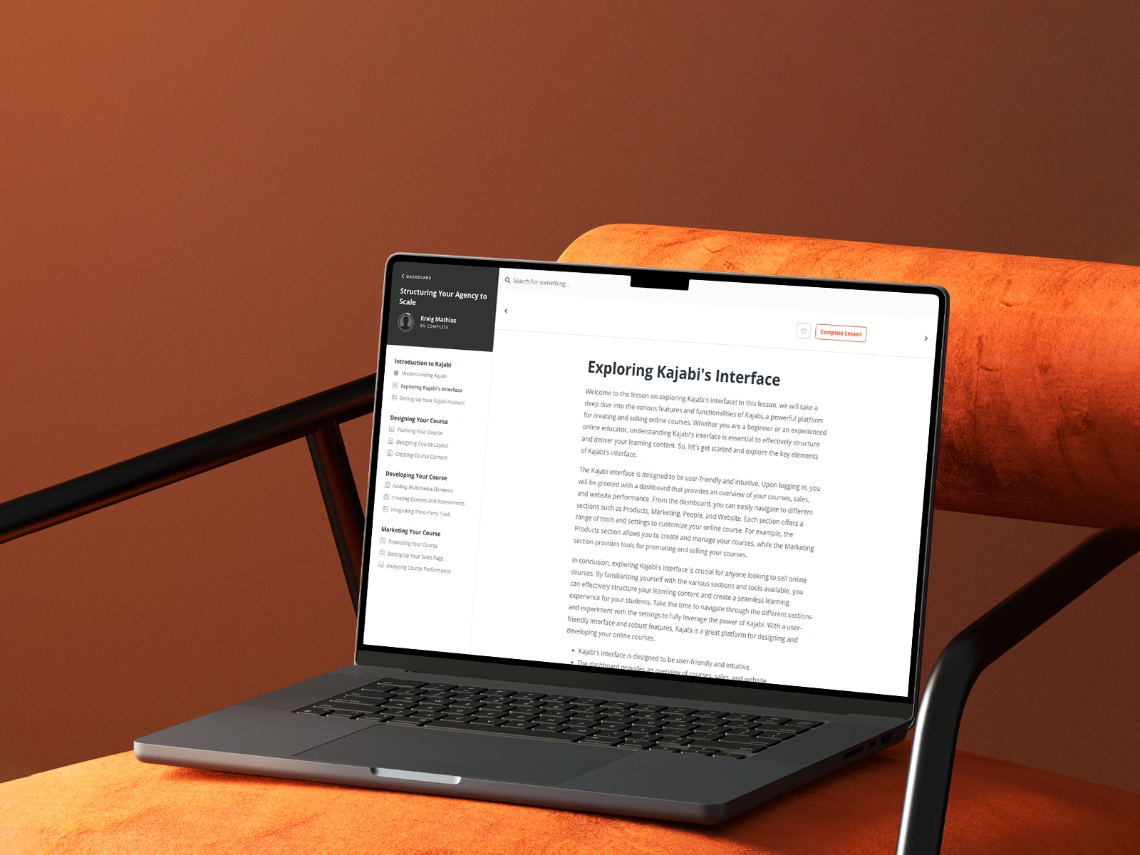
Stephen P., a highly regarded educator specializing in advanced technical topics, hosted an intricate online course on Kajabi.
He leveraged the aesthetically pleasing and widely adopted Momentum template.
A critically important and innovative component of his course involved embedding a sophisticated, custom-built interactive web tool. This tool was designed to facilitate complex simulations, data visualizations, or interactive problem-solving exercises.
However, the default layout and inherent design constraints of the Momentum template created a significant hurdle:
It restricted the embedded tool's display, preventing it from rendering at its optimal size and aspect ratio.
This resulted in either scrollbars appearing unnecessarily, content being truncated, or the tool appearing disproportionately small, thereby diminishing its intended impact and usability.
Stephen's primary objective was to surgically modify the surrounding template, customizing its content area to perfectly accommodate his high-tech, interactive embedded application. This was crucial for:
Ensuring a seamless, visually correct, and fully functional integration.
Maximizing the educational value and overall learning experience for his students.
The integrity of the interactive tool's display was paramount to the pedagogical success of the course.
The Challenge & Our Role
The central and most pressing challenge was to precisely adjust the existing Kajabi Momentum template's predefined layout, specifically its content area's dimensions, to flawlessly frame Stephen's specialized embedded web tool.
This was far from a trivial task, as the interactive tool required meticulous sizing, precise aspect ratio maintenance, and strategic positioning.
Any deviation in sizing could lead to unresponsive elements, hidden controls, or an unintuitive user experience.
My role was highly technical and involved a deep dive into the underlying structure and custom code of the Momentum template, primarily within Kajabi's advanced code editor.
I needed to meticulously identify the exact CSS and HTML elements that governed the content area's width, height, padding, and flexbox or grid properties.
Subsequently, I had to meticulously modify these intricate parameters.
The goal was to surgically create the perfect 'viewport' or 'frame' for his highly interactive application without inadvertently compromising:
The template's overall responsive design integrity.
Its visual consistency across different devices.
Its established branding.
This delicate process necessitated rigorous debugging, iterative testing across various screen resolutions, and careful consideration of how changes would affect other course elements, ensuring a harmonious and optimized learning environment.
The Process
My process commenced with an in-depth initial consultation with Stephen.
He provided a comprehensive demonstration of the embedded interactive tool.
He articulated its core functionalities and, critically, explained his desired visual outcome, including precise sizing requirements, aspect ratios, and responsiveness considerations.
Following this:
I was granted secure access to his Kajabi site's backend, specifically the theme customization area.
I began working diligently within Kajabi's advanced custom code editor.
My initial steps involved a systematic and meticulous analysis of the Momentum template's intricate CSS and HTML structure.
I paid particular attention to identifying the specific classes and IDs responsible for controlling the main content container's width, maximum width, padding, and any media queries or responsive design rules.
Through a series of iterative adjustments, applying refined CSS properties such as 'max-width', 'width', 'padding', and potentially 'overflow' rules, and rigorous testing on various virtual device emulators and actual screens:
I progressively fine-tuned these parameters.
My aim was to ensure the embedded application not only had ample space to display its full interface correctly but also intelligently adapted to different screen sizes without distorting or breaking.
This hands-on, granular, and code-level approach provided unparalleled precise control and customization capabilities, ultimately guaranteeing that the integrated tool was both fully functional, aesthetically pleasing, and delivered its intended educational impact.
The Build & Outcome
Leveraging precise CSS and HTML modifications, I successfully revamped the core layout of the Kajabi Momentum template.
This critical re-engineering tailored its content area dimensions and overall layout to perfectly and seamlessly accommodate Stephen's specialized embedded interactive web tool.
The result is a bespoke display environment that now provides an optimal showcase for the interactive application, ensuring it is rendered precisely as intended:
Neither visually cut off by insufficient space.
Nor disproportionately sized or scaled in a way that would hinder usability.
This custom, code-level adjustment significantly elevated both the functional performance and the overall visual appeal of his online course content.
Moreover, it fundamentally reshaped the student experience, providing them with an unhindered, fully immersive, and intuitively navigable interaction with the powerful interactive application.
Stephen expressed immense satisfaction and delight with the precise, "glove-like" fit and the professional integration.
He acknowledged how this seemingly technical customization profoundly elevated the professionalism, polish, and, most importantly, the pedagogical effectiveness of his entire course offering.
His students now directly benefit from a flawlessly integrated, high-tech, and fully optimized learning experience, which directly contributes to better comprehension and mastery of the course material.
Like this project
Posted Oct 23, 2025
Customized Kajabi's Momentum template, adjusting its layout to perfectly fit and frame an embedded, interactive web tool requiring precise dimensions.
Likes
4
Views
22