Easy Going | CBD Gummies
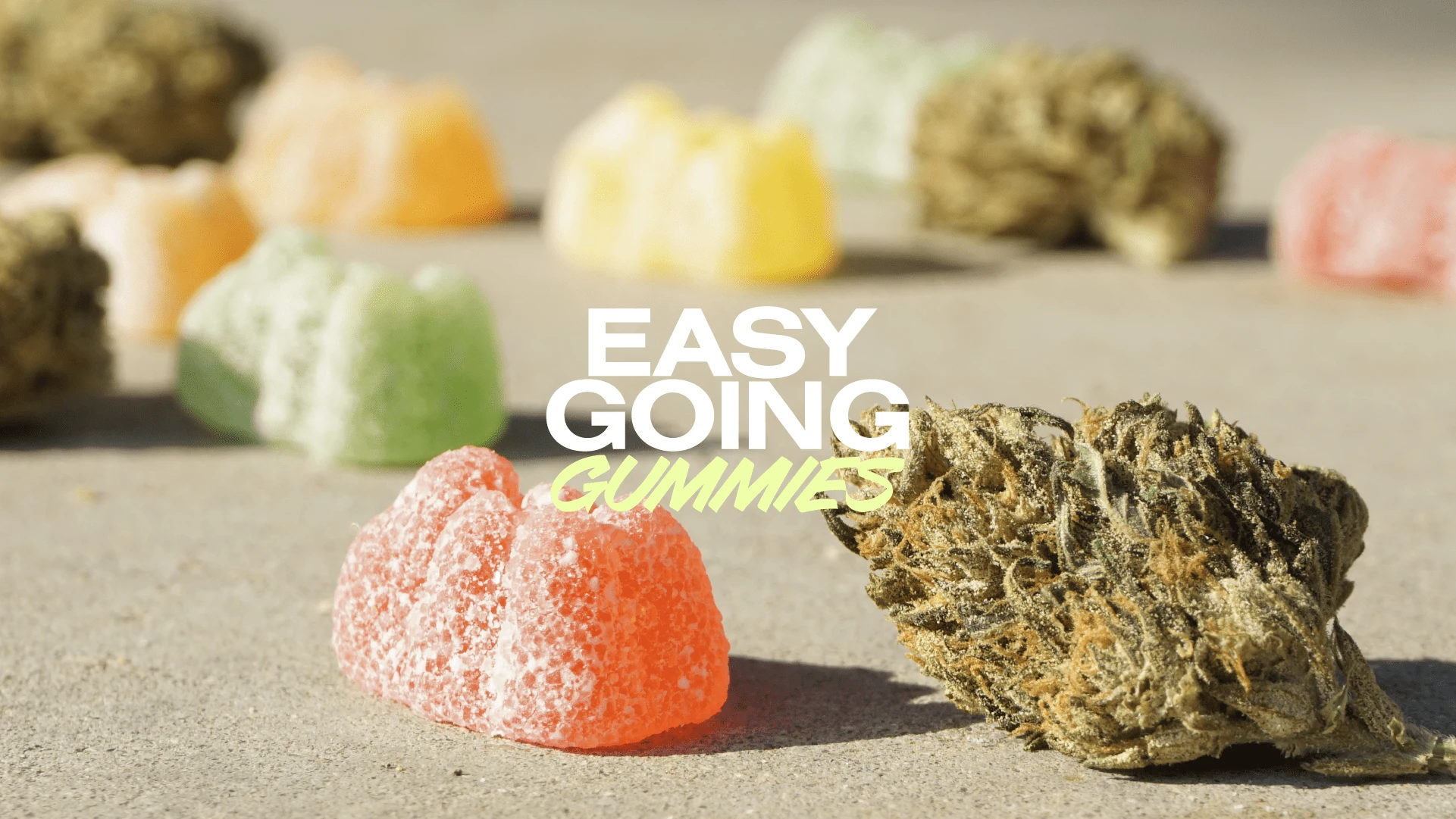
In the burgeoning market of CBD products, Easy-Going has emerged as a brand that defies the conventional. Where competitors opt for a sterile and minimalist aesthetic, Easy-Going has deliberately chosen a path less travelled—one of vibrancy and exuberance. The brand champions a lifestyle that's as unapologetically bold as it is serene.
Challenge
The challenge was to craft a brand identity that captures Easy-Going’s unique ethos—a blend of audacity and tranquillity. The market was saturated with brands that adhered to a "less is more" philosophy, using muted colors and minimalist designs that often mimicked the subtlety of high-end health products. Conversely, some designs skewed towards the other extreme, resembling children’s candy with their overly bright and whimsical aesthetic.
Easy-Going needed to navigate these waters carefully, aiming to break the mould with a vibrant yet sophisticated identity that resonated with adults seeking relaxation and quality without the frivolity often associated with colourful confections.
Solution
The design strategy pivoted on creating a fun and bright aesthetic that exudes the brand's carefree and lively spirit. A vivid colour palette was chosen to imbue the packaging with life and make each product pop off the shelves. The logo design incorporated a playful typeface that nods to the brand's laid-back nature while retaining a sturdy presence to convey reliability.
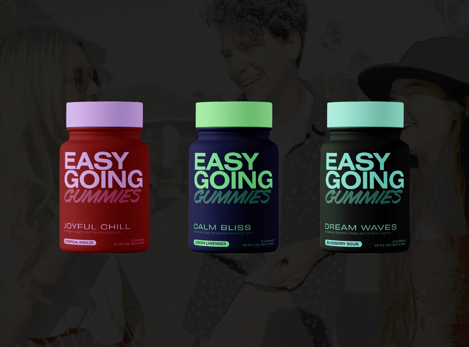
Easy Going - bottles packaing
The packaging for the gummies is intentionally designed with a dual-tone colour scheme that's both eye-catching and indicative of the flavour profiles. The lifestyle imagery reflects a diverse range of joyful moments, from a casual gathering of friends to a solitary poolside retreat, all the while holding the product as a companion to these easy-going experiences.
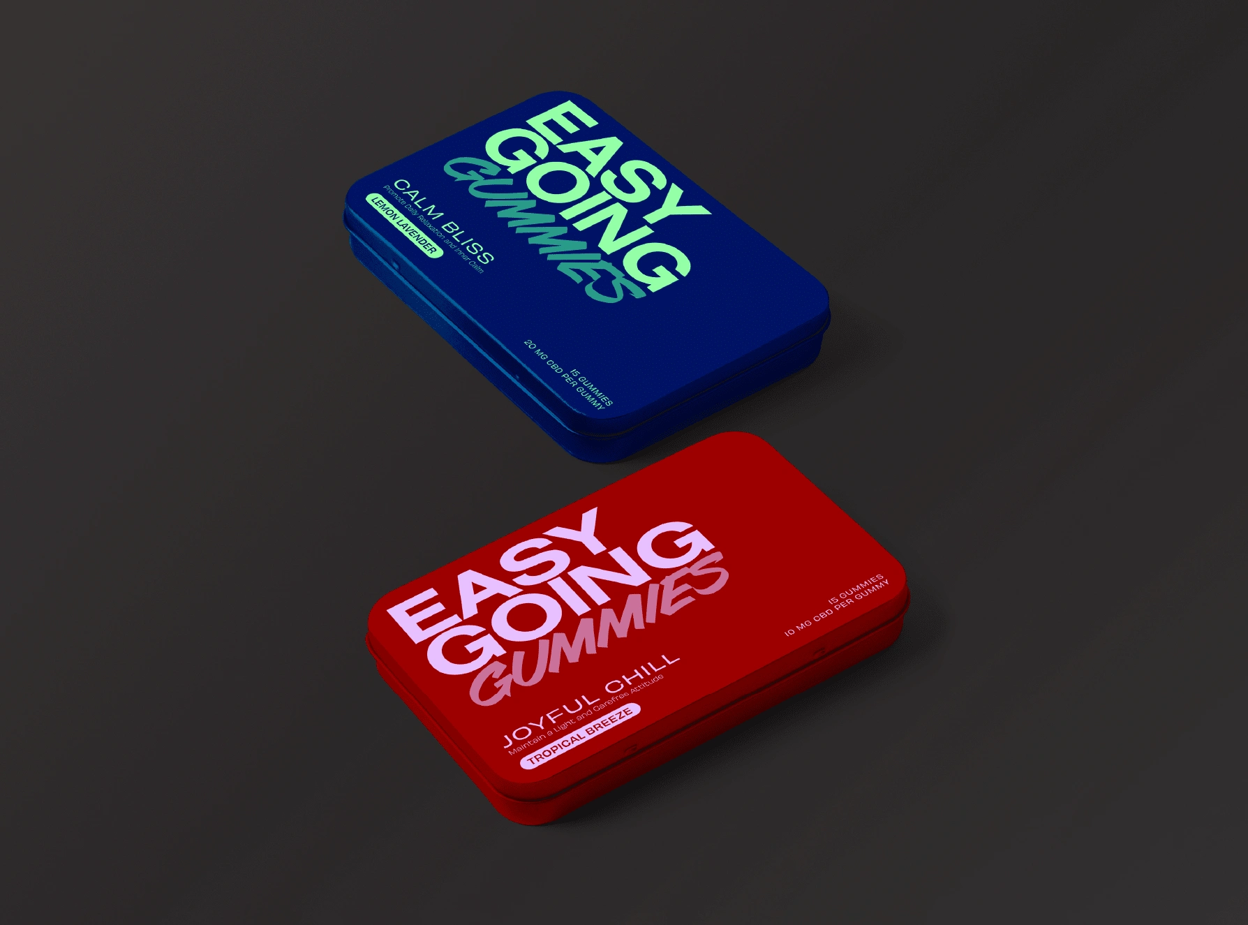
Easy Going - Tins packaging
In a sea of sameness, Easy-Going’s branding is a beacon of individuality. The lively visuals not only attract attention but also communicate a message: relaxation doesn’t have to be dull; it can be as dynamic and colourful as life itself.
This case study exemplifies how stepping away from industry norms can create a powerful brand identity that captivates and endears.

Like this project
Posted Nov 10, 2023
Unwind with a splash of colour—discover CBD gummies that make relaxation lively and bold.

