Portfolio Website Design for Jesse Okafor

Olamide Afolayan

OVERVIEW
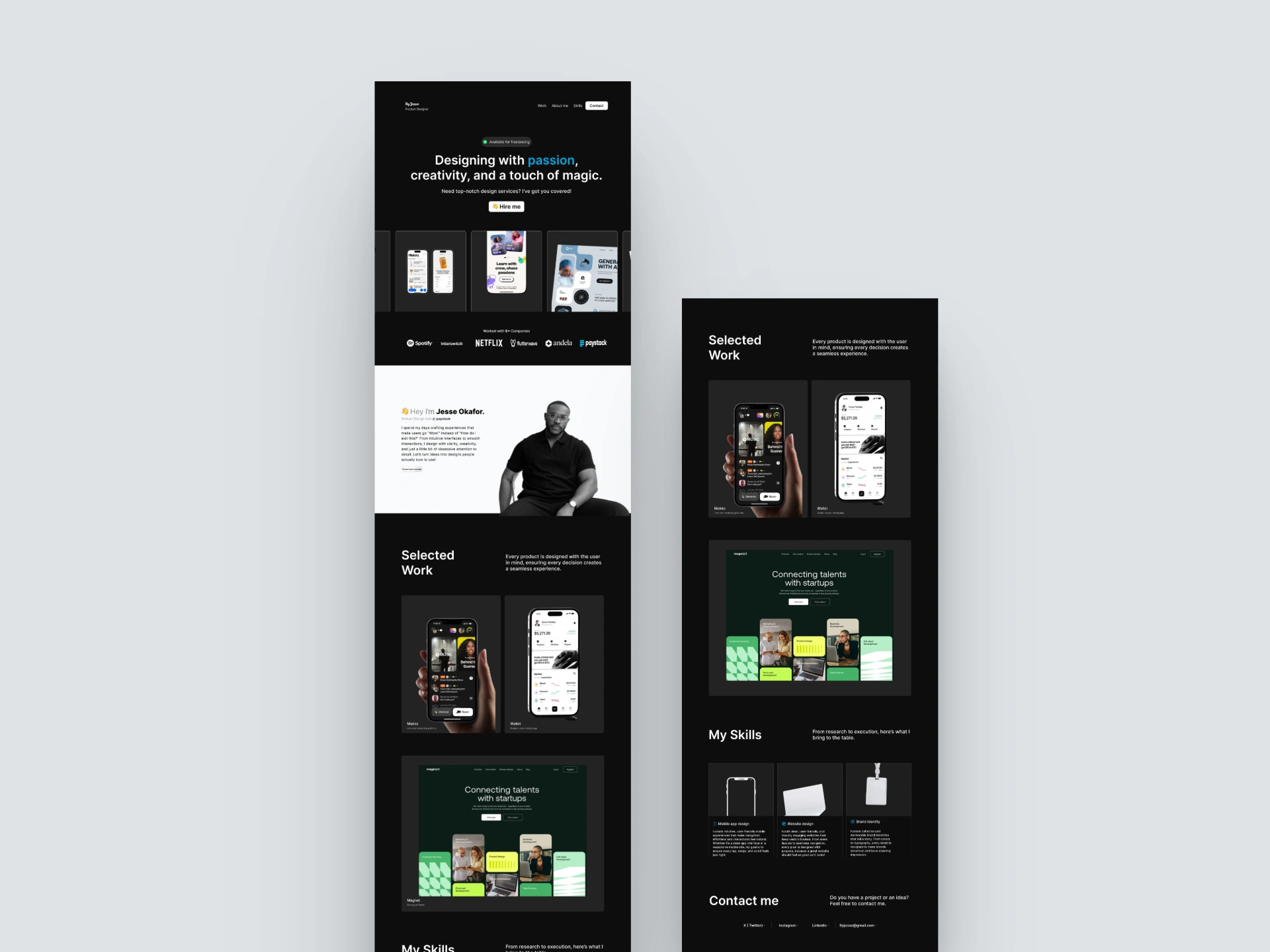
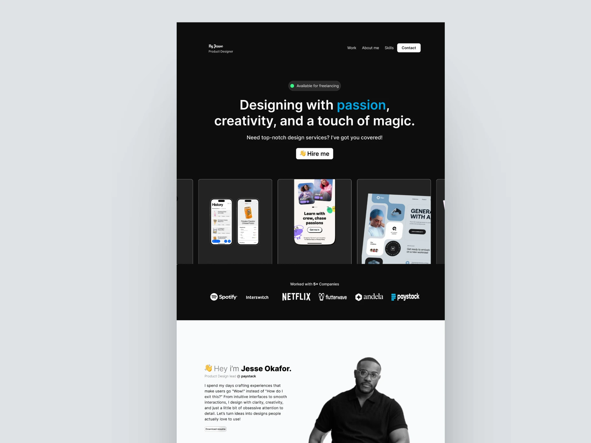
I designed a sleek, personal portfolio website for Jesse Okafor - a multidisciplinary designer aiming to showcase his creative range, personal brand, and design expertise all in one place. The site was built to feel premium, expressive, and easy to explore.
WHAT THE BRAND IS ABOUT
Jesse’s brand is rooted in storytelling, visual craft, and intentional design. He needed a platform that reflects those qualities while helping him connect with clients, recruiters, and collaborators around the world.
THE GOAL
The goal was to create a modern, high-impact portfolio that didn’t just look good but made it easy for visitors to understand Jesse’s strengths, explore his past work, and reach out with confidence. It had to strike a balance between professionalism and personality.
CHALLENGES FACED
One challenge I ran into was making sure all the different projects felt cohesive on the site, even though each one had its own vibe and visual style. I didn’t want anything to feel out of place, but I also didn’t want to strip away their uniqueness. Another was keeping the whole experience clean and easy to navigate, especially since there were a lot of sections and content to work with. It had to feel simple, not overwhelming.
HOW I SOLVED THEM
I went with a dark, editorial-style layout to give the site some depth and make the visuals pop. I kept things clean with bold typography, soft color accents, and lots of breathing room so nothing felt cluttered. I used high-quality mockups, big imagery, and thoughtful copy to guide visitors without overexplaining. From the hero section to the contact page, I wanted everything to feel smooth, bold, and genuinely reflective of Jesse’s personality and work.
Like this project
Posted Jun 9, 2025
Designed a portfolio for Jesse which led to a 3× increase in profile views and helped him land two collaboration offers within the first month of launch
Likes
0
Views
0


CreatorHQ Dashboard Design

Opulent Website Design

NTA News Application