Votch - Logo Redesign
Some companies often seek a redesign of their existing logo, sometimes this part of a standard process of making sure their company has a fresh look that is identifiable, relevant and appeals to both existing and new market shares and or customer/client base.
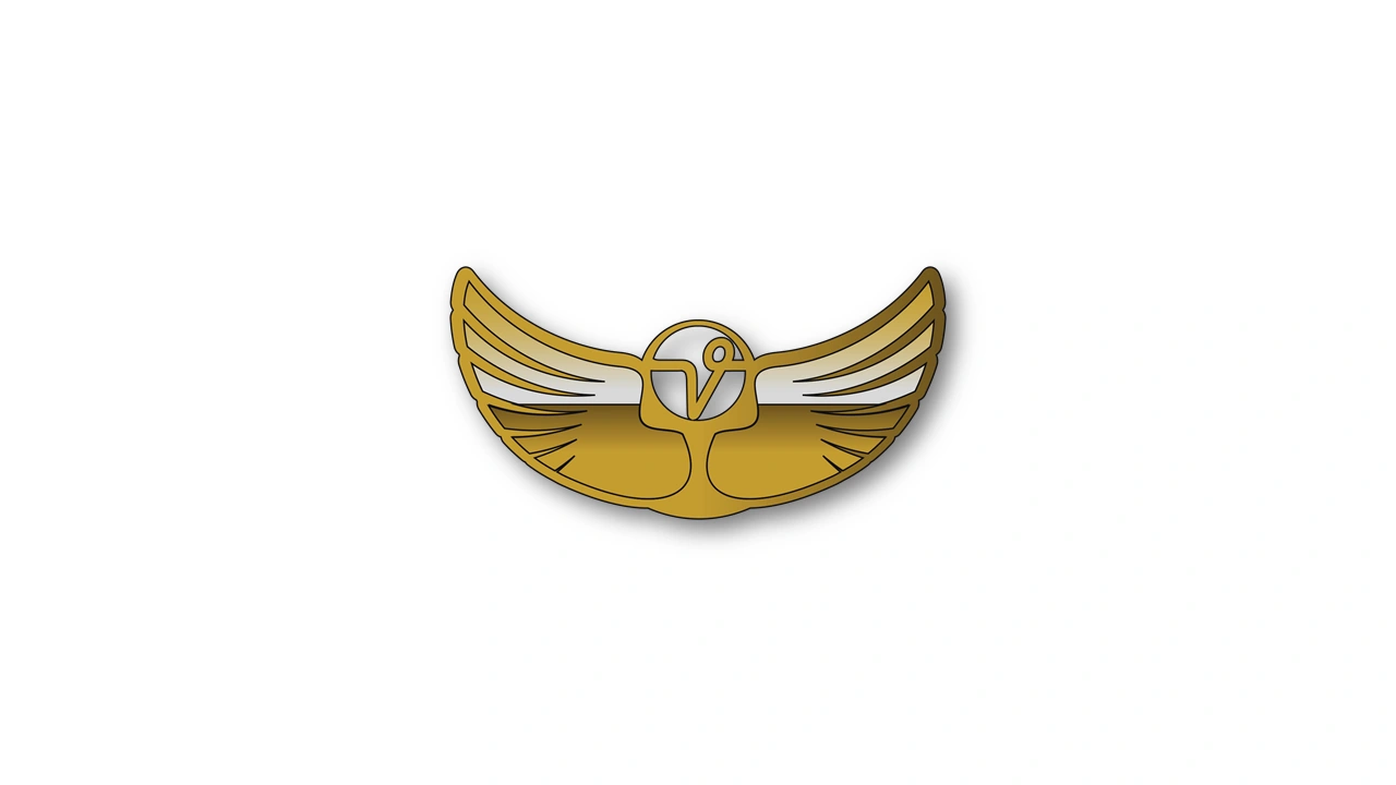
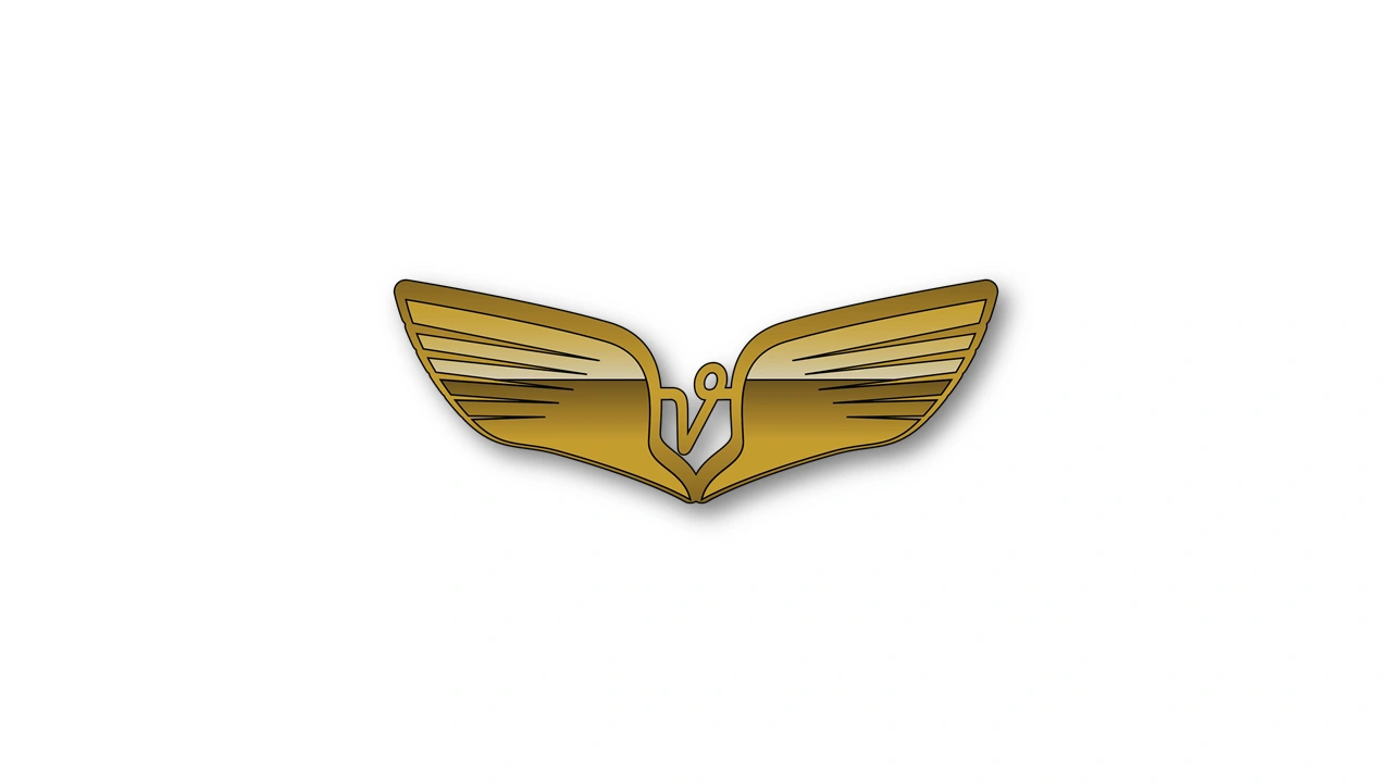
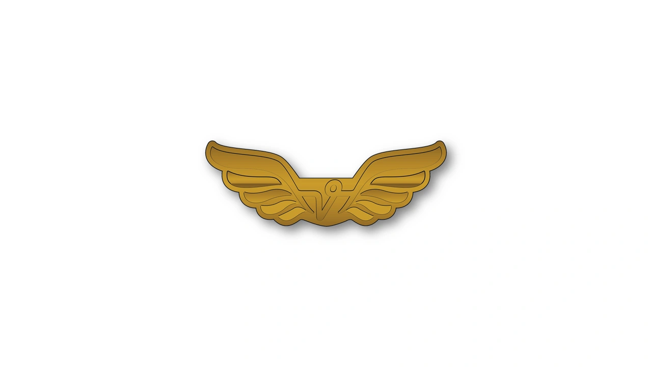
Take for instance Votch Engineering, a private independent firm, that not only had unique typography as part of their previous company design but wanted to incorporate a simplified representation of the first two letters. Hence a Capitalized V which need to be centred to the design and the O highlighted in the same manner as the degree symbol °, i.e. when we write degrees like 360°.
The key was to ensure that the lettering flowed together and was integral to the design itself.
As to the development of the wings, various hand drawn sketches were presented, and digital representations were required. Additional instruction highlighted that the detail and color had to be clear enough as it would be applied not only in publishing, but on other surfaces and using other materials.
For instance, the logo had to look good on fabric and textile, pewter, metal, and Perspex.
Additionally shape became a big issue during teh development, making aviator wings look strong and dependable without looking to familiar to military wings from various air forces.
Below is a sample of a few of the final draft designs presented and selected.


Like this project
0
Posted Jun 14, 2021
Likes
0
Views
2


