A ride-hailing mobile app that solves commuting issues - buseet
Problem
Bus transportation in Egypt is often disorganized, causing delays and inconvenience for passengers. The problem is that there is a lack of accurate and up-to-date information about bus routes and schedules, which leads to confusion and frustration for passengers. Additionally, many bus companies in Egypt do not have an efficient system for booking and paying for tickets, which adds to the inconvenience for passengers.
Goals
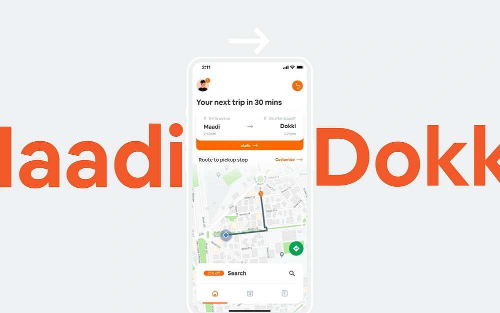
Buseet aims to provide a more seamless and efficient bus transportation experience through an app that allows users to book and track buses in real-time. The niche is the bus transportation market in Egypt, where there is a clear need for a more organized and convenient way to book and pay for bus tickets.
Challenges
The old app experience was really bad to deal with.
The lack of accurate and up-to-date information about bus routes and schedules is a major challenge for bus transportation in Egypt. This makes it difficult for passengers to plan their trips and can lead to delays and missed connections.
Limited access to technology and the internet among some segments of the population is another challenge, as it may prevent some users from being able to use the Buseet app.
Low levels of trust in online transactions among some users is a potential obstacle for the adoption of e-ticketing and digital payment options.
Difficulty in integrating with existing bus companies and government systems is a logistical challenge that Buseet must overcome in order to provide accurate and up-to-date information to users.
UX Research
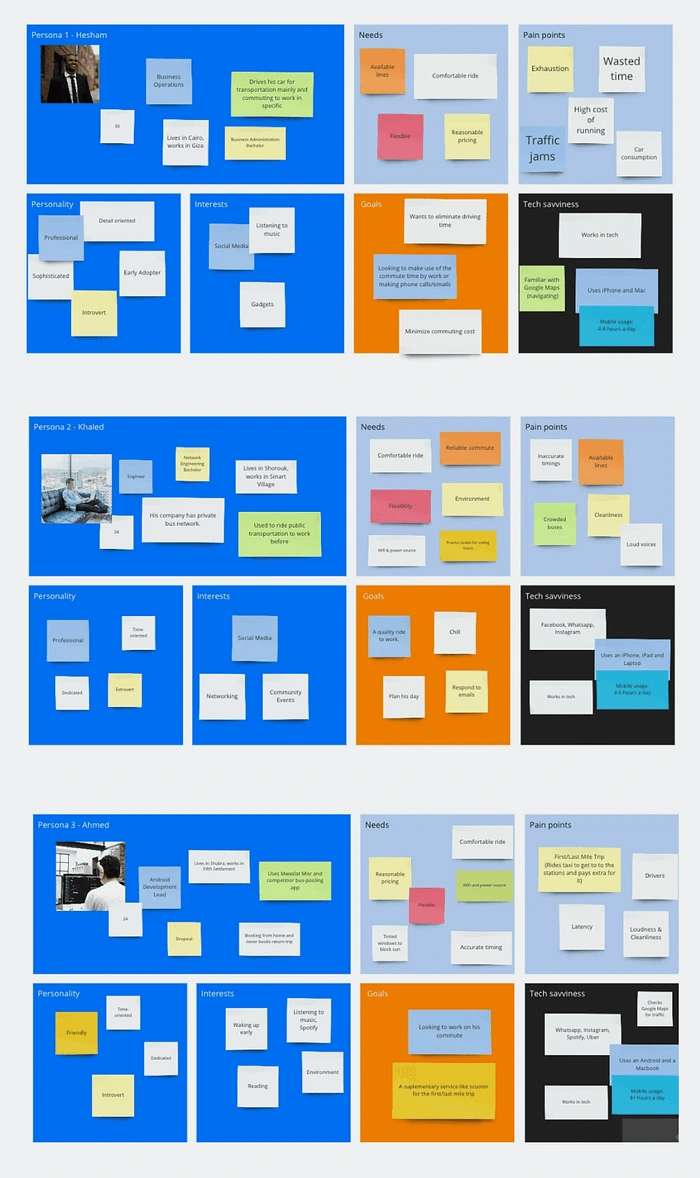
To gain a better understanding of the problems and challenges faced by bus passengers in Egypt, I conducted a user survey to gather insights from potential users. The survey included a checkbox for users who wanted to be included in Buseet’s Research program, which would give them access to free rides, discounts, and special access to beta features. Afterward, I conducted in-person interviews with users during their daily commutes, which allowed me to gather insights on the context of use and the specific challenges faced by users in their daily lives.
UX Strategy
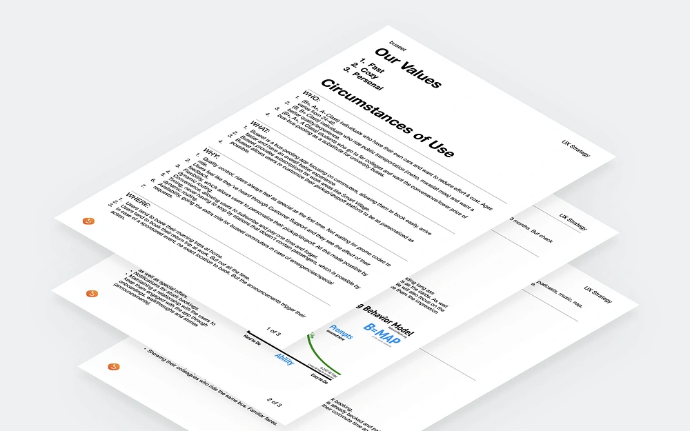
Based on the insights gathered from the UX research, I developed a UX strategy that focused on creating a user-friendly and intuitive interface that could be easily navigated by users of all ages and technical abilities.
To achieve this, I incorporated the following key features:
Real-time information on bus routes, schedules, and arrival times
E-ticketing and digital payments to increase convenience and reduce the risk of fraud
Considering the context of use, such as the users’ likely location and usage scenarios (e.g. commuting, traveling for leisure)
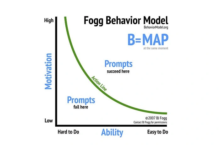
I also incorporated Fogg Behavior Model to try and change the behavior behind the most used tasks in the app.
No Paragraphs
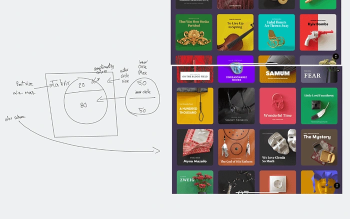
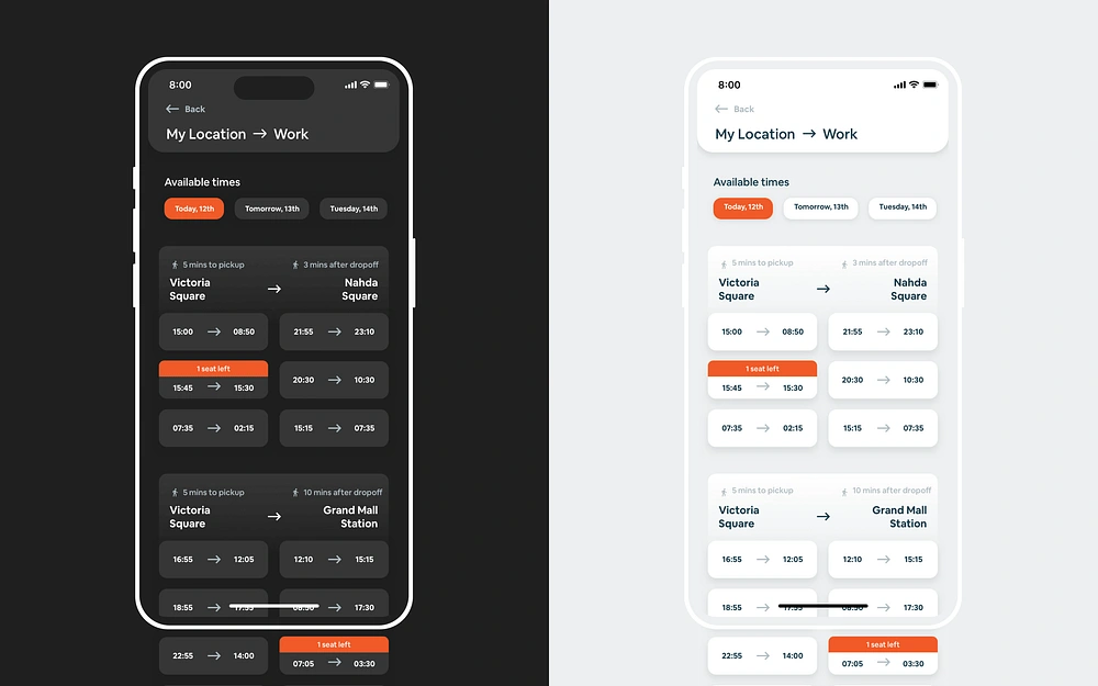
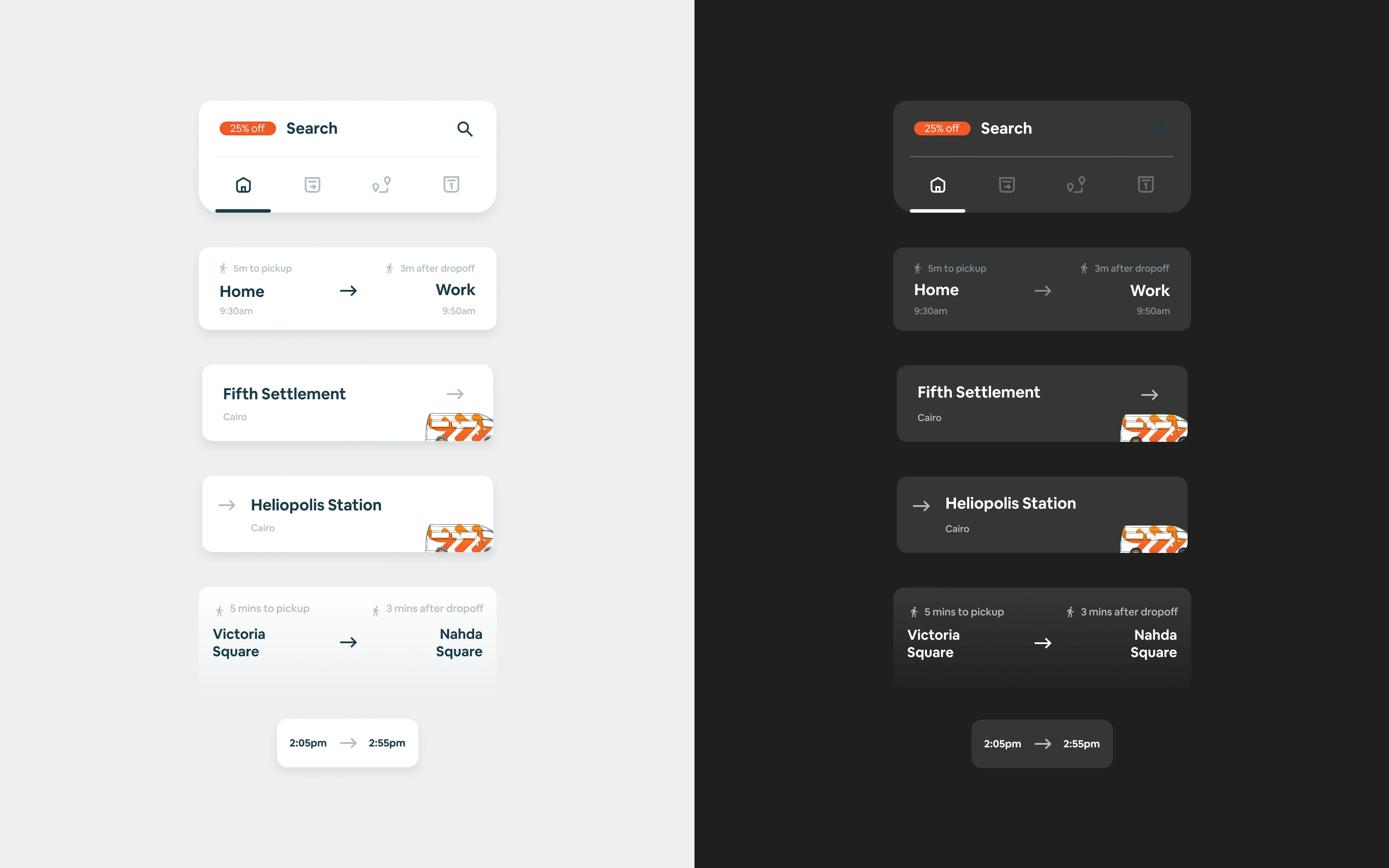
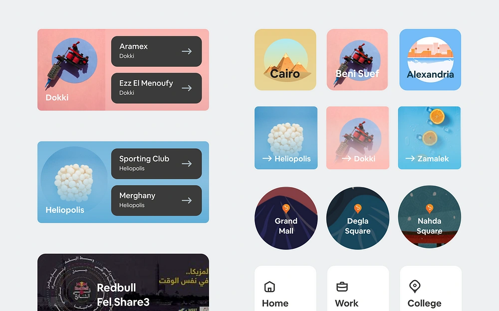
Our users are busy, sophisticated, and geeky. They don’t have time for reading long ass paragraphs. We will depend on mimicking real life subway signs and tickets as the cards. As well as making art workings for the areas we cover instead of showing maps. We will also focus on the performance to make the experience as smooth and fast as possible to give them the impression of speed in our service.
Ideation
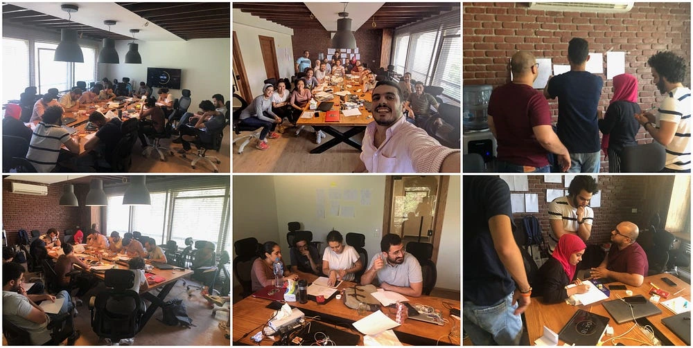
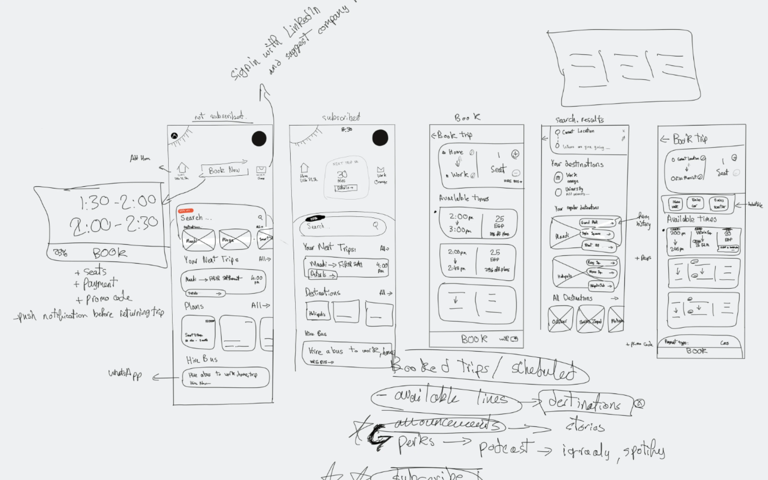
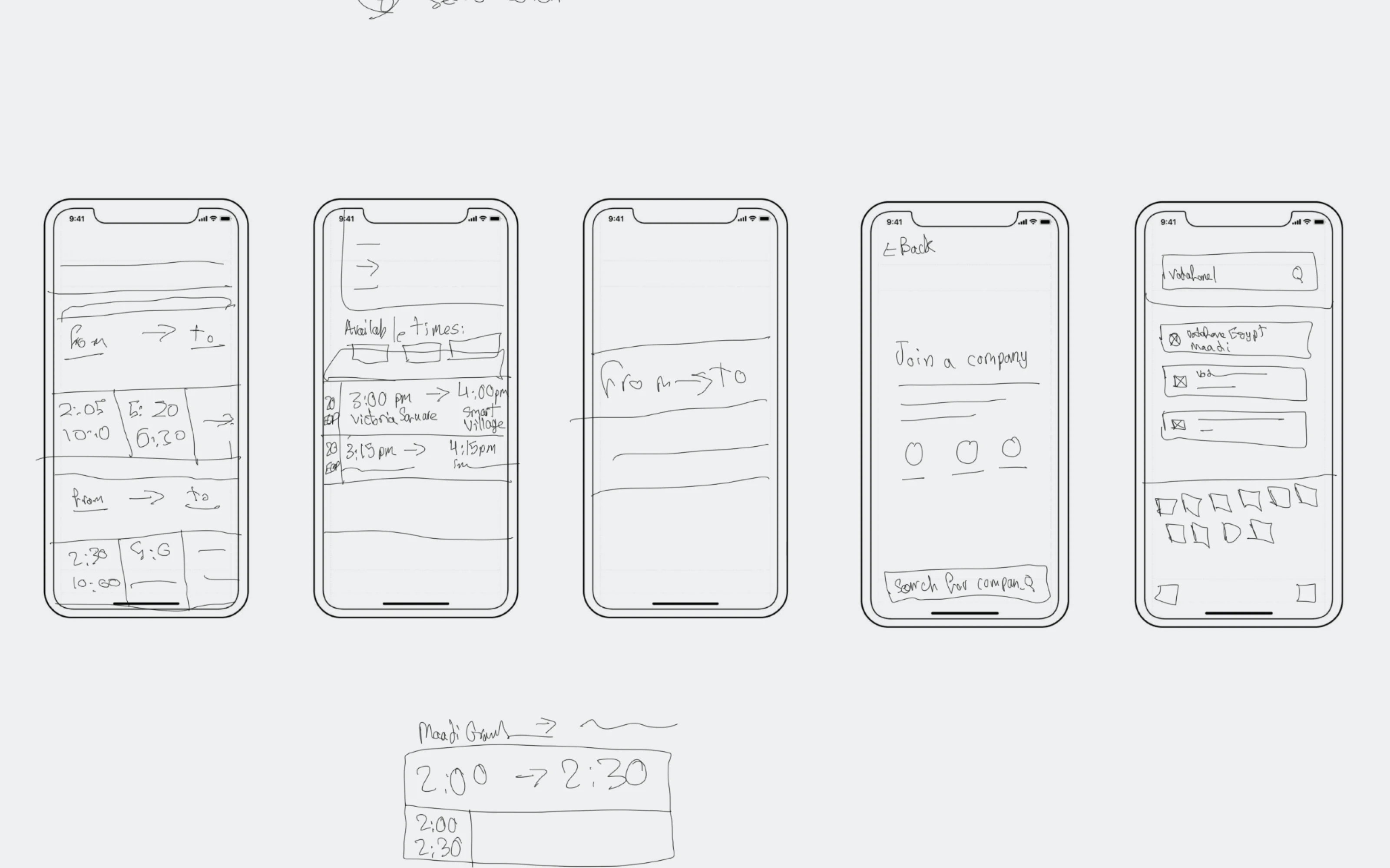
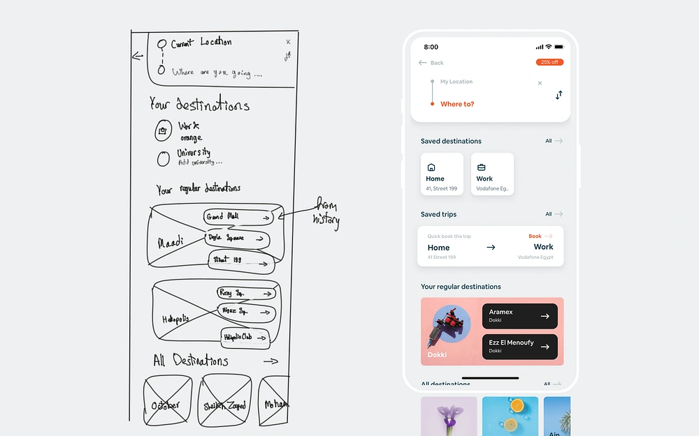
After sharing the UX strategy and the findings of my research I decided to have a group ideation session as one of the problems that were in the team, no one could get their ideas heard, I took this exercise when ideating where I split up the team into 4 teams, each team consists of one of each department. The exercise included 3 stages, each 15 minutes, with a 10-minute break in between.
First phase: each member draws a sketch of their own.
First break: each member presents their idea in front of their own team.
Second phase: each member draws a second round of sketches having seen their colleagues’ ideas and iterates on their first sketch.
Second break: each member presents their idea in front of their own team and then they have to vote on their ideas, they can vote on specific parts.
Third phase: the whole team works on a final version based on all the ideas they had and finalizes them.
Third break: each team chooses one of their members to present the idea in front of all teams and collect feedback.
Design Solution
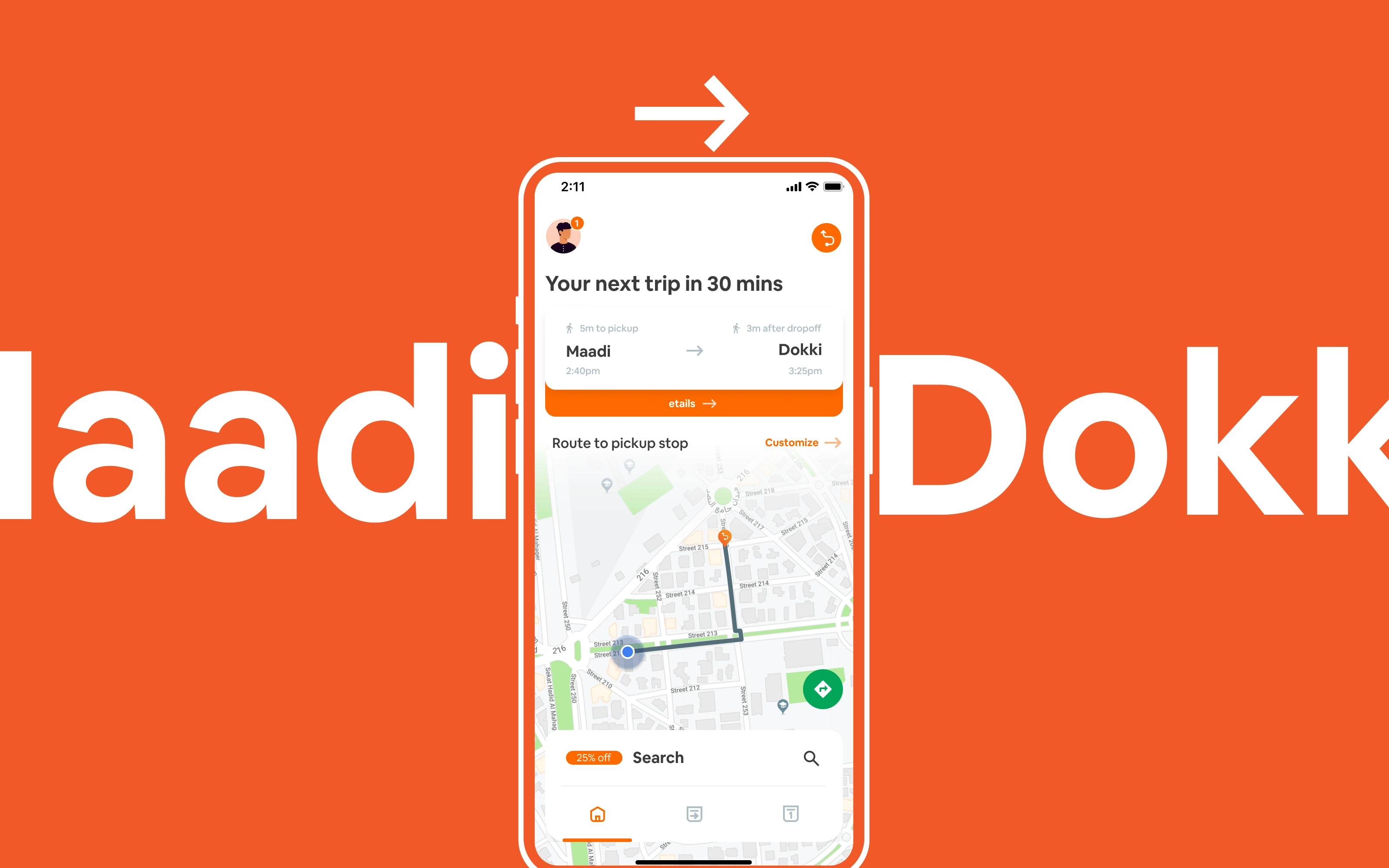
To make the app easy to use, we used a clean and minimalistic design, incorporating imagery and icons to help users quickly identify and access important features. We utilized color coding and other visual cues to help users quickly understand the status of buses and their own bookings.
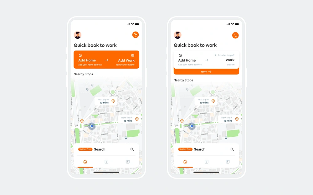
Contextual Home Screen
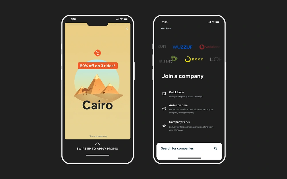
When you first open up the app, you’re prompted to add your home address, and if you signed in with LinkedIn and your company is already registered on our system we automatically add its address for you.
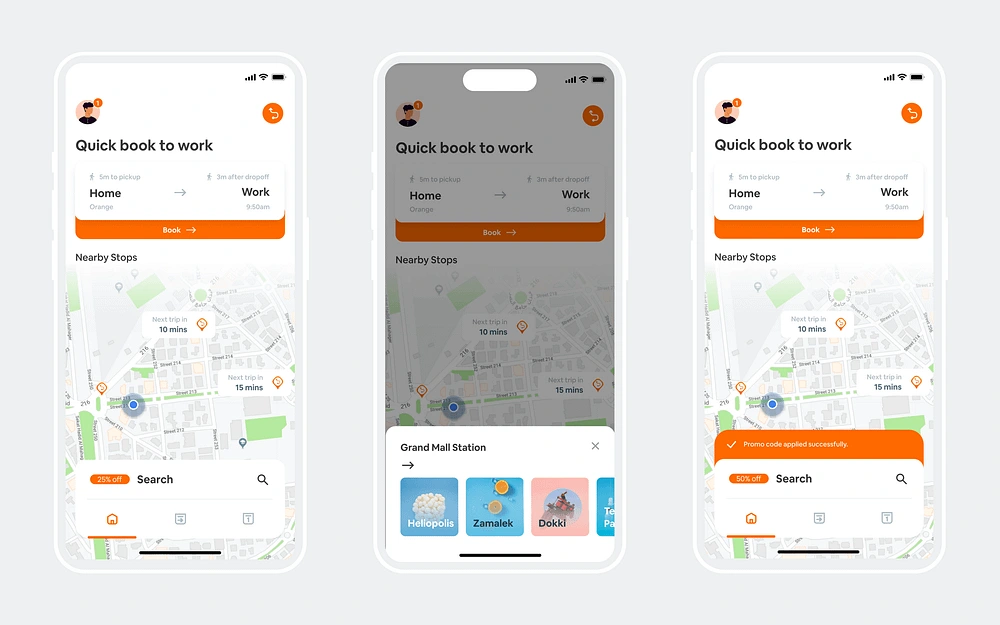
AFTER ADDING THE ADDRESS AND ENABLING LOCATION SERVICES
When you add your address and allow the location services, the home screen shows a map of your current location and the nearby stops around you. When you click on stop you are immediately prompted with the destinations that are available from that stop.
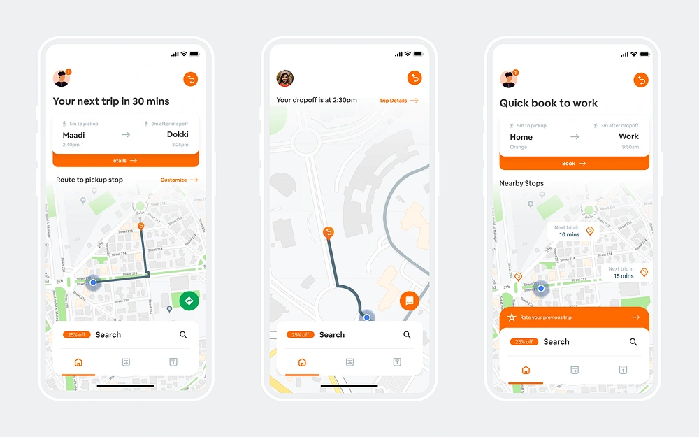
BEFORE, DURING, AND AFTER THE TRIP
Before the trip, you can view the route to your pickup station and can view how long till your next trip, you can also click on the “Navigate” button which opens the Google Maps route for you. During the trip, you can view their dropoff time, your current location, and your route till the dropoff station. After the trip, you are prompted to rate the trip.
Conclusion
The redesign made a huge impact after launching it with around 15% more conversions just during the first week on Android alone, however the pandemic started right afterwards and the lockup happened and the business changed and pivoted more into B2B afterwards. However, it was a great experience for me.
Originally published at https://sydxcix.com.
Like this project
Posted Jun 19, 2023
Bus transportation in Egypt is often disorganized, causing delays and inconvenience for passengers. The problem is that there is a lack of accurate and up-to-d…

