Quantum - Sustainable Energy Landing Page

Odama Studio

Quantum Energy — Solar & Smart Battery Landing Page
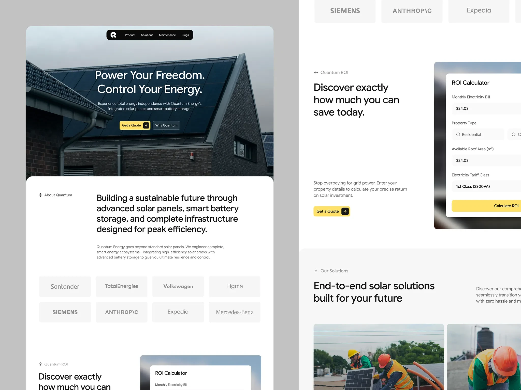
Quantum Energy needed a marketing site that could do two jobs at once: feel as premium as the high-end hardware it sells, and make the buying decision (a large, considered purchase) feel low risk and easy to act on. I designed a single long-form landing page that moves a visitor from "what is this brand" to "get a quote" in one continuous, trust-building scroll.
The Challenge
Solar and home-battery products sit in an unusual spot for a landing page: the audience is skeptical (payback periods, technical specs, installation disruption), but the sale is still emotional (energy independence, protecting the home, sustainability). The design had to:
Establish premium credibility fast, without feeling corporate or cold
Make technical information (system output, battery capacity, warranty years) scannable rather than overwhelming
Reduce the biggest objection "will this actually save me money?" before the visitor ever has to ask
Carry one consistent visual language across marketing, data, and support content (hero, product specs, testimonials, FAQ)
Approach
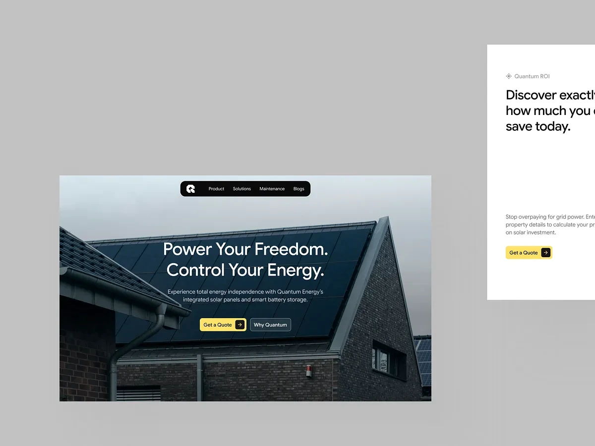
A restrained, high-contrast palette. I kept the palette to just charcoal, a warm off-white, and a single amber-yellow accent used only for calls to action, so the page feels premium rather than "salesy" and the visitor never has to guess where to click.
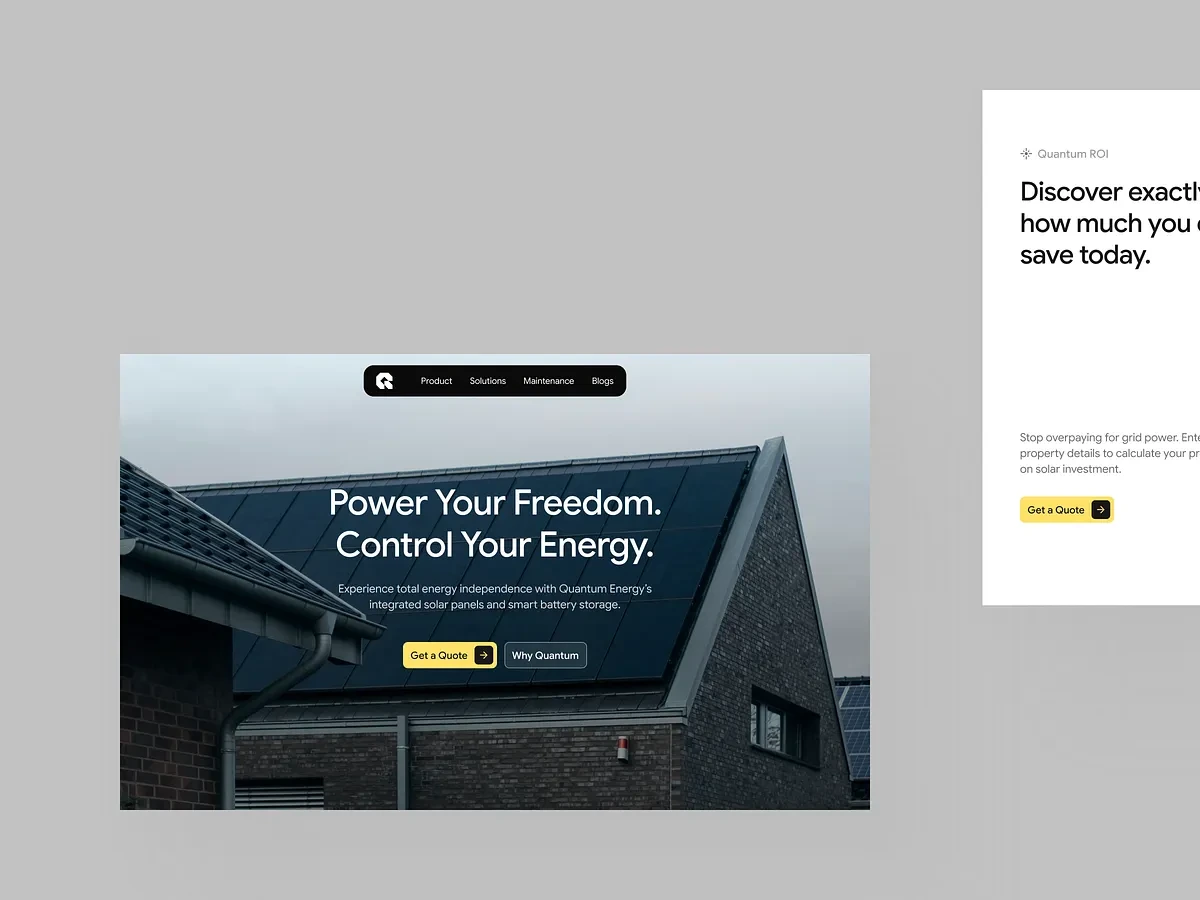
A hero that sells the outcome, not the product. Instead of opening with specs, the hero uses a full-bleed dusk photo of a solar-equipped home and the line "Power Your Freedom. Control Your Energy." selling the feeling first, with the content card below overlapping the photo on a rounded edge to pull the eye down the page.
Borrowed trust, immediately. A row of recognizable enterprise logos sits right under the brand intro, before any product detail, so credibility is established early instead of making the visitor wait for testimonials further down.
Turning the biggest objection into a tool. The ROI Calculator bill, property type, roof area, tariff — sits right after the trust bar so visitors can find out for themselves whether solar pays off, rather than just being told it does. This is the single highest-leverage idea on the page.
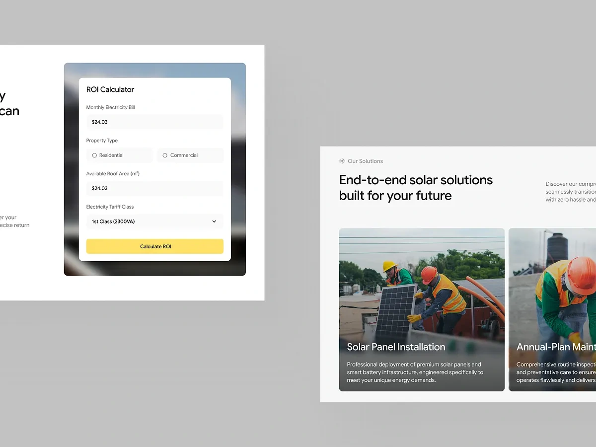
Specs presented like a spec sheet, not a wall of text. The two flagship products pair a photo with a compact table (output, capacity, warranty), so technical buyers get real numbers without turning the page into a brochure of paragraphs.
One shape language, repeated everywhere. Buttons, cards, the calculator, testimonials, and FAQ rows all share the same corner radius and pill-button styling, which is what makes a long page with many content types still feel like one coherent system.
Objection-handling where it's actually needed. Contact details sit beside the FAQ rather than buried in the footer, right where a hesitant visitor's last questions are likely to come up.
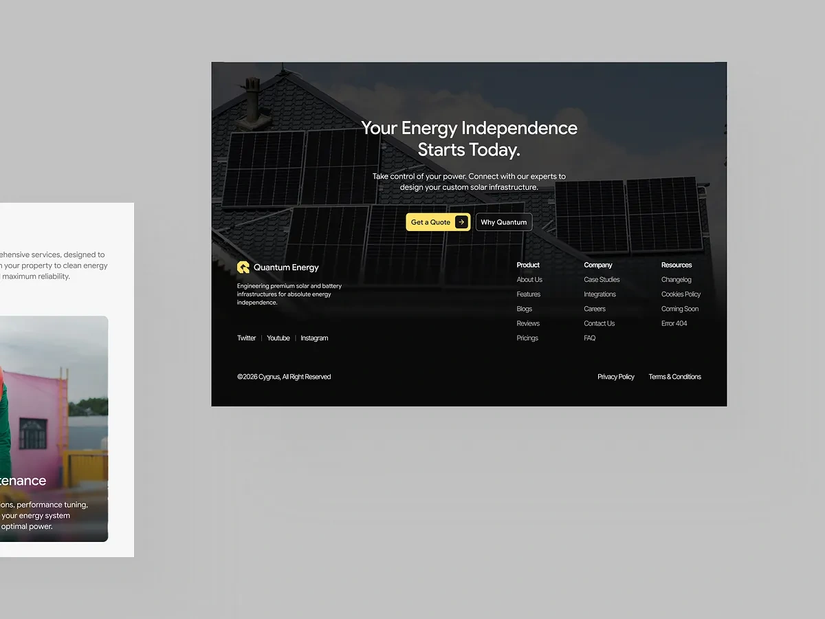
Closing the loop. The footer returns to the hero's dark palette and repeats the same CTA, so the page opens and closes on the same premium note.
Outcome
The result is a page that reads as premium as the hardware it's selling, but does the practical work of a good direct-response landing page: one accent color for every action, an interactive tool that pre answers the visitor's main financial question, and a repeated visual system that makes a long page feel effortless to scroll.

Like this project
Posted Aug 5, 2026
Quantum is a sustainable energy platform built to decentralize power and put full energy independence back into the hands of homeowners.