Middle School Website Redesign Using Figma
Sharayah Rushing
School Website Redesign Project
Overview
We had to pick a website that we believed had poor design. Then, we had to use Figma to redesign the website.
Problem/Goal
My husband is a middle school teacher. On several occasions, he’s complained that his school’s website is terrible. I decided to take a look for myself and realized he was correct. I also had another personal reason for choosing to redesign this website. They have never listed my husband as one of the staff members, even though newer employees are listed. I wanted to add him to my redesign.
Solution
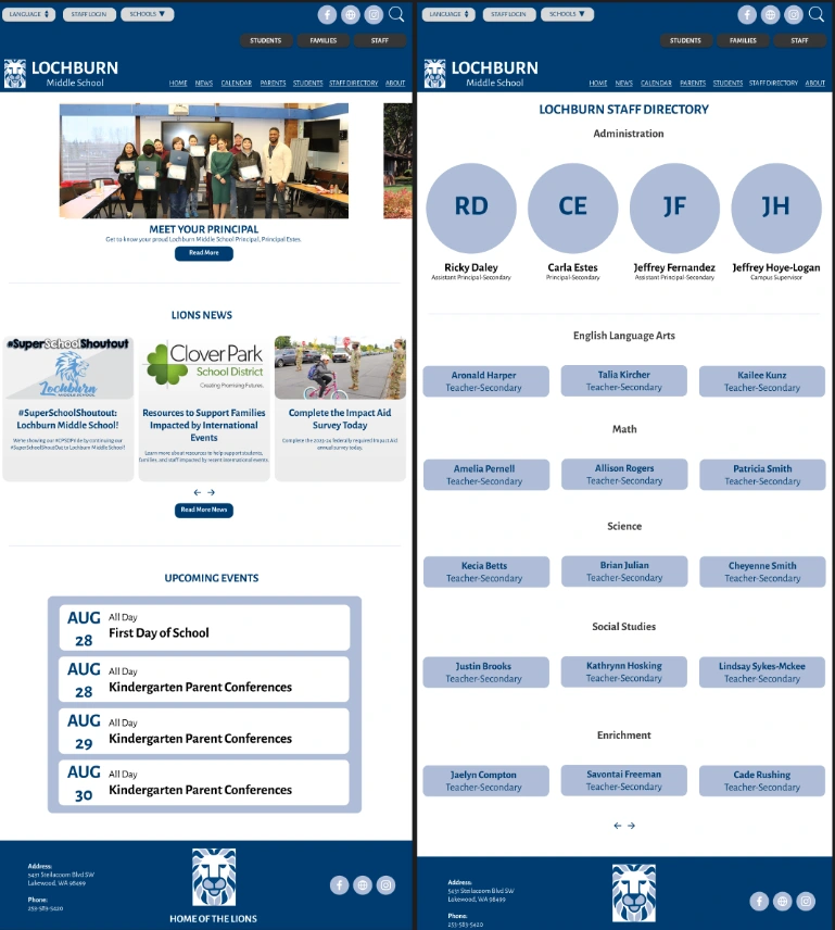
This is the original website’s design.
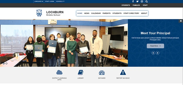
I found the original design clunky and disorganized. I wanted to make something that looked more cohesive.
My first challenge was creating a header that combined all of the necessary links while making it more attractive.
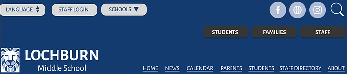
I decided to keep the same Lochburn blue color, but I made that part larger. I also created rounded buttons in different colors to separate them into different sections and uses.
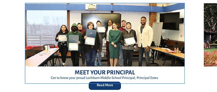
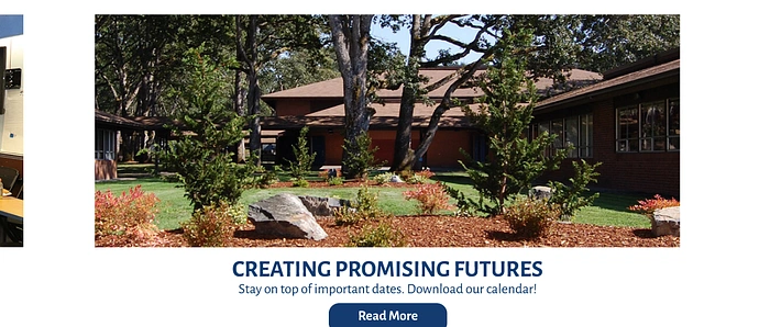
Personally, I find automatically scrolling galleries on web pages annoying. They’re never timed correctly. I remade the gallery, but I added a prototype where you have to swipe to see the next image. The left-most part of the second image is visible, creating a visual cue to scroll further.
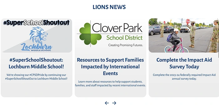
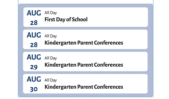
Then, I redesigned the news and events sections to make them feel more modern.
I wanted to add an homage to the school’s team, the Lions, somewhere on the page. But it didn’t fit well in the header. I decided to add it to the footer, where I think it works better.

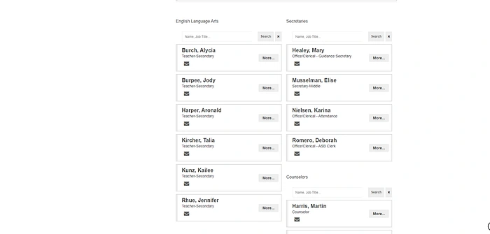
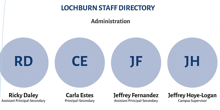
The second page, the Staff Directory, was probably the most challenging. This was mostly due to the sectioning. I decided to use circular profiles at the top, similar to what I’ve seen businesses do in the private sector. I kept the administration profiles above the fold with the option to add photos.
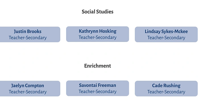
The rest of the staff are listed by name on the current site, but I don’t like the columned format. I decided to separate everyone by subject/area and list them horizontally in rounded buttons.
Results
One of my success metrics was to see how my husband Cade and my friend Katie (who also works at the school) felt about my redesign. Both said that my version was a drastic improvement. My husband was also happy to see his name on my version.
This project showed me Figma’s far-reaching capabilities. I had the most fun with Figma compared to any other software in this course. In the future, I want to eventually explore the full extent of its capabilities.
Like this project
Posted Aug 6, 2025
Redesigned a middle school website using Figma for improved aesthetics and functionality.
Likes
0
Views
3