Brand Identity Redesign for Kirk's Natural
Bethany Falter
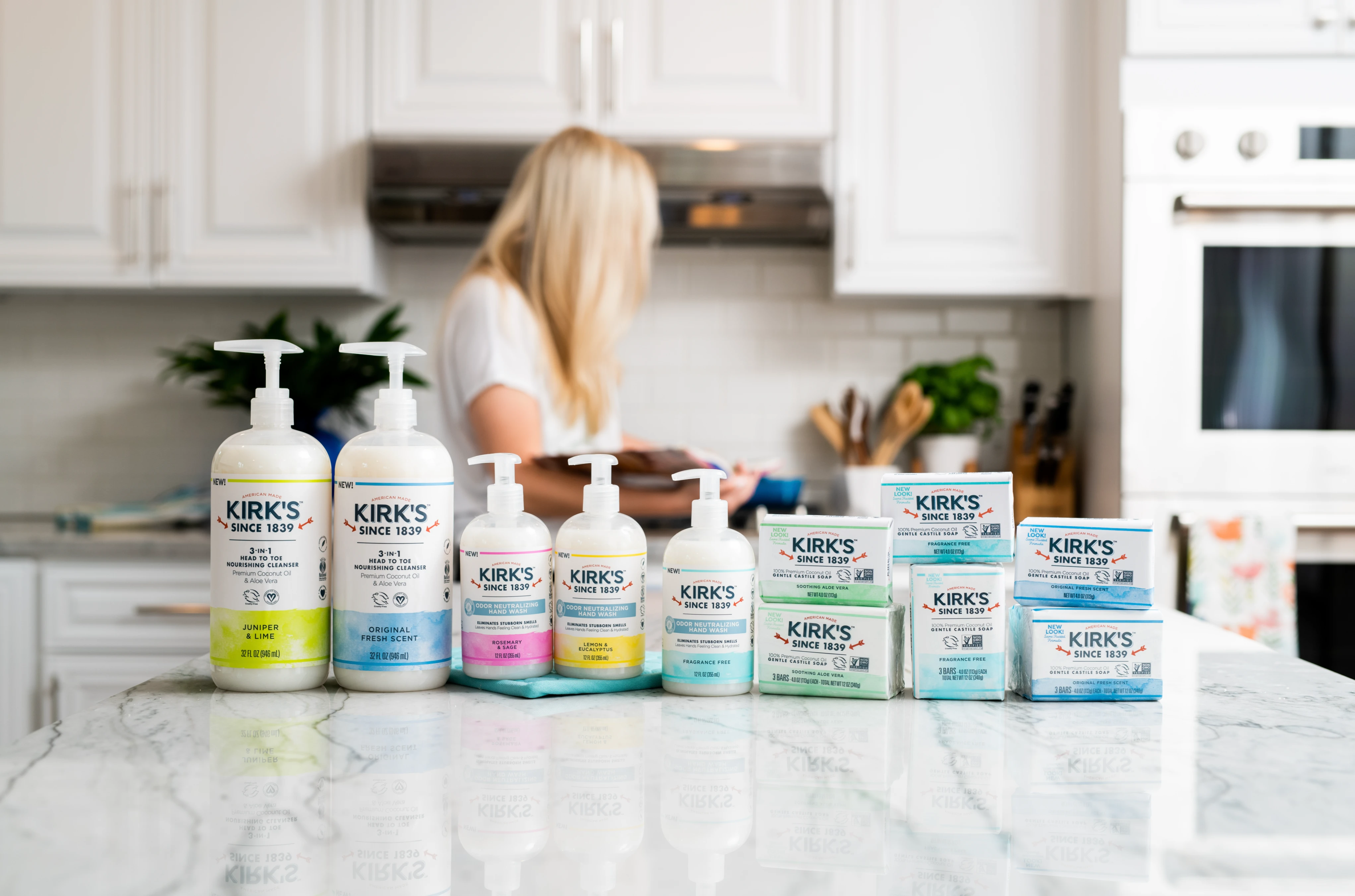
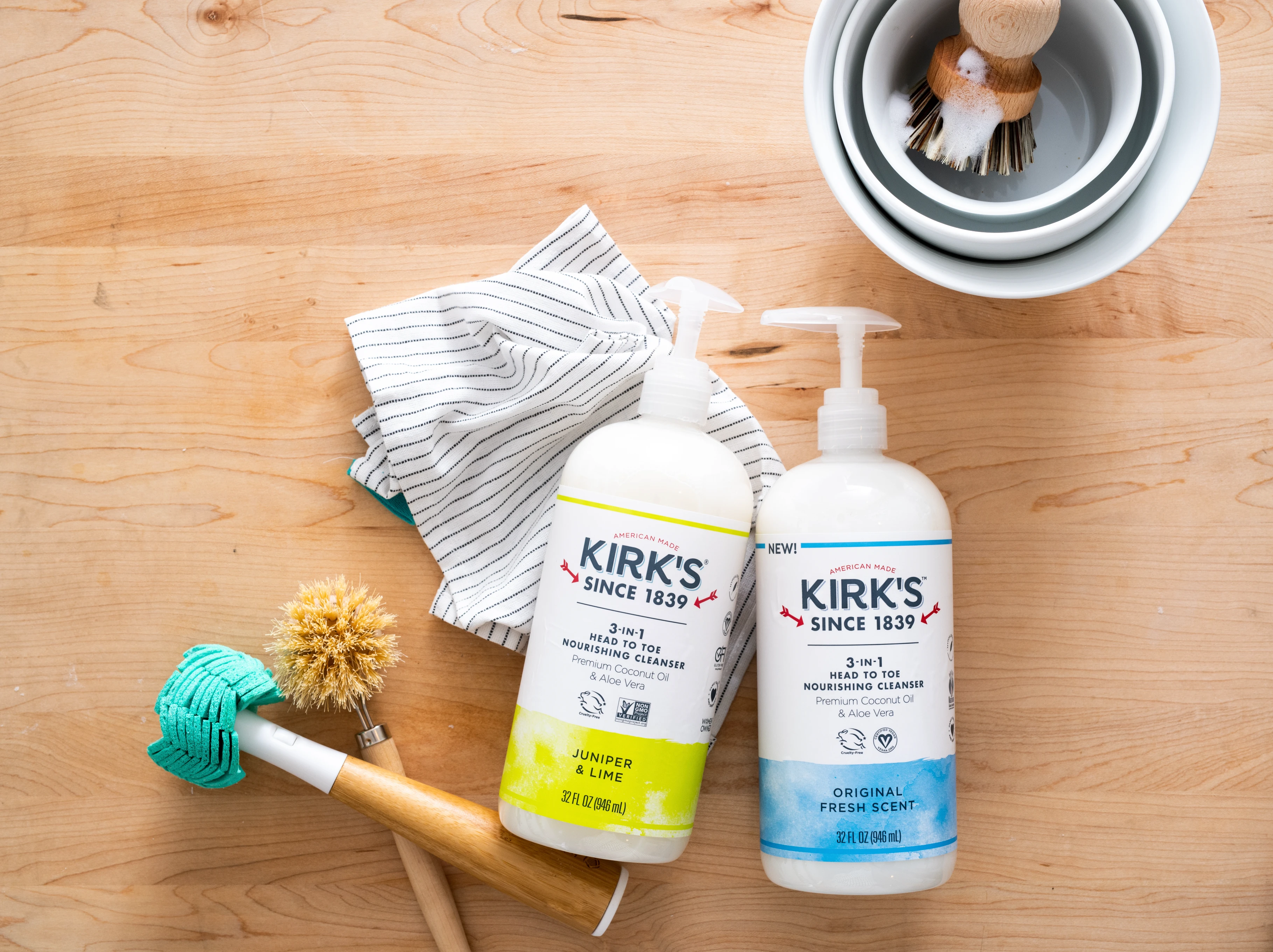
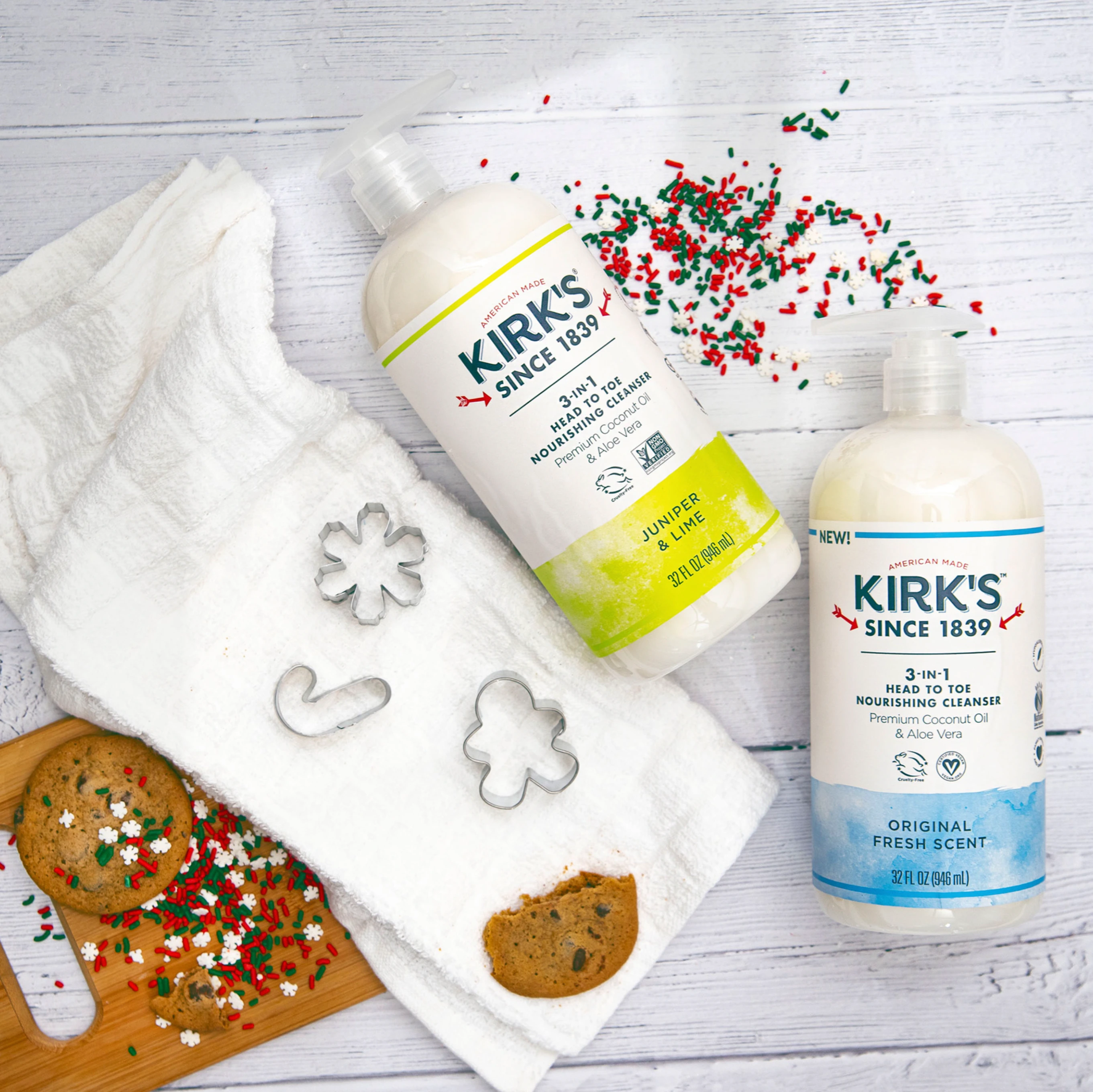
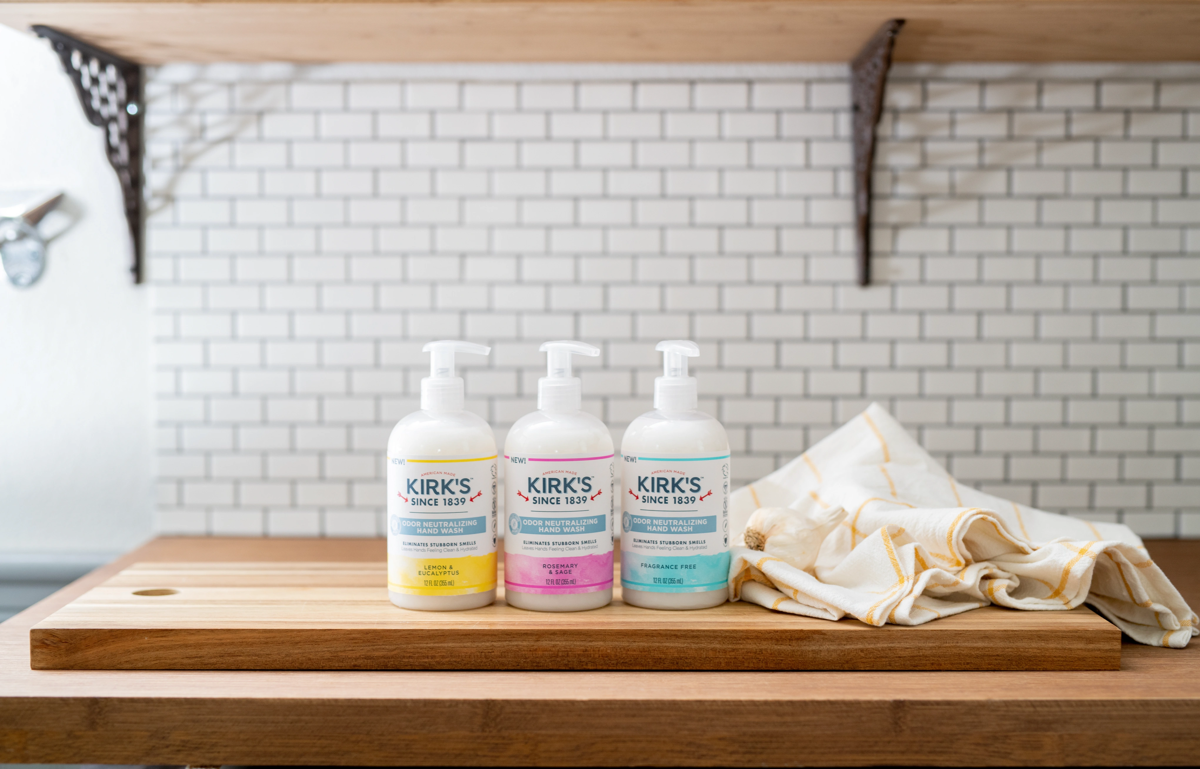
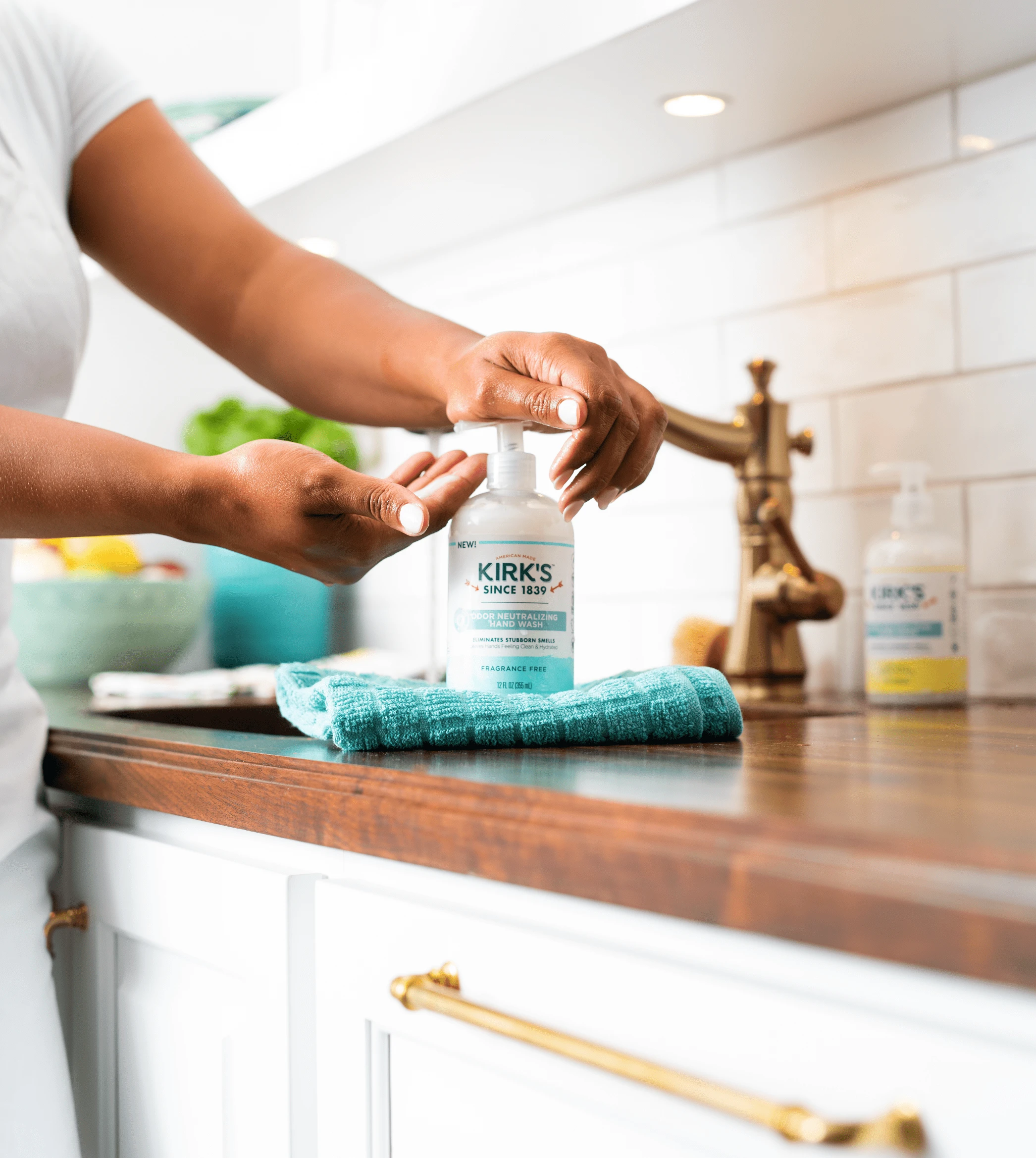
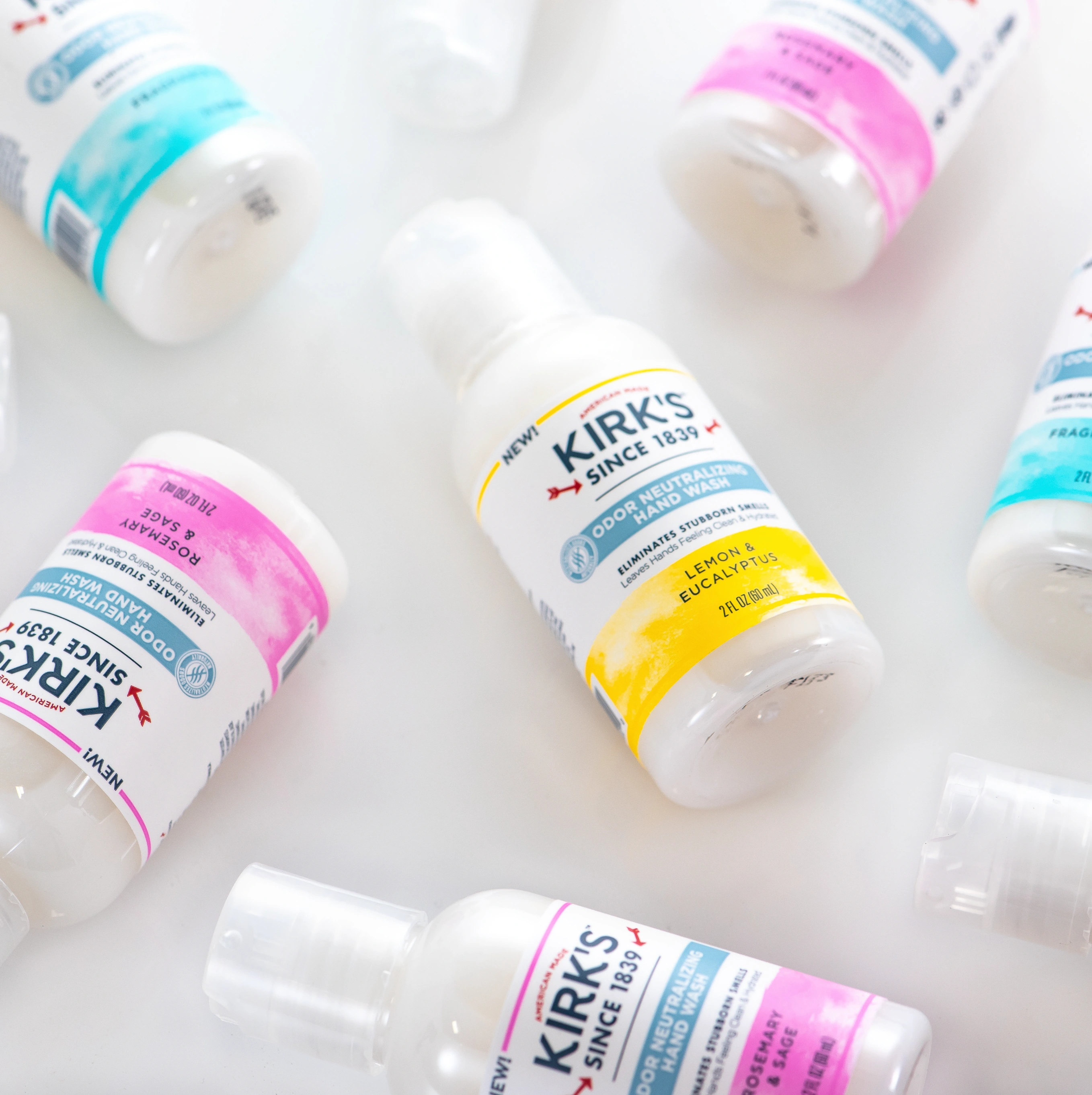
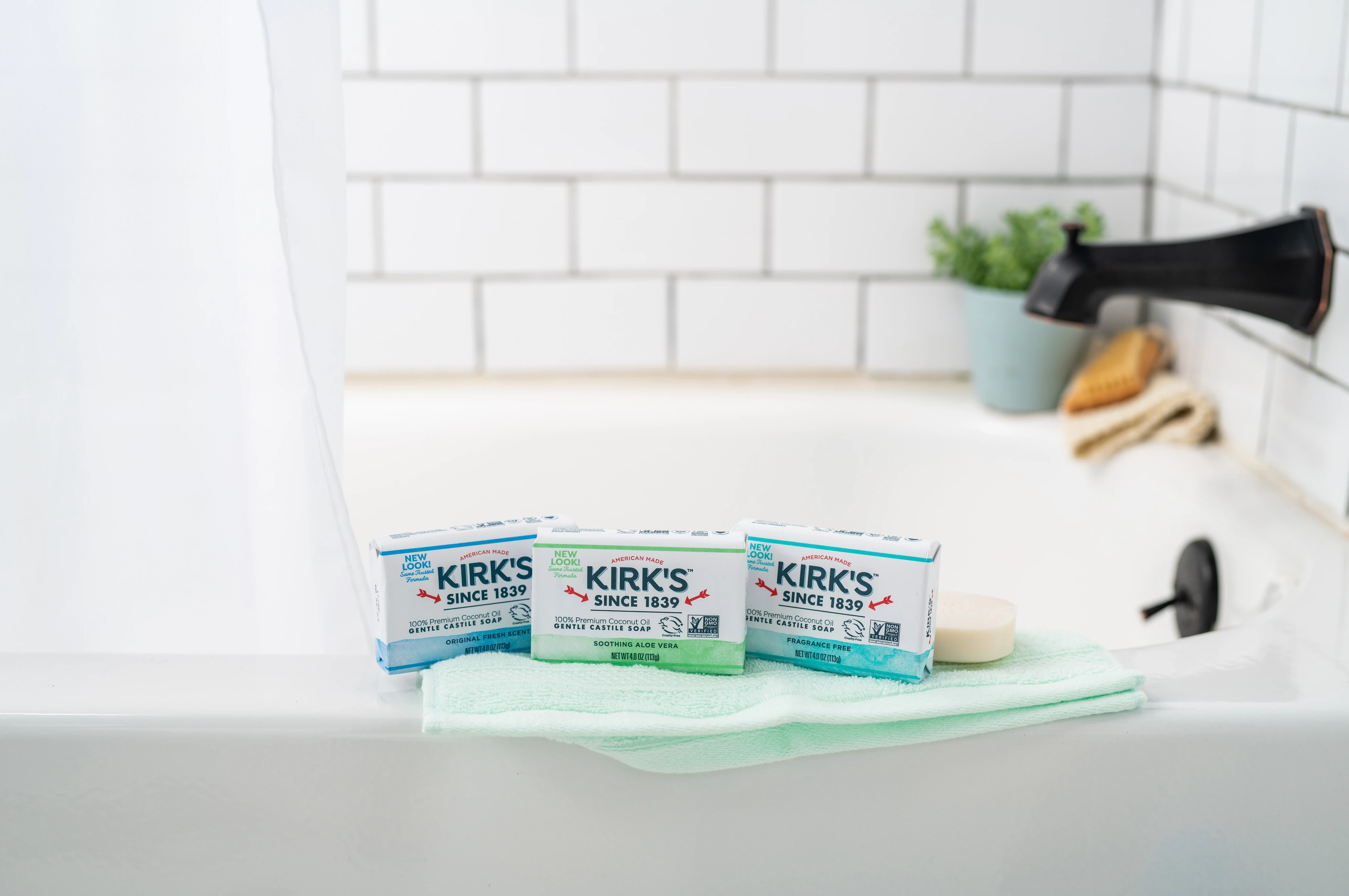
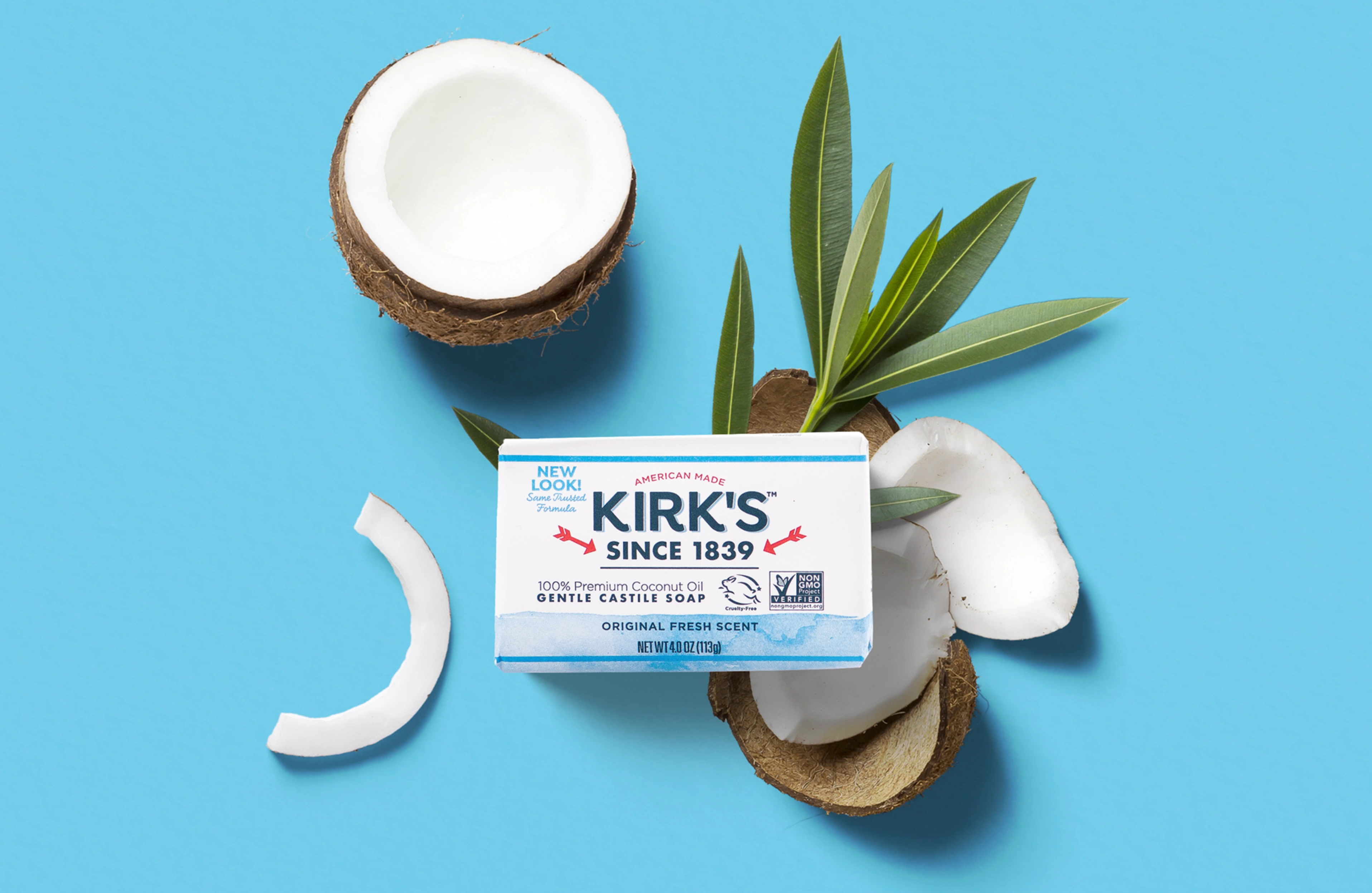
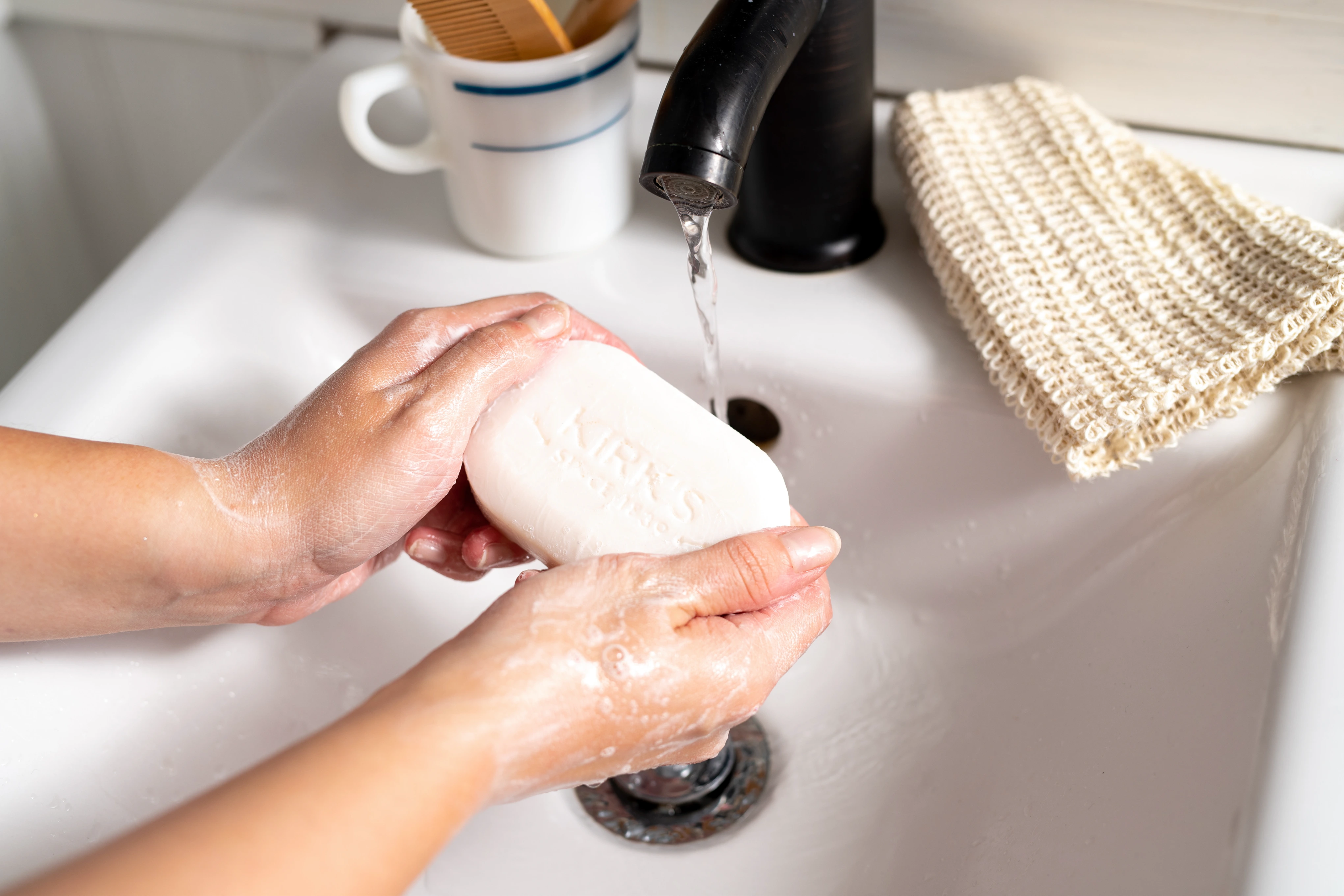
When it comes to designing personal care packaging and on-shelf performance, the brand focus for Kirk's is a simple clean for generations. The color blocking quickly draws consumer eyes to retail shelves and effectively communicates fragrance, while the soft water color texture speaks to the gentle, family-friendly formula. This collection of work showcases strategic brand refreshing, focused packaging design across different substrates, as well as beautifully executed brand-specific product photography.
Like this project
Posted Oct 26, 2023
This collection of work showcases strategic brand refreshing, focused packaging design across different substrates, as well as beautifully executed photography.
Likes
0
Views
14