Quiet Hollow Candle Packaging Design
Victor Abayomi✦
Quiet Hollow — Candle Packaging Design
Overview
Quiet Hollow is a premium candle brand inspired by stillness, nature, and emotional retreat. The goal was to build a packaging system that positions the product not as a candle, but as an atmosphere — one that earns its place on a design-conscious consumer's shelf and delivers on the promise of quiet luxury from the moment they pick it up.
The Challenge
The premium candle market is crowded with brands that rely on predictable botanical imagery, generic serif type, and recycled "natural" aesthetics. Quiet Hollow needed packaging that felt genuinely distinct — communicating calm and warmth without defaulting to the visual clichés that fill the category. The design had to feel premium without over-ornamentation, and emotionally resonant without being vague.
Design Direction
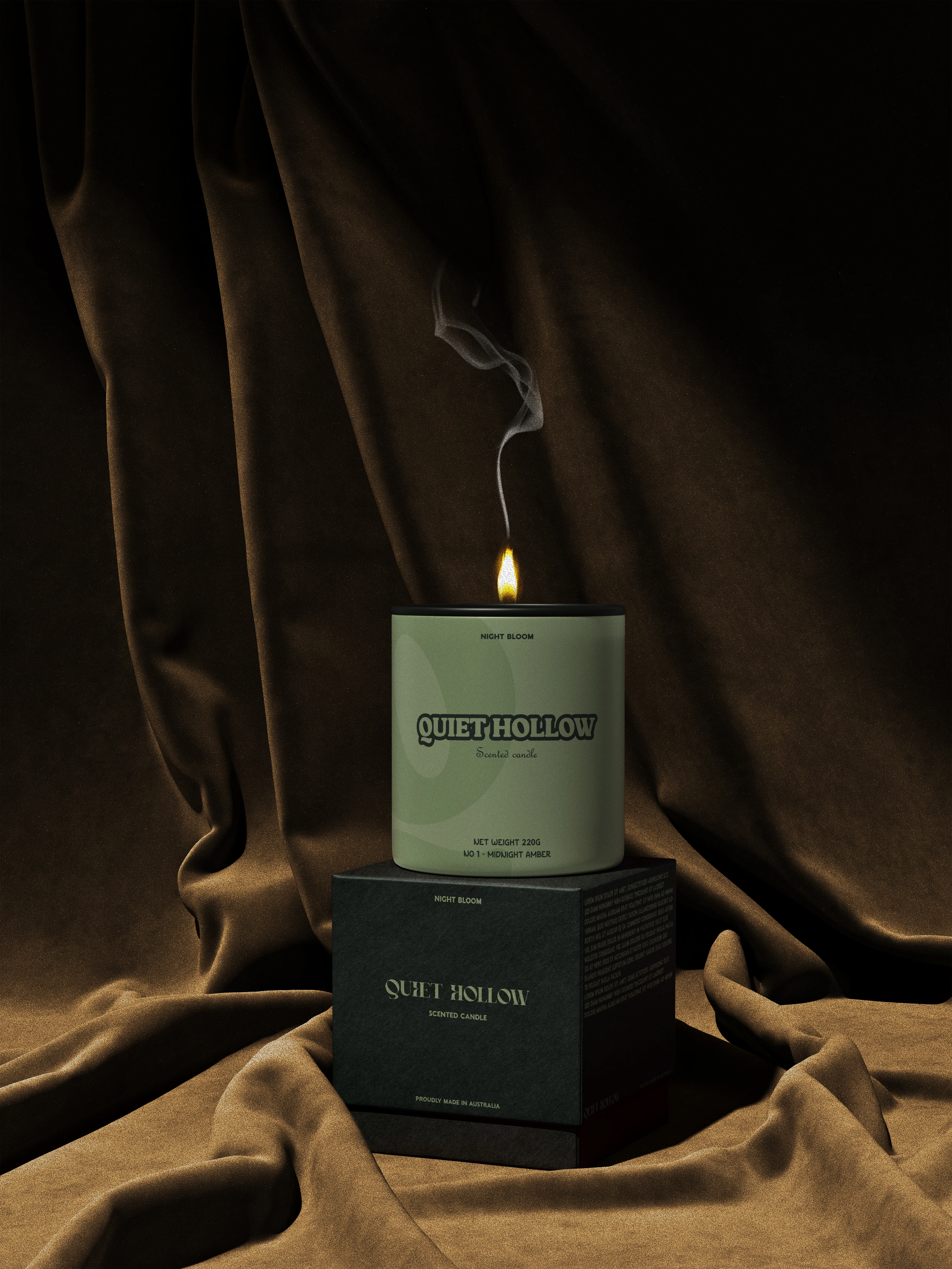
Visual Identity — The visual language centers on simplicity and emotional restraint. Rather than decorating the surface, the system uses negative space, intentional typography hierarchy, and considered placement to create a sense of quiet confidence. The packaging doesn't compete for attention — it earns it.
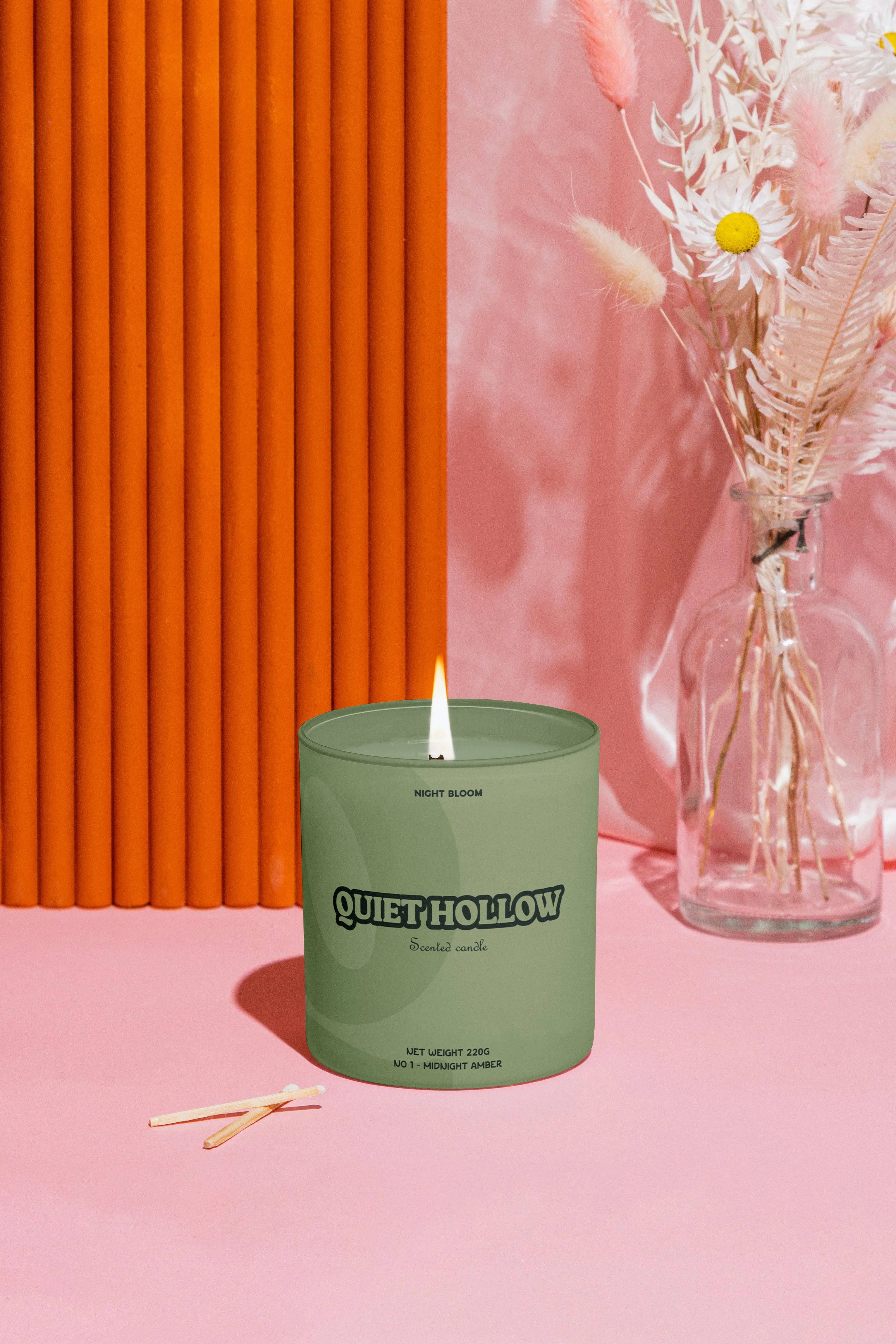
Color System — The palette draws from muted, atmospheric tones: deep forest greens, warm off-whites, and rich earth neutrals. Each color was chosen to evoke a specific sensory state — the smell of damp forest floor, the warmth of a single candle in a dark room, the stillness of late evening.
Typography — A refined editorial serif for the primary wordmark communicates elegance and calm. It is paired with a minimal secondary face for ingredient and product information, ensuring clarity without visual noise. Together they reinforce Quiet Hollow's positioning as a luxury lifestyle brand — precise, considered, and unhurried.
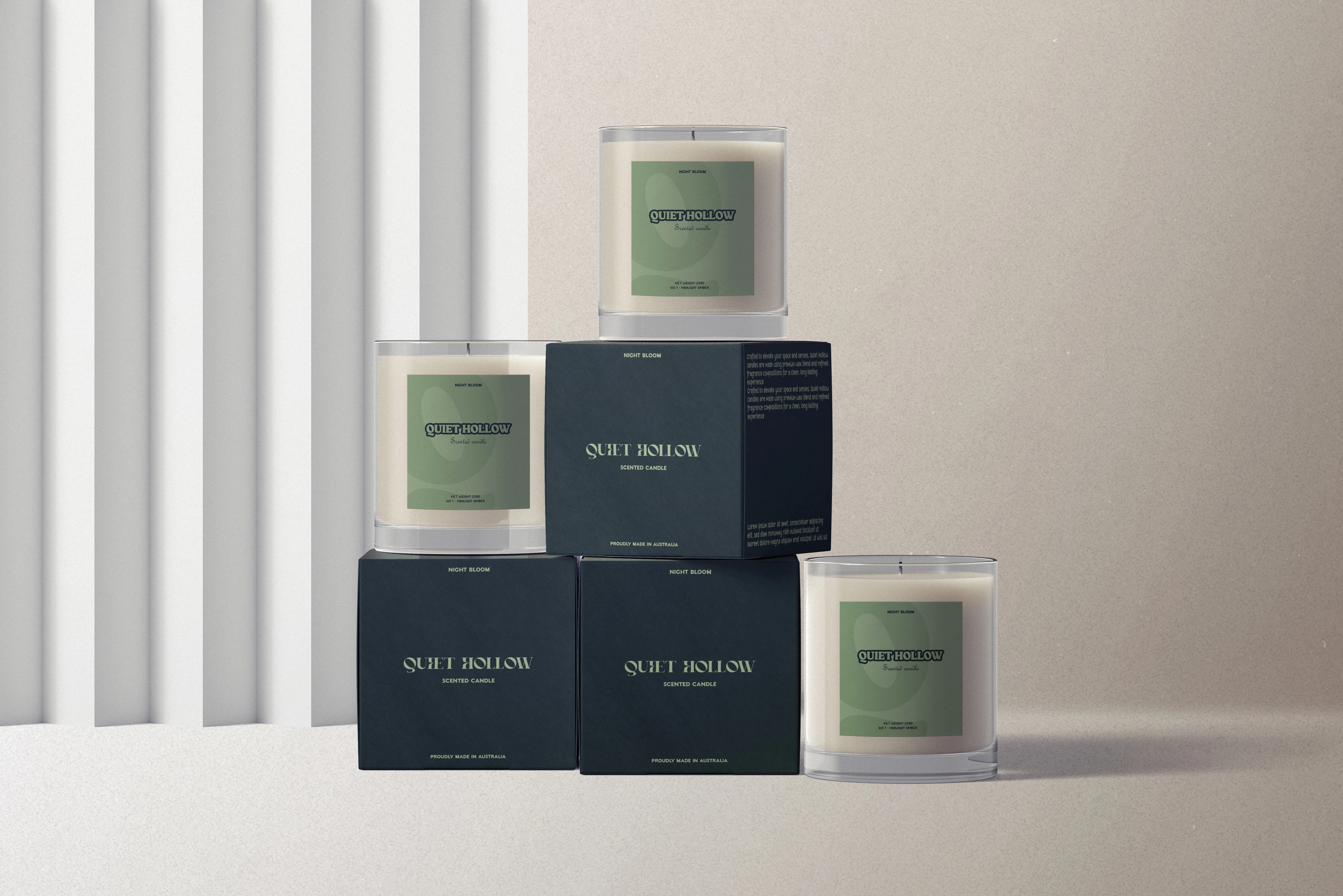
Packaging Experience — The packaging is designed for both shelf impact and unboxing intimacy. Strong shelf presence is achieved without loudness. The unboxing moment is layered — the exterior is restrained, the interior finish rewards the consumer who takes their time. Every surface earns its detail.
Outcome
Quiet Hollow's packaging system established a distinctive visual territory in the premium candle space — one built on emotional restraint rather than surface decoration. The final system is timeless and scalable across product extensions, making it a strong foundation for brand growth into new scent lines, seasonal editions, and gifting formats.
Like this project
Posted Feb 16, 2026
Premium candle packaging designed around stillness — a visual system built to communicate calm, warmth, and quiet luxury from the shelf to the unboxing.