Branding + Packaging — La Boîte à Malt
Mélissa Roy
Project
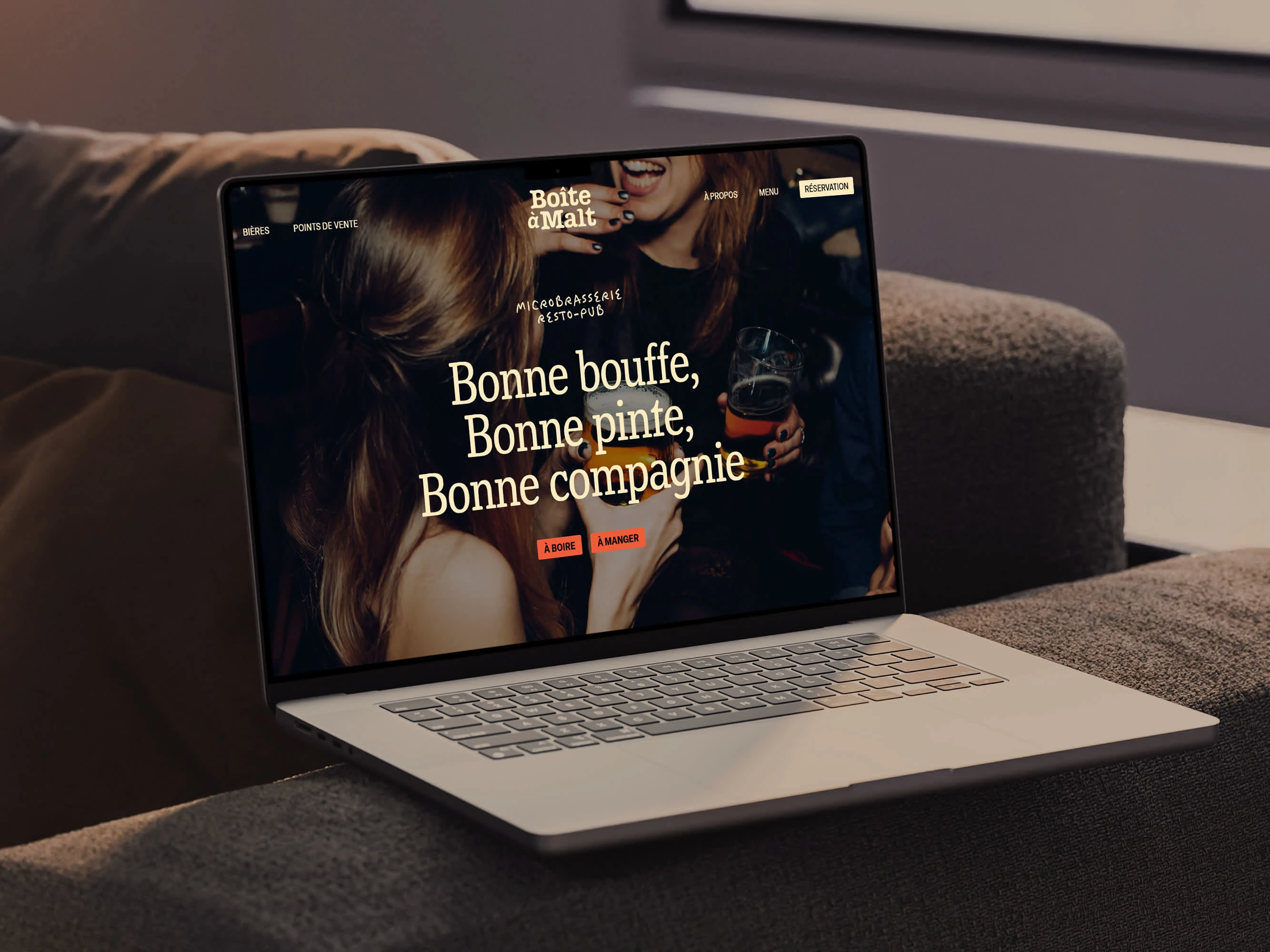
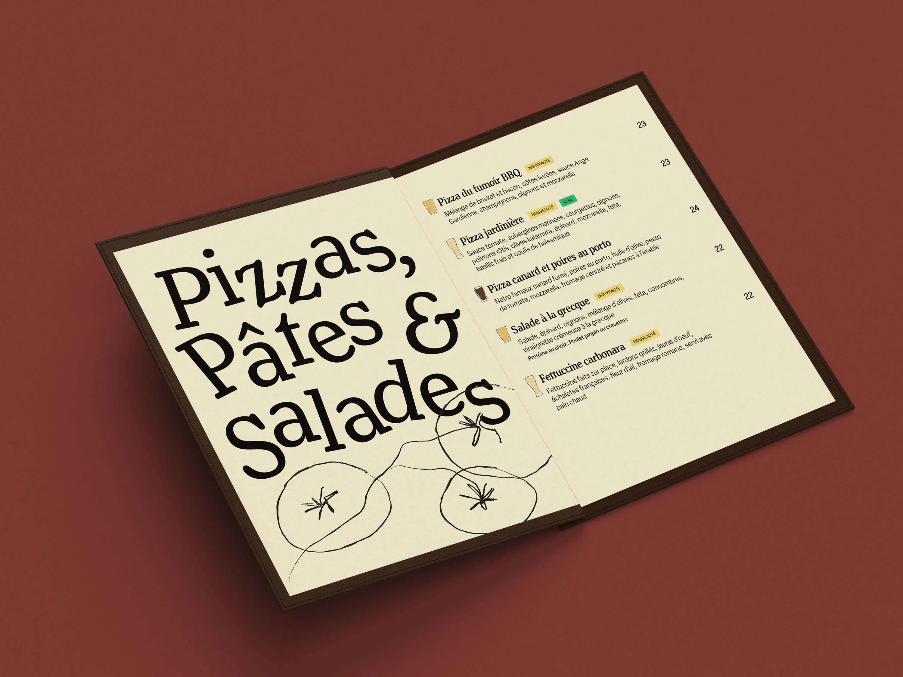
La Boîte à Malt is a microbrewery and resto-pub. This personal exploration aims to modernize the brand image while preserving its heritage and reorienting the approach to put the consumer at the center of the experience.
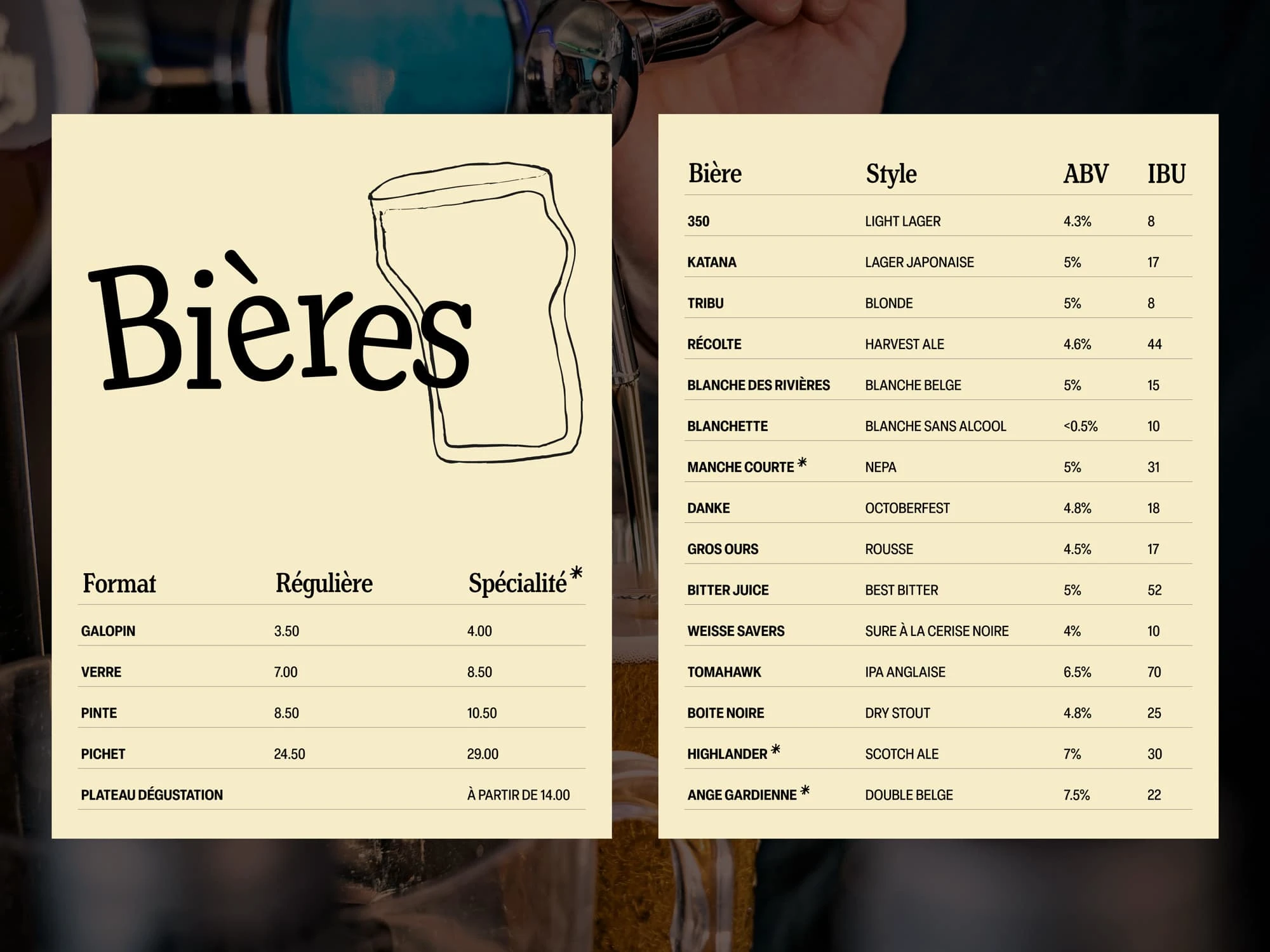
Visual identity
The redesign highlights the care taken in product quality, the passion for craftsmanship, and the pleasure of flavors. The visual territory is rooted in the artisanal and industrial character of the microbrewery and smokehouse, as well as in the good times spent in good company. The combination of these two aspects creates the opportunity to add a handmade touch, thus creating a distinctive universe for La Boîte à Malt.
The microbrewery also hosts comedy and music events. This festive spirit will be reflected in the brand's aesthetic. Overall, the visual universe exudes a warm atmosphere that invites you to slow down and enjoy the moment.
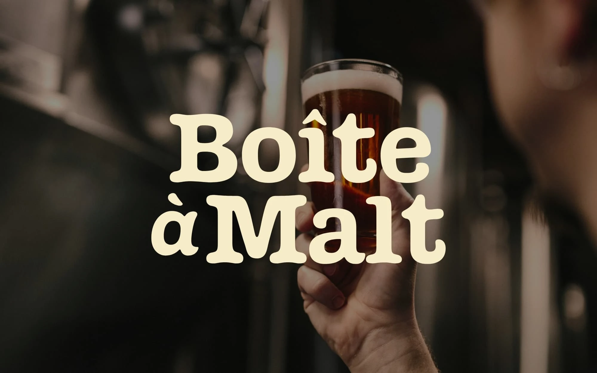
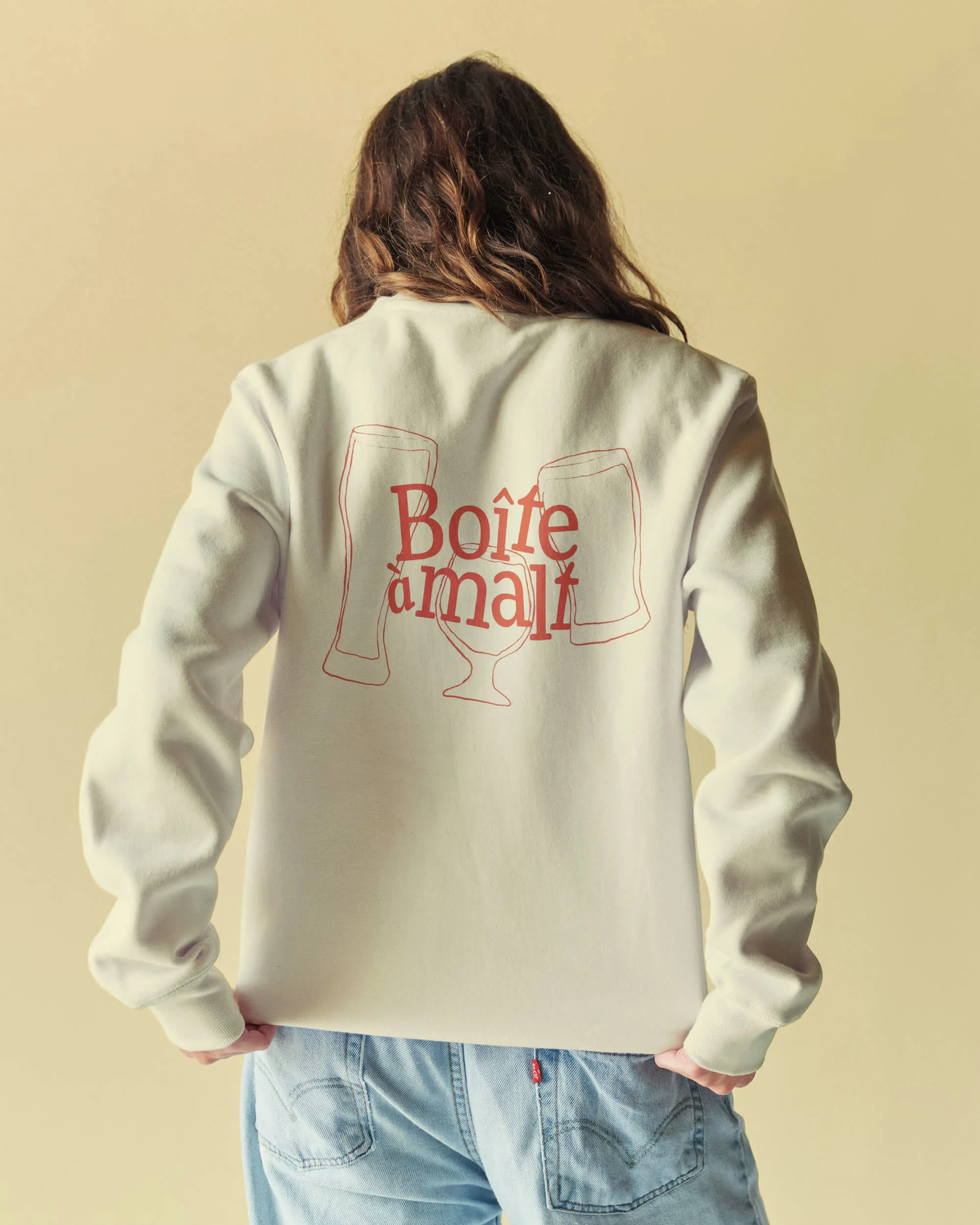
Logo
The typewriter logo has a playful touch that combines industrial elements with a friendly feel. The symbol strikes a similar balance between these two aspects, thanks to the mix of straight lines and curves. These modern designs with nostalgic accents combine originality and familiarity.
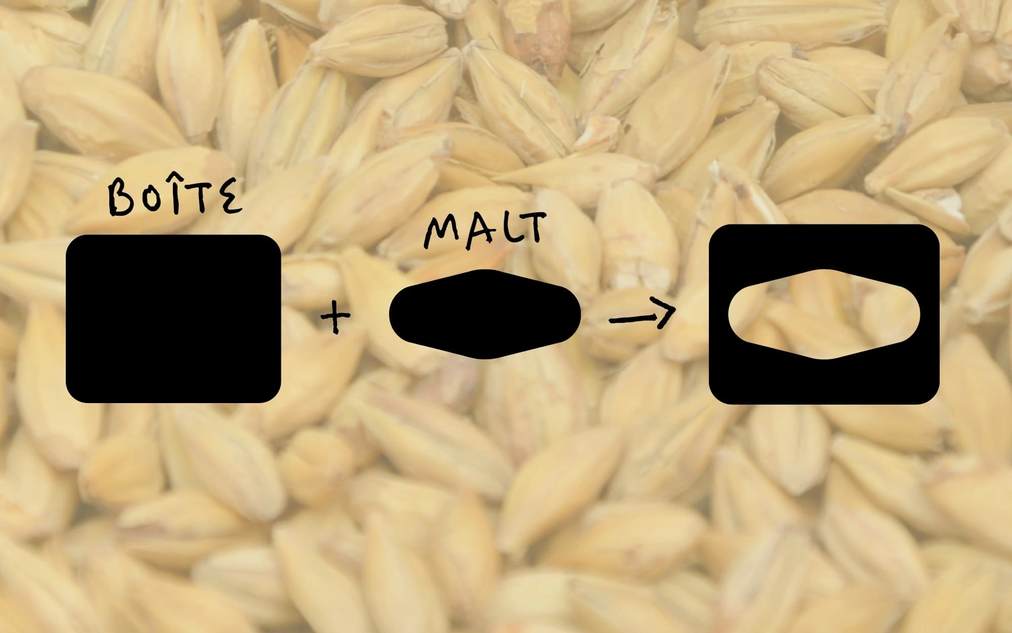
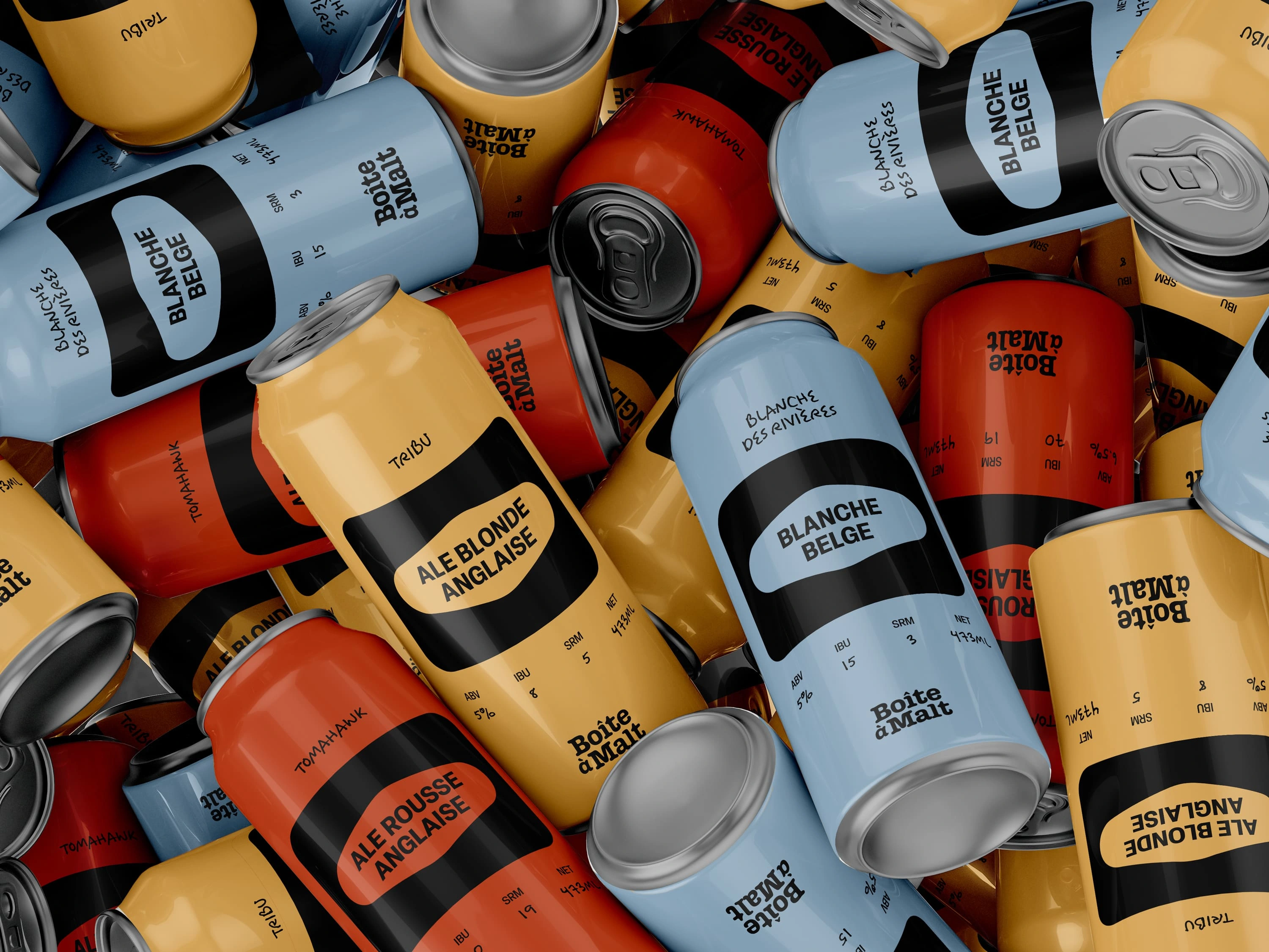
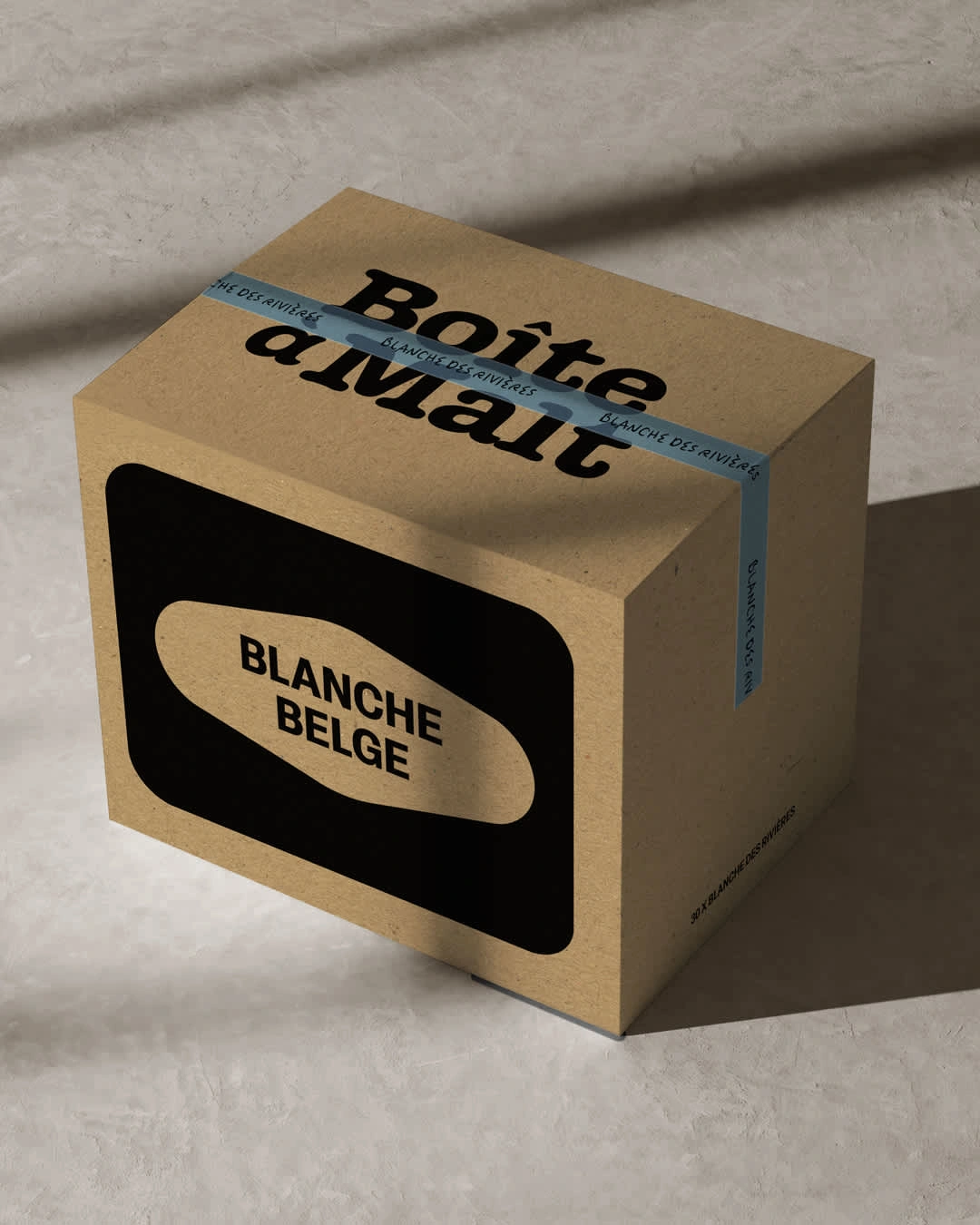
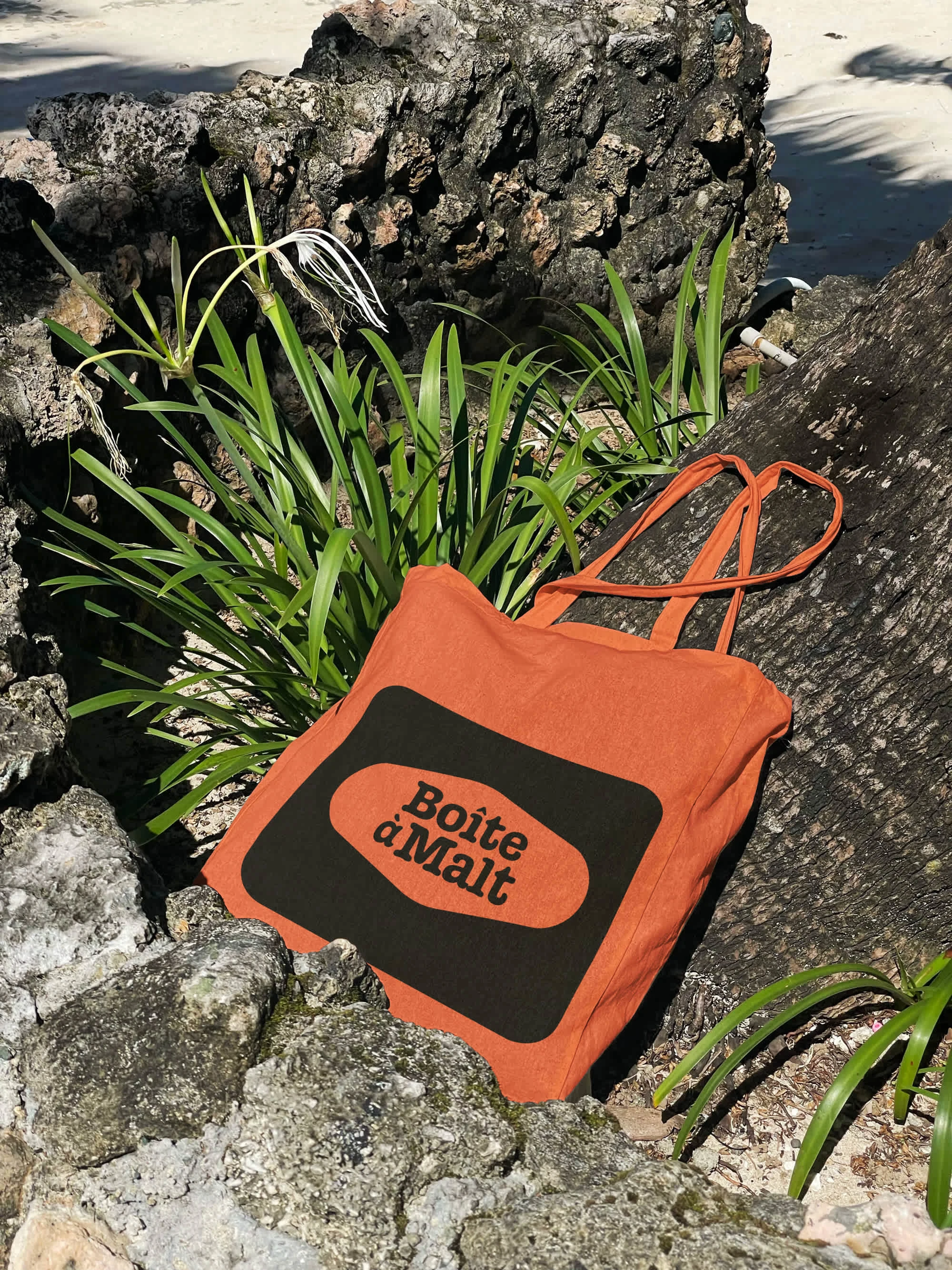
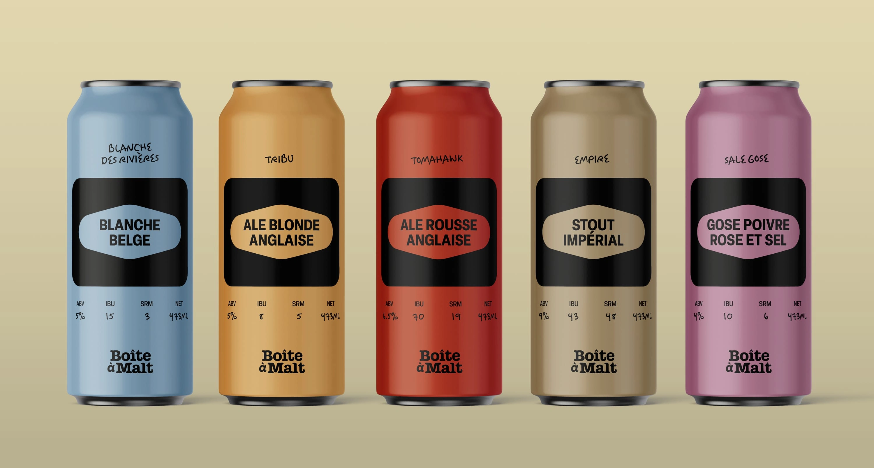
Packaging
The microbrewery beer market is highly creative and presents a lot of visual noise on the shelves. Inspired by the minimalism of vintage beers, the goal is to return to the essentials with simplicity.
Prioritizing the beer type and its characteristics appeals to connoisseurs and piques the curiosity of novices. The repeated use of black and the symbol to highlight the beer type reinforces recognition and creates an impact on the shelf. The retro colour palette creates an authentic and relaxed atmosphere.
Like this project
Posted Apr 24, 2025
Refreshing La Boîte à Malt's branding, focusing on the essence of the business and the customer experience.