Sonet Creative Media Brand Guidelines

Kelechi Isinwa


Brand Overview
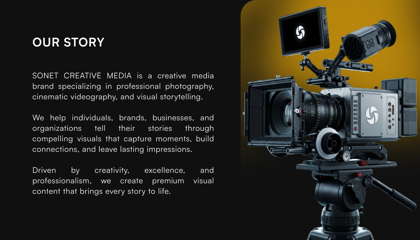
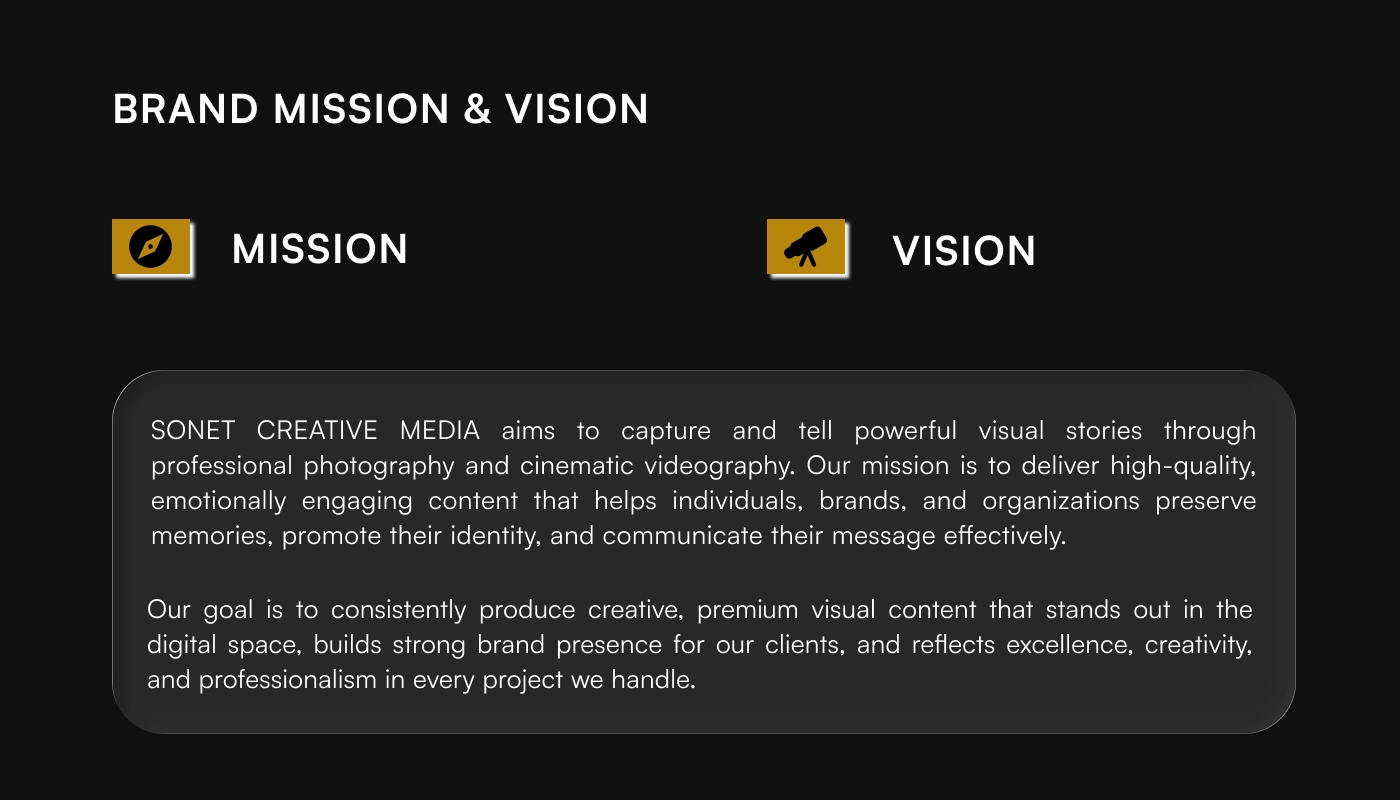
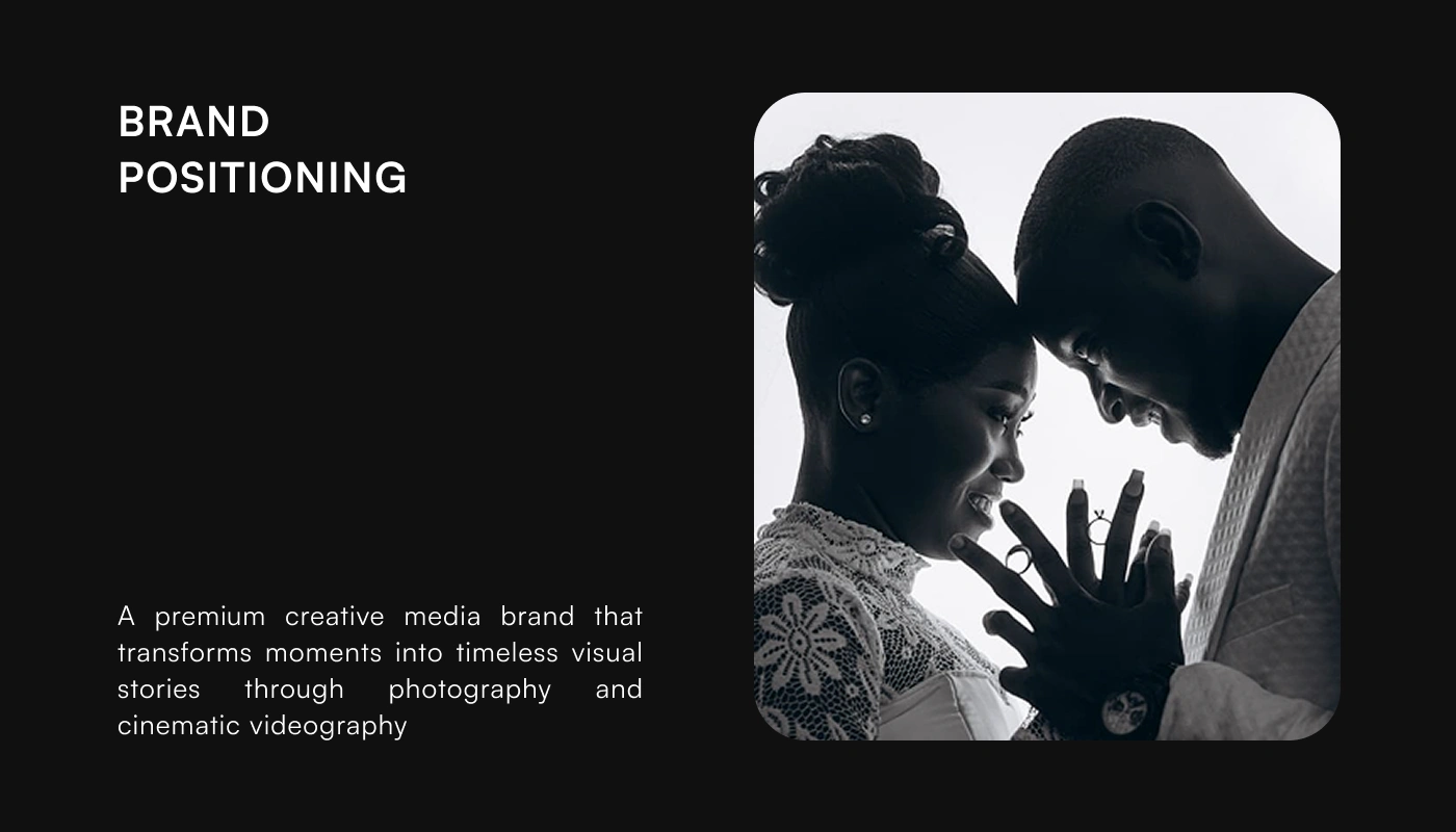
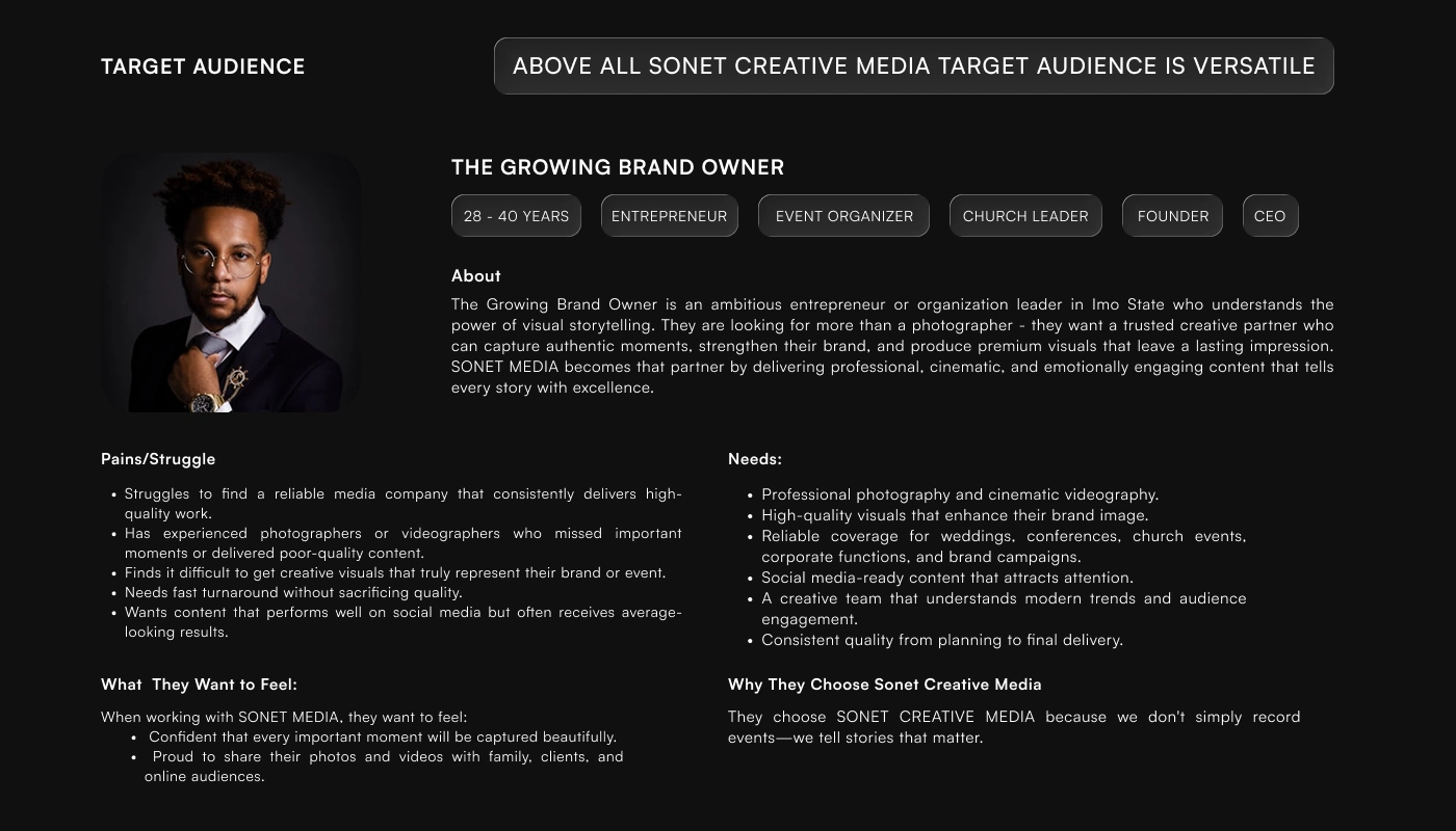
Every successful brand begins with a clear strategy. Before designing, I explored Sonet Creative Media's purpose, audience, positioning, and competitive landscape to understand what truly sets the brand apart.
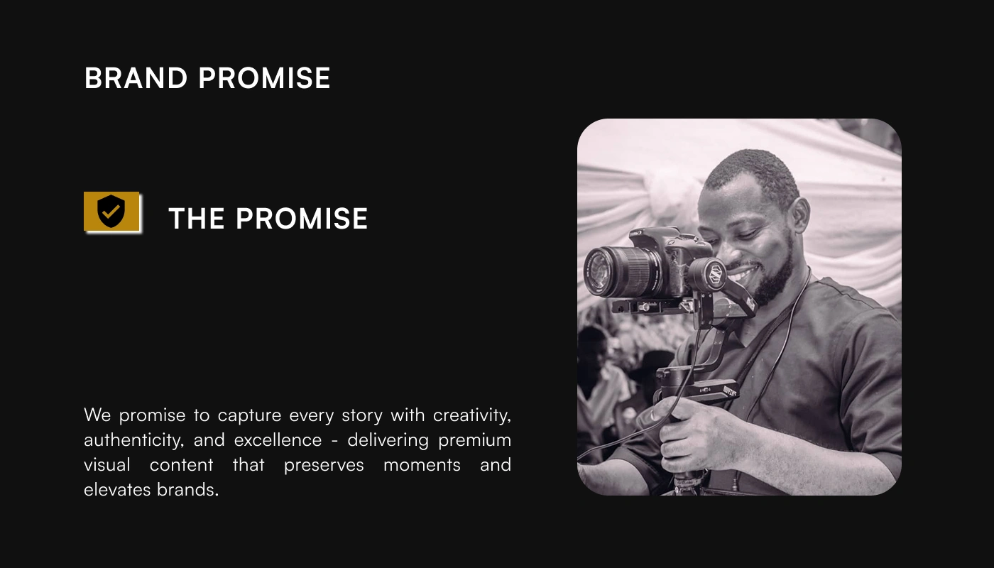
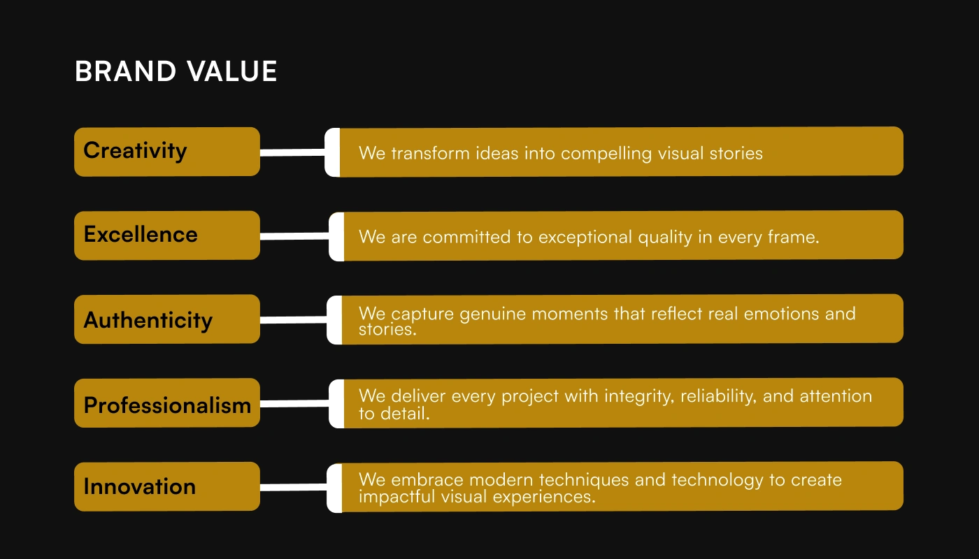
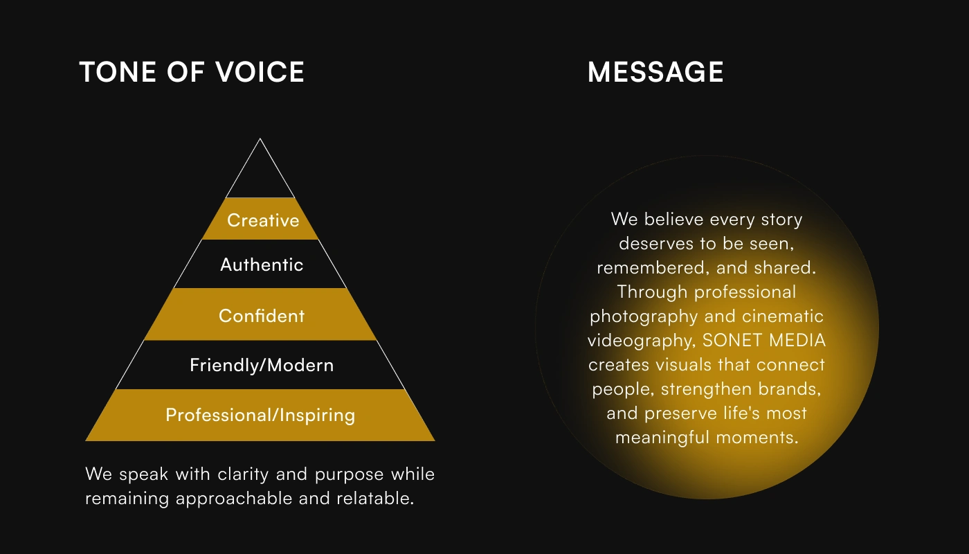
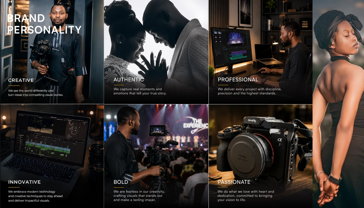
The objective was to develop an identity that communicates creativity, professionalism, and authenticity while establishing a distinctive presence in the creative media industry. Rather than creating isolated visuals, the focus was on building a cohesive identity system that supports long-term brand recognition and consistency.
Logo
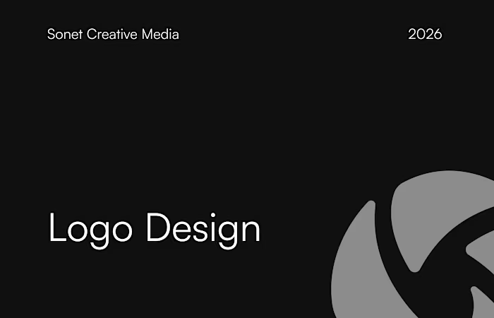
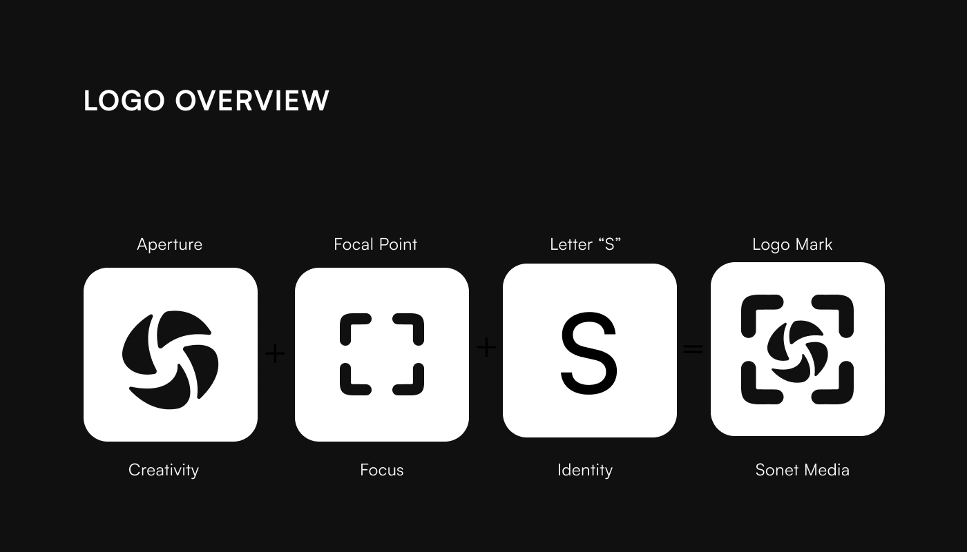
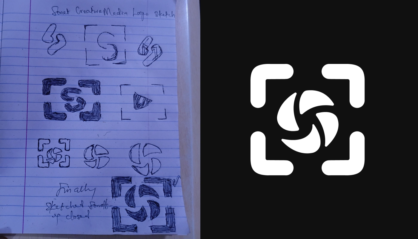
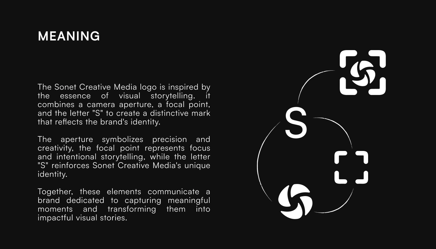
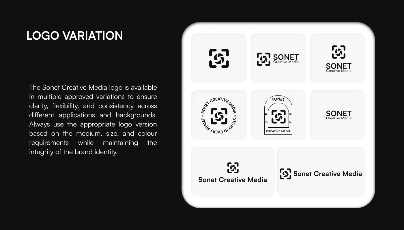
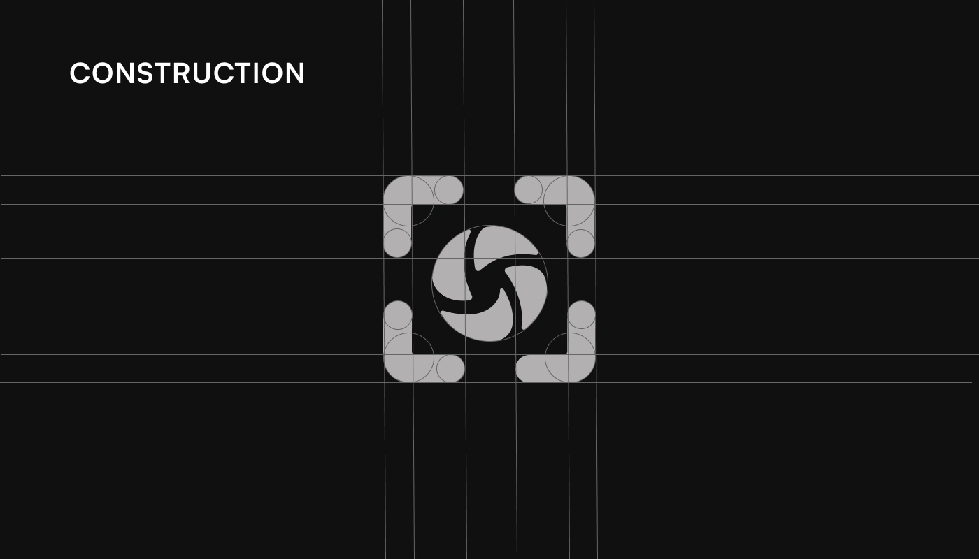
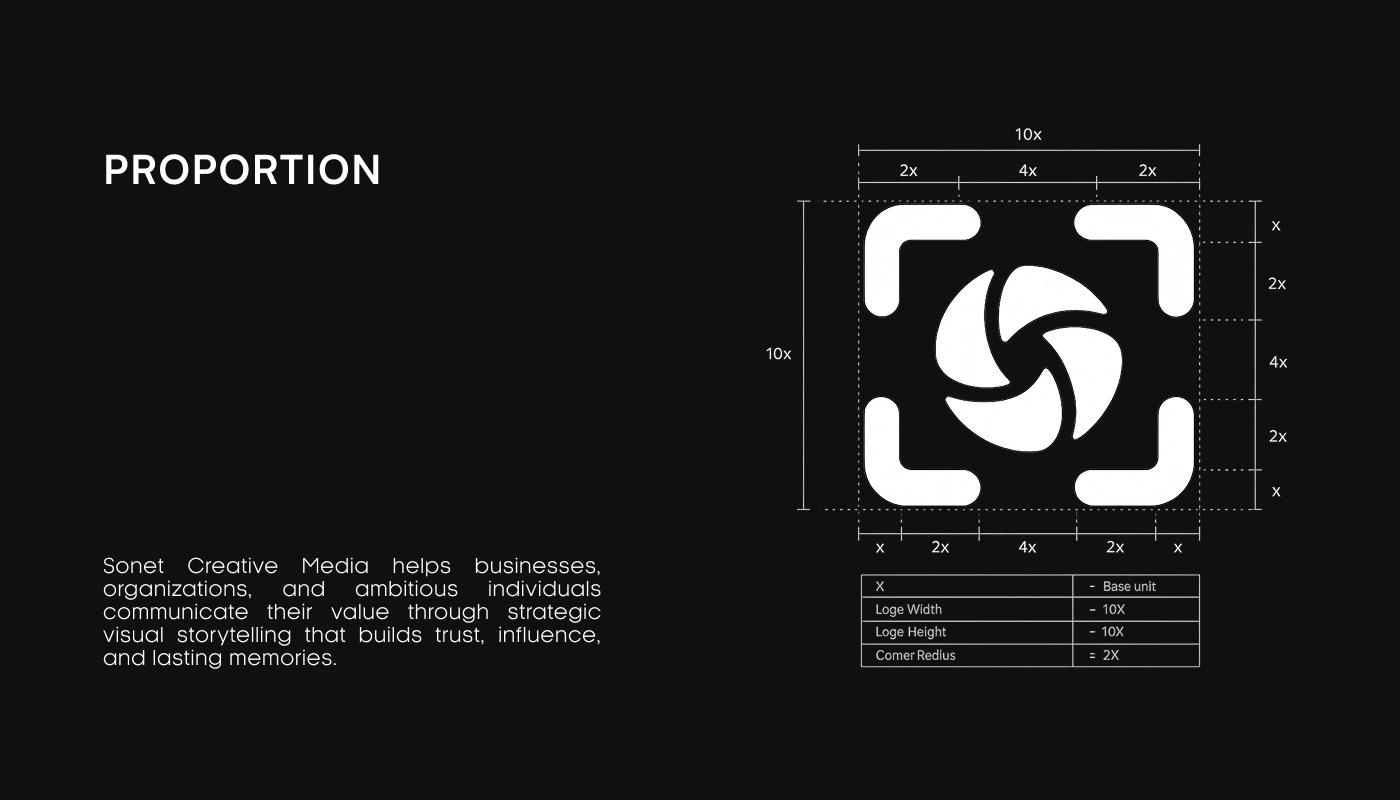
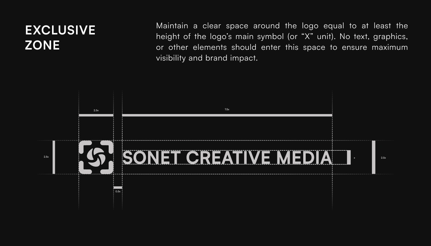
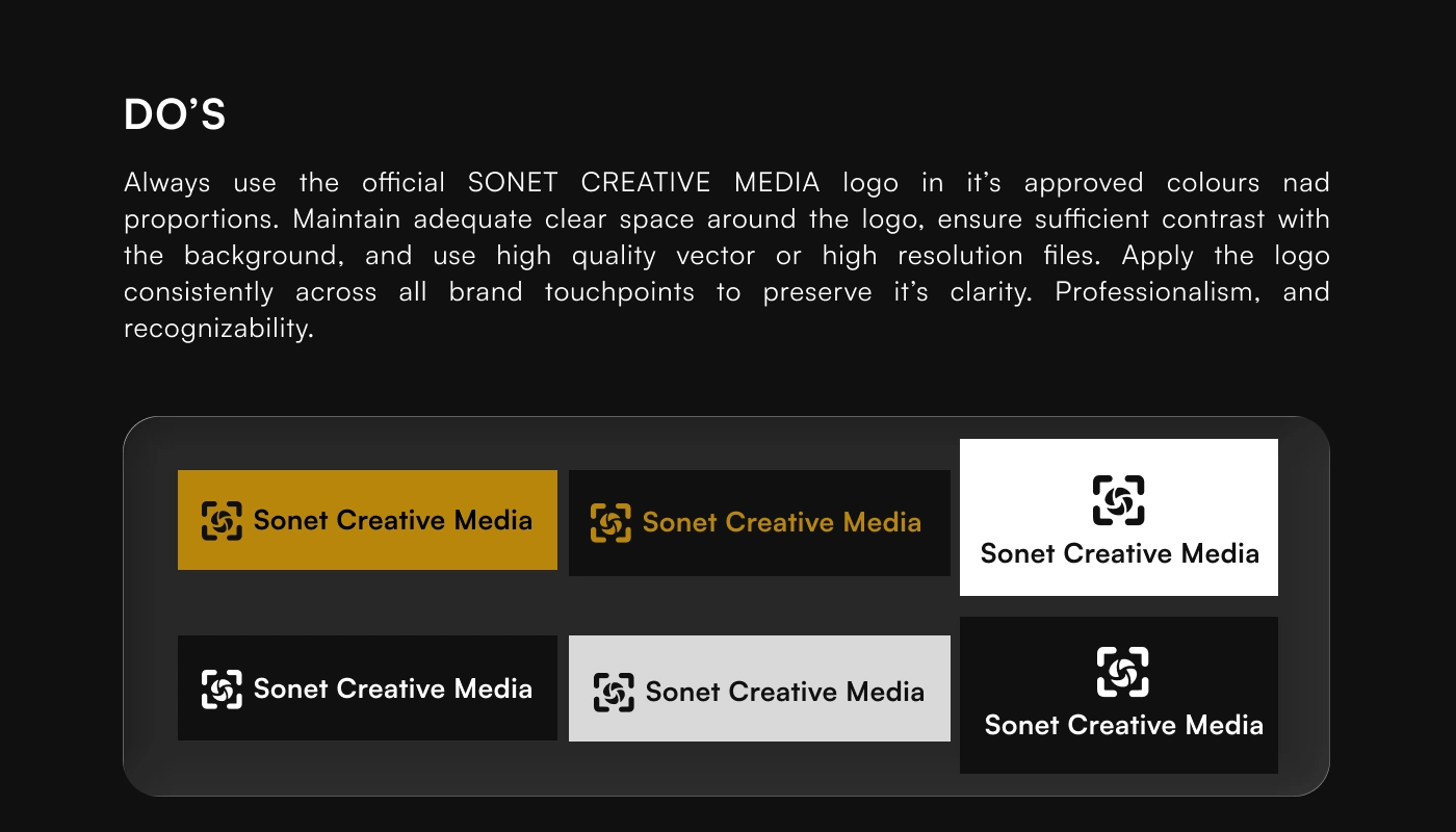
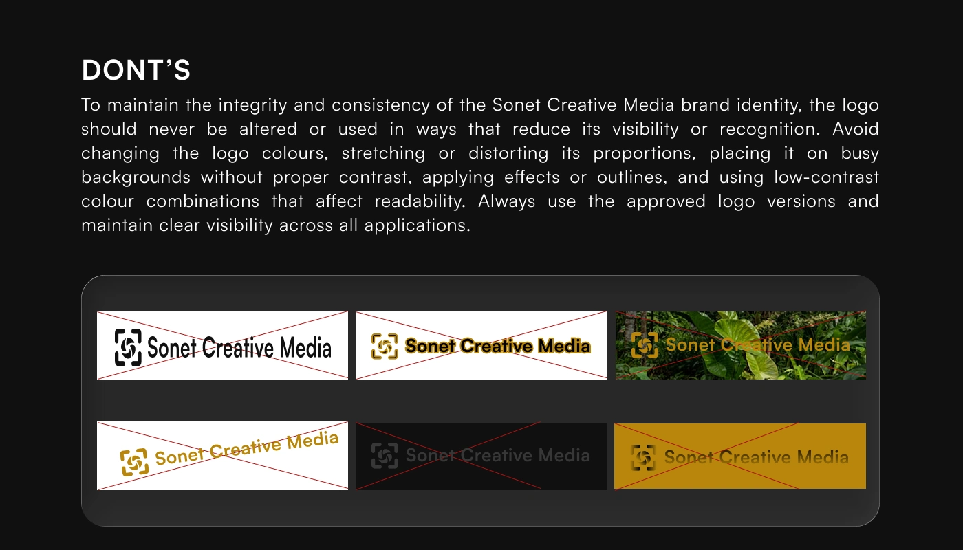
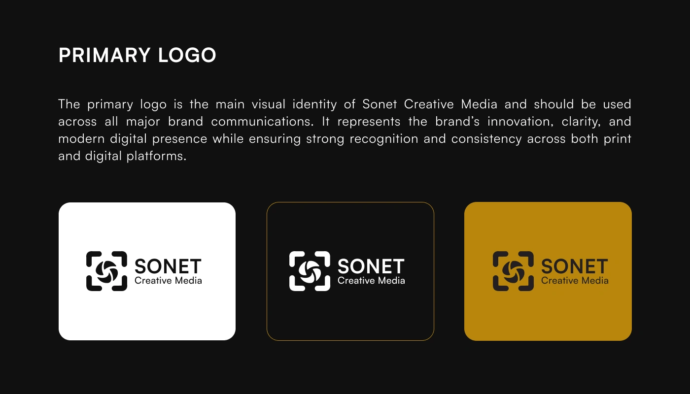
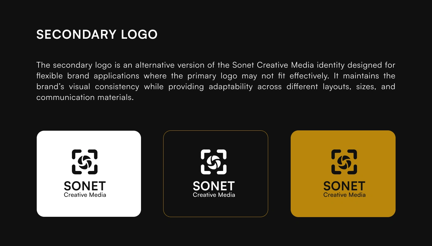
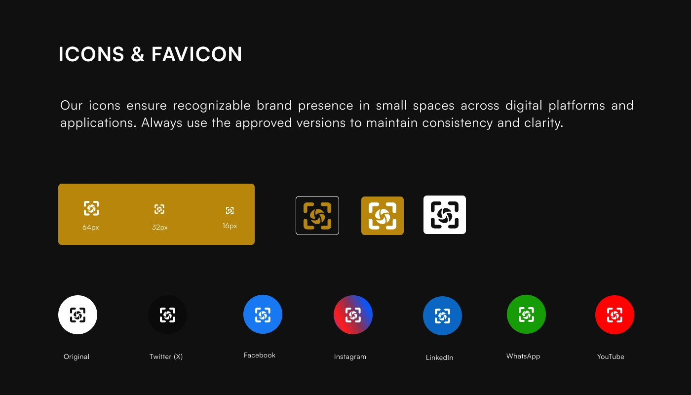
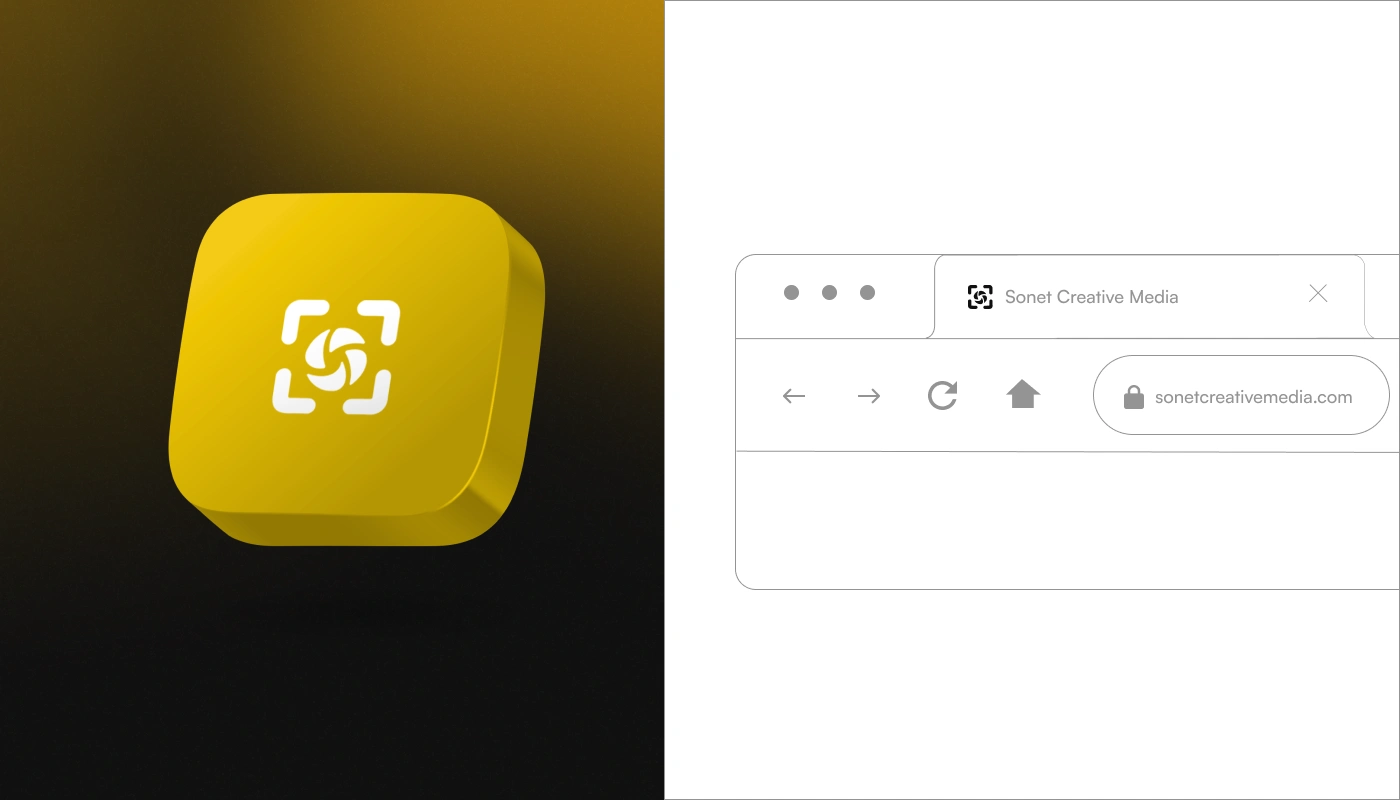
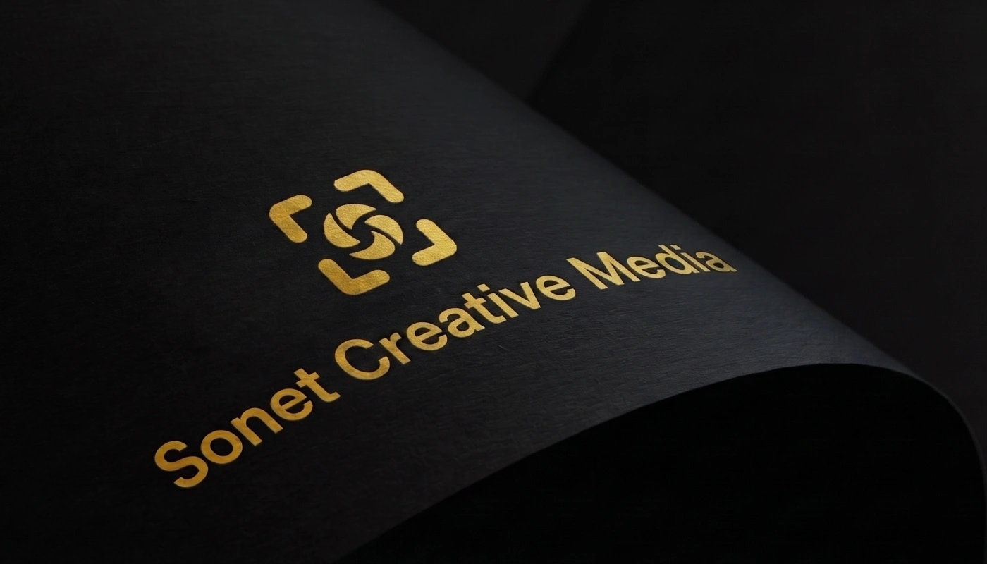
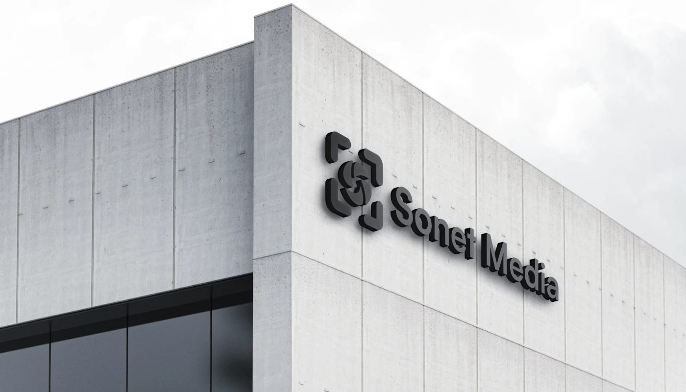
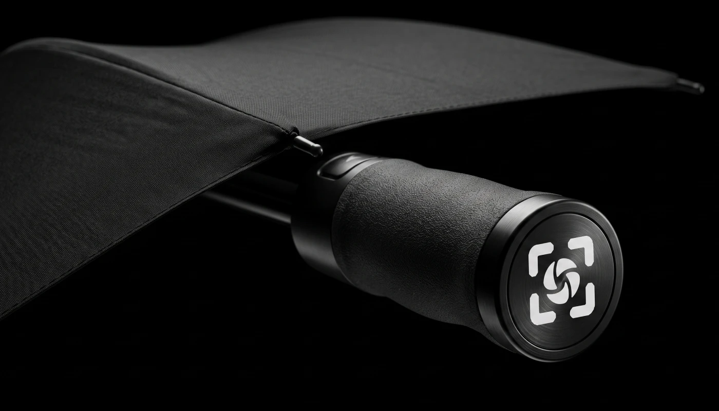
The logo was designed as a visual representation of Sonet Creative Media's core purpose—capturing stories with precision and creativity. The mark combines three meaningful elements: a camera aperture, a focal point, and the letter "S," creating a unique symbol that reflects the brand's expertise in photography, videography, and visual storytelling. Every shape was intentionally crafted to ensure simplicity, memorability, and versatility across digital and print applications.
Typography
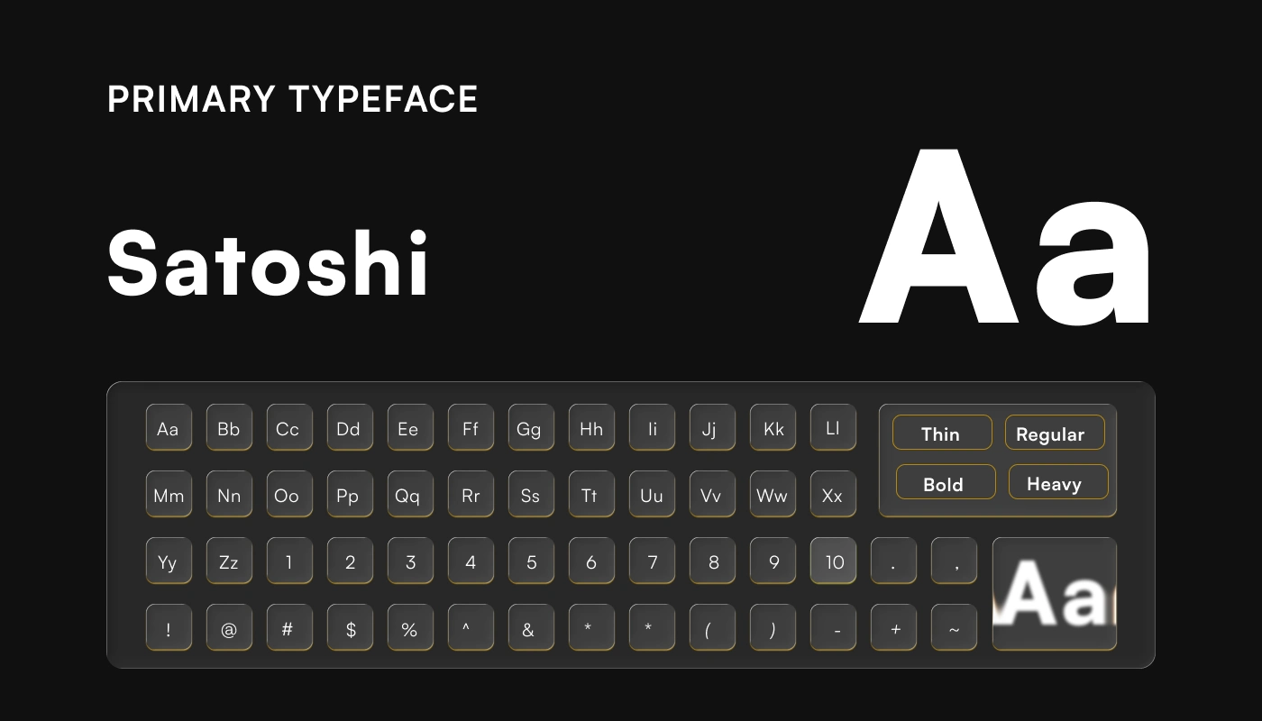
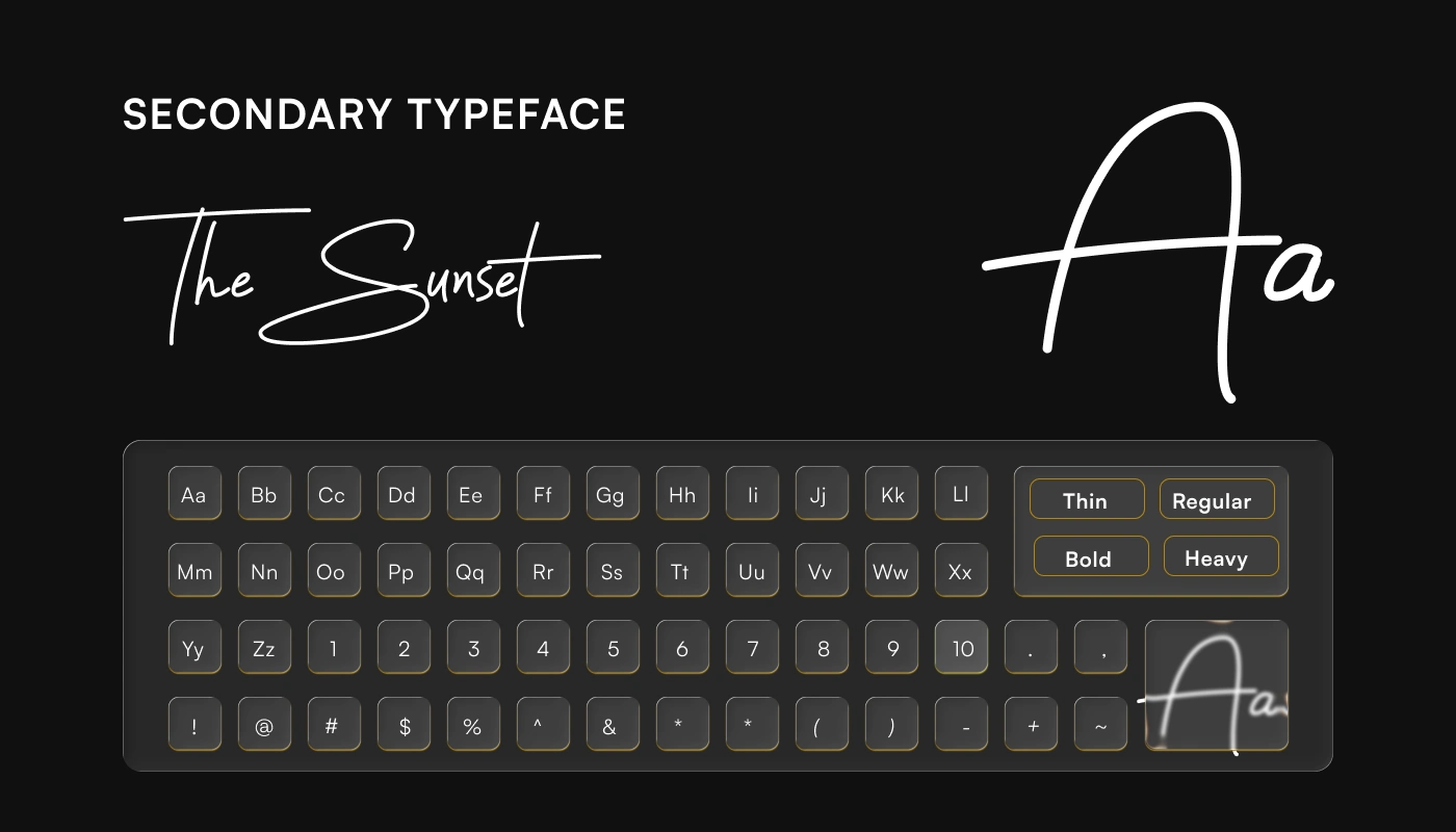
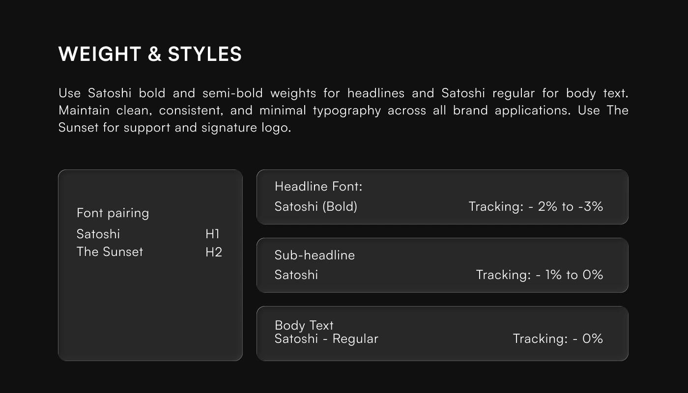
Typography plays a key role in expressing the brand's personality. Satoshi was selected as the primary typeface for its clean, modern, and highly legible appearance, while The Sunset adds a distinctive creative touch where needed. Together, they create a balanced typographic system that feels professional, contemporary, and expressive across all communications.
Colour System
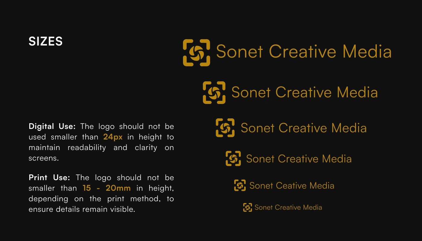
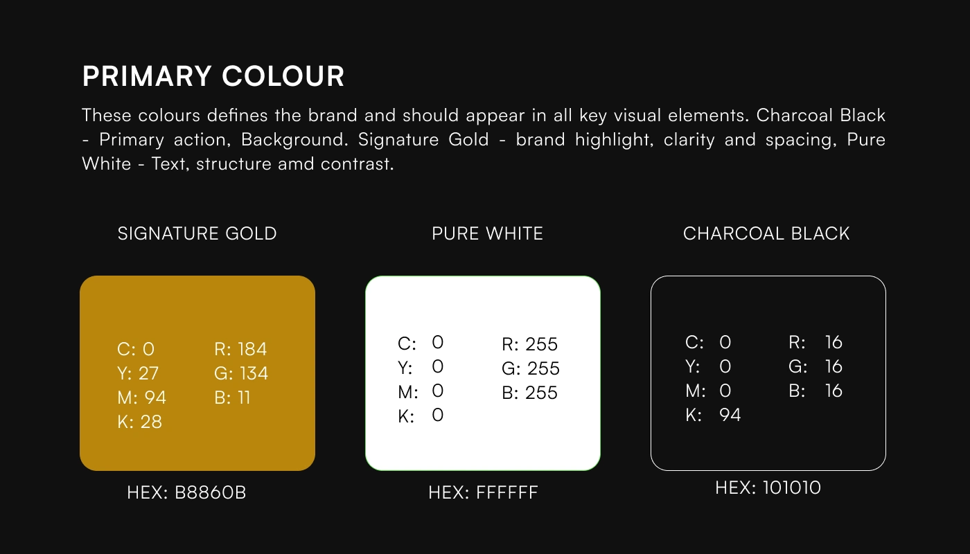
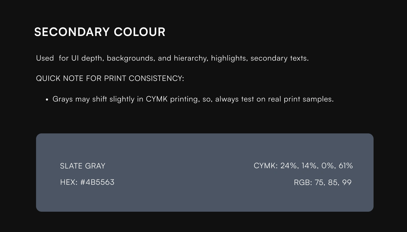
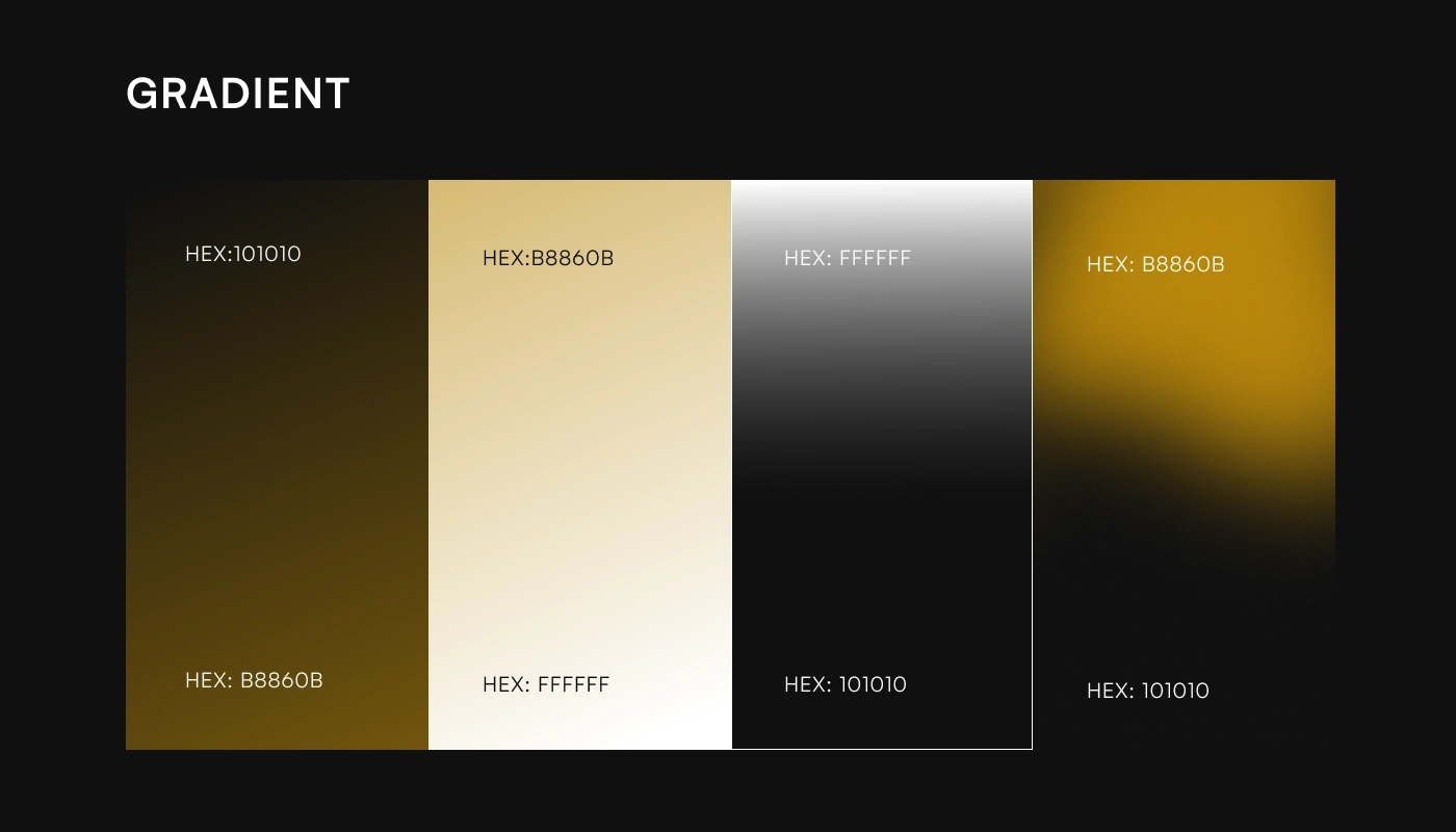
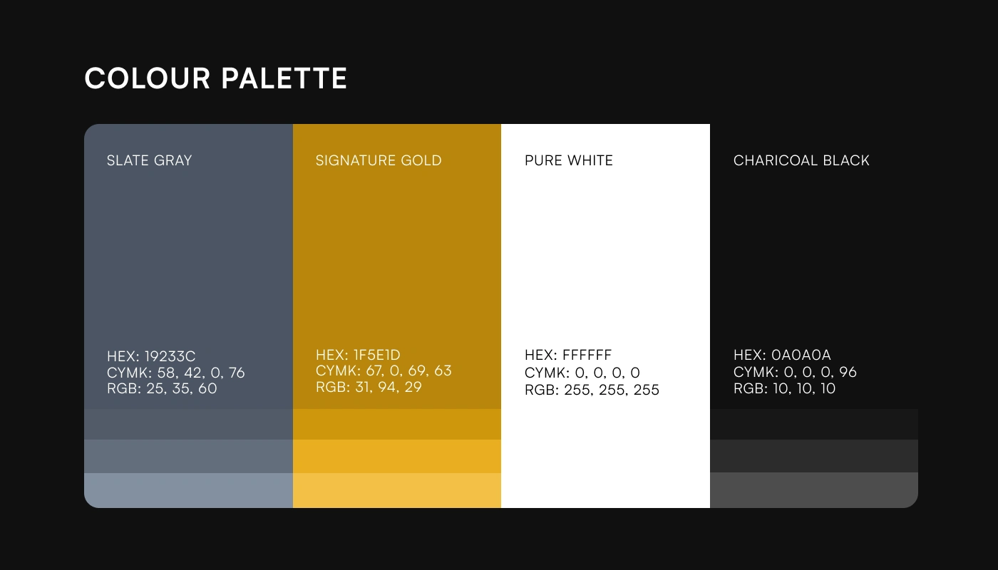
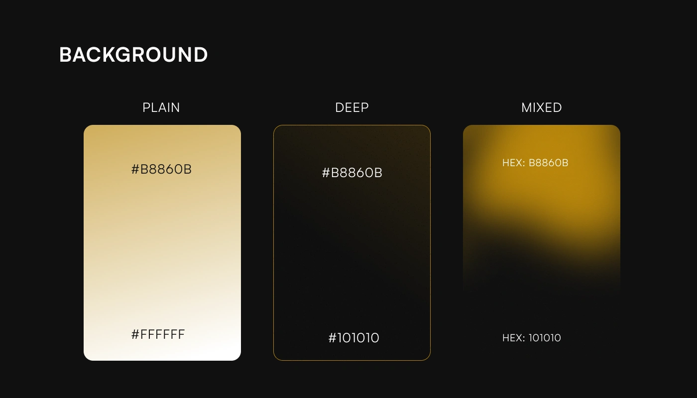
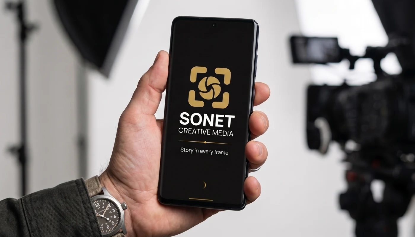
The colour palette was developed to reinforce the brand's positioning. Charcoal Black conveys sophistication and professionalism, Signature Gold represents creativity and premium quality, while Pure White provides clarity and balance. Supporting colours extend the system without compromising consistency, ensuring the identity remains flexible across both print and digital applications.
Visual Identity
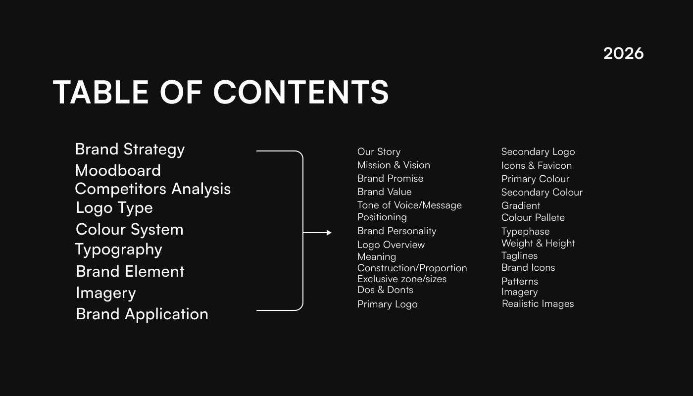
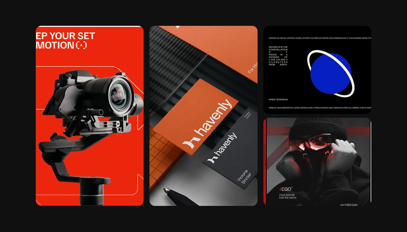
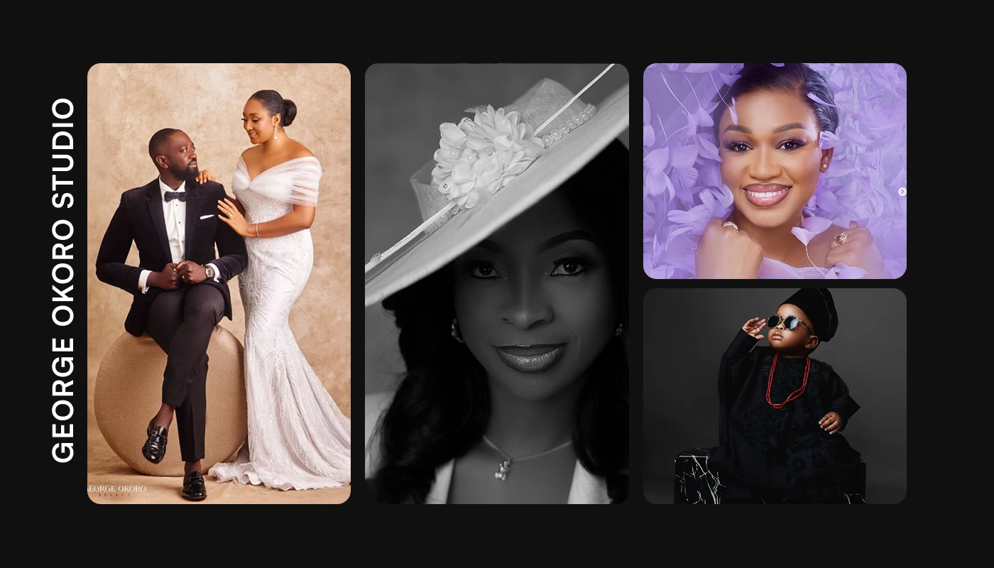
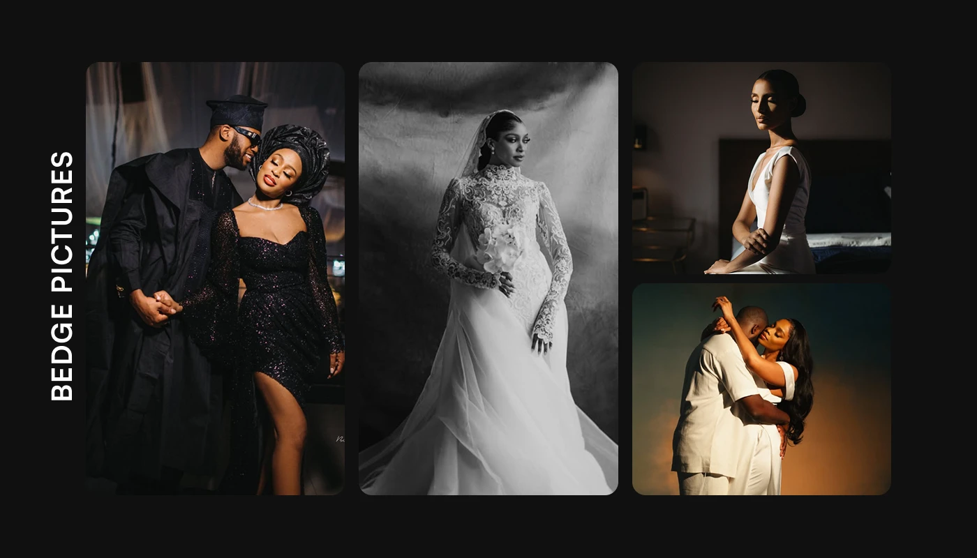
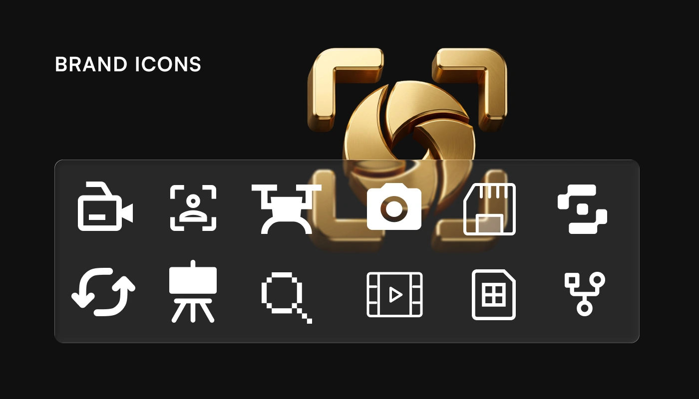
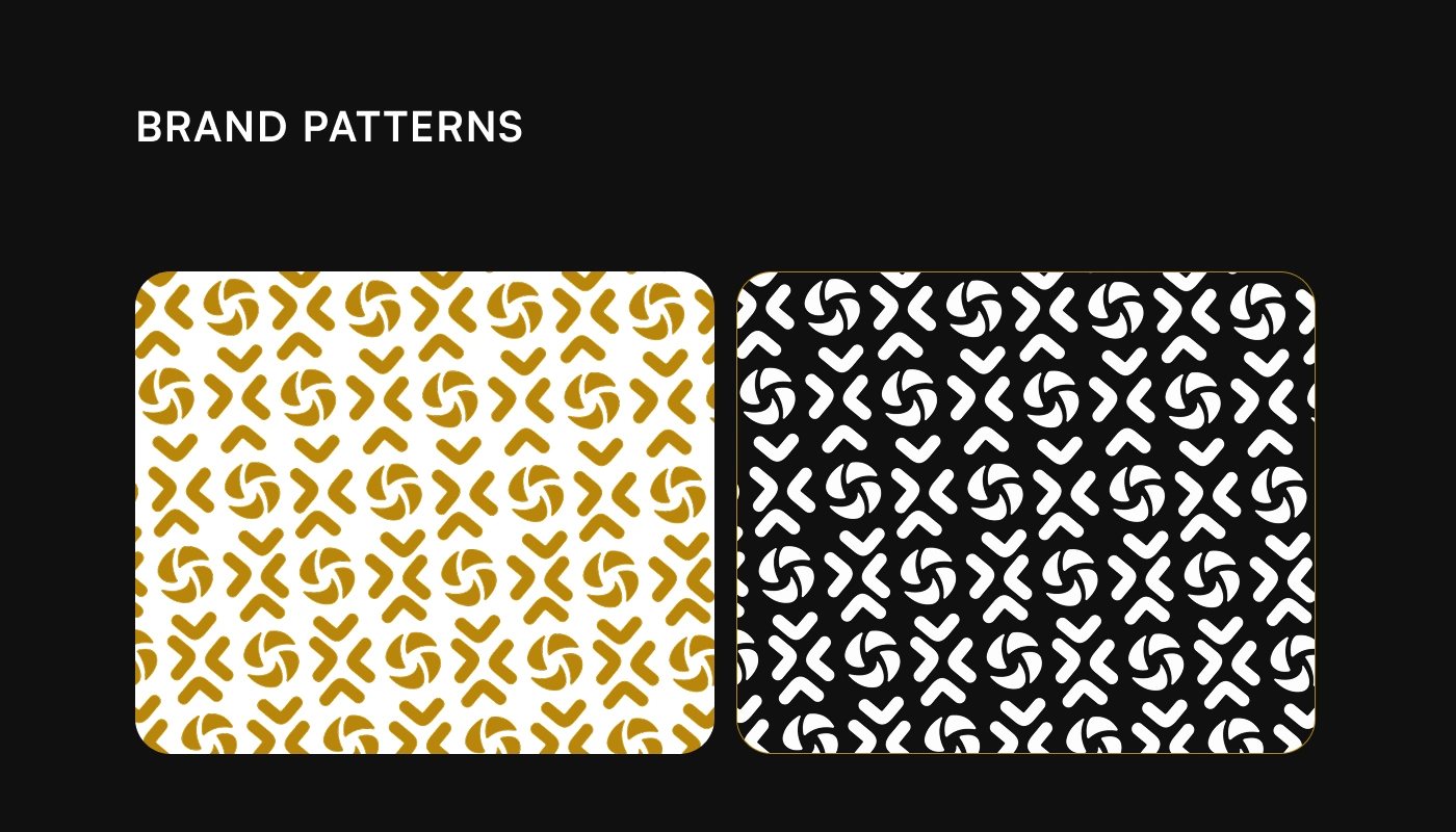
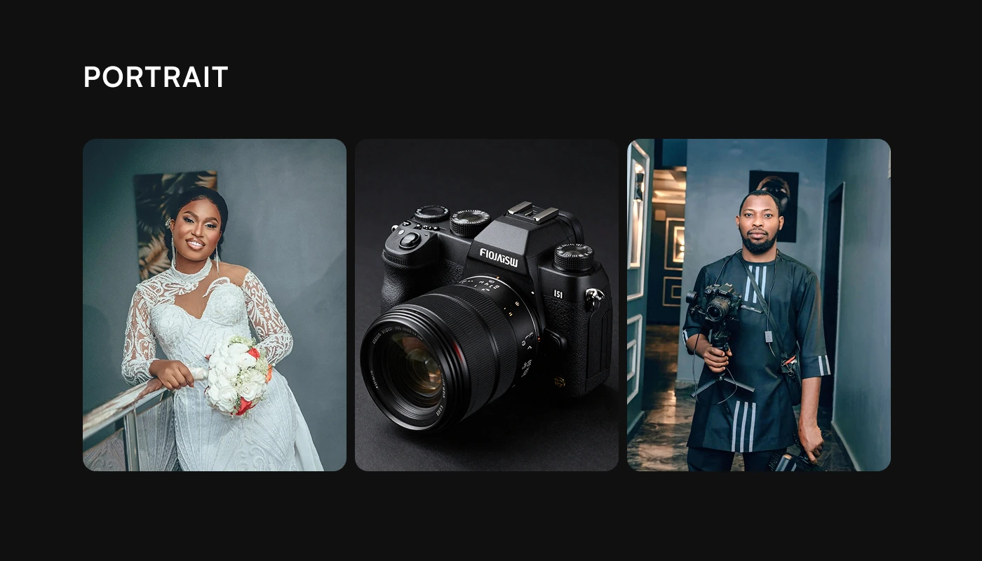
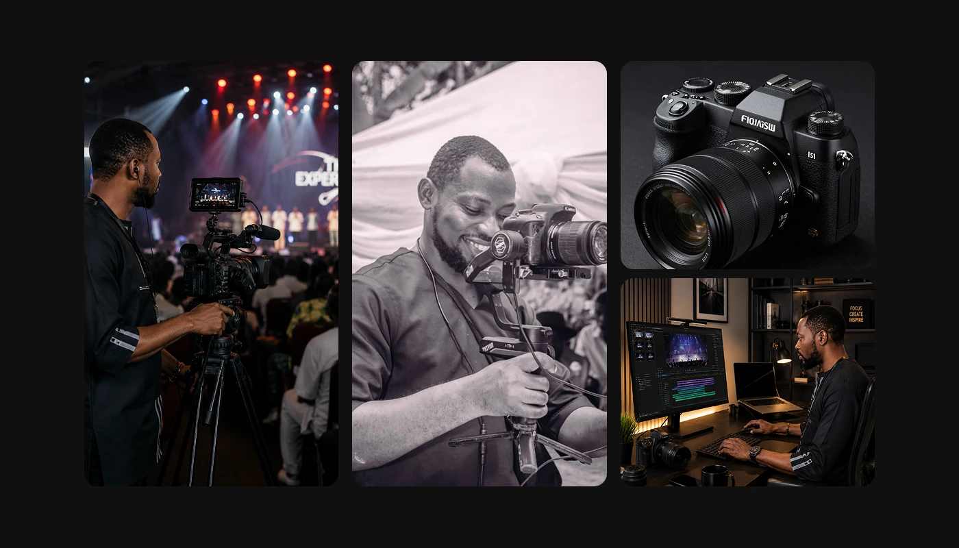
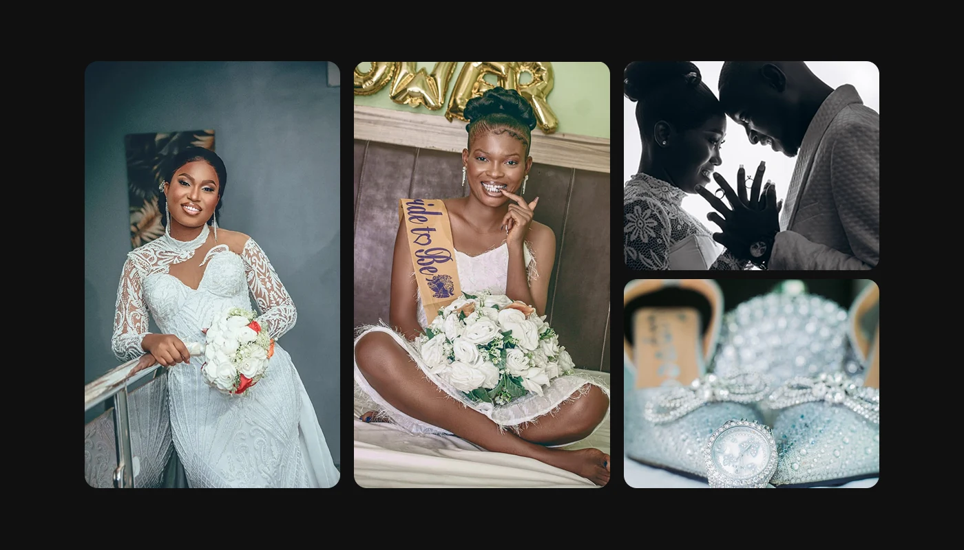
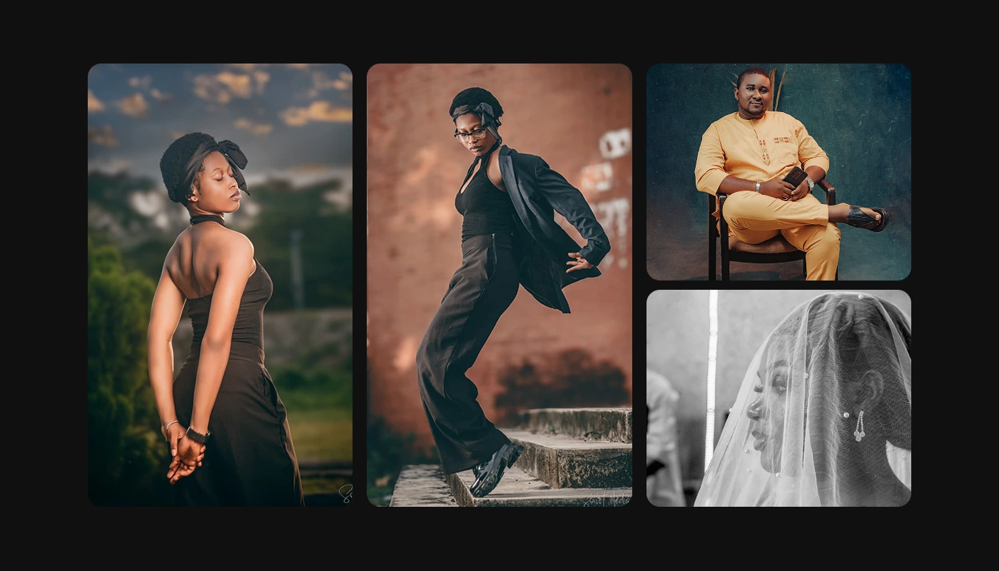
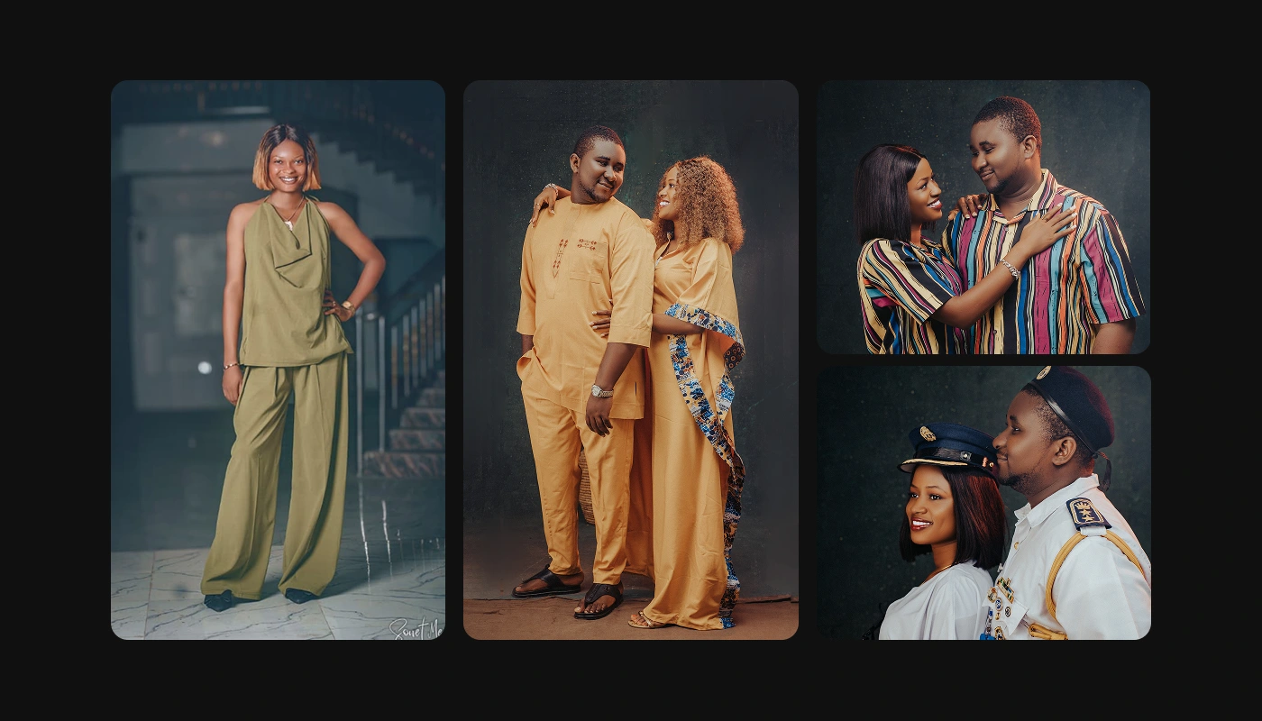
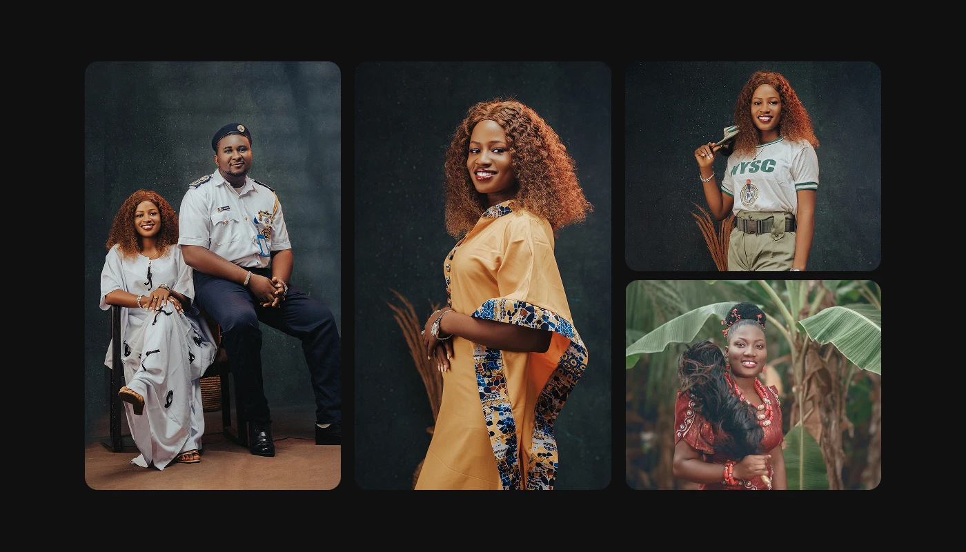
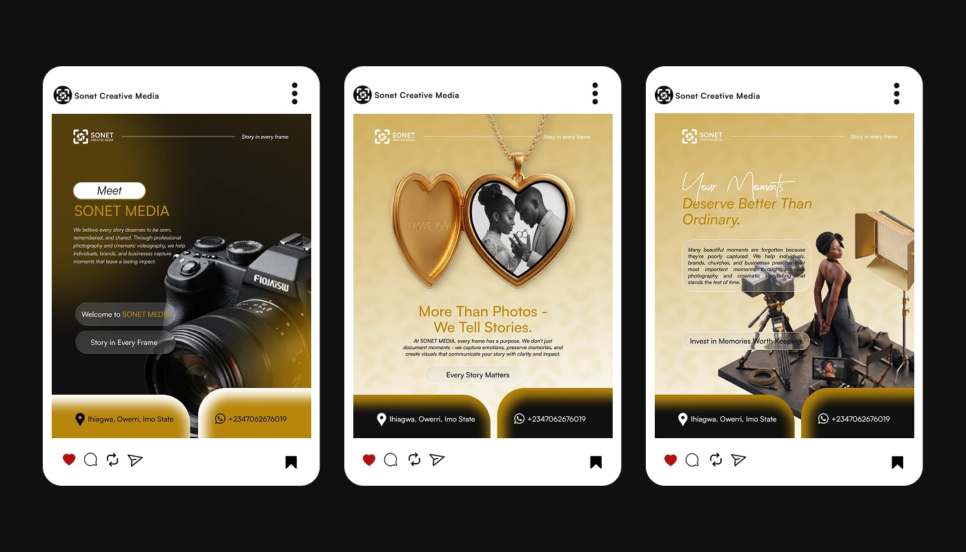
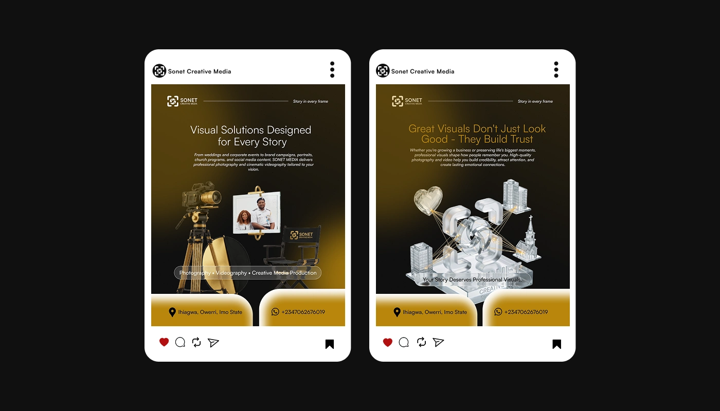
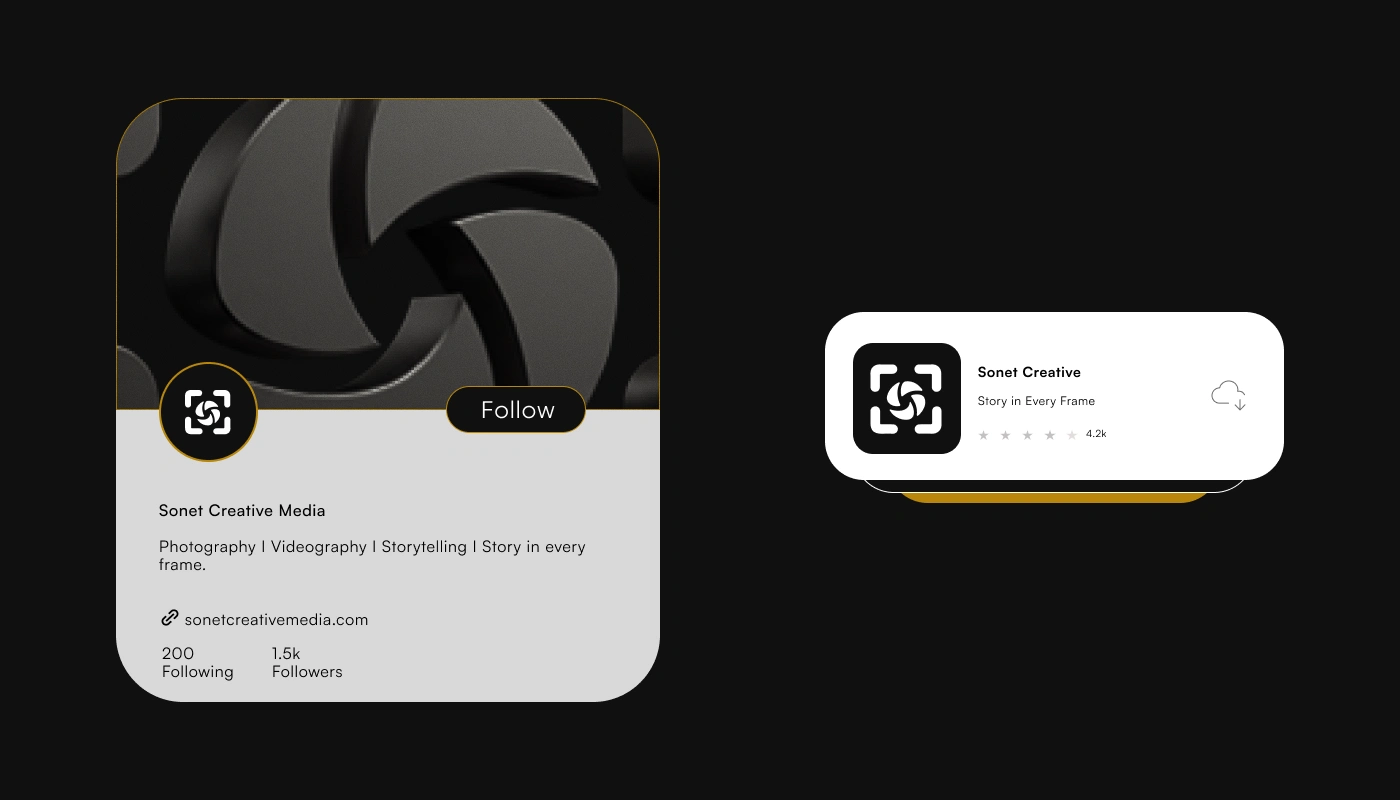
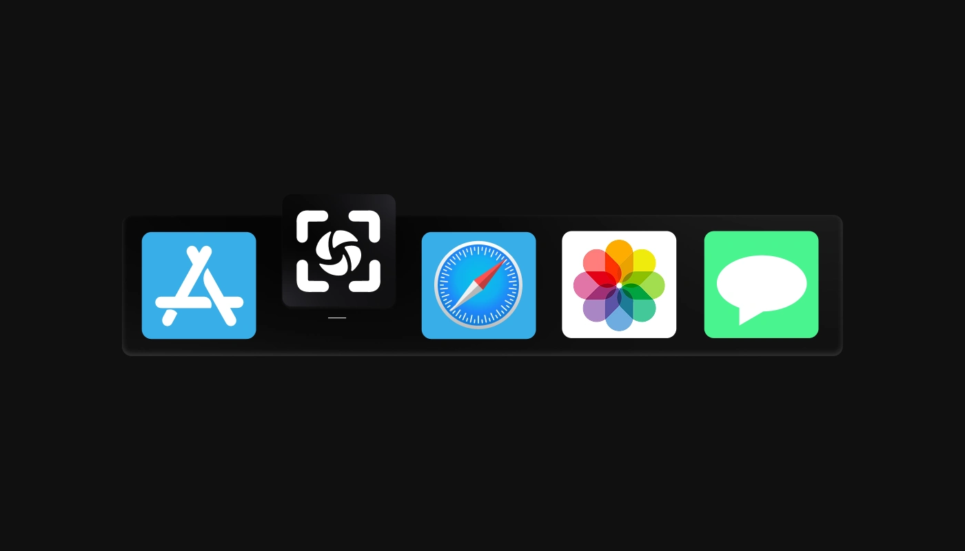
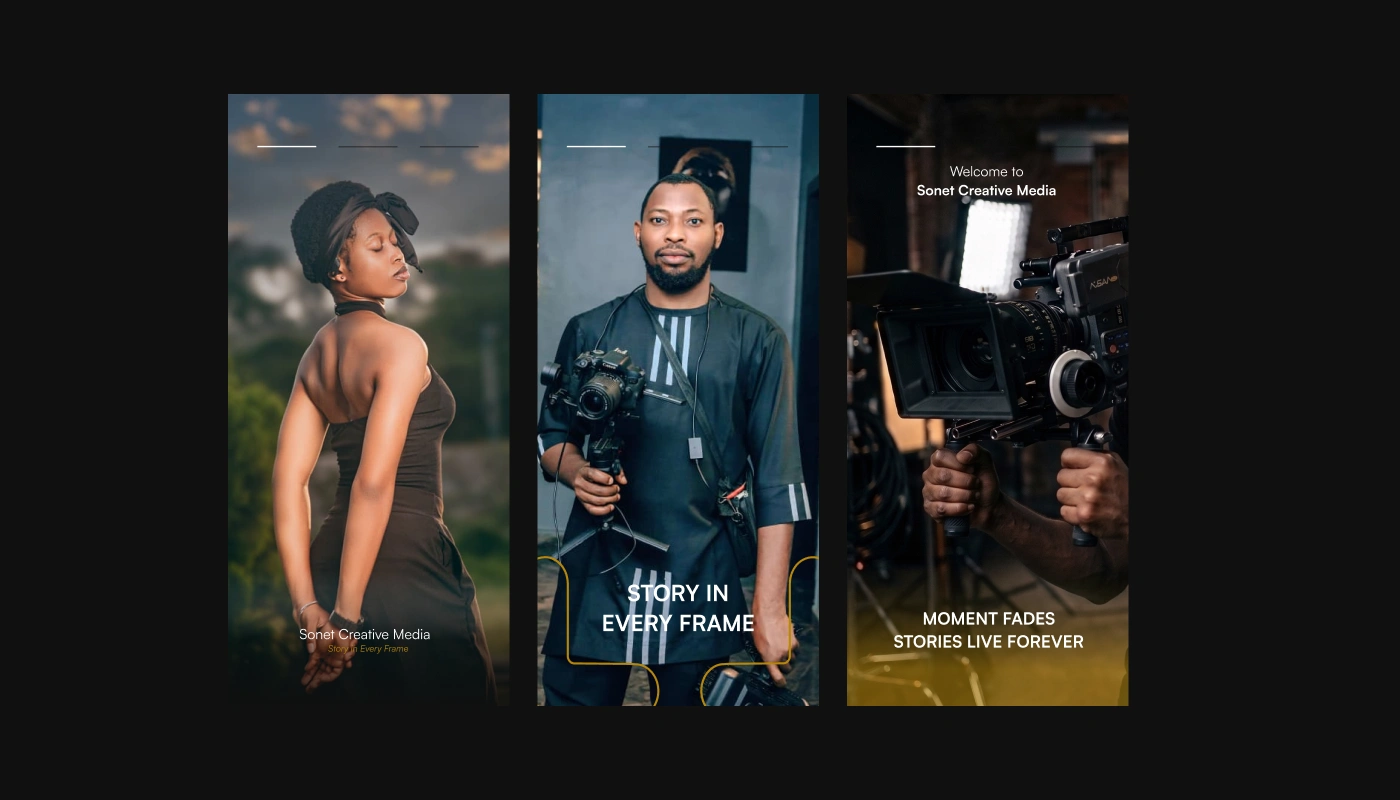
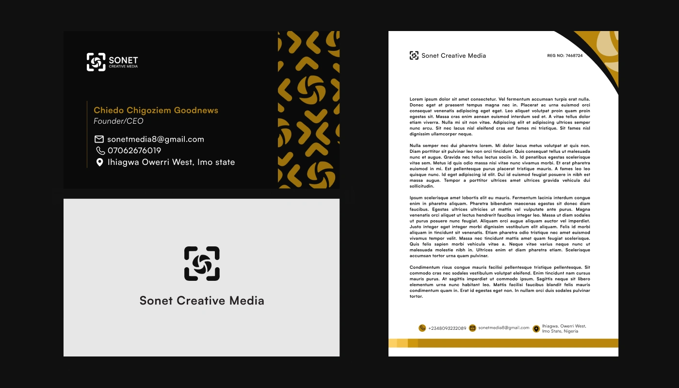
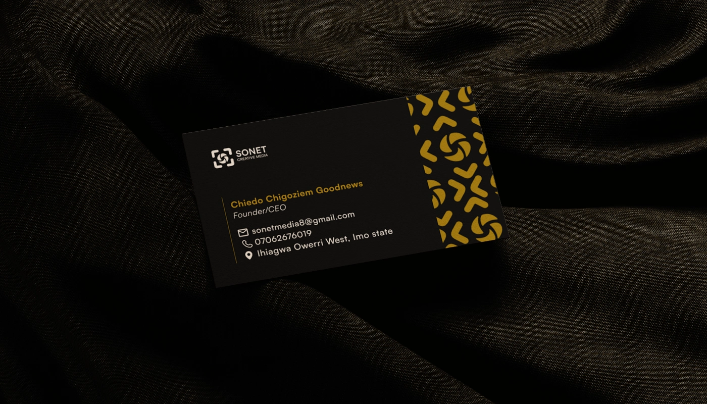
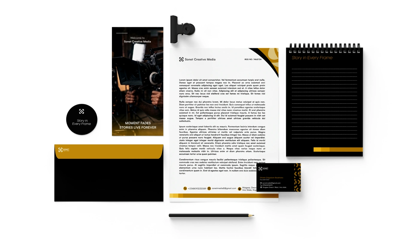
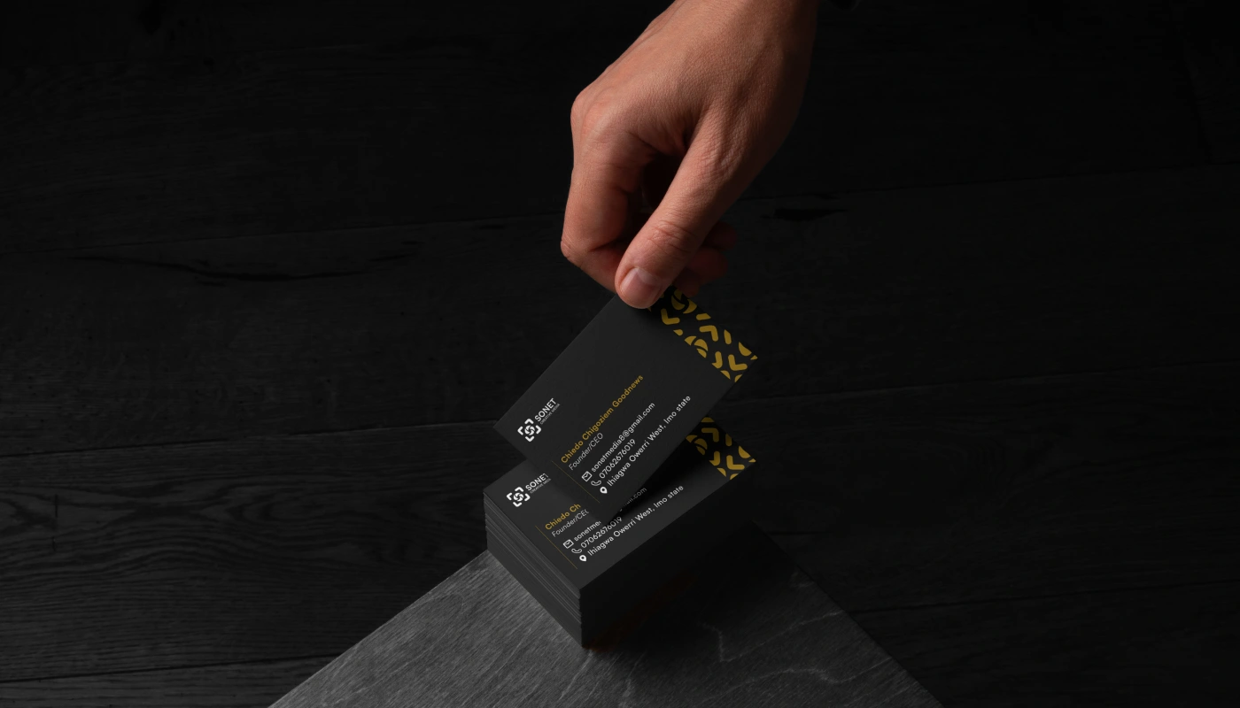
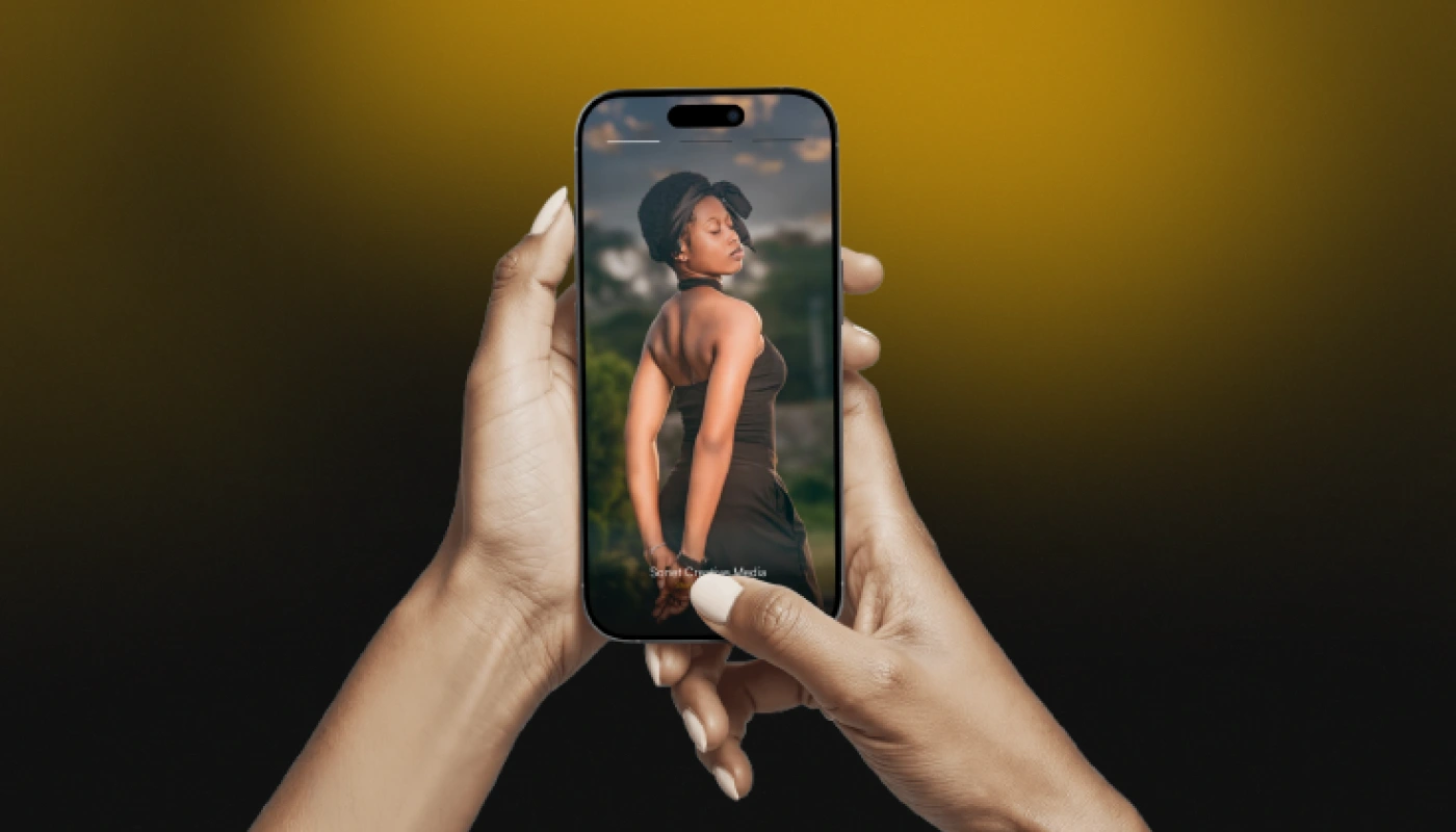
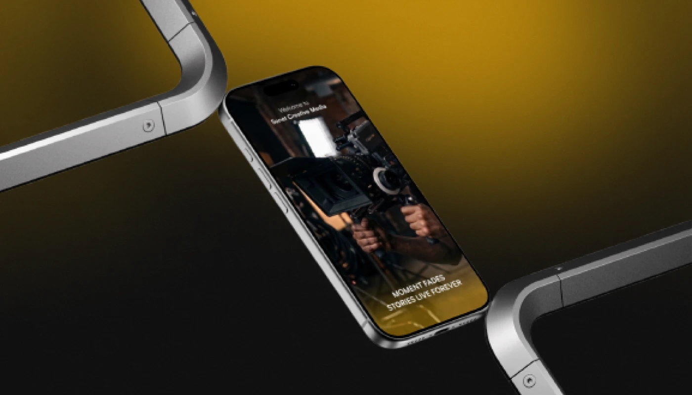
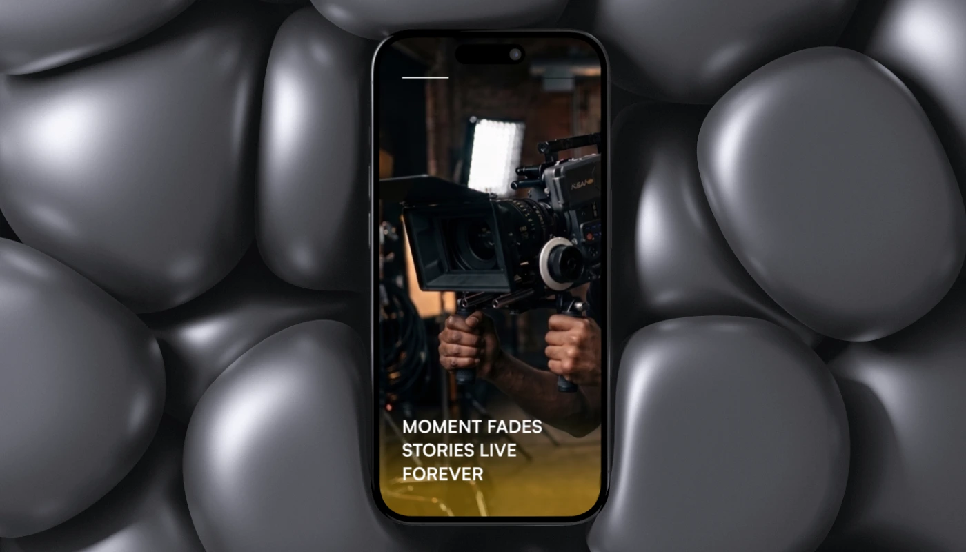
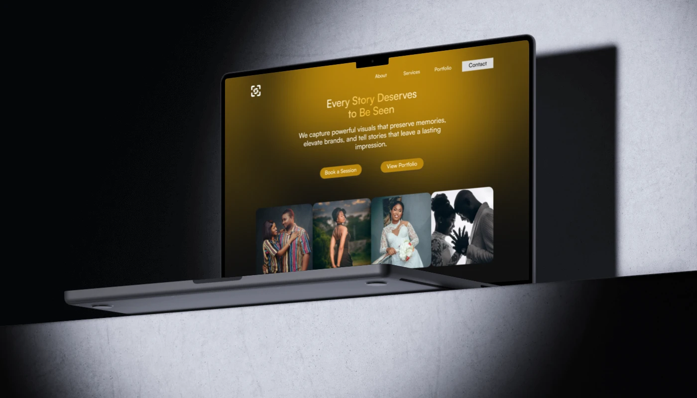
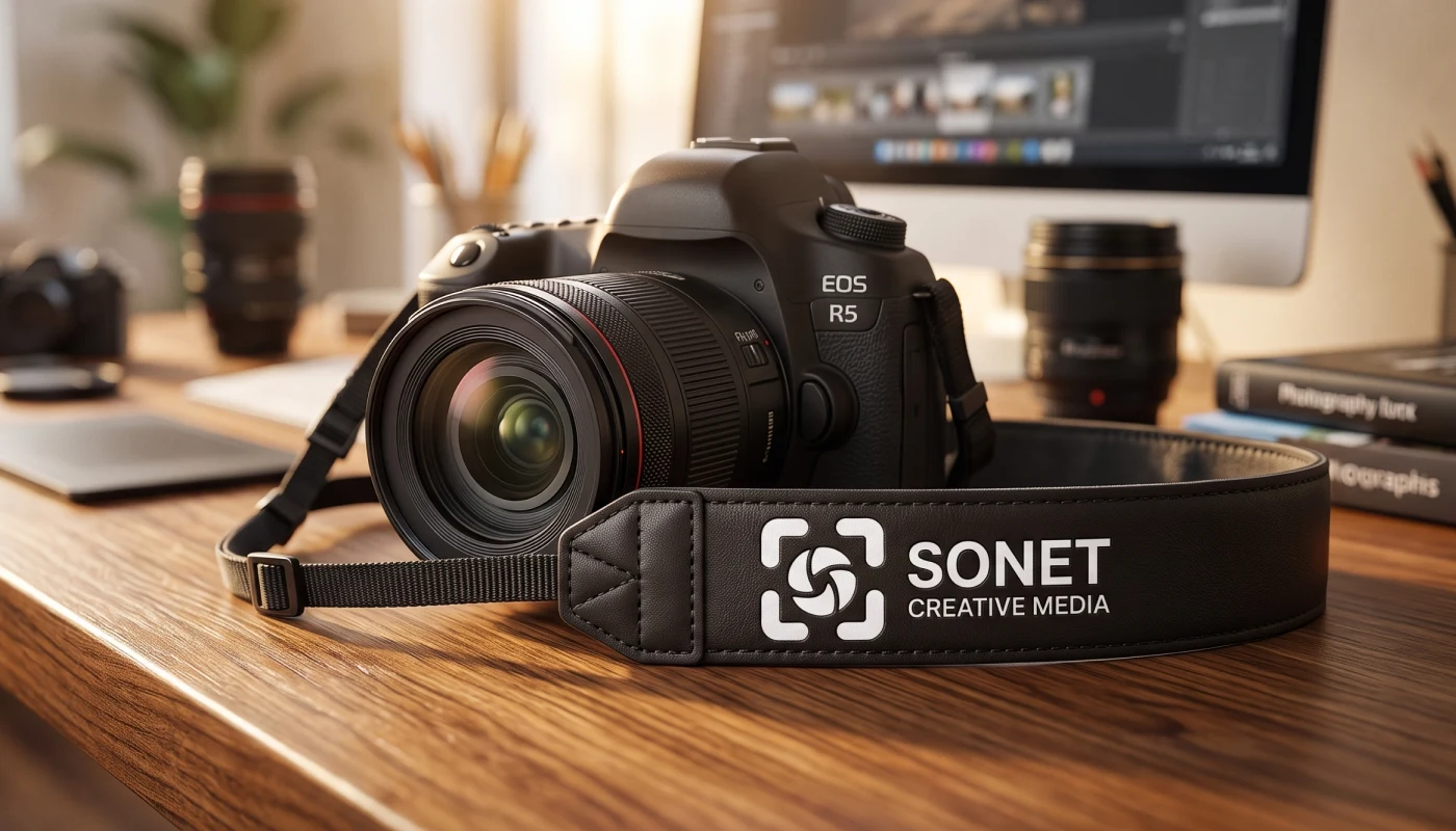
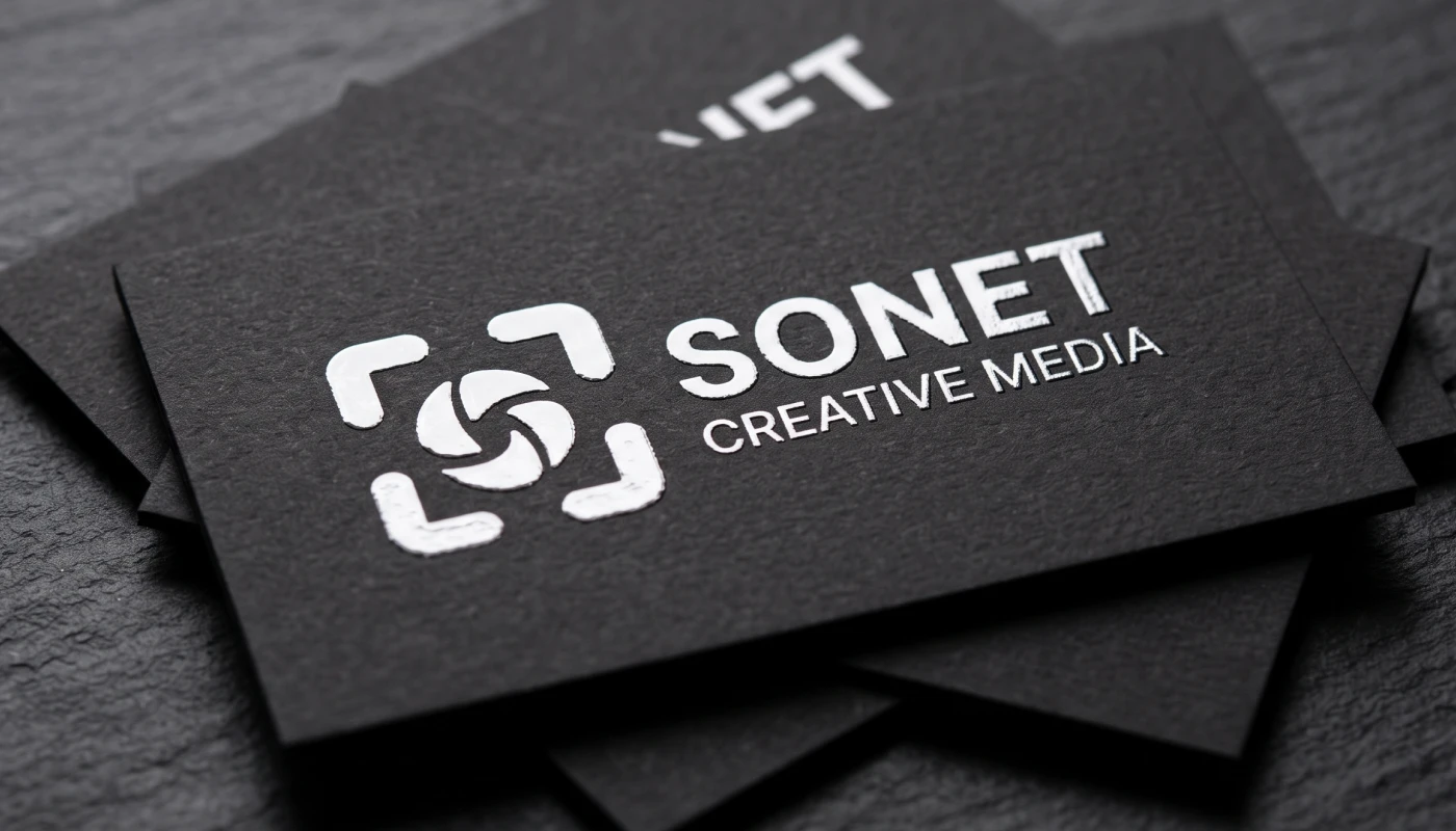
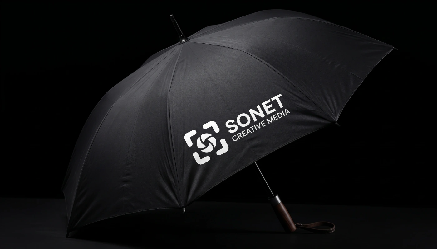
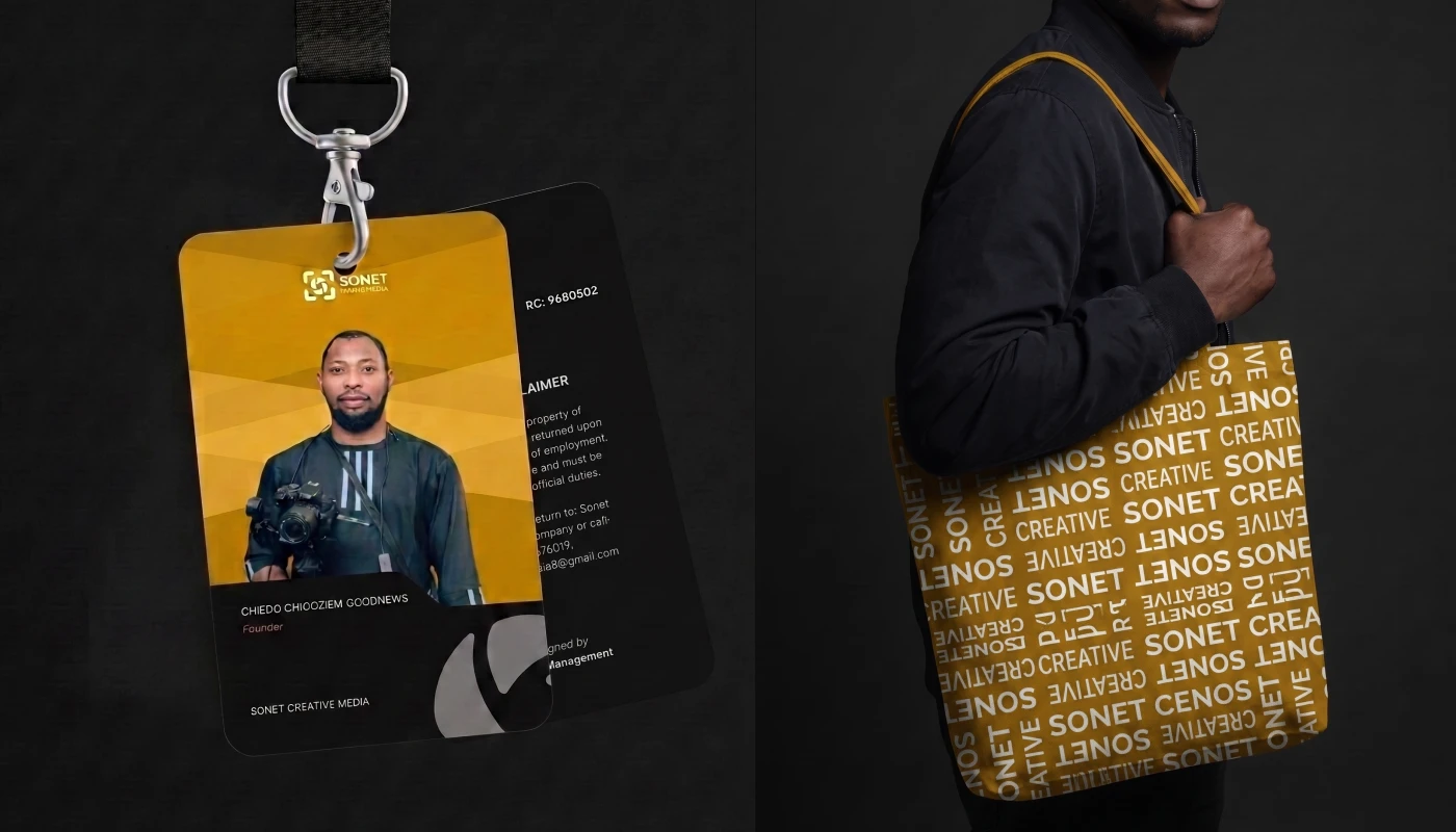
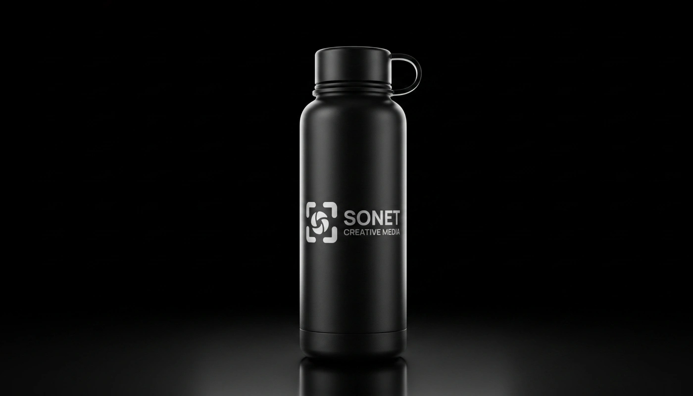
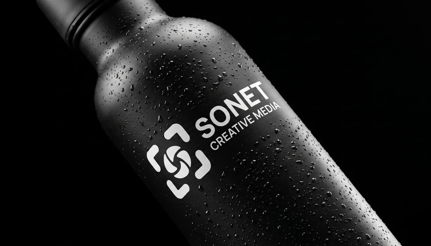
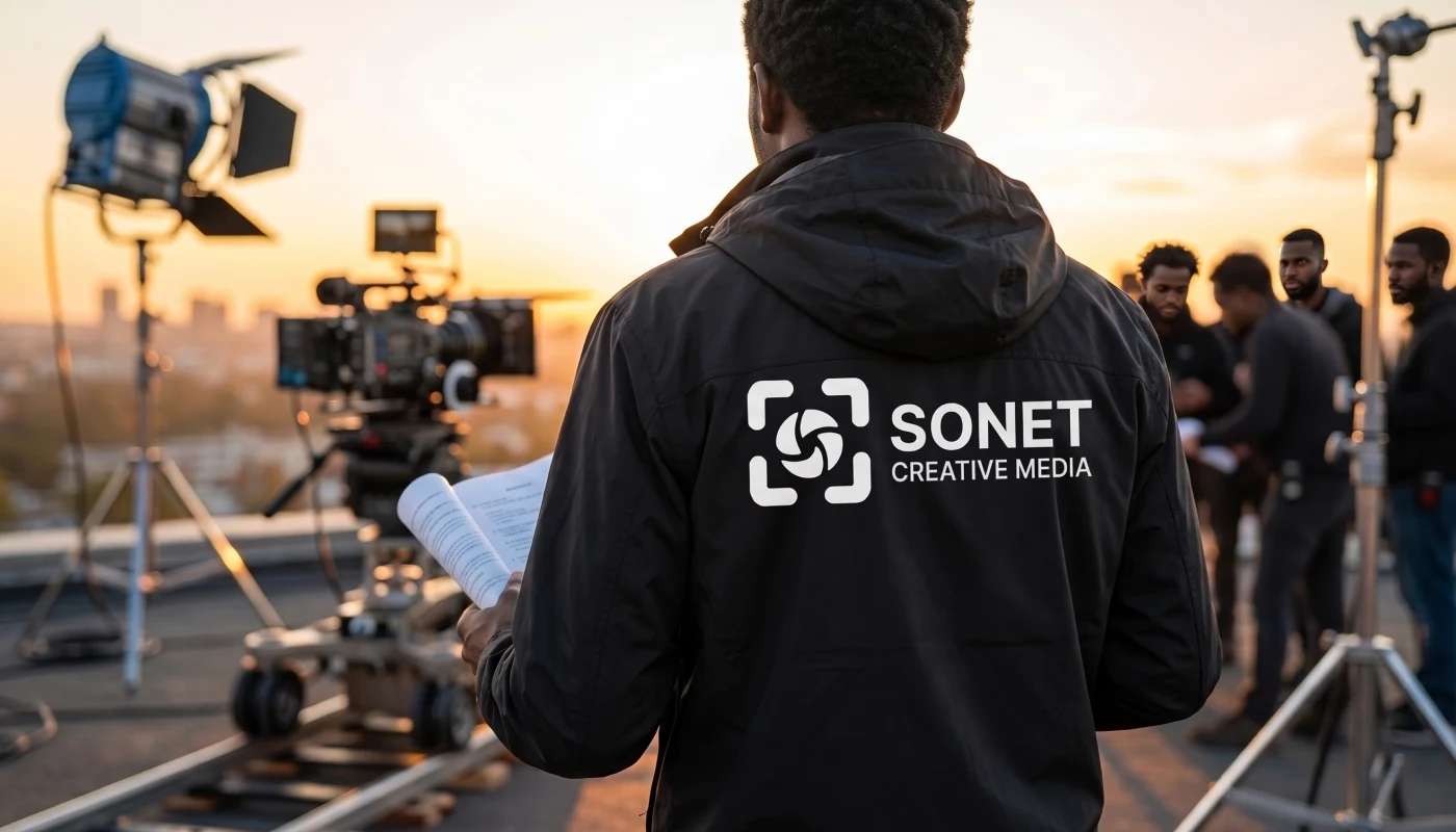
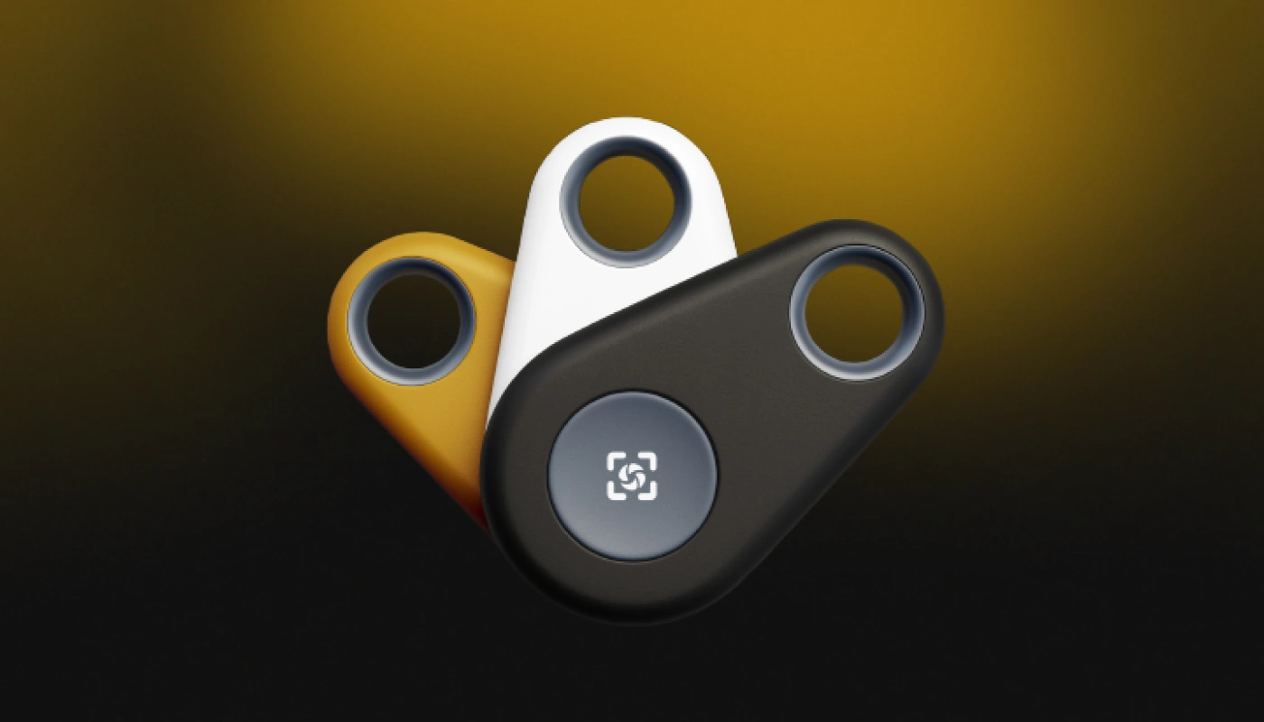
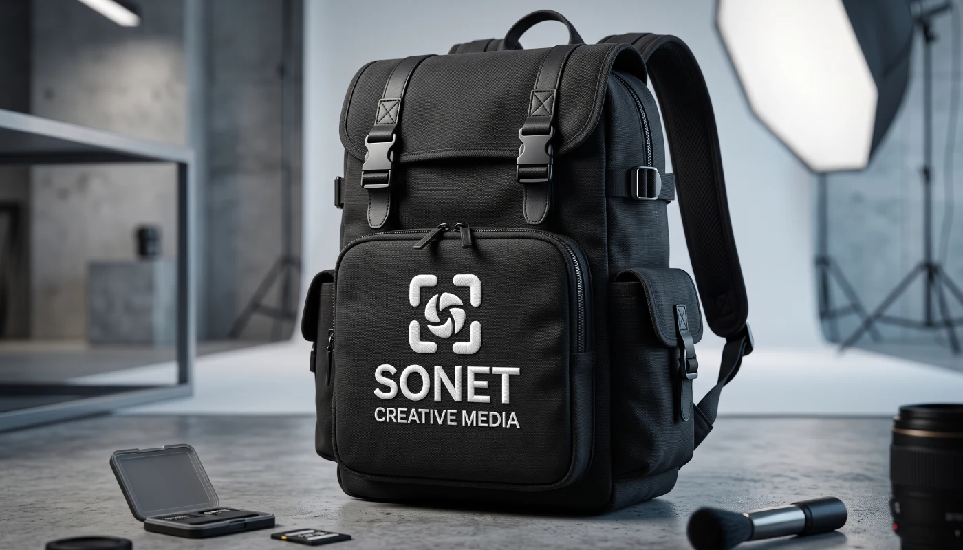
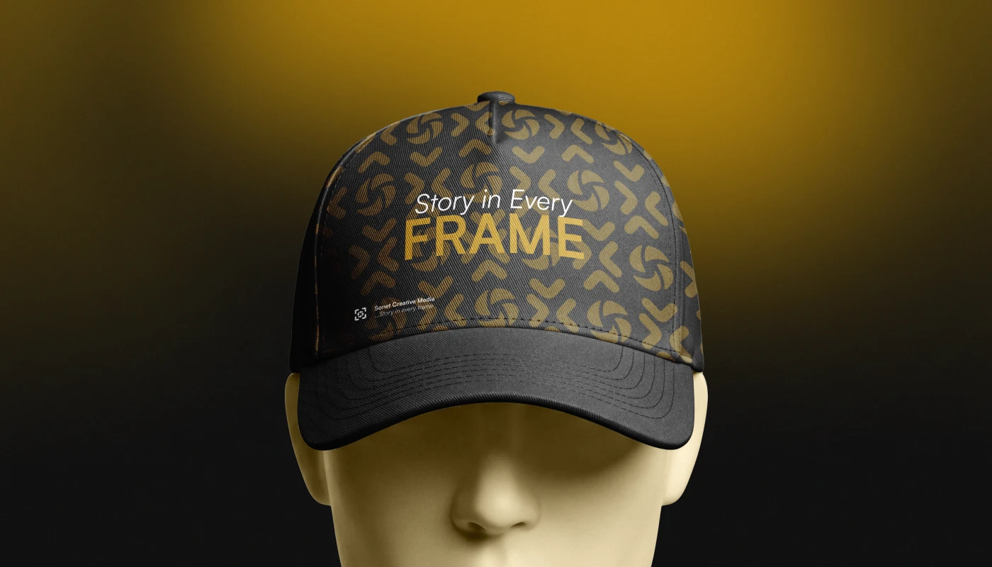
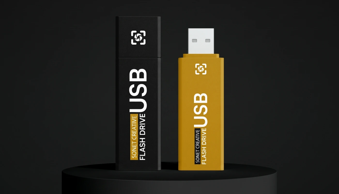
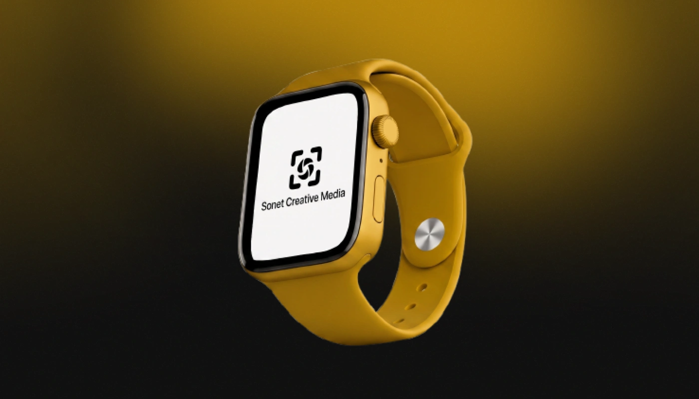
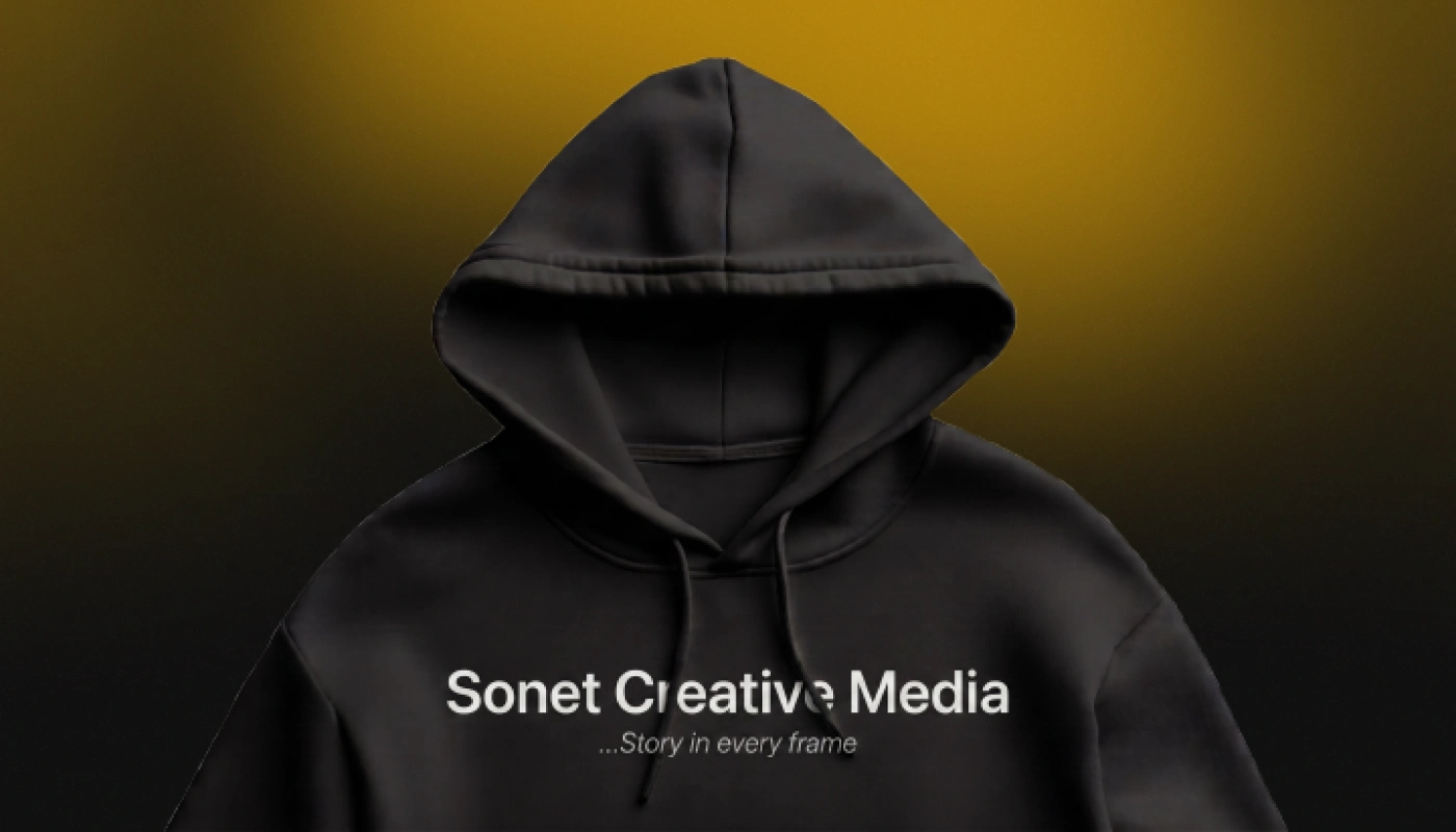
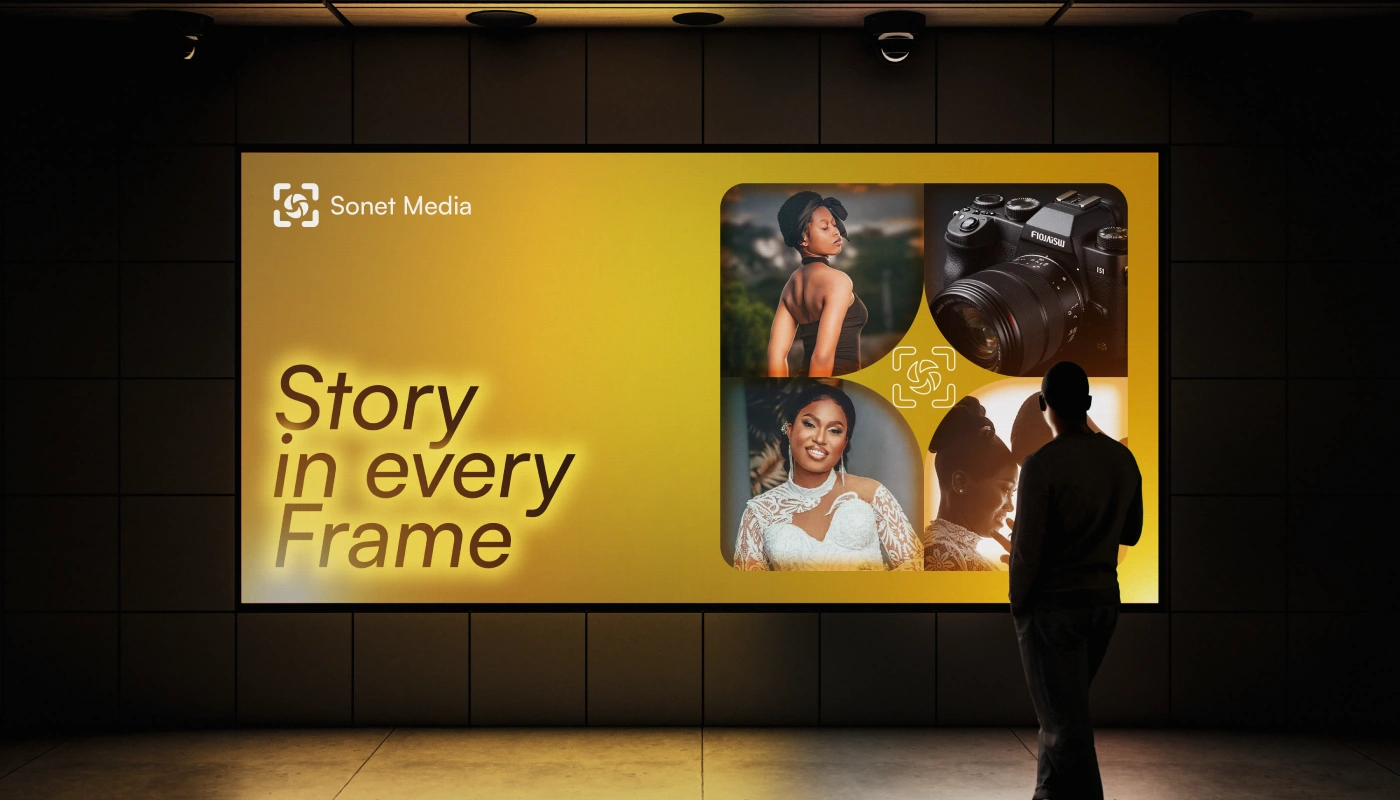
Beyond the logo, the identity system establishes consistent visual rules through iconography, patterns, imagery, layouts, and brand applications. These elements work together to create a unified experience, ensuring every interaction with the brand communicates the same level of creativity, quality, and professionalism regardless of the medium.
My Brand Identity Process
Every brand identity I create follows a structured, strategy-first process:
• Brand Discovery – Understanding the business, goals, audience, and market.
• Research & Positioning – Identifying opportunities, competitors, and points of differentiation.
• Concept Development – Translating strategic insights into meaningful visual concepts.
• Identity System Design – Developing the logo, typography, colour palette, supporting graphics, and visual language.
• Brand Guidelines – Creating a comprehensive system that ensures consistency across every touch-point and allows the brand to scale with confidence.
I believe a brand identity is not just about how a business looks - it's about building a strategic visual system that communicates purpose, creates recognition, and supports long-term growth.











Thanks for taking the time to explore this project.
I help businesses transform ideas into strategic brand identities that communicate clearly and grow confidently. If this approach resonates with you, I'd love to hear about your next project.
Let's build a brand with purpose - kelscreative2025@gmail.com +2348022086443
Like this project
Posted Aug 8, 2026
This brand identity system for Sonet Creative Media was designed to create a consistent and recognizable visual experience across every touchpoint. Built on strategic research, the identity reflects the brand's commitment to storytelling, creativity, and premium visual production while providing a scalable system for future growth.